Since 1958, the Society of Illustrators has elected to its Hall of Fame artists recognized for their distinguished achievement in the art of illustration. Artists are elected by former presidents of the Society and are chosen based on their body of work and the impact it has made on the field of illustration.
HALL OF FAME 2012
R.O. BLECHMAN
[ b. 1930 ]
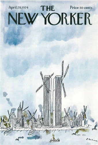
Twin Windmills. Cover, The New Yorker, April 29, 1974. Ink and watercolor. All images courtesy of the artist.
In 1967 a talking stomach was interviewed about its digestion on TV in a commercial spot for Alka-Seltzer, the effervescent cure for indigestion. That a talking organ would change television advertising forever was surprising. Who would have thought such an essentially unattractive muscle could become a TV star, and later an icon of the “Creative Revolution”? Its creator, R.O. Blechman, knew in his gut that it would. The talking stomach was an instant success and viewers were charmed by its understated hilarity, rendered with R. O. Blechman’s famously nervous comic line.
Understated is the best way to describe Blechman’s work. His art foregoes slapstick. His line is genuinely humane. Although many cartoonists have copied the shaky look, no one has ever duplicated the human qualities of his everyman (or every stomach) images. Perhaps the perception of a spiritual humanity has something to do with Blechman’s inventive animation work in which he employs voices that transcend the mere line and move from comic to emotionally multifaceted characterizations. (I always associate Blechman’s figures with Max Von Sydow’s dulcet voice. What other cartoonist can trigger such voices in the head?) Blechman’s ability to invest emotion onto his scratchy homunculi has to do with his painstaking attention to gestured detail. He is a master of the expressive gesture.
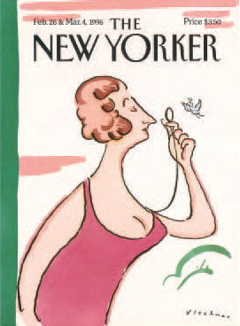
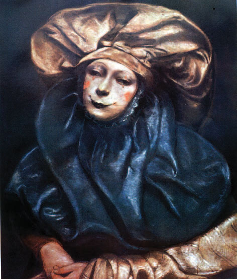
Female version of Eustice Tilley. Cover, The New Yorker, Febuary 26 & March 4, 1996. Ink and watercolor.
Yet contrary to what one might expect of such a minimal line, Blechman’s every last pen stroke is purposely, often excruciatingly composed. He has been known to draw dozens of tiny squiggly noses, for instance, on adhesive-backed paper until the right one materializes; then he meticulously cuts it out with an Xacto knife and pastes it onto the image. The final drawing is pieced together like a jigsaw puzzle. And as studied as this process is, the end product is the perfect marriage of comedy and emotion—accomplished through signature gestures.
When Blechman’s art was on its ascent during the late fifties and sixties, he bucked the prevailing style of gag cartoons. With the notable exception of James Thurber’s primitive scrawls and Robert Osborn’s expressionist brush strokes, abstraction was frowned upon. Blechman’s abstract linear economy was innovative, but so were his themes. The 1953 adaptation of The Juggler of Our Lady, which prefigured today’s graphic novels by decades, was not the usual cartoon or comic fare. Likewise, his 1977 No Room at the Inn, a retelling of the nativity myth, was surprisingly warm and spiritual. His drawing is a form of writing and his writing brilliantly complements his drawing.
It is tempting to refer to Blechman’s wit as deadpan, but that designation does not take into account the inherent joy that pervades even the most somber work. His 1966 Christmas Message, broadcast for many years on CBS, is an animated, ecumenical paean to the season that resonates to this day. A lumberjack, standing before a tree, uses his saw as a violin and plays a Christmas carol. In the tree are birds and therein is the tension between holiday tradition, consumerism, and the human condition. In the hands of more slapstick cartoonists the humor might be there, but not the cathartic power.
Blechman is a “perfectionist.” Witness his first feature film, Igor Stravinsky’s heartbreaking The Soldier’s Tale. The intense energy it cost to make the outcome flawless, drained seemingly indefatigable resources. For him, as an independent producer, to engage in such a mammoth undertaking before the age of CGI, showed not only commitment to his art, but also a devotion to narratives that go deep into his persona. This was no easy task. Adapting this tale of war and its ravages to the screen was difficult enough. To make a story compelling with nervously drawn characters took him years. But from the moment it premiered, viewers were pulled into Blechman’s universe. It was not simply an animated rendition of a classic work, it was a total sensory experience that transcended the existing paradigms of animation and filmmaking. And yet it is a cartoon.

Cover for STORY magazine. Summer 1994. Watercolor.
At 82, Blechman projects youthful skepticism and sardonic sarcasm. He is routinely more optimistic—indeed more joyous—than other world-weary cartoonists, with their sarcasm and rueful skepticism. Blechman’s work, no matter how caustic, never feels like resignation to the fates.
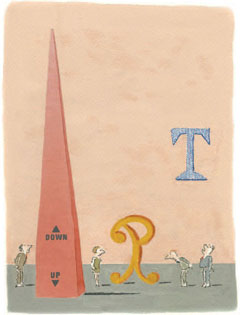
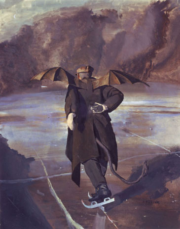
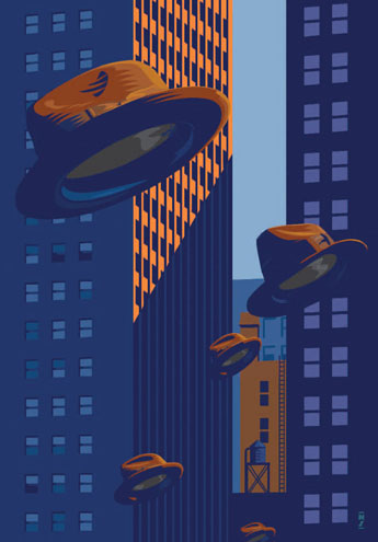
He has created his share of graphic icons too. His 1974 New Yorker cover, published during the height of the energy crisis, is a brilliant watercolor of the New York skyline of skyscrapers depicted as old-fashioned windmills, taking New York back to its Dutch roots, while predicting the increasing interest in wind power. His 1979 New Yorker cover, New York at Night, showing the colored lights on New York’s monumental buildings, is as emblematic for the city as was Saul Steinberg’s earlier New York-centric map. It was similarly imitated as in Milan at Night and Paris at Night, and it helped put the New Yorker and New York back on the map, too. And for me, one of his most illuminating illustrations is a 1981 poster that captures New York’s “Museum Mile,” showing a composite running man representing all the street’s attractions. It is New York to a “T.” For Blechman, it was a mixed media carnival. He worked in watercolor, gouache, crayon, colored pencil, and collage.
Pink Slip. Ink and watercolor.
ART. Ink and watercolor.
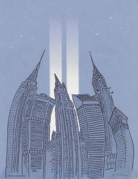
World Trade Center Memorial Lights. The Municipal Art Society, 2006.
Routinely trying new approaches, over time Blechman’s characterizations have become less everyman and more individual journeyman. In recent years he has embraced color with more gusto. He also alternates between pen and brush, and includes collage and montage when appropriate. These may seem like incremental advances, but in the life of an artist any shifts in conceptual thinking and technical processes are building blocks. He does his share of building every day and he is no longer the same artist who cuts out dozens of squiggly noses to find a Platonic ideal.
The political cartoonist J.N. Darling once said a cartoon is “a humor-coated capsule by means of which the sober judgments of editorial minds may be surreptitiously gotten down the throats of an apathetic public.” Blechman’s drawings are very potent pills. His deceptively simple graphic approach is wily camouflage for the many social and political satires that comprise his oeuvre. He rarely makes overtly partisan political commentary, preferring instead to be an outsider, if for no other reason than to “support the underdog,” he once said. His goal has always been to subvert the commonplace. In the manner of a court jester, he attacks real absurdity with comic absurdity. He disarms the viewer, and then, like a victorious army, occupies their senses. His shaky line and steady wit has captured the beachhead for now and always.
STEVEN HELLER
Co-chair MFA Design/Designer
as Author & Entrepreneur,
School of Visual Arts, New York
HALL OF FAME 2012
JOHN COLLIER
[ b. 1948 ]
“Ephemeral.” That’s the word John Collier used to express the nature of ideas while being interviewed as the Society of Illustrators Hamilton King Award winner in 1994. It’s also a word that describes a crucial aspect of his work. When examined closely, Collier’s images have movement at the edges, a tremulous shimmer that evokes a connection to the ineffable in a way that words cannot. Call it spirituality, call it life. Paradoxically, this deceptively quiet shimmer is always exciting, at times thrilling.
Born and raised in Dallas, Collier is largely self taught, in that he didn’t attend art school. However, his father, Carroll Lloyd Collier, an illustrator and painter, created an art-filled atmosphere for his six children, most of whom went on to have careers in the arts. Prepped with art book and museum knowledge, Collier got practical training as an apprentice in an ad agency, where he observed and absorbed his craft. At one time he thought he had “missed the boat” by forgoing art school, but came to feel that his professional training provided a good education for him.
Collier has a deep knowledge of art history, something he feels is of paramount importance for any artist. He understands the progression of attitudes held not only by the producers of art, but also by the public, and he knows how the prevailing attitudes affect the marketplace, for both illustrators and gallery artists. When in his late teens, Collier devoured the Society of Illustrators Annuals, and Norman Rockwell was his hero. Feeling the need to push deeper into the past, he was drawn to Early Italian Renaissance innovators such as Fra Angelico and Giotto, and then looked to other masters for answers, among them, Titian, Watteau, Picasso, Degas, and Manzu.
As a way to improve, he did more than study artists he admired. “It’s good to copy,” he says. “The artist you’re copying has solved all the problems of composition and color. You’re learning how to mix color and get it on the canvas like the master did. You’re learning to think the way he did. You have to think like Degas to paint in his style. It doesn’t mean you can think as well as Degas, but there has to be a sense of how he approached a problem.” In time, Collier “could knock off almost anyone you could name.” But, he points out, “It’s not just manipulating pastel the way Degas did. You learn more and more about the way you think about the world.”
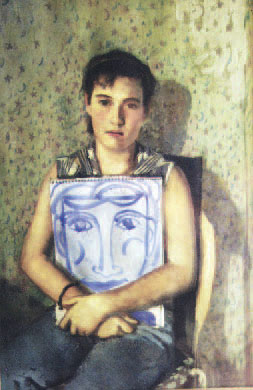
The Virgin with Self Portrait. A personal piece of the daughter of the artist’s friend. Courtesy of the artist.
Collier internalized the lessons from his heroes, not only the manner in which he put marks on paper—with masterful deftness and deep understanding of subtle coloration—he also borrowed compositional references. These he wrought, not as pure “appropriation,” but rather in the way a composer takes a theme from a master as a foundation for a new interpretation. In Collier’s work we see a startling new view of a Degas composition, or the Giotto-like flatness of a model’s features that lends it a feeling of timeless universality.
Collier’s use of pastels in the 1970s was an innovation in contemporary illustration. He “didn’t want to look like anyone else,” and, because he felt he was better at drawing than painting at the time, he found “it was a way to do color work without using oils.” While it would take 12 years before he was satisfied with his painting skills, in the meantime his illustrations drew universal praise. Steven Heller credited him with initiating a “pastel renaissance” in works that evoked classic images in a fresh way, and had “aesthetic concerns that harken back to the Italian Renaissance.” Top illustrators, such as Marshall Arisman and Mark English, agreed that he was one of the country’s most important artists. As did a raft of editorial and commercial clients that included Atlantic Records, Columbia Records, H.J. Heinz, Japan Barman’s Association, Time-Life Books, Push Pin Studios, Masterpiece Theatre, Ladies’ Home Journal, Mother Jones, Redbook, McCall’s, Postgraduate Medicine, Dallas Times Herald, Hallmark, Ritz Carlton Hotel, AMC Theaters, Mobil Oil Corp., Rita Marshall, Byron Priess, Oscar de la Renta, and Bob Dylan.
The Skater. “The devil skating when Hell freezes over.” For Fred Woodward at Rolling Stone, 1994. Pastel. Artist photo courtesy of Karl Erickson.
In addition to the Hamilton King Award, the Society of Illustrators awarded him 20 Gold and Silver Medals, and the IFFRA arm of the American Institute of Architects has presented Collier its award for the best work made for a church in four out of the last six years.
Through a grant from Hallmark, Collier taught at the University of Kansas, where he was honored as the Joyce C. Hall Distinguished Visiting Professor. Sought after by art institutes nationwide, he has lectured at Syracuse University, Art Center College of Design, Pratt Institute, Smithsonian Institute, the University of Delaware and many, many more.
Collier has led a peripatetic life, moving from Minneapolis to Houston to New York to Dallas to Connecticut, where he lived in the midst of the so-called “Westport School” artists, to Puget Sound, Washington, and finally back to Dallas in 1991. Throughout, his wife, Shirley, has been his partner whose support has allowed him to focus on his artwork. “I’m like a farmer” he says, about working at home, where he has used his children, pets, and friends as models. He needs a measure of emotional separation between him and his models, but says he can’t relate to complete strangers. This sensitivity to the subtleties of emotional interaction enliven and deepen his work.
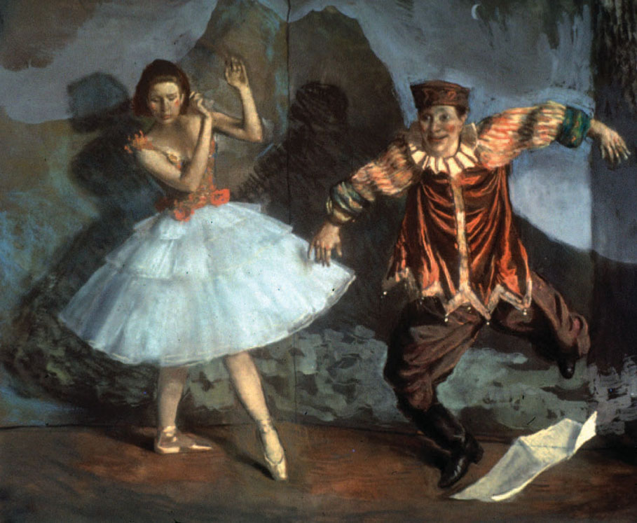
Ballerina and Clown. Illustration for children’s book, Petrushka by Vivien Werner. Art directed by Byron Preiss. Orion Children’s Books, 1992. Courtesy of the artist.
Collier warns against what he calls “the beautiful lie,” an abstract concept he explains in concrete terms in a 1988 documentary, “The Art of John Collier.” He compares the truth of Rembrandt’s Bathsheba at Her Bath, a depiction of a real woman, and the beautiful lie of a glossy centerfold. He contends that the more truthful the work, the better it is, and the more we want to return again and again to witness it. He says, “If art is moving, it is good.”
Collier’s work is rife with subtext, part of the ephemeral nature of his approach. At times incantatory—where one has the feeling angels are just out of the frame. At other times, he evokes a sense of darker mystery, effectively on display in a book of ghost stories, wherein Collier not only illustrates the ghastly subjects, but relays something more complex and very hard to do. He renders terror.
Since 1998 Collier has devoted himself exclusively to painting and sculpting imagery for religious institutions, and in 2005 he was chosen as chief sculptor for the Catholic Memorial at Ground Zero. His larger-than-life-size figures, representing the patron saints of police, firefighters, and workers, as well as one of Mary Magdelene, received the Prestigious Optimé Award from Ministry and Liturgy and are permanently installed at St. Joseph’s Chapel. He has exhibited at the Westmoreland Museum of American Art, the Mulvane Museum, the Smithsonian Institute’s Traveling Art Exhibition, the Museum of Biblical Arts in Dallas, the Longview Museum of Fine Arts in Longview, Texas, and at the Haas Fine Art Gallery at the University of Wisconsin, Eau Claire. In New York, his works have been shown at Tatischeff Gallery, the New-York Historical Society, Chris-tie’s, and the Narthex Gallery at Saint Peter’s Church.
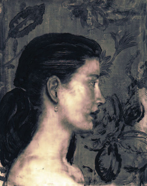
Lisa, Profile. A monoprint that was scanned into the computer with color added. Courtesy of the artist.
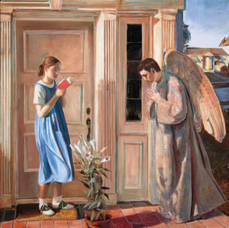
Annunciation. Art created for the Church. “An ancient story cast in a contemporary setting, much as was done in the Renaissance.” Courtesy of John Bergstrom, www.hill-stream.com.
Clown. Cover of Pushpin Graphic, 1978. Pastel. Seymour Chwast, editor. For the issue about clowns, Collier said, “Watteau’s comedians were an inspiration for this piece.” Courtesy of the artist.
Tempted early on to have art take first place in his life, Collier has discovered that the work is a reflection of what is important in life. “To put [art] above God or religion or family would be destructive to the art. People are always loading art down with baggage it was really never meant to carry. If a person wants to make a philosophical statement and put a verbal idea into a visual medium, it doesn’t work very well. Art is really a poor way to preach.” His conviction that what one believes is reflected in the work leads him to ask, “What do I believe that has meaning? Are the things that I believe about life true?” For him, being a Christian affects him emotionally, which, he contends, comes out in his paintings spontaneously, something that naturally affects people. “They feel it and they can’t help themselves.”
JILL BOSSERT
Editor, Illustrators 54
Pink Sheets, 1990. Gouache. This unpublished piece was commissioned by Esquire for a story about the end of a communist newspaper.
HALL OF FAME 2012
NANCY STAHL
[ b. 1949 ]
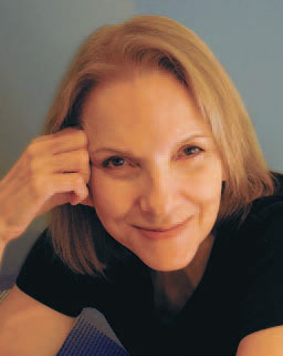
Photo by Mara.
Digital pioneer Nancy Stahl began her love of exploration when she was in high school, where, as the second best artist in her class, she drew posters for plays and events, and spent long hours in her room creating and experimenting with everything from encaustic painting to oils to pen and ink.
After attending a large university for two years, Stahl transferred to Art Center College of Design. There she discovered that a strong sense of competition was a great motivator for her, as she and her classmates pulled all-nighters to complete their assignments and met up for eggs and toast in the morning to compare their work before class.
Paul Hardy, Stahl’s close friend until his death in 2001, left Art Center in 1970 to move to New York City, where he worked with Tony Russell and Kit and Linda Hinrichs at the newly-formed Russell & Hinrichs Studio. When Stahl left school and moved to New York, she got regular freelance assignments from the studio, while holding down a day job in the garment district painting swatches of textile prints. In the early years of her freelance career, she worked in diverse styles and media to satisfy the wide range of the studio’s assignments. She expanded her client list, and after a couple of years she was able to go completely freelance.
She had become known—and popular—for her colored pencil work when she was inspired by the work of Ludwig Hohlwein. She developed a Hohlwein-inspired retro poster style on a gouache portrait of Clark Gable and promoted it to art directors. This was a turning point. With this new boldly graphic poster style, Stahl hit her stride and expanded her clientele beyond editorial work for magazines and newspapers.
Then, in 1985, an assignment to illustrate an article about the battle of the sexes within families gave her the inspiration for further exploration. This time she created an updated spin on Heroic Realism to express the domestic power struggle.
Stahl had always wanted to hit on a “formula” that would allow her to work without recreating herself for each assignment. The only problem was, she says, “As soon as I had the formula worked out, I didn’t want to do it anymore. I was bored. I had to force myself to do it, and it was really painful to do every assignment like the one before.” While she was struggling to find something new to make the assignments personally more interesting, she heard about an offer being made by a post-production company called Charlex. They invited illustrators to come after hours to learn how to create digital art on their big mainframe computers. This was in the late ’80s, when digital art was in its infancy, and Nancy decided to give it a go.
After her very first try at it, she was hooked. Left alone in the office after everyone but the cleaning crew had gone for the day, Stahl sat at the work station, “The next thing I knew it was five o’clock in the morning! I was completely wrapped up in it, it was so fantastic. I came home and slept for maybe an hour; I was going crazy with dreams of cutting things out and moving them around. I was so excited. I woke up and couldn’t wait to call them. Which I did, ‘I want to come back! I want to come back!’ I had felt so boxed in by the way I was working, and this was like magic: I could paint, I could draw, I could do line work, I could do anything I wanted it to do!”
Stahl was still painting in gouache to fulfill assignments for her freelance work. Once she was able to purchase a Mac, she taught herself a new process by creating the job digitally on her computer at the same time as she worked on the traditional painting, so she could see how to make her digital work look like her traditionally painted work. And that’s where she broke ground: her digital work looked the same as her traditional work; it had all the stark power and sophistication of the gouache paintings that had already made her a top-rung illustrator. Only now she was using a brand new tool with which to create and experiment.
This was in the early ’90s, at the very beginning of the digital revolution, and Stahl was in the forefront, breaking digital illustration ground, creating work that was as fluid and personal and as graphically powerful as the gouache paintings that had already made her famous. She had been invited out to Mountain View, California, by Adobe to test-drive the unreleased new program Photoshop; the inventors of the program Painter called and asked to visit her in her studio; she was featured in Communication Arts, Step-by-Step, Print, and Peachpit Press Illustrator Wow and Painter Wow books. Most of all, she was excited by the new ways of drawing and painting she was discovering and inventing.
“I would wake up every single day like it was Christmas morning, so excited to get on the computer. It was like falling in love, for real, after going on a lot of blind dates. It was all-consuming for me. I was up till four or five in the morning; I’d sleep for a couple of hours, and then I’d wake up with a start, ‘What if I tried this? What if I tried that?’ I could barely eat, I was so excited.”

Braid, 1993. Digital personal work.
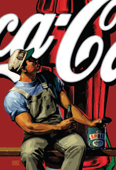
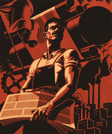
Glidden-Coca-Cola, 1998. A digital poster image for the Arras Group;

Florida Panther, 2002. Digital image for the 37¢ stamp. Courtesy of United States Post Office. All other art, courtesy of the artist.
It took a little convincing for some of Stahl’s clients to make the switch with her to digital, but once they did, there was no turning back. Once again her renown grew along with her new passion. Her work was being used in corporate identity, on packaging, in international publications such as Der Spiegel, and in the late ’90s, she got her first assignment to do a U.S. postage stamp. It was the beginning of a long and successful relationship with the United States Postal Service, during which she created more than 16 stamps, with eight billion copies of her egret stamp in circulation.
Just as Nancy Stahl has the pioneering spirit of a trailblazer, she also has the brave and fiercely independent outlook that transforms exploration into invention.
“How do you explore, if you don’t do things that people don’t like? People discouraged me when I switched from colored pencil to gouache; they wanted me to stay with colored pencil. And then people hated it when I switched from gouache to digital; they wanted me to stay with gouache. If I listened to people, I’d never try anything, and I’d never grow. Getting paid for this stuff is good, but it’s the growing that’s important.”
ZINA SAUNDERS
Illustrator
Flying Hats, 1993. This digital recreation of a painting was done for a recurring weather-watch column in Travel & Leisure. It was also used as the cover for the 1994 Step-by-Step Digital Annual.
HALL OF FAME 2012
LUDWIG BEMELMANS
[ 1898 - 1962 ]
Artist photo by Arnold Newman for Vanity Fair. Courtesy of Barbara Bemelmans Marciano.
“But in a short while, the little elf was back again, his old self.” From Madeline and the Bad Hat, Viking Press, New York, 1956. Pen, black ink, watercolor, and gouache. Courtesy of Penguin Group.
“Writing is always a dreadful, tiresome business and the worst of all tortures for me, because I am convinced that I am not a writer but a graphic workman, a painter who hangs pictures in a row, who collects imagery, and my problem is always to find one for a beginning and one for an end and then, something to hang in the middle so that it resembles a book,” said Ludwig Bemelmans.
Graphic workman, painter—whatever he called himself, Bemelmans belongs in the Pantheon of illustrators. A relentless connoisseur of life, he drew with a child’s eye and wrote with the shrewd wit of an adult. He knew everyone worth knowing, went everywhere worth visiting, all the while recording what he saw on the backs of menus, envelopes, or on the inside covers of matchbooks. His resumé was a checkerboard: hotelier, restaurateur, cartoonist, ad man, theatrical designer, novelist, screenwriter, interior decorator, journalist, and children’s book author. What made Bemelmans such a creative power-house? He confessed, “My greatest inspiration is a low bank balance.”
His best-remembered work, of course, is the series of picture books starring that beguiling schoolgirl, Madeline. “I like to write for children because I suffer from a sort of arrested development. I am about six years old really,” Bemelmans said, “and I am constantly surprised by everything.” He knew that the Madeline books were his lasting legacy, yet it surely would have surprised him to find that they have sold upwards of 13 million copies, and that the thriving Madeline merchandise empire now encompasses DVDs, dolls, board games, backpacks, tea sets, and stickers.
Bemelmans’ world ranged from yachts and limousines to garrets and subways, and was peopled with moppets, jewel thieves, Ecuadorian Generals, and feather boa-clad vamps. His drawing style, humorous and reductive, captures all this in a flash. “I sketch with facility and speed,” he wrote. “The drawing has to sit on the paper as if you smacked a spoon of whipped cream on a plate.”
Born in Meran, Austria, and bred in Tyrolean hotels, Bemelmans came to the States at 16 and landed at the Ritz-Carlton. There he learned “to press a duck, open a bottle, and push a chair under a lady.” While working his way from busboy to banquet manager, he drew, often using William Randolph Hearst’s empty suite as his studio. The Ritz staff and clientele provided him with a rich menu of subjects, and he returned again and again to hotel life for inspiration.
He first set his heart on becoming a cartoonist. His earliest effort, The Thrilling Adventures of Count Bric A Brac (1926), ran for six months, but his big break happened when May Massee of Viking Press came to dinner. Admiring the scenes Bemelmans had painted on the blinds, Massee announced: “You must write children’s books!” Hansi (1934), a reminiscence of his childhood, was quickly followed by three more: The Golden Basket (1936), The Castle Number 9 (1937), and Quito Express (1938).
Bemelmans met and married Madeleine (Mimi) Freund in 1934. The two honeymooned in Belgium, which provided the setting for The Golden Basket, his Newbery-Honor winner. Not many realize that Madeline makes her debut in this book. Madeleine, spelled like his wife’s name here, is one of 12 little girls shepherded by a tall nun through the streets of Bruges.
In 1938, Bemelmans, Mimi, and their two-year-old, Barbara, traveled to France. On the recommendation of Georges, an underworld friend, Bemelmans visited the Ile d’Yeu off the coast of France. Here came more inspiration for Madeline when he was knocked off his bike by a truck. He had to walk to the hospital, where, he wrote, “in the next room was a little girl who had had her appendix out, and on the ceiling over my bed was a crack that, in the varying light of morning, night and noon, and evening, looked like a rabbit.”
He went on: “I remembered the stories my mother had told me of life in the convent school at Altotting, and the little girl, the hospital, the room, the crank on the bed, the nurse, the doctor, all fell into place. I made the first sketches on a sidewalk table outside the Restaurant Voltaire . . . The first words of the text were written on the back of a menu in Pete’s Tavern on the corner of Eighteenth Street and Irving Place in New York.”
The Man Who Made Madeline. Self-portrait from the Town & Country article “Adieu to the Old Ritz,” December, 1950. Pen, black ink, watercolor, and gouache on graph paper. Courtesy of Deborah & Chuck Royce.
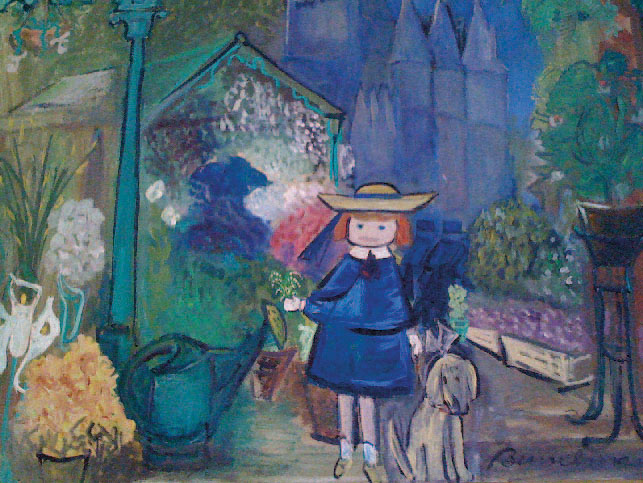
Madeline at the Paris Flower Market, 1955. Oil on canvas. Courtesy of Barbara Bemelmans Marciano.
In a rare moment of poor judgment, Massee rejected Madeline. Although she thought the manuscript was cartoon-like, Bemelmans’ readers were charmed. Bemelmans had found his true audience, which he described as, “clear-eyed, critical and hungry . . . all of whom are impressionists themselves, who love my pictures, and sometimes even eat them. They are children.” Madeline won Caldecott Honors, and the sequel, Madeline’s Rescue, won the Caldecott Medal in 1954.
How useful for Bemelmans that he was both artist and writer. The typewriter may have been his enemy, but as his bibliographer Murray Pomerance wrote, “his manuscripts reproduced like snails.” He turned out hundreds of illustrated magazine articles, anthologies, novels, children’s books, and countless ads for everything from Jello to Tabasco. Bemelmans was also an acute marketer: he advertised his books by pre-publishing a chapter in a magazine, and then after the book launched, sold the artwork at the Kennedy or Ferargil Galleries.
Bemelmans averaged about two books a year, but he also produced an astounding amount of interior design. Like an unruly child with a box of crayons, he embellished walls wherever he went. He painted murals for Hapsburg House, a Viennese restaurant on 55th Street in New York. He decorated Jascha Heifitz’s bar, and designed sets and costumes for a Broadway play. In Hollywood, Bemelmans’ office sported a picture of a lion having its way with Louis B. Mayer (painted out the minute the artist left). Aristotle Onassis asked Bemelmans to create murals for the playroom of his yacht. In Paris, he painted scenes on the walls of his auberge, La Colombe, and the Inn’s sign, a dove, on a piece of zinc from the bar.
In his own home, Bemelmans was equally busy. At one of his Gramercy Park apartments, he glued a map of Paris to the ceiling of the bedroom. An insomniac, he lay in bed with a flashlight, taking nocturnal strolls along the banks of the Seine. The dining room sported a parade of painted donkeys with real straw hats.
Then there is one of the great charm spots of Manhattan, the Bar at the Hotel Carlyle. Gentle mayhem rules in this alternate universe, where animal families dressed in their Sunday best stroll through Central Park. Madeline and the Bad Hat perform circus tricks on the lampshades, and in a snowy corner, an equestrian statue stands. On the base is carved “BEMELMANS ’47.” He painted this marvel in exchange for 18 months’ free rent at the hotel. It is a monument to his lasting and multi-generational appeal.
A Toulouse-Lautrec lady from one of his novels summed up Bemelmans’ style. Sweeping past a debutante, she remarked in a Dorothy Parker-like aside, “Sugarwater, let Champagne show you how it’s done.” Bemelmans at his best—but then he was truly a superlative vintage.
JANE BAYARD CURLEY
Guest Curator, The Eric Carle Museum of Picture Book Art
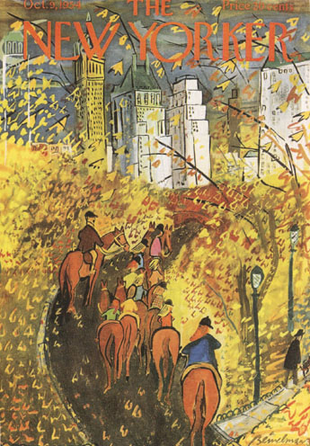
Riding in Central Park. Cover, The New Yorker, October 9, 1954. Oil on canvas. Courtesy of Barbara Bemelmans Marciano.
HALL OF FAME 2012
EDWARD GOREY
[ 1925 - 2000 ]
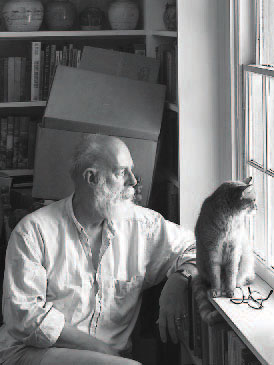
Photo of the artist: ©Steve Marsel Studio. All other images courtesy of the Edward Gorey Charitable Trust.

House Divided. Your Company Magazine, 1994. Ink and watercolor.
Author and artist Edward St. John Gorey was a child prodigy, drawing pictures at the age of two, and reading (self-taught) by the time he was three. Excelling at school, he skipped some early grades and arrived at Chicago’s legendary Francis Parker School in the ninth grade. An exceptional student, he contributed to many school events, exhibited in the annual art shows, and appeared in various school publications. When he was 13, a Chicago newspaper published his cartoons in its sports pages—Gorey’s first commercial work.
Having received the highest regional scores on his college boards, Gorey was offered scholarships to Harvard and other academic institutions. After graduating from Francis Parker when he was 17, with pending draft notices, Gorey postponed university and enrolled in art courses at the Art Institute of Chicago. He then entered the U.S. Army and served during World War II from 1943 until after the end of the war.
In 1946 he enrolled at Harvard, where he occasionally made the Dean’s List. He began pursuing artistic interests: publishing stories, poems, and illustrations in student publications; and designing sets, directing, and writing for the influential Poets Theatre (with John Ashbery, Frank O’Hara, Alison Lurie, Violet Lang, and others). His illustrations appeared for the first time in a published book in 1950. Two years later he was offered a position in the art department of Doubleday Publishers in New York City. He became a serious admirer and frequent attendee of George Balanchine’s New York City Ballet and would later often refer to Balanchine as a major influence on his work.
Gorey rapidly became a significant figure in the Doubleday art department. In 1953 he published his first book, The Unstrung Harp, an illustrated 64-page novella about the creative struggles of a novelist. The book stands today as one of the early precursors to the graphic novel movement in which both text and illustration tell the story. Graham Greene declared The Unstrung Harp “the best novel ever written about a novelist, and I ought to know!” The London Times referred to it as “a minor masterpiece.” Writing in The New Yorker, America’s pre-eminent literary critic Edmund Wilson gave Gorey his first early critical boost. Gorey’s 50 years of exceptional productivity had begun.
Gorey had established an association with New York City’s Gotham Book Mart in the early 1940s while still in the Army. As a voracious reader he began accumulating a unique library of some 25,000 books, many of which he had read more than once. When he came to the city to work he began making frequent visits to the bookshop and became a close friend of its founder, Frances Steloff. In 1961 he launched The Fantod Press, his own private press imprint and sold many of his copies through the Gotham Book Mart.
As early as 1939 Gorey had begun exhibiting his art work at the Francis Parker School, and continued to exhibit during his Harvard years at the Mandrake Bookshop, and as far away as California. In December of 1967, Gotham Book Mart announced the opening of a second-floor art gallery in its brownstone and invited Gorey to be among its first exhibitors. He exhibited there for the next 32 years, until his death. As a result of this association, Gotham Book Mart began to occasionally publish new Gorey works and eventually arranged for Gorey illustrations to appear in works by Samuel Beckett, John Updike, and others.
The theater had always interested Gorey and he was soon involved in off-Broadway productions. Eventually, his own experimental plays were produced on Cape Cod in the summertime, using local amateur actors and even puppets, to the delight and puzzlement of the local community. In 1973 Gorey designed a production of Dracula for a small theater on Nantucket Island. It attracted considerable interest, and in 1977 opened on Broadway as Edward Gorey’s Dracula. A huge commercial success with extraordinary reviews, it garnered two Tony Awards for Best Revival and Best Costumes, ran for almost three years, and had road companies across America, in London, Australia, and elsewhere.
Gorey’s work received serious critical reviews and high praise; his books have been translated into 15 foreign languages (beginning in 1961 with his Swiss German publisher Diogenes Verlag). In 1972 he published his first anthology, Amphigorey, containing 15 of his early works. The New York Times selected it as “One of the Five Noteworthy Art Books of 1972.” Three more anthologies followed (Amphigorey Too, Amphigorey Also, and Amphigorey Again), and have now become Gorey classics and the cornerstones of his large body of work. His strong interest in book design eventually expanded into various forms, including miniatures, pop-up books, books with movable parts, and other unusual formats. Over 150 book designs and hundreds of periodical illustrations are listed in his bibliography and are now much sought after by Gorey enthusiasts.
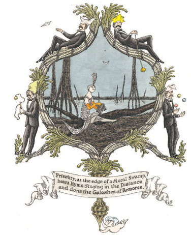
The Galoshes of Remorse. Frontispiece for Amphigorey Again, New York, Harcourt Brace, 2006. Pen, ink, and watercolor.
Twelve Lords a’Leaping... Full-page ad for Christmas subscriptions to The New York Times, c. 1980s.
N is for Neville Who Died of Ennui. From The Gashlycrumb Tinies, New York, Simon and Schuster, 1963. Pen and ink.
He became involved in printmaking in 1975, and for the next 25 years he explored and produced a variety of limited edition prints. In February 1980 he was asked to design animations for Boston Public Television’s Mystery! series. His collaborative work with animator Derek Lamb continues to appear over 30 years after its inception.
For years his family had visited and lived on Cape Cod, and Gorey had spent most of his summers there. In 1979 he purchased a 200-year-old sea captain’s home in Yarmouth Port, and in 1983 resolved to leave New York City and live on the Cape. He became even more active with his small experimental plays and continued to exhibit his work and publish widely. He left his estate to a charitable trust, which he established for the welfare of all living creatures, including not only cats, dogs, whales and birds, but also bats, insects, and even invertebrates. After his death in 2000, his Cape Cod home was converted into the Edward Gorey House museum with profits and programs focused on benefiting animals. Located in the park-like setting of the Yarmouth Port common on an elegant “horseshoe” of several attractive old New England homes, Edward Gorey House, open April through December, has become a very successful cultural attraction and has contributed to the community with interesting exhibitions, programs, and events for children as well as adults.
Humorous and complex, Gorey’s creative body of work includes illustrations for other writers, many of whom are famous and include Nobel Prize and Pulitzer Prize winners. He has received wide praise for his work from such notables as Graham Greene, Vladimir Nabokov, Hermann Hesse, Max Ernst, Oskar Kokoschka, Agatha Christie, Samuel Beckett, John Updike, and many others.
Edward Gorey’s diverse achievements in literature, art, theater, and illustration have made him a permanent part of world culture.
ANDREAS L. BROWN
The Edward Gorey Charitable Trust
HALL OF FAME 2012
JOHN SLOAN
[ 1871- 1951 ]
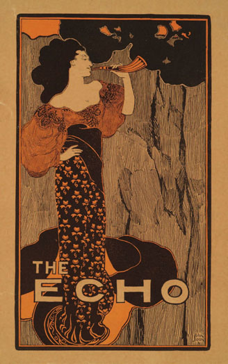
The Echo. Cover design from The Echo, February 15, 1896. Relief linecut, photomechanical, two impressions, black over red ink, mounted on paper board.

Photo of the artist by Louise Dahl-Wolfe (1895–1989), 1933. Gelatin silver print. John Sloan Manuscript Collection, Delaware Art Museum. All artwork Courtesy of Delaware Art Museum, Gifts of Helen Farr Sloan.
Though best known as a painter of incidents on the streets of New York, John Sloan began his career as an illustrator, and the lessons of illustration remained central to his practice. Between 1892 and 1915, illustration was Sloan’s primary means of support, and his illustrations appeared in newspapers, books, and magazines, and on advertising posters. Sloan’s illustration work inflected his paintings and etchings, helping to shape his interests and his technique.
Born in 1871 in Lock Haven, Pennsylvania, Sloan moved to Philadelphia with his family at the age of five. He grew up in a household that prized books, periodicals, and prints, and the earliest evidence of Sloan’s artistic talent comes in the form of drawings added to his 1883 copy of Treasure Island. Using ink, watercolor, and pencil, the young Sloan produced three half-page illustrations, penned tiny images in the table of contents, and even added his name to the title page. Produced when the artist was around age 12, these drawings foreshadowed Sloan’s future vocation.
Sloan’s career as a professional illustrator began while he was still in his teens. As a young man, he was forced to leave the prestigious Central High School to help support his family, and one of his early jobs was at A. E. Newton, where he produced cards, gift books, and other novelties. Many of these items were produced as etchings, a medium he taught himself in the late 1880s. For Newton, Sloan depicted the homes of famous poets, designed pretty calendars, and etched Thoughts from Tennyson. His delicate, precise renderings reveal a flair for decoration, which helped him earn a position on the staff of the Philadelphia Inquirer in 1892.
That year Sloan rented a studio on Chestnut Street with another illustrator, Joe Laub. He also began classes at the Pennsylvania Academy of the Fine Arts and met the painter Robert Henri, who had just returned from study in Paris. Sloan’s diverse interests are apparent in the business card that he produced about that time. On the card, etched with architectural and foliate motifs, Sloan promoted his skills in designing, etching, illustrating, advertising sketches, and lettering. Sloan continued at the Inquirer until he received a better offer from the competing Philadelphia Press. At these newspapers, Sloan produced a wide range of illustrations, including on-the-spot news pictures, though it quickly became apparent that this was not his strength, unlike his friends William Glackens, George Luks, and Everett Shinn who excelled at rapid sketches.
Sloan specialized in decorative work, like headings, puzzles, and illustrations for fiction and the society pages. He studied French and English illustrators, including Daumier, Gavarni, Leech, and Du Maurier. He developed an elegant personal style, using flat patterns and sinuous lines that drew on French art nouveau and Japanese woodblock prints. Sloan was part of the emerging aesthetic of the poster style. His stylized illustrations began to appear in advertisements and little magazines, like Moods and The Echo, and on book covers, as well as in the Philadelphia papers. With Shinn, Sloan attempted to launch a magazine named and patterned after the French Gil Blas, with illustrations by his expanding circle of friends. These little magazines were very short-lived, but at the end of the decade Sloan’s elegant illustrations began to appear in books and mainstream magazines. By that time, his presence was strong at the Press where he produced puzzles for the Sunday supplement. In 1900, his puzzles became full-page color features that invited readers to send their solutions to the newspaper for a ten-dollar prize.
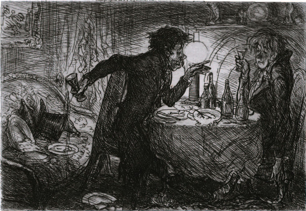
Around that time, under the influence of Henri, Sloan was beginning to paint more seriously, producing portraits and scenes of life in his Philadelphia neighborhood. His work for the Press was supplemented with a major commission to etch illustrations for a luxurious edition of the works of the French author, Charles Paul de Kock, published by Frederick J. Quinby Co. of Boston. In all, Sloan produced 53 etchings for the series. His images include humorous character studies and groups of figures interacting in the streets, gardens, and drawing rooms of mid-nineteenth-century Paris. The De Kock commission honed Sloan’s abilities as an etcher and earned him praise as an illustrator.
His reputation as an illustrator and his mastery of etching served him well when he moved to New York in 1904. His New York City Life set—a series of etchings featuring humorous glimpses of the streets and apartments of Sloan’s neighborhood—benefitted from the lessons learned producing the De Kock project. The City Life etchings, which were not illustrations, vividly conveyed the character of the city’s neighborhoods and residents through composition, pose, and expression.
Rossignol’s Drunken Advice to Pierre. From Andre the Savoyard by Charles Paul de Kock, vol. 2, St. Gervais ed. Boston: Frederick J. Quinby Co., 1904. Etching on paper.
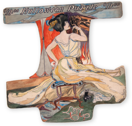
Halloween Puzzle. For The Philadelphia Press, October 27, 1901. Watercolor, pen and ink, graphite on paper board.
In moving to New York, Sloan followed several Philadelphia friends. Around the turn of the century, Henri, Shinn, Glackens, and George Luks had all relocated to New York, which had become the national center of art and publishing. As newspapers moved toward the use of more photographs, Sloan and his illustrator friends were forced to shift their focus toward magazines and books. Newspaper puzzles and cartoons remained sources of income for Sloan and Luks, but Sloan also sought commissions from Century, Collier’s, and McClure’s. His adoptive city provided the setting for some of Sloan’s most accomplished magazine illustrations, like his pictures for “The Steady” from 1905. In addition, he and his friends became increasingly interested in painting the people and places they encountered in New York.
Finding their city paintings frequently rejected from juried exhibitions, the group of friends, headed by Henri, began to organize alternative exhibitions. In 1908, Sloan, Henri, Shinn, Glackens, and Luks received an enormous amount of press attention when they exhibited together—with three other friends, Arthur B. Davies, Ernest Lawson, and Maurice Prendergast—at Macbeth Galleries. Portrayed as a protest against the conservatism of the National Academy of Design, the show was a huge success attracting publicity, visitors, and sales. The group became known as the Eight and the exhibition toured around the country. None of Sloan’s work sold, however, and he supported himself that year, in part, by illustrating Ralph Bergengren’s humorous pirate tales in Collier’s in a clever woodcut style. His style was popular with the author, and the stories were popular with the public. Sloan continued to illustrate Bergengren’s pirate tales for five more years, even as he became increasingly engaged with Socialist politics.
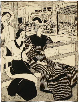
On the Pier. For the Philadelphia Inquirer, June 22, 1894. Ink on paper;

The Triangle Shirtwaist Factory Fire. For the New York Call, March 27, 1911. Ink, gouache, and crayon on illustration board.
Between 1911 and 1914, Sloan would produce some of his most powerful and important illustrations for the Socialist press. In 1911 he memorialized the horrific death of garment workers in his neighborhood with The Triangle Shirtwaist Factory Fire, which appeared in the New York Call. In 1912 Sloan joined the board of The Masses and helped to transform it into a groundbreaking publication. Like other Socialists in Greenwich Village, Sloan was at least as interested in artistic freedom as he was in party doctrine, and the magazine reflected this orientation. Illustrations often appeared without text and even covers did not need to be overtly political. The covers Sloan designed for The Masses included a scathing indictment of John D. Rockefeller and a girl swinging in Washington Square, and his presence at The Masses helped attract submissions from less politically engaged artist-friends like Glackens, George Bellows, and Stuart Davis.
Work for The Masses did not pay, and Sloan was fortunate that his friend Norman Hapgood had become editor of Harper’s Weekly. Hapgood purchased covers and significant illustrations, often of New York City subjects, from Sloan between 1913 and 1915. In Harper’s and The Masses, and in his paintings and etchings, Sloan depicted life on the streets and in the parks of lower Manhattan, where he lived. As an artist and illustrator in the teens, Sloan became known for his depictions of Chelsea and Greenwich Village.
After 1915, Sloan’s output as an illustrator declined sharply. He left The Masses and began teaching at the Art Students League. Kraushaar Galleries began to represent him in 1916, providing occasional sales, and Sloan supported himself as an instructor, with only occasional forays into illustration. Sloan did take on a few important book projects after 1916, including Mitch Miller by Edgar Lee Masters in 1920, The Beginning of a Mortal by Max Miller in 1933, and W. Somerset Maugham’s Of Human Bondage in 1938, but he would increasingly identify himself as a teacher and a painter.
HEATHER CAMPBELL COYLE
Curator of American Art
Delaware Art Museum