Now that you have an idea of what to expect in the Integrated Reasoning section, let’s examine each of the four question types.
Graphics Interpretation questions test your ability to interpret and analyze data presented visually in graphs or graphical images. For each question, you will see a graph with accompanying text and two questions.
As with a Reading Comprehension passage, you do not need to absorb every bit of information on the graph to answer the questions. What you do need to do is get the gist of the graph and what it contains so that you can efficiently find the information you need. You will then read the question stem, view the answer choices, and use the information in the graph to select the correct answer.
Graphics Interpretation questions feature many different types of graphs, including line graphs, scatter plots, Venn diagrams, and even geological timelines. Both examples in this chapter happen to focus on scatter plots, but don’t take this as a sign that scatter plots are more important than any other type of graphic you may see on Test Day. We've chosen these as our examples because you’re probably less familiar with scatter plots than with the other types of graphs commonly seen on the Integrated Reasoning section.
All graphics are accompanied by two incomplete sentences. Test takers must use a drop-down menu to select a word or phrase that completes the sentence according to the information presented in the graphic. Some of the sample graphs in this book are accompanied by more than two sentences in order to give you a better sense of the variety of questions you may be asked. The drop-down menus in this chapter are represented in multiple-choice format for ease of reading.
Let’s take a look at some Graphics Interpretation questions.
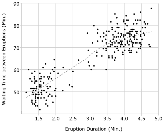
The graph above is a scatter plot with each point representing the duration of an eruption of Old Faithful, a geyser in Yellowstone National Park, and the time in minutes until the following eruption occurred. The dotted line represents a regression line. For each blank, select the answer choice that correctly completes the statement according to the information in the graph.
Your first step with a question of this type should be to read the text that accompanies the graph. You may see only a single sentence, or you may see (as in this case) a full paragraph. This text is important. Although most Graphics Interpretation questions can be answered without reference to the text, reading will give you an overview of the information the graph contains and how it is presented. On Test Day, taking a moment to paraphrase the written information will improve your understanding of the image, speeding up your analysis and reducing your chances of committing a careless error.
Here, the paragraph tells you that the graph shows the behavior of a single geyser, Old Faithful. The graph presents two types of information: how long the eruptions of Old Faithful last and how long it then takes before the next eruption happens. Each point on the graph represents an eruption.
Next, look at the graph itself. Get a bird’s-eye view of the graph by reading the title and the labels of the axes and notice how the information from the paragraph is represented in the graph. Here, you’ll notice that the duration, or length, of the eruption is measured against the waiting time that follows it before the next eruption. Now look at the units of measurement that correspond to each axis and determine whether the scales are similar. In this case, both axes are measured in minutes, but the scales are very different: the x-axis is measured in 0.5-minute increments, while the y-axis is measured in 10-minute increments. Furthermore, the x-axis starts at 1.0 and ends at 5.0, while the y-axis starts at 40 and goes to 90. Then notice if there are any specific features mentioned in the accompanying paragraph that you see represented on the graph, such as a regression line.
The final step before answering the questions is to look at the data to see if they fall into a general pattern. On this scatter plot, most of the data points separate into two distinct groups. With a pattern this clear, you can anticipate that this observation will be key to answering one or more of the accompanying questions. Making these observations before analyzing the questions will help you answer each question more effectively.
Question 1a: First, read and paraphrase the question. It asks about the relationship between the duration of eruptions and the waiting time between eruptions, which means that you are looking for a pattern in how the data points are arrayed on the graph. Before attempting to predict an answer, scan the answer choices. Here, you see the words linear, nonlinear, positive, and negative, which indicate that the pattern may take the shape and slope of a line. The regression line will help you here. There is more than one type of regression line, and in this case, the exact type of regression line has not been specified. But you should know that a regression line, however it is calculated, represents the overall trend of the points as a group. The regression line slopes upward—meaning the waiting time gets longer as the explosion duration gets longer. This is a positive relationship—both variables tend to increase and decrease together—so you can narrow the answer down to choices (A) and (B). Next you need to determine whether the relationship is linear or nonlinear by looking at the shape of the regression line. You’ll notice that the regression “line” isn’t really a line, because its slope changes as the amounts of time get longer. Since the relationship isn’t linear through the entire data set, the answer is (B).
Question 1b: This question might seem a little tricky at first, since the way it’s worded might make you think you need to know something qualitative about the types of eruptions the geyser experiences—perhaps something about their magnitude or geological characteristics. But the GMAT will never require you to have outside knowledge beyond high school math and general knowledge of grammar and logic. All the information you need to answer this question is contained in the graph. Begin by paraphrasing the question for yourself: Does Old Faithful have one, two, or more than two distinct types of eruption? As you noticed before, the data points separate themselves into two main clusters. There are a few stray data points scattered outside these clusters, but their number is not significant. Therefore, you can infer from the graph that Old Faithful has two types of eruptions, (B).
Question 1c: For this question, you need to examine the data in the graph more closely. This statement contains a comparison between two data points: the maximum wait time for an eruption that lasts less than two minutes and the minimum wait time for an eruption that lasts more than four minutes. Note that you’re asked to compare the wait times of these two points—that’s their height along the y-axis. So this question asks you to find these two points and compare their heights. The first point is the highest point to the left of the two-minute line on the x-axis, which looks to be just below 65 on the y-axis. Now find the second point, the lowest point to the right of the four-minute line on the x-axis. The lowest point to the right of that line appears to be just below the 70-minute mark on the y-axis. The first point is therefore lower than the second, so you would choose “less than,” (C).
We’ve discussed how, before attacking any Graphics Interpretation question, you need to understand what the graph contains and how it is constructed. You can then target your research to answer each question correctly and efficiently. Try using these techniques on the next set of questions.
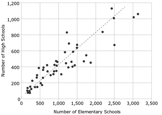
The graph above is a scatter plot with 49 points. The 49 points represent the number of elementary and high schools in 48 U.S. states and the District of Columbia (the numbers of schools in California and Texas are too large to appear on a graph of this scale). The dotted line represents a regression line. For each blank, select the answer choice that correctly completes the statement according to the information in the graph.
First, familiarize yourself with the text that describes the graph. It tells you that each data point represents a state (or the District of Columbia) and that each state is plotted on the graph according to the number of elementary and high schools it contains.
Now take a look at the graph to get the big picture. You see that elementary schools are plotted along the x-axis and high schools along the y-axis. In this case, both axes begin at zero, but again the scales of the two axes are different. The axis for elementary schools increases in increments of 500, while the axis for high schools moves up more slowly, in increments of 200. Looking at the points with these increments in mind, you can see that the states generally have more elementary schools than high schools. Again, you see a pattern in the graph; the data points and the regression line trend upward. That pattern makes sense—states that have more kids or higher populations are generally going to need more schools of both types.
Question 2a: First read the question; then glance at the answer choices. Again, as a Kaplan-trained test taker, you’ll see how important it is to look at the answer choices before predicting an answer; this important step will save you time on Test Day. You’ll notice that your only choices are a slope greater than, equal to, or less than 1. Think about what it means for a line to have a slope of 1. It rises at the same rate that it moves to the right. A line with a slope of 1 usually makes a 45-degree angle with the x- and y-axes. The line on this graph looks to be about 45 degrees, so does it have a slope of 1? If you said no, you just avoided an important trap in this question. A line with a slope of 1 makes a 45-degree angle with the x- and y-axes only when the scales of both axes are the same. But here, the scales are not the same; the numbers on the y-axis move upward much more slowly than the numbers on the x-axis. Remember the formula for the slope of a line:
Slope =
 , or to put it another way, Slope =

On this graph, the change in y is a lot less than the corresponding change in x. So the slope will be less than 1. You can test this out quickly using some approximate
points from the graph. The regression line is close to the points (500, 200) and (1,000,
400). As the line moves up by 200, it moves to the right by 500. Plugging these points
into the slope formula above, you get
 , which reduces to
 , a positive fraction less than 1. (C) is correct.
Question 2b: This question asks about elementary schools only, so focus on the x-axis and count the number of points that fall to the left of the 500 mark on that
axis. This number appears to be about 13 points. (The exact number does not matter,
as the question is asking for an approximate percentage.) Since you want to know what
percentage these states represent out of all the states on the graph, you can set
up a fraction: 13 over the total number of data points, which the paragraph accompanying
the graph tells you is 49. Using estimation,
 , which when converted to a percentage is equal to 26 percent. The closest answer
is (B).
, which when converted to a percentage is equal to 26 percent. The closest answer
is (B).
Question 2c: This question looks similar to the previous question, except it is asking about high schools, which are measured on the y-axis. This time, you need to estimate the percentage of schools that are below 500 on the y-axis. Rather than counting up all the points below 500, which would be a time-consuming task, count the points above 500, find the percentage that those points represent, and subtract that percentage from 100. In this case, you have about 13 points above 500, representing approximately 25% of the total (you might recall this same calculation from the previous question). Subtracting this percentage from 100% leaves you with 75%, or (D).
Question 2d: Read the question and notice that you are looking for a particular point: the state with the greatest total number of schools. There are two points in the upper right portion of the graph that look like they could be the answer: the point highest on the y-axis and the point farthest to the right on the x-axis. Also, recall that the axes are scaled differently and the increments on the x-axis increase much more quickly than those on the y-axis. The point farthest to the right, then, will have the greatest number of schools. The state represented by this point has the greatest total number of elementary schools, but it does not have the greatest number of high schools. The answer is (A).
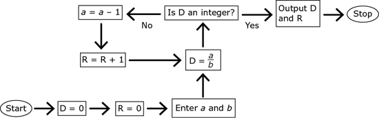
The flowchart represents a computer algorithm that takes two positive integers as the input and is intended to return two integers as the output. Each process is symbolized by an equation, such as a = a – 1. In this particular process, 1 is subtracted from the current value of the variable a, and the difference then becomes the value of a. For example, if the value of a is 5 before the process a = a – 1 is completed, then the value of a will be 4 after the process is completed. Algorithms that are incorrectly formed may sometimes get stuck in an infinite loop. An infinite loop is a sequence of instructions that never terminates. Complete the following statements by making selections from the drop-down menus in accordance with the algorithm represented by the flowchart.
Paraphrase what the algorithm does. First, D is set to
 . Then, if D is an integer, the algorithm outputs D and R and stops. If D is not an
integer, then a is decreased by 1 and R is increased by 1, and the process repeats. Thus, the loop
will keep repeating until
. Then, if D is an integer, the algorithm outputs D and R and stops. If D is not an
integer, then a is decreased by 1 and R is increased by 1, and the process repeats. Thus, the loop
will keep repeating until
 is an integer, at which point it will output the value of D (which is
 ) and R (which is the number of times the algorithm divided a by b and didn’t get an integer).
If you try a few examples, you might notice that this algorithm isn’t just a random
sequence of steps: the outputs are the integer part (D) and the remainder (R) when
a is divided by b. R also acts as a “counter” of the number of times the algorithm loops before stopping.
For example, given a = 13 and b = 5, the outputs are D = 2 and R = 3, because
 equals 2 with a remainder of 3, and the algorithm will loop 3 times before it stops.
Question 3a: The first time through the loop, D will be set to
 , a will be set to 58 – 1 = 57, and R will be set to 0 + 1 = 1. The second time through
the loop, D will be set to
, a will be set to 58 – 1 = 57, and R will be set to 0 + 1 = 1. The second time through
the loop, D will be set to
 , a will be set to 57 – 1 = 56, and R will be set to 1 + 1 = 2. The third time through
the loop, D will be set to
, a will be set to 57 – 1 = 56, and R will be set to 1 + 1 = 2. The third time through
the loop, D will be set to
 , a will be set to 56 – 1 = 55, and R will be set to 2 + 1 = 3. On the fourth time through
the loop, D will be set to
, a will be set to 56 – 1 = 55, and R will be set to 2 + 1 = 3. On the fourth time through
the loop, D will be set to
 = 5, which is an integer, so the algorithm will stop and the values of a and R will not be changed. Thus, the outputs are D = 5 and R = 3. D = 5 is not present
among the selections, but R = 3 is. The correct answer is (D).
= 5, which is an integer, so the algorithm will stop and the values of a and R will not be changed. Thus, the outputs are D = 5 and R = 3. D = 5 is not present
among the selections, but R = 3 is. The correct answer is (D).
Question 3b: If a > b, then you’ve already seen that the algorithm will stop. If a = b, then the algorithm will also stop, because a number divided by itself always equals
1 with a remainder of 0. If a < b, it may seem that the algorithm will get stuck because D will keep getting set to
a fraction. For example, if a = 9 and b = 10, D will get set to
 , then
 , then
 , and so on. However, a will eventually be reduced to 0, at which point
 will equal 0 (which is an integer) and the algorithm will stop. Thus, no matter the
values of a and b, the algorithm’s termination condition is always triggered. This means that it will never not stop, which is (D).
will equal 0 (which is an integer) and the algorithm will stop. Thus, no matter the
values of a and b, the algorithm’s termination condition is always triggered. This means that it will never not stop, which is (D).
As its name suggests, Multi-Source Reasoning tests your ability to take information from multiple sources and synthesize it to answer questions. The information will be presented on two to three tabbed pages. You will have to click through the tabs to find the information you need. The data can be in the form of text, charts, or tables and may be presented in a combination of all three.
The information on the tabs may seem overwhelming, so you’ll need to approach it similarly to how you approach Reading Comprehension. Get the gist of what the tabs contain and take brief notes highlighting the main points of each tab. Don’t try to absorb all of the information at first, but make sure you scan all of the information on each tab so that you’ll know where to find it when you answer the questions.
The tabbed pages are on the left side of the screen, and the questions are on the right. There may be more than one page of questions associated with a prompt, in which case you must click on the Next button to advance to the next page of questions. You can get hands-on experience with tabbed pages in your online resources. Take a few minutes to become familiar with the navigation of this section. Doing so will save you valuable time when answering the questions.
Some of the questions about the tabbed information will be in the standard multiple-choice format that you’re familiar with from the Verbal and Quantitative sections. Others, called multiple dichotomous choice questions, will require you to evaluate multiple statements individually; you may be required to figure out whether statements are true or whether certain expenditures are within a given budget. Each of these yes/no or true/false questions will require you to evaluate three separate statements.

78.4 million dogs and 86.4 million cats are owned as pets in the U.S. Though some pets come from breeders, many others are adopted from shelters and pounds. Even though 78 percent of pet dogs and 88 percent of pet cats are spayed or neutered, there has never been a shortage of animals available for adoption. The result of these staggering numbers of animals is a booming industry of pet supplies, services, and medical care.
Tables 1 and 2, respectively, indicate the average one-time adoption costs and average annual expenses associated with pet ownership. However, dogs vary significantly in size; small dogs such as chihuahuas cost on average 25 percent less than the values shown in the adoption and ownership cost tables, while larger canines such as mastiffs often cost 50 percent more.

|
|
Dog |
Cat |
|
Spay/neuter |
$100 |
$75 |
|
Collar/leash |
$30 |
$10 |
|
Litter box |
— |
$20 |
|
Carrier |
$40 |
$30 |
|
Sleeper crate |
$80 |
— |

|
|
Dog |
Cat |
|
Food |
$250 |
$215 |
|
Veterinary |
$240 |
$210 |
|
Litter |
— |
$150 |
|
Toys/treats |
$60 |
$40 |
|
License |
$25 |
— |
|
House cleaning |
$50 |
$50 |
|
Yes |
No |
|

|
|
Americans spend over $10 billion annually on toys and treats for their cats and dogs. |
|
|
|
The average cost of adopting an average small dog and keeping it for a year is less than the cost of doing so for an average cat. |
|
|
|
The number of categories of expenses unique to cats is the same as the number of categories unique to dogs. |
We approached Graphics Interpretation by first getting a general sense of how the graph works. Similarly, you need to know what is on each tabbed page before you begin answering Multi-Source Reasoning questions. Take brief notes on the content of each tab as you examine it. In the first tab, the text gives you data about the number of American pets and the frequency of spaying and neutering. It then goes on to describe the tables in the next two tabs. More specifically, the first table will show the one-time costs of adopting an animal in the United States, and the second table will focus on yearly expenses. Finally, it gives us an important warning: the data in the tabs are averages, and some dogs will require very different expenses according to their size.
Next, move to the second tab. Here, you are given a table with rows indicating several adoption expenses, separated into a column for dogs and a column for cats. Notice that not all expenses apply to both types of animal. The total cost of adoption isn’t calculated for you, but you could find it with simple addition if necessary.
Switch to the third tab to view another table. This one also shows expenses for dogs and cats. Rather than listing one-time expenses, this lists the repeating yearly costs of those pets. Other than that, it’s similar in structure to Table 1.
Question 4a: You can expect two things on a yes/no question like this. First, the answer will require you to look at two or three tabs. Second, the question will reward estimation.
Table 2 in the third tab gives the annual cost of toys and treats, but that cost is per animal. Calculating the total expenditure for all pets requires knowing the total number of pets. To look for that data you should check your notes, which will send you to the first tab. According to the combined data from Tabs 1 and 3, there are approximately 80 million (rounded from 78.4 million) dogs in America, and their treats and toys cost an average of $60 per dog, meaning the total toy and treat expense for dogs would be about $4.8 billion. The same tabs tell you that there are approximately 90 million (rounded from 86.4 million) cats and their owners spend an average of $40 for toys and treats per cat, meaning owners spend about $3.6 billion annually on toys and treats for cats. The combined total for money spent on cat and dog treats and toys is therefore only a little over $8 billion. Even though this is a high estimate (since both of the values above were estimated by rounding up), it’s still less than $10 billion, so the answer is “No.”
Question 4b: This problem requires you to total the adoption and annual ownership costs. You will need information from the tables in the second and third tabs. You’ll also need to do some addition, if you haven’t already, to total up the costs in each column.
If you add all of the expenses for cats, the total comes out to $800 for adopting and owning a cat for a year. For a dog the same costs $875, although if you were rounding to speed up the addition, you might have ended up with $850 or $900. Regardless, at first glance it seems clear-cut that the dog will cost more than the cat.
But something should have caught your eye: this question specifies a “small” dog. When you paraphrased the tabs, you noticed that size is mentioned briefly in Tab 1. Researching that tab will reveal that small dogs average 25% less money to adopt and keep. Because 25% (or one-fourth) of $875 is well over $200 ($875 × 0.25 = $218.75, but it’s probably not worth calculating exactly), the cost reduction of having a small dog easily offsets the initial $75 difference you calculated between the cost of a dog and that of a cat. A small dog is therefore cheaper than a cat, so the answer is “Yes.”
Question 4c: This question requires only simple counting, but you need to know what you’re looking for. “Categories of expenses unique to cats” means expenses that are paid only for cats, not for dogs. Since this doesn’t specify which expenses, look in both tabs that list expenses, Tables 1 and 2.
Litter box and litter are the two categories unique to cats. Sleeper crate and license are the two categories unique to dogs. Both animals have two unique categories, the same number, so the answer to this question is “Yes.”
Question 5: This question asks you for the cost of spaying or neutering all unspayed and non-neutered dogs and cats in America. A glance at the answer choices can provide an important hint, as many of the answer choices are quite far apart. With numbers this big and this spread out in the answer choices, it’s usually best to estimate.
Spaying and neutering statistics, as well as numbers of pets, are in the first tab. Researching this background information reveals that 22% of 78.4 million dogs and 12% of 86.4 million cats are unspayed or non-neutered. To estimate, instead say 20% of 80 million = 16 million dogs and 10% of 90 million = 9 million cats are unspayed or non-neutered.
Spaying and neutering are one-time expenditures, so the second tab contains the price. At $100 each, it will cost about $1.6 billion to spay or neuter 16 million dogs. At $75 per cat, it will cost $675 million, or about $0.68 billion, to spay or neuter 9 million cats.
The combined cost of spaying or neutering all unspayed and non-neutered dogs and cats is therefore about $2.3 billion. Although the estimate above rounds both percentages significantly down, it rounds the number of animals of both types up to compensate, so the resulting estimate is likely close to the real solution; regardless, the next closest answer choice ($4 billion) can’t be correct unless the above estimation is off by more than 50%. Verify that you calculated the number of decimal places correctly and didn’t confuse millions with billions. Once you’ve double-checked the accuracy of your estimations and calculations, you can see that $2.5 billion is closest and confidently choose (A) as the correct answer.
You’ve learned from working through this set of Multi-Source Reasoning questions that it’s crucial to get the gist of each tabbed page and take brief notes highlighting the main points before attempting to answer any questions. Now apply these techniques to the next set of Multi-Source Reasoning questions.

Email from project manager to financial officer
August 3, 9:43 a.m.
Did all three bids arrive on time last night? We need to minimize delays on construction, so if the contractors have submitted their estimates and our research team has compiled reports on the contractors’ histories, we should make a decision on which firm to hire by the end of the day.

Email from financial officer in response to the project manager’s August 3, 9:43 a.m. email
August 3, 10:12 a.m.
Appaloosa Construction sent us a bid of $1.35 million. Its bid is the highest of the three, but its track record is spotless; none of the past 10 major projects it has worked on has gone over budget by more than 4 percent. Breton Construction did manage to underbid them—its representative claims that it can do the project for $1.25 million. However, in the past two years, Breton oversaw two different projects that went over budget by a full 25 percent. If our project were to exceed Breton’s estimate by a comparable percentage, we would run out of funds before completion. Finally, Campolina Construction presented a $1.1 million plan, and its track record is as good as Appaloosa’s. Unfortunately, although Appaloosa and Breton can both start tomorrow, Campolina would be unable to begin work until August 25, so we cannot accept Campolina’s low bid.

Email from project manager in response to the financial officer’s August 3, 10:12 a.m. email
August 3, 10:38 a.m.
Even though Breton’s work could potentially cost less than either of the other two, that savings does not justify the risk of being unable to complete the project. But as far as Campolina is concerned, you’re not considering the actual cost of a delay. It’s true that we are losing money at a constant rate each day we don’t start building. But even after factoring in the losses of waiting until August 25, the estimated cost of working with Campolina still ends up $50,000 below Appaloosa’s bid.
|
Yes |
No |
|
|
|
|
In making their decision, the project manager and the financial officer considered how much time the contractors would spend on construction. |
|
|
|
The project manager and the financial officer disagree about the best choice of contractors for completing the project. |
|
|
|
The project manager is willing to wait a few days before deciding on Campolina’s bid. |
First, look through the tabbed pages and notice the basics: you have three emails, sent minutes apart, between a project manager and a financial officer. Use your Reading Comprehension Passage Mapping skills to create a brief synopsis of each email in your scratchwork:
Email 1—project manager to financial officer:
Email 2—financial officer to project manager:
Think strategically here: although the financial officer never draws an explicit conclusion about which company should be hired, his opinion is clear. Breton could cause the company to run out of money for the project, and Campolina’s delayed start date is unacceptable, so the financial officer must be in favor of Appaloosa.
Email 3—project manager to financial officer:
It is not necessary to jot down all of the figures and calculations from the email. Just as with Reading Comprehension, if you need the details, they will be there for you to refer to later.
Question 6: Notice that you have another set of yes/no questions. As always, you’ll want to read the introductory sentences very carefully. Your task is to consider whether the inferences in the questions are supported by the information in the three emails. Critical Reasoning skills will help you here; you must use only the evidence in the three emails to determine your answers.
Question 6a: Read carefully here. Time is discussed, but it is discussed in reference to when the construction can begin, not how long it will take. There isn’t any mention of the length of construction in your notes, and if you glance through the three emails, there isn’t any information there either. The answer is “No.”
Question 6b: This question asks whether the project manager and financial officer disagree about who would be the best contractor. The answer to this question, as seen in your notes on the emails, is “Yes.” The project manager thinks Campolina is the best choice, and the financial officer is in favor of Appaloosa.
Question 6c: The wording of this statement is tricky, so answer it by doing some careful research in the emails. Here, the question asks whether the project manager is willing to wait a few days to decide. Glance at your notes to find relevant keywords: “decide” is mentioned in the first email, and “delay,” or waiting, is mentioned in the third. Going to the first email, you see that the project manager wants to reach a decision by the end of the day. This seems to contradict the inference given in the question, but don’t stop just yet. Check the third email to see whether the project manager changed her mind. In the third email, the project manager discusses waiting, stating that it might be acceptable to wait to begin construction with Campolina—but there is nothing in this email about waiting to make a decision. Thus, you cannot infer that the project manager is willing to wait a few days, and the answer here is “No.”
Question 7: By now, you can expect that you’ll need to find information in multiple emails to answer this question. Looking at your notes, you see that the delay costs are discussed in the third email. The email states that a constant amount is lost every day that construction is delayed. From the second email, you find that the other two companies can start the next day, August 4, but Campolina can’t start until August 25, a delay of 21 days. Next, use the information given to determine how much money is lost in those 21 days.
The third email says that even with the delay, Campolina would cost $50,000 less than
Appaloosa’s $1.35 million bid, or $1.3 million. That means the cost caused by the
delay would be $1.3 million – $1.1 million, or $200,000. To determine the cost per
day, calculate
 . However, since the question asks for the number that’s “closest to” the amount lost
per day, you can save time by estimating. Round 21 to 20 and calculate much more easily
that $200,000 divided by 20 is $10,000, or (B).
. However, since the question asks for the number that’s “closest to” the amount lost
per day, you can save time by estimating. Round 21 to 20 and calculate much more easily
that $200,000 divided by 20 is $10,000, or (B).

Email from CEO to store manager
April 10, 2:53 a.m.
I just got a call from the police. Our store on Thompson street was robbed again. This is the third time in exactly seven months. After the first robbery, you said you would heighten security, but the measures you took had no effect; 60 days later the same store was robbed. Then you said you’d install an alarm system, but I guess you never got around to that. After the second robbery, the insurance company threatened to cancel our account if the store was robbed again and we hadn’t done anything to increase the security of the premises. What am I supposed to tell them?

Email from store manager in response to the CEO’s April 10, 2:53 a.m. text
April 10, 3:38 a.m.
I had an alarm system installed within a week after the second robbery. It took the police exactly four minutes to get to the store after the alarm was triggered; the robber was in and out in three. The alarm company called me after calling the police, and I still beat the police to the scene. I’ve told the alarm company to call me first next time—I missed the robber by no more than 30 seconds.
You can tell the insurance company that the measures I undertook after the first robbery did have a major impact. We started moving inventory from the shelves to the back room before closing the store each day. This cut our losses in the second robbery by nearly 70 percent as compared to the first robbery. I’ve attached the exact numbers for your perusal. After the second robbery, we began leaving even less inventory on the shelves. It’s too soon to tell exactly how much money we lost in this morning’s robbery, but my survey indicates that the losses are about another 40 percent smaller than those of the second robbery.

Attachment to the store manager’s April 10, 3:38 a.m. email
Value of Stolen Inventory
|
Robbery |
Cameras |
Tripods |
Lenses |
Accessories |
|
First |
$45,652 |
$9,834 |
$2,119 |
$589 |
|
Second |
$11,000 |
$4,832 |
$1,003 |
$672 |
|
True |
False |
|
|
|
|
An alarm system was installed at the store in November. |
|
|
|
Upon being reached by phone, the store manager can make it to the store in under five minutes. |
|
|
|
The attachment contradicts the store manager. |
|
Yes |
No |
|
|
|
|
The robbery could have been prevented if the store manager had installed shatterproof windows. |
|
|
|
The alarm company’s phone call to the police lasted less than 45 seconds. |
|
|
|
The value of the lenses stolen in the third robbery is less than that of the second robbery. |
Email 1—CEO to store manager
Email 2—Store manager to CEO
Attachment to email 2—Value of stolen goods in 1st vs. 2nd robbery
Question 8: The store manager’s email states that there was an estimated 40% reduction in losses from the second robbery to the third. The total losses of the second robbery were about $18,000, so the losses of the third robbery were about $18,000 × 60%, or about $11,000. Then 15% of that is about $1,650, which is closest to (C).
Question 9a: The CEO’s text message states that the first robbery was exactly seven months ago and that the second robbery happened 60 days later. The current day is April 10, so the first robbery happened around September 10 and the second on November 10. The store manager’s email states that the alarm was installed within a week of the second robbery, so there was indeed an alarm installed in November. The answer is “True.”
Question 9b: According to the second email, the store manager missed the robber by 30 seconds. Since the robber was in and out in 3 minutes, the maximum time it could have taken for the store manager to reach the store was 3 minutes and 30 seconds. The answer is “True.”
Question 9c: The total losses of the first robbery were $58,194. The total losses of the second
robbery were $17,507. This is a percent change of
 , or 69.9%, which confirms the store manager’s claim that the reduction in losses
was “nearly 70 percent.” The answer is “False.”
, or 69.9%, which confirms the store manager’s claim that the reduction in losses
was “nearly 70 percent.” The answer is “False.”
Question 10a: There’s no information in the tabs about how the robber broke into the store. Thus, there’s no way to tell whether shatterproof windows would have made any difference. The answer is “No.”
Question 10b: The store manager’s email states that he or she missed the robber by 30 seconds. This means that the alarm company’s phone call to the police (whom they called first) lasted at least 30 seconds, but there’s no way to tell whether that call was longer or shorter than 45 seconds. The answer is “No.”
Question 10c: According to the store manager, the total losses of the third robbery are 40% less than those of the second robbery. However, the store manager doesn’t say that the losses are proportional in all categories. It’s possible that decreases in losses for other goods compensated for an increase in losses for lenses. The answer is “No.”
Table Analysis questions measure your ability to interpret and analyze information presented in a sortable table similar to a spreadsheet. You will see a table, a paragraph of text that describes it, and one set of the same three-part multiple dichotomous choice questions you saw for Multi-Source Reasoning (i.e., yes/no, true/false, etc.).
Directly above the table, you will see a Sort button that, when clicked, opens a drop-down menu of options that correspond to the column headers in the table. When you select a category from the drop-down menu, the entire chart will be sorted based on the category you select. If the information in that column is numerical, it will be sorted from lowest to highest. If the information in that column is text, it will be sorted in alphabetical order. While working through the questions in this book, decide how you would sort the information before answering each question. To gain experience sorting tables in the test interface, use the questions in your online resources.
Read the text that accompanies the table first to get an overview of the table’s content. Then look at the table itself, paying special attention to the column headings. Now let’s look at some Table Analysis questions.

| Undergraduate | Postbaccalaureate | ||||||||
| Total | 4-year | 2-year | Total | Not-for-profit | For-profit | ||||
| Not-for-profit | For-profit | Not-for-profit | For-profit | ||||||
| Alabama | 58,558 | 23,229 | 34,000 | 0 | 1,329 | 7,343 | 4,128 | 3,215 | |
| Arizona | 291,869 | 3,539 | 275,530 | 0 | 12,800 | 81,066 | 4,507 | 76,559 | |
| California | 264,775 | 136,304 | 76,356 | 2,375 | 49,740 | 147,979 | 129,522 | 18,457 | |
| Colorado | 69,460 | 18,375 | 40,733 | 165 | 10,187 | 20,507 | 13,586 | 6,921 | |
| District of Columbia | 71,465 | 37,967 | 33,498 | 0 | 0 | 49,061 | 36,575 | 12,486 | |
| Florida | 206,477 | 106,089 | 79,732 | 152 | 20,504 | 56,629 | 48,067 | 8,562 | |
| Georgia | 76,356 | 47,701 | 23,670 | 1,057 | 3,928 | 23,757 | 17,940 | 5,817 | |
| Illinois | 200,263 | 134,075 | 56,676 | 1,126 | 8,386 | 98,568 | 86,235 | 12,333 | |
| Indiana | 88,896 | 68,677 | 13,020 | 495 | 6,704 | 16,110 | 15,652 | 458 | |
| Iowa | 113,385 | 45,397 | 67,601 | 151 | 236 | 16,487 | 10,919 | 5,568 | |
| Massachusetts | 173,897 | 166,873 | 2,800 | 1,737 | 2,487 | 97,339 | 97,203 | 136 | |
| Michigan | 101,252 | 93,562 | 4,649 | 0 | 3,041 | 23,507 | 22,870 | 637 | |
| Minnesota | 78,855 | 50,793 | 25,723 | 106 | 2,233 | 75,567 | 21,232 | 54,335 | |
| Missouri | 117,735 | 95,299 | 12,510 | 2,275 | 7,651 | 49,937 | 49,298 | 639 | |
| New York | 390,435 | 341,205 | 24,241 | 6,575 | 18,414 | 168,531 | 166,449 | 2,082 | |
| North Carolina | 75,228 | 68,524 | 4,635 | 572 | 1,497 | 18,773 | 18,039 | 734 | |
| Ohio | 146,395 | 107,277 | 7,044 | 1,272 | 30,802 | 31,669 | 30,621 | 1,048 | |
| Pennsylvania | 251,369 | 195,359 | 17,783 | 7,492 | 30,735 | 83,943 | 83,372 | 571 | |
| Tennessee | 75,283 | 54,023 | 8,373 | 278 | 12,609 | 18,187 | 17,097 | 1,090 | |
| Texas | 127,359 | 92,495 | 12,935 | 867 | 21,062 | 36,657 | 33,996 | 2,661 | |
| Virginia | 90,439 | 59,959 | 24,416 | 0 | 6,064 | 27,236 | 24,789 | 2,447 | |
The table above gives the 2008 enrollment in private degree-granting institutions for the 20 states with the highest total enrollment, as well as for the District of Columbia. These statistics do not include state-funded and federally funded public institutions. The data include both for-profit and not-for-profit institutions; enrollment for both of these categories is provided in addition to the total enrollment.
|
True |
False |
|
|
|
|
The state with the largest number of students enrolled in for-profit four-year undergraduate programs has the smallest number of students enrolled in not-for-profit four-year undergraduate programs. |
|
|
|
The state with the median number of students enrolled in not-for-profit four-year undergraduate programs also has the median number of students enrolled in not-for-profit two-year undergraduate programs. |
|
|
|
More than half of the students enrolled in degree-granting programs in Minnesota attend for-profit schools. |
As with Graphics Interpretation questions, your first step should be to read the text accompanying the table. Here, the text explains that the table shows the private school enrollment numbers for various states, as well as for the District of Columbia, in 2008. It also tells you that the table distinguishes between for-profit and not-for-profit institutions.
Next, look at the table itself and read the column headings. The private institutions are split into two main categories, undergraduate and postbaccalaureate, which are further broken down into for-profit and not-for-profit schools. The undergraduate schools are also divided into two- and four-year programs. Total enrollment numbers for undergraduate and postbaccalaureate programs are also provided. This is a lot of information, and you will need to pay attention to how it is organized in order to answer the questions.
Question 11a: Many Table Analysis questions ask you to compare pieces of information. Take each question one piece at a time. For this question, you first need to find the state with the largest enrollment in for-profit four-year undergraduate schools. Look at your table and find the column that contains that information. Here, it’s easy to see that Arizona has the highest enrollment, with 275,530 students. If you weren’t able to see that at a glance, you could sort the table by the for-profit four-year undergraduate column. Now that you have the first piece of information, it’s time to find the second. You now know that you’re looking for information about Arizona. Sort the table by the not-for-profit four-year undergraduate column, and you’ll see that Arizona is by far the lowest, at 3,539 students. Arizona, the state with the largest for-profit four-year undergraduate enrollment, does in fact have the smallest not-for-profit four-year undergraduate enrollment, so the answer is “True.”
Question 11b: Here, you are asked again to compare two pieces of information. By now, you should be zeroing in on the keywords in the statement that will tell you how to sort the table. In this case, you are looking for the “not-for-profit four-year undergraduate” column and the “not-for-profit two-year undergraduate” column. Also notice the keyword “median,” which appears twice. You need to sort two columns and compare the median numbers. The median number of each set will appear exactly in the middle of the set when all the terms are placed in ascending or descending order. You won’t be able to eyeball the median number, so get ready to use the Sort function. First, sort by not-for-profit four-year undergraduate institutions:

| Undergraduate | Postbaccalaureate | |||||||
| Total | 4-year | 2-year | Total | Not-for-profit | For-profit | |||
| Not-for-profit | For-profit | Not-for-profit | For-profit | |||||
| Arizona | 291,869 | 3,539 | 275,530 | 0 | 12,800 | 81,066 | 4,507 | 76,559 |
| Colorado | 69,460 | 18,375 | 40,733 | 165 | 10,187 | 20,507 | 13,586 | 6,921 |
| Alabama | 58,558 | 23,229 | 34,000 | 0 | 1,329 | 7,343 | 4,128 | 3,215 |
| District of Columbia | 71,465 | 37,967 | 33,498 | 0 | 0 | 49,061 | 36,575 | 12,486 |
| Iowa | 113,385 | 45,397 | 67,601 | 151 | 236 | 16,487 | 10,919 | 5,568 |
| Georgia | 76,356 | 47,701 | 23,670 | 1,057 | 3,928 | 23,757 | 17,940 | 5,817 |
| Minnesota | 78,855 | 50,793 | 25,723 | 106 | 2,233 | 75,567 | 21,232 | 54,335 |
| Tennessee | 75,283 | 54,023 | 8,373 | 278 | 12,609 | 18,187 | 17,097 | 1,090 |
| Virginia | 90,439 | 59,959 | 24,416 | 0 | 6,064 | 27,236 | 24,789 | 2,447 |
| North Carolina | 75,228 | 68,524 | 4,635 | 572 | 1,497 | 18,773 | 18,039 | 734 |
| Indiana | 88,896 | 68,677 | 13,020 | 495 | 6,704 | 16,110 | 15,652 | 458 |
| Texas | 127,359 | 92,495 | 12,935 | 867 | 21,062 | 36,657 | 33,996 | 2,661 |
| Michigan | 101,252 | 93,562 | 4,649 | 0 | 3,041 | 23,507 | 22,870 | 637 |
| Missouri | 117,735 | 95,299 | 12,510 | 2,275 | 7,651 | 49,937 | 49,298 | 639 |
| Florida | 206,477 | 106,089 | 79,732 | 152 | 20,504 | 56,629 | 48,067 | 8,562 |
| Ohio | 146,395 | 107,277 | 7,044 | 1,272 | 30,802 | 31,669 | 30,621 | 1,048 |
| Illinois | 200,263 | 134,075 | 56,676 | 1,126 | 8,386 | 98,568 | 86,235 | 12,333 |
| California | 264,775 | 136,304 | 76,356 | 2,375 | 49,740 | 147,979 | 129,522 | 18,457 |
| Massachusetts | 173,897 | 166,873 | 2,800 | 1,737 | 2,487 | 97,339 | 97,203 | 136 |
| Pennsylvania | 251,369 | 195,359 | 17,783 | 7,492 | 30,735 | 83,943 | 83,372 | 571 |
| New York | 390,435 | 341,205 | 24,241 | 6,575 | 18,414 | 168,531 | 166,449 | 2,082 |
There are 21 states in this table, so you will be looking for the 11th state. To calculate
which line you’re looking for in a table with an odd number of lines, you can always
use the following formula: Median =
 .
.
In this example,
 + 1 = 10 + 1 = 11. According to the sorted chart, the 11th state is Indiana. Once
you know to focus on Indiana, sort the table by not-for-profit two-year undergraduate
institutions:
+ 1 = 10 + 1 = 11. According to the sorted chart, the 11th state is Indiana. Once
you know to focus on Indiana, sort the table by not-for-profit two-year undergraduate
institutions:

| Undergraduate | Postbaccalaureate | |||||||
| Total | 4-year | 2-year | Total | Not-for-profit | For-profit | |||
| Not-for-profit | For-profit | Not-for-profit | For-profit | |||||
| Arizona | 291,869 | 3,539 | 275,530 | 0 | 12,800 | 81,066 | 4,507 | 76,559 |
| Michigan | 101,252 | 93,562 | 4,649 | 0 | 3,041 | 23,507 | 22,870 | 637 |
| Virginia | 90,439 | 59,959 | 24,416 | 0 | 6,064 | 27,236 | 24,789 | 2,447 |
| District of Columbia | 71,465 | 37,967 | 33,498 | 0 | 0 | 49,061 | 36,575 | 12,486 |
| Alabama | 58,558 | 23,229 | 34,000 | 0 | 1,329 | 7,343 | 4,128 | 3,215 |
| Minnesota | 78,855 | 50,793 | 25,723 | 106 | 2,233 | 75,567 | 21,232 | 54,335 |
| Iowa | 113,385 | 45,397 | 67,601 | 151 | 236 | 16,487 | 10,919 | 5,568 |
| Florida | 206,477 | 106,089 | 79,732 | 152 | 20,504 | 56,629 | 48,067 | 8,562 |
| Colorado | 69,460 | 18,375 | 40,733 | 165 | 10,187 | 20,507 | 13,586 | 6,921 |
| Tennessee | 75,283 | 54,023 | 8,373 | 278 | 12,609 | 18,187 | 17,097 | 1,090 |
| Indiana | 88,896 | 68,677 | 13,020 | 495 | 6,704 | 16,110 | 15,652 | 458 |
| North Carolina | 75,228 | 68,524 | 4,635 | 572 | 1,497 | 18,773 | 18,039 | 734 |
| Texas | 127,359 | 92,495 | 12,935 | 867 | 21,062 | 36,657 | 33,996 | 2,661 |
| Georgia | 76,356 | 47,701 | 23,670 | 1,057 | 3,928 | 23,757 | 17,940 | 5,817 |
| Illinois | 200,263 | 134,075 | 56,676 | 1,126 | 8,386 | 98,568 | 86,235 | 12,333 |
| Ohio | 146,395 | 107,277 | 7,044 | 1,272 | 30,802 | 31,669 | 30,621 | 1,048 |
| Massachusetts | 173,897 | 166,873 | 2,800 | 1,737 | 2,487 | 97,339 | 97,203 | 136 |
| Missouri | 117,735 | 95,299 | 12,510 | 2,275 | 7,651 | 49,937 | 49,298 | 639 |
| California | 264,775 | 136,304 | 76,356 | 2,375 | 49,740 | 147,979 | 129,522 | 18,457 |
| New York | 390,435 | 341,205 | 24,241 | 6,575 | 18,414 | 168,531 | 166,449 | 2,082 |
| Pennsylvania | 251,369 | 195,359 | 17,783 | 7,492 | 30,735 | 83,943 | 83,372 | 571 |
Again, Indiana is the median (the 11th state), so the answer to this question is “True.”
Question 11c: For this question, you’ll be looking for information about Minnesota. Specifically, you’ll need to find the number of students in that state who attend for-profit schools and then determine whether that number is more than half of Minnesota’s total enrollment.
Approach strategically here—rather than add all the numbers, do some comparisons. In the four-year undergraduate programs, there are approximately 25,000 more students in not-for-profit schools. Look next at the two-year undergraduate enrollments. These numbers are probably too low to significantly affect the total, so turn your attention to the postbaccalaureate column: here there are approximately 33,000 more students enrolled in for-profit schools. Because 33,000 is significantly higher than 25,000, you know that there are more students enrolled in the for-profit schools, making the answer to this question “True.”
Of course, if you have time to check your work, you can use the on-screen calculator:
For-profit: 25,723 + 2,233 + 54,335 = 82,291
Not-for-profit: 50,793 + 106 + 21,232 = 72,131
More than half the enrollments in Minnesota are in for-profit institutions, confirming our answer of “True.”
Remember, for success in Table Analysis, you need to understand what information the table contains and how it is organized before attacking the questions. Pay close attention to the column headings and use the Sort function whenever possible, especially when finding the median. Apply this strategic approach to the next set of Table Analysis questions.

| 1-person households | 2-person households | 3-person households | 4-person households | 5-person households | 6-person households | 7-or-more-person households | Total households | |
| Connecticut | 373,648 | 443,095 | 226,658 | 197,116 | 84,916 | 29,348 | 16,306 | 1,371,087 |
| Maine | 159,533 | 213,695 | 84,340 | 64,010 | 23,840 | 7,854 | 3,947 | 557,219 |
| Massachusetts | 732,263 | 813,166 | 417,216 | 353,676 | 150,842 | 51,409 | 28,503 | 2,547,075 |
| New Hampshire | 133,057 | 188,923 | 85,046 | 70,835 | 27,365 | 9,286 | 4,461 | 518,973 |
| Vermont | 72,233 | 96,889 | 39,695 | 31,210 | 11,107 | 3,480 | 1,828 | 256,442 |
The above data are drawn from 2010 census data for New England (excluding Rhode Island, whose data is not available). The table provides the total number of households in each state and the distribution of households of various sizes within each state.
|
True |
False |
|
|
|
|
The median household size of all households in the five states combined is two people. |
|
|
|
Of the seven categories of household size, Maine has the median number of households in exactly three. |
|
|
|
In each of the seven categories of household size, Massachusetts has more households than the next highest two states combined. |
This table has fewer rows, but don’t assume that means you’re in for an easy time—the questions are likely to compensate for the graph’s simplicity. They may require abstract reasoning, challenging math, or both. Begin as always by reading the paragraph of text that accompanies the table. It tells you that the table provides data about the number of households and the size of those households in several New England states.
Now look at the table itself. Note the column headings, which are broken down into households of seven different sizes, plus the total number of households, for each of the five states. Take note of the outliers in the data sets; a quick glance at the “Total” column shows you that Massachusetts has an overwhelmingly large number of households compared to the other states.
Question 12a: Now you’re being asked to determine the median household size for all states combined.
To do this, first sum up the total number of households for all five states (the far
right column). Rounding to the nearest thousand, you get 1,000 × (1,371 + 557 + 2,547
+ 519 + 256) = 5,250,000. That means that if you were to place all these households
in order according to their size, the median household would be roughly the
 = 2,625,000th household. The household size of the 2,625,000th household is therefore
the median household size.
= 2,625,000th household. The household size of the 2,625,000th household is therefore
the median household size.
To determine the size of that particular household, you need to total the number of households of each size until you hit the 2.6-million mark. Starting at either end of the table will eventually get you to the middle, but because there are bigger numbers of smaller households, you’ll reach the threshold faster if you start on the left with the one-person households. Rounding to the thousands place gets you 1,000 × (374 + 160 + 732 + 133 + 72) = 1,471,000, so you’re a little over halfway to the 2,625,000th house.
Careful observation saves even more work on the next step of finding this solution. Every state has more two-person households than one-person households. If you actually tallied up the exact number of one- and two-person households, you’d end up with a number well above 2,900,000 (twice the previous total). Therefore, the 2,625,000th household must be a two-person household, so this statement can be marked “True.”
Question 12b: This is another question about medians. You need to find the median number for each of the seven categories and determine whether Maine has the median for exactly three of them. It’s time to use the Sort function again.
One-person households:

| 1-person households | 2-person households | 3-person households | 4-person households | 5-person households | 6-person households | 7-or-more-person households | Total households | |
| Vermont | 72,233 | 96,889 | 39,695 | 31,210 | 11,107 | 3,480 | 1,828 | 256,442 |
| New Hampshire | 133,057 | 188,923 | 85,046 | 70,835 | 27,365 | 9,286 | 4,461 | 518,973 |
| Maine | 159,533 | 213,695 | 84,340 | 64,010 | 23,840 | 7,854 | 3,947 | 557,219 |
| Connecticut | 373,648 | 443,095 | 226,658 | 197,116 | 84,916 | 29,348 | 16,306 | 1,371,087 |
| Massachusetts | 732,263 | 813,166 | 417,216 | 353,676 | 150,842 | 51,409 | 28,503 | 2,547,075 |
Maine is the median for one-person households. That’s one instance so far.
Two-person households:

| 1-person households | 2-person households | 3-person households | 4-person households | 5-person households | 6-person households | 7-or-more-person households | Total households | |
| Vermont | 72,233 | 96,889 | 39,695 | 31,210 | 11,107 | 3,480 | 1,828 | 256,442 |
| New Hampshire | 133,057 | 188,923 | 85,046 | 70,835 | 27,365 | 9,286 | 4,461 | 518,973 |
| Maine | 159,533 | 213,695 | 84,340 | 64,010 | 23,840 | 7,854 | 3,947 | 557,219 |
| Connecticut | 373,648 | 443,095 | 226,658 | 197,116 | 84,916 | 29,348 | 16,306 | 1,371,087 |
| Massachusetts | 732,263 | 813,166 | 417,216 | 353,676 | 150,842 | 51,409 | 28,503 | 2,547,075 |
Maine is again the median; that makes two instances.
Three-person households:

| 1-person households | 2-person households | 3-person households | 4-person households | 5-person households | 6-person households | 7-or-more-person households | Total households | |
| Vermont | 72,233 | 96,889 | 39,695 | 31,210 | 11,107 | 3,480 | 1,828 | 256,442 |
| Maine | 159,533 | 213,695 | 84,340 | 64,010 | 23,840 | 7,854 | 3,947 | 557,219 |
| New Hampshire | 133,057 | 188,923 | 85,046 | 70,835 | 27,365 | 9,286 | 4,461 | 518,973 |
| Connecticut | 373,648 | 443,095 | 226,658 | 197,116 | 84,916 | 29,348 | 16,306 | 1,371,087 |
| Massachusetts | 732,263 | 813,166 | 417,216 | 353,676 | 150,842 | 51,409 | 28,503 | 2,547,075 |
New Hampshire is the median; keep going.
Four-person households:

| 1-person households | 2-person households | 3-person households | 4-person households | 5-person households | 6-person households | 7-or-more-person households | Total households | |
| Vermont | 72,233 | 96,889 | 39,695 | 31,210 | 11,107 | 3,480 | 1,828 | 256,442 |
| Maine | 159,533 | 213,695 | 84,340 | 64,010 | 23,840 | 7,854 | 3,947 | 557,219 |
| New Hampshire | 133,057 | 188,923 | 85,046 | 70,835 | 27,365 | 9,286 | 4,461 | 518,973 |
| Connecticut | 373,648 | 443,095 | 226,658 | 197,116 | 84,916 | 29,348 | 16,306 | 1,371,087 |
| Massachusetts | 732,263 | 813,166 | 417,216 | 353,676 | 150,842 | 51,409 | 28,503 | 2,547,075 |
New Hampshire again; not what you’re looking for.
Five-person households:

| 1-person households | 2-person households | 3-person households | 4-person households | 5-person households | 6-person households | 7-or-more-person households | Total households | |
| Vermont | 72,233 | 96,889 | 39,695 | 31,210 | 11,107 | 3,480 | 1,828 | 256,442 |
| Maine | 159,533 | 213,695 | 84,340 | 64,010 | 23,840 | 7,854 | 3,947 | 557,219 |
| New Hampshire | 133,057 | 188,923 | 85,046 | 70,835 | 27,365 | 9,286 | 4,461 | 518,973 |
| Connecticut | 373,648 | 443,095 | 226,658 | 197,116 | 84,916 | 29,348 | 16,306 | 1,371,087 |
| Massachusetts | 732,263 | 813,166 | 417,216 | 353,676 | 150,842 | 51,409 | 28,503 | 2,547,075 |
Still New Hampshire.
Six-person households:

| 1-person households | 2-person households | 3-person households | 4-person households | 5-person households | 6-person households | 7-or-more-person households | Total households | |
| Vermont | 72,233 | 96,889 | 39,695 | 31,210 | 11,107 | 3,480 | 1,828 | 256,442 |
| Maine | 159,533 | 213,695 | 84,340 | 64,010 | 23,840 | 7,854 | 3,947 | 557,219 |
| New Hampshire | 133,057 | 188,923 | 85,046 | 70,835 | 27,365 | 9,286 | 4,461 | 518,973 |
| Connecticut | 373,648 | 443,095 | 226,658 | 197,116 | 84,916 | 29,348 | 16,306 | 1,371,087 |
| Massachusetts | 732,263 | 813,166 | 417,216 | 353,676 | 150,842 | 51,409 | 28,503 | 2,547,075 |
New Hampshire is the median frequently in this table. There’s only one more chance to find a third instance of Maine being the median.
Seven-or-more-person households:

| 1-person households | 2-person households | 3-person households | 4-person households | 5-person households | 6-person households | 7-or-more-person households | Total households | |
| Vermont | 72,233 | 96,889 | 39,695 | 31,210 | 11,107 | 3,480 | 1,828 | 256,442 |
| Maine | 159,533 | 213,695 | 84,340 | 64,010 | 23,840 | 7,854 | 3,947 | 557,219 |
| New Hampshire | 133,057 | 188,923 | 85,046 | 70,835 | 27,365 | 9,286 | 4,461 | 518,973 |
| Connecticut | 373,648 | 443,095 | 226,658 | 197,116 | 84,916 | 29,348 | 16,306 | 1,371,087 |
| Massachusetts | 732,263 | 813,166 | 417,216 | 353,676 | 150,842 | 51,409 | 28,503 | 2,547,075 |
No luck. The median is once again New Hampshire.
Maine is the median in exactly two of the seven categories, making the answer to this statement “False.” Note that Maine is the median of the “Total” column, so there are actually three instances in the table in which Maine is the median. However, this question asks only for the seven categories, not all columns. Pay close attention to each column heading as you work through Table Analysis questions.
Question 12c: From your first glance at the table, you noticed that Massachusetts has by far the largest total number of households. So you can guess that Massachusetts might be the greatest in every subcategory. You can sort the tables as before to determine the rankings of the states in each column. For each one, you need to determine whether the number of households in Massachusetts is greater than the second-highest state plus the third-highest state. Perform the calculation for each household-size category and, where possible, use approximation instead of calculation:
One-person households: Is 732,263 > 373,648 + 159,533? Yes.
Two-person households: Is 813,166 > 443,095 + 213,695? Yes.
Three-person households: Is 417,216 > 226,658 + 85,046? Yes.
Four-person households: Is 353,676 > 197,116 + 70,835? Yes.
Five-person households: Is 150,842 > 84,916 + 27,365? Yes.
Six-person households: Is 51,409 > 29,348 + 9,286? Yes.
Seven-or-more-person households: Is 28,503 > 16,306 + 4,461? Yes.
Since Massachusetts is higher than the next highest two states combined in each category, the answer here is “True.” Note that you did not need to perform the exact calculations for any of those comparisons; once you identified the correct values to compare, you could estimate the sum of the second-highest state plus the third-highest state and see that in each case, it is less than the number of households in Massachusetts.

|
Manager |
Employee satisfaction rating (%) |
Yearly sales (thousands of dollars) |
Percent change in sales over previous year |
Underground parking |
Free shipping |
Size of sales force |
|
L. Jenkins |
32.3 |
58.4 |
+5.3 |
no |
no |
5 |
|
P. Parsons |
44.4 |
92.0 |
−7.8 |
yes |
yes |
11 |
|
A. Yangzou |
65.7 |
105.2 |
−1.2 |
no |
yes |
10 |
|
D. Xin |
55.7 |
85.1 |
+10.8 |
yes |
yes |
15 |
|
M. Stover |
18.0 |
116.9 |
+15.5 |
no |
yes |
12 |
|
Z. Szymes |
50.1 |
64.7 |
+4.8 |
no |
no |
8 |
|
T. Emerald |
64.2 |
77.4 |
+0.3 |
yes |
no |
11 |
|
O. McDonough |
75.5 |
79.6 |
+31.2 |
no |
yes |
8 |
|
K. Eriksson |
46.9 |
58.9 |
−20.0 |
no |
no |
13 |
|
B. Stripley |
48.7 |
101.7 |
−9.4 |
yes |
yes |
16 |
A small furniture store chain conducted performance reviews of its 10 branch managers. The managers’ performance in several metrics over the last year has been compiled in the table. The table also lists some relevant features of each manager’s branch.
|
True |
False |
|
|
|
|
A majority of the managers who oversaw an increase in sales over the previous year have an employee satisfaction rating higher than the median. |
|
|
|
There is a positive correlation between the size of a branch’s sales force and that branch’s change in year-over-year sales. |
|
|
|
The branch that had the highest sales in the previous year has underground parking. |
For each of 10 branch managers, three measures of job performance are given, as well as three features of their stores.
Question 13a: Sort the data by employee satisfaction rating to quickly find the median; it’s about 49%. Six managers saw positive sales growth. Of these, four have an employee rating above 49%—Emerald, Xin, Szymes, and McDonough—and two have an employee rating below 49%—Jenkins and Stover. Four out of six is a majority. The correct answer is “True.”
Question 13b:. The second statement asserts that as the size of a branch’s sales force increases, so too does its change in year-over-year sales. This is untrue: the three smallest branches saw positive growth, while the two biggest branches saw negative growth. There is in fact no correlation between sales force and change in sales, and the second statement is “False.”
Question 13c: For the third statement, locate the branch that had the highest sales in the previous year. While Stover’s branch had the highest sales this year, that’s up 15.5% over the previous year, so Stover’s sales in the previous year were under $100,000. The branch with the highest sales the previous year was Stripley’s. $101,700 in sales this year with a 9.4% decrease over the previous year puts the previous year’s sales at around $112,000. Stripley’s branch does have underground parking, so this statement is “True.”
Simply put, Two-Part Analysis questions have solutions in two parts. Two-Part Analysis questions consist of a few lines of text and instructions to select choices in a table based on the given information. These questions may test quantitative or verbal skills.
Solving an algebraic Two-Part Analysis usually necessitates setting up an algebraic equation with two variables. You’ll want to begin by first reading the text and identifying the two unknowns, which may be provided or may need to be assigned variables. Then, you’ll create one or more equations that relate the two values or variables. Once you’ve set up your equations, you can simplify them and look for a match (if the answer choices are algebraic equations or expressions) or start plugging in answer choices from the table until you find two corresponding values that work together.
Verbal Two-Part Analysis questions draw on many of the same logical reasoning skills, such as drawing supported inferences and finding assumptions, that you use on the Verbal section of the GMAT. For example, after reading about a type of dwelling used by a certain species of animal, you might identify from among the choices a characteristic that must be true of all dwellings of that type and a characteristic that can never be true. Alternatively, you might be asked to strengthen and weaken an author's argument.
All this will make much more sense with concrete examples, so let’s take a look at some questions to see how Two-Part Analysis questions work.
|
Taking at least one of economics and history |
Taking both economics and history |
Possible answers |
|
|
|
78 |
|
|
|
83 |
|
|
|
104 |
|
|
|
154 |
|
|
|
160 |
|
|
|
164 |
The text in Two-Part Analysis questions is likely to be brief, so read it thoroughly before doing anything else. Here, you are given information about students at University X: the number of students who are taking economics, 146, and the number of students who are taking history, 97. The question asks you to find two numbers: first, the number of students taking at least one of these two subjects and, second, the number of students taking both.
Start by solving for the number of students taking at least one subject. The most efficient way to determine this number is to think critically. If you add together the numbers of students taking each subject, you get: 146 + 97 = 243. However, you know from the question stem and the column header that some students are taking both; if you rely on simple addition, you end up counting those students twice. Instead, set up an equation that relates the number of students in at least one subject, a, to the number of students in both, b.
Initial formula: # in at least one = # in Group 1 + # in Group 2 − # in both
Fill in what you know: a = 146 + 97 – b
Simplify: a = 243 – b
Before you start plugging in the answer choices to find two values that satisfy this equation, think critically: Which number will be bigger? In this case, it has to be a. With that in mind, move to the answer choices.
Because your equation is a = 243 – b, start by plugging b into the equation to determine if there is a corresponding value for a in the chart. b must be the smaller of the two numbers, so start testing at the top of the column with b = 78. Your equation is now a = 243 – 78 = 165. Do you see 165 in the possible answer choices? Nope. The closest they get is 164, so this is not the correct answer. Once you know that 78 is not a possible answer for b, move on to 83. Plugging it into the formula, you have a = 243 – 83 = 160. Do you see 160 among the possible answer choices? Yes. This question format always has a single solution, so you don’t need to test any further answer choices. You have your answer: a = 160 and b = 83.
Before submitting your answers, make sure that you enter each of your choices in the correct column. It would be unfortunate to do all of the work correctly, get the correct answers, and then not receive credit simply because you selected the numbers in the opposite columns. Look back at your scratchwork and remember that a represents the number of students in at least one subject and b represents the number of students in both subjects. You can now be sure that 160 belongs in the first column and 83 belongs in the second column.
Take what you’ve learned about solving for unknowns by using the given information to set up an equation and apply it to the next Two-Part Analysis question.
In the table below, select a value for x and a value for y that together are consistent with the given information. In the first column, select the row that corresponds to the value of x, and in the second column, select the row that corresponds to the value of y.
|
Value of x |
Value of y |
Possible answers |
|
|
|
8 |
|
|
|
14 |
|
|
|
17 |
|
|
|
29 |
|
|
|
42 |
|
|
|
49 |
When reading the information, remember that your goal is to use it to create an equation that relates the two unknowns, x and y. The text gives information about two cars and states one definitive relationship between them: Car P travels 21 more miles than Car Q. That is enough to indicate that your equation will focus on distance traveled. Go back to the beginning of the question stem to determine what you can about the distance the two cars travel.
Since the time traveled is given in terms of minutes, and speed in terms of miles per hour, you need to convert to get all of the times expressed in the same units.

Since distance = speed × time, the distance each car traveled, in terms of x and y, is as follows:

Once you have determined the distance traveled by each car, use the information that Car P travels 21 miles farther to set up the following equation: 1.4x = 2.8y + 21. Before moving to the answer choices, be sure to get one variable entirely by itself. In this case, you can divide both sides by 1.4 to get x = 2y + 15. You can now plug possible values for y into this equation to see what value for x would result.
To simplify the process of plugging in answer choices, first determine which value is going to be bigger. Since all of the answer choices are positive (as they would have to be, since they represent the speed a car travels), you know that x must be greater than y. This makes sense when you think about the logic of the problem, which specifies that Car P travels a greater distance than Car Q in a shorter amount of time.
Use the possible answer choices to start testing for y. As before, since you are starting with the smaller value, y, you will start plugging in numbers from the top of the list and work down. Start with y = 8. Substituting into the equation, you get x = 2(8) + 15 = 31. Since 31 is not an option in the table, you know that 8 is not the value of y. Next, try y = 14. In this case, the calculation would be x = 2(14) + 15 = 43. Again, 43 is not one of the available choices, so keep going. If y = 17, then x = 2(17) + 15 = 49. Since 49 is among the answer choices, it must be the value for x. Again, be very careful when filling in the answer choices. Your answers are x = 49 and y = 17.
Now that you are familiar with the basic format and structure of Two-Part Analysis questions, try your hand at the following question, which focuses on your reasoning skills rather than on math.
Four printed books and four e-books have already been chosen for publication:
Printed:
Dickens, David Copperfield (British Victorian autobiographical novel)
Thoreau, Walden (American Victorian nature writing)
Doyle, The Hound of the Baskervilles (British Edwardian detective fiction)
Collins, The Woman in White (British Victorian epistolary novel)
E-Books:
Doyle, The Valley of Fear (British Edwardian detective fiction)
Stoker, Dracula (British Victorian gothic novel)
Allen, The Great Taboo (Canadian Victorian adventure novel)
Freeman, The Red Thumb Mark (British Edwardian detective fiction)
Select a title that could be published as either a printed book or an e-book. Then select a title that could not be published as a printed book or as an e-book. Make only two selections, one in each column.
|
Either printed or e-book |
Neither printed nor e-book |
Possible titles |
|
|
|
Cooper, Rural Hours (American Victorian nature writing) |
|
|
|
Doyle, A Study in Scarlet (British Victorian detective fiction) |
|
|
|
Collins, The Moonstone (British Victorian detective fiction) |
|
|
|
Freeman, The Eye of Osiris (British Edwardian detective fiction) |
|
|
|
Orczy, The Old Man in the Corner (British Edwardian detective fiction) |
|
|
|
Wells, The Invisible Man (British Victorian science fiction) |
You are given two lists of four book titles each; the fifth in each list is missing. The question asks you to find a book that would work on either list and to find a book that would work for neither list, given the publisher’s selection criteria for printed books and e-books. In other words, the question wants one answer that “could be true” for either list and one that “must be false” for both lists.
You don’t need to set up an equation to solve this problem, but you do need to use the GMAT Core Competency of Attention to the Right Detail as you consider the rules governing each set of books. Start by thinking about how to complete the list of printed books, which has only a single rule: there must be at least four Victorian titles. The list of printed books currently has only three Victorian titles, so you need a fourth. On Test Day, you would write, “Printed: need Victorian,” on your scratchwork.
The list of e-books is governed by two rules: there must be at least three works of detective fiction and at least four books by British authors. The list already includes two detective titles and three titles by British authors. It follows that you need a work of detective fiction by a British author to complete the list of e-books. Your scratchwork might read, “E-books: need British detective fiction.”
A book permissible for either list must have all the qualities that the rules for both lists require. The title that “could be true” for either list, therefore, must be a work of British Victorian detective fiction. There are two such books available among the answer choices—those by Doyle and Collins. If you have paid Attention to the Right Details, however, you know that another rule from the question states that no author may be included more than twice on both lists combined. Doyle shows up on both lists already, so it follows that the Collins book, The Moonstone, is the only one that would satisfy the requirements of either list.
Moreover, since Doyle has already appeared twice, he cannot appear again. So among the answer choices, the Doyle book is the “must be false” answer, the one that may not appear on either list.
Pay close attention to the column headings when filling in the answer choices. The correct answer for the first column (either printed or e-book) is The Moonstone by Collins, and the correct answer for the second column (neither printed nor e-book) is Doyle’s A Study in Scarlet.
State A currently allows casino gambling while State B does not. The legislature of State B is considering a proposal under which a limited number of casino licenses would be granted within the state in order to compete with State A for gambling revenue. Given the fact that a great many citizens of State B currently visit casinos in State A, the legislature of State B would be foolish not to enact this proposal.
In the table below, select one statement that would strengthen the proposal and another that would weaken it. Make exactly two selections, one in each column.
| Would strengthen proposal | Would weaken proposal | Possible statements |
|
|
|
Some other states that have granted casino licenses have subsequently experienced an overall increase in revenue. |
|
|
|
The residents of State B who currently visit casinos in State A travel to State A primarily to visit a nature preserve that serves as a major tourist attraction. |
|
|
|
Currently, more State A residents than State B residents undertake international travel. |
|
|
|
Before State A offered casinos, those residents of State B who wanted to visit casinos had to travel nearly twice as far in order to do so. |
|
|
|
Most residents of State B who traveled to State A within the past year made the trip primarily to visit casinos. |
|
|
|
Over the past five years, the gambling revenue that State A has taken in has more than offset the associated infrastructure costs associated with gambling tourism. |
In order to strengthen or weaken an argument, start by finding the conclusion, evidence, and assumption—exactly as you would do when attacking Strengthen or Weaken questions in Critical Reasoning. The author’s conclusion is that State B should adopt the proposal to grant casino licenses. The evidence is that residents of State B currently visit casinos in State A. The author assumes that those same State B residents would visit casinos in State B if they had the opportunity to do so rather than visit the casinos in State A.
To strengthen the argument, look for a statement that supports the assumption that State B residents would stay home if there were casinos in State B rather than travel to State A. The fifth statement does so very well: “Most residents of State B who traveled to State A within the past year made the trip primarily to visit casinos.” If State B residents are traveling to State A specifically to visit casinos, they might well save themselves the trip if there were casinos in State B.
To weaken the argument, look for a statement that undercuts the assumption—that is, find a statement that makes it less likely that residents of State B would visit casinos within their own state if given the opportunity to do so. That’s the second statement: “The residents of State B who currently visit casinos in State A travel to State A primarily to visit a nature preserve that serves as a major tourist attraction.” If State B residents are traveling to State A in order to visit a nature preserve, then they are not traveling specifically in order to visit casinos, and perhaps their casino visits are not all that important to them. They will likely continue to travel to State A (and perhaps continue to visit the casinos there as part of their visit), but there is no reason to believe that they might make separate trips to visit casinos within State B.
The correct answers are “Most residents of State B who traveled to State A within the past year made the trip primarily to visit casinos” to strengthen the proposal and “The residents of State B who currently visit casinos in State A travel to State A primarily to visit a nature preserve that serves as a major tourist attraction” to weaken the proposal.
Note that the first choice is incorrect because even if some states did see increased revenue from casino gambling, there may be more states that did not, or that even saw revenue decreases. The third and fourth choices are wrong because international travel and what happened before State A offered casinos both have no bearing on the argument. Finally, the last choice is wrong because the argument is about revenue only; infrastructure costs have no impact.