CHAPTER 23
Rendering with Brush
IN BLACK AND WHITE
WHEN a discriminating sense for close values has been developed and the fine muscles of the fingers have been so trained that a delicacy of touch results from every pencil mark, the student is prepared to undertake brush rendering.
Make several full-size drawings of sword guards or similar objects on a sheet of white water-color paper. The models chosen should be simple in their outline and pattern as those on page 209. When the drawings are complete, rub them lightly with art gum to reduce the pencil marks to a grayness. Unless this is done, especially when light colored washes are used, the pencil lines will show through the color. With a number 3 brush, mix some charcoal gray and water in a tray, to obtain a value half-way between white and black. More than enough to cover the designs should be mixed. The student should always be generous when mixing paint since it is very difficult to obtain the same value if the wash should run short when applying it to the drawings. With the same brush fairly full of the wash, apply, beginning at the top of the design and working from left to right till covered, leaving the perforations the color of the paper. If a puddle of paint forms at the bottom of the design, first dry the brush on a blotter and then take up the superfluous wash with the dry brush. This should be repeated till the painted surface appears as one flat tone. Best results are obtained if the board is held in a sloping position as this allows the paint to flow down gradually and evenly. When the drawings are covered and the paint is dry, mix charcoal gray with a little water to represent the thickness of the metal. Enough water should be used to reduce the paint to a consistency that can be applied; this value should be almost black. Imagine, then, that the light falls from the upper left-hand corner; wherever the ray of light strikes the edges it will be light and wherever it does not it will be dark. Apply this dark paint, already mixed, for the thickness as illustrated on page 209.
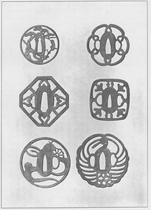
Wash rendering in two values reveals perforated designs in a satisfying manner
When applying paint in superposition or juxtaposition, the student should make certain that the first color is dry unless a moist background is purposely desired.
This exercise should be repeated till a satisfactory degree of perfection has been attained. The washes should be smooth and flat—free from cloudy effects and hard edges.
The exercise just completed consists of but two values, viz., black and middle gray, as it is impossible to show the highlight because of the white paper used. The effect produced is a flat surface with a dark representing the thickness of the metal.
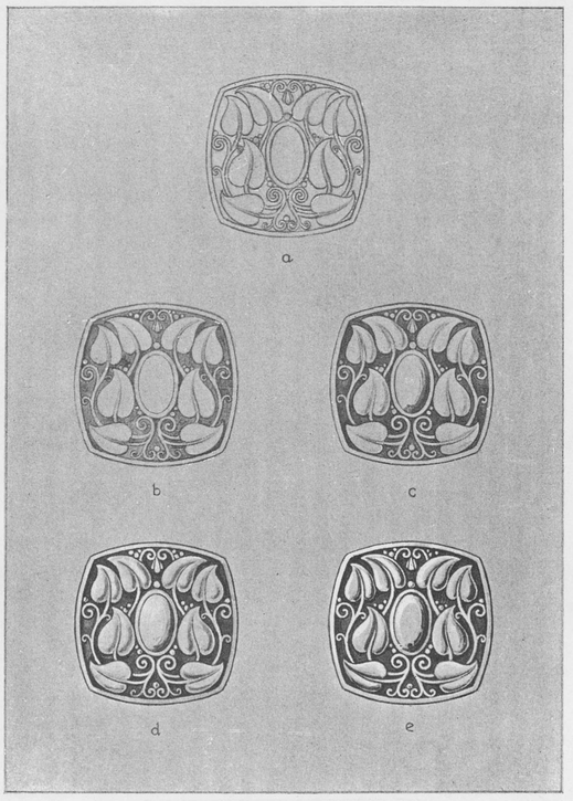
The next exercise is done on granite rendering paper. The design, which may be original or a copy, should be smaller in area and more intricate in its pattern than the sword guard designs, thereby complicating the exercise. The design is to appear as a domed surface. Page 211 represents the steps taken when rendering in five values. Fig. A shows the design in pencil outline; fig. B the results after applying a gray wash; fig. C same as fig. B with the addition of a darker wash on the right half of the design; fig. D a lighter wash than fig. C with a little Chinese white added. This value covers less area than half of the design. In fig. E the thickness of the metal is represented by the black edges and the highlights by the white edges.
When applying highlights, experience shows that it is better to use the white directly from the tube and apply it with a No. 2 brush slightly moistened. If too much water is used it will be noticed that the white fades into a grayish white as the moisture in the paint evaporates. This means the repeated application of more paint if white highlights are desired. Attention is also directed to the fact that when one wash is placed upon another, covering only part of the area, if the first is dry the second wash will leave a hard edge wherever it does not cover the first. This can be avoided if the second is applied while the ground is still moist or, if already dry, by moistening same with brush and a little clear water. To grade one value into another, blend the two gradually by stippling with the brush while the surface is still wet.
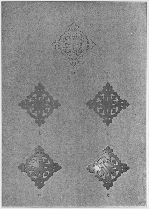
The five steps in pencil and wash drawings to give a domed surface appearance to the design
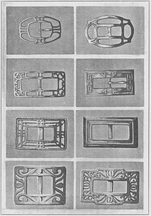
Buckle designs rendered from photographs according to the method described produce a three dimension quality
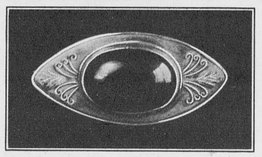
Four-value rendering of original design brings work in relief
The exercise on page 213 differs from the previous ones in that the design is not perforated and has a stone, leaves, and silver shot. The method of procedure is the same as before, kept in four simple values. Fig. A shows the pencil outline drawing; fig. B, one flat gray wash for the background using a No. 2 brush. Fig. C is white mixed with a little water applied to light areas of leaves and stone. A dark has been added to the stone. Fig. D has some dark added to the background and leaves to bring into relief the leaves and stone. Fig. E has highlights added on the lights already added at fig. C, covering less of the light areas.
The rendering of stones in general will be taken up in Chapter 23.
It will be seen in fig. E that the darks for shadows have been accentuated slightly more than those in fig. D. This is due to the fact that the exact value cannot always be ascertained the first time. The study of lights on metals will also reveal the fact that they appear as a sheen when the surface is flat, as represented on the outside rim of fig. E. Throughout rendering, the student should make a careful study of lights and darks and the shapes of shadows, for the shadows give life and reality to the shapes of the lights. Without the shadows on the upper left side of the stone cast by the bezel and the shadow on the light side on the lower right of the bezel, the stone would appear very flat and lifeless.