Planning a Painting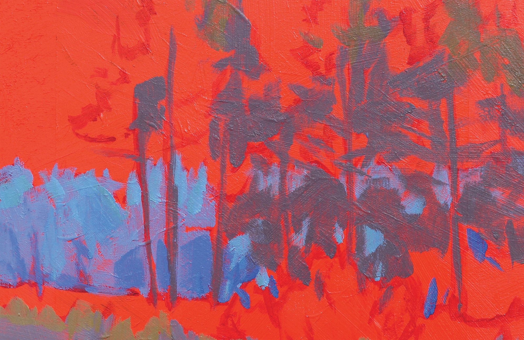
Painting as You Perceive
I prefer sunny mornings and foggy days to paint en plein air. I love the long shadows of early morning light—the quality of the light close to dawn. I also love the mood of a foggy day. Fog causes the light and the dark ends of the value scale to drop out, pushing all the values toward the middle. What is uninteresting on a sunny or cloudy day becomes mysterious and subtle on a foggy day. The easiest way to build interest in an otherwise ordinary scene is to plan it out.
About half the time, once I settle on a painting location, I take a quick photo, and then I draw a small 2-by-3-inch or 3-by-4-inch compositional value plan in pencil. These little sketches provide the relationship of the big shapes (how they fit together) and the value of each shape (how light or dark those shapes will be). This plan is especially important when the light is changing rapidly.
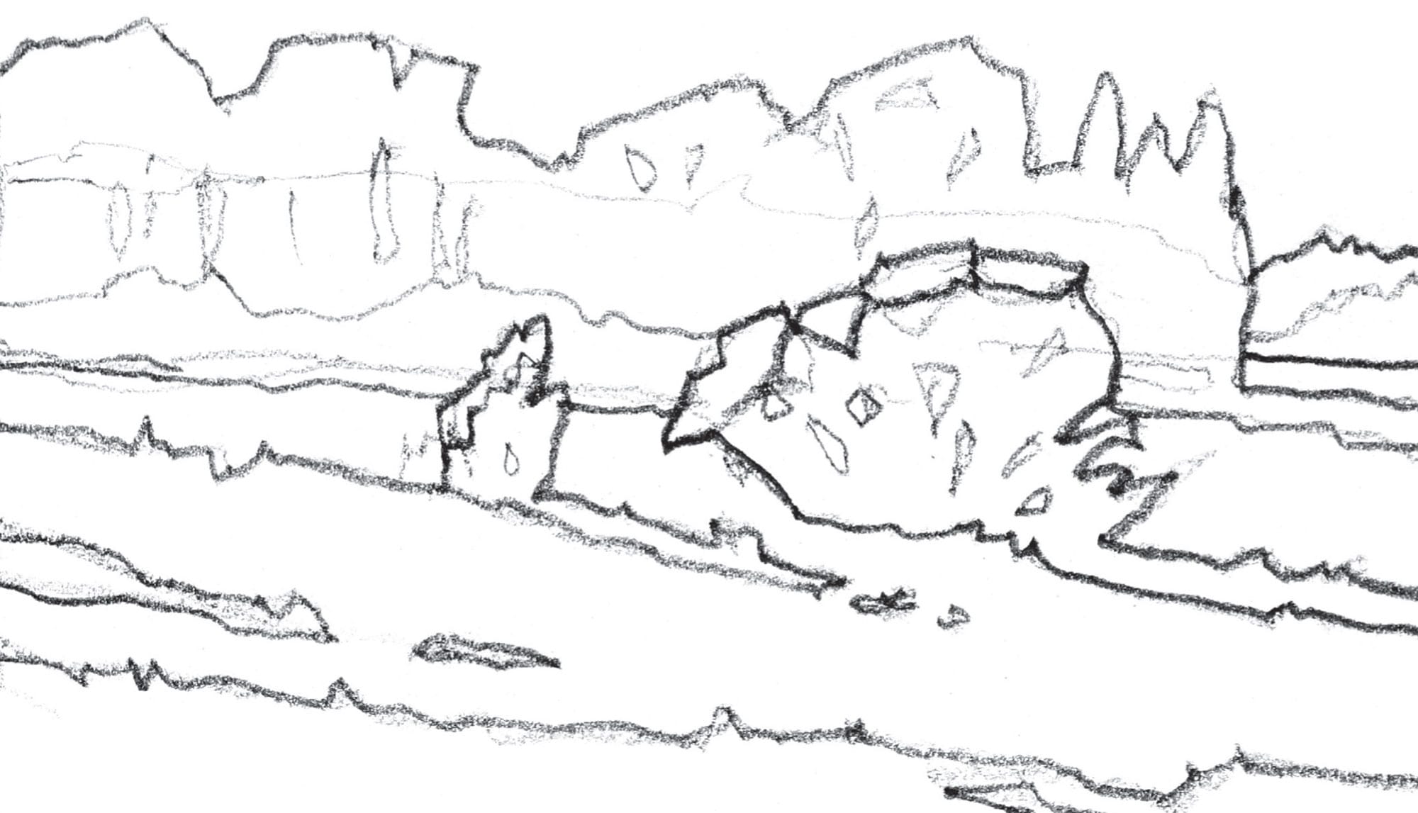
The first step in a contour (outline) drawing is to establish where the big shapes go.
Next add the values to those shapes. This tells me how light or dark each shape should be. This is my plan, but I am not locked into this outline. If I think deviating from this will make a better painting, I do so.
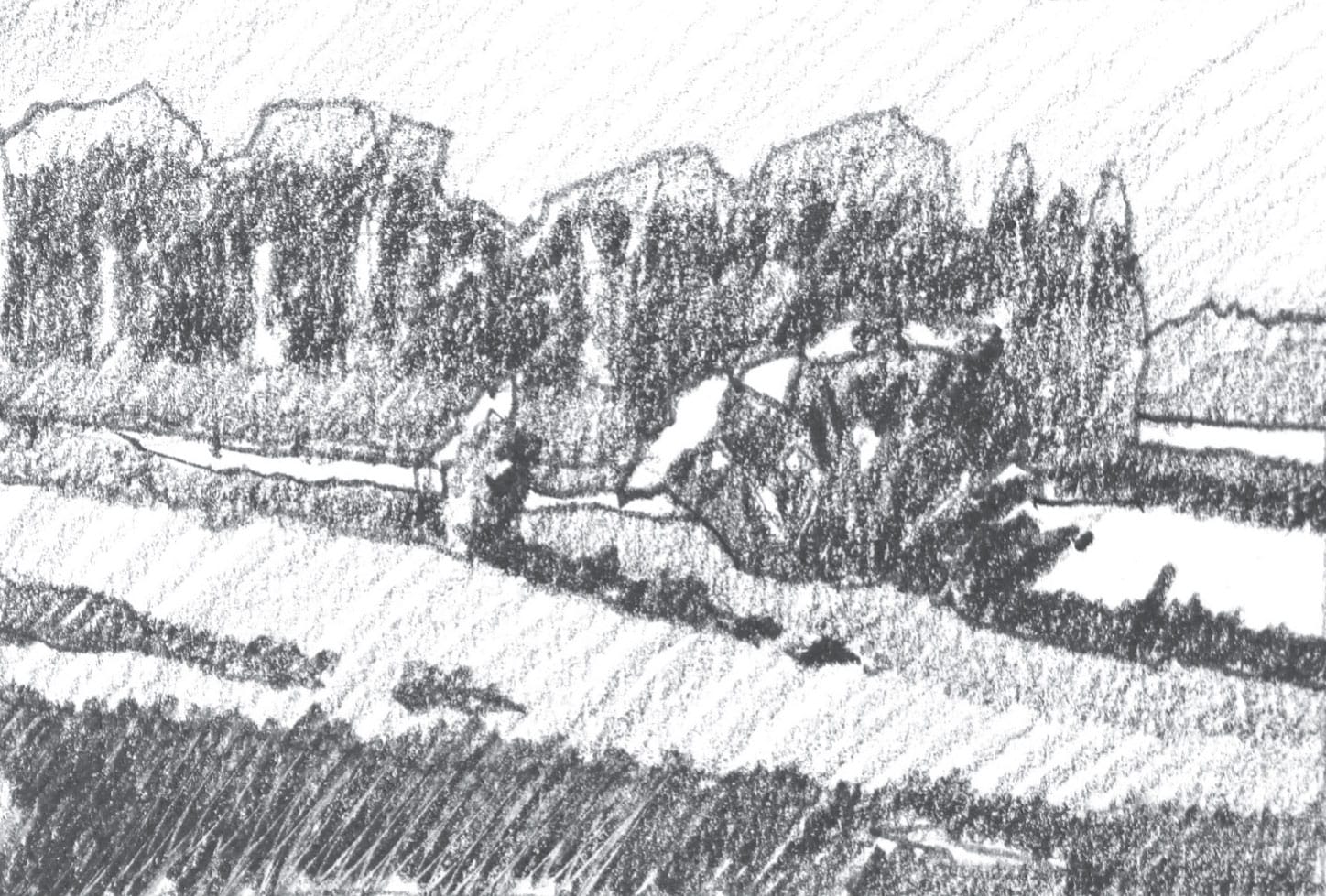
When I’m satisfied with my outline, I add the values. I generally use five values: white, light, medium, medium dark, and very dark or black. These five are enough for me to execute the painting, knowing that I may slide from one to the other or even add an in-between value. Once I’m satisfied with my plan, the fun begins!
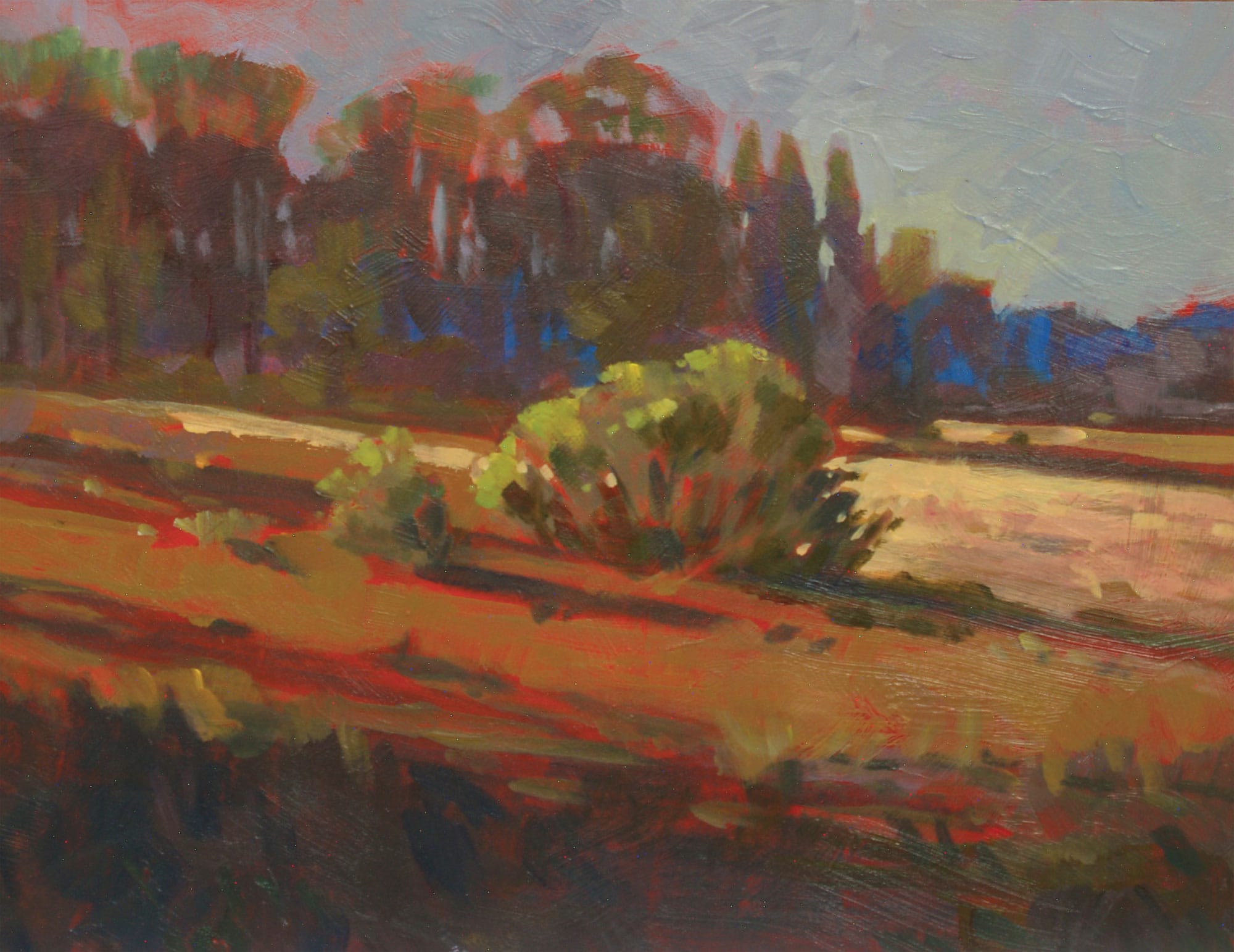
When the natural scene is fairly average, it becomes your job as the artist to make the painting interesting. For example, it is most difficult to make a painting on a cloudy day. The light is scattered evenly, there are no dramatic shadows, and everything is bathed in an overall sameness. Perhaps try to find an unusual viewpoint or a different color combination for the composition. The use of interesting, interlocking shapes offers many design possibilities. Improvise, experiment, and remember your goal is to make a good painting.
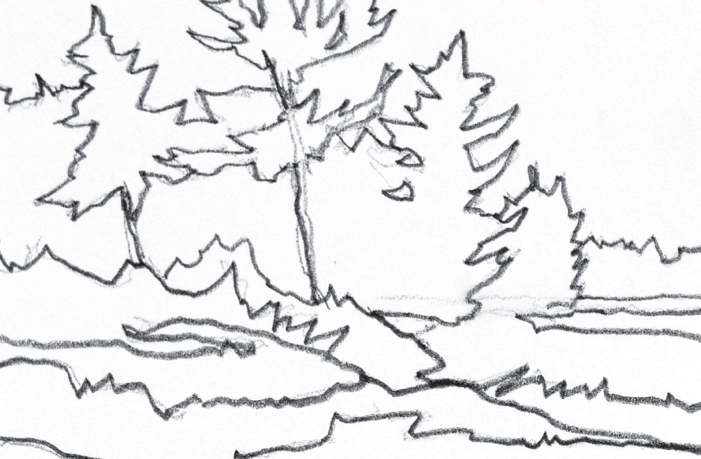
This drawing is from my sketchbook. It illustrates the “bones” of the composition—where the shapes go and how those shapes relate to one another. Next I need to add the lights and darks—my values.
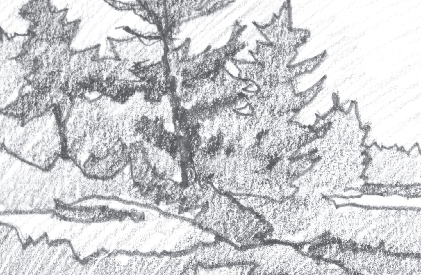
The lights and darks are now all in place. There’s neither value contrast nor cast shadows to play with.
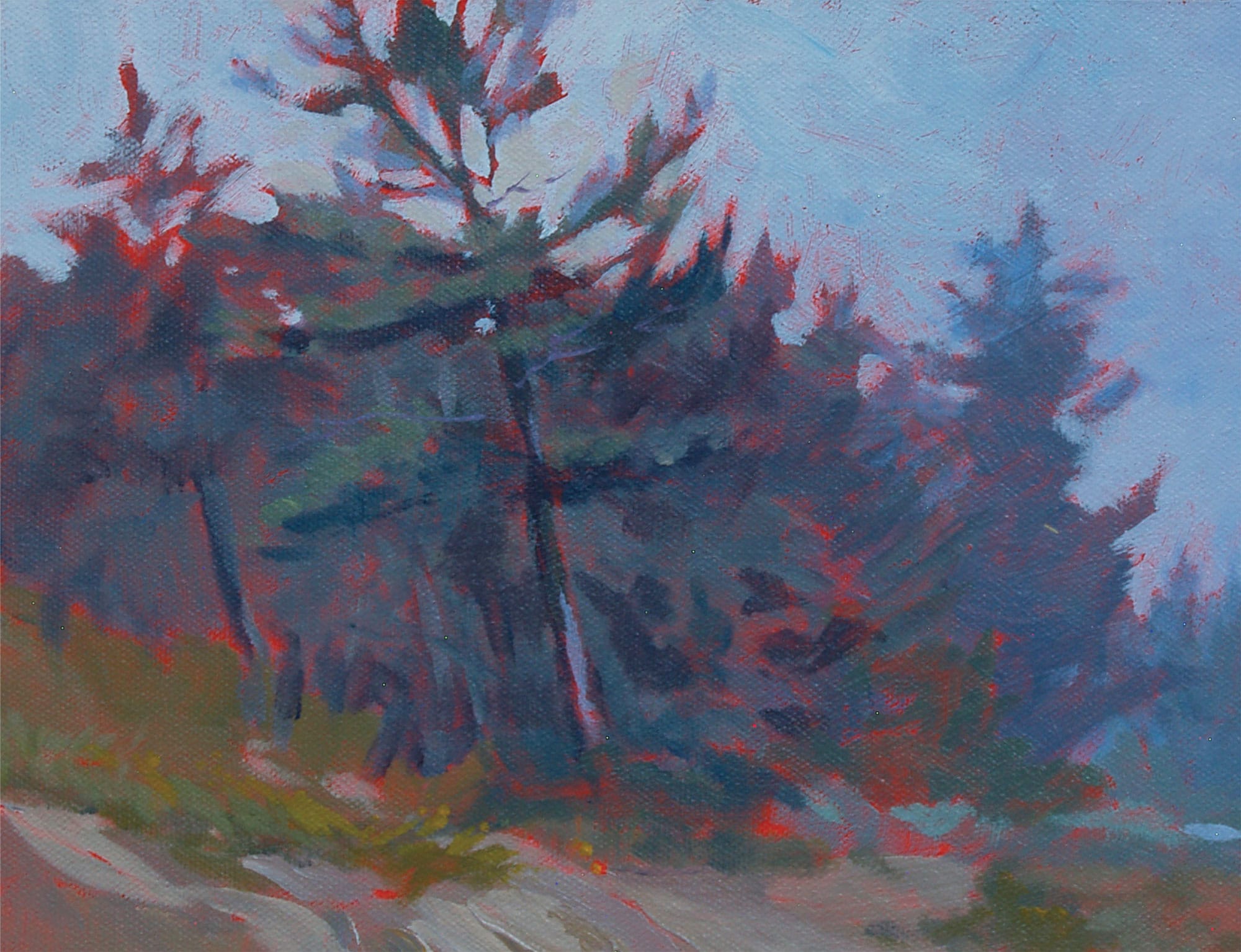
It’s a gray day, but I did my best to make the interlocking shapes that form the foreground—especially the sky and tops of the pine trees—as interesting as possible.
The Focal Point
Once we decide where and what to paint, the work really begins. Something we see causes us to say, “I’d like to paint that!” That becomes the focus of our work. Sometimes it’s referred to as the focal area, the focal point, or the center of interest. Whatever the name, it’s the star of our visual show.
Our eyes take in everything they see. If we had unlimited time, we could probably do a good job of painting “everything.” However, our viewers would rather see what’s important; not necessarily everything. We need to edit what we see, which means to simplify and leave extraneous items out of our paintings. The more we leave out, the more the viewers will fill in. Usually, the more involved the viewer, the more he or she likes our work.
1. Find the focal area.
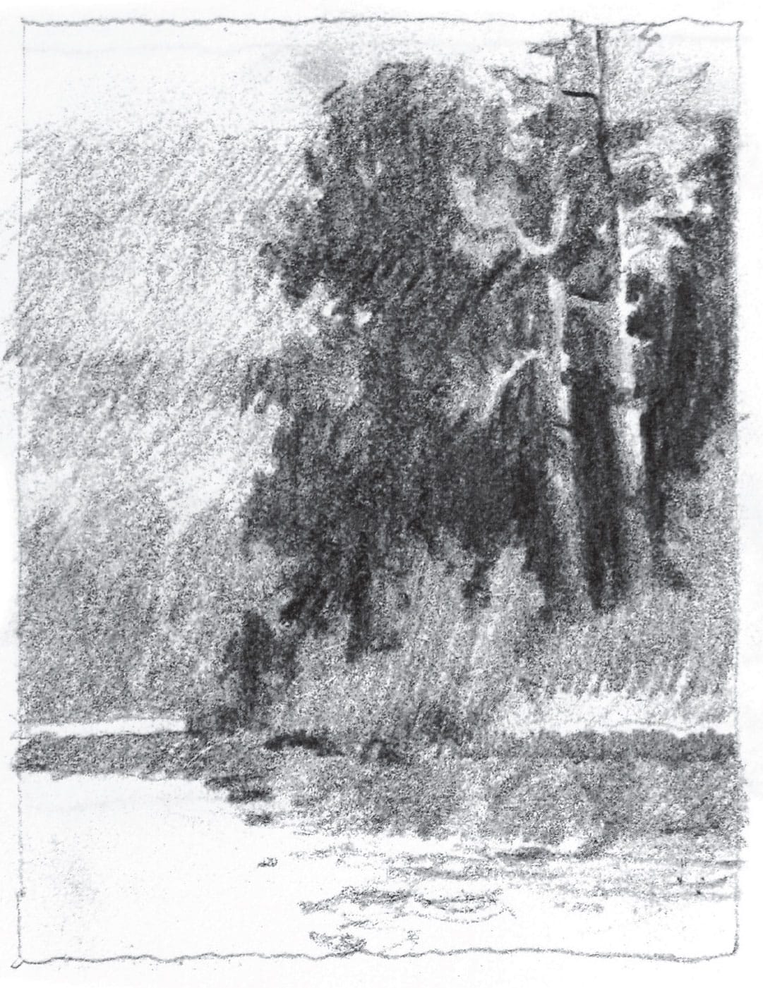
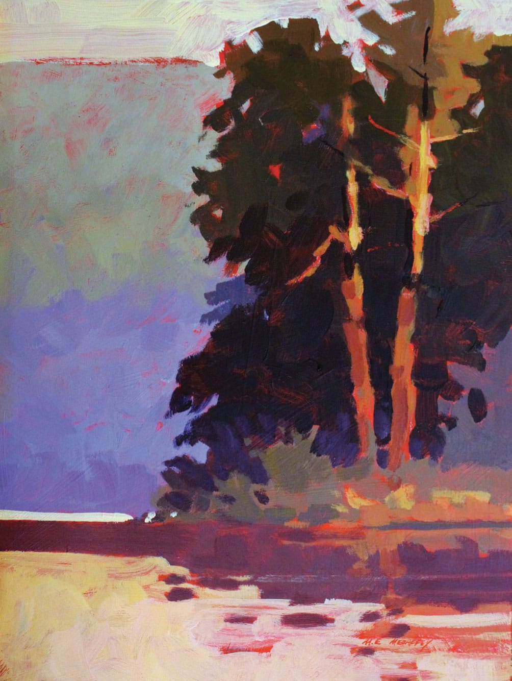
My sister lives beside a beautiful lake in northern Michigan. I love visiting, as there is an endless amount of beautiful scenery to paint. For this painting, I chose a view from the water. At this time of day (late afternoon/early evening), the light hit the two large pines on the right side of the composition. Those light shapes were surrounded and framed by dark pine boughs. This strong value contrast (the difference between a light shape and a dark one) was what initially captured my interest. I decided this would be the “star of my show”—my center of interest.
2. Contour the shapes.
I created a contour (outline) drawing in my sketchbook of the shapes as I wanted them arranged in the painting. This is where the simplification and process of omission starts. Try it—you will be surprised by how much information you can leave out and still have the viewer “get it.”
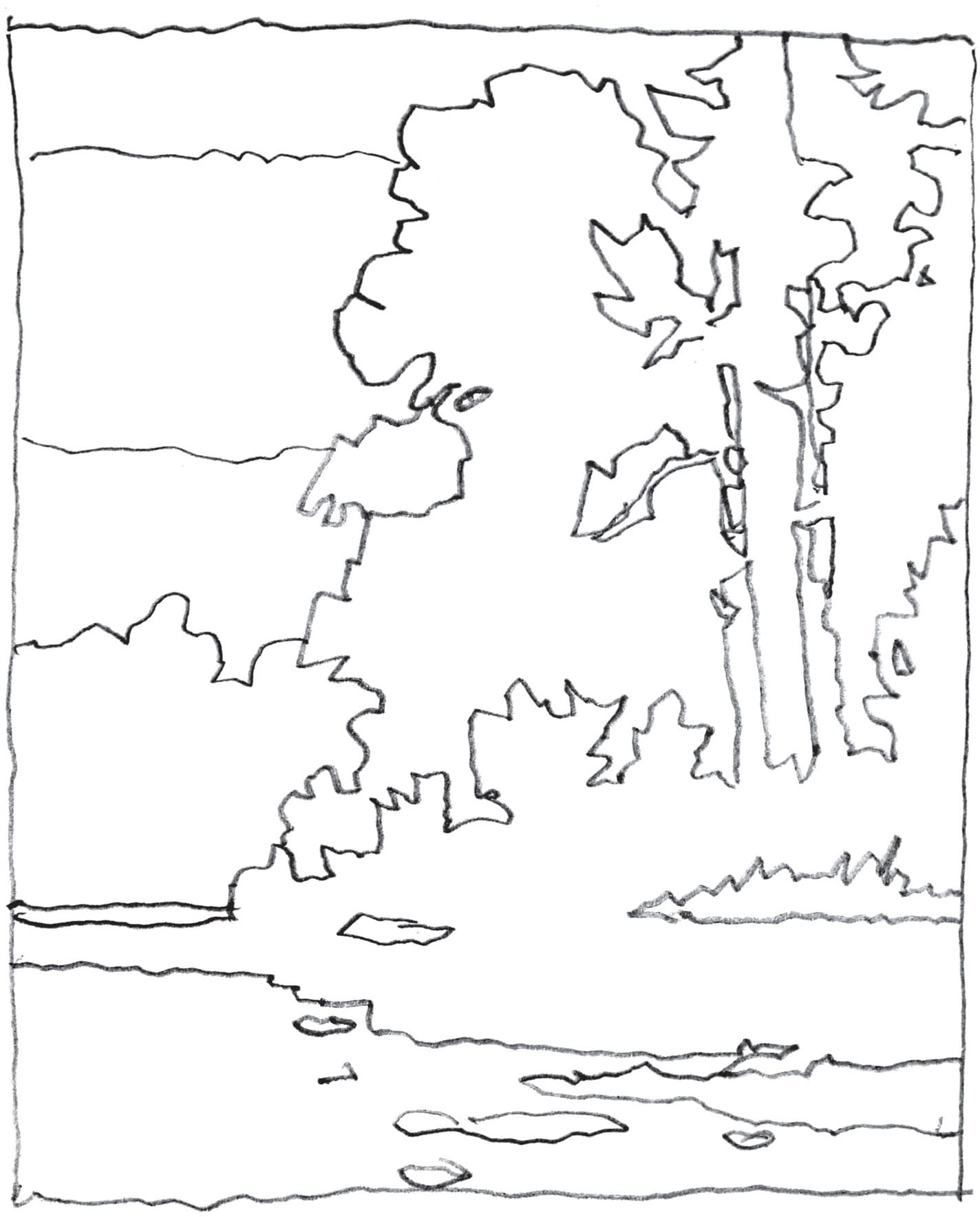
3. Assign values to every shape.
Here the center of interest is clearly defined. My darkest dark and my lightest light draw the viewer’s eye to those sunlit tree trunks. In addition, I used smaller shapes surrounded by larger shapes in this area. The contrast in size also emphasizes the focal point: the upper right where the light hits the tree trunks. This light is nicely framed and contrasted by the darks behind it. I use a 5B pencil, which is soft and can easily make darks, to shade in the values as I want them to appear in the final painting.
4. Redesign to change the focal area.
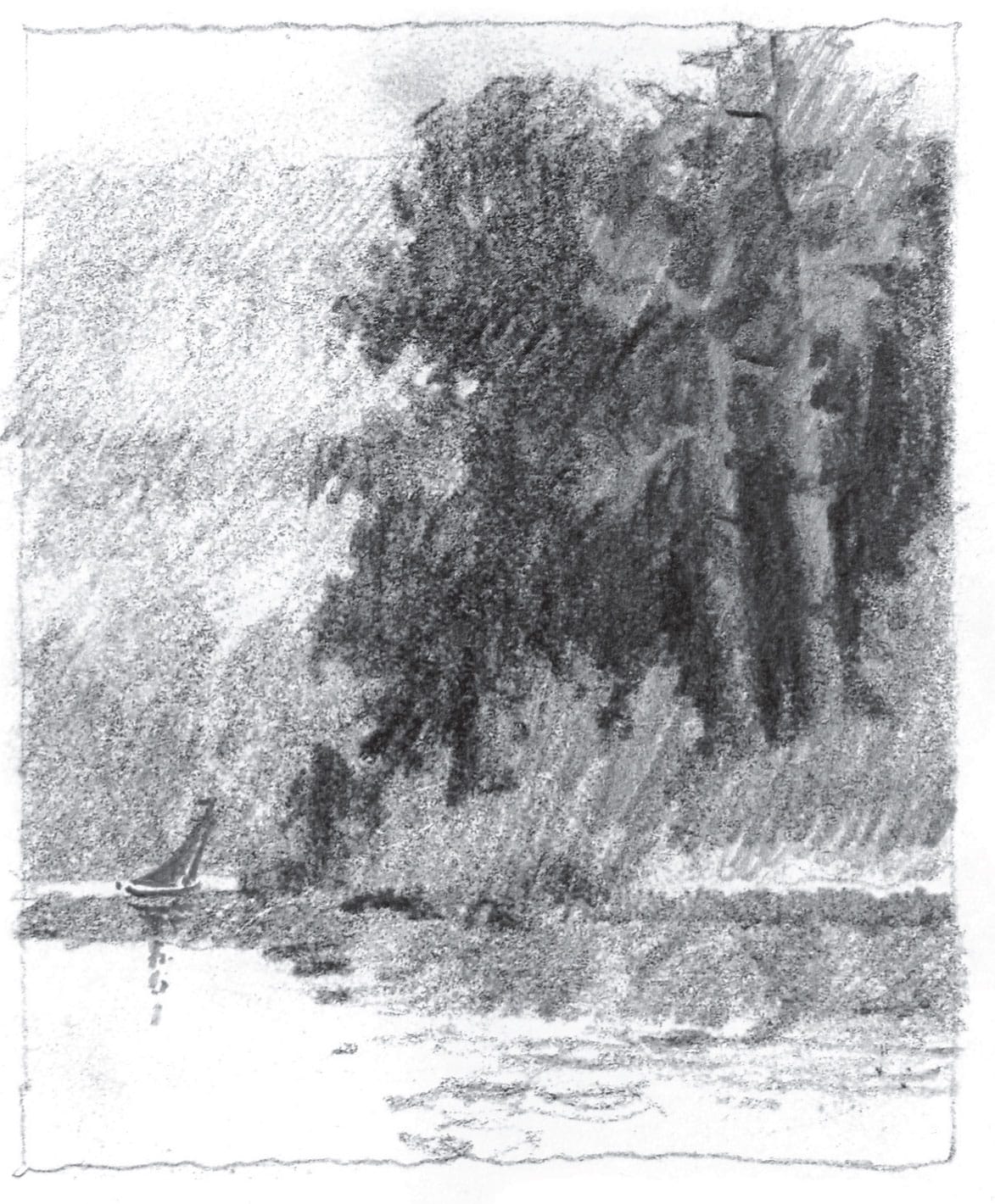
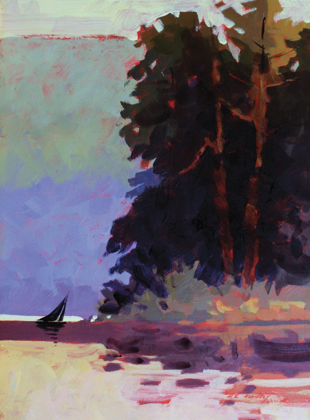
But what if I decide to change the focal area? It is possible to completely change where the viewer looks by emphasizing different elements. I decide to add a small, dark sailboat. But if I leave it at that, there would be a visual conflict between the small shape of the sailboat and the light and dark shapes on the tree trunks. To solve this visual dilemma, I reduce the value contrast in the tree trunks so that my gaze is drawn more to the small sailboat in the lower left part of the composition. Remember, you can change anything that you think might result in a good painting!
Step-by-Step Project: Early Spring
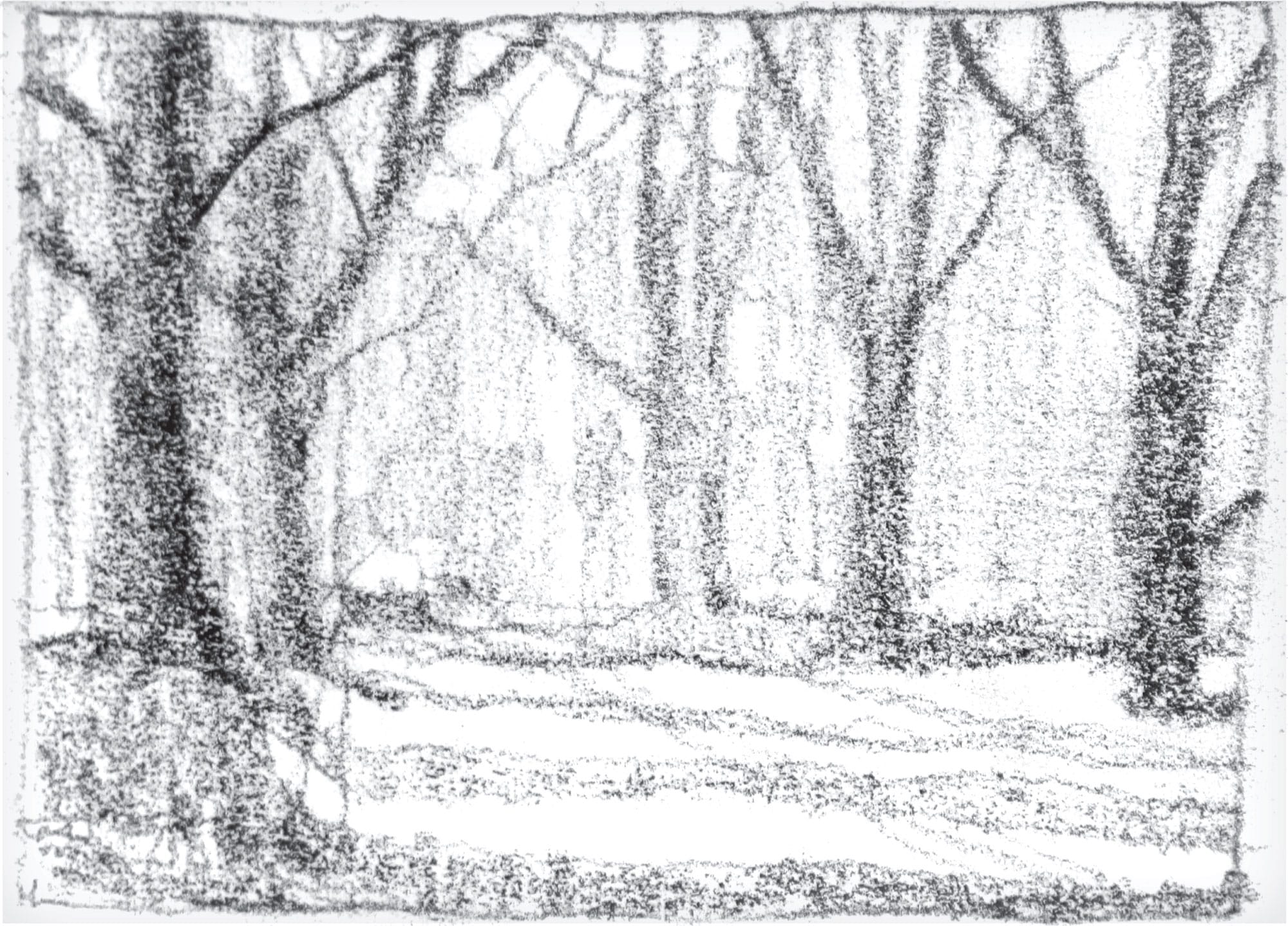
I start this project with a 2-by-3-inch sketch, introducing the big shapes.
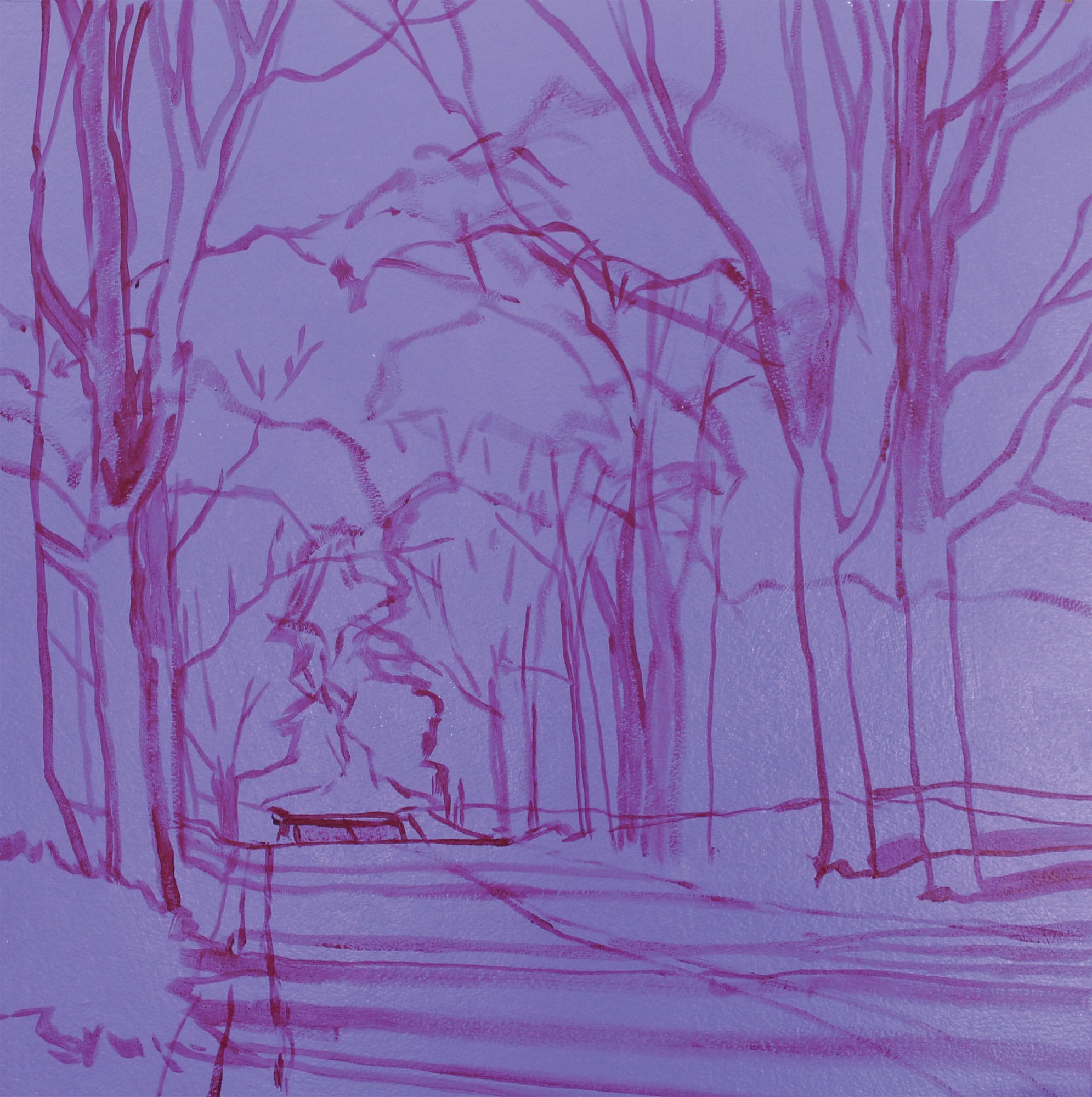
Step 1
I start with a background mixture of ultramarine blue and alizarin crimson with enough titanium white to create a middle value of violet. I paint the entire panel, including the edges. Alizarin crimson is slightly darker than a mid-tone, so I use that to draw all the big shapes on the panel. I also decide that a square format will tighten my design considerably.
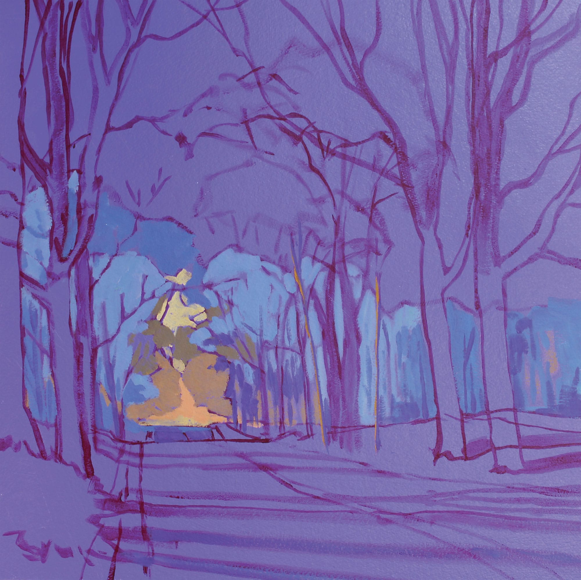
Step 2
The converging lines that form the side of the country road lead the eye into the distance. To give the viewer a bit of a destination, I use mixtures of cadmium yellow deep, a bit of alizarin crimson, a small amount of ultramarine blue, and white in the area shown. I paint the trees along the horizon line on both sides of the road using a mixture of ultramarine blue, a small amount of cadmium yellow light, and plenty of white. I keep this distant tree line cool in temperature to help it recede into the distance.
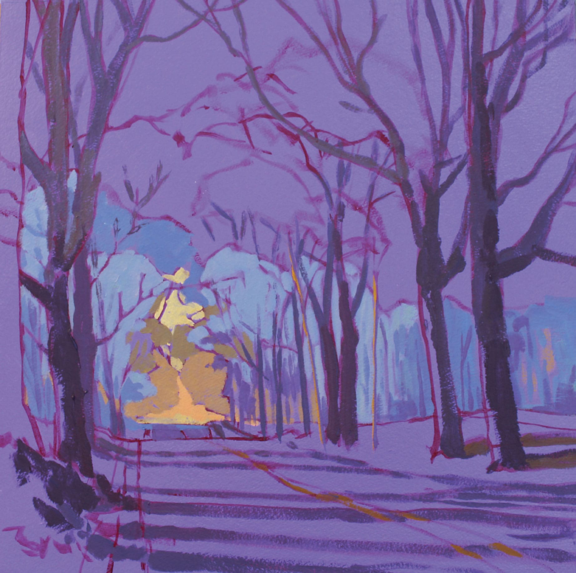
Step 3
I paint all the trees and their shadows with a neutralized violet. Complementary colors when mixed together neutralize each other. First, I make a medium dark mixture of ultramarine blue and alizarin crimson. To this mixture I add a small amount of cadmium yellow deep. Yellow is opposite violet on the color wheel. Opposites, when mixed together, will tend to dull or neutralize that color. I add some white to this subdued violet. I paint all the trees (except where the light hits on the left side), and I extend this color into all the tree shadows. This has the effect of simplifying those shapes. As the trees recede into the distance (and get smaller), I add a bit more white to slightly lighten those areas. I also use this lighter mix to paint the branches up in the sky.
Step 4
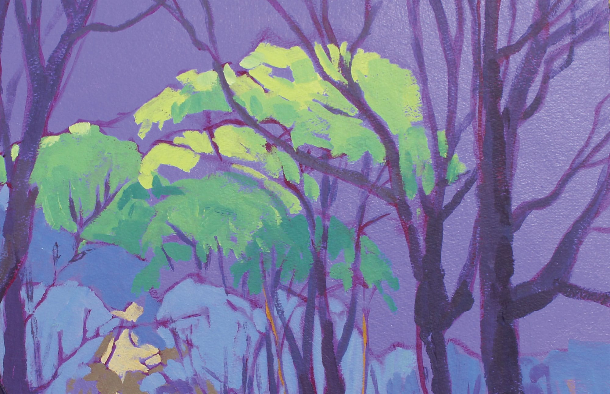
In early spring, the tops of the trees show new growth. I indicate this with a saturated bright green. To give the viewer a sense of increased saturation or intensity for those shapes, I switch from ultramarine blue to phthalo blue. Phthalo blue is cooler and tends toward green. When mixed with cadmium yellow light, it makes a saturated green. I add a bit more yellow and white to lighten the tops as an indication of extra light hitting those shapes.
Step 5
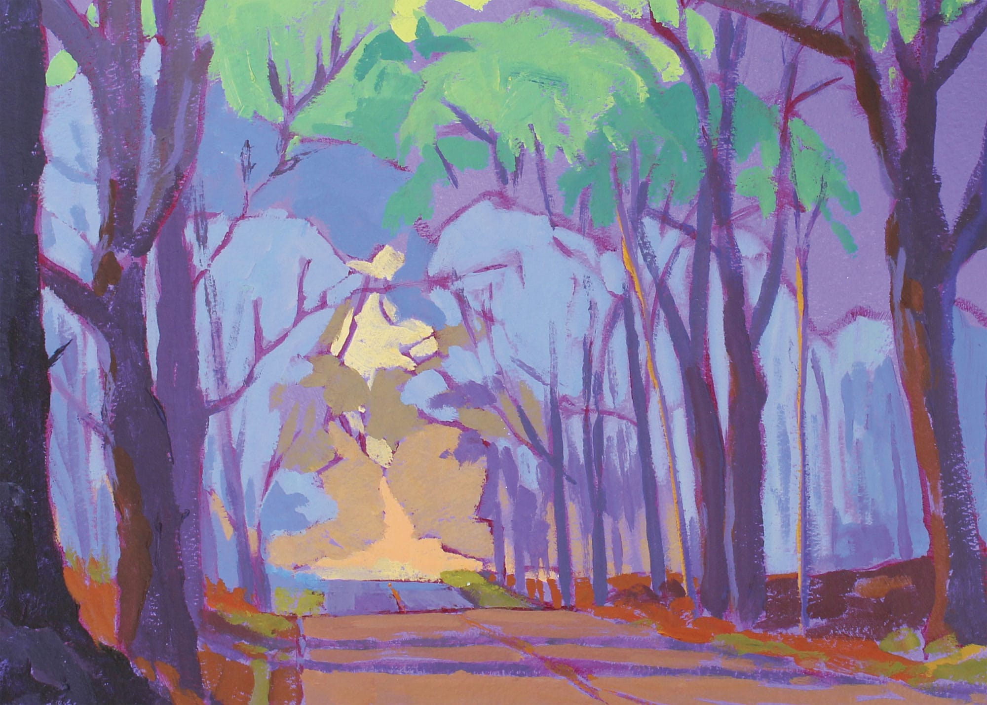
The shapes that make up both the ground and the road between the shadows are decidedly warm in color temperature. I again “push” that relationship by using a mixture of cadmium yellow deep with a bit of alizarin. On the sides of the road, I reduce the amount of alizarin and add more ultramarine blue to produce green for the new grass.
Step 6
I decide to go with a light, neutralized yellow (made by mixing cadmium yellow light, a bit of violet, and lots of white) for the sky area, hoping to contrast with the warmth of the orange around the distant road and the warmer color in the tree shapes just above where the road disappears. As always, as the shapes get smaller, the size of my brush gets smaller. For the larger negative shapes between the branches, I use a size 6 short flat. For the smaller shapes, I switch to a size 4 flat. I work quickly, allowing some of the violet to show throughout the entire painting. This provides some unity and, I hope, some sense of early spring.
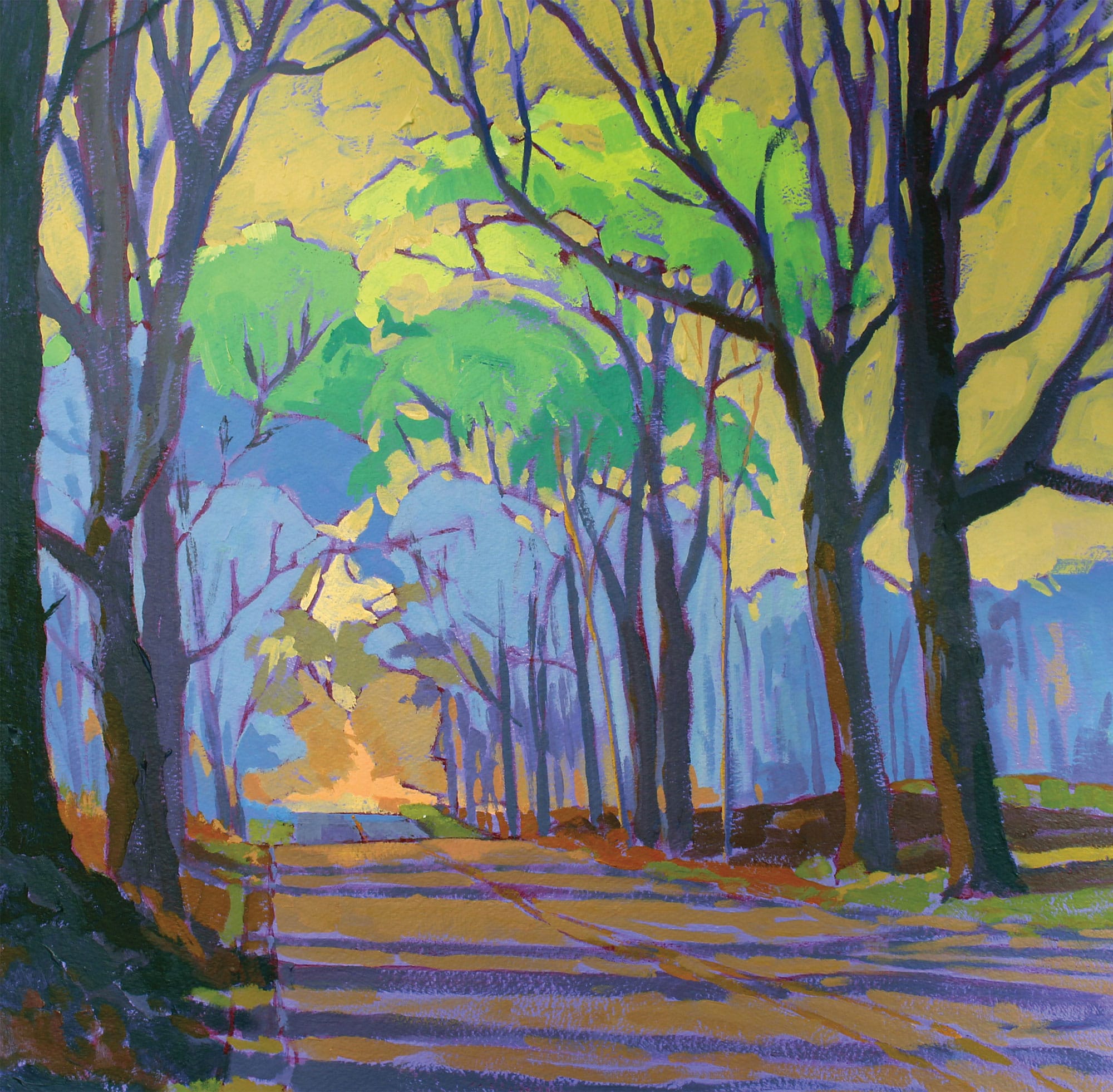
Early Spring (acrylic on paper, mounted on panel)