
8
Building interfaces
This chapter demonstrates how to use Java Swing components to create a graphical program interface.
Creating a window
Programs can provide a graphical user interface (GUI) using the “Swing” components of the Java library. The javax.swing package contains classes to create a variety of components using the style of the native operating system. These can be made available to a program by including the initial statement import javax.swing.*;.
A class must be created to represent the GUI to which components can be added to build the interface. This is easily achieved by declaring it a subclass of Swing’s JFrame class using the extends keyword – thereby inheriting attributes and behaviors that allow the user to move, resize, and close the window.
Remember the letter x in javax.swing by thinking of JAVA eXtra.
The class constructor should include statements to set these minimum requirements:
•The title of the window – specified as a String argument to the inherited super() method of the JFrame class.
•The size of the window – specified as width and height in pixels as arguments to its setSize() method.
•What to do when the user closes the window – specified as a constant argument to its setDefaultCloseOperation() method.
•Display the window – specified as a Boolean argument to its setVisible() method.
Additionally, the constructor can add a JPanel container component to the window, in which smaller components can be added, using the inherited add() method of the JFrame class.
By default, a JPanel container employs a FlowLayout layout manager that lays out components in left-to-right lines, wrapping at the right edge of the window.
The steps opposite describe how to create a basic window containing a JPanel container with a FlowLayout layout manager. This window is featured in subsequent examples in this book that demonstrate how to add various components to the JPanel container.

Layout managers are described in more detail here .
 Start a new program that imports all Swing components
import javax.swing.* ;

Window.java
 Create a subclass of the JFrame class named “Window” containing the standard main method
class Window extends JFrame
{
public static void main ( String[] args ) { }
}
 Before the main method, create a JPanel container object
JPanel pnl = new JPanel( ) ;
 Next, insert this constructor method to specify window requirements and to add the
JPanel object to the JFrame
Next, insert this constructor method to specify window requirements and to add the
JPanel object to the JFrame
public Window()
{
super( “Swing Window” ) ;
setSize( 500 , 200 ) ;
setDefaultCloseOperation( EXIT_ON_CLOSE ) ;
add( pnl ) ;
setVisible( true ) ;
}
 Create an instance of the Window class by inserting this line into the main method
Window gui = new Window() ;
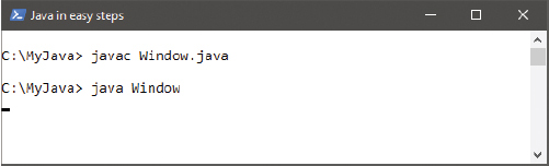
 Save the program as Window.java then compile and run the program to see the basic window appear


The EXIT_ON_CLOSE operation is a constant member of the JFrame class. It exits the program when the window gets closed.
Notice how the add() method is used here to add the JPanel object to the JFrame window.
Adding push buttons
The Swing JButton class creates a push-button component that can be added to a graphical interface. This lets the user interact with the program by clicking on a button to perform an action.
The JButton object is created with the new keyword, and its constructor takes a String argument specifying text to be displayed on that button.
Images can appear on buttons too. An ImageIcon object must first be created to represent the image, specifying the image file name as the argument to its constructor. Typically, the image will be located alongside the program but the argument can include the path for images outside the local directory.
Details of how to create event-handler methods to respond to user actions, such as a button click, can be found in the next chapter.
Specify the name of the ImageIcon object as the argument to the JButton constructor to display that image on the button, or specify a String and ImageIcon as its two arguments to display both text and the image.
Edit a copy of Window.java from here
, changing the class name in the declaration, the constructor, and the instance statement
from “Window” to “Buttons”
Buttons.java
Before the Buttons() constructor, create two ImageIcon objects
ImageIcon tick = new ImageIcon( “Tick.png” ) ;
ImageIcon cross = new ImageIcon( “Cross.png” ) ;
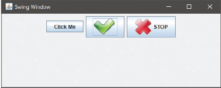
Next, create three JButton objects to display text, an image, and both text and an image respectively
JButton btn = new JButton( “Click Me” ) ;
JButton tickBtn = new JButton( tick ) ;
JButton crossBtn = new JButton( “STOP” , cross ) ;
Inside the Buttons() constructor, insert three statements to add the JButton components to the JPanel container
pnl.add( btn ) ;
pnl.add( tickBtn ) ;
pnl.add( crossBtn ) ;
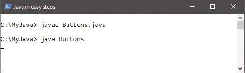
Save the program as Buttons.java then compile and run the program to see push buttons appear in the window
The JPanel object has an add() method – to add components to that panel.
Details of how to create a Java Archive (JAR) can be found here .
The buttons respond graphically when they are clicked, but will not perform an action until the program provides an event-handler method to respond to each click event.
Where the program is intended for deployment in a single Java archive (JAR), image resources must be loaded by a ClassLoader object before creating the ImageIcon objects to represent them.
Specifying the resource file name or path to the getResource() method of a ClassLoader returns a URL, which can be used as the argument to the ImageIcon constructor. The java.net package provides a useful URL class to which these may first be assigned.
Before the Buttons() constructor, create a ClassLoader object
ClassLoader ldr = this.getClass().getClassLoader() ;
 Load the URLs of the image resources
java.net.URL tickURL = ldr.getResource( “Tick.png” ) ;
java.net.URL crossURL = ldr.getResource( “Cross.png” ) ;
 Edit the ImageIcon() constructors in Step 2 opposite to use URLs
ImageIcon tick = new ImageIcon( tickURL ) ;
ImageIcon cross = new ImageIcon( crossURL ) ;
 Save the changes then recompile and re-run the program – it will run as before but
can now be deployed in a JAR
Save the changes then recompile and re-run the program – it will run as before but
can now be deployed in a JAR
Notice how the getClass() method and this keyword are used here to reference this class object.
Adding labels
The Swing JLabel class creates a label component that can be added to a graphical interface. This can be used to display non-interactive text or image, or both text and an image.
The JLabel object is created with the new keyword, and its constructor takes a String argument specifying text to be displayed on that label, or the name of an ImageIcon object representing an image to display. It can also take three arguments to specify text, image, and horizontal alignment as a JLabel constant value. For example, JLabel( “text”, img, JLabel.CENTER ) aligns centrally.
Where a JLabel object contains both text and an image, the relative position of the text can be determined by specifying a JLabel constant as the argument to setVerticalPosition() and setHorizontalPosition() methods of the JLabel object.
Additionally, a JLabel object can be made to display a ToolTip when the cursor hovers over, by specifying a text String as the argument to that object’s setToolTipText() method.
Edit a copy of Window.java from here
, changing the class name in the declaration, the constructor, and the instance statement
from “Window” to “Labels”
Labels.java
Before the Labels() constructor, create an ImageIcon object
ImageIcon duke = new ImageIcon( “Duke.png” ) ;
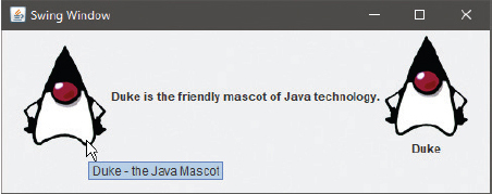
Next, create three JLabel objects to display an image, text, and both text and an image respectively
JLabel lbl1 = new JLabel( duke ) ;
JLabel lbl2 = new JLabel( “Duke is the friendly mascot of Java technology.” ) ;
JLabel lbl3 = new JLabel( “Duke” , duke , JLabel.CENTER ) ;
Inside the Labels() constructor, insert this statement to create a ToolTip for the first label
lbl1.setToolTipText( “Duke - the Java Mascot” ) ;
Add these two statements to align the text centrally below the third label
lbl3.setHorizontalTextPosition( JLabel.CENTER ) ;
lbl3.setVerticalTextPosition( JLabel.BOTTOM ) ;
Now, add three statements to add the JLabel components to the JPanel container
pnl.add( lbl1 ) ;
pnl.add( lbl2 ) ;
pnl.add( lbl3 ) ;
Save the program as Labels.java then compile and run the program, placing the cursor over the first label

JLabel alignment constants include LEFT, CENTER, RIGHT, TOP and BOTTOM.
Where the program is intended for deployment in a single Java archive (JAR), the image resource must be loaded by a ClassLoader object before creating the ImageIcon object to represent it.
Specifying the resource file name or path to the getResource() method of a ClassLoader returns a URL, which can be used as the argument to the ImageIcon constructor.
Before the Labels() constructor, create a ClassLoader object
ClassLoader ldr = this.getClass().getClassLoader() ;
Edit the ImageIcon() constructor in Step 2 opposite to load the URL of the image resource using the ClassLoader object
ImageIcon duke = new ImageIcon( ldr.getResource( “Duke.png” ) ) ;
 Save the changes, then recompile and re-run the program – it will run as before, but
can now be deployed in a JAR
Save the changes, then recompile and re-run the program – it will run as before, but
can now be deployed in a JAR
Details of how to create a Java Archive (JAR) can be found here .
Adding text fields
The Swing JTextField class creates a single-line text field component that can be added to a graphical interface. This can be used to display editable text, and allows the user to enter text to interact with the program.
The JTextField object is created with the new keyword, and its constructor can take a String argument specifying default text to be displayed in that field. In this case, the component will be sized to accommodate the length of the String. Alternatively, the argument may be a numeric value to specify the text field size. The constructor can also take two arguments, specifying both default text and the text field size.
Use the JPasswordField class instead of the JTextField class where input characters are needed to be not visible.
A multiple-line text field can be created with the JTextArea class, whose constructor takes two numerical arguments specifying its number of lines and its width. Alternatively, three arguments can be supplied specifying default text, line number, and width. Text can be made to wrap at word endings within this field by specifying true as the argument to the setLineWrap() method and setWrapStyleWord() method of the JTextArea object.
Where text entered into a JTextArea component exceeds its initial size, the component will expand to accommodate the text. To make the component a fixed size with scrolling capability, it can be placed in a JScrollPane container. This is created with the new keyword, and takes the name of the JTextArea as its argument.
Scroll bars will, by default, only appear when the field contains text that exceeds its initial size – but they can be made to appear constantly by specifying a JScrollPane constant as the argument to the snappily-named setVerticalScrollBarPolicy() or setHorizontalScrollBarPolicy() methods of the JScrollPane object. For example, to always display a vertical scrollbar use the JScrollPane.VERTICAL_SCROLLBAR_ALWAYS constant as the argument.
Edit a copy of Window.java from here
, changing the class name in the declaration, the constructor, and the instance statement
from “Window” to “TextFields”
TextFields.java
Before the TextFields() constructor, create two JTextField objects
JTextField txt1 = new JTextField( 38 ) ;
JTextField txt2 = new JTextField( “Default Text” , 38 ) ;
Create a JTextArea object five lines high
JTextArea txtArea = new JTextArea( 5 , 37 ) ;
Add a JScrollPane object – to contain the JTextArea created in Step 3, above
JScrollPane pane = new JScrollPane( txtArea ) ;
In the TextFields() constructor method, insert statements to enable the JTextArea object to wrap at word endings
txtArea.setLineWrap( true ) ;
txtArea.setWrapStyleWord( true ) ;
Insert a statement to always display a vertical scrollbar for the JTextArea object
pane.setVerticalScrollBarPolicy ( JScrollPane.VERTICAL_SCROLLBAR_ALWAYS ) ;
Insert two statements to add the JTextField components to the JPanel container
pnl.add( txt1 ) ;
pnl.add( txt2 ) ;
Insert another statement to add the JScrollPane container, (containing the JTextArea field) to the JPanel container
pnl.add( pane ) ;
Save the program as TextFields.java then compile and run the program, entering some text into the text area

A JTextArea component has no scrolling ability unless it is contained within a JScrollPane component.
Adding item selectors
The Swing JCheckBox class creates a checkbox component that can be added to a graphical interface. This can be used to allow the user to select or deselect individual items in a program.
The JCheckBox object is created with the new keyword, and its constructor takes a String argument specifying text to be displayed alongside that checkbox. It can also take a second true argument to make the checkbox be selected by default.
A choice of items can be offered by the JComboBox class that creates a drop-down list from which the user can select any single item. This object is created with the new keyword, and its constructor typically takes the name of a String array as its argument. Each element in the array provides an item for selection in the drop-down list. Similarly, a choice of items can be offered by the JList class that creates a fixed-size list from which the user can select one or more items. It is created with the new keyword, and its constructor also takes an array as its argument, with each element providing an item for selection. As both JList and JComboBox are “Collections” they must specify the generic type they may contain when they get created, such as <String>.
Edit a copy of Window.java from here
, changing the class name in the declaration, the constructor, and the instance statement
from “Window” to “Items”
Items.java
Before the Items() constructor, create a String array of items for selection
String[] toppings = { “Pepperoni” , “Mushroom” , “Ham” , “Tomato” } ;
Next, create four JCheckBox objects to present each array item for selection – with one selected by default
JCheckBox chk1 = new JCheckBox( toppings[0] ) ;
JCheckBox chk2 = new JCheckBox( toppings[1] , true ) ;
JCheckBox chk3 = new JCheckBox( toppings[2] ) ;
JCheckBox chk4 = new JCheckBox( toppings[3] ) ;
Add a second String array of items for selection
String[] styles = { “Deep Dish” , “Gourmet Style” , “Thin & Crispy” } ;
Create a JComboBox object to present each item in the second array for selection
JComboBox<String> box1 = new JComboBox<String>( styles ) ;
Add a JList object to present each item in the first array for selection from a list
JList<String> lst1 = new JList<String>( toppings ) ;
In the Items() constructor method, insert statements to add each JCheckBox component to the JPanel container
pnl.add( chk1 ) ;
pnl.add( chk2 ) ;
pnl.add( chk3 ) ;
pnl.add( chk4 ) ;
Insert statements to make a default selection and to add the JComboBox component to the JPanel container
box1.setSelectedIndex( 0 ) ;
pnl.add( box1 ) ;
Now, insert a statement to add the JList component to the JPanel container
pnl.add( lst1 ) ;
Save the program as Items.java then compile and run the program, selecting items from the lists

Only one item can be selected from a JComboBox component – multiple items can be selected from a JList component.
Details of how to create event-handler methods to respond to user actions, such as an item selection, can be found in Chapter 9.
Adding radio buttons
The Swing JRadioButton class creates a radio button component that can be added to a graphical interface. This can be used to allow the user to select an item from a group of radio buttons.
The JRadioButton object is created with the new keyword, and its constructor takes a String argument specifying text to be displayed alongside that radio button. It can also take a second true argument to make a radio button be selected by default.
A ButtonGroup object logically groups a number of radio buttons so that only one button in that group can be selected at any time. Each radio button is added to the ButtonGroup object by specifying its name as the argument to the group’s add() method.
Edit a copy of Window.java from here
, changing the class name in the declaration, the constructor, and the instance statement
from “Window” to “Radios”
Radios.java
Before the Radios() constructor, create three JRadioButton objects – with one selected by default
JRadioButton rad1 = new JRadioButton( “Red” , true ) ;
JRadioButton rad2 = new JRadioButton( “Rosé” ) ;
JRadioButton rad3 = new JRadioButton( “White” ) ;
Next, create a ButtonGroup object with which to group the radio buttons
ButtonGroup wines = new ButtonGroup() ;
In the Radios() constructor method, insert statements to add each JRadioButton component to the JButtonGroup
wines.add( rad1 ) ;
wines.add( rad2 ) ;
wines.add( rad3 ) ;
Insert statements to add the JRadioButton components to the JPanel container
pnl.add( rad1 ) ;
pnl.add( rad2 ) ;
pnl.add( rad3 ) ;
Save the program as Radios.java then compile and run the program, selecting any one radio button after the default
The ButtonGroup object only groups the buttons logically, not physically.


Details of how to create event-handler methods to respond to user actions can be found in the next chapter.
The examples on the previous pages have demonstrated the most common Swing components – JButton, JLabel, JTextField, JCheckBox, JComboBox, JList and JRadioButton. There are many more specialized components available in the javax.swing package, whose details can be found in the Java documentation. For example, the JSlider, JProgressBar, and JMenuBar components below:

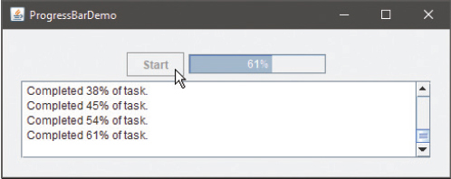

Try using the Java documentation to add a JSlider component to the Radios program – see here for details on how to use the documentation.
Arranging components
The java.awt package (Abstract Window Toolkit) contains a number of layout manager classes that can be used to place components in a container in different ways.
A layout manager object is created using the new keyword, and can then be specified as the argument to a JPanel constructor to have the panel use that layout. When components get added to the panel they will be placed according to the rules of the specified layout manager.
|
Layout Manager: |
Rules: |
|
BorderLayout |
Places North, South, East, West and Center (the content pane default) |
|
BoxLayout |
Places in a single row or column |
|
CardLayout |
Places different components in a specified area at different times |
|
FlowLayout |
Places left to right in a wrapping line (the JPanel default) |
|
GridBagLayout |
Places in a grid of cells, allowing components to span cells |
|
GridLayout |
Places in a grid of rows and columns |
|
GroupLayout |
Places horizontally and vertically |
|
SpringLayout |
Places by relative spacing |
The top level JFrame object has a “content pane” container that places components using the BorderLayout layout manager by default. This can be used to place up to five JPanel containers, which may each use their default FlowLayout layout manager, or any of the layout managers in the table above. Using a variety of layout managers accommodates most layout requirements.
The content pane can be represented by a java.awt.Container object, whose add() method can specify the position and name of a component to be placed within the content pane.
You can find further details of each layout manager in the java.awt section of the Java documentation.
Edit a copy of Window.java from here
, changing the class declaration, constructor, and instance from “Window” to “Layout”,
then add a statement at the start of the program to import the functionality of the
java.awt package
import java.awt.* ;
Layout.java
Before the Layout() constructor, create a Container object representing the JFrame content pane container
Container contentPane = getContentPane() ;
Create a second JPanel object using a GridLayout layout manager in a 2 x 2 grid
JPanel grid = new JPanel( new GridLayout( 2 , 2 ) ) ;
In the Layout() constructor method, insert statements adding JButton components to both JPanel objects
pnl.add( new JButton( “Yes” ) ) ;
pnl.add( new JButton( “No” ) ) ;
pnl.add( new JButton( “Cancel” ) ) ;
grid.add( new JButton( “1” ) ) ;
grid.add( new JButton( “2” ) ) ;
grid.add( new JButton( “3” ) ) ;
grid.add( new JButton( “4” ) ) ;
Now, insert statements adding both panels and a button to the content pane
contentPane.add( “North” , pnl ) ;
contentPane.add( “Center” , grid ) ;
contentPane.add( “West” , new JButton( “West” ) ) ;
Save the program as Layout.java then compile and run the program to see the component layout

While the FlowLayout maintains the JButton size, other layout managers expand the components to fill their layout design.
Changing appearance
The java.awt package (Abstract Window Toolkit) contains “painting” classes that can be used to color interface components. These can be made available to a program by including the initial statement import java.awt.* ; .
Included in the java.awt package is a Color class that has constants representing a few basic colors, such as Color.RED. Additionally, instances of the Color class can be created using the new keyword to represent custom colors. The constructor can take three integer arguments between zero and 255 to represent red, green, and blue (RGB) values to form the custom color.
Each component has a setBackground() method and a setForeground() method that take a Color object as their argument to paint that component with the specified color.
Note that the background of JLabel components are transparent by default, so it is recommended that their setOpaque() method should be called to set the opacity to true before they are painted.
Also in the java.awt package is a Font class that can be used to modify the font displaying text. A Font object represents a font, and its constructor can take three arguments to specify name, style and size:
•The specified name should be one of the three platform-independent names “Serif ”, “SansSerif ” or “Monospaced”.
•The specified style should be one of the following three
constants: Font.PLAIN, Font.BOLD or Font.ITALIC
•The specified size should be an integer of the point size.
Each component has a setFont() method that takes a Font object as its argument to paint that component with the specified font.
Edit a copy of Window.java from here
, changing the class name in the declaration, the constructor, and the instance statement
from “Window” to “Custom”
Custom.java
Add a statement at the very start of the program to import the functionality of all
classes in the java.awt package
import java.awt.* ;
Before the Custom() constructor, create three JLabel objects
JLabel lbl1 = new JLabel( “Custom Background” ) ;
JLabel lbl2 = new JLabel( “Custom Foreground” ) ;
JLabel lbl3 = new JLabel( “Custom Font” ) ;
Next, create Color, Font, and Box layout objects
Color customColor = new Color( 255 , 0 , 0 ) ;
Font customFont = new Font( “Serif” , Font.PLAIN , 64 ) ;
Box box = Box.createVerticalBox() ;
In the Custom() constructor method, insert statements to color a JLabel background using a Color constant
lbl1.setOpaque( true ) ;
lbl1.setBackground( Color.YELLOW ) ;
Insert a statement to color a JLabel foreground using a custom Color object
lbl2.setForeground( customColor ) ;
Insert a statement to paint text on a JLabel component using a custom font
lbl3.setFont( customFont ) ;
Add each label to the layout container
box.add( lbl1 ) ; box.add( lbl2 ) ; box.add( lbl3 ) ;
Then, add the layout container to the JPanel container
pnl.add( box ) ;
Save the program as Custom.java then compile and run the program to see the effect

In this case, the custom color is equivalent to Color.RED as the RGB value specifies the maximum red value with no green or blue.
A Box object is a handy lightweight container that uses BoxLayout as its layout manager. The Box object’s createVerticalBox() method individually displays its components from top to bottom.
Summary
•The javax.swing package contains the Java Swing classes that are used to create GUI components.
•A window is created as a top-level JFrame container.
•The JFrame constructor should specify the window’s title, size, default close operation and visibility.
•A JPanel container displays smaller components in a wrapping line using its default FlowLayout layout manager.
•The JButton constructor can specify text and images to be displayed on a push button component.
•An ImageIcon object represents an image to use in the program.
•Programs that are to be deployed as a single Java archive (JAR) should use a ClassLoader object to specify an image source.
•A JLabel object displays non-interactive text and image content.
•Editable text can be displayed in JTextField and JTextArea fields.
•A JScrollPane object provides scrollbars for a JTextArea field.
•Items for selection can be displayed with JCheckBox, JComboBox and JList components.
•A ButtonGroup object logically groups a number of JRadioButton components so only one can be selected.
•Specific RGB colors can be represented by the Color class of the java.awt package.
•The java.awt package has a Font class that can be used to create objects representing a particular font name, style, and size.
•Multiple JPanel containers can be added to a JFrame container by using the Container class of the java.awt package to represent the content pane of the JFrame.
•When creating a JPanel container object, its argument may optionally specify a layout manager.