Scientists have always looked for patterns in data, reflecting patterns in nature. In 1913, the American astrophysicist Henry Norris Russell found himself in a quandary. The Royal Astronomical Society in London had invited him to discuss the properties of three hundred stars in the night sky in just fifteen minutes. He quickly concluded that what he needed was a visual representation. He settled on a graph, plotting each star’s temperature along one axis and its brightness along the other.
To his surprise, many of the stars congregated along a diagonal band. He recognized immediately that this representation actually chronicled the life and death of stars, in that each star grew hotter and brighter, then dimmer, as it grew older. For historical reasons this famous representation became known as the Hertzsprung–Russell diagram. It plays a critical role in our understanding of the universe and of why we are here.
Data are collections of numbers taken from surveys or collected in the laboratory or even collected oneself, such as how many times you went to the movies last year. Such information can be more than dry numbers. It can hold deep secrets about the world or nature or one’s personal habits. The question is, how to draw this information out of the raw data. The visual display of data—to make it more accessible and, even more, to draw out its deeper significance, as Russell did—is an issue in many fields, business and psychology as well as science. In the past, methods for describing data were usually straightforward, with no particular need for an eye-catching aesthetic or representation.
One notable exception is Charles Joseph Minard’s representation of data charting the fate of Napoleon’s army as it advanced into Russia in 1812 and then retreated. Drawn in 1861, Minard’s representation combines text with drawings, showing dates, battles, the number of men lost, the temperature, the direction of the army’s movement, and the distances covered. It is effectively six-dimensional. The pioneer of data visualization, Edward R. Tufte, wrote of it, “It may be the best statistical graphic ever drawn.”
Tufte was writing in 1983. Up until then, no one had taken the time to survey the field of data representation, put together ways to accomplish this, or critiqued them. The topic was considered so humdrum that Tufte had to second-mortgage his home in order to self-publish his book The Visual Display of Quantitative Information, based on a course he gave at Princeton University. The book subsequently became a bestseller.
Today information is everywhere. Google, Amazon, and Facebook use your website and book preferences and your age and interests to build your profile and offer you products. Subjective responses to events such as the Olympics carried in texts and tweets can be put together to communicate the general mood. All this is possible using increasingly sophisticated software to analyze and represent data.
What is sought in data mining is not a cause-and-effect relationship between data exchanges, such as my emails with a friend, but correlations—patterns. For example, should I or my friend decide to communicate with a terrorist website, red lights go off at the National Security Agency, and the patterns of both of our electronic communications will be investigated. The NSA cannot tap into each of the trillions of phone calls and SMS messages sent every day. Patterns are what they are looking for; phone taps follow.
In the twenty-first century, data has taken on another dimension—as a medium for art. In mining data in a way that is aesthetic or beautiful, perhaps a deeper meaning can emerge.
Nanoart: Mike Phillips
Mike Phillips works in nanoart, as part of a research project with artistic aims, exploring how technology can help us become aware of the world beyond our senses. He is concerned not with the very large but with the very small. Like many cutting-edge artists, he deals with the fact that what we see is not necessarily what is “out there.”
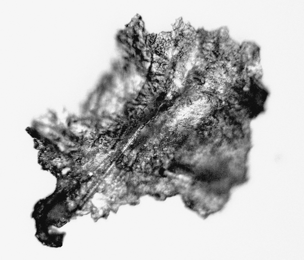
To him the world is a “landscape of data” and his task is to visualize that data. One of his projects is entitled A Mote it is to trouble the mind’s eye, the words spoken by Horatio in Hamlet after he and his comrades have seen the ghost of Hamlet’s father. Although they have seen the ghost, not everyone will believe them. Was the ghost real, or did they all imagine it?
9.1: Mike Phillips, A Mote, 2009.
Phillips begins with a mote, a speck of grit, which he actually found in the corner of his eye and removed with tweezers. It’s almost impossible to see, but then he magnifies it many times over to reveal that it is ragged and twisted, with a distorted surface, like a piece of shrapnel. Then he uses an enormously powerful atomic force microscope (AFM) to magnify it still further. The AFM reveals the landscape of its atomic structure, a world beyond sight, knowable only by data (numbers), processed with software to produce images. Phillips chose a blurred image to suggest the invisible world of atoms which actually make up the mote: the “ghost” of the mote is the “landscape of data,” be it from an optical microscope (data measured through our senses—sense data) or the atomic realm (accessible from data measured in numbers).
The term “mote” runs deep into history. It comes from Middle English, with Indo-European roots and Christian Masonic overtones, and represents the tiniest element possible, which nevertheless gives existence to things. That it has this power and yet is incredibly small “makes it a powerful talisman of nanotechnology.”

9.2: Mike Phillips, AFM Mote, 2009.
With his close-cropped salt-and-pepper hair and black T-shirt, Mike Phillips fits the deliberately dressed-down image of the artist. He studied at the University of Exeter, the University of Massachusetts, and the Slade School of Art at University College London (UCL), where he did postgraduate work. When I ask him why he went into art, he replies that he was good at physics, bad at mathematics, and excellent at pattern-matching. “Then the computer came along and offered me the vehicle to create real situations.”
There were other reasons, too. Widely read in the fledgling area of technological art, he had run across Robert Rauschenberg, Jean Tinguely, Billy Klüver, 9 Evenings: Theater and Engineering, and E.A.T.—“heroes of mine.” He was excited by the collaborations, the synergy of it all. He feels strongly that “digital art today makes the mistake of ignoring” these early pioneers. It’s typical of developing fields in science and technology to cut themselves off from their origins, akin to trying to understand the UK or the USA today while ignoring their roots.
While at Exeter, Phillips took an interdisciplinary course called 4D, named not after the fourth dimension but the number of the classroom where it was taught. Part of the course concerned computers, and just the right machine happened to be available: the ZX81, which was very popular at the time. Besides being inexpensive, it was relatively easy to assemble and program, perfect for the beginner. Phillips’s lifelong love affair with computers had begun. “I sometimes dreamed in BASIC” computer code, he says.
By the time he got to the Slade, it was phasing out its work in computer arts. He spent as much time as he could in the physics and computer science departments at UCL. He even played around with interactive programs and light shows for nightclubs. He also met Roy Ascott and became involved in the pre–World Wide Web network of artists through UCL’s then infamous email program, EUCLID. After taking a higher diploma in fine art in mixed media at the Slade, Phillips was offered a position at the University of Plymouth as professor of interdisciplinary arts, a title he had to negotiate for fiercely to ensure the interdisciplinarity he wanted.
In 1992, Phillips set up a course at Plymouth called media arts, based primarily in the computing department. He began spending more and more time there and recalls that “in the computing department I talked art more than in the art college.” Currently, after several years of negotiation, his work is more fully integrated into the art department.
Presently Phillips’s main interest is in nanoart, dealing with the unimaginably small, at scales a mere ten times the size of an atom. At the nano scale scientists have been developing new materials, a field which has become known as nanotechnology. One spectacular result was the production of graphene, an exceedingly strong material made up of ultrathin graphite layers, engineered on the nano level. Nanotechnology may also play an important role in detecting cancer and as a vehicle for drug delivery systems, in addition to opening new vistas in electronics.
Nanoart began with scientists who exhibited some of the strange structures revealed by the atomic force microscope (AFM), an instrument with a rounded silicon tip approximately one nanometer across (0.000000001 meters). The AFM can scan an apparently smooth surface at the nano level, producing a topographical map much like a mountain range as seen from outer space. These maps are as beautiful as a Mandelbrot set—the collection of points whose boundary is the familiar fractal pattern—or the images of stars from the Hubble Space Telescope. They are so strange that to the layperson they seem like nature’s art. Soon artists began to manipulate these images and a new form of art emerged, connected with technology.
An early example of nanoart was Nanobama, created in 2008 by John Hart, a professor of mechanical engineering at the University of Michigan. Using nanotechnology, he inscribed an image of President Obama on 150 million carbon microtubules—cylindrical structures made of carbon atoms, tens of thousands of times thinner than a human hair yet with the strength of steel. He produced the image of Obama’s face by scanning the microtubules with an electron scanning microscope. Hart intended this as a political statement of Obama’s high regard for science, as opposed to that of his opponent for president, John McCain. It was a straightforward use of nanotechnology by a scientist.
In 2000, Phillips participated in the search for terrestrial intelligence as part of his work as director of i-DAT, a branch of the Centre for Media, Art and Design Research at Plymouth University. The Wellcome Trust, the Gulbenkian Foundation, and the Arts Council supported this research. Whimsical though it sounds, it was actually a serious exercise in pattern recognition. The question was whether, from scientific data taken from space telescopes, patterns could be recognized indicating life on our planet. Phillips’s group wrote algorithms for perusing—“flying over,” as he likes to put it—a database of over 3,000 photographs. This was, of course, before Google Earth.
There was also a citizens’ science angle, in that all the photographs were on the Web and could be perused, and input was encouraged. The verdict was, “Not conclusive.” It would be difficult for aliens, scanning our universe from afar, to conclude that there was definitely intelligent life on earth. Similarly, it would be equally difficult for us to identify intelligent life on other planets using the space telescopes at our disposal.
Phillips believes that the scientists he has worked with now see data differently as a result of his input. “There are not enough collaborations,” he laments. Moreover, such relationships are fraught with difficulty, and he has noticed that “a lot of collaborations have not borne fruit.” It is difficult for artists and scientists to meet. “Speed dating,” where scientists and artists pair off for a few minutes to decide if they will get on, usually doesn’t work. Either the partnership “doesn’t root properly” or is short-term due to time constraints, usually the scientist’s.
When Phillips took up his position at Plymouth, he found a glass wall separating him from the more traditional artists, who chafed at the idea of introducing computers into the curriculum. “I always liked to operate outside of art per se; but operating in that way seemed threatening to traditional art.” Phillips has always tried to steer clear of the art world. When I ask if he sells his work, he replies that he isn’t dependent on that because he is a salaried academic and occasionally receives commissions and grants.
“I’ve always resisted galleries because I thought they were part of the problem,” he says. “But at a certain age, you go for the easy life, embracing the gallery, betraying your belief system.” Recently Phillips has designed installations specifically for galleries. His mote is displayed in the John Curtin Gallery at Curtin University, Perth. Visitors have responded positively. “They engaged with it.”
When Phillips’s involvement with computers first began as a young man, he probably never imagined he would spend his whole life working with them or what advances in technology there would be. “Whenever I fly over data fields, I relive that first dream in BASIC,” he says with a smile.
Experimenting with evolution: William Latham
“When scientists have data, sometimes they are constrained by it,” says William Latham. “But not artists.” Latham’s spectacular 3D mutating computer graphics have been the basis of games, have been featured in movies, and have been exhibited worldwide. Since 2007, he has been a professor at Goldsmiths College in London, teaching a master’s course in creating and programming computer games. He is certainly not constrained in any way.
At first glance, Latham’s office at Goldsmiths is more scientist’s den than artist’s studio. Books on computing codes and reprints of articles written for scientific journals are strewn around, including a copy of Evolutionary Art and Computers, the book he coauthored with the mathematician and computer graphics expert Stephen Todd. Brimming with computer code and computer-generated scientific drawings, it “brings together the worlds of modern art, geometry, and computer graphics, employing the underlying themes of natural evolution and artificial life,” according to its Amazon description—an extraordinarily ambitious brief.
Latham cuts a dramatic figure. With piercing eyes and sharp features accentuated by long, tapering sideburns, he sports a carefully coordinated geometrically-patterned shirt and tie. His father was a chemist at Harwell Nuclear Research Centre, his mother a composer and musician, so he had a “mixture of art and science from an early age.”
At Oxford he studied fine art and painted his way through the twentieth century. He took a particular interest in Russian Constructivism and appreciated the scientific element in it, particularly the focus on chance, which he also saw in the work of the British artist Kenneth Martin. There he also discovered computers and realized their potential to create art, but was frustrated at first by the difficulties of programming and the “apparent mismatch between how artists think and the implicit constraints of software.”
He moved to the Royal College of Art and frequently visited the nearby Natural History Museum where his interest was piqued by the theory of evolution. Could you apply this theory to abstract shapes? he wondered. What other forms might have developed? He worked out a system using rule-based art, where the artist selects objects, then lays down procedures for assembling them. “With just a simple set of rules, it was like a Pandora’s box. The wealth of possibilities was endless.”
He thought of two forms working their way up the evolutionary tree and imagined what might result if they came together. At first he used forms evolving out of geometrical shapes—cubes, tetrahedrons, icosahedrons, and funnel shapes. He drew up a set of rules for reshaping them and bringing lines together, making them bulge, twist, scoop, grow tendrils, stack, merge, or clone. He included deformations decided on beforehand, such as adding a bulging nose-like appendage. He even “married” certain forms to produce more complex forms that still bore a resemblance to their “parents.” All these forms were abstract; they did not occur in nature. In this evolutionary world, he was God. He decided which were the fittest on the basis of aesthetics—which he would allow to survive—and discarded the rest.
Latham graduated from the Royal College of Art in 1987. On a whim, he phoned IBM and asked for some sort of sponsorship. To his amazement, they offered him a post as a research fellow in the computer graphics unit at their UK research center in Winchester, to do whatever he wanted. At the time IBM financed research centers akin to the Bell Telephone Laboratories in Murray Hill, New Jersey.
There Latham met Stephen Todd, a computer graphics expert. The two set about expanding Latham’s evolutionary drawings. Their goal was to derive a new form of art from the evolutionary process.
Latham’s evolutionary drawings were “brainstorming, plagiarizing the natural world.” Todd applied science to this process, setting the evolutionary process into code for a computer. The next step was to discuss whether the resulting shapes were what Latham had had in mind.
They developed a powerful algorithm, Mutator, which contained the element of randomness, enhancing Latham’s rules for his original evolutionary drawings. With computer graphics, they were no longer confined to the original geometrical shapes but could generate a cornucopia of fantastic forms seemingly from an alien world, in a spectacular array of colors. They also built in a means to ratchet randomness up and down, and included dynamic elements such as going to sleep and waking up, letting the mutations turn themselves on and off. “The artist became like a gardener,” as Latham puts it.
The resulting forms unfolded in beautiful and strange ways, fantastic organisms from “possible worlds.” “Some artists,” Latham and Todd wrote, “feel that [Mutator] provides a genuinely new way of working, and it has certainly led to the creation of forms that would not have been created by other methods.” Nor, they might have added, could they have been imagined either.
The economic depression of the early 1990s forced IBM to shut down their research centers. By then, Latham had developed an interest in computer games and had to make a choice between academia and the world of business. His art wasn’t selling, the core of the problem being, as we’ve seen before, that “the art world was never very comfortable with computer art.” Finding the art world rather dull, Latham opted for business. For fourteen years he successfully developed computer games, and for ten of those years was CEO of his own company. To his amusement, he found that his evolutionary films showing otherworldly organisms unfolding, created for artistic–scientific audiences, were popular at “drug-fueled raves.”
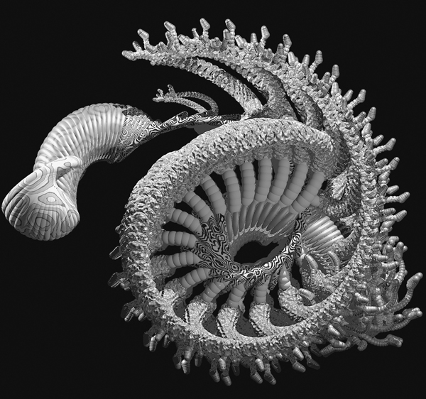
9.3: William Latham, Mutation X Raytraced. Bump mapped/Blue, 1993.
Nevertheless he still wanted to make a difference in the art world. In 2007, he became professor of computing at Goldsmiths, while retaining his games business. He also resumed his collaboration with Stephen Todd. They have streamlined their original systems, including Mutator, and are currently working on scientific visualization in protein folding with the bioinformatics department at Imperial College. Bioinformatics is the study of methods for storing, retrieving, and analyzing biological data, particularly in sequences of proteins in DNA. By interacting with each other, the chains of amino acids that form proteins fold to form the organs in our bodies. Unfolded proteins can be toxic, while defective protein foldings can produce degenerative diseases.
After a year, Latham and Todd succeeded in linking Mutator with codes used by the Imperial College scientists. They called the resulting code FoldGrow. Using scientific data, FoldGrow can create real protein structures as well as foldings not found in nature. Once again, Latham played the role of aesthetic filter, using the guidelines of “symmetry, elegance, and balance.” He describes this as “tech-inspired art.” The foldings FoldGrow produced were amazing, beautiful, and mesmerizing. “They looked organic but were completely artificial—they might, however, be on an alien planet,” says Latham, who also on occasion writes science fiction.
As the artist of the team, Latham had more freedom to use scientific data to produce new protein foldings. Scientists, he says, have to beware of “peer disdain.” “Scientists don’t want to be seen as doing something absolutely mad. But if you call it art, then it’s not mad!” While scientists have to take on board ethics and morals when they use data, for the artist anything goes.
“What I’m trying to do is to change the definition of art,” Latham says. “Art is running out of track. It’s time to go back to a Renaissance collaboration of artificial intelligence, geometry, and math [with art]. Otherwise, artists are just doing the same thing over and over again. Another white painting, perhaps slightly whiter, on a slightly heavier canvas. Meanwhile, the middle classes are just discovering art.” When you bring in computers, “then art becomes a research project.” This is why he returned to academia and continues to work there, in the computer science department. “The most stimulating debates,” he adds, “are with scientists. It’s better than working with other artists.”
When I ask whether he considers himself an artist, a scientist, or some combination thereof, he replies, “75 percent artist, 25 percent scientist.”
Visualizing data through sculpture: Erik Guzman
For three months, between October and December 2010, Erik Guzman’s Weather Beacon lit up the Winter Garden at the World Financial Center in New York City (see Insert). Shaped like an elegant assembly of large cogs, it occupied an eight-sided transparent box 16 feet long, 8 feet high, and 12 feet across. Its averred purpose was to beam out the weather forecast in a code of lights, using highly polished plates driven by weather report data input from the Internet. The plates, differently shaped but each distinctly human-looking, rotated as well as emitting flashing lights ranging from white—cold—to red—hot. When the light pulsed, it meant rain was on the way. Says Guzman, “It took three years’ real hard labor to plan and assemble!”
Erik Guzman inherited his curiosity from his grandfather, Fletcher Hanks, “a weird maverick inventor” who built a hydraulic digger to dredge up soft-shelled clams from the coast of Maryland, organized and participated in marathons and triathlons, and, as a pilot in World War II, made countless hair-raising trips “over the hump” in Burma. His advice to his grandson when he reached eighteen was to learn how to weld, scuba dive, and fly a plane. “Got the whole thing done,” Guzman says proudly.
Tall, lanky, and relaxed, Guzman studied sculpture at the School of Visual Arts, then went on a tour of Japan which “completely changed everything.” He was struck by the delicate scale of the architecture, the joinery, the anime films, and by Buddhism and Shinto. Back at the School of Visual Arts he took a master’s degree in sculpture and learned all he could about computers. He gradually developed an interest in digital art and, more specifically, in combining kinetic sculpture with data visualization.
Guzman’s kinetic sculptures are made of intricately machined, interconnected parts, a bit like the inside of a clock, and can be very large. As an undergraduate, he had the experience of building by hand, before digital methods became available. These days students start off immediately using digitally driven tools. “Very few artists understand the nuts and bolts” of what goes into producing a piece of sculpture, he contends. They have no appreciation of industry or the hands-on credo.
Guzman is inspired by architecture, especially in the way it deals with “humans reacting to spaces.” He admires the British sculptor Anish Kapoor, who has an architectural background. In computer art, he mentions the American digital artist and painter Jeremy Blake, whose animations were based on big fields of color. Of Jean Tinguely he says, “Anyone who sets the MoMA on fire is okay with me. Kinetics is a really scary world.” As for Alexander Calder, famous for his mobiles, “he really understood weight, gravity, and movement; there are parts in [his work] that are hard to explain.”
Guzman is fascinated by what he calls “digital as material, [the fact] that zero and one can carry the same weight as a piece of wood” in setting a kinetic sculpture into motion. This, he adds, is the link between macro and micro. He constantly thinks of unification in his works—of zero and one catalyzing the flow of electrons that turn metal wheels, as in Weather Beacon.
Weather Beacon was Guzman’s first public piece and he was delighted to be able to display it at the World Financial Center, where there are always people passing through. People liked Weather Beacon and expressed sadness when it was taken down in a special three-day event. One woman demanded, “What are you doing with my weather beacon?” He sees Weather Beacon as a data visualizer, “big enough that people can see it.” “Beyond apps, computers, iPads, and all that technology, there is a real need to have something tactile; visual tactility triggers tactile things in the brain.” He is keen to “educate the public as to what art is.”
When I ask Guzman whether he would call himself a data visualization artist, he replies with a chuckle, “It’s like the space race. Everyone is trying to coin the right terminology which will enter the canon of art per se.” Guzman is critical of categorization. He sees it as frivolous, adding sarcastically, “I wish I was sharp enough to figure out one of those lines. I think I’d be much further ahead.”
As for funding, Guzman points out that the federal government is trimming expenditures and has virtually cut off funding for the arts. Large high-tech companies such as Norton, Microsoft, and Google are beginning to step in and offer increasing amounts of funds. This could be to the “advantage of a culture” in which science, art, and technology are considered as one and the same, he says. Fortunately, some galleries in New York’s Chelsea have expressed interest in projects that combine art with science and technology. This is encouraging, Guzman says, because the private sector often looks to “Chelsea for signals.”
He sees a problem in that “most galleries go for flat paintings,” for which there is definitely a market. An artist approaches a gallery with an idea based on a combination of art and technology. As he describes it, “The gallery says, ‘Yeah, make this really cool thing, then come back to us and we’ll put you in a show.’ Then when you come back they say, ‘No, this is a little too much because we need insurance for the space and so, no, we can’t make this happen.’” The major galleries have a yearly overhead of about one million dollars—to cover maintenance, payroll, rent, and insurance, among other expenses—so why deal with something that may not be sellable? Galleries won’t buy the idea if they can’t sell the product.
Turning data into sculptures: Jonas Loh
Jonas Loh has found a way to bring data to life by expressing it in the form of extraordinary sculptures. Loh describes himself as a designer and inventor who searches for “new aesthetic forms while also researching how to communicate them.” For his undergraduate thesis in 2009, he and Steffen Fiedler, a fellow student, recorded the digital identities of eight people, using data from Amazon and Twitter and including their interests and listening habits. Using data visualization software they sifted out the similarities, aiming to produce a snapshot generated by the connections in this complex of digital identities.
They produced the final shape, or Gestalt—the essence or shape of an entity’s complete form—by rapid prototyping, a way of making a three-dimensional computer-generated form. The result is an extraordinary extruded sculpture that looks like a fossil or a seashell or some sort of alien life form, in line with Loh’s interest in synthetic biology, a theme in the Design Interactions Programme at the Royal College of Art. Loh and Fiedler entitled their thesis project The “Gestalt” of Digital Identity.
Loh, who is German, sports a shaved head and immaculately trimmed beard and speaks with absolute conciseness. He studied at the University of Applied Science in Potsdam, where he focused on data visualization, information visualization, and generative design. He then joined the RCA’s Design Interactions Programme, where he became interested in science through conversations he had with scientists at Imperial College. He began exploring complex data sets and ways to visualize them and communicate their meaning, as well as studying their ethical implications.
His key inspiration was not a person or an art movement but a software tool, open-source software developed by Ben Fry at the MIT Media Lab. This software is available free of charge and can be modified for one’s own use. It “made programming very easy for artists and engineers.”
What you need to begin with, says Loh, is an “interesting data set that communicates something,” such as, for example, the digital identities of the eight people he used to create The “Gestalt” of Digital Identity. First he applies data visualization software, such as a computer graphics algorithm called Marching Cubes which looks for eight neighboring points and forms a cube, then goes on to generate more complicated polygons. With luck, interesting patterns emerge. If not, Loh writes new, more complex software to represent the data. This is the point, he continues, where data visualization gets really interesting, and something brand new emerges. “What is produced is art.”
During the 2012 London Olympics, Loh and his colleagues captured the day-to-day excitement through Twitter. They collected and processed around 12.5 million Twitter messages, analyzing them for content and emotional tone and producing a real-time picture of the daily ups and downs. They called the project Emoto.
Once the games had finished, all the data was transformed into seventeen interactive sculptures, one representing each day. What emerged was a “new sort of angle on the Olympics in real time [in which] the data becomes explainable in a new way.” The data—numbers registering emotions—was given substance, becoming something you could touch and sense. The finished sculpture looked like an abstract mountain range, a landscape of peaks and troughs on a table 10 feet long, 2.5 feet wide, and 2 feet high. The dimensions of each plate, representing the data for one day, were 17 inches long, 6 inches wide, and 1 inch maximum in height.
Can visual techniques such as these help scientists analyze data? What he does is not really different, says Loh, from what scientists do. But what about the analysis of data that requires certain laws of physics to be applied, as in the Hertzsprung–Russell diagram of the life of stars? Could Russell have accomplished this today using data visualization software? “Absolutely!” says Loh.
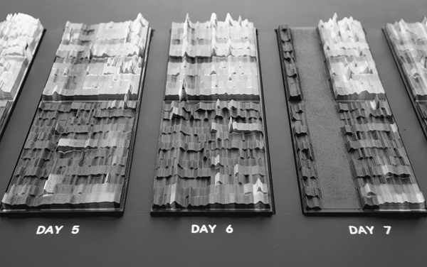
9.4: Jonas Loh, Emoto, 2012.
Loh’s view of aesthetics involves the communication of facts, which is, after all, what data visualization is all about. “Communicating data in an interesting way gets people involved to inquire what’s going on.” Aesthetics is a visual thing, tied in with information content. The higher the information content, the greater the aesthetic content. A concrete example is Harry Beck’s map of the London Underground—a visual representation communicating a great deal of information in a minimal graphical style. The Tube map looks beautiful and has become iconic.
Loh believes that “artists can only aid scientists” to find better methods of visualizing data. Often “scientists find it hard to actually think about their research in a different way,” he says, referring to his experiences with scientists at Imperial College. “Artists use technologies in an absolutely different context.”
“The border between science and art will melt away, enabling research to be dealt with in a more artistic way,” he goes on, adding that fields such as data visualization are in the forefront. “Blurring the line will lead to interesting new developments and to interesting new times.”
Data on a huge scale: Benedikt Gross
“The amount of data around these days is so big that it can’t be handled manually,” says Benedikt Gross. Take global warming. We hear about it daily, yet it’s difficult to visualize. Gross set out to do just that. He realized that NASA space missions had scanned the entire earth and produced hundreds of photographs with excellent data on elevations. But what about the seabed? Then he learned that the Scripps Institution of Oceanography in San Diego, California, had done a thorough survey.
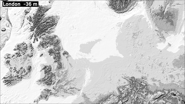
9.5: Benedikt Gross, a frame from Speculative Sea Level Explorer, 2013.
Running the data from these photographs with his own data visualization software, Gross produced a dramatic image—Speculative Sea Level Explorer—which can be adjusted so that the viewer can observe seas rising and the resulting effects on geography: coastlines change, countries shrink and sometimes even disappear, other regions increase in size, and economies collapse.
Around 2007, Gross noticed that “there were no books on computer design, on how to program an image.” So he and three colleagues sat down to write Generative Design: Visualize, Program, and Create with Processing, which was published in 2009. Before this, he had thought about computational design and what else it could be applied to. He started off with the idea that “it would be cool to program things to create visual representations.” “A logical next step,” he thought, “would be to merge computational design with accessibility to large amounts of data as an information visualization”—in other words, to make large amounts of data more meaningful by finding a way to represent them in visual form. “Programming to create a visual output is a new development,” he says.
Computational design—applying computational approaches to design problems—began in the 1960s, with Frieder Nake and Max Bense in Germany and Bell Labs in the USA. But it was not until the twenty-first century, when new programming tools and processing appeared, that it really got moving. This was when Gross became interested in it. “Visualization of data always interested me from a scientific point of view, long before it emerged as an art form.”
Gross started out studying geography and computer science at Stuttgart but decided that information and media were more exciting. He went to the University of Applied Sciences in Schwäbisch Gmünd, Germany, where he completed his thesis, which was actually a proposal for his book, in 2007. The book itself, the first of its kind, was published two years later to a glowing reception. Gross’s specialty is using computer art to create visualizations of data. He has won several awards and since 2011 has been in the Design Interactions program at the Royal College of Art, studying for a PhD. He and Jonas Loh seem cut from the same mold, from their physical characteristics to their terse way of speaking, interspersed with wry humor.
While a graduate student, Gross continued to consult. One such job was at MIT’s SENSEable City Lab, on the border between urban planning and architecture. The brief of the researchers is to study the life of the city in real time, with the aim of radically transforming it. In New York, particularly Manhattan, the vast majority of vehicles are taxis. The question is how to use them to move people around efficiently without creating traffic jams. There is a huge amount of data. Each taxi has a GPS system, and additional data includes tips and whether passengers pay with a credit card. At first sight, it seemed to the researchers to be data overload—and this set of data was for only one year. To deal with it, they hired Gross to work on a project funded by New York City and General Electric. “Visual design started out producing logos, etc.,” he says. “Now it has gone way beyond that.”
On arriving at MIT, Gross was confronted with a huge amount of abstract and uncorrelated data. He began by looking for a dispatch algorithm for routing taxis, seeking the best pickup and dropoff points. To do this, he worked with computer scientists, mathematicians, and urban planners. A big challenge was how to encode all the data. The researchers divided the city into rectangular grids of a fixed size. The upshot was a beautiful display of traffic running efficiently. One way they accomplished this was to model an ad hoc taxi service, running only along efficient traffic-jam-free routes, with multiple dropoff points—taxis of the future will be shared. Some of the computer calculations that went into the visualization took up to twelve days.
“As a designer I don’t care about certain things that concern scientists,” says Gross. Among these is whether a certain visualization of a set of data is unique. This can be of importance in science because it shows that nature really acts in a particular way and no other, but need not be for the designer. There can be lots of different sorts of Coca-Cola bottles, but only one Hertzsprung–Russell diagram. In that sense he believes that designers have more freedom than scientists.
I ask him whether the taxi project was a genuine collaboration, with each person benefiting from it. “Yes,” he replies, without batting an eyelid.
“Programming is going to be a new cultural technique,” says Gross. As far as programming is concerned, “we are in a time like photography was in the 1950s, expensive and expert-oriented. Now everyone takes photos with cameras and telephones. Photography is just a tool.” By this he means that we are entering a period in which people will very rarely program with code, but with apps. There is “no longer a programmer and an artist,” he continues. “They are one and the same.” Gross’s “coding style,” he says, differs from an engineer’s only in that it creates an aesthetic product that conveys information in a visually attractive way.
So what is the difference between computational art and design? “Art raises the question, and design solves it,” is his answer. He is careful to add that both are creative. “I think I’m somewhere in between.”
“The diversity is huge at the RCA,” he adds. “We play around with technology and create scenarios in nanotechnology and synthetic biology, almost sci-fi-like. We make prototypes which provoke discussions about whether we want them, whether they are beneficial to the planet. Instead of Design Interactions, it should be called ‘Speculative Design.’” Like others in this field, Gross is actively involved in designing all our futures.
Computers can have soul: Scott Draves
“I believe that computation can reproduce the whole creative process, and that ultimately computers can have soul,” says Scott Draves. If anyone can communicate that soul, he can. His almost sci-fi presence on my screen (I interview him on Skype)—shaved head with large features and the easygoing yet authoritative way he explains his work as a computer artist—gives the impression that he is definitely at one with the computers running his software.
Draves’s spectacular images are everywhere. He is the magus of software art. He is the inventor of Fractal Flames, the first ever open-source graphics software, creating ever-changing images which conjure up brilliantly colored feathers, galaxies, coral reefs, and all sorts of symmetrical and asymmetrical natural forms. Versions of Flame appear all over the world in advertisements and on book covers, including the cover of Stephen Hawking’s 2010 book The Grand Design. “A graphics package is like a language, and Flame is a visual language, to use the term like Kandinsky did,” says Draves, referring to Kandinsky’s idea of a “language of form and color.” Draves is also the creator of Electric Sheep, run worldwide as a screen saver.
When Draves was ten, in 1978, his parents bought him an Apple II and he “dove right in.” He was a natural at programming, quickly moving on from games to constructing graphics. When I ask Draves what he did before computer art, he replies, “There was no before. I’ve been a math computer programmer guy pretty much my entire life.” And an artist too, in the new sense of the term—not wielding a paintbrush or a sculptor’s chisel, but a graphics package.
At high school Draves continued doing computer art, “at home and alone,” he recalls. He didn’t think it was anything that anyone would be interested in. Studying computer science at Brown University, he found himself spending more and more time with the large computer graphics group there and realized he was not alone. When he showed them his art, they said it was not only cool but “pretty exotic.” Nevertheless Draves “still didn’t think of himself as an artist.”
That happened in graduate school, at Carnegie Mellon University, in Pittsburgh, where he was working on a PhD. Ever since his early days working on an Apple II, Draves had been interested not in using the computer to calculate but as a way to produce the unexpected, to make complex images using algorithms. At Brown he became interested in fractals and wrote a program that produced images which could be used as input for further computations. He called this the Flame algorithm, “creating art out of math.”
The calculations, however, turned out to exceed the power of the computers at Brown and also at Carnegie, forcing him to simplify the complex equations he was using. The resulting images, however, were not so good. Then in 1992 he spent the summer at the Nippon Telegraph and Telephone Corporation in Japan, where he had access to a supercomputer. He was finally able to solve his equations in all their glory, “to reveal the beauty contained in them.” What emerged were ravishing images, some geometric, some organic, eerily evocative of natural forms.
Back at Carnegie, he showed the images to his PhD supervisor, who advised him not to publish them but to enter them in the competition at Ars Electronica in Linz. It was 1993. He won an honorary mention in the Prix Ars Electronica for the image Flame #149. Draves’s immediate reaction was, “Holy shit, this is art.” He was ecstatic, he had discovered his calling. “This was really what I wanted to do.”
Flame was probably the first open-source digital art. Draves took this route, instead of selling it, because he believed that scientific results should be freely shared. This accorded with his support for the GNU Project, begun in 1983 by Richard Stallman at MIT, the premise of which was that the best way to free computer users was to allow them access to all software, enabling them to share, copy, and modify it.
9.6: Scott Draves, Flame #149, 1993.
This seems enough to satisfy the requirements for a PhD, but in fact Draves’s PhD topic was “much more complicated,” as he puts it. It was related to metaprogramming—the theory of computer languages, of giving meaning to logical statements in a program, and of how people communicate with computers. He finally completed his thesis in 1997.
Two years later he came up with Electric Sheep (see Insert). When a computer is asleep, Electric Sheep comes alive and the computers communicate with each other, producing elaborate abstract forms that continually change when animated. Each user can design their own screen saver or sheep. The animations appear on everyone’s screens and users can vote for their favorites. Following the principle of the survival of the fittest, popular sheep live longer and can reproduce and mutate via a genetic algorithm. Draves sees this as a system combining humans and machines, a cyborg mind made up of hundreds of thousands of computers all working together and all based on mathematics. Computer scientists call it artificial life—mathematics generating biological phenomena that emulate Darwinian evolution.
Draves names as one of his key inspirations Alan Turing, the great British pioneer in computer science and the mastermind behind Bletchley Park, where he designed and built the first digital computer in order to break German codes during World War II, contributing significantly to the Allied victory. Then there was science fiction, which fueled Draves’s dreams as a boy, together with concepts like artificial intelligence and artificial life, which led him to wonder, “What is life in the abstract sense? Can it exist in nonbiological and chemical substrates?” Big questions.
Draves’s artistic inspiration is Karl Sims, an American computer graphics artist who played an important role in using genetic algorithms which mimic Darwinian evolution. Computer artists may use lines and geometry, as in architecture, while algorithmic artists use graphics packages to create images that constantly change according to the algorithm. What Sims did was to make creatures out of assemblages of blocks, move them around, make them fly, and subject them to the laws of evolution. Certain shapes did better than others. These were saved and constituted starting points for further evolution, passing on the good traits to future generations.
Around 1995, Draves recalls, he was “struggling with the definition of information and meaning.” He had come across many definitions by people like Erwin Schrödinger, Claude Shannon, “the father of information theory,” and Gregory Chaitin, an important contributor to computer science, especially algorithms. Draves felt uncomfortable with their definitions because “they kept trying to quantify [information].” Then he came across the anthropologist, semiologist, and cyberneticist Gregory Bateson, who famously said that information is “a difference which makes a difference.” Draves recalls, “It was a sign to me that information (and hence beauty) could not be quantified, or reduced to an equation. But I was also reassured that I could trust myself to recognize it. And so I was able to continue to pursue creativity.”
“I want to be surprised by the computer. I want to give up control. I want to exceed my imagination,” says Draves of the images his algorithms produce. It’s the public, not him, who makes aesthetic judgements on creations such as Flame and Electric Sheep, and the evolutionary machinery in his software makes variations on that basis. Some of the choices may not be to his liking, but that makes it democratic.
I ask him whether there are times when he knows what he wants and writes the software for it. “You’re right,” he says, “it’s not black and white.” Naturally “for sellable items I select what art collectors pay for.” He will then go through the sometimes thousands of images produced and “pick out the best ones, in my opinion, of course.”
“I have a love relationship with technology and computers, and my artwork tries to express that,” says Draves. This wonderfully expresses the almost symbiotic relationship between Draves and the computer. I ask whether he believes that computers can be creative and even produce art. “Yes,” he continues, “although collaborative. Some comes from the computer but most comes from myself and my colleagues. [The computer plays] a minor part, but I feel its presence.”
Recently the celebrated futurist Ray Kurzweil, who is also a computer scientist, inventor, and Google executive, predicted that by 2045 there will be robots whose intelligence will surpass that of humans. This is part of what he calls the singularity, when progress will outstrip human ability to comprehend it. Working together with humans whose intelligence and constitution have been enhanced by nanotechnology, machines will dominate life on earth.
Like many computer scientists, Draves thinks Kurzweil overoptimistic, especially as regards the date. But he does think that “there’s something going on. Computers and mathematics can capture the essence of life.” This view may seem materialistic but, after all, he says, the brain is ultimately made up of atoms which obey the laws of quantum physics which, in turn, can be programmed into a computer. So, “in principle computers can think.” He agrees with Kurzweil on “the arc of history.” Computers are becoming faster and faster, he points out, taking over more and more tasks, like translating and finding information, using powerful search engines like Google. He sees nothing to stop this trend. “This is really getting spooky. I see more of a merging of man and machine. If you approach AI with fear,” he adds, “this will slow down advance and could precipitate just those conflicts we are afraid of.”
Draves “hates science fiction in which there are wars between man and machine. Somebody has to take the first step forward to promote friendship. Giving up some kind of control is okay.” Losing control completely would certainly be a disaster, and probably generate a Terminator scenario.
When I ask Draves whether he considers himself an artist or a scientist, he replies, “Both.” His business card says “Software Artist.” I mention that people at MIT and NYU describe themselves as researchers. “Everybody wants to be cool,” he replies.
He likes the term “scientist,” he says, but insists he isn’t one because he doesn’t do experiments, and a lot of computer science is really engineering. Yet it is here that you find a blurring between art and engineering.
Draves has won many awards. His work has been shown at Moma.org, the Museum of Modern Art’s website, and has appeared in Wired and Discover magazines. It is also an official skin for Google Chrome—a personalized visual appearance for a Google Chrome page generated by purpose-built software that changes the image at intervals. Dreams in High Fidelity, which he considers his masterpiece, produces an infinite variety of patterns in the lobby of Google’s headquarters and has been bought for corporate and residential collections nationwide. He also recently produced a work he calls 243, commissioned by the Gates Center for Computer Science at Carnegie Mellon University. But he has yet to crack the establishment art world.
“The art world doesn’t care about technology and vice versa,” says Draves. The problem with gallery curators, he goes on, is that they “don’t understand the material and can be fooled,” which might result in them trying to sell inferior works. There is also the layperson’s fear of anything to do with science or technology.
Furthermore, there is the problem of reproducibility. “Anything that’s digital is copyable and so in conflict with the concept of sole copy or unique artifact.” Materials also wear down, requiring repair and in some cases modernization, which again runs up against the concept of original artifact. “Barriers to acceptance are still numerous.”
“The electronic world has created its own world, a ghetto, really,” he says. He is optimistic that barriers will come down, though within his world opinion varies from “It’s over, we’ve won,” to “Never, they suck,” to “I like being separate.” One way out may be via today’s twentysomethings, who are entering the art world equipped with technological savvy—though “we’ll have to wait another twenty years for them to become forty and take over.”
Draves discusses all this with his wife and business manager, Isabel Walcott Draves, who is also an Internet strategy consultant. In 2009, in an attempt to break down barriers, she founded Leaders in Software and Art, to put people working in the field into contact with each other. These include software and new media artists, curators, collectors, coders, and collaborators. She organizes monthly salons and occasionally daylong conferences featuring the best artists and speakers from the salon.
Says Draves, referring to Charles Saatchi, the powerful and influential London art dealer and gallery owner, “We have to get past irony and get Saatchi on board!”
Breathing life into data: Aaron Koblin
“I create art with data,” says Aaron Koblin. “We live in an exciting time and we must take a step back, look at that data, and try to understand it.”
One of Koblin’s first projects was Flight Patterns (see Insert). He describes it as being “visually exciting while also related to our lives, giving us new perspectives on how we are living.” To put it together, he used a huge amount of data assembled by the Federal Aviation Administration, gathered by monitoring aircraft across the US for twenty-four hours on August 12, 2008, including altitudes, makes, and models of more than 205,000 different aircraft. The result is a fascinating, ever-moving animation showing the flight paths of all these aircraft over the United States. As we watch, first the East Coast lights up as the red-eye flights come in from Europe and the early morning flights leave, then the West Coast comes alive, in a complex, elegant, and beautiful spiderweb of activity, like the flights of a myriad of fireflies.
Viewers can home in on cities, observing the density of flights above New York’s three airports, for example, or isolate the different types of airplanes or the different altitudes. Certain areas of the US remain stubbornly black, as if they are no-fly zones—a fruitful area for conspiracy theorists. Apart from the sheer beauty of the animation, it’s also a very effective way to communicate a huge amount of information, drawing out the patterns in a vast amount of data.
“I’m 50 percent artist, 50 percent nerd,” says Koblin—a self-effacing self-portrait of the creative director of the data arts team at Google.
Born in 1982, Koblin has won many awards for work that uses data visualization to explore how we interact with systems of our own creation. His work is in the permanent collections of the Museum of Modern Art in New York, the Victoria and Albert Museum and Tate Modern in London, and the Pompidou Center in Paris, and was exhibited at the Japan Arts Festival for several years running. Tall, boyish, with floppy dark hair, he radiates confidence and expertise combined with a laid-back Californian manner.
Koblin was interested in computers from an early age. At the University of California, Santa Cruz, he studied computer science and took a minor in film studies. He then did graduate work at the Department of Design and Media Arts at UCLA. One of the professors there was the artist Casey Reas.
Reas was the creator of Procession, an open-source programming language which could be used to create patterns. Koblin was intrigued by “those systems and [wondered] how [he] might generalize them.” He also crossed paths with Mark Hansen, a professor of statistics, who had become disillusioned with studying data just as numbers. He preferred “doing artwork about live data using algorithms for sorting and managing data,” connecting this to the way these numbers relate to our lives. “I was excited about visuals coming out of procedural programming and also about the context of working with data to understand our humanity,” Koblin recalls.
Flight Patterns was enormously successful, so much so that Koblin was approached by the SENSEable City Lab at MIT and asked to participate in a research project to create a visual representation of the way New York communicates with itself and the rest of the world. Using data provided by AT&T on SMS messages broadcast out of New York, Koblin and his colleagues at MIT produced a spectacular multicolored animation which they call New York Talk Exchange, with spikes of yellow leaping up at certain times of day when the volume of SMS messages suddenly increases. The work was shown at the Design and the Elastic Mind exhibition at the Museum of Modern Art in 2008.
Koblin did a similar project on SMS messages sent from Amsterdam. At midnight on New Year’s Eve, there is an explosion of yellow as millions of “Happy New Year” messages are sent. These are dazzling examples of the power of data visualization to create a story out of what is at first sight an overwhelming mass of data.
Koblin is also famous for his crowdsourcing projects, made up of input from tens of thousands of online volunteers. The first of these was The Sheep Market. He put out a request online for drawings of sheep, facing to the left, to be drawn with software provided by Google, in order to investigate the way each one was constructed, and collected through a Web service created by Amazon called the Mechanical Turk (after a medieval chess game supposedly played by a machine but in reality operated by a human being).
Koblin’s inspiration was projects like the Search for Extraterrestrial Intelligence (SETI), in which thousands of people contribute idle time on their computers to help sort out the huge number of signals from outer space striking the earth. Instead of idle computers, Koblin used idle brains, people who were happy to contribute online for a fee of two cents per drawing. They were allowed a maximum of five. Ten thousand sheep arrived in forty days, after which Koblin closed the project down. Still more arrived. Clearly people were driven by motivations other than money. Koblin viewed and approved the sheep, rejecting 662 which “didn’t meet sheeplike criteria.” He then assembled the drawings in a grid. Animations of how each sheep was drawn can be seen online.
Data visualization is very different from scientific visualization. Type the words “black hole” into Google and what comes up are classic images of a black hole as a round opening in space, surrounded by swirling lines representing gas particles snared by the black hole’s enormous gravitational attraction. These are drawn by artists on the basis of mathematical models based on data of what a black hole is supposed to be—scientific visualizations, not art. Scientists sacrifice artistry in order to explain their views simply to colleagues and the public, Koblin says, whereas “I try to reembody data into a context that makes it relevant and emotionally satisfying in some way.”
Koblin starts off by using a set of data with already existing software. “If I find something interesting then I ask further questions. For me the pursuit is really about distilling, about simplifying, about making a very clear argument. What I’m interested in is more explanatory. Sometimes it’s more about asking questions than about pursuing them.”
I tell him about the Hertzsprung–Russell diagram and ask whether he could make a similar discovery by using his data visualization tools to examine scientific data. Koblin replies that his group at Google Sky, which harvests data from several space telescopes including the Hubble Telescope, NASA satellites, and the Sloan Digital Sky Survey, could potentially make new discoveries.
He draws an interesting distinction between the two main ways of representing data: infographics and data visualization. Infographics is a means for conveying statistics and ideas, as in the map of the London Underground. It is a means of storytelling, he continues, similar to what Edward Tufte, the pioneer of data visualization in the early days of computers, advocates when he writes about clear, articulate representations which are also beautiful. Koblin prefers data visualization, which is “time-based and so opens up different sorts of narratives, whereas what Tufte proposes is static.” Data visualization methods “allow interfaces enabling you to ask new questions, to toggle on and off parameters, reading the data differently.” Thus, in Flight Patterns, you can home in on air traffic in specific cities at specific times of day or night. He hopes that the software he and others in his team write will be able to “pull out a pattern like the Russell thing.”
As far as beauty, he says, it’s a gut feeling on seeing something that is “cleanly designed.” It’s about “telling a story in its form, it resonates properly with what I’m interested in creating. It’s a reaction that you must have.” Then there is “the emotional test: is it exciting?” Koblin takes a set of data and applies some standard software to it. If something interesting emerges, he writes new software and hopes for something to appear that stimulates a gut feeling, thereby passing his emotional test for what is aesthetic.
At Google, Koblin interacts with engineers, as he did when he worked at MIT. He believes that at present artists profit more from collaborations than scientists. How the artist benefits “is tangible [while] what scientists get out of it is less tangible, but perhaps the pursuit is as valuable.” In his opinion, scientists and engineers need to learn to “think in terms of shifting perspectives and enthusiasm.” The problem is that “in the worlds of science and engineering some magic disappears because they are so wrapped up in what they are doing.” Then “there is the communication problem,” which goes beyond the issue of artists merely working for scientists as illustrators. His own work with engineers involves “pushing technology to the limits,” so automatically the engineer gains some benefit.
The next issue is to find a way to “help esoteric scientific pursuits to be communicated properly,” how to make his work more accessible to others in data visualization as well as to the public. He also needs to satisfy administrators “cutting checks for those working in such niche, highly esoteric realms,” who want to know where the money is going.
Koblin has exhibited in galleries and art museums around the world. “I have been in and out of favor [and] am not particularly concerned” with the establishment art world. In his opinion, “currently galleries have a love of relics in which everything is commodifiable; it is a difficult thing for art to exist in a world of capitalism.” Koblin rarely sells his work. “It’s more for collectors.”
“I’ve been studying art for about twelve years, but I’m not sure I know what that means because the term ‘art’ is in flux,” he says. There are various names for fields that have arisen skirting art, science, and technology, among them, computer animation film, digital music and sound art, interactive art, hybrid art, and digital communities. “A lot of people in the ‘maker culture’ are not concerned with debating over where their work fits,” Koblin comments. “Any distinction between art and science is becoming increasingly irrelevant.” “New terms continuously arise, like ‘media’ and ‘media art.’ Perhaps we should just call the whole thing ‘media art.’”
It’s worth quoting at length his thoughtful view of art as research, which is the crux of his work:
I do see art as experimentation. It’s fundamentally the process of combining things that have never been combined before. I’m fascinated by the process of translating ideas from one reality into another and ways that systems and structures can influence and guide new creation. To some extent art is an excuse. It’s a word that we use for yet-to-be-defined progress—necessary experiments in thought space which help us define and test limits. These are experiments that allow us to question, reflect, discover, and appreciate.
Koblin vividly describes his mode of research at Google—testimony that lateral thinking can sometimes be effective:
At Google, I think we have a healthy mix of team work and solo time. We quickly and comfortably share as a team, creating a rich pool of ideas that we can discuss and experiment with on our own. I’ve seen great ideas come about in casual conversation, and greater ideas be proposed by individuals and then be taken to even greater heights while being “implemented” and experimented on by the team.
Together with a colleague, Chris Milk, Koblin has managed a rare achievement in data visualization or, for that matter, any sort of art that borders on technology: an exhibit at Tate Modern. This Exquisite Forest has a room to itself. It is a spinoff of the Surrealist game Exquisite Corpse, in which players add to a drawing or a sentence without knowing what comes before. It was a hit in Parisian cafés and exported as the game Consequences.
9.7: Aaron Koblin and Chris Milk, This Exquisite Forest, 2012.
This Exquisite Forest is played online with software provided by Google. As the artists describe it, “users create short animations that build off one another [resulting in] a collection of branching narratives resembling trees.” Viewers at Tate Modern can see the evolving image on a huge screen; zeroing in on each “leaf” with a cursor reveals the animations. Like The Sheep Market, This Exquisite Forest is a crowdsourcing event.
“This is very much the age of big data,” Koblin concludes.
Visualizing the world of science: W. Bradford Paley
W. Bradford Paley turns data into visualizations that can actually be read to provide an enormous amount of information, from charts for clients on Wall Street to complex diagrams that lay out different aspects of scientific research. They are also beautiful. His most famous “map,” Relationships among Scientific Paradigms, is a schema relating the number of times scientific papers are cited in different fields of research (paradigms) and the key words and concepts they use. The nodes are linked not with straight but with curving lines, with tiny words swirling off at the edge like the wisps of a peacock’s feather. For all its seriousness of purpose, it’s a beautiful image that almost gives the impression of flying (see Insert).
Paley designed Relationships among Scientific Paradigms together with Kevin Boyack and Dick Klavans, using data provided by the Institute for Scientific Information, an academic citation indexing service. The image first appeared in Nature magazine in 2006. Paley describes it as follows:
The image was constructed by sorting roughly 800,000 scientific papers (shown as white dots) into 776 different scientific paradigms (red circular nodes) based on how often the papers were cited together by authors of other papers. Links (curved lines) were made between the paradigms that shared common members, then treated as rubber bands, holding similar paradigms nearer one another when a physical simulation had every paradigm repel every other: thus the layout derives directly from the data. Larger paradigms have more papers. Labels list common words unique to each paradigm.
Relationships among Scientific Paradigms was so popular that it was featured in SEED, Discover, and dozens of other magazines around the world. Paley was so touched by the size of the response and the number of requests for copies that he gave it away for the cost of shipping and handling. Those who have seen it have been struck by the delicacy and beauty of the differently colored nodes and curved lines of varying width that connect the nodes. Paley says he chose curved lines to connect the links because straight lines would have obscured one another, hiding the density of links where it might matter most. The printed edition, 42 by 43 inches, is eminently readable.
But, iconic though the image is, Paley himself was far from satisfied with it. “Today such a representation would never leave my lab,” he says. “My driving goal is to find beauty in the world, not in my translation algorithms.” Part of what he disliked was the wisps of “hair,” made up of key words from papers in a certain paradigm, and how “seductive they are—they really grab your eye,” whereas Paley meant them to have only a “playful meaning.” This effect was “at odds with the informative goal. The wisps of hair are actually distracting.” He concluded that the “meaning or sense of the information transmitted by the representation was a mess [in the first version].” The tiny white dots representing scientific papers needed a darker background.
A perfectionist, Paley set to work to improve the image. He transformed the nodes representing paradigms into transparent colored circles, making them into single visual elements, and cut out the individual white dots he’d used to represent each paper. The lists of words still looked like hairs, but he pushed them into the background by printing them in gray, emphasizing the colored nodes; this gave the data more prominence. He also used a more modern typeface. (See Insert for the new versions.)
Paley’s colleague Dick Klavans, an expert in scientometrics—the art of measuring the impact of scientific publications in one field of study on another—suggested a variation on the data to discover what sort of science major nations focused on. Paley responded by setting up his representation in such a way that he could peel data off the main figure to produce representations showing the number of scientific publications on a particular topic in a particular country, shown in the bottom row of images. Thus the USA and the UK focus research on medical sciences, while France and Germany are weighted more toward chemistry and physics.
“Photography was very formative for my future,” says Paley. When he was fifteen and already an accomplished photographer, he was printing commercial photos of grapes when he lost track of whether he had printed a particular negative. He noticed that the photographic paper was not properly aligned and moved it into place. When he developed it, he found that he had double-printed. He had moved the paper by the width of half a grape. The result was extraordinarily “visually engaging.”
Excited by his discovery, he went to his local library to inquire whether any other photographer had ever done this. Instead of books on photography, the librarian sat him down in front of books about Cubism and art history. “Studying the Cubists led me to wonder about the structure of the mind,” about how Picasso and Braque had created Cubism, and then to look into cognitive science.
When he reached the age to apply to a university, “Dad wouldn’t pay for an art history and philosophy degree, so I studied economics.” As a minor subject he did computer science and found he was pretty adept, enough that he ended up working at Citibank and then Lehman Brothers as a coder. But his real love was his evening job, where he developed tools for animators. There were few in the early 1980s. To his surprise, he found designing the tools more interesting than making animations.
Following up on this interest, in 1982 he founded Digital Image Design Incorporated, creating user interfaces for data visualization—in other words, ways for the user to access representations of data. Paley was especially interested in data issues in the financial sector because of the cognitive complexity of the task and lack of an inherent spatial structure in the data, and subsequently established the first significant financial data visualization team at Lehman Brothers; night and day jobs had merged.
“Personally and emotionally, my driving goal is to find beauty in the world,” including in the data we move around in, Paley says. Here his experience as a photographer comes to the fore, in that to obtain the proper image you have to “select it and draw it out of the world.” The rules of selection are not arbitrary. To Paley, the most important thing is “the meaning from information process.” Aesthetics comes second. By “meaning,” he means how well a visual representation can be understood, as opposed to one that verges on the abstract.
He also believes that visual representations must not be oversimplified or conventionalized. As an example, he takes the customary visualization of a black hole—a well in space represented by a deformed grid defining the depression inside which a star is collapsing. “This is dangerous,” he says. “The layperson could take this as real and think there exist actual grid lines defining the fabric of space, or that the warp is only two-dimensional, like a piece of graph paper.”
When he came to create his improved version of Relationships among Scientific Paradigms, Paley tells me, the key was, quoting Bateson, that “information is the difference that makes the difference.” Now he had a representation with meaning, one which drew the eye to the most meaningful parts. Finally the new representation was aesthetic, an object of art unto itself. Paley says with some satisfaction, “I am a designer. I design tools for everyday use. As a secondary goal I want to make them attractive because that improves engagement with the tool, and I like to make pretty things. I like to make people happy.” He was still, of course, not completely satisfied. It was still too “hairy”-looking, some letters were upside down, and there were still too many overlaps. He is fiddling with it to this day.
Paley is also involved in designing interfaces for the New York Stock Exchange. Here there are no images to be evoked. It is “not meant to pull on the retina, but on the mind.”
Basic to all of his work in data visualization is, as he puts it, “How do you make a mark on a page that makes somebody think?”
Paley has worked with the great pioneer of data visualization, Edward Tufte. “As a curator,” he says, Tufte “brought together hundreds of years of the most inspiring work ever [and] the way he categorized these things is pretty damned good.” Nevertheless, in Paley’s view, much of the work Tufte collected has become too abstract; the representations worked more as a result of their retinal effects than their effect on the mind—their understandability. Paley’s own work tends in the opposite direction.
“If I create something and someone considers it art, then it’s art,” says Paley.
He quotes James Joyce’s Portrait of the Artist as a Young Man: “If a man hacking in fury at a block of wood . . . make there an image of a cow, is that image a work of art?” Stephen Daedalus’s reply is negative. Paley replies conversely that it is, even when the man does not intend to produce a work of art; it becomes art by the act of the viewer or curator, not the creator. Much of the work “blessed” by curators and thus turned into fine art was created to be tools.
His one counterexample is CodeProfiles, commissioned explicitly as art for Codedoc, an exhibition curated by Christiane Paul at the Whitney Museum of American Art in New York in 2002. “Codedoc” refers to the code documents that generate a work. For this exhibition, Paul commissioned miniature works from twelve artists, one of whom was Paley. Their task was to write code (program) to connect and move three points in space, a brief that could be interpreted in any way they wanted. What made the exhibition unique was that each artist had to display their code. The software itself was part of the exhibit.
Without the code there would be no work of art, just as without paint there would be no painting. To take this analogy further, the curator emphasized that what makes a painting unique is the artist’s brushstrokes. In Codedoc, the artist’s brushstrokes are their codes.
Code is written in arcane symbols and each artist has their own style. Like music notation, the symbols carry instructions. Writing code, the New York new media artist John F. Simon Jr. argues, is a form of creative writing. So the works on display at Codedoc could be enjoyed on two levels: watching the animations, and reading the code and appreciating the creative process that went into making it.
Even in the usual case, when the tools are appropriated as pieces of art, Paley sees his work as “artifacts out there in the world.” He is delighted when people invite him to exhibit. “I’m the maker of Duchampian pre-readymades, then the curator turns them into art.” Paley, however, turns down most invitations to exhibit because he disagrees with the aesthetic agendas of the curators.
Does he consider himself an artist or a data analyst? He replies, “Neither. I’m a toolmaker who tries to understand how analyzers analyze and how artists represent. I’m a designer, a ‘cognitive engineer’ applying the findings of science and art to perform the engineering task of building tools for analysts. I’m programming the human mind, using human-recognizable visual code.”