3
Back in junior high school, would you have paid attention and done your homework just as diligently for a male teacher who came to school in tattered jeans and a T-shirt as one who wore a dress shirt and tie? A Canadian study reported on what students thought ‘‘their friends’’ would do under these two different conditions. Findings from this study are used to illustrate some key statistical concepts covered in this chapter.
This chapter, along with the next, will acquaint readers with statistical concepts that play an essential role in nearly all social science research. For those who have had a course in statistics, these chapters will build on what you have already learned. If you have not yet taken a statistics course, these chapters will acquaint you with a number of concepts essential for grasping the role of statistics in social science research.
Mathematics and science are different. Whereas science primarily deals with empirical phenomena (things that can be observed through the senses), mathematics is focused on logical rules. Science and mathematics have become intimately linked over the past few centuries because mathematics can be useful in depicting many aspects of the empirical world. For instance, to describe how old the attendees were at a large convention, one estimates the average. Social scientists do similar things in describing the subjects in a study, but they do so in accordance with agreed-upon mathematical rules. These rules are called statistics.
THE NATURE OF UNIVARIATE STATISTICAL CONCEPTS
The most basic set of statistical concepts used by social scientists are called univariate statistics. As the prefix uni implies, univariate statistics pertain to a single variable. This chapter explores various aspects of univariate statistics. Afterward, attention turns to understanding how scientists make judgments about the statistical significance of their findings.
AVERAGES
The word average is a word every English-speaking person has heard, but many people are unaware that the term can have several specific meanings. As a result of different meanings, it is possible to be misled when discussing averages. Suppose, for example, that one is in a class of ten students, nine of whom are twenty years old, and one of whom is eighty years old. If one were to calculate the average age by adding all of the individual ages (260) and dividing by the total number of students in class (ten), the average age would be twenty-six. Most people would not feel quite right telling people that the average age for the students in this class was twenty-six, even though it would be technically true, at least according to one way of calculating average.
So what does average mean as statisticians use the word? Average is defined as any measure of central tendency. Most measures of central tendency assume that one is dealing with interval- or ratio-level variables. In other words, it is relatively meaningless to ask what the ‘‘average gender’’ or the ‘‘average religious preference’’ for a class is, since these are nominal variables.
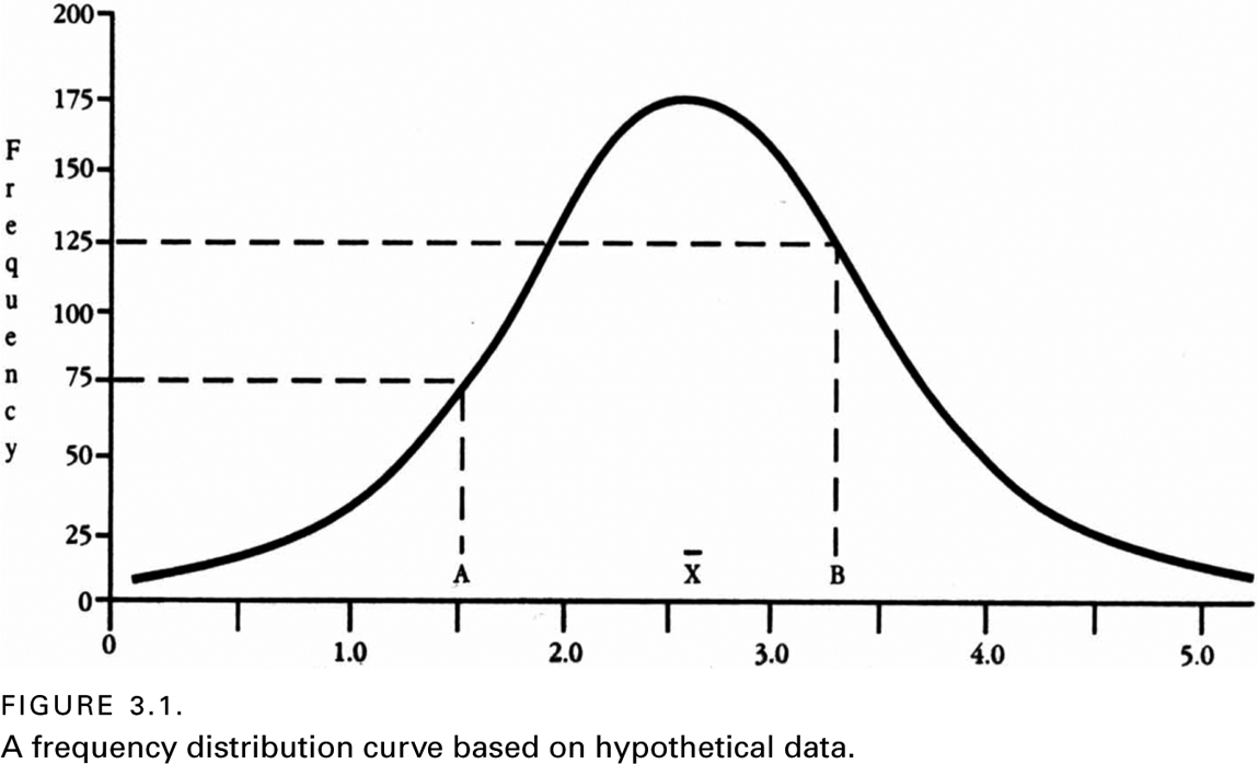
To conceptualize the full range of what is meant by the word average, consider a simple graph, called a frequency distribution graph (or curve). As with nearly all graphs, a frequency distribution curve has a vertical axis (called the Y-axis) and a horizontal axis (called the X-axis). The Y-axis is used to represent the number of observations for a particular sample, and the X-axis is used to calibrate the variable being measured. Figure 3.1 represents a frequency distribution curve in which a special kind of curve—called a normal (or bell-shaped) curve—is represented.
A frequency distribution curve allows a researcher to visualize how many subjects received each particular score or rating. Thus, in figure 3.1, one can see that at Point A, 75 subjects got a score of 1.5 and at point B, 125 subjects got a score of 3.3. Few frequency distribution curves have a shape that is as symmetrically shaped as this one. Nevertheless, many distributions are sufficiently close to resembling a bell shape as to warrant assuming that, if they had been based on very large samples (e.g., hundreds of thousands of subjects), they would perfectly resemble the shape of a bell. Within the context of various frequency distribution curves, three types of averages can be delineated.
The Mean
The type of average with which people are most familiar is called the mean. This type of average is defined as the result of adding up the values (or scores) pertaining to some variable for a group of subjects, and then dividing the total by the number of subjects. Another name for this type of average is the arithmetic average. In a normal distribution (such as the one shown in figure 3.1), the mean is located at the highest point in the middle of the curve, directly above the X with a bar over it (sometimes the capital letter M is used to represent the mean).
The Mode
Another type of average (or measure of central tendency) is called the mode. Mode means ‘‘hump’’ or ‘‘peak.’’ (When one orders pie a la mode, one has not asked for pie with ‘‘ice cream on top’’; one has literally asked for pie with ‘‘a hump on top.’’) The mode is defined as the most frequently observed score in a distribution curve. Obviously, for a curve that is normally distributed (as in figure 3.1), the mode is in the same location as the mean. So one may wonder why there are separate concepts if the mode and the mean are in the same place. The answer is that not all distribution curves are normally distributed (bell-shaped).
Look at the frequency distribution curve in figure 3.2. This curve is said to be bimodal because it has two modes rather than one. Suppose a researcher conducts a survey at a strange convention of professional racehorse jockeys and basketball players. If one asks all the attendees their heights and plots the results on a frequency distribution curve, one will probably get a distribution that is bimodal.

If one calculates the mean height for those attending this convention, it would probably be around 5′5″. Such a figure would obviously be misleading to anyone who associated ‘‘average’’ with what is most typical, since it is not likely that any of the attendees would be 5′5″. In this case, a researcher would probably tell readers that, for this particular population, the sample was bimodally distributed, and that one mode was, say, 4′5″ and the other mode was 6′2″.
Although the example of a convention of racehorse jockeys and basketball players is obviously contrived, there are times when real-life variables are bimodally distributed.
In the field of evolutionary biology, for example, as two new species or breeds begin to diverge from a common ancestral stock, there is often a time during the transition when some of the traits for the diverging population will take on a bimodal distribution. For instance, as one segment of the population is adapting to a warm climate and another is adapting to a cold climate, the length of fur in these two populations might well become bimodally distributed. In an example more relevant to social science, at least one study found that human females exhibited a bimodal distribution in a test of spatial reasoning, with one group being near the range of the average male, and the other group being clustered around a considerably lower point (Kail et al., 1979).
The Median
The third type of average commonly recognized in science is the median. It is defined as the fiftieth percentile (or the midpoint) in a set of numbers that have been arranged in ascending order. More technically, the median is the point along the X-axis above and below which each half of the distribution is found. Referring back to figure 3.1, one can see that the point where half of the sample is above and half of the sample is below on the X-axis is exactly the same location as the mean and mode. So, again, one may wonder why this third type of average is necessary. The answer is that there are certain types of distribution curves for which neither the concepts of the mean nor the mode are appropriate.
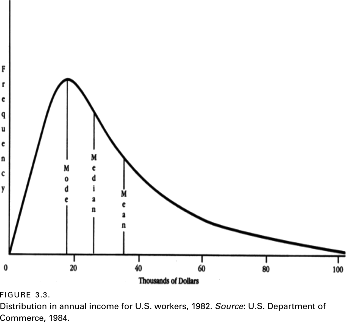
Figure 3.3 is an example of a distribution curve that is better described in terms of a median than either of the other two measures of central tendency. This curve is said to be skewed, and the direction of the skew is toward the higher values, where one can see that the curve tapers off more gradually than it does to the left. (To remember the difference, associate the word skewed with squished.)
Income in virtually all countries is skewed. The fact that income is not normally distributed means that descriptions of average income can vary, depending on the measure of central tendency used. In the case of figure 3.3, if one had taken all of the money earned in 1984 and divided it by the number of wage earners, the average income in that year would have been over $35,000. This is much higher than the amount earned by most wage earners. If one were to report the peak in the distribution curve, average income could shift widely from one year to the next by simply changing the legislated minimum wage.
Consequently, when average income is reported, the median income is the measure of central tendency that is nearly always used. In 1984, one can see that the median was roughly $27,000. Half of U.S. workers earned more and the other half earned less.
Frequency distribution curves that are at least slightly skewed are fairly common, although they are less common than normally distributed curves. Variables linked to age—such as the age distribution of persons in most countries, or the age distribution of persons involved in crime—are nearly always skewed.
Figure 3.4 presents a second example of a skewed distribution. This graph is based on the records of divorces granted in the United States in 1979, and shows the number of years couples were married before they divorced.
Based upon figure 3.4, what would be the average number of years of marriage for persons who were divorced in 1979? Obviously, one would need to note that the distribution was substantially skewed, and therefore the answer depends on what is meant by ‘‘average.’’ The mode, median, and mean would all be different. Specifically, the mode would be at three years, the median would be around seven years, and the mean would be in the vicinity of ten years.
Sentence lengths that prisoners receive are also most always skewed. Most persons get one or two, or even five or ten years in sentence length and very few persons get twenty-year, thirty-year, or even life sentences. What if you administered a survey in which you asked people to indicate the number of times they have done something illegal? Do you think the responses would be normally distributed or skewed? Hopefully, you strongly suspect the latter.
DISPERSION
The other major feature of a frequency distribution curve is called dispersion. This concept refers to the degree to which scores are tightly or loosely scattered about the measure of central tendency (i.e., mean, mode, or median). Various ways of measuring dispersion have been developed, but the most widely used method is standard deviation.

Standard Deviation
For variables that are normally distributed, a very useful shorthand way to describe dispersion has been devised. Because normally distributed variables are so prevalent, this standardized measure of dispersion has numerous statistical applications.
To conceive of this measure, look at figure 3.5, and imagine that it is a slippery slide and that someone is located at its summit (the mean). Notice that, as this person descends down the slope (in either direction), he or she will reach a point when the curve stops bending outward (convexed) and begins bending inward (concaved). Imagine that a vertical line is drawn through that point until the line intersects the X-axis; the distance between that intersect point and the mean is called standard deviation.
The most common symbols used to represent the standard deviation are s and SD. In statistics, there are general rules for differentiating these symbols that are not relevant to the present discussion. For this text, we will use the symbol SD. There are specific mathematical formulas in statistics that are used to calculate the standard deviation. However, for purposes of reading research reports, one only needs to have a mental picture of standard deviation.
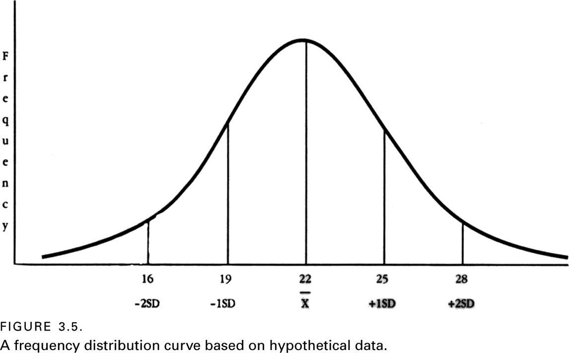
Using the numbers shown along the X-axis of figure 3.5, note that the mean is at approximately twenty-two, and the standard deviation is about three. Thus, if you start at the mean and begin counting forward, you encounter +1SD at twenty-five, +2SD at twenty-eight, and so on. Similarly, counting back from the mean (i.e., to the left), one encounters -1SD at nineteen, -2SD at sixteen, and so on.
To understand the power of standard deviation in conjunction with the mean, one should know that it is possible to construct any normal curve simply by knowing the curve’s mean and standard deviation. Figure 3.6 makes this point clear. Mathematically, it has been determined that 34 percent (approximately one-third) of an entire population will have a score between the mean and the first standard deviation on either side of the mean. Thus, two-thirds of the scores for a normally distributed variable will fall between the first standard deviation on both sides of the mean. Close to 95 percent of the scores will fall within the first two standard deviations. And, for all practical purposes, all scores for a normally distributed variable are captured by three standard deviations. (Theoretically, a normal curve of distribution never intersects with the X-axis.)
By knowing the few numbers represented in figure 3.6, it is possible to make a number of deductions about scores for any normally distributed variable simply from knowing the mean and the standard deviation. Consider the following simple illustration. One reads an article that reports that the mean was thirty and the standard deviation was five for scores on a social science exam. If two hundred students took the test, one can now figure out how many students received a score higher than forty. The answer is roughly 2.5 percent of two hundred, or five. This answer is derived by inserting thirty as the mean for the normal curve, and noting that forty comes at the second positive standard deviation (since the standard deviation is five). Because only 2.5 percent of the population remains beyond the second standard deviation, one multiplies .025 by two hundred students to estimate the number of students who will get a score higher than forty (.025 × 200 = 5).

The mean and standard deviations are fundamental concepts in the social sciences. You will find the terms used in most research reports. In fact, even the much more complex statistics that social scientists use often incorporate these two concepts as underlying elements.
Other Measures of Dispersion
There are other measures of dispersion that one encounters when reading research reports. One is called the range. If the variable is being measured at the interval or ratio level, the range is defined as the top value for a variable minus the bottom value. This simple concept of dispersion has limited utility because it is quickly altered by one unusually high or low value. Any extremely unusual score in a variable’s distribution is called an outlier.
Another measure of dispersion is called the variance. It is defined as the standard deviation squared. Scientists use the concept of variance as a conservative indicator of the entire spread of a population with respect to scores on a variable.
Describing the dispersion of scores for variables that are skewed, bimodally distributed, or otherwise not bell-shaped is less standardized than for normally distributed variables. The most common measure of dispersion of non-normally distributed variables divides the distribution into quartiles. Quartiles are calculated by arranging all the scores in order, and then counting until one reaches intervals containing one-fourth, one-half, and three-fourths of the population. If this sounds reminiscent of procedures used to determine the median, it is because the median and the second quartile are the same thing (i.e., the fiftieth percentile). While quartile is a cruder measure of dispersion than standard deviation, the concept of quartile can be applied to distribution curves that do not conform to normal distributions.
ILLUSTRATING THE CONCEPTS OF AVERAGES AND DISPERSIONS
Following are a couple of examples of studies whose findings can be reasonably well interpreted with nothing more than the concepts of mean and standard deviation in mind. The first example was alluded to at the beginning of this chapter.
Students’ Responses to How Teachers Are Dressed
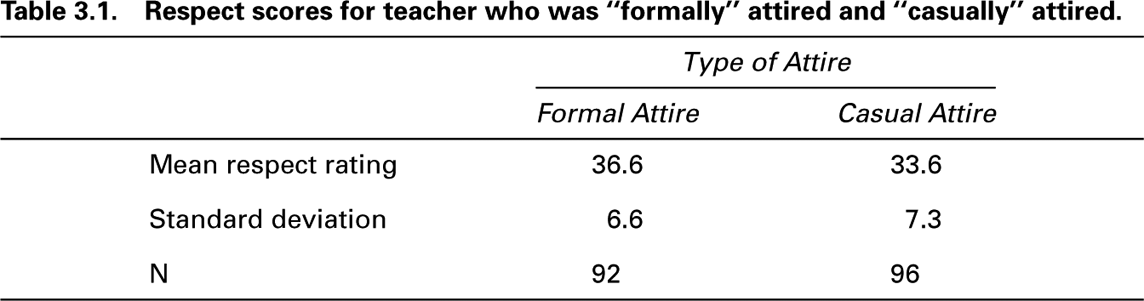
To assess how clothes might alter the respect that male teachers receive from students, two hundred Canadian junior high school students were shown one of two different photographs of the same male teacher (Davis et al., 1992). In one photograph, the teacher was dressed in a business suit and tie, and in the other photograph he was casually dressed in a T-shirt and jeans. Answers from twelve of the students were not used because they did not complete the questionnaire properly, making the final sample ninety-two students who rated the teacher neatly attired and ninety-six students who rated him casually dressed.
The students were asked twelve specific questions about how they thought a good friend or classmate would respond to the photographic teacher. The questions included, ‘‘Would your friend do assignments given by him?’’ ‘‘Make smart remarks to him?’’ ‘‘Disrupt the class?’’ ‘‘Pay attention in his class?’’ and so on. Students answered each question on a five-point scale ranging from ‘‘definitely not’’ to ‘‘definitely.’’
In coding the returned questionnaires, the researchers assigned numbers from one to five to the responses (with five meaning the most respect); then they totaled these twelve responses for each subject as a final ‘‘index of respect.’’ Thus, the scores on each student’s respect rating ranged from a low of twelve to a high of sixty. A summary of the results is presented in table 3.1.
Try to answer the following question based on information presented in table 3.1: Focusing just on the casual attire rating, what percentage of students rated the casual attire with a rating greater than 41? Here is how to make a quick estimate: If one adds one standard deviation to the mean rating, one gets 40.9, which is very close to forty-one. That means that 34 percent of the ratings will lie between 33.6 and 40.9, leaving essentially 16 percent of the ratings above a rating of forty-one.
Here are two similar questions for readers to answer: First, concerning the formal attire ratings, the top 16 percent of the ratings would have begun with what number? Second, the bottom 16 percent of the ratings would have begun with what number? (For the answers, see note 1 for this chapter in the Notes section near the end of this book.)
BUILDING THE CONCEPT OF STATISTICAL SIGNIFICANCE
Having explored various types of averages and dispersions, it is now time to consider the important concept of statistical significance. The need for such a concept can be made apparent by asking the following question: What if someone asserted that the two averages presented in table 3.1 (36.6 and 33.6) are essentially the same? In other words, they are the sort of averages that would have occurred by chance, which means that, in fact, the typical student does not react any differently to teachers based on how well they dress. Now, suppose that someone else makes the opposite argument, asserting that these two averages are obviously different from one another, and therefore one’s manner of dress does matter. The bone of contention is this: Is it reasonable to consider a difference of three rating points more than would simply occur by chance?
Can we hope to settle the disagreement without bloodshed? Fortunately, the answer is yes, provided that those involved agree on certain statistical principles (which nearly all social scientists do accept). These statistical principles have to do with what are called rules of probability. When these rules are combined in certain ways, they can be used to create a concept known as statistical significance. Without this simple concept, and the rules upon which it is grounded, science would be chaotic.
The Concept of Probability
There are ways to ‘‘bias’’ a coin so that it will fall to one side more times than to the other. For instance, the ‘‘heads’’ side could be made of a heavier metal than the ‘‘tails’’ and then the edge of the coin could be beveled inward toward the ‘‘heads’’ side just enough not to be noticeable.
Suppose that someone gave you two coins and asked you to determine if either of them had been made in a biased fashion, but you were not allowed to actually do any physical inspection of the coins. All you could do is toss each coin ten times. Assume you did this and got the following results:
Coin 1 six heads and four tails
Coin 2 eight heads and two tails
Obviously, you would be more likely to suspect that coin 2 was the biased one, but how confident would (or should) you be? Statisticians have developed some basic rules that can aid your intuition.
One rule of probability is called the multiplicative rule. It states in part that one can multiply the probabilities of several similar individual events (like coin flipping) to derive an estimate of the probability of any combined number of those events. To illustrate, using a completely fair coin, the probability of getting heads the first time it is tossed is two or .5, and the probability of getting heads in the second toss is also .5. So, the multiplicative rule states that the possible outcome for two coin tosses is .5 × .5 = .25 for two heads, and the probability of getting one of each is .50. Using this sort of logic, one can also calculate the probability of getting six heads or more out of ten tosses and eight heads or more out of ten tosses. For those who are curious, the answers are .2051 and .0439, respectively. The likelihood of getting eight out of ten heads with a fair coin is considerably less than the likelihood of getting six out of ten.
Probability in a statistical sense refers to mathematical estimates of the likelihood of various events taking place. In thinking about probability, one should keep in mind that all probabilities range from 0.00 (0 percent) to 1.00 (100 percent). Also, many more complex events than coin tossing and dice rolling can be estimated using rules of probability. One of the main reasons for this is that the probability of many types of events conforms almost perfectly with normal curves of distribution (Hinkle et al., 1988, 157).
Mathematical proof that many statistical probabilities can be expressed as normal curves of distribution would carry this discussion far from the focus of this chapter, so it will not be presented here. Nevertheless, for those who are still a little reluctant to believe that scientists can often use probability-based statistics to make reliable judgments of a probabilistic nature, consider the following example.
An Amazing Example of Probability
In a room with thirty people, there is approximately a 70 percent chance that at least two of the room’s occupants have the same birthday (but not necessarily the same year). To get a sense of why this is true, assume we pick you and one of the other twenty-nine persons (we will set aside leap-year births for simplicity’s sake). The probability that you and this person will have the same birthday is 1/365 or .0027. Actually, it is a little higher since births are concentrated in some months more than in others (Bobak, 2001).
A probability of .0027 is obviously not much of a chance, but note that both you and this other person have this same probability of matching birth dates with the remaining twenty-eight people in the room; thus .0027 × 28 = .0810 (or 8.1 percent). If a third person is chosen at random, there is a .0027 × 27 probability that he or she will have the same birthday as any one of the remaining twenty-seven people (i.e., .0729). Add this probability to .0027 and .0810, and one is now up to a probability of .1566 (or 15.66 percent). Then the fourth person that is chosen has a .0027 × 26 probability of having the same birthday as the remaining twenty-six people, and so on. When finished multiplying and adding all these probabilities, one comes to .71.
Each person added to the room beyond thirty raises the odds of matching birthdays considerably. With sixty people in the room, it is a virtual certainty (.994), although one will not actually reach 1.00 until 366 people are in the room. To increase the odds of a match to about 90 percent certainty, one needs to have about forty birthdays picked at random.
Skeptical? Test it empirically. If there are fewer than thirty people in the room you select, have some of them throw in the birthday of their mothers to get your sample of birth dates up to at least thirty. (Hint: Comparisons of birthdays can be done most quickly by asking how many were born in each month and then having those born in each month state the actual day.)
Thinking Scientifically, Thinking Statistically
Almost every conclusion reached by scientists has at least some probability of being incorrect. Scientists seek to estimate what that probability is, and then attempt to keep it at a minimum when drawing conclusions. As we have just seen, it is possible to make probability estimates using some basic rules.
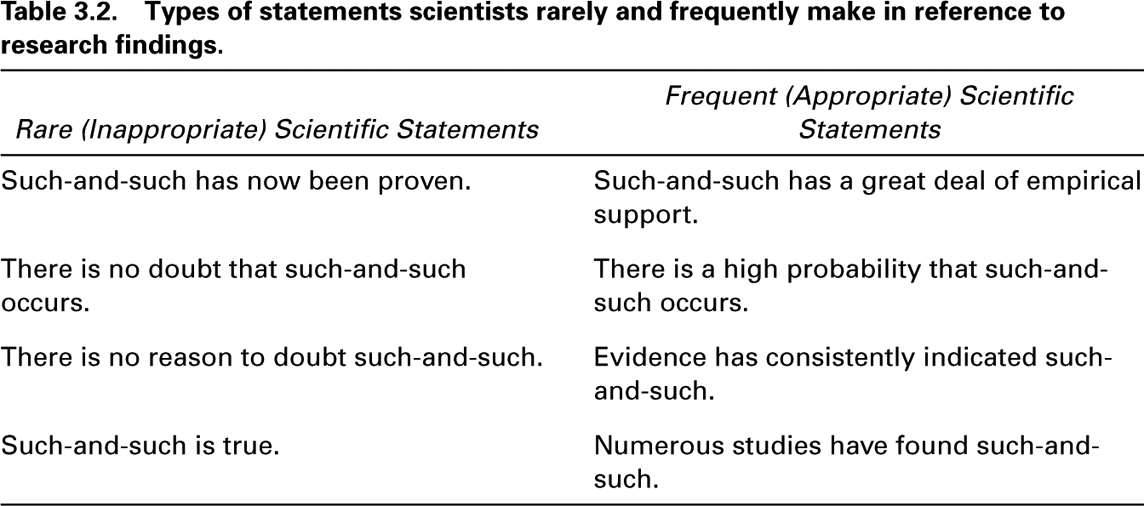
Because of the probabilistic nature of science, scientific writing contains few emphatic statements. Table 3.2 contains some examples of the sort of nonprobabilistic statements that rarely appear in scientific reports. Alongside these statements are similar statements that acknowledge the fact that nearly all scientific findings are tentative. This tentativeness is due not only to errors that are sometimes made in measurement, but also to the fact that nearly all scientific research is based on samples, and samples do not necessarily reflect what is the case in an entire population. Often times, samples are not collected in a manner that makes them representative of the population from which they were drawn.
In thinking about writing for a scientific audience, it is important to notice the difference between the statements in these two columns when writing research reports. Remember to use statements similar to those in the second column rather than those in the first. In addition to being less emphatic, statements in the second column also direct the reader to the evidence, rather than simply to the conclusion.
Why are scientific statements so guarded and unemphatic? In part, the reason is that scientific knowledge is always tentative and nearly always stated in statistical terms. As one delves deeply into most areas of science, especially social science, it is not uncommon for research findings to disagree with one another. The confusion associated with these inconsistencies is minimized when each researcher explicitly acknowledges that his or her findings are not definitive and are associated with at least some probability of being incorrect (which in fact is always the case).
One needs to accept the fact that science creeps, rather than leaps, to ‘‘the truth.’’ It is a grindingly slow social process, in which no single researcher simply proves something once and for all. When thinking and writing for a scientific audience, be careful not to overstate the weight of evidence derived from any one study.
The .05 Probability of Error and the Concept of Statistical Significance
We have now established that essentially all scientific research findings run at least some risk of being inaccurate, and we have shown that rules of probability can be used to estimate the chances of such inaccuracies. Let us now consider how much of a chance of inaccuracy should be considered acceptable, keeping in mind that a zero chance is essentially not an option.
Nearly all scientists use a 5 percent cut-off for judging statistical significance. This means that they will consider a finding ‘‘statistically significant’’ if there is only a 5 percent chance (or less) of a finding being simply a random event, and they will not declare it significant if the probability exceeds 5 percent. When researchers present these probabilities in research reports, the numbers are usually expressed in decimals (e.g., .05) rather than in percentages (e.g., 5 percent).
Probabilities of error are often preceded with the letter p (called a p-value), which is followed by an equal sign ( = ), a greater-than sign (>) or a less-than sign (<), and then the probability estimate itself. Therefore, if one reads ‘‘p > .05,’’ one knows that what was reported fell short of being considered statistically significant. When reading ‘‘p < .001,’’ one knows that the finding was very significant, because there was less than one chance out of a thousand that its occur-rence would be a statistical fluke.
Returning to the findings summarized in table 3.1, recall that an unresolved issue was whether a mean rating of 36.6 was significantly higher than a mean of 33.6. Now for the solution: Using a statistical test that will soon be described, the researchers who conducted the study (Davis et al., 1992) determined that by declaring the two means significantly different, they risked only a 1 percent chance of doing so in error. Therefore, they concluded that the junior high school students gave significantly higher respect ratings to the formally attired teacher than to the casually attired teacher. Nevertheless, the differences were obviously still only modest. Thus statistical ‘‘significance’’ means ‘‘reliably present’’ rather than ‘‘important’’ or ‘‘strong.’’
HYPOTHESIS TESTING AND THE CONCEPT OF THE NULL HYPOTHESIS
As is explained more fully in chapter 13, a hypothesis is a tentative statement about empirical reality, which may or may not be true. A null hypothesis simply posits that no relationship or no difference exists in whatever is being studied. In other words, when researchers put forth a null hypothesis about two or more variables, they are hypothesizing that the variables are not related to one another, or that there are no differences between two or more groups with reference to the variables under scrutiny.
The null hypothesis is usually implied rather than stated. Thus, even though a researcher does not explicitly state the null hypothesis, it looms as an implied alternative to any hypothesis that is stated. Researchers normally state and test what are called alternative or research hypotheses. These hypotheses assert that there are relationships or differences among whatever variables are being studied.
To illustrate the null versus the alternative hypothesis, let us discuss a personality-attitude study (Kish & Donnenwerth, 1972) that will be further explained in chapter 4. The researchers found a significant relationship between sensation seeking and dogmatism-authoritarianism for males, but not for females. What these researchers found can now be stated as follows: The null hypothesis was rejected in the case of males, but it could not be rejected for females. Since the null hypothesis is normally only implied, researchers often speak of ‘‘retaining it’’ or ‘‘failing to reject it.’’
Until the concept of the null hypothesis is elaborated on in chapter 13, keep in mind the following point: Whenever an alternative to the null hypothesis is accepted, by implication the null hypothesis is rejected. Conversely, whenever the null hypothesis cannot be rejected, all alternative hypotheses must be rejected.
INFERENTIAL STATISTICS
Mathematicians (and other number-orientated intellectuals) have been toying with probability estimates for centuries (Hacking, 1991). Some of this tinkering has been incorporated into valuable statistical tools that social scientists often use in their research. A few of the most widely used of these statistical tools are considered here.
The statistical tools that one should be most aware of are those used for assessing statistical significance. These tools are collectively known as inferential statistics, because they allow researchers to make inferences about rejecting and accepting hypotheses. In this chapter, the focus is on three of the most widely used inferential statistics: the t-test and ANOVA, which are used for comparing means, and chi-square, which is used for comparing proportions.
The t-Test: Comparing Two Means
One of the simplest and most widely used applications of mathematical probability is one called the t-test. It is a relatively simple test that can be used for comparing two means to determine if they can be considered significantly different from one another. The t-test is also occasionally referred to as student’s t. The t-test was developed by a statistician named William Gosset who worked for the Guinness Brewery in Dublin, Ireland. Brewery policy prevented him from publishing the paper introducing the t-test under his own name, so he published it under the pseudonym ‘‘Student.’’
How does the t-test work? As noted earlier, many probability estimates conform almost perfectly to normal curves of distribution. This makes it possible to apply these probability estimates to the study of many real-world events that also resemble normal curves of distribution. The t-test was developed for this purpose.
Without delving into the mathematical details, the t-test is relatively easy to understand. To use it, a researcher basically needs to determine the two means to be compared, their respective standard deviations (SDs), and the sample size upon which each mean and SD was based. The square root of each SD is then used to derive what is called a standard error (SE) of the mean. An SE provides a mathematical estimate for the stability of one or both means.
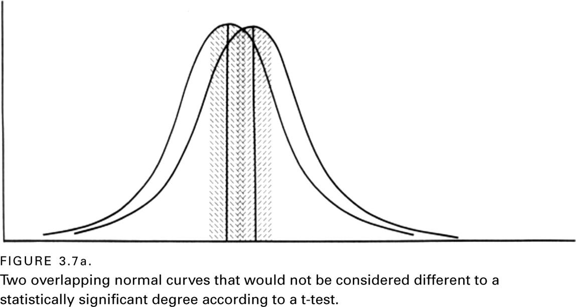
One can visualize the final steps in deriving an estimate of statistical significance using a t-test by comparing figures 3.7a and 3.7b. In the case of figure 3.7a, one can see that the means are very close to each other, and that their respective SEs (represented with shading) overlap one another. Performing a t-test on the results of the data set shown in figure 3.7a reveals that these two means cannot be considered significantly different from one another.
In contrast, consider figure 3.7b. There, the reader can see that the means are much farther apart, and that the SEs do not overlap. This is clear evidence that the means should be considered significantly different from each other. Without generating graphs such as those shown in figure 3.7, a t-test will yield a simple number (usually called a t-value), along with an associated probability that the t-value occurred by chance. If the p-value is less than .05, then the two means are declared different from one another to a statistically significant degree.

Here is an illustration of the t-test in action, beginning with a question. Who receives better grades in college, men or women? Over the years, several studies have investigated this question and most have concluded that women get better grades (e.g., Caldas & Bankston, 1999, 51; Olds & Shaver, 1980, 331; Summer-skill & Darling, 1955), although the fact that males and females gravitate toward different majors complicates direct comparisons. To eliminate variability in gender differences in the courses taken, one can compare the grades men and women receive when taking the same course. Two U.S. studies have compared the grades of men and women with reference to courses in introductory statistics. One study found that females obtained slightly higher grades, but not significantly so (Buck, 1985), while the other found that females received significantly higher grades than males (Brooks, 1987).
Now focus on the second of these two studies. To obtain his data, Brooks (1987) went back over the grades he had given to over three hundred students who had taken a statistics course from him over the previous ten years. He assigned all As a four, all Bs a three, and so forth. The average grade for the men was 2.21 and the average grade for the women was 2.74. The question that then needs to be answered is whether these two means are different enough from one another to be considered statistically significant. Based on their respective SDs (converted to SEs) and the sample size, Brooks performed a t-test. The result was t = 5.30, p < .001. Guess what he concluded.
If one is following the logic so far, one will notice that the p-value in Brooks’ study is very, very small (less than one in a thousand). This means that if Brooks were to declare the two means significantly different from one another, he would be risking less than one chance out of a thousand of doing so in error. In light of those statistical odds, one should have no doubt about what Brooks concluded regarding which gender did best in his statistics course. (In statistics classes, you learn how to actually calculate t-values. If you are curious about how to interpret a t-value, it can be roughly translated as stating the number of standard deviations separating two averages, and more than two standard deviations will usually be statistically significant.)
For another illustration of the t-test, let us return one more time to the Canadian study of student ratings for teachers based on formal versus casual dress. The average differences were shown in table 3.1, and we have already noted that the findings were considered statistically significant. Here are the actual numbers reported: t = 2.982, p < .0032. Take a moment to write out a sentence that would essentially summarize what anyone knowledgeable in inferential statistics would conclude from these numbers. (See note 2 in the Notes section near the end of this book to check your answer.)
ANOVA: Comparing Two or More Averages
To compare more than two means at a time, another inferential statistic, called analysis of variance (ANOVA) is widely used. ANOVA is a bit more complicated mathematically, but the underlying statistical principles of probability are very similar to those developed for the t-test (Howell, 1989, 220). Depending on the exact nature of the data being analyzed and the types of questions being addressed, there are advantages to ANOVA that are not discussed here.
To illustrate ANOVA, consider a study undertaken by two educational psychologists to compare three different approaches to teaching artistic expression to young school children (Cox & Rowlands, 2000). The three approaches they chose to compare were a conventional one used in Canadian public grade schools and two experimental approaches, one taught according to the Montessori (1912, 1965) method and the other by the Steiner (1909/1965) method. In order to maintain our focus on how the researchers analyzed their data, we do not discuss the nature of the differences between these three educational approaches.
Two people were used to judge the quality of the artistic works created by the sixty children involved in the study (twenty children having been taught by each of the three approaches). The averages ratings by the two judges of each student’s artistic works are presented in table 3.3. One can see that the average rating for the artistic creations of children from one of the three approaches was rated quite a bit higher than the other two, but is the difference statistically significant?
The ANOVA statistic is expressed with the letter F; it and its accompanying p-value were as follows: F = 6.27, p < .01. Look at these numbers, and formulate in your mind what they would allow the researchers to conclude. If you are focusing on the low p-value, you are on the right track. If this number suggests to you that there is very little chance that the three means are equivalent, you are reasoning as you should. If you conclude therefore that one of these means must be significantly different from one or both of the other two, your conclusion would be the same as that of the researchers who undertook the study.
There is more to the study on teaching artistic expression than the comparisons shown in table 3.3, and questions can be raised about how comparable the three groups of children were and about the appropriateness of the ratings given by the two judges. Nevertheless, the study illustrates the essential logic of ANOVA, which has several additional elements that can be used with even more complex data.
Chi-Square: Comparing Proportions
Thus far, the concept of statistical significance has been illustrated by discussing examples in which means are compared. However, researchers sometimes want to compare proportions instead. For this task, the most widely used statistical test is one known as chi-square (X2).
To see how chi-square works, consider a study undertaken some time ago to determine if people who commit suicide are more likely to do so during the full moon than during other phases of lunar cycle (Lester et al., 1969). Here is how the study was designed: The researchers used records from a New York coroner’s office to determine when 399 suicides occurred relative to the four phases of the twenty-eight-day lunar cycle (each phase consisting of seven days).
Lester and his colleagues reasoned that 99.75 of these suicides would have occurred by chance during each of the four phases of the lunar cycle. They then sought to determine if more than 99.75 suicides occurred during the full moon phase of the lunar cycle. Indeed, 102 suicides occurred during that time. Was this significantly more than one would have expected to occur by chance? To answer this question, the researchers entered their observations for the four lunar phases, along with the numbers expected by chance, into a chi-square formula. Manipulating the numbers according to the formula yielded the following: X2 = 1.07, df (degrees of freedom) 2, p > .25.

Had the researchers involved in this study declared 102 significantly different from 99.75, they would have risked a .25 probability of doing so in error. This risk, of course, far exceeds the .05 error limit normally set in scientific research in order to consider a finding statistically significant. Thus, the study concluded that there was no significant tendency for suicides to occur more often during the full moon than during the moon’s remaining three phases. (The chi-square value itself along with its associated degrees of freedom are needed to calculate the probability estimate, but need not concern us here.)
CLOSING REMARKS ABOUT STATISTICAL SIGNIFICANCE AND INFERENTIAL STATISTICS
Scientists who conduct research are not simply interested in the nature of what they find, but also in whether their findings are of a sufficient magnitude to surpass what would be expected by chance. To address this important issue in an objective way, most research studies incorporate at least one inferential statistic as part of their design.
In this chapter, we have explored three widely used inferential statistics: the t-test, ANOVA, and chi-square. Several types of each of these inferential statistics have been developed, and there are several subtle features of each one with which readers should become acquainted. Also, there are many other types of inferential statistics that have been developed that are less commonly used, and many are considerably more complicated. Some of the most important of these additional inferential statistics are explored in chapter 4.
The purpose in discussing inferential statistics here is twofold: First, understanding inferential statistics allows one to make sense of them when reading the numerous scientific reports in which they are utilized. Second, when thinking about designing research projects, one should always have in mind some notion of how the data will be analyzed, and nearly all studies that test hypotheses utilize some type of inferential statistic.
As an incidental note, one should know that not all social scientists are in agreement about the appropriateness of using tests of statistical significance (e.g., Falk & Greenbaum, 1995). Most of the criticisms are technical in nature and based on questions about the true randomness of most samples used in social science research (Harris, 1997; Shaver, 1992). (More is discussed regarding sampling procedures in chapter 7.)
The bottom line of any discussion regarding a scientific finding is whether it is of sufficient magnitude to be considered significant. In order to remove potentially biased subjective judgments from the decision-making process as much as possible, the concept of statistical significance has been developed. In most cases, scientists allow themselves up to a 5 percent chance of making a decision in error when they declare findings significantly different from one another.3
SUMMARY
This chapter was written to familiarize readers with several fundamental statistical concepts in terms of how these concepts are used in scientific research, rather than in terms of their detailed mathematics. The focus was on the measurement of a single variable, and two overarching sets of concepts were also considered. The first set had to do with averages and dispersion. The second involved probability and statistical significance.
The existence of three main types of averages was noted: the mean, the median, and the mode. In the case of normally distributed variables, all three refer to exactly the same location along the X-axis of a frequency distribution curve. However, for skewed or bimodal distribution curves, types of averages can vary substantially, depending on the specific measure used.
The mean is derived by adding all the scores obtained for a variable and then dividing the sum by the number of individuals in the study. This is the preferred measure of central tendency as long as the variable under consideration is close to being normally distributed.
In the case of dispersion, the most widely used measure in the social sciences is standard deviation. Along the X-axis, the first standard deviation from the mean on each side will capture 34 percent of a normally distributed population. If one extends out further from the mean to the second standard deviation on both sides of the mean, one will capture 95 percent of a normally distributed population. Other measures of dispersion include the range and various tiles (e.g., quartiles). Variance is also a type of dispersion measure; it is mathematically defined as the standard deviation squared.
Turning to the concepts of probability and chance, the probability of some event happening always ranges between .00 and 1.00. For a set of scientific observations, the lower the probability that a finding is due to chance, the more statistically significant it is said to be. Rarely will researchers declare a finding statistically significant if it has more than a .05 probability of having occurred by chance.
Various statistical procedures have been developed for estimating chance probabilities associated with the comparisons of means and proportions. These procedures, collectively known as inferential statistics, are based on ingenious combinations of simple rules of probability and on the fact that probability estimates can often be represented by normal curves of distribution.
The three most widely used types of inferential statistics in the social sciences are the t-test, ANOVA (analysis of variance), and chi-square. The t-test allows researchers to estimate the likelihood that the means from two groups of subjects (or the same subjects under different conditions) can be considered different. The lower the p-value associated with this estimate, the greater the confidence researchers can have that the differences are ‘‘real.’’ An ANOVA test functions similarly, but can be used to compare several means, rather than just two. To determine if two or more proportions are significantly different from one another, the most widely used test is chi-square.
There are many inferential statistical concepts that cannot be given attention here. Nonetheless, with what has been discussed in this chapter, one should have a basic understanding of how most scientists make decisions about statistical significance when testing hypotheses. Additional statistical concepts are presented in the next chapter.
SUGGESTED READINGS
Gani, J. (Ed.). (1976). Perspectives in probability and statistics. New York: Academic Press. (Contains several well-written chapters about the history and practical applications of probability theory.)
Hacking, I. (1991). The taming of chance. New York: Cambridge University Press. (Recommended to students who are interested in a delightful account of how probability theory and the concept of a normal curve of distribution developed over the past few centuries.)
Salsburg, D. (2001). The lady tasting tea: How statistics revolutionized science in the twentieth century. San Francisco: W. H. Freeman. (A popularized account of the role statistics has played in science.)
Walsh, A., & Ollenburger, J. C. (2001). Essential statistics for the social and behavioral sciences: A conceptual approach. Englewood Cliffs, NJ: Prentice-Hall. (Provides a down-to-earth introduction to statistics.)
Zeisel, H. (1968). Say it with figures. New York: Harper & Row. (Provides useful advice on how to use graphs in conveying basic statistical information to readers.)