1
U.S. Health Spending and What Drives It
Many Americans, perhaps most, believe that ours is the best health system in the world, bar none. That belief may rest on the fact that we spend more on health care than does any other developed nation in the Organisation for Economic Co-operation and Development (OECD).
As a percentage of GDP or per capita income, U.S. health spending is by far the highest in the world, even though the U.S. population is among the youngest among the developed nations. In 2016, total national health spending in the United States amounted to $3.4 trillion, a claim of 18.1 percent of U.S. GDP, which then was $18.5 trillion. That claim is projected to reach 20 percent by 2025. No other nation even comes close to ceding that large a slice of its GDP to its health care sector.
The per capita cost of health care in this country has been rising inexorably over the past half century. How inexorable these cost increases are can be gauged by the ease with which drug companies can raise prices, even on long-established brand name products and generics.
Just how high U.S. health spending is, both in terms of total national health spending and per capita, can be seen from the international comparative data in the charts that follow.
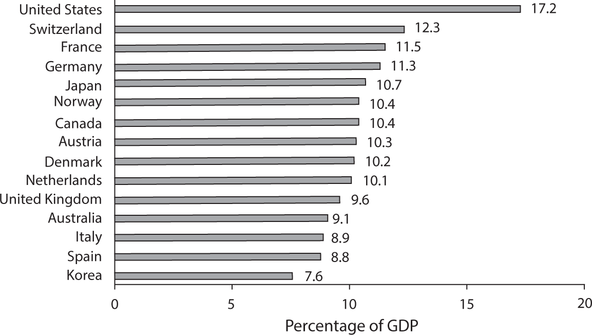
Figure 1.1 Percentage of GDP Claimed by Health Care in Select OECD Countries, 2017.
Source: OECD Data, 2018.
U.S. Health Spending in International Perspective
Figure 1.1 depicts data on total national health spending as a percentage of GDP for 2017 in wealthy countries in the OECD.1
The OECD excludes from “health spending” certain items included in the health spending data assembled and published by the Centers for Medicare and Medicaid Services (CMS) of the U.S. Department of Health and Human Services (DHHS). Therefore, the OECD numbers are slightly lower than those published by the CMS, but the relative magnitude of spending among nations is indicative.
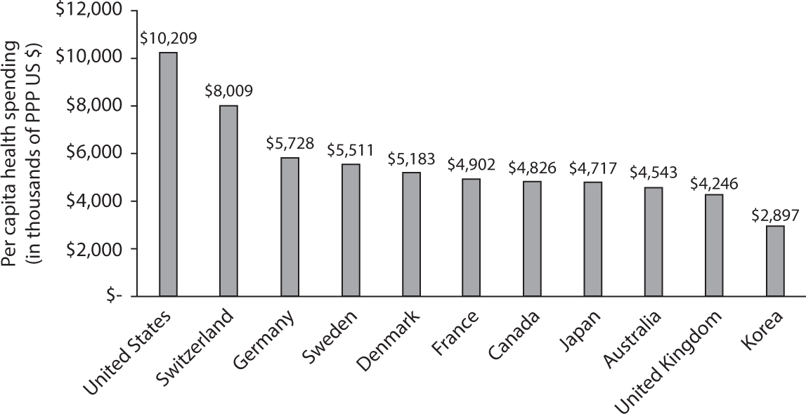
Figure 1.2 Per Capita Health Spending in PPP US $s, Select OECD Countries, 2017.
Source: OECD Data, 2018.
U.S. health spending per capita in 2017 amounted to an estimated average of $10,209—about twice as much as is spent per capita in most of the rest of the developed countries. The major exception is GDP-rich Switzerland, whose per capita health spending is about 78 percent of the U.S. average. Figure 1.2, based on 2017 data reported by the OECD, exhibits these differences in per capita health spending.
What Factors Drive U.S. Health Spending to These High Levels?
It is natural to ask what factors drive the much higher health expenditures in the United States relative to those in other OECD countries. This chapter will focus on the factors that might explain the extraordinarily high level of U.S. health spending. Let us explore the following factors:
- ability to pay, as measured by real GDP per capita;
- the demographic structure of the U.S. population;
- the high prices of U.S. health care; and
- the huge administrative burden loaded onto medical bills by the extraordinary complexity of our health insurance system.
Ability to Pay as an Explanatory Factor
Our higher GDP per capita means we have a higher ability to pay for goods and services, including health care goods and services, than poorer countries with a lower GDP per capita. Health care goods and services, however, differ from normal goods and services in the economy in one important respect. Economists describe health care as a “superior good.” This means that spending on health care tends to rise disproportionately with income. If, for example, in a given year GDP rises by, say, 5 percent, then typically health spending will rise by more than 5 percent, possibly with a lag of a year or two.
If we plot, for a given year, health spending per capita in purchasing power parity U.S. dollars (hereafter PPP US $s) on GDP per capita (ability to pay), also in PPP US $s, we should not be surprised to find a positive bivariate correlation and a so-called income elasticity (percentage change in health spending over percentage change in GDP) in excess of 1.
Figure 1.3 shows that GDP per capita does drive health spending systematically; but that variable alone leaves much unexplained. Even after adjusting the health spending data for GDP per capita (roughly, “ability to pay” for health care), U.S. spending levels are much higher than would be predicted by the trend line. Factors other than GDP per capita must drive U.S. health spending.
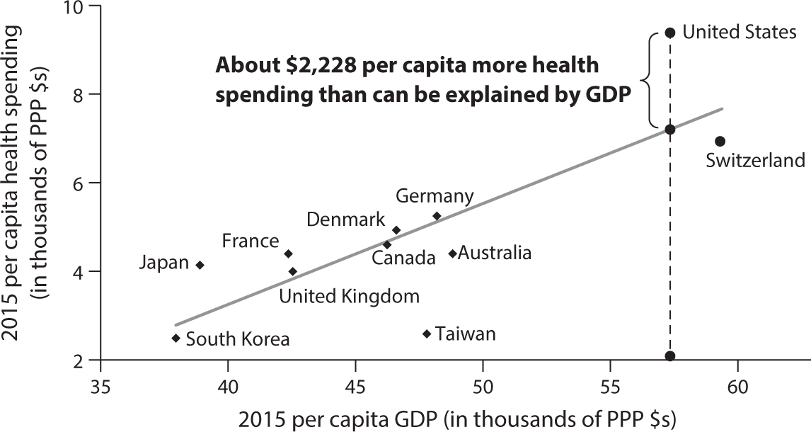
Figure 1.3 Per Capita Health Spending and Per Capita GDP (PPP $s) in Select OECD Countries and Taiwan in 2015.
Source: OECD Health Data, 2016. Data for Taiwan from MOHW, Taiwan, 2016.
Demographic Structure
On average, per capita health spending in any country first falls and then rises with age. It is so in any country, although the spending curve plotted on age varies a bit among countries.
Perhaps surprisingly, the age composition of the population is not a significant factor.
For the United States, the age-spending curve as shown in figure 1.42 is indicative. Within the cohort of the elderly above age sixty-five, the spending ratio increases further above 5.31 with age, although that is not shown in the figure.
Thus, one’s intuition forged by this chart suggests that per capita health spending in countries with older populations is apt to be higher than that in countries with younger populations. Similarly, one would expect that the aging of the population within a country—for example, the retiring of the baby boom generation in the United States—must be a powerful driver of annual increases in total per capita health spending, averaged over all age groups.
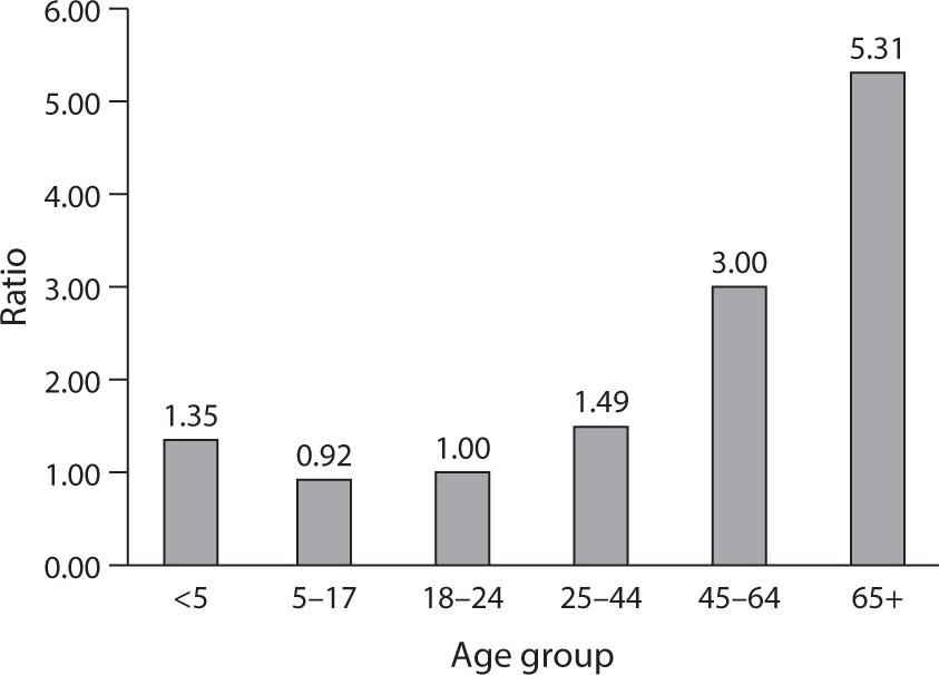
Figure 1.4 Average Per Capita Health Spending in Age Group Relative to Spending by Age Group 18–24 (=1).
Source: http://
Is that actually so? Perhaps surprisingly, the answer seems to be no, as can be inferred from figure 1.5.
AGING AND HEALTH SPENDING ACROSS COUNTRIES
As figure 1.5 shows, there is a wide variance of spending per capita at any population-age level. The U.S. population is, on average, much younger than the populations of many other countries in the OECD, yet we spend so much more per capita on health care. In fact, although the United States has one of the youngest populations among developed nations, we have the world’s highest health spending per capita. Japan, in contrast, has the oldest population but among the lowest health spending levels.
It can be fun to impose a trend line on the data points in figure 1.5. That trend line would have a negative slope, suggesting (spuriously) that the aging of a nation’s population lowers its per capita health spending. Just two data points would drive that result: the high per capita health spending in the United States, given its relatively young population, and the low health spending per capita in Japan, given its very old population.
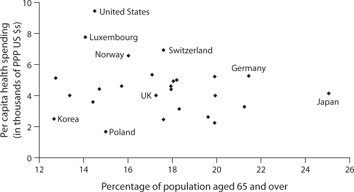
Figure 1.5 2015 Per Capita Health Spending in PPP US $s. Plotted on Percentage of Population Aged 65 and Over.
Source: OECD Data, 2017.
Two-dimensional graphs implicitly embody bivariate models with only one explanatory variable and an explained variable. In more elaborate cross-national regression models that control statistically for many other explanatory variables thought to drive health spending, the estimated effect of aging on spending still remains statistically insignificant. It is a curious and counterintuitive fact, but one that should be noted.
AGING AND THE GROWTH OF PER CAPITA HEALTH SPENDING WITHIN COUNTRIES
The aging of the U.S. population often is fingered as a main driver of the annual growth in U.S. health spending. Is that really so?
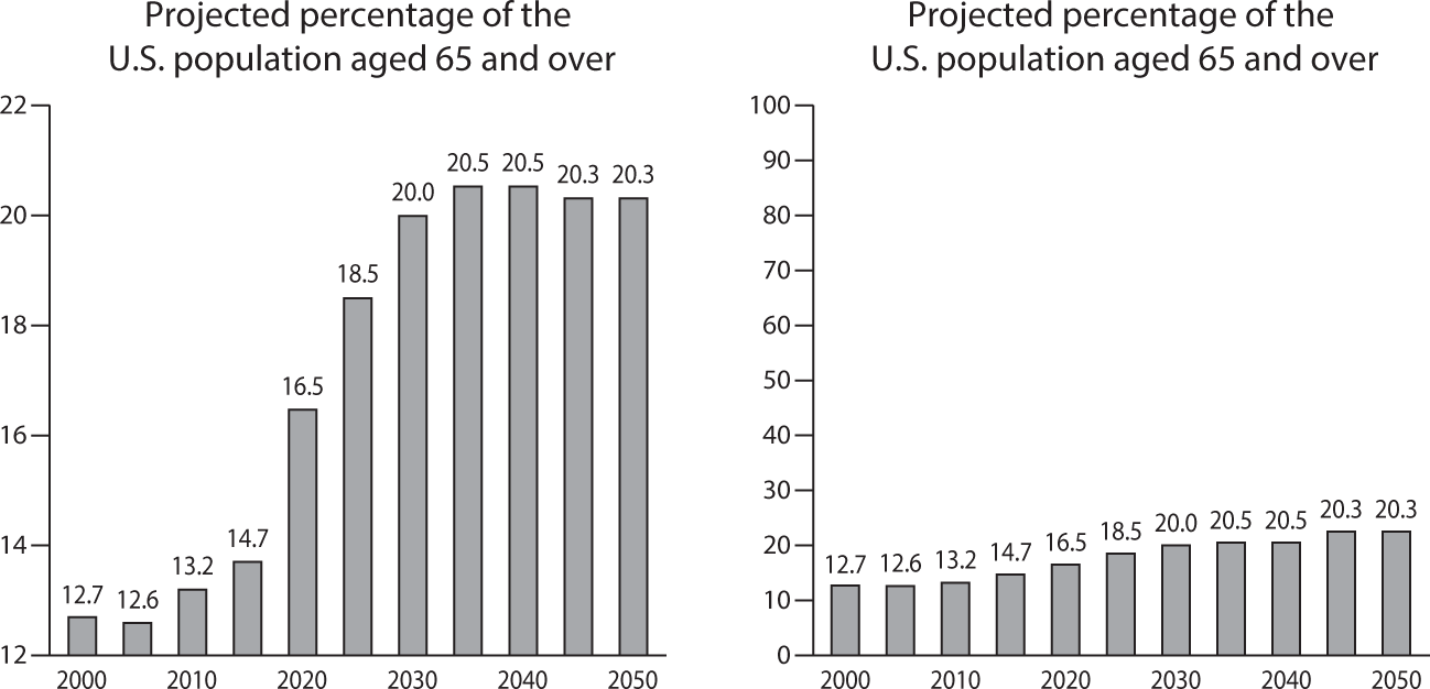
Figure 1.6 How Scaling the Vertical Axes in a Graph Can Easily Trick Its Beholder.
Source: “Does the Aging of the Population Really Drive the Demand For Health Care?,” Uwe Reinhardt, Health Affairs, 2003, vol. 22, issue 6.
Here the answer is no again, as I have shown in my article “Does the Aging of the Population Really Drive the Demand for Health Care?”3
If one assumes (1) that the age-specific, average utilization of health care per capita in dollar terms remains constant at some base-year level (e.g., the year 2000) for the next three or four decades, (2) that the size of the population does not change over that future period, and (3) that the only variable that changes is the age composition of that population, then it will be found that this aging process can explain only about 0.5 percentage points of the usual annual growth of 4 to 6 percentage points in total health spending.
And why is this so? Figure 1.6 can explain it.
In the graph on the left of the chart, the vertical axis goes only from 12 percent to 22 percent. That is the graph commonly presented in connection with the baby boom tsunami. In a graph with the vertical axis running from 0 percent to 100 percent (the one on the right of the chart), the much-feared baby boom tsunami becomes just a ripple. It shows, as the above-cited paper does, that the aging of a population is just too small and too gradual a process from year to year to act as a major driver of the annual growth of U.S. health spending.
Furthermore, we may note in passing that the United States, along with Canada and Australia, is expected to be forever younger than the rest of the developed world, including some Asian countries (e.g., Japan, China, Korea, and Taiwan). For Americans this should be cheerful news.
The High Price of U.S. Health Care
What, then, does drive the higher U.S. GDP-adjusted health spending? With the exception of a few high-tech procedures, Americans actually consume fewer real health care services (visits with physicians, hospital admissions and hospital days per admission, medications, and so on) than do Europeans. In this regard, the reader is referred to a widely quoted paper published in 2003 in the health policy journal Health Affairs, entitled “It’s the Prices, Stupid: Why the United States Is So Different from Other Countries.”4 However, earlier publications made the same point, among them a McKinsey study, to be discussed further on, and published work by the health economist Mark Pauly.5
For better or for worse—better for the supply side of the health care sector and worse for consumers—prices for virtually any health care product or service in the United States tend to be at least twice as high as those for comparable products or services in other countries. The International Federation of Health Plans publishes an annual price comparison for standard health care products and services. That publication is well worth perusing. Figures 1.7 through 1.11 present just some of the data from that comparison.
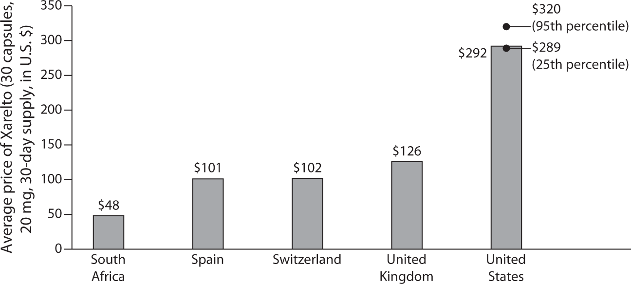
Figure 1.7 Drugs: Xarelto is prescribed to prevent or treat blood clots.
Source: IFHP 2015 Comparative Price Report, published by the International Federation of Health Plans. Reprinted here with permission.
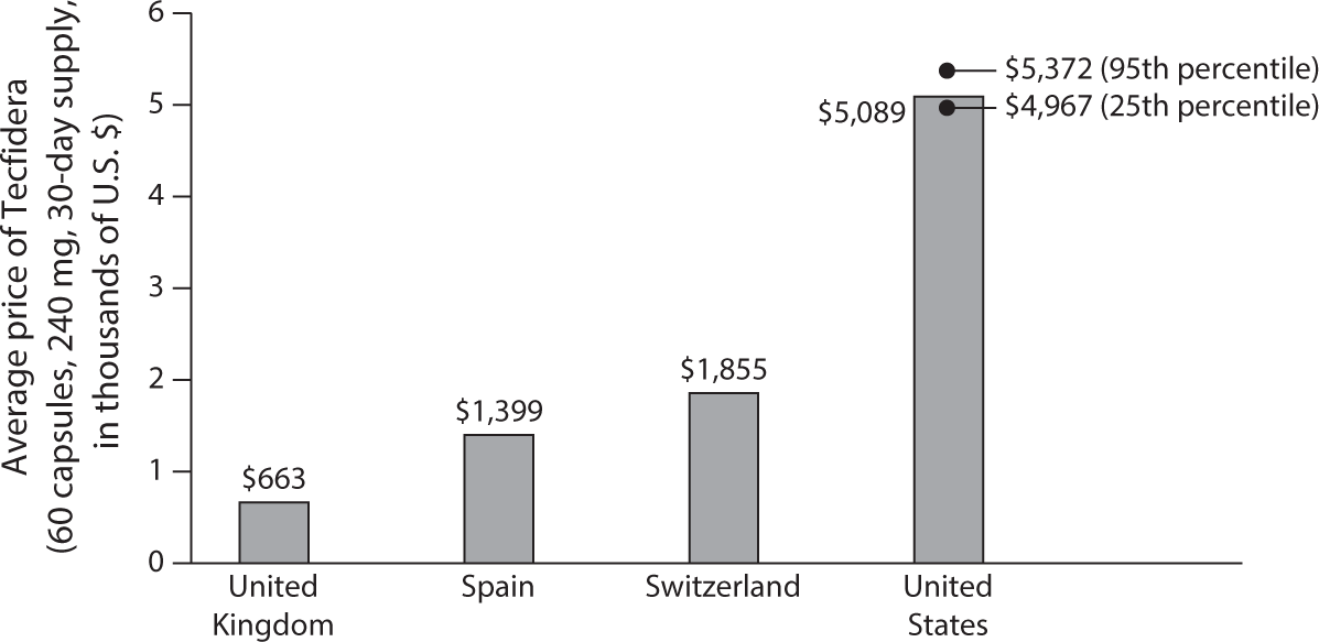
Figure 1.8 Drugs: Tecfidera is prescribed to treat multiple sclerosis.
Source: IFHP 2015 Comparative Price Report, published by the International Federation of Health Plans. Reprinted here with permission.
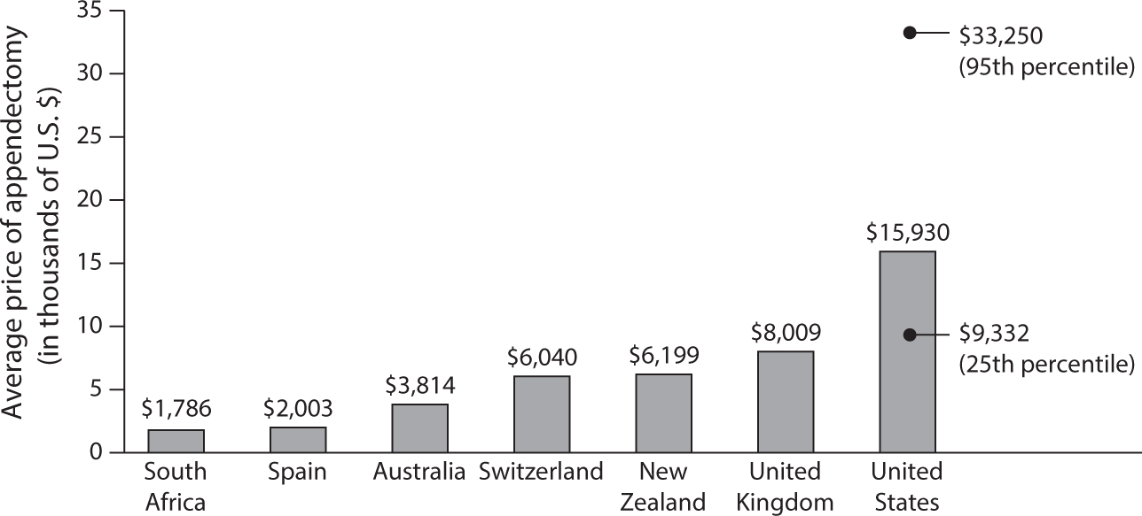
Figure 1.9 Total Hospital and Physician: Appendectomy.
Source: IFHP 2015 Comparative Price Report, published by the International Federation of Health Plans. Reprinted here with permission.
Prices for health care are instrumental in determining the claim that the health system can stake on GDP. Relative to other countries, prices in the United States make the providers of health care better off and the users of health care worse off. It is a matter of income distribution on which economists do not have much to say.
The High Administrative Overhead Cost of U.S. Health Care
No other country among the developed economies spends nearly as much on administrative overhead for health care as does the United States, where, before the Affordable Care Act came along, administration absorbed an estimated 25 percent to 30 percent of total health spending. As will be seen further on, the implementation of the Affordable Care Act changed the situation for the better.
Most nations have relatively simple health insurance systems. Usually there is a heavily government-regulated social insurance scheme covering 90 percent to 95 percent of the population, with uniform fee schedules and rules, and a small private insurance market outside the social insurance scheme used by high-income households. The uniformity of fee schedules and rules furnishes ideal platforms for the smart application of health information technology (HIT), which can lower administrative costs.
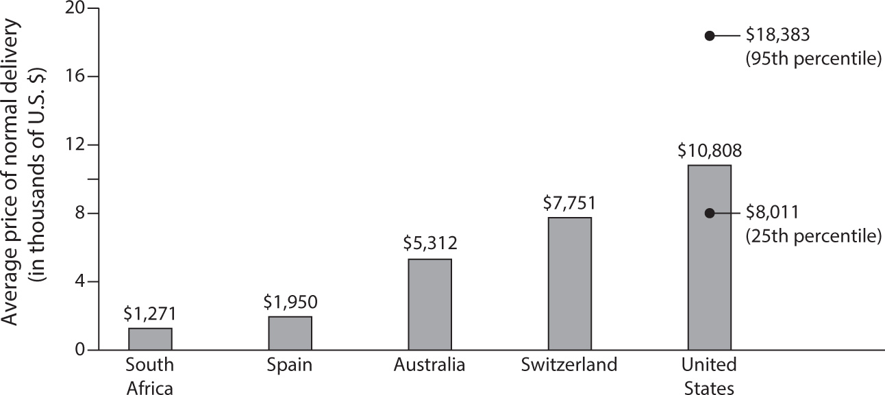
Figure 1.10 Total Hospital and Physician: Normal Delivery.
Source: IFHP 2015 Comparative Price Report, published by the International Federation of Health Plans. Reprinted here with permission.
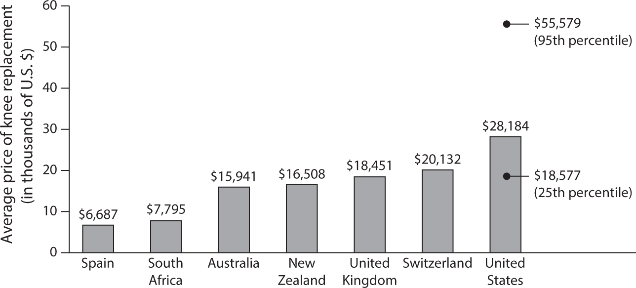
Figure 1.11 Total Hospital and Physician: Knee Replacement.
Source: IFHP 2015 Comparative Price Report, published by the International Federation of Health Plans. Reprinted here with permission.
By comparison, the U.S. health insurance system is highly complex, with myriad insurance schemes that vary by the socioeconomic and demographic status of the insured and by employer for families covered by employer-sponsored insurance.
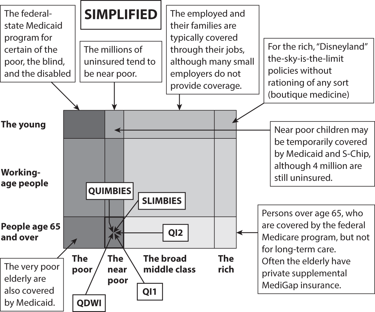
Figure 1.12 Categories of People in the U.S. Health Insurance System.
Figure 1.12 conveys the idea. Consider, for example, how many different insurance schemes there are for near-poor elderly Americans.
A health insurance system this complex makes incremental health reform challenging. Changing the rules in one cell of the system can easily have an effect on other cells in the system.
For example, establishing a new public health insurance program for working people whose employers do not offer them health insurance might easily induce employers who now do offer insurance to drop it and load their employees onto the new public program. This phenomenon can significantly raise the budget cost per originally intended object of compassion—sometimes so high that it helps kill the proposed legislation.
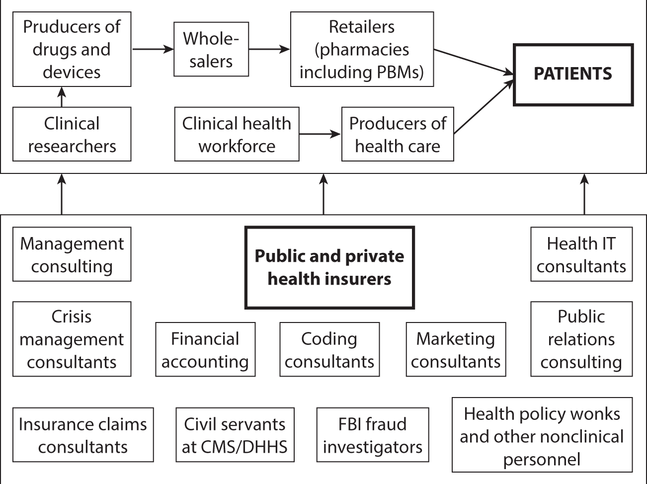
Figure 1.13 The Value Chain in U.S. Health Care, Clinical Enterprise.
If one were to depict a so-called value chain for U.S. health care, it would look something like what is shown in figure 1.13.
The clinical facet of the system is shown at the top of the chart. It is supported by a huge armada of nonclinical individuals, shown at the bottom of the chart. Each member of that administrative armada believes itself to be adding “value” to the patient, who must pay for these camp followers’ often-handsome sustenance. It is not always clear, however, what value patients actually derive from these myriad camp followers.

Figure 1.14 The All-American Health Care Team.
Source: Andriy Popov, © 123RF.com.
Figure 1.14 gives a picture of the all-American health care team—more consultants than clinicians.
In an analysis of the growth of the U.S. health workforce over the period 1990–2012, Robert Kocher, MD, of Venrock Capital (formerly of the McKinsey Global Institute, with a detour through the Obama administration) wrote in the Harvard Business Review:
My colleagues and I found that from 1990 to 2012, the number of workers in the U.S. health system grew by nearly 75 percent. Nearly 95 percent of this growth was in non-doctor workers.… So, what are all these people doing? Today, for every doctor, only 6 of the 16 non-doctor workers have clinical roles, including registered nurses, allied health professionals, aides, care coordinators, and medical assistants. Surprisingly, 10 of the 16 non-doctor workers are purely administrative and management staff, receptionists and information clerks, and office clerks. The problem with all of the non-doctor labor is that most of it is not primarily associated with delivering better patient outcomes or lowering costs.6 (Italics added.)
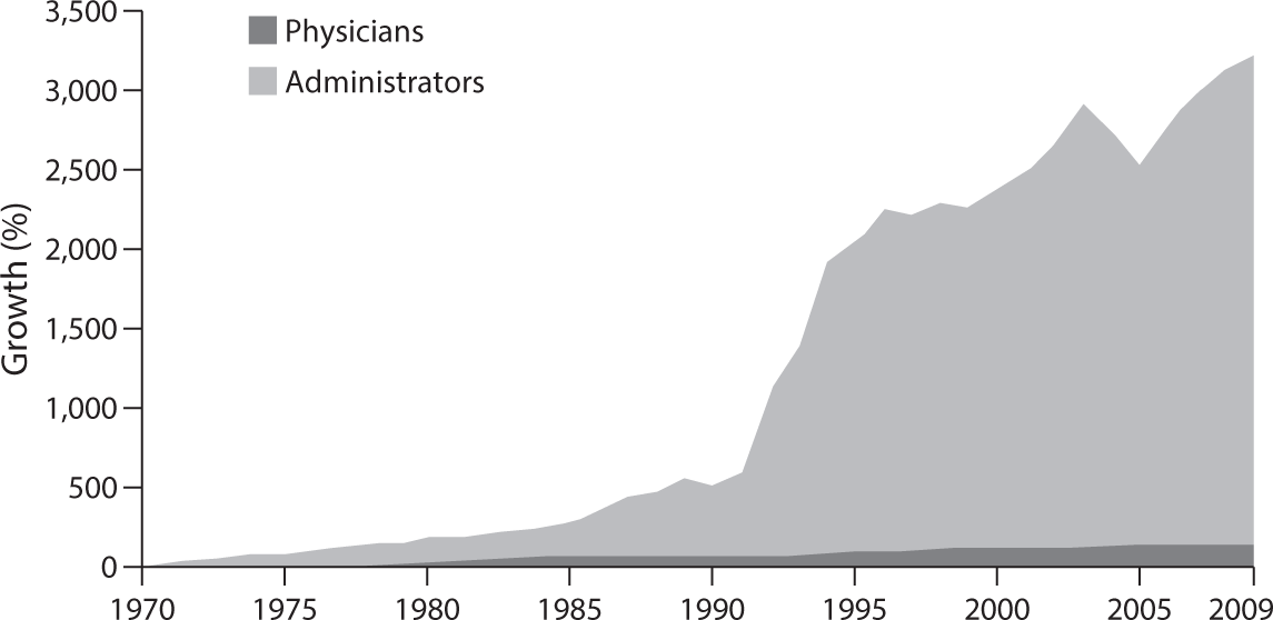
Figure 1.15 Growth of Physicians and Administrators, 1970–2009.
Source: Bureau of Labor Statistics; NCHS; and Himmelstein/Woolhandler analysis of CPS.
Figure 1.15 is a famous chart well known to many doctors.
PRIVATE INSURERS
According to a recent publication7 by America’s Health Insurance Plans (AHIP), private health insurers on average take a haircut of about 17.8 percent off the insurance premiums paid by employers or individuals for “operating costs,” which means marketing and administration. Another 2.7 percent goes for profits. That haircut was as high as 45 percent pre-Obamacare for smaller insurers selling policies in the (nongroup) market for individually purchased insurance. Under Obamacare the portion of the premium going to marketing, administration, and profits was constrained to 20 percent for small insurers and to 15 percent for large insurers. Under the Senate’s 2017 draft bill (The Better Care Reconciliation Act [BCRA]) states would have the freedom to relax these standards.
Some students of administrative costs of Blue Cross Blue Shield plans and other private insurers report that the AHIP number is too high. They currently estimate the range to be between about 9 percent for the Blues and between 10 percent and 11 percent for other private insurers.8
PUBLIC INSURANCE PROGRAMS
Government-run health insurance programs do not have marketing costs and profits, and they tend to have low administrative costs as a percentage of their spending for health care. On the other hand, with a never-ending stream of new, arcane regulations that require consultants for interpretation, they impose considerable administrative costs on doctors, hospitals, and other providers of health care.
However, the haircut private and public insurers take off the insurance premium and taxes is only part of the overall administrative overhead of our health system. It probably is not the largest part.
HOSPITALS
Hospitals in other countries may have fewer than half a dozen billing clerks and coding consultants. By contrast, U.S. hospitals require hundreds and thousands of billing clerks. Duke University’s health system, for example, with 957 beds, has 1,600 billing clerks.9
PHYSICIANS
It is estimated that the typical American physician spends over $80,000 per year interacting with health insurers. That is nearly four times as much as is spent by colleagues in Canada and undoubtedly multiple times what physicians spend in Europe, Taiwan, Japan, and Korea.
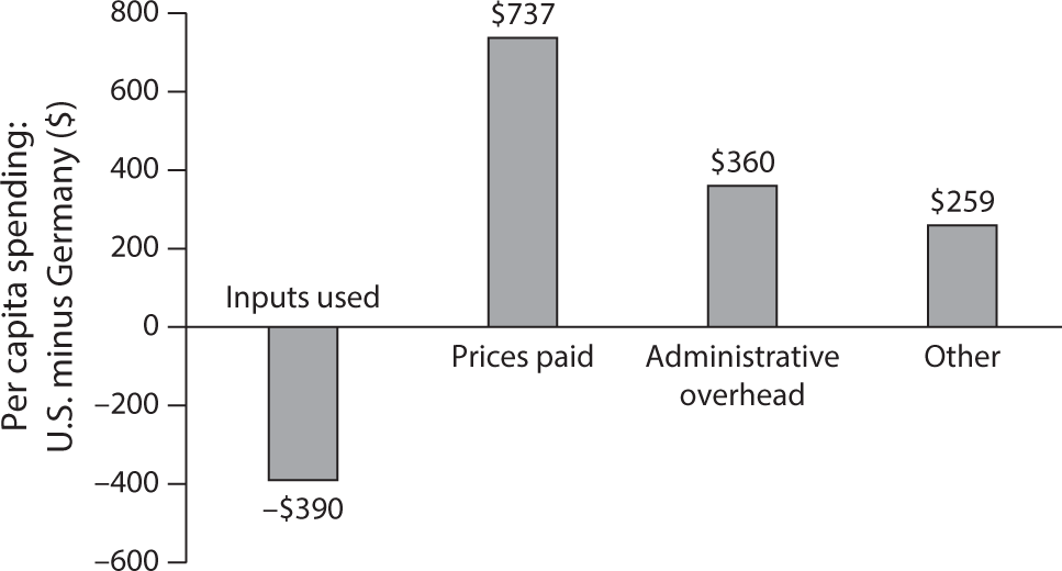
Figure 1.16 Sources of Differences in Health Spending in U.S. Purchasing Power Parity: Per Capita Spending U.S. minus Germany, 1990. Total U.S. $2,439, total Germany $1,373.
In their paper “U.S. Physician Practices versus Canadians: Spending Nearly Four Times as Much Money Interacting with Payers,”10 the authors write:
We estimated physician practices in Ontario spent $22,205 per physician per year interacting with Canada’s single-payer agency—just 27 percent of the $82,975 per physician per year spent in the United States. US nursing staff, including medical assistants, spent 20.6 hours per physician per week interacting with health plans—nearly ten times that of their Ontario counterparts.
PATIENTS
None of the empirical estimates on administrative expense includes the value of the time American consumers devote to choosing health insurance products or, as patients, to process usually incomprehensible medical bills from the providers of health care or claims from health insurers. Patients who can afford it can hire billing consultants who front for them when querying medical bills.
Elisabeth Rosenthal,11 formerly of the New York Times and now at the Kaiser Family Foundation, describes in her article on medical bills that doctors and hospitals contract with armies of coding specialists to help them code their work in a way that extracts the maximum revenue from the rest of society (private and public insurers as well as patients). For their part, private insurers contract with equally adept coding experts to help them fend off up-coding by providers of care. There is nothing like this unproductive zero-sum game in the rest of the world.
The enormous administrative overhead in U.S. health care had been noted as early as the 1990s by the McKinsey Global Institute. Figure 1.16 is based on a very sophisticated study published by the institute in 1996, based on data for 1990 gathered by the study.
As this chart indicates, in 1990 Americans actually used $390 less in real health services per capita (both priced out at and expressed in U.S. prices) than did Germans.
However, Americans paid $737 more per capita than did Germans in higher prices for identical health care products and services. Furthermore, Americans spent $360 more per capita than did Germans on administrative overhead, and $259 more per capita than did Germans for “other,” a category that may have included more administrative expense not specifically identified.
In other words, almost all of the $390 in savings (the McKinsey authors called it higher productivity) squeezed out of American clinicians was absorbed in the United States by added administrative expense. For hardworking American clinicians, this reallocation of the health care dollar must be a source of anger.
All told, Americans in 1990 spent $2,439 per capita on health care—$966 or 65 percent more per capita than did Germans, who spent only $1,473 per capita (both in PPP $s).
Unfortunately, none of the higher U.S. spending represented more consumption of real health services. All of the difference (and more) between American and German health spending represented higher administrative costs, higher prices, and higher spending on “other” non–health care items.
It is anyone’s guess what added value American patients and insured consumers derive from the huge overhead they must finance. One can only hope that whatever that added value may be, it covers the enormous cost of that system. Alas, that is open to doubt. To quote Henry Aaron, the distinguished health economist at the Brookings Institution, in a commentary published in the New England Journal of Medicine:
I look at the U.S. health care system and see an administrative monstrosity, a truly bizarre mélange of thousands of payers with payment systems that differ for no socially beneficial reason, as well as staggeringly complex public systems with mind-boggling administered prices and other rules expressing distinctions that can only be regarded as weird.12
OUR EXPENSIVE DRUG DISTRIBUTION SYSTEM
Spending on prescription drugs has become the fastest-growing component of total health spending in the United States. This is so because, as was noted earlier, Americans pay much higher prices for a given drug than do citizens of other developed countries. Furthermore, drug manufacturers in recent years have been able to raise prices substantially, even for long-established generic products. It has prompted President Trump to declare that the pharmaceutical industry is “getting away with murder.”13
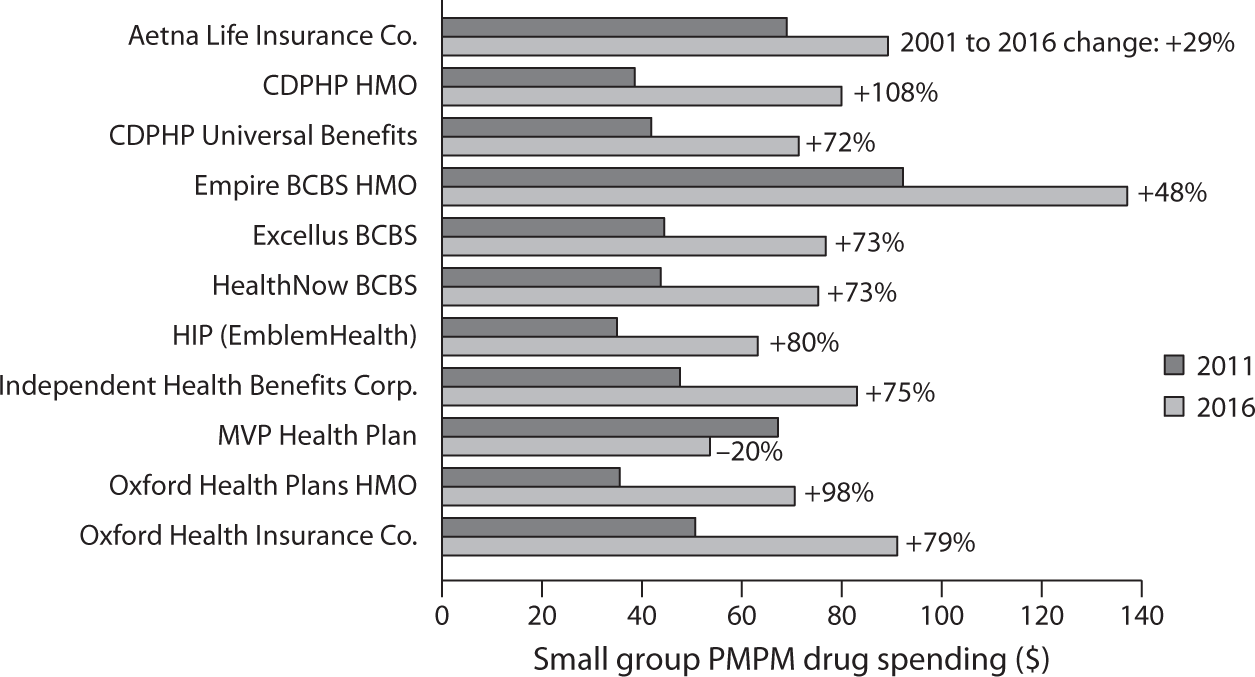
Figure 1.17 Small Group PMPM Drug Spending, 2011 and 2016.
Source: United Hospital Fund analysis of 1) Statement of Revenue and Expenses by Line of Business, New York Supplements to the National Association of Insurance Commissioners Annual Statements, filed with the NYS Department of Financial Services by nine health plans participating in the small group market, for calendar years 2011 and 2016; 2) for Aetna Life Insurance Company, 2016 New York State Supplement, and for 2011, Medical Loss Ratio Reporting Form filed with the U.S. Department of Health and Human Services, small group market; and 3) for HealthNow New York, small group market prescription drug data obtained through personal communication with the insurer. Newell P. and S. R. Hefter. June 2017. Under Pressure: Prescription Drug Spending Trends in New York’s Medicaid Program and Small Group Market. New York: United Hospital Fund. https://
Recently the United Hospital Fund of New York undertook a study14 on spending on prescription drugs per insured member per month registered by a number of health insurance plans in New York State. Figures 1.17 and 1.18 are two graphics presented in the study.
In their defense, drug manufacturers15 explain that the high cost of prescription drugs is partly the result of an elaborate and expensive drug distribution system. Figures 1.19 and 1.20 are from a paper16 presented at a seminar sponsored by the Brookings Institution in June 2017.
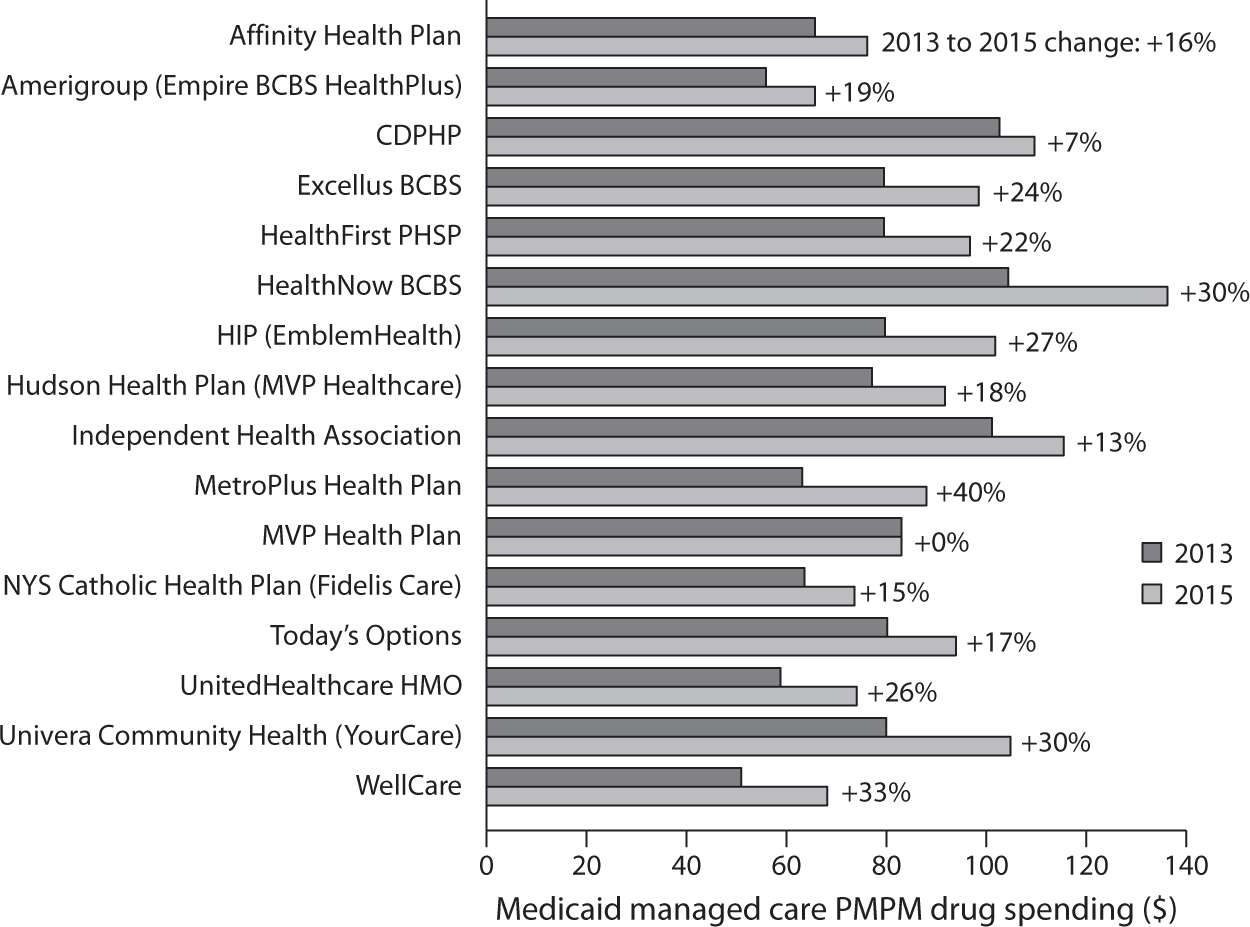
Figure 1.18 Medicaid Managed Care PMPM Drug Spending, 2013 and 2015.
Source: United Hospital Fund analysis of 1) Statement of Revenue and Expenses by Line of Business, New York Supplements to the National Association of Insurance Commissioners Annual Statements, filed with the NYS Department of Financial Services by nine health plans participating in the small group market, for calendar years 2011 and 2016; 2) for Aetna Life Insurance Company, 2016 New York State Supplement, and for 2011, Medical Loss Ratio Reporting Form filed with the U.S. Department of Health and Human Services, small group market; and 3) for HealthNow New York, small group market prescription drug data obtained through personal communication with the insurer. Newell P. and S. R. Hefter. June 2017. Under Pressure: Prescription Drug Spending Trends in New York’s Medicaid Program and Small Group Market. New York: United Hospital Fund. https://
Figure 1.19 shows the nature of the drug distribution system, although in real life it is even more complicated than that. For example, some Pharmaceutical Benefit Managers (PBMs) also function as retail pharmacies.
Figure 1.20 shows the authors’ estimates of the cut each agent in the value chain from producing prescription drugs to consumer spending on drugs (out of pocket or as part of a health insurance premium) takes from that money flow. The chart shows that drugs that cost $17 to produce end up costing patients or purchasers of health insurance $100.
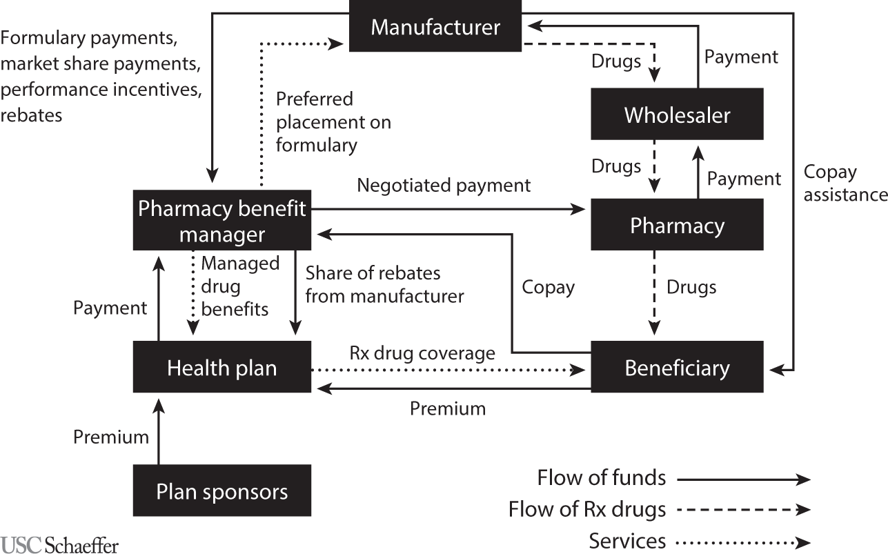
Figure 1.19 Conceptual Model of the Flow of Products, Services, and Funds for Nonspecialty Drugs Covered under Private Insurance and Purchased in a Retail Setting.
Source: Sood N., Shih T., Van Nuys K., and Goldman D. (2017). The Flow of Money through the Pharmaceutical Distribution System. USC Leonard D. Schaeffer Center for Health Policy & Economics White Paper, figure 1.
Of a total $100 in consumer spending, health insurers pay PBMs $81, keeping $19 for themselves, of which $3 is profit; the rest goes for marketing and administration.
PBMs are supposed to manage prescription drugs for health insurers. That task includes negotiating prices with drug manufacturers and dealing with retail pharmacies and patients. The PBMs pay pharmacies $76, keeping $5, of which $2 is profit. Of the $76 the retail pharmacies receive from the PBMs and co-pays paid by patients, they keep $15, of which $3 is profit. The retail pharmacies pay pharmaceutical wholesalers roughly $60; they in turn pay manufacturers $58. Manufacturers spend $17 for manufacturing the drugs and $26 for marketing, administration, and research and development (R&D); they keep $15 as profit, a handsome net profit margin of 26 percent. In general, research-based drug manufacturers spend about twice as much on marketing and administration as on R&D.
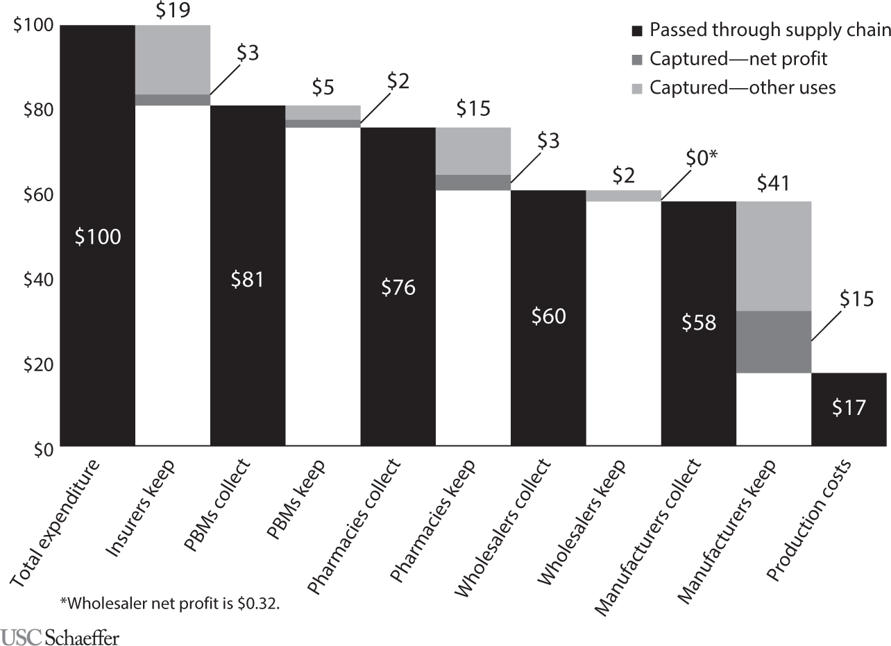
Figure 1.20 Flow of a Hypothetical $100 Expenditure on Prescription Drugs Covered under Private Insurance through the U.S. Retail Distribution System.
Source: Sood N., Shih T., Van Nuys K., and Goldman D. (2017). The Flow of Money through the Pharmaceutical Distribution System. USC Leonard D. Schaeffer Center for Health Policy & Economics White Paper, figure 2.
Total profits alone booked by all of the agents in the value chain collectively amount to $23 of the $100 paid for drugs by consumers.
Although PBMs claim to be able to drive tough bargains with drug manufacturers and retail pharmacies over prescription drug prices, they seem to have only a modest capacity to do so. First, as can be inferred from data published by the International Federation of Health Plans, the prices Americans pay for drugs are the highest in the world. Second, the PBMs seem unable to resist the steep annual price increases for existing drugs that drug companies routinely manage to impose on them, even generic ones. In early June 2017, for example, it was widely reported17 that Pfizer had raised prices on ninety-one existing drugs by an average of 20 percent since the beginning of 2017. There is a good chance that the PBMs will just accept such increases and pay them.
Insured patients typically are required to pay at the pharmacy coinsurance pegged to the price their PBM has negotiated with retail pharmacies. But the PBMs receive from the drug manufacturers secret rebates that, so claim the PBMs, are mostly passed on to the health insurers with whom they contract, who in turn claim to pass most of the secret rebates on to the employers with whom they contract. Given this secret rebate flow, one wonders what incentives the PBMs actually have to help keep drug prices low for consumers.
Probably nothing so clearly exposes the disregard for efficiency and costs with which Congress sometimes fashions health policy than the distribution of drugs for cancer and rheumatology treatments. These drugs commonly are administered on an ambulatory basis in the medical practices of oncologists and rheumatologists or in outpatient departments of hospitals.
Under the Medicare program, a major payer for these drugs, physicians and hospital outpatient departments are reimbursed by Medicare for the drugs they infuse at the Average Sales Price (ASP) for the drugs reported by the drug industry to Medicare, plus a 6 percent markup over the ASP. With some of these drugs costing more than $100,000 a year, this 6 percent markup clearly provides a strong financial incentive for physicians to favor expensive drugs.
One would hope that in their clinical decisions most physicians would be impervious to this strong financial incentive. It was troubling, however, to behold the vehement opposition18 on the part of the American medical community, the pharmaceutical industry, and members of Congress who front for the pharmaceutical industry to a proposal by the Innovation Center of the Centers for Medicare and Medicaid (CMS) to experiment with alternative payment approaches.
The idea was to reduce the percentage markup on cancer and rheumatology drugs from 6 percent to 2.5 percent and to increase the flat fee paid physicians and hospital outpatient departments for administering the drugs. That sensible idea had been recommended19 to CMS by the nonpartisan Medicare Payment Advisory Commission (Medpac).
In the face of this vehement opposition from powerful interest groups and from the members of Congress who carry their water, CMS in late December 2016 simply abandoned the idea of reforming this conflict-ridden drug reimbursement system. On behalf of the interest groups, K Street lobbyists won out over plain common economic sense.
THE ROLE OF CONGRESS IN DRIVING UP ADMINISTRATIVE EXPENSES
I can think of no legislation ever to emerge from Congress that addressed the magnitude of this administrative overhead. It is as if Congress just does not care what health spending by consumers actually buys in America.
On the contrary, every health reform emerging from Congress vastly complicates the system further and brings forth new armadas of nonclinical consultants who make a good living teaching clinicians and hospitals how to cope with the new onslaught of administrative strictures. All of their income becomes the providers’ expense and thus ends up in the patient’s bill.
A classic illustration of this tendency in Congress is its introduction of so-called Flexible Spending Accounts (FSAs).20 They allow employed individuals to set aside, at the beginning of the year, out of pretax income, a certain amount of money to cover out-of-pocket spending for health care in the coming year.
As is well known, or should be well known, any expenditure that comes out of pretax income or, which is equivalent, is deductible from taxable income, is just another tax-financed subsidy in disguise.21 In this case, the larger the employee’s income and thus marginal tax rate, the larger that public subsidy.
Tax-preferred Health Savings Accounts (HSAs) are now all the rage. They, too, provide tax-financed public subsidies22 that favor mainly high-income households. Individuals can deposit money in these savings accounts, out of pretax income, to help defray out-of-pocket spending for health care.23 HSAs differ from FSAs in that unspent balances in one year carry over to the next year, while unspent balances in FSAs are lost to the employee and revert to the employer.24
Aside from being regressive, however, FSAs and HSAs have another dubious claim. These accounts have given rise to yet another profit-seeking new industry 25 of nonclinical “health workers” who feed themselves at the health care trough, which patients must fill with their insurance premiums or out-of-pocket payments. Someone must hold the funds in the HSAs and make sure that the owners of FSAs and HSAs do not charge to these accounts frivolous items not allowed under the legislation authorizing them. This new industry serves those functions.
Presumably, this new industry produces value for taxpayers who use these accounts to shift their tax burden onto the shoulders of other taxpayers, who are the losers from the policy. The industry’s revenues are part of GDP, as if it actually produced value for society as a whole. What that value would be, however, is not clear to this economist.
Nevertheless, Congress loves these nonproductive redistributions of tax burden among taxpayers. Tax preferences—properly called “tax expenditures”26 by economists—are the vehicles for these dubious favors. It is easy to see why Congress loves tax preferences. As New York Times op-ed columnist David Brooks has put it in one of his columns:27
David Bradford, a Princeton economist, has the best illustration of how the system [of tax preferences] works. Suppose the Pentagon wanted to buy a new fighter plane. But instead of writing a $10 billion check to the manufacturer, the government just issued a $10 billion “weapons supply tax credit.” The plane would still get made. The company would get its money through the tax credit. And politicians would get to brag that they had cut taxes and reduced the size of government!
So it goes. With tax deductibility of expenditures or other forms of tax preference, Congress can provide favorite constituents tax-financed subsidies that do not formally show up as government spending but can even be deceptively styled as tax reductions. Only economists and politicians appear to understand this dubious game.