Pentagram is the world’s largest independent design consultancy. The firm is owned and run by nineteen partners, a group of friends who are all leaders in their individual creative fields.
Pentagram’s offices are located in London, New York, San Francisco, Berlin, and Austin. They design everything: architecture, interiors, products, identities, publications, posters, books, exhibitions, websites, and digital installations.
Every client of theirs works directly with one or more of the firm’s partners; Pentagram’s conviction is that great design cannot happen without passion, intelligence, and personal commitment, which is reflected in a portfolio of work that spans five decades.
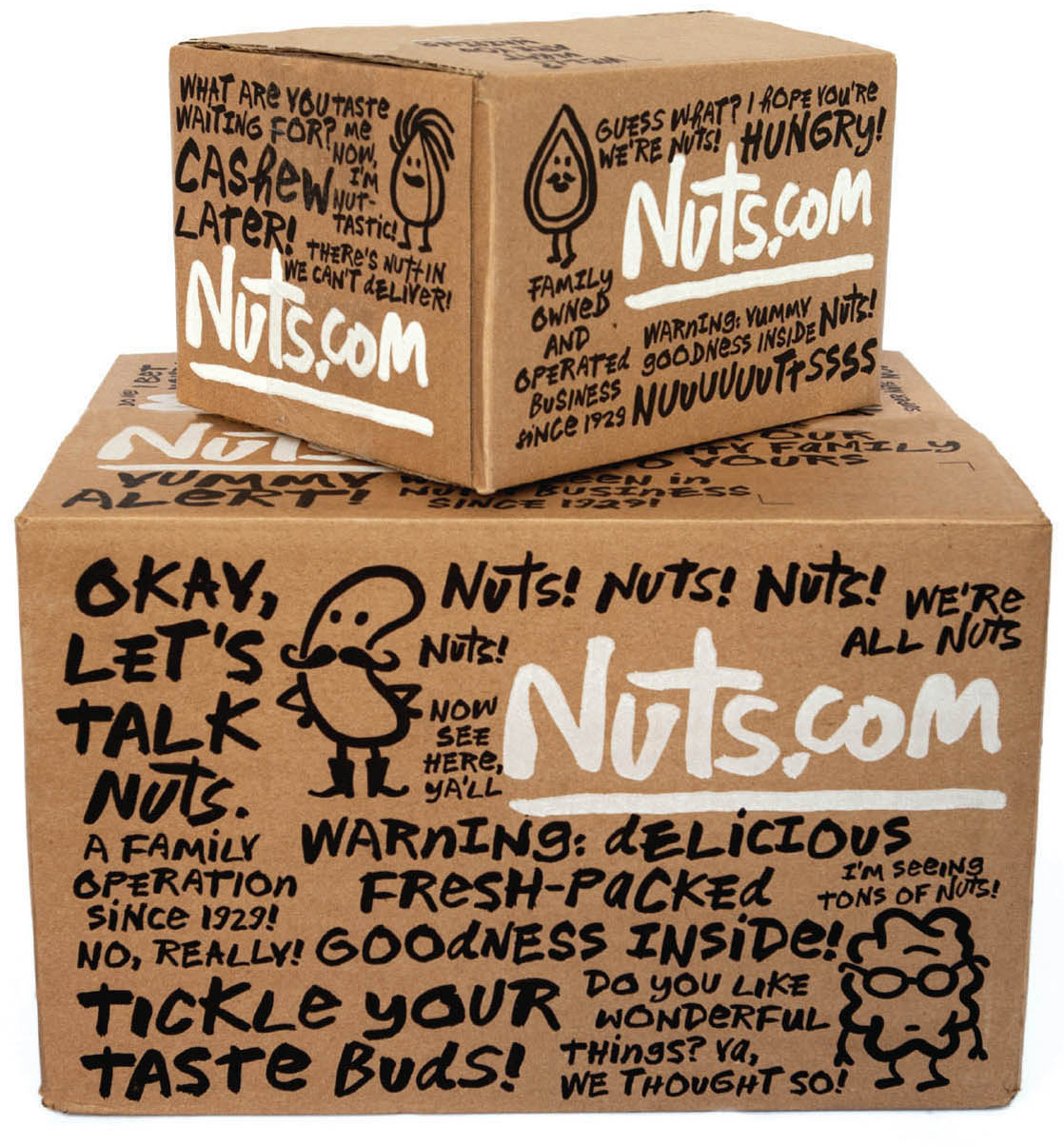
How much of this was set using the typeface (which you originally painted by hand) and how much is custom?
michael bierut: All of it was done using the typeface. Once we had it digitized, the game was to see how crazy we could get without picking the paintbrush back up. There were a lot of alternate characters.
Were other lettering/typeset solutions considered?
Yes, we were originally looking at multiple directions. My favorite of the alternates was a customized Cooper Black with all the letters colored and modeled to look like nuts. It made sense as a concept, I suppose, but the overall effect just looked like sugary breakfast cereal for kids.
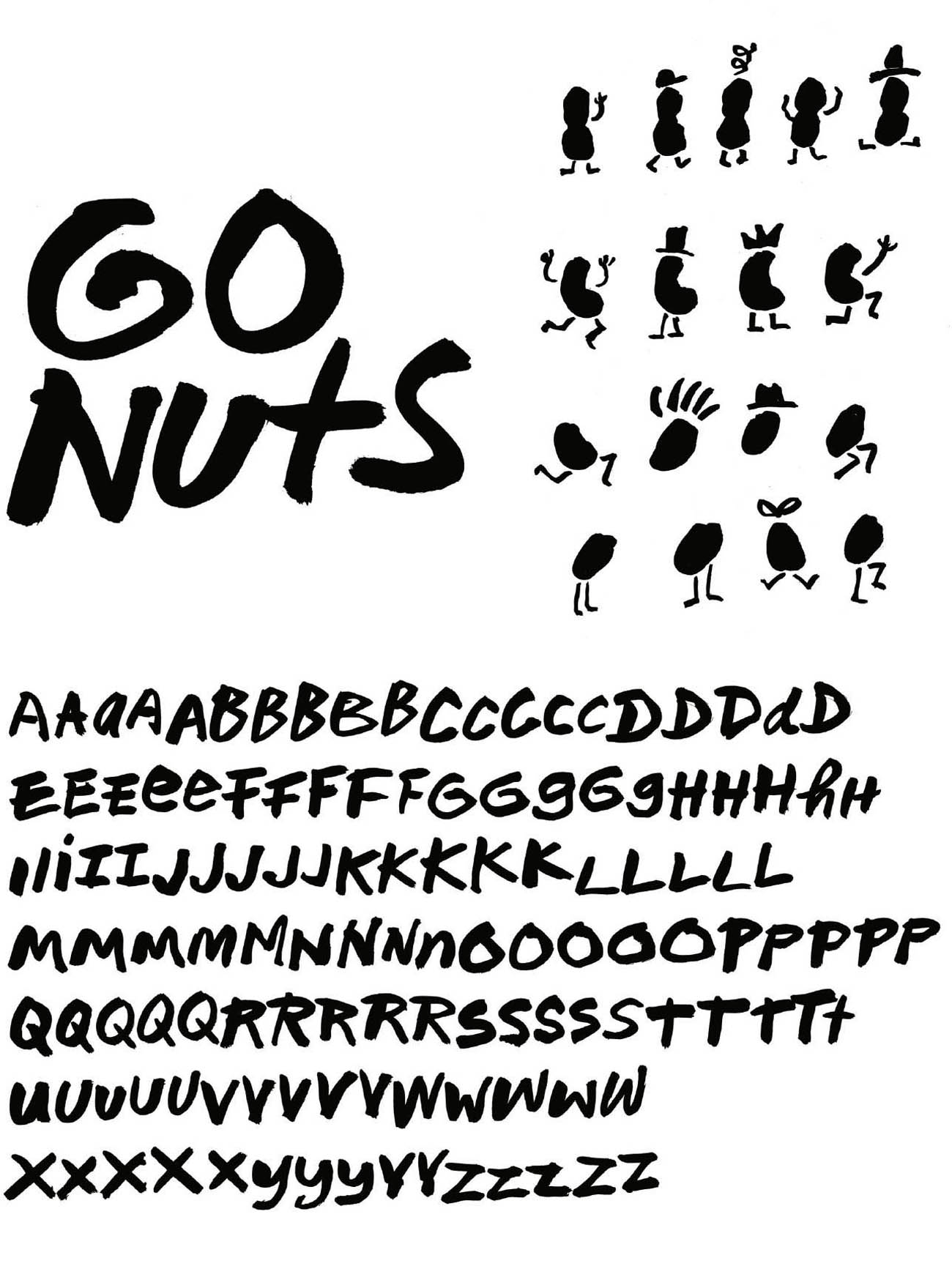
Did font designer Jeremy Mickel work from the type sample (shown) or did he create all of the alternate characters?
All of the characters, including the alternates, are based on letters that I hand painted.
How easy (or difficult) was it to get the client’s buy-in?
With the new URL secured, fledgling Nuts.com CEO Jeff Braverman and his team were really ready for something different. They also have a very secure sense of who they are, and are very confident about their tone of voice and their relationship with their customers. And best of all, because the product is sold exclusively online, the packaging isn’t faced with the challenge of competing on the grocery store shelf. Their customers buy nuts based on the pictures of nuts. The box and the product packaging are more like gift wrapping, which is how Jeff thinks of their fulfillment process: sending the customers wonderful gifts.
product: Nuts.com
client: Nuts.com
design firm: Pentagram
creative director: Michael Bierut
designers: Katie Barcelona and Aron Fay
hand letterer: Font design by Jeremy Mickel, based on a hand-drawn alphabet by Michael Bierut
illustrator: Christoph Niemann
medium: Ink and digital
country: United States
Redesigned Nuts.com packaging featuring the bold new identity
The original NutsOnline.com packaging is paired with its updated counterpart. The difference is striking.

The Nuts.com typeface is based on an alphabet hand drawn by Bierut.
