Joel Holland is a hand letterer and illustrator working with individuals and companies from around the world. Clients include Apple, Wieden+Kennedy, Random House, Little, Brown & Co., New York magazine, and the New Yorker. His work has been recognized by American Illustration, the AIGA, and the Art Director’s Club, and has appeared on book jackets, billboards, and even a model’s butt.
Your lettering covers a pretty broad range of type styles, from ornate scripts and ornamented wood to simple sans. How do you choose the right style for each project?
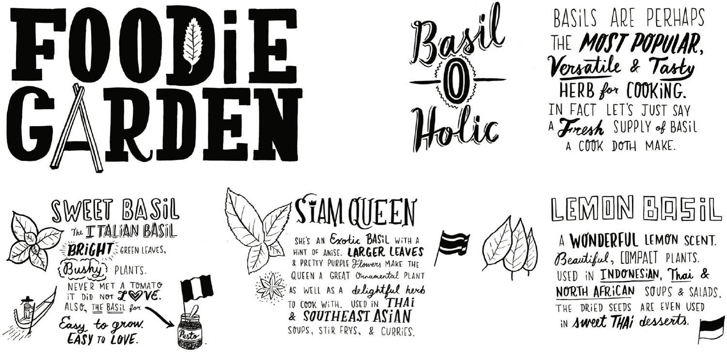
joel holland: I let the context determine the style. In this instance, they wanted an approach that was louder and more alive than the competitive products already on the market. My aim was to satisfy that goal while keeping a consistent look.
The color sketch has the background color and slip shadow. It does not appear to have made the final cut. Why not?
I believe it was a choice to go in a more immediate direction: less ink, less labored. I was psyched about it because I’m a big fan of the one-color produce boxes you see on the streets of New York. This mirrors that aesthetic.
Can you walk through your lettering process? Do you work by tracing letterforms, or is your work done freehand?
It’s all done freehand. I’ll comb through a lot of reference material. Books, photos, blogs, etc. This way there’s always a freshness and a good variety of styles.
How do you address issues of scale/weight/ legibility between small and large letters?
Again, I go by the context, much like a typesetter would, I suppose. With this project being a series, I wanted to keep the body copy consistent and ultralegible. The display/illustrated areas were naturally going to run larger, so there is a bit more wiggle room with the look of the letters/words.
product: Foodie Garden
client: Noted
design firm: Joel Holland Illustration
art director: Doug Woiske
hand letterer/illustrator: Joel Holland
medium: Ink, paper, and silk screen
country: United States
“It was a pretty quick process from sketch to final,” Holland says. “The client was very flexible and clear in their brief. My intention was for the work to feel as raw and real as possible for the context.”

Holland says, “The brief was pretty open. For the color sketches, I was running with silk screen inspiration in the vein of Globe Poster or Hatch Show Print—bright, simple color separations, bold type. In the end, I’m happy we went one-color, as the product was allowed to become its own thing, not a derivative.”
