Sagmeister & Walsh is a New York City–based design firm that creates identities, commercials, websites, apps, films, books, and objects for clients and audiences as well as for themselves.
Each box is literally lettered by hand, making each a more collectable item. Is there any other reason you did that?
stefan sagmeister: As the edition was only ten each, going through the trouble of having films made and silk-screening them would have been just as much work as sitting down and handwriting them all. And since I had handwritten all the text on the walls for the various stops of the exhibit already (Philadelphia, Toronto, Los Angeles, Chicago, Paris, Vancouver, and Vienna), it seemed in keeping with the overall spirit of the project.
Custom lettering and type play a role in your work in general. Talk about that (reasons, challenges, advantages, disadvantages). Why not Helvetica?
When I was fifteen, I was writing for a small local magazine and discovered that I liked creating the layout better than writing. We were setting headlines with Letraset sheets donated by friendly design studios, and as they invariably all had the letter e missing, it was easier to write a headline by hand than to reconstruct the missing e. That’s where my love for handwritten typography stems from.
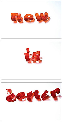
Much later we created the series “Things I have learned in my life so far.” My grandfather was educated in sign painting and I grew up with many of his pieces of wisdom around the house: traditional calligraphy carefully applied in gold leaf on painstakingly carved wooden panels. I am following his tradition with these typographic works. They are all part of a list I found in my diary under the title “Things I have learned in my life so far.”
The message is always very clear and straightforward, the typography much more ambiguous and open for interpretation. I found that by utilizing an open typographic approach combined with a clear message, many viewers have an easier time relating to the work. We do employ various typographic strategies from one project to another (within the series). Some are influenced by the environments in which they take place, some by outside people, some by personal experiences.
You’ve remarked on the use of handwritten lyrics on your Lou Reed poster, saying it’s “very personal.” Can your handwriting remain personal across a range of projects (like the movie boxes)? Does it become impersonal if repeated too often, or has it become your signature?
Everything will eventually lose its meaning through repetition. I remember promising myself ten years ago to not use my handwriting again, for fear that I had done it too often already. Since then, a project with a compelling reason for breaking that promise seems to come along every so often.
product: Limited-edition film and packaging
design firm: Sagmeister & Walsh
creative director: Stefan Sagmeister
art director: Santiago Carrasquilla
designers: Santiago Carrasquilla, Christian Widlic, Esther Li, and Thorbjørn Gudnason
hand letterer: Stefan Sagmeister
ceramic production: Janine Sopp
box production: South Side Design and Building
medium: Paint
country: United States

Sagmeister’s own handwriting was chosen to evoke the simple, clear messages of this project’s theme: Things I have learned in my life so far. Because this series of products was limited to a total of thirty, it was deemed easier to letter each by hand.
On future work, Sagmeister says, “Recently, I copied a page from an eighteenth-century Turkish Quran I had seen in the Islamic Arts Museum Malaysia in Kuala Lumpur. I hope this has an influence on our work, as Western typography has rarely reached the absolute pinnacle of total gorgeousness as it did in Islamic culture (as they were not allowed to show any imagery, all the creative juice went into type and ornament).”


Sagmeister’s films include the vernacular typography that has made him a much-admired figure in graphic design.