Wes Anson and Phil Curl of d.studio are brand designers based in the beautiful village of London, England. They work on large- and small-scale projects from clients across the globe, as well as closer to home. They love working with energetic emerging companies, matching their ambitions and sharing their enthusiasm to help brands achieve what they set out to do, and more. Their approach is to look at the bigger picture, creating narratives that run through brands from top to bottom.
How did the client’s brief evolve into what you delivered?
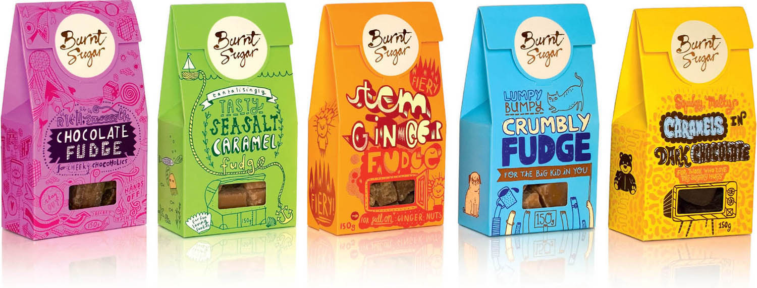
d.studio: The initial brief was extremely open, so we were largely responsible for defining the brief from the outset. The biggest evolution (and leap of faith by the client) was going from the initial concept to the final packs, as a large amount of imagination was required to envision what the five packs would look like with a different illustrator’s style on each one, which the client didn’t see at first.
What was the process of rendering this type like?
It varied from pack to pack. Working with five different illustrators brought its own set of challenges. Some nailed it pretty much the first time, others required a few rounds of exploration. Our general approach was to set certain parameters that ensured the packs worked as a range but without limiting the creative expression of each illustrator—we were keen for them to bring their own unique style and personality to the project.
Did the client request hand-drawn typography?
Not specifically, but Justine is a huge fan of illustration, so it didn’t take much to twist her arm!
Do you see a trend of hand lettering taking place in the UK?
It’s everywhere—from boutique brands to High Street private labels! But we like to think we got in before it was a “thing”—bandwagon jumping is banned here at d.studio!
title: Burnt Sugar
client: Burnt Sugar
design firm: d.studio
art directors/designers: Phil Curl and Wes Anson
illustrators: Gemma Correll, Jess Wilson, Nick Deakin, Kate Sutton, and Rudi de Wet
medium: Pen and ink
country: United Kingdom

A quirky variety of styles is used to reflect the “every one is different” concept, representing both the perfectly irregular pieces of fudge, and the lively mix of foodie fans who consume it.