Two Arms Inc. is a Brooklyn-based husband-and-wife design team specializing in custom illustration and typography, with a range of clients including the MoMA Design Store, Time Out New York, Nike SB, Jack Daniels, Maxim magazine, Jameson, and Warner Music Group.
How did you arrive at the different styles of typography for each bottle?
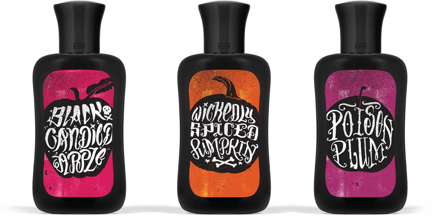
michael tabie: After working through a variety of design directions, we realized the inherent layout issues we were faced with given the shape of the label. An illustrated scent name allowed us to make the type larger and more prominent.
What were the instructions from the client?
The project was art directed by Joshua English, of Chad Lavigne LLC. Our creative brief was very loose. The original concept for Sinister Sweets was a “Sinister Soiree party invite.” After working on a few different holiday launches, we knew that keeping the flavor name larger was always a plus.
How do you achieve the rough textures that are a hallmark of your work?
Our textured style comes from our background as screen printers. We like to take advantage of texture and halftones as a way of working with limited color palettes. As a printer you want to get the most out of each color, and limit the number of times you have to go through the press. This texture style has since become part of our design toolbox.
Why did you choose such loose and fun lettering rather than blackletter or movie monster type?
In this case, the hand-drawn style of the lettering fits the curves of the bottle better than a more rigid or straight typeface. In keeping with the playful nature of Halloween-inspired flavor names, we went with a more simple execution of fruit silhouettes as a holding device for the lettering.
product: Sinister Sweets
client: Bath & Body Works
agency: Chad Lavigne LLC
design firm: Two Arms Inc.
art director: Joshua English
designers: Michael Tabie and Karen Goheen
hand letterer: Michael Tabie
medium: Brush pen
country: United States

Bold will hold. “While we always try to sketch out as many ideas and variations as possible,” Tabie says, “sometimes the best answer is the first answer. This was one of those rare occasions when our client loved our first version.”