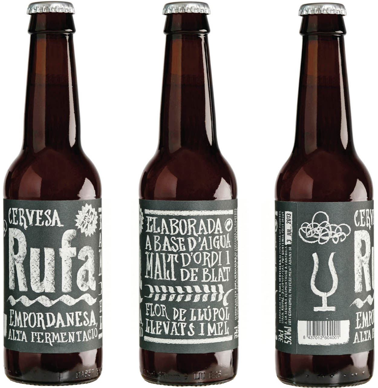
Senyor Estudi is a two-person company founded by Lluís Serra and Mireia Sais. Serra studied graphic design in Barcelona, and Sais studied industrial design in Girona, Catalonia. The Senyor Estudi office is located in a small village, far from Barcelona, in the heart of the Empordà, in the Costa Brava, a coastal region in northeastern Spain.
You use a considerable amount of custom type in your design. What is your process in terms of how you choose a typographic direction?
LLUÍS SERRA: Paella dishes, daily menus, and fresh beer are the main items the restaurants and bars on the Costa Brava write, in calligraphy, on their chalkboards. Therefore, we thought that it would be appropriate to take inspiration from them. This graphic style did not correspond with the usual aesthetics for traditional beers, but these are not traditional beers.
Café chalkboards are common across the world. You cite the Costa Brava region in Spain. Is there anything specific to the lettering styles of the region?
The diversity of chalkboards and restaurant menus around the world is exciting. I am convinced that trends can be found in each region, but today, everything is very chaotic and amateurish. In fact, much depends on the waiter’s handwriting style. There are very interesting books and studies about the popular graphics, signs, and lettering from Barcelona, such as Barcelona Gràfica by América Sánchez. However, in this case we did not go that deep into its history. We just wanted to convey this diversity. Each beer is visually different but maintains the aesthetics of the chalkboard as a common element.
This is quite different stylistically from the North American chalkboard trend. Were you aware of that style? And did it affect your choices?
I would like to give you a more interesting answer, but I would be lying if I told you that the hand-drawn type is related to the essence of a main local style. It is mainly inspired by chalkboards that can be found on the coast—some of the boards directly scanned, others reproduced—but it does not mean that they represent a specific style. We were particularly interested in the diversity. We knew that the product range would grow, and that allowed us to explore different languages and different techniques. For example, for the latest beer that was released on the market, Rufa Blat (wheat Rufa), an agreement was signed with the Girona Baker’s Guild to use a variety of wheat that they harvested. Therefore, we wanted the label to convey the effect of the glass used in old bakeries, on which the “deals of the day” were painted with a brush and chalk. So, we explored this technique, but in this case, we reproduced typography with calligraphic origin.
There is a lot of text on the bottles. Did you create a complete alphabet and then composite that? Or did you draw every word by hand?
All the information, including legal, is drawn. We did not want the required information to seem required. So we drew it all, even the barcode. There is no computer-set text. We were interested in the texture of the chalk or the marker, so it would not have made sense to trace (vectorize) it. There are some cases in which the information varies from one year to another, such as the alcoholic content, for which we have already drawn all the numbers. This will allow us to keep changing it every year without having to lift a brush again.
product: Rufa
client: Rufa Cervesera
design firm: Senyor Estudi
designers: Lluís Serra and Mireia Sais
hand letterer: Rob Verhaart
photographer: Roger Lleixà
medium: Chalk and paint
country: Spain

“The first three editions of Rufa are just the beginning,” says Serra. “The graphic style for the labels is designed with the hopes of expanding the range of products using the same concept. The constraints are chalk and chalkboard, but the content varies.”