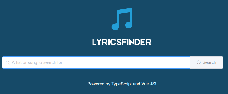
In order to let the users of LyricsFinder easily look for artists and songs, we will now create a search component.
Our specifications for this component are quite simple:
- Display a search input field, allowing users to type in the name of an artist or song they want to look for.
- Pressing Enter in the input field should automatically trigger an event containing the entered text.
- Include a search button, allowing users to trigger a search manually.
- Clicking on the search button should automatically trigger an event containing the entered text.
- Clearing the input field should automatically trigger an event. This event will later allow us to reset the artists and songs lists.
The search component will be a dumb component: it will emit events but will not know or care about what happens next. Actually, the home view will be responsible for listening and reacting to those events; as such, that view will be a smarter component.
Let's get started! Go ahead and create a Search.vue file in src/components.
To begin with, use the following skeleton for the component:
<template>
  <el-container class="lf-search">
    TODO
  </el-container>
</template>

<script lang="ts">
  import {Component, Vue} from 'vue-property-decorator';

  @Component({})
  export default class Search extends Vue {
  }
</script>

<style scoped>

</style>
Let's work on the template.
Replace the TODO line in the el-container with the following code:
<el-input clearable placeholder="Artist or song to search for" prefix-
   icon="el-icon-search">
  <el-button slot="append" type="primary" icon="el-icon-
   search">Search</el-button>
</el-input>
We have now added the input field and the search button.
There are some interesting things in this code:
- The el-input has the clearable directive set on it. It adds a button on the right of the field to easily clear it.
- The el-input has a prefix icon (that is, an icon on the left side).
- The button also has an icon defined.
Another interesting detail is that the button is nested in el-input and has a slot property set to append. You might wonder what this all means.
Slots are a feature of Vue components enabling content projection. They're actually one more of those ideas borrowed from Angular. The concept of slots is that components can define places where elements can be inserted by its users.
In this case, we have used the slot named append of the el-input component, which adds content after the input field. This approach is described here in detail: https://element.eleme.io/#/en-US/component/input.
Now, adapt the style tag as follows:
<style scoped>
  .lf-search {
    width: 100%;
  }
</style>
This will increase the width of the container.
Now let's bind the input to the component's class. To do so, first add the following field to the class:
private searchText = '';
Then, in order to define the binding, follow these steps:
- Add v-model="searchText" to the el-input tag. To finish up, we need to implement the event handling as described in our specifications. Adapt the template again to handle the keyup, clear and click events.
- Add @keyup.enter.native="searchHandler()" to the el-input tag.
- Add @click="searchHandler()" to the el-button tag.
Thanks to those event handlers, LyricsFinder will now react to the Enter key press and to the button click.
Next, import the Emit decorator at the top of the component's class:
import {Emit} from 'vue-property-decorator';
Finally, add the following methods to the same class:
public searchHandler(): void {
  if ('' !== this.searchText) {
    this.emitSearchEvent();
  } else {
    this.emitSearchClearedEvent();
  }
}

@Emit('search-triggered')
public emitSearchEvent(): string {
  console.log('Emitting search triggered event');
  return this.searchText;
}

@Emit('search-cleared')
public emitSearchClearedEvent(): void { }
Our searchHandler method checks the state of the input field in order to decide whether to emit a search-triggered or a search-cleared event.
Our component is now ready; we can now add it to the Home view:
- Open the src/views/Home.vue file and update the template as follows:
<template>
  <el-container class="lf-home-view" direction="vertical">
    <Search></Search>
  </el-container>
</template>
- Then, update the @Component decorator as well:
@Component({
  components: {
    Search,
  },
})
Again, you'll need to also add the import.
- Take a look at the application now:

Great, now we're getting somewhere!
Next up, we're going to implement the event handling on the Home view and see how to fetch artists and songs using MusicService.
Here are a list of references:
- Input component: https://element.eleme.io/#/en-US/component/input
- Button component: https://element.eleme.io/#/en-US/component/button
- Slots: https://vuejs.org/v2/guide/components-slots.html