Chapter 1: Constructing the Perfect Table
In This Chapter
 Understanding table jargon
Creating a table and entering the text and numbers
Aligning the table text in various ways
Merging and splitting cells to make interesting layouts
Changing the size of rows and columns
Decorating a table with table styles, colors, and borders
Discovering an assortment of table tricks
The best way to present a bunch of data at one time is to do it in a table. Viewers can compare and contrast the data. They can compare Elvis sightings in different cities and income from different Ponzi schemes. They can contrast the number of socks lost in different washing machine brands. A PowerPoint slide isn’t the place for an exhaustive table like the kind found in reference books. Researchers can’t come back to a PowerPoint table to look up information as they can in a book table. Still, provided that the row labels and column headings are descriptive, a PowerPoint table is a great way to plead your case or defend your position.
As everyone who has worked on tables knows, tables are a chore. Getting all the columns to fit, making columns and rows the right width and height, and editing the text in a table is not easy. This chapter explains how to create tables, enter text in tables, change the number and size of columns and rows, lay out tables, and format tables. You also discover a few tricks — including using a picture for the background — that only magicians know. And to start you on the right foot, I begin by explaining table jargon.
Talking Table Jargon
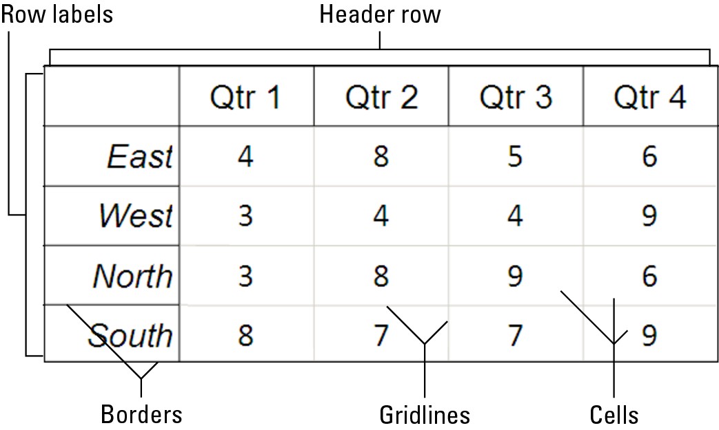
As with much else in Computerland, tables have their own jargon. Figure 1-1 describes table jargon. Sorry, but you need to catch up on these terms to construct the perfect table:
 Cell: The box that is formed where a row and column intersect. Each cell holds one data item.
Header row: The name of the labels along the top row that explain what is in the columns below.
Row labels: The labels in the first column that describe what is in each row.
Borders: The lines in the table that define where the rows and columns are.
Gridlines: The gray lines that show where the columns and rows are. Unless you’ve drawn borders around all the cells in a table, you can’t tell where rows and columns begin and end without the gridlines. (To display them, go to the [Table Tools] Layout tab and click the View Gridlines button.) By the way, table gridlines are not the same as the layout gridlines on the PowerPoint grid. Those gridlines are explained in Book IV, Chapter 2.
|
Figure 1-1: Parts of a table. |
|
Creating a Table
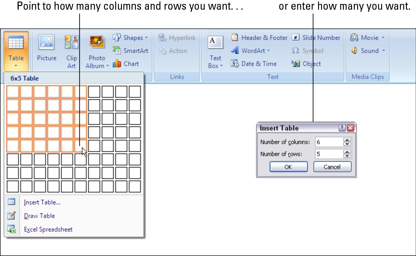
PowerPoint offers no fewer than four ways to create the cells and rows for a table. (The best slide layout for creating tables is Title Only because it gives you a text frame for entering a table title, or Title and Content because it also offers space for a title and provides the Table icon, which you can click to create a table.) Create your table with one of these techniques:

Dragging on the Table menu: On the Insert tab, click the Table button, point on the drop-down to the number of columns and rows you want, as shown in Figure 1-2, and let go of the mouse button.
|
Figure 1-2: Declare how many columns and rows you want for your table. |
|

Clicking the Table icon: Click the Table icon in a content placeholder frame. You see the Insert Table dialog box, shown in Figure 1-2. Enter the number of columns and rows you want for your table and click OK.
Using the Insert Table dialog box: On the Insert tab, click the Table button and choose Insert Table on the drop-down list. The Insert Table dialog box shown in Figure 1-2 appears. Enter the number of columns and rows you want and click OK.
Drawing a table: On the Insert tab, click the Table button and choose Draw Table on the drop-down list. The pointer changes into a pencil. Use the pencil to draw the table borders, the rows, and the columns. If you make a mistake, click the Eraser button on the (Table Tools) Design tab and drag it over the parts of the table you regret drawing (you may have to click the Draw Borders button first, depending on the size of your screen). When you’re finished drawing the table, press Esc or click the Draw Table button to put the pencil away.

Constructing your table from an Excel worksheet
Fans of Microsoft Excel will be glad to know that you can construct an Excel worksheet on a PowerPoint slide. Excel worksheets, which present data in columns and rows, are very much like PowerPoint tables and can serve as such on slides.
To create a worksheet on a slide, go to the Insert tab, click the Table button, and choose Insert Excel Spreadsheet. An Excel worksheet appears on the slide and — gadzooks! — you see Excel menus and commands where PowerPoint menus and commands used to be so that you can start crunching the numbers. The worksheet you just created is embedded in your PowerPoint presentation. Whenever you click the worksheet, Excel menus and commands instead of PowerPoint menus and commands appear on-screen. Click outside the worksheet to return to PowerPoint. Book VII, Chapter 4 explains how embedded documents work.
If the Excel worksheet you need for your PowerPoint slide has already been created and is already in your arsenal, you can import it into PowerPoint. Copy the Excel columns and rows you want for your table and, in PowerPoint, choose the Paste or Paste Special command (on the Home tab, open the drop-down list on the Paste button and select Paste or Paste Special). By choosing Paste Special, you can link the worksheet to your slide so that changes made to the worksheet appear on the slide as well. See Book VII, Chapter 4 for details.
Entering the Text and Numbers
After you’ve created the table, you can start entering text and numbers. All you have to do is click in a cell and start typing. Here are some tips to make the onerous task of entering table data a little easier:

Quickly changing a table’s size: Selection handles are found on the corners and sides of a table. By dragging one of these handles, you can change a table’s size, as well as the width and height of its columns and rows.
Moving a table: Move the pointer over the table’s perimeter, and when you see the four-headed arrow, click and start dragging.
Clearing the table styles: Maybe it’s just me, but I find it much easier to enter the text and numbers in a plain table without banded columns and other style doo-dads. To clear colors and doo-dads from a table, click the (Table Tools) Design tab, open the Table Styles gallery, and choose Clear Table (the Clear Table option is at the bottom of the menu). Later, you can redecorate your table with a style, as “Formatting Your Table” explains later in this chapter.
Choosing your preferred font size and font: Entering table data is easier when you’re working in a font and font size you like. Right-click the table and choose Select Table. Then click the Home tab and choose a font and font size there; or right-click, choose Font, and choose a font and font size in the Font dialog box.
Quickly inserting a new row: Click in the last column of the last row in your table and press the Tab key to quickly insert a new row.
Removing the borders and showing the table gridlines: Sometimes borders are a distraction, and it’s easier to enter data without them. To remove all borders from a table, select it (right-click and choose Select Table); on the (Table Tools) Design tab, open the drop-down list on the Borders button and choose No Border; and, on the (Table Tools) Layout tab, click the View Gridlines button (if necessary) to see gridlines.
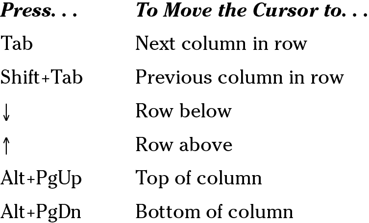
Here are some shortcuts for moving the cursor in a table:
Selecting Different Parts of a Table
It almost goes without saying, but before you can reformat, alter, or diddle with cells, rows, or columns, you have to select them:
Selecting cells: To select a cell, click in it. You can select several adjacent cells simultaneously by dragging the pointer over them.

Selecting rows: Drag across rows to select them, or go to the (Table Tools) Layout tab, click inside the row you want to select, click the Select button, and choose Select Row on the drop-down list. To select more than one row at a time, select cells in the rows before choosing the Select Row command.
Selecting columns: Drag across columns to select them, or start from the Layout tab, click inside the column you want to select, click the Select button, and choose Select Column on the drop-down list. To select several columns, select cells in the columns before choosing the Select Column command.
Selecting a table: Click the Layout tab, click the Select button, and choose Select Table on the drop-down list. You can also right-click a table and choose Select Table on the shortcut menu.
.jpg)
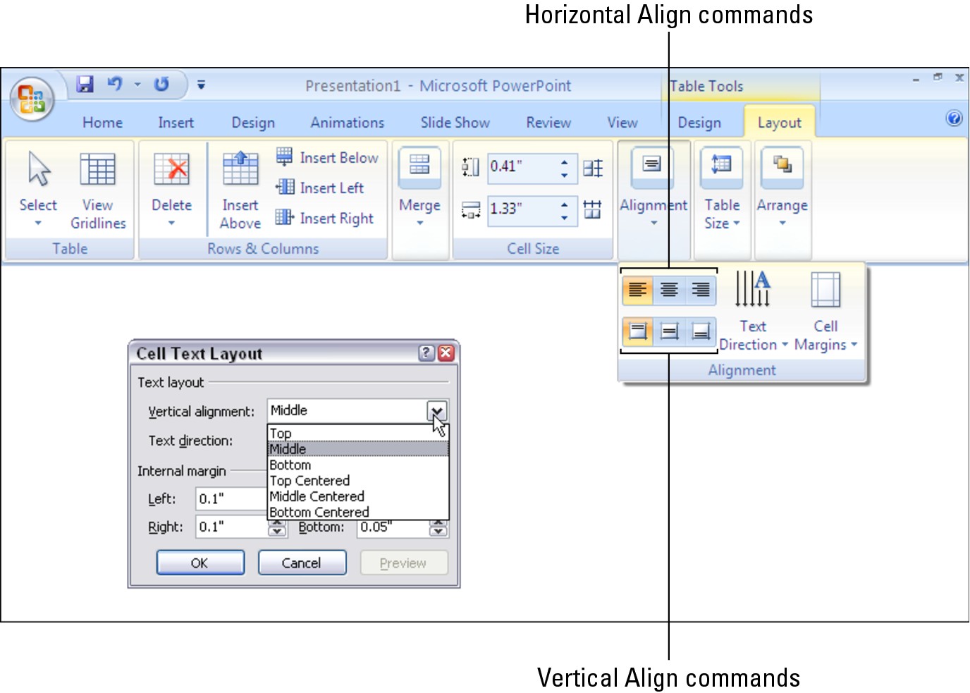
Aligning Text in Columns and Rows
Aligning text in columns and rows is a matter of choosing a combination of a horizontal and vertical Align command. PowerPoint offers two sets of Align commands, one for horizontal alignment and one for vertical alignment. By choosing one of each, you can align text any way you wish in a table.
Follow these steps to align text in a table:
1. Select cells, rows, columns, or your entire table.
The previous section in this chapter explains how to select parts of a table.
2. Select the (Table Tools) Layout tab.
3. Choose a combination of a horizontal Align button and a vertical Align button.
Depending on the size of your screen, you may have to click the Alignment button before you see the alignment buttons, as shown in Figure 1-3.
Click one horizontal and one vertical Align button:
• Horizontal Align commands: Click the Align Left (press Ctrl+L), Center (press Ctrl+E), or Align Right button (press Ctrl+R).
• Vertical Align commands: Click the Align Top, Center Vertically, or Align Bottom button.

|
Figure 1-3: Combine two Align commands to align text any way you wish. |
|
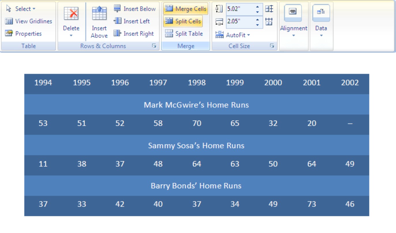
Merging and Splitting Cells
Merge and split cells to make your tables a little more elegant than run-of-the-mill tables. Merge cells to break down the barriers between cells and join them into one cell; split cells to divide a single cell into several cells (or several cells into several more cells).
In the table shown in Figure 1-4, the cells in rows 2, 4, and 6 have been merged, and a baseball player’s name is in each merged cell. Where rows 2, 4, and 6 should have nine cells, they have only one.
Select the cells you want to merge or split, go to the Layout tab, and follow these instructions to merge or split cells:

Merging cells: Click the Merge Cells button. You can also right-click and choose Merge Cells.

Splitting cells: Click the Split Cells button or right-click and choose Split Cells. In the Split Cells dialog box, declare how many columns and rows you want to split the cell into and then click OK.
|
Figure 1-4: Merge cells to create larger cells. |
|

Laying Out Your Table
Very likely, you created too many or too few rows or columns for your table. Some columns are probably too wide and others may be too narrow. If that is the case, you have to change the layout of the table by deleting, inserting, and changing the size of columns and rows, not to mention change the size of the table itself. In other words, you have to modify the table layout. (“Decorating your table with borders and colors,” later in this chapter, explains how to put borders around tables and embellish them in other ways.)
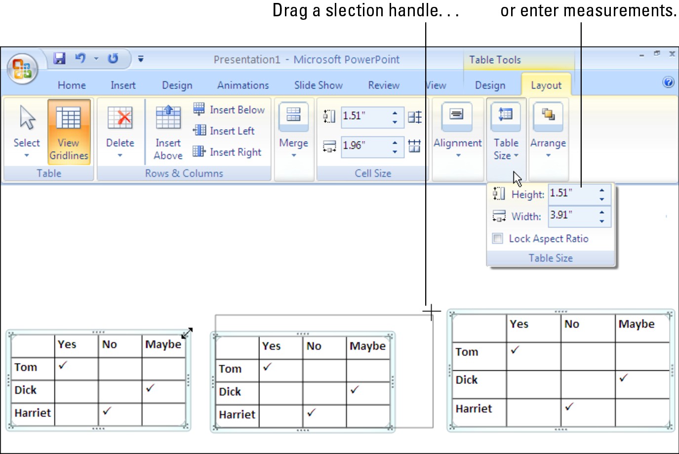
Changing the size of a table, columns, and rows
The fastest way to adjust the width of columns, the height of rows, and the size of a table itself is to “eyeball it” and drag the mouse:

Column or row: Move the pointer onto a gridline or border, and when the pointer changes into a double-headed arrow, start dragging. Tug and pull, tug and pull until the column or row is the right size.
You can also go to the (Table Tools) Layout tab and change the measurements in the Cell Size boxes to change the width of a column or the height of a row. The measurements affect entire columns or rows, not individual cells.
A table: Drag a selection handle on a side or corner, as shown in Figure 1-5. You can also go to the Layout tab, click the Table Size button (if necessary), and enter inch measurements in the Height and Width text boxes, as shown in Figure 1-5. Click the Lock Aspect Ratio check box to keep the table’s proportions as you change its height or width.
|
Figure 1-5: The two ways to change a table’s size. |
|
Because resizing columns and rows can be problematic, PowerPoint also offers these handy buttons on the Layout tab for adjusting the width and height of rows and columns:

Distribute Rows: Click this button to make all rows in the table the same height. Select rows before clicking the button to make only the rows you selected the same height.

Distribute Columns: Click this button to make all columns the same width. Select columns before giving this command to make only the columns you selected the same width.
Inserting and deleting columns and rows
Go to the (Table Tools) Layout tab and follow these instructions to insert and delete columns and rows:
Inserting columns: Select a column or columns and click the Insert Left or Insert Right button. If you want to insert just one column, click in a column and then click the Insert Left or Insert Right button. You can also right-click, choose Insert, and choose an Insert command.
Inserting rows: Select a row or rows and click the Insert Above or Insert Below button. If you want to insert just one row, click in a row and click the Insert Above or Insert Below button. You can also right-click, choose Insert, and choose an Insert command on the submenu.
Insert a row at the end of a table by moving the cursor into the last cell in the last row and pressing the Tab key.

Deleting columns: Click in the column you want to delete and then click the Delete button and choose Delete Columns on the drop-down list. You can also right-click and choose Delete Columns. Select more than one column to delete more than one. (Pressing the Delete key deletes the data in the column, not the column itself.)
Deleting rows: Click in the row you want to delete and then click the Delete button and choose Delete Rows. You can also right-click and choose Delete Rows. Select more than one row to delete more than one. (Pressing the Delete key deletes the data in the row, not the row itself.)
Moving columns and rows
Because there is no elegant way to move a column or row, you should move only one at a time. If you try to move several simultaneously, you open a can of worms that is best left unopened. To move a column or row:
1. Select the column or row you want to move.
Earlier in this chapter, “Selecting Different Parts of a Table” explains how to select columns and rows.
2. Right-click in the selection and choose Cut on the shortcut menu.
The column or row is moved to the Clipboard.
3. Insert a new column or row where you want to move the column or row you cut.
The preceding section of this chapter explains how to insert columns and rows.
4. Move the column or row:
• Column: Click in the topmost cell in your new column. Then right-click and choose Paste on the shortcut menu.
• Row: Click in the first column of the row you inserted. Then right-click and choose Paste on the shortcut menu.
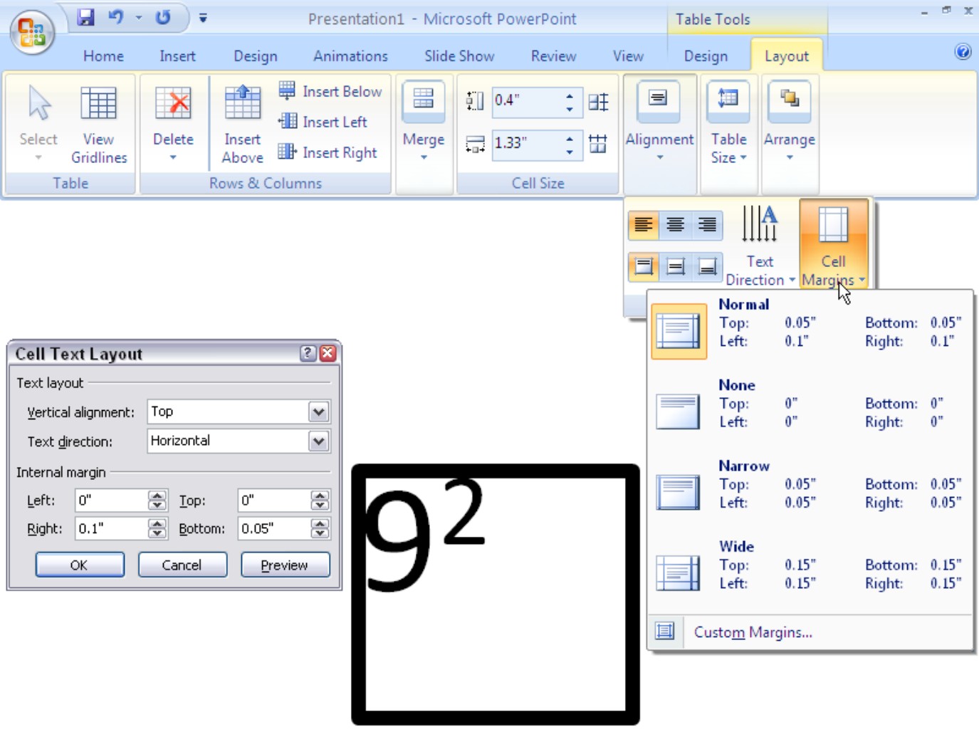
Changing the size of cell margins
Each table cell is like a miniature page in that it has a left, right, top, and bottom margin. Except when a table or cell has thick borders, the cell margins are fine. A thick border, however, can impose on the margin and come too close to the text.
Follow these steps to adjust the internal margins of table cells to move text further from or closer to the row and column borders:
1. Select the table cells whose margins need an attitude adjustment.
2. Click the (Table Tools) Layout tab.
3. Click the Cell Margins button.
Depending on the size of your screen, you may have to click the Alignment button first.
4. On the submenu, choose a Margins option or choose Custom Margins to establish margins on your own.
The Margins submenu offers the Normal, None, Narrow, and Wide options, as shown in Figure 1-6. If you select Custom Margins, you see the Cell Text Layout dialog box, shown in Figure 1-6, where you can enter internal margin measurements of your own.
Formatting Your Table
After you have entered the text, placed the rows and columns, and made them the right size, the fun begins. Now you can dress up your table and make it look snazzy.
|
Figure 1-6: Establishing the size of cell margins. |
|
Almost everything you can do to a slide you can also do to a table by selecting parts of it and selecting design and layout commands. You can change text fonts, choose colors for rows and tables, and even land a graphic in the background of your table. You can also play with the borders that divide the rows and columns and “shade” columns, rows, and cells by filling them with gray shades or a black background. Read on to find out how to do these tricks.
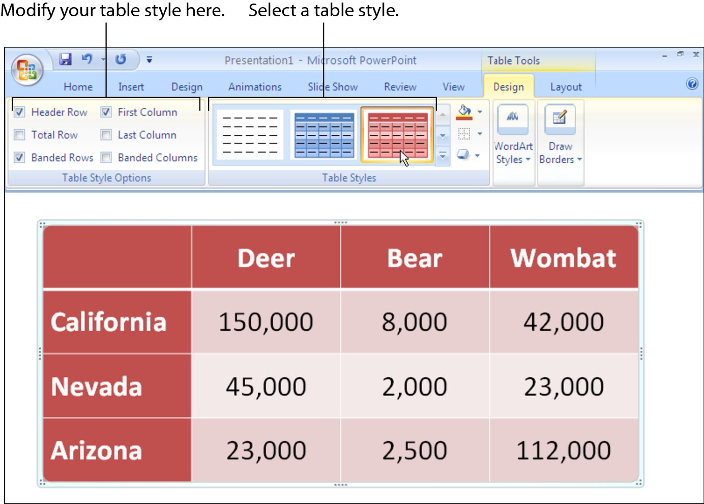
Designing a table with a table style
Select your table and follow these steps to choose a table style:
1. Click the (Table Tools) Design tab.
2. Open the Table Style gallery and move the pointer over table style choices to “live-preview” the table.
|
Figure 1-7: Lots of choices in the Table Styles gallery. |
|
3. Select a table style.
To remove a table style, select Clear Table on the bottom of the Table Styles gallery.
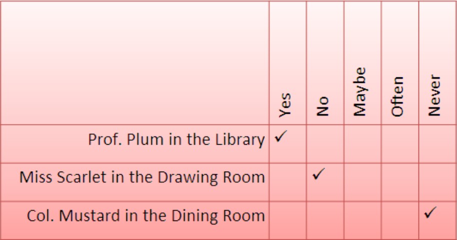
Calling attention to different rows and columns
On the (Table Tools) Design tab, PowerPoint offers Table Style Options check boxes for calling attention to different rows or columns (refer to Figure 1-7). For example, you can make the header row — the first row in the table — stand out by selecting the Header Row check box. If your table presents numerical data with total figures in the last row, you can call attention to the last row by choosing the Total Row check box. Select or deselect these check boxes to make your table easier to read and understand:
Header Row and Total Row: These check boxes make the first row and last row in a table stand out. Typically, the header row is a different color or contains boldface text because it is the row that identifies the data in the table. Select the Header Row check box to make the first row stand out; if you also want the last row to stand out, select the Total Row check box.
Banded Rows and Banded Columns: Banded means “striped” in PowerPoint lingo. For striped rows or striped columns — columns or rows that alternate in color — select the Banded Rows or Banded Columns check box.
First Column and Last Column: Often the first column stands out in a table because it identifies what type of data is in each row (refer to Figure 1-7). Select the First Column check box to make it a different color or boldface its text. Check the Last Column check box if you want the rightmost column to stand out.
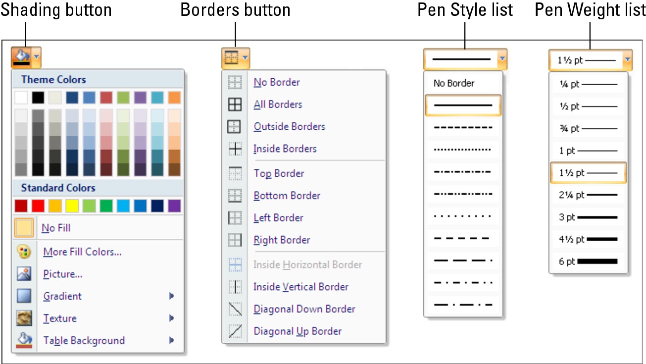
Decorating your table with borders and colors
Rather than rely on a PowerPoint table style, you can play interior decorator on your own. You can slap color on the columns and rows of your table, draw borders around columns and rows, and choose a look for borders. Figure 1-8 shows the drop-down lists on the (Table Tools) Design tab that pertain to table decoration.
|
Figure 1-8: Tools on the (Table Tools) Design tab for decorating tables. |
|
Designing borders for your table
To fashion borders for a table, start by declaring what the borders will look like. Then select the part of the table that needs new borders and choose a Borders command. Click inside your table and follow these steps to decorate it (or part of it) with borders:
1. Click the (Table Tools) Design tab.
2. Select the part of the table that you want to “border-ize.”
To select the entire table, right-click it and choose Select Table.

3. Open the drop-down list on the Pen Color button and choose the color you want for borders.
You may have to click the Draw Borders button first, depending on the size of your screen.
4. Open the drop-down list on the Pen Style button and choose a line style (refer to Figure 1-8).
Stay away from the dotted and dashed lines unless you have a good reason for choosing one. These lines can be distracting and keep the audience from focusing on the data being presented in the table.
5. Open the drop-down list on the Pen Weight button and choose an option that describes how thick you want the borders to be (refer to Figure 1-8).

6. Open the drop-down list on the Borders button (refer to Figure 1-8) and choose where to place borders on the part of the table you selected in the previous step.
This is the tricky part. The Borders commands have different effects, depending on which part of the table you selected. For example, if you selected two rows and you choose the Top Border command, the command applies only to the top of the uppermost row. If you are anywhere near typical, you have to repeat Steps 5 and 6 until you get it just right.
Choosing colors for columns, rows, or your table

Colorizing rows or columns: Select the rows or columns that need color and choose a color option on the Shading button drop-down list. Theme colors are deemed appropriate for the theme you chose for your presentation.
Colorizing the entire table: Open the Shading button drop-down list, select Table Background, and choose a color on the submenu.
Later in this chapter, “Using a picture as the table background” explains how to use a picture as the background in a table.
Neat Table Tricks
The rest of this chapter details a handful of neat table tricks to make your tables stand out in a crowd. Why should all tables look alike? Read on to discover how to make text in the header row stand on its ear, put a picture behind a table, draw diagonal border lines, line up column numbers on a decimal point, draw on top of a table, and wrap slide text around a table.
Changing the direction of header row text
In a top-heavy table in which the header row cells — the cells in the first row — contain text and the cells below contain numbers, consider changing the direction of the text in the header row to make the table easier to read. Changing text direction in the header row is also a good way to squeeze more columns onto a table. Consider how wide the table shown in Figure 1-9 would be if the words in the first row were displayed horizontally.
|
Figure 1-9: Change the direction of text to squeeze more columns on a table. |
|
Follow these steps to change the direction of text on a table.
1. Select the row that needs a change of text direction.
Usually, that’s the first row in a table.
2. Go to the (Table Tools) Layout tab.
3. Click the Text Direction button.
Depending on the size of your screen, you may have to click the Alignment button to see the Text Direction button.
4. Select a Text Direction option on the submenu.
Choose the Horizontal option to read text the normal way. For the table in Figure 1-9, I chose the Rotate All Text 270 Degrees option. The Stacked Option places the letters one above the other.
5. Change the height of the row to make the vertical text fit.
As “Changing the size of a table, columns, and rows” explains earlier in this chapter, you can change the height of a row by going to the Layout tab and entering a measurement in the Table Row Height box.
Using a picture as the table background
As Figure 1-10 demonstrates, a picture used as the background in a table looks mighty nice. To make it work, however, you need a graphic that serves well as the background. For Figure 1-10, I got around this problem by “recoloring” my graphic. (Book IV, Chapter 3 explains how to “recolor” a graphic.) You also need to think about font colors. Your audience must be able to read the table text, and that usually means choosing a white or light font color for text so that the text can be read over the graphic. For Figure 1-10, I selected a white font color.
|
Figure 1-10: Using a graphic as a table background by stitching a graphic and table together (left) and by using the Table Background⇒ Picture command (right). |
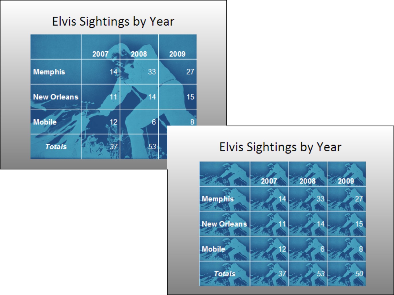
|
PowerPoint offers two ways to make a graphic part of a table. Either make the graphic appear behind the table (refer to the left side of Figure 1-10) or make the graphic appear in every table cell (refer to the right side of Figure 1-10). Both techniques are described forthwith.
Placing one picture behind the table
Follow these steps to place a graphic behind a table:
1. Select the (Table Tools) Design tab, open the Table Styles gallery, and choose Clear Table.
With the table styles out of the way, you can see the graphic clearly through your table.
2. Click anywhere in the table.
Make sure that the table itself isn’t selected, nor are any columns, rows, or cells.
3. On the (Table Tools) Design tab, open the drop-down list on the Shading button and choose Table Background ⇒Picture.
You see the Insert Picture dialog box.
4. Select a picture and click the Insert button.
You may have to resize your table to keep the picture from being warped. See “Changing the size of a table, columns, and rows,” earlier in this chapter.
To remove a background picture from a table, open the drop-down list on the Shading button and choose Table Background⇒No Fill.
Placing a background picture in each table cell
To place pictures in table cells, you need a graphic of uniform color; otherwise, the text is too hard to read (you might consult Book IV, Chapter 3, which explains how to alter graphics with the Office Picture Manager). Follow these steps to place a background picture in each table cell:
1. Right-click your table and choose Select Table.
Or, if you want to place a picture inside a handful of cells, select the cells.
2. Click the (Table Tools) Design tab.
3. Open the drop-down list on the Shading button and choose Picture.
The Insert Picture dialog box opens.
4. Select a picture and click the Insert button.
To remove the background pictures from a table, open the drop-down list on the Shading button and choose No Fill or choose Clear Table in the Table Styles gallery.
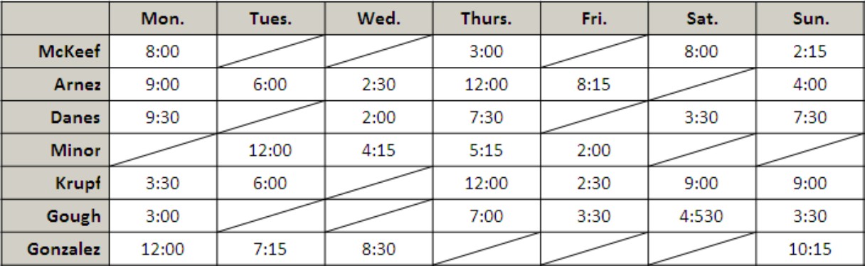
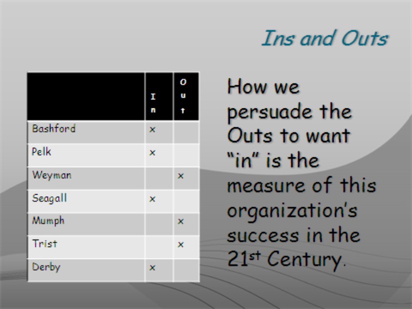
Drawing diagonal lines on tables
Draw diagonal lines across table cells to cancel out those cells or otherwise make cells look different. In Figure 1-11, diagonal lines are drawn on cells to show that information that would otherwise be in the cells is either not available or is not relevant.
|
Figure 1-11: Diagonal lines mark off cells as different. |
|
Select the cells that need diagonal lines, go to the (Table Tools) Design tab, and use one of these techniques to draw diagonal lines across cells:

Draw Table button: Click the Draw Table button (you may have to click the Draw Borders button first). The pointer changes into a pencil. Drag to draw the diagonal lines. Press Esc or click the Draw Table button a second time when you are finished drawing.
Borders button: Open the drop-down list on the Borders button and select Diagonal Down Border or Diagonal Up Border.
To remove diagonal lines, click the Eraser button and drag across the diagonals.
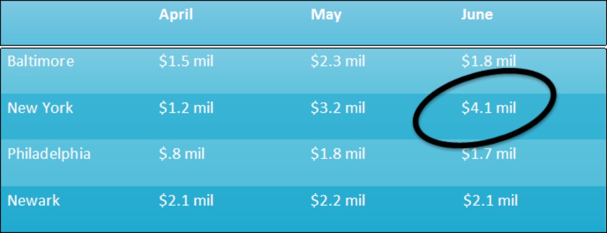
Drawing on a table
When you want the audience to focus on data in one part of a table, draw a circle around the data. By “draw” I mean to make an Oval shape and place it over the data you want to highlight, as shown in Figure 1-12. Book IV, Chapter 1 explains the drawing tools in detail. To spare you the trouble of turning to that chapter, here are shorthand instructions for drawing on a table:
1. On the Home or Insert tab, open to the Shapes gallery and select the Oval shape.
2. On a corner of your slide, away from the table, drag to draw the oval.

3. On the Format tab, click the Shape Outline button and choose a very dark color.

4. Click the Shape Fill button and choose No Fill.
5. Drag the oval over the data on your table that you want to highlight.
If the oval is obscured by the table, click the Bring to Front button on the (Drawing Tools) Format tab (you may have to click the Arrange button first). While you’re at it, consider rotating the oval a little way to make it appear as though it were drawn on the table.
|
Figure 1-12: You can circle data to highlight it. |
|
In the course of a live presentation, you can draw on slides with the Pen to highlight data. See Book VI, Chapter 1.
Wrapping slide text around a table
You can’t truly wrap text around a table on a PowerPoint slide, but you can come close. By starting from a Two Content slide layout, you can place the table on one half of the slide and the text on the other, as shown in Figure 1-13. To the untrained eye, this arrangement looks something like wrapped text.
|
Figure 1-13: Use the Two Content slide layout to give the appearance of wrapping text. |
|