Introduction
As a genre, still life is the most accessible way for artists to practise their skills. Objects of all sorts are always easily available to draw, and even in your own house you will find numerous still-life arrangements that have occurred without any effort on your part. Still life encourages you to look closely before you have even set pencil to paper. Observe how a single object rests upon a surface: what angle will you choose; what texture does it have; are there any highlights or shadows playing upon it? Again, a group of objects makes a different set of demands on your powers of observation, because you are looking at things in relation to one another and considerations of proportion and perspective will come into play. From the exercises in this section of the book you will learn about the ways in which you can build up a pleasing still-life composition and gain some practice in the genre.
Basic Drawing of Single Objects
For your next practice, find a number of ordinary objects from around the house and have a go at drawing them in a simple way. There’s no need to look for items with inherent beauty – this is just about learning to draw things accurately.

Find an ordinary wooden box and do your best to reproduce it as I have done here, with its perspective effect. Notice how the far end of the box appears to be slightly smaller than the closer end.
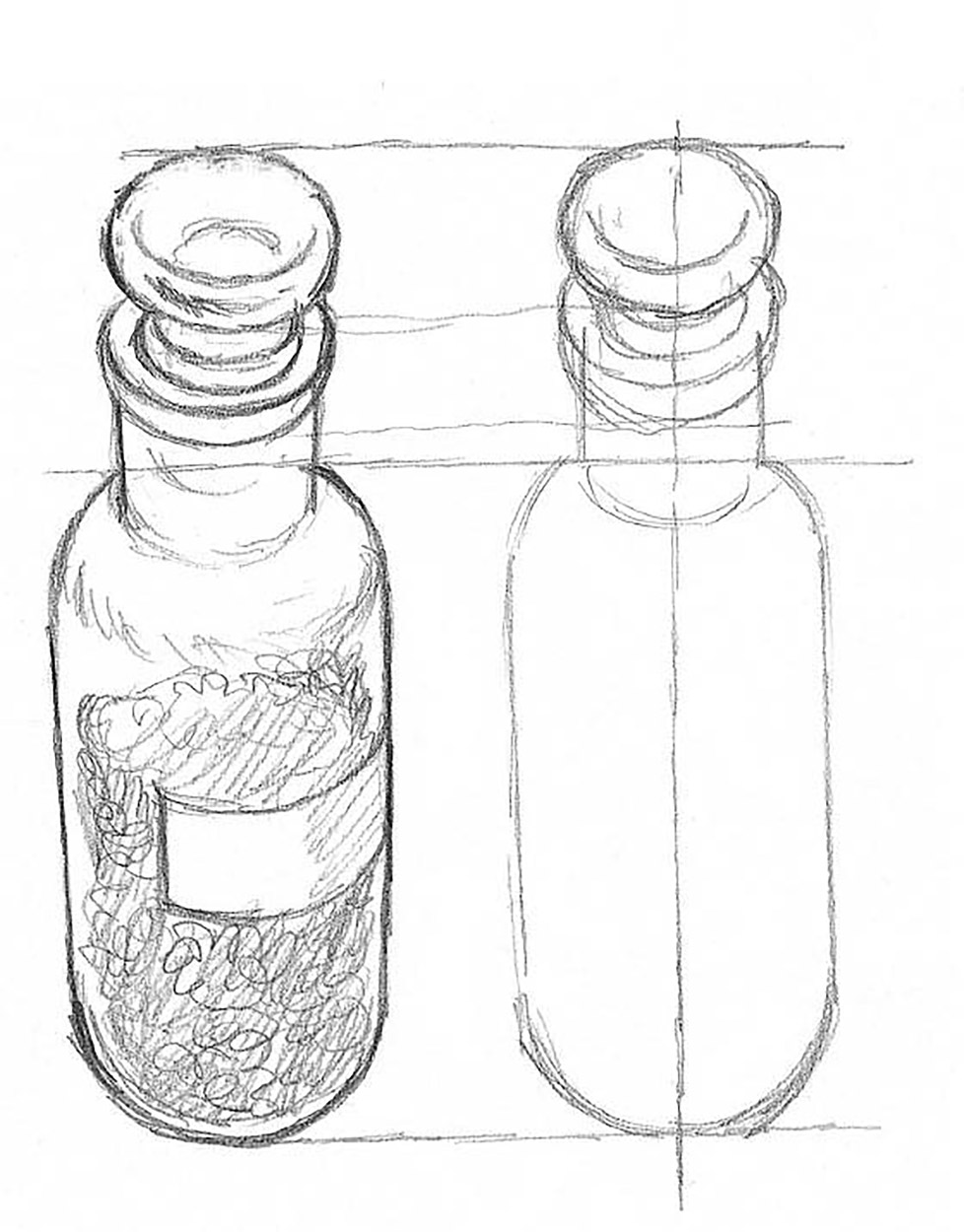
Here’s a little glass bottle containing some pigment that I found in my studio. It is based on a circular shape so, as you can see in the drawing next to it, the sides show as mirror images either side of a central line.
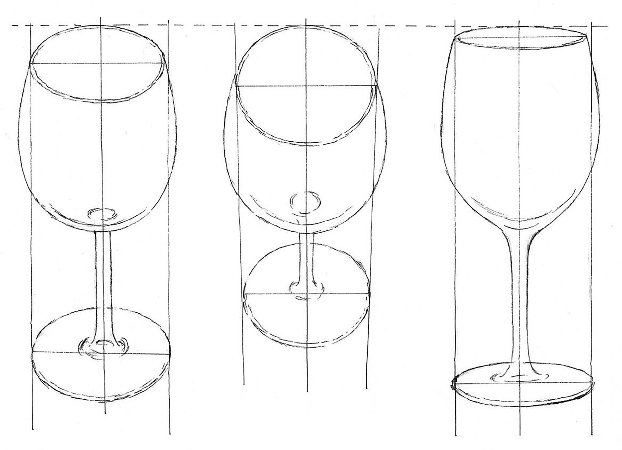
Now find a straightforward object like a wine glass, which has an interesting shape; its transparency enables you to see the structure clearly. Begin by getting some idea of the proportions of the glass; calculate the ratio of stem length to bowl size. As with the glass bottle opposite, draw a vertical ruled line to mark the centre line of the object. The shape of the glass is curved, so the two sides should appear symmetrically either side of the central line. If they don’t, it means that your drawing is out of balance. You have plenty of opportunity for drawing ellipses in this exercise so try to make them as accurate as you can. Check that none of the curves look odd or out of proportion.
Have a go at drawing the same object from a slightly different angle. This gives you both practice at drawing and familiarizes you with its overall shape. Having drawn it a couple of times, do it again from another viewpoint, so that you get even more information about the object. All this concentration on one object boosts your knowledge of the world of ‘form’, which is essential for an artist. Repeat the exercise as many times as possible with different objects, knowing that the more you draw the better you will become.
Working Up a Simple Object
Now you can start to portray objects in a little more detail, adding some tone to lend solidity. First I have chosen a cup and saucer, because this pair of closely fitting objects is fairly simple to draw, but sufficiently complex to be a good test of your newly acquired skills.
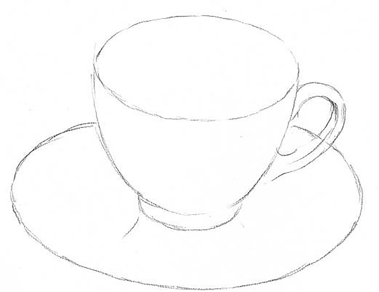
1. First draw the ellipses to show the top and bottom of the cup, and the main shape of the saucer. Draw the handle shape and the curved sides of the cup.

2. Add in the main areas of shade with, as before, one single tone. Pay attention to the inside of the cup and to the tones on the side of the saucer.

3. Lastly, work up the tones until you get a good likeness of the shape and reflections on the objects.
The next object is a glass jar containing tinted water.

1. As before, draw the ellipses and outside edges of the jar, not forgetting to indicate the level of the water as well.

2. Shade in the area that represents the tinted water. There will not be many other tones, due to the transparency of the glass.

3. Now indicate all the very darkest parts, and show the difference between the body of the water and the surface. Most of the darkest tones are round the lip of the jar and the indentations in the glass at the top and bottom.
Tone On an Object
It is only once tone has been added that an object begins to look like something three-dimensional that you can handle and use. The following drawings show just how important it is to be able to use tone to describe the substance of objects.

1. Here I’ve drawn a light-coloured jug, first in outline to show how the shape alone, if well described, will give you quite a lot of information about the jug. You can see that it must be round and that it has a lip and a handle, and it appears to be on a surface, the limit of which you can see behind it.
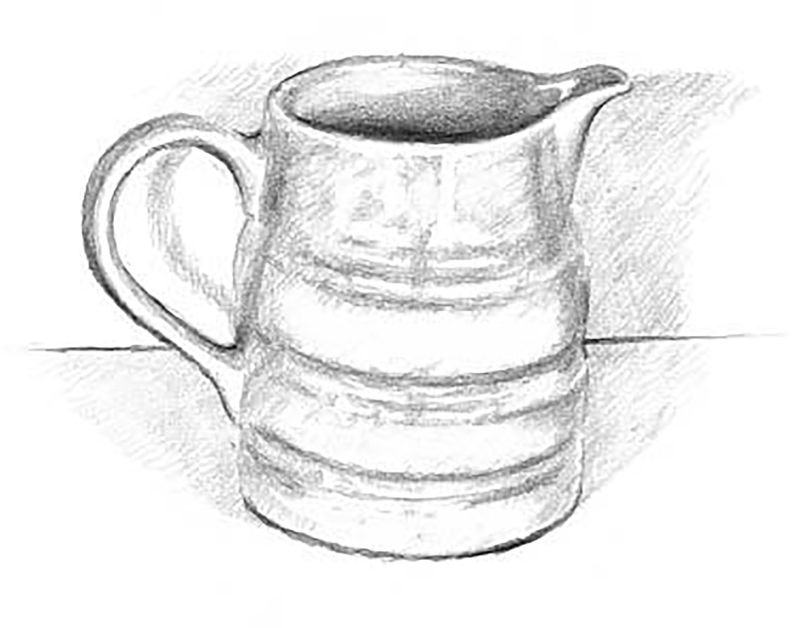
2. Here all the tone has been put in to show the difference that this makes to our knowledge about the object. The space is more defined and the quality of the curve of the jug is more clearly seen. The object looks solid.

3. In the next drawing I have put in all the tone on the jug but have left out the tonal background. This has the effect of making it appear to float in the space, because it doesn’t have any real connection with the background.

4. The last drawing of the jug does the opposite, making the dimensions of the object loom out of the darkness of the background, so that it’s very clearly defined as light against dark. This isn’t realistic, but it’s a good way of bringing our attention to the jug shape jumping out of the space. So you can see that tone can add or subtract from your drawing.
Tonal Drawing Practice
Having looked at some of the possibilities of tone, we can now turn our attention to some straightforward objects on which you can practise your technique. Take this opportunity to try using some different materials and experiment with the effects you can achieve.

First, a drawing in ink of an apple. The buildup of tonal texture is done in a scribble technique, which seems to work well with round objects.
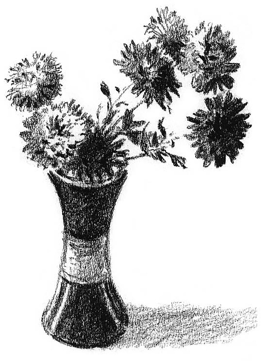
These flowers are drawn in charcoal. The soft edges of the medium suit the quality of the plants. The slightly fluffy texture of the blossoms is easily shown in this medium.

The brush and wash technique is appropriate for this drawing of a leather bag as it emphasizes its slightly squashy appearance.
Materiality
Showing some awareness of the material constitution of your still-life subjects will make your final drawing all the more convincing. There are well-known ways of drawing that make materiality quite clear. Here are some examples.
Leather – smooth and shiny
This particular shoe is dark and well polished, so there are strong contrasts between the light and dark areas. Study it carefully and observe how those light and dark areas define the shape of the shoe, as well as its materiality. Notice how the very darkest tones are often right next to the very lightest, giving maximum contrast.

Glass – transparency
The shape of this tumbler, set against a dark background, is defined by the glass picking up all sorts of reflections from the surrounding area. Notice how a section of the straight edge behind the glass is visible but in a distorted (refracted) way, because of the thickness of the material and its curved surface. Make sure that when you draw the outline of the glass it is well delineated, because this outer shape holds together the rather amorphous forms of the reflections. Also, note how the brightest highlights occur in only one or two small areas. Don’t be tempted to put in too many highlights or the tumbler won’t look so transparent.

Metal – strong reflections
The metal object I have chosen is also a highly reflective piece of hardware – a shiny saucepan. Once you have drawn the shape as accurately as you can, you have to decide how much of its reflectivity you are going to show. Reflections on this type of surface can become very complicated to draw, so it is reasonable to simplify them to a certain extent. Make sure you represent all the main areas of dark and light and that, once again, the very brightest is placed next to the very darkest. The interior of the pan is not so clearly reflective and you should show the difference between the inside and the outside. The cast shadow is also important because this is reflected in the side of the pan and reinforces the illusion.

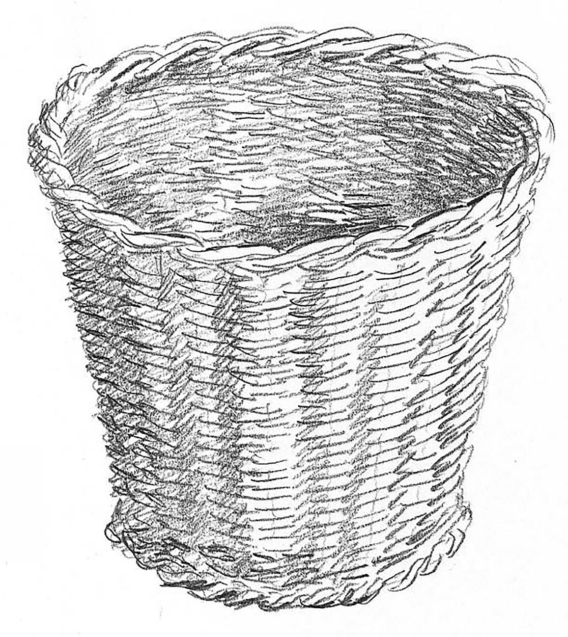
Basketwork – strong texture
This particular texture needs careful drawing in order to achieve the best general effect. On the plus side, the shapes of the woven strands of basket are repetitive in nature, so once you get the hang of it, it should not take you long. When the pattern of the basketwork has been completed, the shadow on the inner part and down one side should yield a three-dimensional aspect.
Pottery – hard and smooth
This pottery bottle shouldn’t be too difficult to draw because the surface is not as reflective as some of the previous objects and the shape is simple enough. Just make sure that the gradation of tone around the bottle doesn’t look too harsh, and create a little texture with pencil strokes round the contours to mimic the striated surface.

Textiles: silk – soft surface
A silk handkerchief is the next item and, again, is not so difficult to draw, although it does require careful rendering in even tones. Folds occurring in silk fabric tend to be rounder and softer than in any other material.

Textiles: corduroy – tough texture
This corduroy shirt is made of a fairly stiff material and this quality should show in the way you draw the folds. It also has a distinctive surface texture, which makes it look very different from other, smoother fabrics. Don’t delineate every detail of the surface, just the shadowy areas where the tone is deeper.
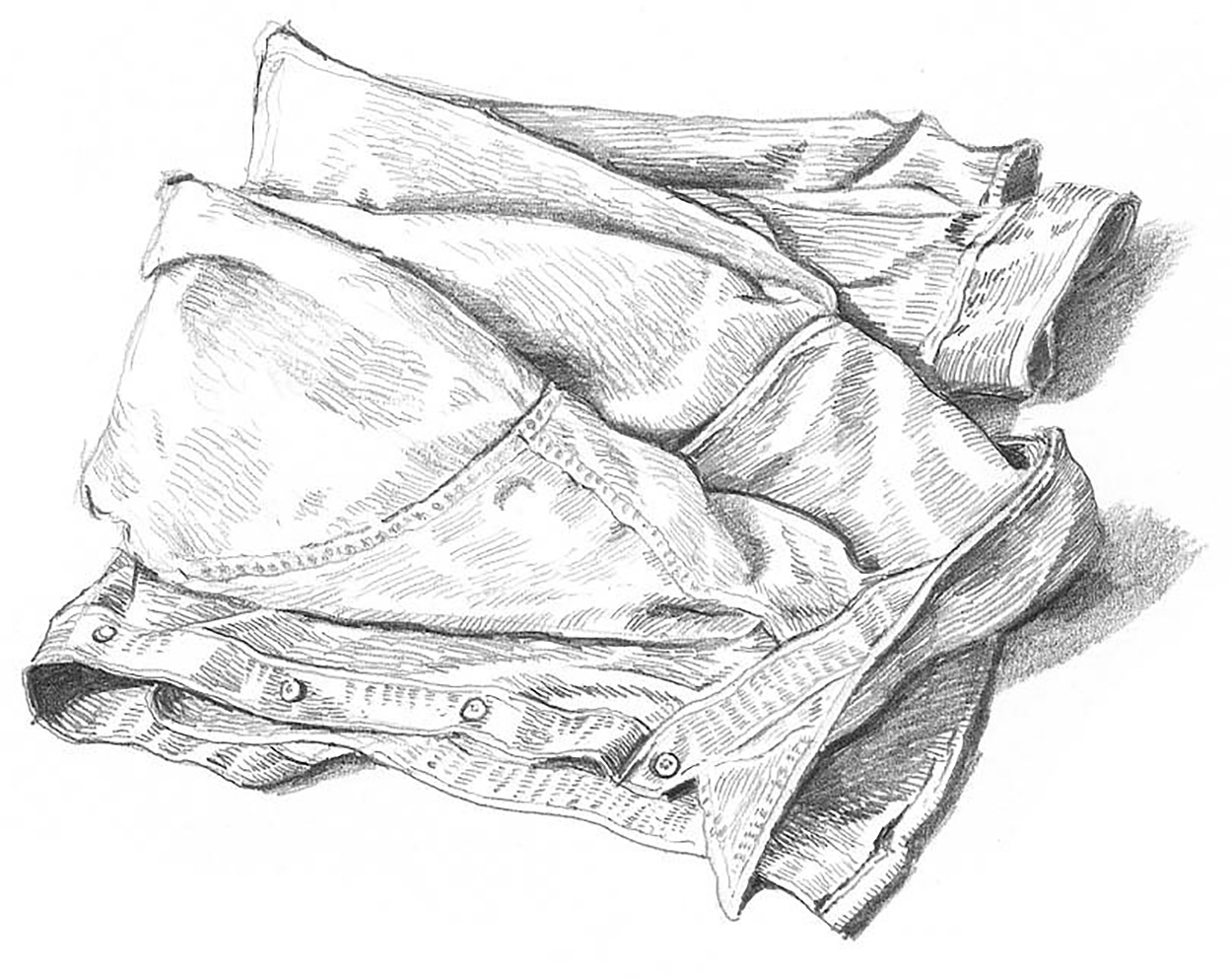
Paper – crumpled surfaces
Crumpled paper exhibits quite sharp folds, which is the main way to differentiate it from textiles in your drawings. The other characteristic of paper is that it reflects light well, and consequently there are very few deep shadows.

Vegetables – draw what you eat
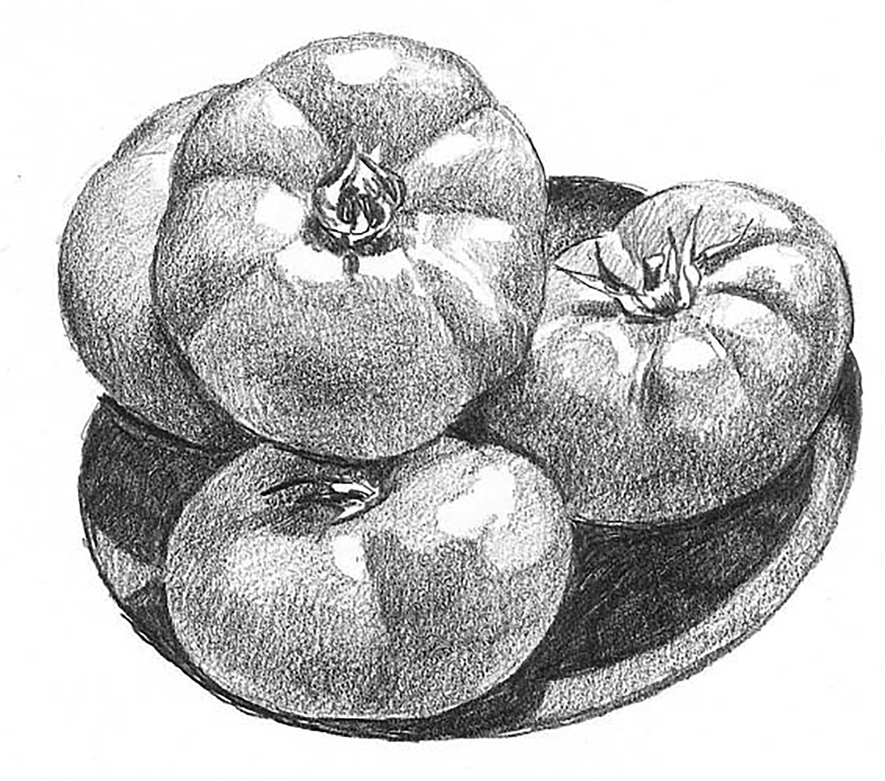
Fruit and vegetables are great standbys for still-life artists, and here we show a couple of examples. The bowl of tomatoes gives an idea of the smooth shiny surface of the fruit. The main aim here is to balance the dark and light tones to give a convincing impression of the curved surface.
The cauliflower is an altogether different proposition, with strongly veined leaves and a creamy, lumpy ‘curd’. No part of the surface of the vegetable is smooth and you need to show a strong contrast between the dark leaves and the white florets.

These rose and clematis flowers present interesting and complex shapes and need to be carefully studied in order to render their delicate texture.

Flowers – different methods
Here are two approaches to try when drawing plants.
For the first (above left), take a big close-up of a boldly shaped flower and draw it in as much detail as possible. Keep it big.
Then, for contrast (above), try something like a vase of flowers and draw them in very lightly with sweeping strokes. Don’t worry about the details, but concentrate on getting the flowing feel of the growth and the fragility of the flowers. Here less is more, in that you don’t want to overdraw your subject, so keep your marks very loose and impressionistic.

Accidental and Composed Arrangements
The still-life objects on these two pages were just sitting there waiting for someone to notice how interesting they were. This is one of the benefits of drawing still life – you begin to see subjects everywhere you look. You may wish to make slight alterations to obtain the composition you are after, or you can simply draw the arrangements as they are.
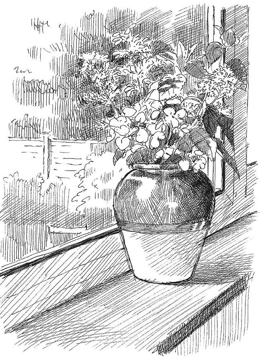
Here is a vase of flowers on a windowsill. You can see the perspective of the surface it is standing on, the way the light from outside lights up the objects, and the background of the garden through the window pane.
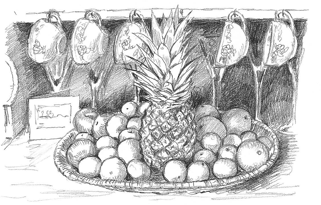
The next composition is much more complicated. It consists of several cups hanging on a sideboard, glasses under the shelf and a large basketwork tray full of fruit, arranged fairly carefully. This is much more like the traditional paintings of still lifes that artists have been making for many generations.

The next choice was more considered. I found two jugs of different shapes and sizes and placed them next to each other, turning them so that their spouts were facing. The fact that one is short, curvy and dark in colour while the other is tall, straight and lighter figured in my reasons for choosing them. This demonstrates how you can make aesthetic judgements about even a very simple subject, whereas in the two previous examples I had just happened upon the still lifes.
Negative Shapes
In a drawing there are no spaces as such – the shapes between and around objects are just as important as the shapes of the objects themselves. These ‘spaces between’ are called negative shapes, and when it comes to creating more complex compositions involving several objects, observing them will help you to draw more accurately.

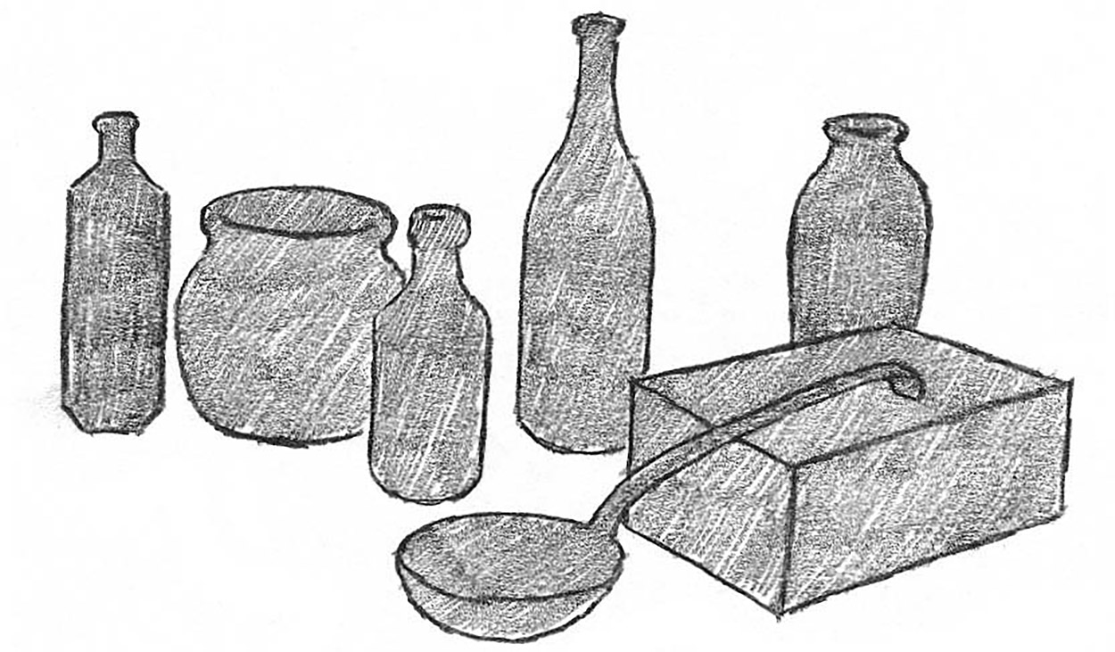
Here is a still life group, which you may want to draw. Your first instinct will probably be to try to draw it object by object, hoping that they will relate to one another correctly.
Seeing the group of objects drawn in a flat tone helps you to understand the positive shapes and their relation to one another.

In the example above, you can see how drawing the negative shapes describes the forms of the objects and how much they overlap one another.
A Still-life Project
The drawings on these pages show how you might go about selecting a still-life subject. Remember to take some time to work out your ideas before you choose a composition and progress through the stages to a finished piece of work.
Preliminary Drawings

Thinking about a kitchen theme, I took some apples and oranges and laid them out in a way that I thought I could use. The theme seemed to be developing.


Next, to keep the idea going, I drew a large saucepan and then a couple of wine glasses. All this preparation is very useful for working up a good still-life composition. It may take several days, but it’s worth it when you are drawing a major piece of work.
After that I added a bowl and, to bring in food again, a box of eggs from the fridge. My kitchen still life seemed to be falling into place.

I then put a napkin on the tabletop to add a different texture to the scene.
Choosing a Composition

The next stage was to choose my composition pieces and try them out. I roughly scribbled out an arrangement of some of the objects I had gathered.

Then I tried a much simpler one, but wasn’t altogether convinced that it was interesting enough.
So I tried another arrangement but still felt it was not what I really wanted. This scribbling up of various compositions is never a waste of time, because it helps to clarify what you are really after.

Finally I got something that started to look like the composition I wanted. All this preparatory work can be done long before you start to draw, but you do have to sit in the position that you think you will be drawing from when it comes to the real thing. Then you quickly start to see what it is that you find attractive.
The Final Composition
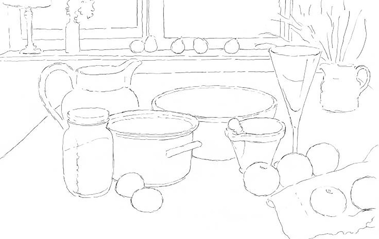
1. Now I had a good idea as to what the composition would look like. I carefully arranged all the objects I wanted to see in the drawing, sometimes swapping one object for a similar one in a different size or style. At this stage I drew up the whole composition in a light outline, correcting all the time in order to arrive at a clear cartoon drawing of the whole thing.

2. The next stage was to lay on a single tone that represented all the different tones in the drawing, in order to get a clear idea about how the light was falling on the objects.
3. I now put in the very darkest areas, which were almost black. This gave me the contrast between the lightest and the darkest tones, and made it much easier to put in all the mid-tones. This can take some time but if it is done attentively it will really enhance the quality of the final picture.
4. Finally, the tones between the darkest and lightest were carefully graded to build a convincing three-dimensional effect, giving the appearance of light falling across the various objects and helping to indicate their texture and materiality.
