Chapter Eight
Dynamic Trends And Trend Lines
The loss was not bad luck. It was bad analysis.
David Einhorn (1968-)
In this chapter I want to explore the concept of trends and trend lines. And no doubt you will have heard the oft quoted term 'let the trend be your friend', which in my humble opinion is more or less meaningless mumbo jumbo.
It is the mantra people who profess to be mentors and coaches parrot to their students in an effort to impress. However, just like price congestion where, with hindsight any fool can see when the market has been trading sideways, so it is with trends. And anyone who quotes this axiom has clearly little live trading experience, in my view. Generally they will show you a lovely trend with several lines on, and sagely advise this was the place to enter and then hold for the duration of the trend, before finally exiting at the end of the trend run higher or lower. All easy stuff when you are considering an historic chart.
Let me start with some basic thoughts on trends, as I want to dispel some of the nonsense that has been written on the subject. And the first, and most important question is this - how do we know when a trend has started?
Just as with support and resistance, the short answer is we won't, until it's over. It's that simple. It was the same with our congestion phase. We have to have some parameters to give us the clues as to whether a trend is beginning to develop in whatever time frame we are considering. As a trader, it is pointless to look back over an extended period, draw some lines on the chart, and then decide this is a trend. By then you will have missed most, if not all of the move, and are probably just getting in when the insiders are getting out.
This is why VPA is so powerful. It validates the price action for us, and reveals where we are in the longer term trend. After all, if we see a selling climax or a buying climax, then we know a new trend is about to begin. We are in at the start, which is where we want to be, not at the end, which is where trend lines inevitably point to, particularly if you only rely on this technique. I must stress I am not saying trend lines are not useful, they are, but only when used in the correct way which is what I am going to teach you in this chapter.
Let's start with Charles Dow who really laid down the foundations of trend analysis. His core beliefs in this aspect of price behaviour were founded on one simple principle which was this – that the trend in an index, was far more revealing and valuable than the trend in an individual stock. His view was very simple. An individual stock could be influenced by any number of factors, from earnings reports, broker recommendations, and analysts views, all of which would affect the price. An index, on the other hand, was far more representative of the broader sentiment in the market and therefore more likely to be of use in identifying market trends. One of his many axioms, that have since been absorbed into modern day technical analysis, is the concept of systematic and unsystematic market risks.
Systematic risks affect all stocks in an index, whilst unsystematic risks may affect only one or a group of stocks in one particular market. Dow's own work centred around the creation of indices, which now form the cornerstones of the financial markets, with the S&P 500, the Dow Jones (DJIA), the Nasdaq (NQ100) and many more around the world. In addition, the concept of an index has been adopted by virtually every other market and instrument and led to the creation of volatility indices, such as the VIX, sector indices for stocks, currency indices such as the Dollar Index (DXY) and commodity indices such as the CRB, with hundreds of others in between. In some markets, indices are now considered more attractive to trade than the underlying assets from which they are derived.
Another of Dow's guiding principles was the concept that trends were classified into three broad time related phases, which he referred to as primary, secondary and minor trends. Now in his world, of course, the ticker tape was still the main source of data, and for Charles Dow and other iconic traders of his day and later, the time frames were very different to those of today. A minor trend for example would be one lasting for 2 to 3 days, whilst a secondary trend might be 2 to 3 weeks and a primary trend for 2 to 3 months. For our purposes, with electronic charts, our time horizons are much shorter. For intraday traders, a minor trend might last 2 to 3 hours, whilst a secondary trend may last 2 to 3 days and a primary trend 2 to 3 weeks. These are much more realistic, and indeed for many markets, the days of extended trends which last for months or longer are almost a thing of the past. The markets have changed beyond all recognition. High frequency trading, market manipulation and the move to electronic trading have all seen to that.
Nevertheless, Dow's original and pioneering work gives us a hook on which to hang our hat. What is also interesting is that in developing his ideas of trend, he also introduced the concept of the three stages of a trend as follows :
- The accumulation phase
- The technical trend following stage
- The distribution stage
If this sounds familiar, then it should because this is the cycle the insiders follow in the constant round of first filling, and then emptying their warehouses, as developed and expanded by Richard Wyckoff. Charles Dow referred to the insiders as the 'smart money' with the distribution phase of the trend where the 'smart money' is taking its profits and heading for the sign marked 'Exit'.
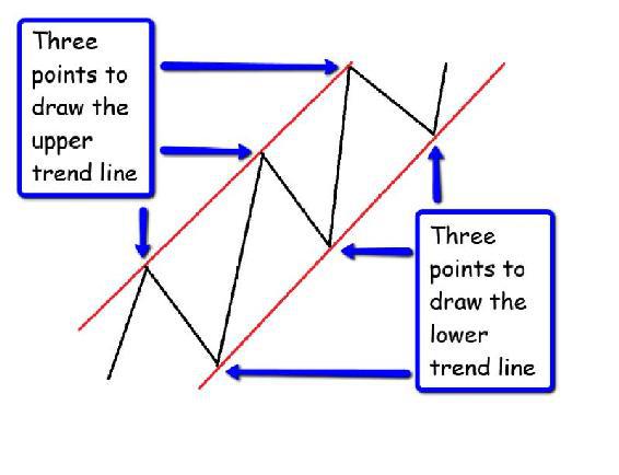
At this point we are going to diverge from standard trend analysis and look at it in slightly different terms, which I hope you will find more useful when trading live, rather than the theoretical nonsense that appears in most books. The above introduction has given us the framework to move on, but at this stage most trend analysis would then present you with the schematic in Fig 8.10
Fig 8.10
A Bullish Trend Higher – Surely Not
Here we have the traditional picture of a trend. The market has moved higher in a series of steps, and once we have three steps in place, we can draw our upper and lower trend lines, which define the channel clearly. Most text books will tell you it is impossible to define a trend using two points, since the possibilities for interpretation are endless and ultimately meaningless, which is why we have to wait for three points, before joining them up to create the trend lines themselves.
These are the higher highs and higher lows which define the peaks and troughs as the market moves higher, and lower highs and lower lows as the market falls.
Now we have a clear picture a trend has been established, we are ready to enter the market, and wait for this trend to develop further. That is the theory, but unfortunately, by the time we have waited for our three higher highs and higher lows, the trend is already reaching a climax. We have already been through the technical trend following stage and we are about to buy, at the start of a distribution phase.
But how do we know this? Because most likely you have been reading too many text books written by people who have never traded or invested in their lives. This is all theoretical easy to see in hindsight, and once the trend is this well developed, it is not of much use.
What's the answer? And for this we need to return to support and resistance which holds the key, and which is why I covered it in such detail in the previous chapter.
Support and resistance is where trends are created, born and then propelled on their way. This is where trends reverse and change direction. This is where accumulation and distribution phases occur, along with selling and buying climaxes. It is the most important area of price behaviour on any chart. It is also where markets pause and move sideways, often ahead of news releases, and here you will see volume decline as participation falls away. The buying and selling climaxes are like the spawning grounds at the head of a great river, to which the salmon ultimately return to spawn.
This is where we start to answer the question all traders, investors and speculators have at the forefront of their minds constantly. Is this the start of a trend, and if so, what is the strength of the trend and how far is it likely to run? These questions can only be answered by understanding support and resistance in the context of Volume Price Analysis.
To attempt to do so in any other way is doomed to failure, and drawing a few lines on a chart, is a pointless and meaningless exercise. I do accept they may help to clarify the trend a little and may even be of limited use once the trend has started, but in terms of getting you into a strong position, they are of no value whatsoever.
However, let’s return to basics and revisit our congestion phase, where the market is moving sideways and creating the floors and ceilings of price support. The market is preparing to breakout, and all we need to do as traders, investors or speculators is to wait, be patient and then to validate the breakout using volume. How do we know the extent of the trend at this stage? The short answer is we don't, but we do have several clues which will allow us to make an educated guess at this stage.
First, is the extent of the price congestion phase. Again we must recall Wyckoff's cause and effect as this will dictate whether we can expect to see a primary, a secondary trend or a minor trend develop. For an intraday scalper, the trend will almost certainly be a minor trend or secondary, but this may well sit within the context of a longer term trend in a slower time frame. In this context our scalper would then be trading, with the dominant trend in a higher time frame. In other words the minor trend being traded, is in the same direction as the longer term trend, which for an intraday trader may be the hourly chart.
This is one of the many reasons why trading using multiple charts is so powerful. It helps to frame the trend we are trading. However, there is nothing wrong with taking a trade against the dominant trend in whatever time frame that may be. For example, the dominant trend in a stock market may be bullish on the index, but there may be a bearish opportunity in a stock. This is fine, as long as we recognise we are trading against the 'dominant trend'. This type of trading is often referred to as 'counter trend trading', and there are two points that define this type of position.
First, it is a higher risk position as we are trading 'against the market flow' – swimming against the tide if you like. Second, and following on from the first point, we are only likely to be holding such a position for a short period of time, since by definition we are trading against the longer term dominant trend.
Next, in any congestion phase as VPA traders we are always analysing the volume from two standpoints. First the volume associated with the sideways price action to determine whether this is a major reversal evidenced by volume, as either a selling or a buying climax, or simply a pause point ahead of news for example. Secondly, the volume and price action following any associated breakout, which will then provide us with additional clues as to the likely extent of the trend. In turn this will also be validated by considering the associated volume and price action on slower time frames along with analysing potential support and resistance areas ahead, which might create pause points in any longer term trend,
Therefore, the first step is always the price action, immediately following a move away from the price congestion zone, and this is very similar to the way we identified our congestion entrance using the pivot high and the pivot low, to give us our levels. This gave us our bearings. The previous price action (whatever it may have been) has now paused and is taking a rest. Our pivots have alerted us to this pause, which may be an extended one, in which case the levels will be further reinforced with further pivots to the upper and lower levels, or it may be a temporary one, with few pivot points. It may be a reversal, in which case we can expect to see some extensive VPA action, or a continuation of the previous trend. All this will be revealed as the price action in this area unfolds into our traditional congestion area, with our ceilings and floors in place. However, at some point, the market will break away, and this is where the pivots come into play again, only this time to help us define the trend as it develops. Furthermore, it allows us to take advantage as soon as possible and not have to wait for the higher highs and higher lows (or lower highs and lower lows ) to develop before entering a position.
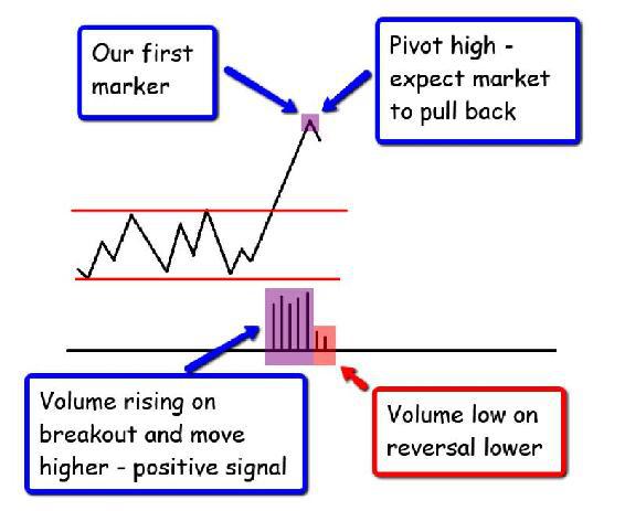
Let's take an example which shows a break out to the up side in Fig 8.11:
Fig 8.11
First Marker – Pivot High
As we can see in Fig 8.11 the market has been in a consolidation phase and has broken out on robust volume. Our analysis signals this is a valid move, and we are now looking for signs that a trend is likely to develop. The first signal we have is of a market rising on solid and generally rising volumes, and we take a position.
What we are waiting for now is our first marker, which just as in the case of our congestion entrance in the previous chapter, is a pivot, and as we are in a bullish phase we are looking for a pivot high.
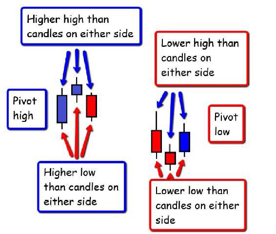
As we know markets never go up or down in straight lines and this is the first sign of a reversal, which in turn may also define the upper region of our trend as we break away. Remember the pivot high and the pivot low are combinations of three candles as shown below in Fig 8.12
Fig 8.12
Pivot Creation
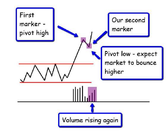
We now have our first point of reference in the price move higher, and since we have a pivot high, we expect some short term weakness and for the market to reverse lower. This could be a major reversal, which is unlikely given the volume profile and the recent price congestion, but at this stage we are never sure and must be patient. The volume is falling, which a good sign (falling price and falling volume signals weakness in the trend), and in due course, the market stops and reverses higher, posting a pivot low. We now have the second marker in our journey higher, as we can see in Fig 8.13.
Fig 8.13
Second Marker – Pivot Low
Now we are starting to build a picture of the price action. We have a position in the market, and provided volume continues to confirm price, then all is well with the move higher.
The pivot points which are now forming, are our markers to highlight the journey and define the boundaries of the trend. Unlike the trend lines which most people draw after the event, these are dynamic and created during the price action, and provided they build in a series of higher and lower levels, then we know the trend is developing and we stay in our position, provided volume supports our analysis.
Let's scroll forward now and add two more levels to the chart, and based on exactly the same principle. From our current position, we are now looking for the market to push higher, off the pivot low, and the next target for us is a second pivot high, and provided this is above the previous pivot high, we are in an upwards trend. Once this second pivot high has formed we expect the market to pullback or pause, but hopefully only in a minor way at this stage, and on low or falling volume, at which point we are now looking for our second pivot low.
This is duly posted, and provided it is higher than the previous pivot low, we stay in our position, as we are now expecting the market to push off this pivot low and develop the trend further.
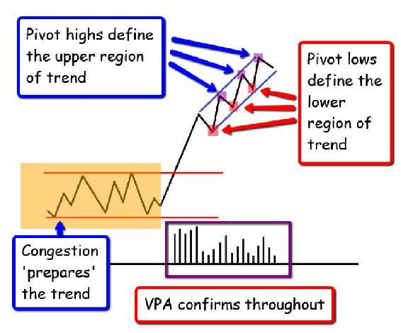
The market continues higher as expected, and now we are waiting for our third pivot high, higher than the previous one, which will then define the upper region of our trend. If this is posted as expected then once again, and I'm sure you are getting the picture now, the market pulls back off this pivot high and moves lower, to post, another pivot low. If this is higher than the previous pivot low, then we continue to hold and now have our third pivot low to define the lower region of the trend.
This is how we build trend lines dynamically, whilst simultaneously holding a position in the market based on Volume Price Analysis and the fundamental principles of VPA breakouts from sideways congestion, as we can see in Fig 8.14.
Whilst the end result is the same, the journey in creating these trend lines is very different and allows you, as a trader to join the trend at the best point, which is the start, and not at, or towards the end. This is shown in Fig 8.14 below.
Fig 8.14
Dynamic Trend Lines – Bullish Trend
We can imagine this whole process almost as one of 'scene setting'. The congestion phase sets the scene for the price action, which is then delivered and supported by volume. The pivots highlight the journey – they are like the lights at the side of the road, giving us a clear view of where we are, whilst also giving us the confidence to hold our position in the market.
Finally, at some point, we see a pivot high posted which is lower or perhaps at the same level as a previous pivot. It is at this point we are viewing a market that may be moving into a secondary congestion phase, with a pivot low to follow. If this is at a similar level to a previous pivot low, then we are probably entering a congestion phase and our analysis continues. Now we are looking for confirming signals with further pivots and finally a break out. Again, is this a trend reversal, or merely a trend pause? If we break to the downside then it is a trend reversal (from a primary bullish trend to a primary bearish trend), and we exit our position, but if it is a trend pause, and the trend continues on a break higher, then we hold our position, and start the process of building our dynamic trend lines once more.
Naturally, the above is a text book example of what we want to see on every breakout from a congestion phase, but trading life is rarely text book. Sometimes these pivots do not appear. For example on a break higher, the pivot high may not appear, but the pivot low may do so in due course.
At this point we have to make a decision based on our VPA analysis, and judge whether the trend is developing as expected. However, this may be the first early warning signal that this is not a trend which has any sustained momentum. In general, we would expect to see the move away from congestion as having some momentum, supported by volume. As markets move quickly, so buyers and sellers move equally quickly, either to get in, or to get out creating the pivot points on the chart.
If these are missing, for whatever reason, then this alone suggests a market which is potentially lacking in momentum which will always be evident from our volume analysis. If the market is moving higher, but the volume is average or below average then this is a trend lacking momentum. Buyers and sellers are simply not participating in the move higher, and the trend will therefore simply not develop. There is no energy, no activity, and this is reflected in the volume and associated price action.
Therefore, don't expect to see the perfect scenario on each breakout. Every one will be different, characterised by varying degrees of momentum and duration. What we have to do is to look for the clues using VPA, and then wait for the pivots to appear as the price action unfolds. If they do not follow a logical pattern in the trend, then the market is potentially weak, and may simply revert back into a period of congestion at a slightly higher level.
The price action and associated pivots for a move lower away from a congestion phase are created in just the same way, but this time we are looking for a pivot low to form initially, followed by a pivot high, as we can see in Fig 8.15. Note the rising volume on the down trends and the falling volume on the reversals higher which are key confirming signals of VPA.
Fig 8.15
Dynamic Trend Lines – Bearish Trend
In summary, and to put all of this into context. There is nothing wrong with drawing what I call 'static' trend lines on a price chart, and in many ways this is what we have done here. The difference however, is the trend lines in this chapter have been created by the dynamic price action of the market. Obviously this is hard to present in a book, and is best seen live in action as the market unfolds. Nevertheless, what I have tried to describe here is the process of analysis and price action which describes where we are in our trading journey, or perhaps more importantly where the market is in its trading journey.
The pivots are formed dynamically, and as they are created, so the trend is built which we can then define using these points as our 'way points' on the journey. Nothing is ever perfect, but at least using VPA, and your understanding of the importance of price congestion, should put you into a strong position, allowing you to identify a trend before it starts, and not after. This is what I have tried to explain in the last two chapters, and I hope that in reading them you will at least have a better understanding of how markets behave and the importance of price congestion.
Many traders become frustrated when markets move into a congestion phase, which I find hard to understand. This is where the market is preparing the next trend. These areas are the breeding grounds for trends, and in many ways far more important than any existing trend, since this is a new trend, from which we can take advantage, early. It really is that simple. It may be a selling climax or a buying climax, it may be a pause in a longer term trend. Whatever the reason, and whatever the timeframe, you can be sure of one thing. The market is preparing for a move away from this region, it is just building up strength and preparing to breakout, one way or the other. All we have to do is be patient, wait, and then apply VPA to the consequent price action, coupled with our pivots which highlight the journey.
Once you have developed a deeper understanding of congestion phases, VPA and trends, all that remains is for you to decide as a trader the tactical approach to adopt. Are you going to look for reversals, or are you going to wait for the trend to develop before jumping in? As always there is no right or wrong answer, just what suits you and your risk and money management rules.
