Chapter Nine
Volume At Price (VAP)
In a bull market it is better to always work on the bull side; in a bear market, on the bear side.
Charles Dow (1851-1902)
At the start of this book I made the statement there is nothing new in trading, and that volume has been around for over a century. It was the iconic traders of the past with their tape reading skills who laid the foundations for today's VPA traders.
Well that statement is not entirely true, as in this chapter I want to introduce you to one of the latest developments in volume studies, which takes volume and Volume Price Analysis to the next level. This is called volume at price, or VAP for short. Now we have VPA and VAP – very neat really.
So what is volume at price and how does this differ from our studies so far using Volume Price Analysis or VPA? But first, let me introduce a simple concept which I hope will help to explain, and once again we return to our wholesaler of goods, who has a warehouse with one product to sell. As a wholesaler, (and indeed anyone selling anything) he or she is always looking to maximise profits from each sale, and one of the easiest ways to do this is to 'test the market'.
This is something companies do all the time. A product will be marketed at one price, and the volume of sales recorded. The price will then be raised or lowered and the resulting sales recorded and monitored. Obviously, if the wholesaler can sell at a higher price and still maintain the same sales volume, then this will increase profits automatically, with no fall in volume.
At some point, the price will reach a level at which volumes do fall, as buyers now perceive the product as over priced, and simply stop buying. To correct this, the wholesaler simply drops the price and sales volumes should pick up again.
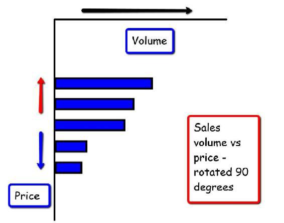
On a simple bar chart, this price action and volume would be reported on a chart which would look similar to that in Fig 9.10 below :
Fig 9.10
Sales Volume vs Price
Here we have a chart of volume and price, with price on the X axis and volume on the Y axis. As you would expect, as the price increases, the volume of products sold falls. This is not always the case, but generally so in most markets. The point here is we now have a 'map' of volume against price. In other words, we can see visually how the volume has changed as the price changes, and this is what Volume at Price is all about. In a normal volume bar, all we see is one bar, but within the price action there are many different levels of price. All we are seeing in our single volume bar, is the total volume associated with the price spread of the bar. What this volume bar does not reveal, is the levels of buying associated with the different price points, exactly as in our simple example above. If we swing this chart through 90 degrees, then we have a perfect representation of VAP as it would appear on our chart, as we can see in Fig 9.11 :
Fig 9.11
Sales Volume vs Price – Rotated
Now perhaps you can begin to see how the principle of volume at price really works, and in many ways the term itself describes the methodology. What we are looking at here, is the
volume at the
price. In other words, we can see the volumes associated with each price level as the market moves higher and lower. What we have is a volume histogram of the buying and selling volumes associated with each price point. We can imagine this as a dissection of the single volume bar we use in Volume Price Analysis (VPA). Here the volume bar records all the volume of activity associated within the period of the bar and the spread of the price action.
With VAP, what we are doing is taking that volume bar, and cutting it open to reveal where the concentration of volumes actually occurred. After all, if the concentration of volume was at the bottom, then this is more likely to be buying volume rather than selling volume. Conversely, if the concentration of volume took place at the top of the bar rather than at the bottom, then this is more likely to be selling volume. Volume at price gives us a different perspective on the more traditional volume bar, revealing as it does, the concentration of buying and selling, at the various price levels, which in turn gives us an alternative perspective, not only in terms of momentum, but also in terms of support and resistance.
And, as far as I am concerned, this is the key point.
The way to use this methodology is as an enhancement to the classic VPA approach, and not to replace it in any way. As you will discover shortly, volume at price gives us a very different perspective, as it provides an insight into the concentrations of buying and selling areas, which to me means support and resistance. As we have already discovered how to identify these areas using price and price action, VAP then gives us an additional tool to use, which gives us a visual representation of these areas on the chart through the prism of volume. If you remember in the previous chapter, I referred to support and resistance as invisible barriers, natural barriers if you like – well now, with volume at price, these barriers are actually revealed on our charts.
However, we must remember, VAP is a supporting technique to VPA, not the other way round. Whilst VAP is powerful and gives us a three dimensional view of the volume and price action, it does not replace traditional VPA, and never will in my view. So please use VAP as a tool with which to identify price congestion along with support and resistance zones, which you can then confirm with traditional analysis using VPA.
Let's look at some examples and the good news is this indicator, is generally available free on most good charting packages. All the examples in the remainder of this chapter are taken from my NinjaTrader trading platform.
Fig 9.12
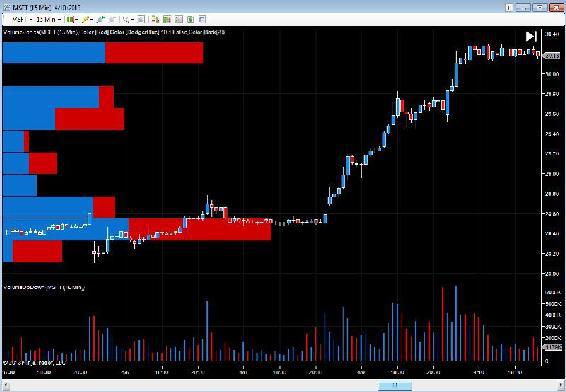
Microsoft (MSFT) – 15 Minute Chart
The chart in Fig 9.12 is a 15 minute chart for Microsoft, and as you can see, traditional volume bars are presented at the bottom of the screen, whilst the volume at price indicator presents the volume distribution on the Y axis vertically as a histogram.
Throughout this book I have tried to explain and reinforce the concept of support and resistance. It is the breeding ground for trends, it is where they are created and fostered and from which they ultimately break free, and the beauty of volume at price, is that these areas of price congestion are now painted on the chart visually for us. Therefore, let me explain this chart in broad terms, and highlight what is perhaps obvious, and more importantly, what is not so obvious, at first glance.
And before moving to this example, just a quick word about the colours in any VAP bar which are normally just two. Just as with a conventional volume bar, we have a choice generally red for down and blue or green for up, depending on personal preference. In a VAP bar we have the same, and what each bar represents, with the two colours, is the number of up or down candles associated with that phase of price action. If there had been more up candles than down then the fulcrum of the bar would be more blue (or green) than red. Conversely, if there had been more down candles than up, the fulcrum would be weighted more red than blue. This in itself gives us a perspective on the balance of ‘buying’ or ‘selling’ at this price range.
Moving to our example in Fig 9.12, in simple terms, there are four phases of price congestion here, one at the bottom of the chart which continued for an extended period, two in the middle, which were both relatively short and one at the top in the current trading range. The chart covers a 5 day period approximately. What does VAP reveal? First, it defines these regions for us on the chart. Each area of price congestion is marked by the volume histogram which then gives us a sense of the importance of each region. As we would expect, the most dense area of volume is in the first area of price congestion, with two volume bars denoting the significance of this area, one 'above average' and one extreme.
The area of congestion above this level is modest by comparison, with only two volume bars of any significance, both of which are well below average. A very minor area of price congestion indeed.
Next we move to the third level and here we see more sustained volumes at this level with two above average volume bars denoting an area of price congestion which is significant. Finally, we move to the current price area, where we can see one extreme volume bar. What can we deduce from this analysis?
First we can see immediately which of these areas are likely to be significant in the future in terms of resistance and support. When these areas are revisited, these levels which were once invisible, now become visible on the volume histogram and from which we can judge the likely level of support or resistance accordingly. And of course time is all important. The longer a market is in a congestion phase, then the higher the concentration of volumes we expect to see within the price range. It goes without saying that if the market pauses for days or weeks, then all this volume is contained in a relatively narrow price range, which in turn will be reflected in the VAP histogram on the left hand side of the chart.
However, whilst this is perhaps an obvious statement to make, what is more revealing as always, is when we bring in the time aspect of the volume and price relationship. Let's take a look and see what VAP is telling us here.
The chart is over a five day period, and the first phase of price congestion lasted for three days. What we see here is what we expect, some high volume bars confirming a dense region of price congestion. All we can say about this price region is that it is significant, and had we been trading, then on the breakout we would have been very comfortable with the volume histogram, confirming a strong platform of support below with the market breaking higher. Equally in the future, if the market reverses to test this region, once again we can say with confidence there is a strong platform of support, which will take some extreme volumes to penetrate and break.
Moving to the next area of price congestion, which in this case only lasted a handful of bars, a few hours at most, before the market broke higher and moved on. This is a secondary area of congestion, and instantly recognisable as such with our VAP volumes. These are below average, and only two are of any significance, so if this region were tested in the future, it would not take much effort to penetrate this level, either from below or above.
Finally, we come to the third and fourth levels of price congestion on the chart which are the most revealing. The first of these lasted 14 price candles (approximately 4 hours) whilst the second lasted the entire session of a day. However, look at the associated volume bars and compare these to the price congestion that lasted for 3 days. The most recent price congestion phase at the top of the chart, which lasted a day, has almost the same concentration of volume as in the first area of price congestion, which lasted for three times as long – 3 days.
What is the volume telling us about this congestion phase of price? And once again, as with all volume analysis it is in comparing one with another the anomalies are revealed giving us the validation we are always searching for in any analysis of price using volume, and in this respect VAP is no different. In this example in Fig 9.12 we have an intraday chart, with the congestion phase at the bottom of the chart giving us our benchmark against which to measure other areas of price congestion and their significance.
Whilst the second phase of congestion is, as we would expect, with below average volume bars in a short phase of sideways price action, the next level above, our third level, is already starting to ring the alarm bells. And the reason is this.
Because here we see a price congestion phase, over a short period of time, but with above average volume bars and spread over a deep area of price. So an alarm signal is sounded. From a trading perspective if we were holding a long position, this would give us the confidence on the break out higher, that this was a significant area of price support and we could therefore continue to hold the position with confidence.
Then we arrive at the fourth level on our chart at the top of the price action, with the congestion phase marked with ultra high volume on our VAP, and additional high volume bars in a very narrow trading range on our traditional volume bars. Clearly the market is weak at this level and the volumes are heavy, and likely to be selling in this region. After all, on volume of this strength we would expect to see the market move higher but it hasn't, instead it has remained range bound.
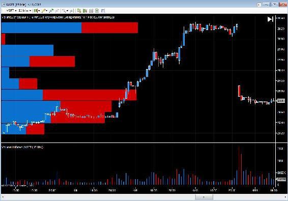
In case you think this was a chart deliberately 'hand picked' to reveal the power of VAP, nothing could be further from the truth. It was the first one I happened to select when writing this chapter, and indeed, you may find this hard to believe, but as I was writing, the market opened, and the Microsoft stock price fell like a stone, down $1.40 on the open.
Fig 9.13
Microsoft (MSFT) 15 Minute Chart – After Open
And here it is! As you would expect the volume at price profiles have now changed, as we are seeing heavy volumes coming into the market, as evidenced on both the VAP and also on our traditional volume bars at the bottom of the chart. This once again demonstrates the power of volume at price analysis. Not only are we seeing a potential support region being built visually, we are also seeing this validated in our volume bars at the bottom of the chart, and when we begin to analyse this with our price spread, a complete story of price action backed by volume is created. It still defeats me as to how anyone can ever trade without using volume, and I fervently hope by now I have convinced you to at least consider it as one of, if not the only one of, your foundational analytical techniques. I sincerely hope so.
Just to round off this chapter, let's take a look at some other examples of VAP.
Fig 9.14
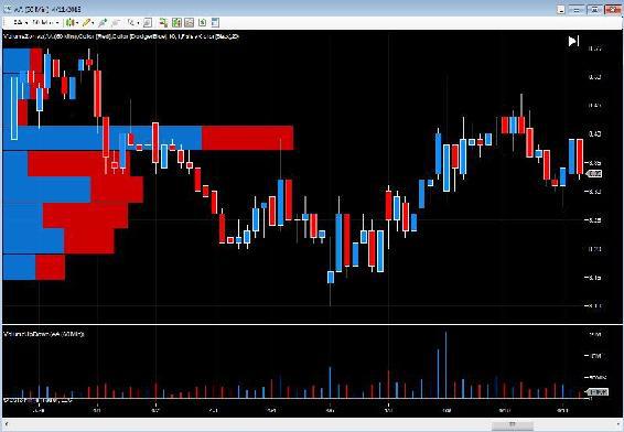
Alcoa (AA) – Hourly Chart
Fig 9.14 is a really interesting chart. It's an hourly chart this time for Alcoa, but look at the huge volume spike in the centre of the volume at price histogram. It is enormous, and more importantly is right in line with the current price action which is in congestion. The market has traded in this range before, and clearly this represents a very significant area of price consolidation as evidenced by the VAP. As you can see, in the past few hours the market has rallied and attempted to breach this level, but failed. And no wonder, given the volume profile on the left of the chart in the VAP histogram. At this point we would be moving to our traditional Volume Price Analysis to look for anomalies and validation, which may well confirm this view, and suggest any breakout is likely to be to the down side.
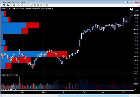
Fig 9.15
Proctor & Gamble (PG) – Daily Chart
Now this looks a really nice stock in Fig 9.15 to be trading right now and the reason is that, as an investor, you would almost certainly have been looking at this as a longer term buy and hold. It is a daily chart and covers around 6 months in total. For the first three months, this stock was in congestion. However, look at the volumes in the VAP. One extreme volume bar with another of average volume. Whilst the congestion phase was long, looking higher up the chart, we see a further phase of congestion, which lasted for two months, but the volume bars here are only moderate and above average. This gives us our benchmark as clearly the support platform at the lower level is a substantial one, so in the event of any reversal lower, there is an extremely strong, natural barrier in place.
More importantly, when the breakout from this region occurred, it moved higher on a gap up, which is always a strong signal provided it is validated with volume (VPA). From there this stock has risen strongly, and following the second phase of congestion, has moved higher once more. However, the key thing about the second congestion phase is that the volumes, relatively speaking, are lower, and therefore this price region may not offer the same degree of support in the event of a reversal lower. This helps when placing our stop orders in the market, which are always governed by our risk and money management rules.
Nevertheless, the point is this. These visual regions created using the VAP approach, give us vital clues and signals which help us in many different ways. They help to validate the current price action. They reveal the 'depth' of support and resistance in key congestion areas, and they give us confidence on breakouts, when the platform of support or resistance is there for us to see. If it is strong, then we have additional confidence to take a position, if it is weak, we may hold back and wait for other signals. Finally VAP reveals the strength of support and resistance for future price action, which again helps us to visualise and analyse risk.
In the next chapter we're going to examine some further examples using Volume Price Analysis (VPA). However I would urge you to discover more about VAP for yourself. The examples I have used here have all been using stocks, but it is a technique that applies equally well to many other markets and instruments.
The CME themselves used to provide a facility called Chart -EX which produced a similar picture for traders in futures, but I believe this is no longer available. However, as I said earlier, most good charting platforms will have this indicator in one form or another.
Since writing this book I've spent some time studying the principles behind market profile and how this could be blended with volume at price. The end result has been the development of a unique indicator which I call the volume point of control or VPOC which is available for NinjaTrader, MT4 and MT5 at present, but which will also be ported to other platforms in the future such as Tradestation. The indicator presents the volume profile as a histogram in much the same way as the examples of VAP covered here, and then creates the volume point of control which is the fulcrum of the market where price agreement has been reached for the longest period. The high and low volume nodes on the histogram then define those areas of light or heavy concentrations of volume, and as these are approached give a clear signal as to whether the market is likely to struggle at these areas or move through quickly. You can discover more about this indicator at Quantum Trading by clicking the link
VPOC for NinjaTrader
or
VPOC for MT4/MT5
.


