Chapter Ten
Volume Price Analysis Examples
Two… key factors: correct action and patience. These you must supply yourself.
Charles Brandes (1943-)
I hope by now I have managed to convince you of the merits and power of Volume Price Analysis in all its various forms. My purpose in writing this book has been twofold. First to guide you in the direction I was fortunate to take, when I first began trading all those years ago. Albert was a rogue, and even though he has attracted many detractors over the years, I for one will always be grateful for the day I happened to stumble across his article in the newspaper. Volume to me just makes sense, it is logical, and is the only way I believe you can truly see inside market behaviour, manipulated or otherwise. All the charts used here are taken from either my NinjaTrader platform, or my MT4/5 brokerage account.
My second reason for the book is to explain this methodology in a straightforward way. The markets may be complex, but they are not complicated or difficult to understand, and if you are prepared to learn and study the charts yourself, you too can become an expert in VPA in no time. There are no short cuts, but just like riding a bicycle, once learnt, you will never forget. I do not believe any software program can do the analysis for you. Trading is an art, not a science and the subtleties and nuances of the market are simply beyond the capabilities of machine code, no matter how sophisticated the program. And the principle reason why trading is an art, is because markets are driven by people and their money and underpinned by fear and greed.
Therefore, as we near the end of this book, I'd like to cover some examples from various markets, and from different platforms. All have volume. Some is actual volume, as in the cash markets and the futures markets, others are from the spot forex market. But all of them have one thing in common. The application of VPA is identical in each case, and where we have VAP data, I have added this as well to complete the picture.
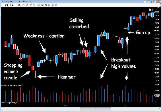
And I would like to start with some examples from the US stock markets and the first chart is the daily chart for Honeywell (HON) in Fig 10.10.
This is a nice example which teaches us several lessons. Whilst this is a daily stock chart, our VPA principles still apply, regardless of market or instrument.
Fig 10.10
Honeywell (HON) Daily Chart
The stock sells off, moving lower, and initial weakness is signalled by the small shooting star candle, which is then confirmed with rising volume and a wide spread down candle. So no anomaly here. This is then followed by a narrow spread down candle with higher volume than on the previous bar. This is an anomaly, and could be stopping volume. The following day, the market closes with a hammer candle, and high volume again. We are now looking for this stock to pause at this level, perhaps move into a congestion phase, or see further accumulation before a breakout and move higher.
In this case, Honeywell moves higher immediately on the following day with a gapped up open, but the volume is only average. The following day the price spread is narrow, and although higher on the day, the volume is falling away. This is not a good sign and suggests weakness. Rising price and falling volume is a sign of weakness. The stock is possibly not going to move too far, and does rotate into a congestion phase. However, towards the end of this phase we start to see daily selling pressure absorbed with a narrow spread down candle and high volume, an anomaly. After all, if this was selling, then we would expect to see a wide spread candle, and we haven't. We have a narrow spread candle, followed by another, three candles later.
The selling is being absorbed, and we are now waiting for a potential break out from this region, which duly arrives. Rising volume with wide spread up candles. A positive signal the market is bullish. We also have a nice platform of support below. The market then moves sideways again at the higher level for two weeks, sliding lower, but note the down candles. The selling volumes are falling all the time at this level, not a sign of a bearish market. If the stock were truly bearish we would expect to see falling prices and rising volume. We have falling volume. Remember, it takes effort to rise and fall.
Therefore, we are expecting to see buyers come into the market soon, which is precisely what happens next, and with attitude. The buyers come in with above average volume, and note the tail on this candle which is the last in the current congestion phase. This looks positive.
The following day we get the breakout, with high volume. This is not a trap up move, but a genuine move higher. And we know it is genuine because volume reveals everything. Not only have we seen a breakout, but this has been accompanied by a gapped up open as well. All signs of a bullish market provided this is validated with volume. Three months later the stock was trading at $76.08.
The next US stock is a particular favourite of mine. David (my husband) and I first starting trading Duke Energy back in the days when it was $17! Now it’s over $70. In those days we held this stock and wrote covered calls which is a great options strategy, and the topic for another book.
Fig 10.11
Duke Energy (DUK) Daily Chart
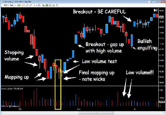
Once again, there are several lessons to be learnt here, and the most valuable one is patience. If you recall what I said at the start of the book. When I first started trading using VPA I used to get very excited as soon as I saw a hammer candle, or stopping volume and would immediately take a position in the market. However, remember the oil tanker. It takes time to stop. Therefore, what can we learn from Duke Energy?
First, at the extreme left of the chart we can see the stock has been rising on relatively low volume. The volume on the last bull candle, a wide spread up candle, is only marginally higher than on the previous candle, which was half the price spread. Clearly there is an early sign of weakness ahead, which duly arrives two candles later. The stock attempts to rally before entering a price waterfall with falling prices and rising volumes, with stopping volume applying the brakes. At this point Duke Energy attempts to move higher, but with a wick to the upper body of the candle, not a strong response, and the stock price falls further, but on average volumes.
In fact the spreads on both of these candles is wide, and when compared to the equivalent spreads in the waterfall, the volumes should be much higher, so clearly selling is being absorbed at this level. Duke Energy attempts to rally, this time with a bullish engulfing candle, but the volume is average again, and clearly not a sign of strength just yet.
The market then pulls back with two small hammers on low volume. Is this the final phase of mopping up the selling pressure? The answer is delivered on the next candle with a low volume test. The insiders are preparing the ground. The selling has been absorbed, the market has been tested for further selling, and the low volume test signals success, Duke Energy is now primed and ready to move.
The stock moves higher on good volume and is subsequently followed by a gap up day, supported with strong volume, not a trap up move but a genuine move higher. The insiders are joining in. Then we move into a congestion phase, followed by a further gap up and breakout on high volume, and from this move, the stock price then declines slowly lower, but note the volume. It is low. An anomaly. We can be pretty sure the stock price is not going to fall far. After all, if it were, we should see high volume and this is certainly not the case with below average volumes.
The final candle in this group is then followed by a bullish engulfing candle, and the following day, with a gapped up move higher. However, note the volume on the gap up, it's very low. Is this a trap move by the insiders? It certainly looks weak, and the volumes following the move higher are well below average. But note where we are in the overall price action. We are back where we started in terms of price, and this is therefore an area of potential price resistance given the earlier failure at this level. So we should be doubly on our guard. A gap up move on low volume, and resistance ahead.
So what happened next?
Fig 10.12
Duke Energy (DUK) Daily Chart - Moving Forward
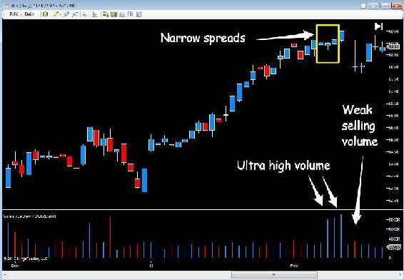
Duke Energy stayed at this price level price of $65.75 for several days, before finally breaking above the resistance area, and then moved steadily higher on solid volumes. Finally, the move runs out of steam and volume as always tells the story. Right at the end of this trend we have three ultra high volume bars, beneath narrow spread candles. Is the market strong or weak? And the answer of course is weak, and we see the price fall sharply. But once again, the selling volumes are average, so clearly not a major turning point for Duke Energy which continued higher and remains bullish, for the time being. At time of writing Duke Energy is trading at $74.41.
Fig 10.13
SLV - ETF 5 Min Chart
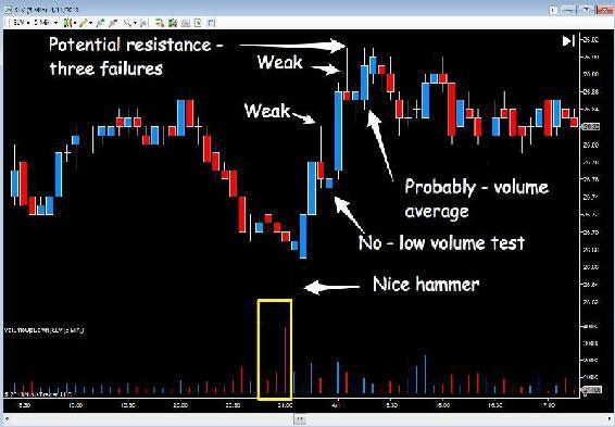
I now want to consider different markets and time frames and the first example is the SLV which is an ETF (Exchange Traded Fund) for silver. ETFs are a very popular way for many traders to enter the commodity markets, and the SLV is certainly one of the most popular. It is a straightforward ETF, unleveraged and is backed by the physical metal. Here we have the 5 min chart, so perfect for an intra day scalping strategy.
As we can see from the chart, starting at the far left the SLV had been moving sideways, albeit with a bullish tone before starting to fall, breaking below the interim platform of support with 5 consecutive down candles on rising volume. A signal the price action was being validated by volume, which at this point is above average.
The SLV then drifts sideways for a few bars before we see two narrow spread down candles, the first with above average volume, an anomaly, and the second with extremely high volume. This must be stopping volume and therefore buying, otherwise the candle would be wide. Instead it is narrow. This is followed by the hammer candle, on high volume, signalling more buying in the market. The response is muted with the up candle which moves higher on low volume, not a sign of strength, but is followed on the next candle with rising volume and a wide spread candle, so an encouraging signal. The insiders then test on low volume, and move higher on solid volume, before weakness starts to appear with a wide spread up candle and a subsequent failure at the same level.
What happened next was the SLV then drifted along at this level for some time, before selling off again the following day.
It would be very easy for me to show you hundreds of examples where VPA gives us great trends and great trading opportunities. It does. But what it also does, is give us sound common sense logic on which to base our trading decisions, and more importantly to quantify the risk on the trade itself, which is what trading is all about.
In this example we're looking at this opportunity as a scalping trader. However, if you were an aggressive trader, you may well have taken a position based on the hammer alone. After all, this looks like a strong signal. However, the following candle suggests weakness at this level. The volume is well below average, and at this point we would be wondering if this was a wise decision. Any stop loss by the way would be below the wick of the hammer, with the market setting this level for us. Assuming we continue to hold, the next candle is much more encouraging, a wide spread up candle with high volume, so a good sign. No reason to exit just yet.
The next candle suggests weakness, a shooting star type candle (although not at the top of a trend, weakness nevertheless with the deep upper wick) and above average volume. We are expecting a reversal on the next bar, when in fact we see a positive signal, a low volume test, which is followed by a wide spread up candle with above average volume once more, with a further pause before the final leg to the top of the move.
A more cautious trader might have seen the initial response to the hammer and taken this as a sign of weakness, which it is, and decided, based on this signal to stay out of the market for the time being, and perhaps waited for the second candle, which is a sign of strength, before entering a position. If so, in this case, this would probably have ended as a small profit, a small loss, or perhaps break even. But my point is this.
The examples I have chosen here are designed to teach, to educate and also to show you VPA applied in a variety of time frames and markets, and perhaps more importantly, that all trends and trading opportunities are relative. Here we might have taken a position as a scalping trader and netted perhaps 20 or 30 cents on the contract.
In the earlier examples with stocks, market positions there may have been in place for days, weeks or even months and netted hundreds, if not thousands of dollars. It is all relative. The beauty of VPA is your trading decisions are based on logic. The logic of volume and price. From there, it is down to your skill as a trader to balance your money management with your own risk tolerance and trade accordingly. VPA will give you the trading opportunities, but you will have to judge the risk on the trade, and how much capital you are prepared to risk based on your assessment.
And remember, your assessment of risk will also be based on your analysis using multiple time frames, and in the example above, a slower time frame may well have been signalling a warning this was a weak move and therefore the risk on the trade was high. This may even have been against the dominant trend. In fact it was, as the general trend for silver at the time was bearish, so by definition, the trade was a higher risk trade anyway.
Fig 10.14
GLD - ETF 15 Min Chart
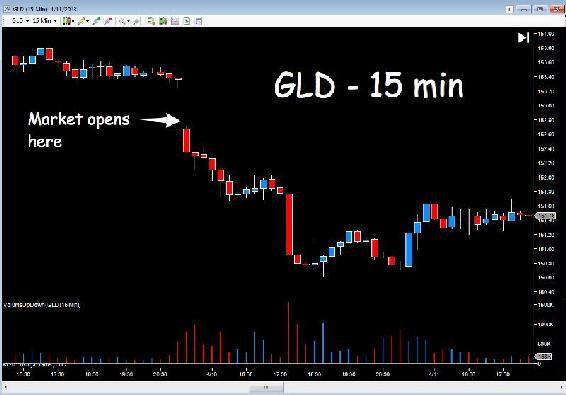
This next example is another extremely popular commodity for traders, gold, and the ETF is the GLD fund. Once again I've taken a faster time frame here to use as an example, and in this case my commentary is on a candle by candle basis with no annotation. The reason for this is the chart would simply be too cluttered.
Before starting, let me put the gold market into context for you. At the time of this chart, gold had been weak for some time, and in a low inflation environment with higher returns in risk markets, money flow in general at this point was away from safe havens. The longer term trend for gold was therefore bearish. This is the context against which to view this intra day price action.
The market opens gapped down on extremely high volume, a clear signal of weakness. We are starting with weakness which has been validated by volume. The next candle forms, a small hammer, again with ultra high volume. Is this stopping volume? Perhaps, and we wait for the next candle to form, a small candle with an upper wick, suggestive of further weakness and coupled with high volume.
Clearly not a positive response to the 'stopping' volume. The next two down candles suggest a modicum of buying on each, with the lower wicks showing some support, but the market continues lower on rising volume with the penultimate candle suggesting stopping volume once again. Finally the last down candle in this price waterfall closes on average volume, followed by the first up candle of the session. A weak response if ever there was one, with a deep upper wick and narrow spread with above average volume. This is hardly a market preparing to reverse at this point. The next candle is perfectly valid, a narrow spread up candle with average volume – this looks fine.
Then we see a repeat of the first candle in this sequence of up candles, but this time, look at the volume, it is extremely high. This is sending a loud signal the market is very weak. If this were buying volume the market would be rising fast and it isn't, so it must be selling volume. Everyone is selling and trying to get out of the market before it collapses, with every attempt to rise knocked back by the pressure of selling. The next candle is even worse, sending an even stronger signal, if any were needed, that everyone is selling and the market is now incredibly weak.
Here we have ultra high volume and a market that is going nowhere. The price spread is narrow, and if the volume were buying, then the market would have risen. The insiders are propping the market up, selling stock accumulated in the price waterfall, before taking it lower.
The next two candles give no clues, narrow spreads with low volume, then the market sells off sharply, as expected, and validated with ultra high volume, as it lurches lower once more. The next candle hints at stopping volume again with a narrow spread and deep wick on very high volume. The buyers are moving in at this level which is repeated on the next candle with high volume again on a narrow spread. Now we should see the market recover, but look at the next candle. The market attempts to rise, but falls back to close near the open on above average volume. Not a strong signal. A small hammer follows, on ultra high volume so perhaps there are more buyers in the market, and based on the volume of the last few bars, a possible reversal is now in prospect?
Three bullish candles then follow, each with a narrow spread, but the volume is flat, so we have a market rising on flat volume, and therefore unlikely to go very far. The market reverses from this level, and as it falls volumes are increasing signalling selling pressure once more. The final candle in this sequence is a very narrow spread doji candle, with high volume, and again we can assume this is stopping volume with buyers coming in once more.
This is confirmed with the next candle which is a wide spread up candle with above average volume, but as the market rises on the next two candles, volume is falling away. The insiders are not taking this market far. The market then drifts sideways for an extended period in the session with several attempts to rally all failing, and with volumes generally falling to low levels throughout this phase the market duly closes, looking very weak.
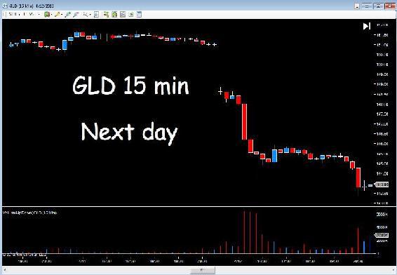
What happened in the following day’s trading session is the bearish tone of the previous day was taken up in dramatic fashion, as the GLD opened gapped down again on three times the volume of the previous day’s open.
Fig 10.15
GLD - ETF 15 Min Chart - Next Day
Whilst the open was bad news for those traders bullish on gold, even worse was to follow, and candles five, six and seven in the initial sequence were accompanied with volume which can only be described as extreme. Trading volumes on each candle were in excess of 6 million, with average volumes around 500,000. In other words, panic selling.
Even the hammer candle and the associated volume was not sufficient to slow the market momentum and the solitary wide spread up candle on high volume, failed to follow through, with the market moving into a congestion phase before rising volumes on the four down candles at the end of the sequence signalled yet more bearish pressure and heavy selling. In this region of congestion, support and resistance along with VAP would also have played a significant part in any analysis.
The above market analysis which I have written here for you in long hand, is really a transcript of the conversation I would have in my head as this price action appeared on the screen and could be for any chart, any instrument and in any time frame. All I need is volume to give me a view of what is going on inside the market. With this insight I can draw my conclusions from the price behaviour. The above is on gold, but it could be any ETF or other instrument. It makes no difference.
I now want to move to the spot forex market and here the charts are from the MT4/MT5 platform. Here we have time charts and tick volume. However, the same principles apply.
The first example is from a position I took on the Aussie Dollar on the 15 minute chart in Fig 10.16.
The currency pair had been rising nicely for a little while, volumes were average with no anomalies or signs of weakness at this stage. Then suddenly we see the up candle form, with a wide body, but also with an equally deep wick above, and marked on the chart as 'First signal of weakness'.
Fig 10.16
AUD/USD - 15 Min Spot Forex Chart
We are now paying attention as with this volume bar, the pair should have risen strongly, and clearly there is a large amount of selling, confirmed by the deep wick to the top of the candle.
The pair manage to move higher for a couple of bars, but the warning has been flagged and sure enough five candles later we see a shooting star with high volume. The next candle is also weak, a narrow spread doji candle with high volume. A potential reversal awaits. The next candle confirms the weakness, another shooting star candle this time with higher volume still. And what is also important here, a lower high than the previous candle. This is the time and place to take a short position with a stop loss above the level of the wick of the first candle.
The pair sell off and duly start to move lower, and one very important aspect I want to highlight here is how VPA helps you to stay in a strong position and hold it in order to maximise your profits from the trend.
As we all know, markets never move in a straight line, they move lower, then pull back a little, before moving lower again. Here we can see this in action perfectly illustrated, and the point I want to make is this.
Four bars after the second shooting star, we have a wide spread down candle, and we are delighted. Our analysis has been proved correct, and we are now in a strong position. Then the market begins to reverse against us. Is this a trend reversal, or merely a pause in the move lower?
Well, the first candle appears. The spread is relatively narrow and the volume is above average, so this is an encouraging sign. In addition, we have not seen any evidence of stopping volume with narrowing spreads and rising volume, so this looks like a pause point. The next candle confirms this as does the third, and on the completion of this last candle we can see we have a market attempting to rise on falling volume, and we know what that means.
The next candle is weak, and whilst the volume is below average it is another small shooting star type candle.
The market moves lower in steps and each attempt to rally is seen in the context of falling volume, confirming the weakness further which is my point.
Once you have a position in the market, you must keep revisiting your VPA techniques as they will give you the confidence to hold and stay in the trend. If you are short the market and it pulls back against you, but the volume on the upwards moves is falling, then you know
this is simply a temporary pullback and not a change in the primary trend. In other words we are in a secondary trend pullback. Equally, if any pullback has not been preceded with signs of stopping volume, the buyers are not in the market at that level and any reversal will not last long, so you can continue to hold in the primary trend.
Equally, if you are long the market the same applies. In an up trend the market will reverse against you. If the volume is falling on these reversals you know
this is simply a minor reversal lower and not a change in the primary trend, particularly if you have seen no topping out volume.
Finally as we can see on the right hand side of the chart, stopping volume finally appeared, with the market moving into a congestion phase with the selling pressure dropping away to below average. The pair completed this phase of its journey and we exit.
Our entry, our management, and exit of this position have all been executed using one simple tool. VPA. Nothing else. Why more traders, speculators and investors don't pay attention to volume is beyond me, but there we are.
Here are some further examples from the world of spot forex.
Fig 10.17
AUD/USD – Weekly Spot Forex Chart : Selling Climax
The reason I’ve chosen the weekly chart for the AUD/USD is not only is it a good example of a selling climax, it also gives us a perspective on how long this may last. As I have said several times in this book, we have to be patient. Major changes in trend take time to come into effect, and this is an example. It also demonstrates VPA works in all time frames.
Remember, here we are looking at a period of around 18 months, so long term trends with big profits to be made if you are patient, and believe in the power of VPA of course.
As we start from the left of the chart the AUD/USD pair has been bullish, before moving into a congestion phase on average volume. Then we see our first anomaly. A narrow spread up candle with very high volume and marked 'Weakness'. The pair are struggling at this price point and the market is not responding. The next weekly candle arrives with ultra high volume, and if this pair were going to sell off sharply, we should expect this to be a wide spread down candle – it isn't. It's a narrow spread. The buyers must be supporting the market at this level. The next candle arrives, a hammer with a deep wick, and this confirms the previous candle. This is buying, and now we wait for any further signals, which arrive on the next candle, a low volume test on a smaller hammer candle. The high volume selling we were seeing in the previous candles, which was absorbed by the buyers, has now dissipated and the forex market makers are ready to take this pair higher. And off it goes at a nice steady pace, marching higher on nice steady volume.
The move higher extends over several months, but the point to note here, is the slow steady fall in volume over this period. It's not dramatic, just a steady decline, and then as we enter the box at the top of the chart, what do we see? Two wide bars, one after the other, but look at the volume. It has fallen away to almost nothing. This is a huge warning signal this pair is becoming exhausted, and either running out of steam, or there is some alternative explanation. What is clear, is the market makers are moving prices higher with low volume, and have withdrawn from the market.
Traders who have missed this long trend higher, are now jumping in on fear and greed. They fear missing out on a golden opportunity. After all, they have watched this market go up and up, and have finally caved in and bought, just when the market makers are leaving by the side door.
Then the selling climax begins. The market makers are selling in huge volumes at this level, before finally after several weeks the pair break lower, and attempts to rally giving us signs of further weakness, before breaking lower again.
Note the attempt to rally at the right hand edge of the chart. Here we see narrow spread up candles on very high volume, and falling, another very strong signal of further weakness to come, which duly arrives.
One point I do want to cover here in a little more detail is the issue of rising and falling volumes when associated with trends, because we do have to apply some flexibility to any analysis and interpretation. After all, if the market moved higher for ten consecutive bars, and you wanted to apply the volume principle to the letter of the law, you would have to see ten volume bars each one higher than the last. Clearly this would place a limit on how far any trend could go, since it is unreasonable to expect volumes to go up and up and up for ever.
The above example is a case in point. The first few candles on the up move are supported by good volume, which is up and down, but above, or just around the average. This is fine. After all, there are always going to be variations particularly when you begin to look at the longer term timescales. There may be seasonal effects, days when the markets are thinly traded during holidays, and of course days when the markets actually close. This rarely happens in forex, but it does happen in other markets and affects the forex markets accordingly.
Please be a little flexible in your approach when judging volume in trends, and allow a little bit of latitude in your analysis. Here we were waiting for an anomaly, and until the two low volume candles arrived, there was nothing to signal any change in trend was imminent.
I now want to consider the opposite, namely a buying climax and once again we have a nice example on the AUD/USD weekly chart in Fig 10.18 below.
On this chart, we are looking at an eighteen month period approximately, and we can see the pair has topped out and rolled over into a nice price waterfall, all confirmed with rising selling volumes and validating the move lower.
Then a hammer candle arrives and we need to assess whether there is sufficient stopping volume? The next candle gives us the answer with a small shooting star type candle on high volume.
Fig 10.18
AUD/USD - Weekly Spot Forex Chart : Buying Climax
Clearly the market is not ready to rise just yet and the selling pressure continues as we finally enter the buying climax phase. However, as the pair attempt to rally, the first candle we see is a narrow spread up candle with a deep upper wick, hardly a sign of strength, on high volume. The pair are not ready to rise just yet, and the following two candles confirm this, with very low volume. The second of these is particularly significant with a wide spread and ultra low volume.
The pair then roll over and back down into the congestion area, which I have marked on the chart with two horizontal lines. These define the ceiling of resistance we would now be monitoring, along with the floor of support below.
Any break above through this resistance area would now need to be supported with good rising volume. It doesn't have to be 'explosive' volume, and in many ways it is better if it isn't – just steady and rising is what we want to see. If this were a gap up breakout, as we saw in earlier examples, then we do expect to see volumes well above average, and even ultra high if the move is dramatic. But for normal breakouts through an area of resistance, above average is fine.
The pair develop a nice even trend higher, with some pauses along the way. This trend lasted for over nine months before finally running out of steam with a selling climax developing.
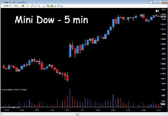
I now want to move to the world of futures and back to my NinjaTrader platform. The first chart is the 5 minute on the YM E-mini futures contract, an extremely popular index futures contract for scalping, and derived from the Dow Jones Industrial Average in the cash market.
There are two versions of the index, the 'small' Dow and the 'big' Dow. This is the small Dow with each index point worth $5, whilst the big Dow is $25. I always recommend new traders to any market always start with the smallest instrument, so if you are new to index trading or indeed the futures market in general, start with the mini Dow.
The reason I wanted to show this example is really to focus on the open of the market. As I explained earlier, these contracts now trade virtually 24 hours a day, and therefore the open of the physical market is not the surprise that it once was, as this will generally follow the trend of the electronic contract, which will have been trading overnight on Globex following the close of the exchange.
Fig 10.19
YM E-mini 5 Min Chart
What do we see here? First, we have a gapped up move as the cash markets open. Volume is high and a nice wide spread up candle closes the first five minutes of trading. The big operators are joining the move. The next two candles are down, but volume is falling, so we do not expect the market to move far, and indeed the lower wick on the second of these candles is a clue this is simply some early profit taking on the gap up open, and the buyers are in control.
From there, the market moves steadily higher. There are no signals of a reversal, just a steady rise, with minor pull backs, but each time we see a little wave lower this is balanced by a wave higher in the volume trend, which is what I was trying to describe earlier. You do have to be a flexible in how you view volume in a rising (or falling) trend. What is interesting here is if we compare the first 'wave' with the second 'wave' in terms of the buying volumes. Volumes on the second wave in the up move, are slightly lower than volumes in the first wave, so we may begin to think that perhaps this move was running out of steam, and possibly time to exit the trend. However, there is nothing particularly frightening in any of the subsequent price action, and indeed as we can see on the right of the chart, the down candles have very low volumes. But interest appears to be waning and we need to be vigilant. Remember, volumes at the open are generally much greater and tend to fall away naturally after the initial surge of futures contracts as the cash markets open. So a general decline is normal and part of the intraday volume pattern. Rather like the winter sales - the doors open and the bargain hunters rush in, and once the initial surge is over volumes of shoppers then settle. It's the same here.
One further point on this chart, before we move on to look at another.
The move higher after the first few candles of the open would also have given us confidence as the index broke above the initial resistance area created at the open. This is only a secondary resistance level, but nevertheless another 'confidence builder' for us in taking a position in this market. The same applies at the right hand side of the chart as the market moves into a congestion phase, and coupled with the general decline in volumes, this may prompt us to exit at this stage as resistance builds.
Fig 10.20
ES E-mini 10 Min Chart
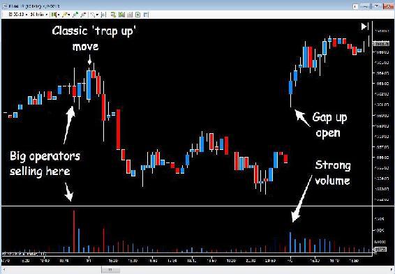
Fig 10.20 is another very popular futures index for scalping traders, the ES E-mini which is a derivative of the S&P 500. However, it is extremely volatile and of all the indices, is the most manipulated by the big operators, which is what I wanted to show here. In this example we are looking at a 10 minute chart, and here we have a complete daily session, sandwiched between a day either side.
Working from left to right, as the trading session comes to an end we can see the extremely high volume bar standing like a telegraph pole above all the others. The big operators are clearing out of the market preparing for the following day. This ultra high volume is associated with a shooting star candle, a sure sign of selling, followed by an up candle with very high volume, which goes nowhere. The big operators are selling into the market and struggling to hold it at this level. Finally, the session ends with a small doji on average volume.
The following day, the market opens at much the same level as the close of the night before, with a classic trap up move by the big operators, a wide spread up candle on low to average volume. Compare this volume with the up candle of the night before following the shooting star candle. The price spread is much the same, but the volume is substantially lower.
This is a trap up move, and one which was prepared the night before. It is a classic move that happens all the time, particularly at the open of a session, and you will see this time and time again in the futures markets and the cash markets. The insiders, whether they are the operators or the market makers, love to trap traders into weak positions, and this is the easiest time to do it, when traders are waiting for the market to open, eager with anticipation, and jump in making emotional trading decisions, frightened to miss out on a nice move higher or lower. Then the selling starts, and down it goes. Easy really, and given the chance we would do the same. Volume is the only way to see these tricks in action – watch out for them and you will see them all the time, in every market, and in every time frame.
Finally, and just to prove the point, on the third day on our chart the market opens gapped up, but look at the volume – it's high, and well above the volume of the previous day, so this is a genuine move, and the big operators are buying into the bullish trend higher.
Moving to another platform, a different market and a different type of chart. So far, all the charts we have considered in our volume analysis have been based on time, but many traders, myself included like to trade tick charts for some markets. If you have never used such charts to trade, I would urge you to consider these as part of your trading education, for one simple reason.
When we trade on a time based chart, for example a 15 minute chart, every bar or candle on the chart is created in 15 minutes. By contrast when we trade on an 80 tick chart, each candle will be created according to the time it takes to complete. In other words, the time taken to build each candle will depend on the energy and activity in the market. It is, yet another way to consider volume or market activity. A tick on a futures chart essentially records an order, but that order could be for one contract or a hundred contracts. However, the point with a tick chart is this. If the market is very active and there is a great deal of buying and selling, let's say after a news announcement, then each 80 tick candle will form very quickly, perhaps in just a few seconds, as there are hundreds of orders flowing through the market in a very short space of time, each of which is recorded as a tick.
Therefore if we were watching a tick chart following the release of the NFP data, the candles would form as though being fired from a machine gun – they would literally print on the chart at high speed, but each tick candle would take a different length of time to form. So in seeing the speed of creation of the tick candles, we are also, in a sense, seeing inside the market and the 'volume' or activity associated with this buying and selling frenzy.
This is something you will never see on a time based chart, since each candle is defined by the time frame of the chart. On a tick chart it is not, and this is a key difference and why many full time traders and professional traders only use tick charts.
To put this into context for you, imagine a tick chart in the following scenarios.
First in the example above, the open of the New York trading session and an NFP data release. Each 80 tick candle would form in seconds and perhaps in milliseconds. Now imagine the same chart overnight in Asia, where perhaps we are overlapping the close of one market and the opening of another. Then the time taken for each candle on the chart might be 30 seconds, perhaps even a few minutes.
And the point is this. With a tick chart, you see the activity visually with the speed the candles are created. With a time chart, you never see the activity, just a price moving higher or lower as the candle forms. This is the difference between tick and time based charts and is why many traders prefer to trade on tick charts. With a tick chart, we are seeing 'inside the market' and it is reinforcing our volume analysis. After all, volume is really nothing more than 'activity' which is what we see visually with a tick chart.
One important point about tick charts is if the volume is also represented as ticks, all we would see would be a series of 'soldiers' of equal height, with each one representing 80 ticks or 80 transactions. In order to overcome this problem, most platforms will provide the option of selecting either tick volume or trade volume when setting up a chart, and this is certainly the case with another of my trading accounts. Here we simply select trade volume when setting up the chart, rather than tick volume, and we then have volume reported in trade size, which gives us our variable volume bars.
Fig 10.21
Coffee Futures - 80 Tick Chart
The session for the Coffee contract as shown in Fig 10.21 opened with a weak move higher before rolling over and sliding lower, but as you can see, with very little selling pressure at this stage.
The market is moving lower, but the volume is falling so this is not a market that is going far.
Then we see the large operators moving into the market. Volume spikes higher and continues to rise with the market which marches North in nice, even wide spread candles. However, on the 9th volume bar, we see our first sign of weakness, ultra high volume and no price action to match. The candle spread is wide, but judged against the candles and price action that has just preceded it, the reaction from the market should have been much stronger. This signals weakness and the large operators are starting to struggle, although there is only a small upper wick on the candle at this point.
The market then goes into consolidation with above average volume and narrow spread up candles with wicks to the upper body, confirming the initial weakness first seen in the trend higher. The market then rolls over and sells off on high volume, and the attempt to recover is marked with rising prices and falling volumes, a further sign of weakness. This is duly confirmed again with the price action at this level marked with a shooting star candle, the catalyst for the price waterfall which followed.
It is interesting to note, even though I did not add this example for this particular reason, but the recovery from the price waterfall appears to have occurred with little evidence of buying volume or stopping volume. This in itself is suspicious. After all, this is a significant fall, and despite being a fast intraday chart, we would still expect to see high volumes at the bottom. Therefore, could this action be a further extended trap up move higher on low volume? Not quite, and this is where we always have to be careful.
The volumes in the move up were so extreme they tended to distort the volumes elsewhere during the session, and in fact scrolling forward, the volumes at the bottom of the price waterfall were well above average, but distorted by the volumes in the bullish trend. Nevertheless, this coffee future did sell off the following day and never moved higher during this session. Therefore, this is always a point worth remembering. Whatever the instrument we are trading, we must try to have an idea of what is considered to be high, low and average volume. So that when these extremes of volume do appear, they do not distort our view of what follows in the remainder of the trading session.
Finally, to round off this chapter I would like to examine one of the most widely followed indices around the world, and that is the Dow Jones Industrial Average. The Dow 30 is considered to be, by the media, who know very little if anything about the financial markets, a leading benchmark of the US economy. It is not, but never mind.
I wanted to end this chapter with this index, as it really makes the powerful point, that VPA works in all time frames for all instruments and for all markets. Here in Fig 10.22 we have the weekly chart for the DJIA and really for those investors amongst you reading this book, this is precisely the sort of time horizon you would be considering for longer term investing in stocks, of which the primary indices will be key.
Fig 10.22
DJ30 - Weekly Chart
Even just a cursory glance at this chart tells us where the major buying occurred. It is so obvious, and proves the point about VPA. Your eye should be drawn instantly to those anomalies, of either extreme highs, extreme lows, or concentration of volumes in certain areas. From there, you then dig deeper and take a more forensic view at the macro level. This is a classic chart with the market rising, then rolling over a little, before rising further, then rolling over again with the classic rounded tops.
The market makers came into the market strongly over an eleven week period (the volume inside the box), and then continued to stock up over the next six to eight weeks at this level, so the market was consolidating in this region for 4 - 5 months. This is the length of time accumulation may take, and no move will be made until they are ready.
The question everyone is now asking, is how much further can this market go? And the answer is to look at the volume. Since the accumulation phase, the index has climbed steadily on average volume with no particular extremes one way or the other. For a major reversal to occur, we need to see signs of a selling climax in this time frame, and this is certainly not the case at the moment.
If and when this does appear, then as VPA traders we will see it instantly, whether on the monthly, weekly or daily chart. Volume cannot be hidden from view, and no matter how hard the market makers try, and they do have tricks to hide large block orders, most of the daily trading volumes are free for all to see. They may be clever, but have yet to work out a way to hide volume from view.
In the next chapter I want to highlight some of the price patterns I believe help to give us additional pointers and guidance in our analysis of price action and the associated volume.
