Chapter Two
Bonds and Bond Yields
I used to think if there was reincarnation, I wanted to come back as the president or the pope or a .400 baseball hitter. But now I want to come back as the bond market. You can intimidate everybody.
James Carville (1944 -)
Bonds are the basic ingredient of the world's debt capital markets, and is where money is borrowed by, and lent to, governments, companies, organisations and countries.
Bonds are loans, short and simple, and as such, tell us about the money flow between all the various market participants. Put simply, it is a market which not only reveals the cost of money, but also reveals a variety of deeper trends including market sentiment and risk.
Whilst bonds are loans, and similar in many ways to more traditional types of borrowing, where they differ is these loans are tradable in a secondary market.
They are often referred to as fixed income instruments or the fixed income market.
Bonds are issued in order to raise money, and the borrower is required to repay the amount borrowed, plus interest, over a specified time period, the maturity or term of the loan. So, if a loan is over a ten year period, this is the term of the loan to maturity.
In general, there are three types of bonds:
-
Those with a maturity of less than a year
-
Those with a maturity between one and ten years
-
Those with a maturity between ten and thirty years
Bonds with a maturity of less than a year are referred to as money market debt, whilst those over one year are considered to be capital market debt.
Strictly speaking there is no difference, since money is money. This is just the way they are referred to, and in fact this has more to do with accounting terminology than anything else.
As forex traders there are really only two debt markets that interest us. Namely, bonds denominated in US dollars, and bonds denominated in so called Eurodollars. Eurodollar bonds have nothing to do with the EUR/USD currency, but is simply a shorthand way of referring to US bonds held outside the US.
The reason for focusing on the US dollar bond market is that this is the largest market by some measure, and is therefore the prime driver for money across the world.
Until recently, the primary focus of attention for analysis of market sentiment was solely on those bonds issued by the US Treasury, but in 2009, all of this changed. It has been necessary to add another group of bonds to our analysis, namely Munibonds.
Prior to 2009, the focal point was on the three types of US bonds:
These bonds cover the short, medium and long term debt markets respectively.
So what changed in 2009? The answer is quantitative easing or QE, and the profound effect it has had on the bond market. QE has changed the game and the way we now interpret what the charts are telling us. We still analyse the US Treasury bonds, but now include the US Munibonds and the reasons are as follows.
Quantitative easing is a mechanism by which the central bank of a country prints its own money. It doesn't actually print this using a printing press as such, but adds this money to its own balance sheet by crediting its own account. Access your online bank account, add some more zeros and the effect would be much the same. It's that simple.
And this is what the Federal Reserve in the US and other central banks were forced to do, following the near collapse of the monetary system in the wake of the sub-prime mortgage crisis, the collapse of Lehman Brothers, Fannie May, Freddie Mac and Bear Stearns.
The logic was simple. The Central bank needed to stop the meltdown, and stabilise the financial system so it could create an environment conducive to growth. And part of this environment has been the policy of ultra low interest rates. In this way they hope to create a stable economic environment which stimulates demand, growth and employment.
However, the quantitative easing program has had two effects.
-
The first was to devalue the US currency in an effort to stimulate demand and drive inflation into the economy, in other words the desired effect.
-
The second, but unintended consequence, has been to create a distorted bond market, which could no longer be considered as the bellwether of money.
In simple terms, the US Treasury bond market has become polluted and distorted by all this additional money flow, which was then being purchased by the originator of the money, the Federal Reserve themselves.
So now, the bond market can no longer be considered a 'free' market rendering any analytical study of the US Treasury bond market unsafe as a result. Slowly, these markets are beginning to return to some normality as QE ends, and other countries begin their own tapering program.
In order to overcome this problem it has been necessary to find an alternative bond market untainted by the action of the Federal Reserve. And the answer is the so called US Unibond market.
These are bonds issued by the municipal authorities in the US, untainted by the actions of the FED and therefore more representative of a truly free market. They are also a more reliable indicator of risk and market sentiment. Equally important, however, these bonds are also considered to be extremely secure, and therefore truly reflect the cost of money along with investor appetite and risk sentiment.
This is not to say we ignore the traditional US Treasury market. We consider both, but always conscious of the fact the US bond market is distorted for the time being. And with further rounds of quantitative easing inevitable, this situation is likely to continue for years to come. Indeed with many other central banks also following this path, the situation will get worse before it gets better, and this is what I meant by tearing up the rule book.
The game has changed and is likely to stay this way for years if not decades to come. Japan has still not recovered from a similar pattern of events, first started twenty years ago.
So, how do we interpret what the bond markets are telling us? Let's look at some bond market terminology and what is meant by “yield”. There are three terms which define bonds, and these are as follows:
-
Par Value – the face value of the bond. This means the face value of the bond, so a $10,000 bond has a par value of $10,000
-
Coupon – this is the interest rate and so called as bonds used to come in books of coupons
-
Maturity – the length of time before the par value has been repaid to the lender
But what is yield, what does it tell us, and where do we find this information? As always I will try to explain the yield concept using a simple analogy based on property. Not an ideal analogy, but it is a straightforward way to explain the basic concepts.
Imagine for a moment you are a property investor, and are looking to buy houses to rent to prospective tenants. You are considering two areas in which to buy. Both areas have the same average rental potential of $500 per month, but in the first area the average cost of a house is $75,000 and in the second the average cost is $50,000.
The rental yield on the first house is:
The rental yield on the second house is:
As a property investor we would choose the second area as this offers the higher yield and therefore a better return on our investment. The reason the yield is so much higher is simply because the capital cost of the property is lower. This in essence is how yield works in the bond markets.
If the underlying value of the bond falls, the yield will rise, and as the underlying value of the bond rises, yield will fall.
It is this constant price action that occurs in the bond markets every day which leads to the constant change in yields, and in turn reveals market sentiment and risk appetite.
In other words, when underlying bond prices are rising, they are in demand, their price rises and so the yield falls.
Conversely, when underlying bond prices are falling, they are not in demand and yields will be rising. In a rising interest rate environment, bond holders will see market value erosion, whilst in a declining rate environment, the market value of their bonds increases.
This is the inverse relationship which drives the bond price to bond yield linkage, which can best be explained by considering a real example.
Suppose an investor decides to buy a ten year note with a 6% coupon, when yields are at 6%. The buyer pays 100% of the par value. The rate duly rises to 7% and the buyer decides to sell, however, no-one will pay the par value as the notes are now quoted at 7%, so in order to sell, he or she has to sell at a discount price on the bond. In other words, rising rates are accompanied by a falling price.
The reverse scenario also applies. Had the rate fallen to 5% the investment yield is more than the market rate, and so the seller can offer the bond at a premium to the par value. So here, falling rates mean higher bond prices.
This is a key point that often surprises many traders and investors. Bond prices change all the time, and it is this change in the underlying price which is reflected in the yield.
So far we have discussed bonds with a fixed coupon, but in fact there are many different types of bonds, with different issuers. There are bonds with coupons which are both fixed and variable, and different terms to maturity. But of course, in comparing all the various bonds, buyers and sellers are only interested in one thing, which is yield.
The underlying price tells them nothing. It is yield that reveals everything about the bond, and the consequent returns. For us as traders, this constant change in yield tells us all about risk and market sentiment and the associated money flow to other asset classes. This tells us where the broad market sentiment is heading. Is the market looking for safe haven currencies and assets, or riskier assets with better returns, which will then be reflected in higher risk currencies.
In terms of yield, there are three types as follows:
-
Nominal yield
-
Current yield
-
Yield to maturity
It is the second and third of these which are most useful to us as forex traders.
Nominal yield is simply the interest rate on the bond, so not very helpful.
Current yield is in fact very similar to the example we used with our rental property and is simply the yield at present. So going back to our earlier example, if we had purchased a property at $50,000 with a rental of $500 giving a yield of 12%, but the property had then increased in value to $75,000, our current yield would have fallen to 8%.
The current yield is extremely helpful as it gives us an instant and visual picture of money flow second by second during the trading day, as yields fluctuate to reflect the flow of money.
These charts can be read, just like any other, using technical analysis, and technical tools and techniques, to give us a view on trends, strength and weakness, and therefore future market direction.
The time-frame chosen can be from minutes to hours, days or weeks, depending on your strategy, approach to the market, and time horizon. As an intraday scalper your focus will from minutes to hours, whilst as a longer term trend trader, this will shift from hours to days, or even weeks.
As we have already discovered, there are a huge number of US Treasuries from 30 day to 30 year, so the next question, of course, is which do we use for our analysis?
My suggestion is to use, what are generally considered to be the benchmark bonds of the 5, 10 and the 30 year giving us a good spread across the risk profile. The ticker symbols to access these charts are as follows:
-
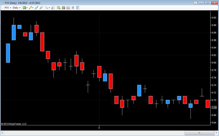
Five year US Treasury notes: FVX
-
Ten year US Treasury notes: TNX
-
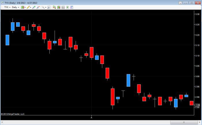
Thirty year US Treasury bonds: TYX
Here are examples of each, using the daily chart.
Fig 2.10
Five year Treasury note – daily chart
Fig 2.11
Ten year Treasury note – daily chart
Fig 2.12
30 year Treasury bond – daily chart
These are the benchmark US Treasuries to watch and, as I mentioned earlier, one of the other key bond markets, which offers a less 'polluted' view of money, is in those bonds issued by US Municipal authorities.
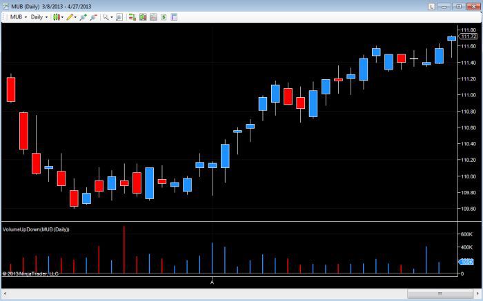
The easiest place to check on the yields for this market is using an instrument referred to as an ETF or Exchange Traded Fund, which will be covered in greater detail later in the book. This is simply a fund which trades like a stock, but is based on an underlying basket of assets. In this case it is a range of municipal bonds which make up the ETF index. And one of the most popular is the S&P National Municipal Bond with the ticker symbol MUB.
Fig 2.13 is an example, once again, based on the daily chart. As with the Treasury bonds and notes the time scale you choose will vary according to your trading strategy, but in considering the Municipal bond markets in this way, you will be triangulating market sentiment using an untainted source of lending.
Fig 2.13
Municipal bonds – daily chart (MUB)
Finally, one other important point to note. As the ETF trades like a stock this also means we have volume available on the chart.
Volume is the ONLY leading indicator, and I will be covering the importance of volume in detail later. However, when read in conjunction with price action, this offers traders the ultimate in market forecasting.
Using price action with volume is not new and is what I refer to as Volume Price Analysis or VPA for short. Put simply, volume is the fuel that drives any market. If the market is rising on low volume, this is a weak move and unlikely to continue for long. Equally a move lower on low volume will fail.
For markets to move either higher or lower requires effort in the form of volume. The good news is volume and ETF's go hand in hand, in much the same way as in the cash markets for equities. For forex trading, we use a proxy which is tick volume, but again this will be covered in due course.
To summarise. When markets are risk averse money will flow into bonds as a safe haven, and the yields will fall as the underlying price of bonds rise.
When markets are risk on, and investors are prepared to take on more risk, the flow of money is out of bonds and into riskier asset classes. Therefore, the underlying price will fall, and the yield will rise as a result. This is the simple see-saw of money flow which is such a powerful analytical tool, and which works in all time frames. And regardless of whether you are a scalper or a swing trader, the bond chart will always reveal the current market sentiment to money and risk appetite.
Now we come to the most complicated aspect of yield which is the third of these, the yield to maturity. This is the yield we need to analyse when considering the bond markets over a longer period of time and is known as the yield curve. This is often simply referred to as 'yield'.
The yield curve is a graphical representation of the constantly changing relationship between the underlying bond price and the return, but viewed from the perspective of short term T Bills, right through to a thirty year bond. It is a complicated calculation and beyond the scope of this book, but there are various places to find these charts, which will be referenced shortly.
The yield curve is a snapshot of yields on bonds of similar credit quality and asset class, and the yield curve covers maturities from three months to 30 years.
As you would expect, bonds with longer maturities pay higher rates of interest. Bonds with shorter maturities pay lower rates of interest, since the owner of a longer term bond is taking a bigger risk than a holder with a shorter term bond.
The yield curve is created by joining up the various market yields at one point in time over the period of short to long term bonds, and it is the shape of this curve that tells us what the market is thinking, in terms of interest rates, risk, inflation, and of course money flow.
There are four types of yield curve all of which reflect differing views of market sentiment, risk, the economic outlook, and investors longer term appetite and anticipated returns on money. These are as follows:
-
Normal yield curve
-
Steep yield curve
-
Inverted yield curve
-
Flat or humped yield curve
As we have already discovered, all bonds have a maturity date or a time value and, as a result, bonds with longer maturities pay higher coupon rates, than bonds with shorter maturities. So in general, the rate on a 30 day T bill will be much lower than the coupon rate on a 10 year T note or a 30 year T bond. The reason is straightforward. It is because the lender or creditor is taking a much greater risk in lending for such a long period, and this in turn is reflected in the longer term yields.
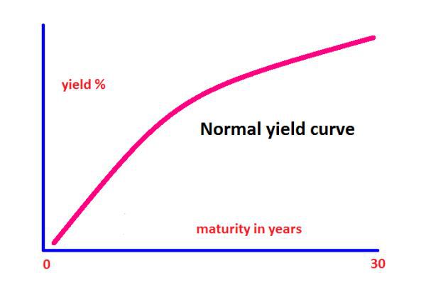
The yield curve gives us a visual picture of this relationship between the short term and long term yields in one chart. The shape of the yield curve describes market sentiment, and the most common is the normal yield curve. See Fig 2.14.
This kind of yield curve is the one most often seen, and generally referred to as the normal curve. It is seen in periods of economic stability in the middle of an economic cycle. In general terms, equity markets are moving higher, the economy is growing steadily, and with normal rates of growth, the threat of inflation is being controlled. The yield curve is this shape, since short and medium term bills and notes have a lower yield, with longer term bonds offering a higher yield, but which slopes gently out to the longer term.
Fig 2.14
Normal Yield Curve
The second type of yield curve is one we refer to as steep as shown in Fig 2.15. Under normal circumstances, the yield on a 30 year bond is typically around 3 to 4 percentage points above the yield on three month T bills.
However, from time to time this gap increases dramatically, and the slope on the yield curve increases sharply. The message being sent here is that investors believe the economy is likely to improve quickly in the future, so typically this yield curve will be seen at the start of an economic recovery and consequent expansion. In other words, signalling the move out of recession and into the first phase of expansion. But why does the yield curve adopt this shape?
Fig 2.15
Steep Yield Curve
Up to this point, the economy has been stagnant with low short term interest rates. However, as demand for capital grows rates begin to rise, long term investors become concerned at being locked into low rates.
As a result, they demand greater compensation for taking the risk in the debt market for the longer term, when in fact they could consider moving into equities, and better returns. Longer term rates are therefore forced higher, which is reflected in an increase in the differential rates between the shorter term and longer term bond holders. So a steep yield curve sends a strong signal longer term rates are on the rise, fast, ahead of an economic recovery and expansion from recession.
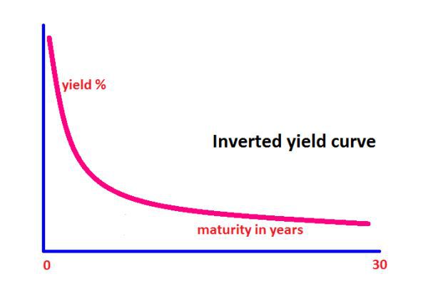
The third type of yield curve is called an inverted yield curve, and at first glance may appear to be a paradox. After all, in this case longer term investors are accepting lower yields than those short term investors. Why is this?
Fig 2.16
Inverted Yield Curve
In this case the long term bond holders have taken the view rates in the future are likely to be moving lower with a slowing economy, and have therefore decided locking in the current rate is a sensible decision. This type of yield curve is therefore almost always the pre-cursor to a recession, with the economy slowing and interest rates likely to fall. It is often referred to as the yield of fear.
Whilst they are rare, they are a powerful signal and should never
be ignored, as they are always followed by an economic slowdown, or an outright recession. Lower interest rates then follow.
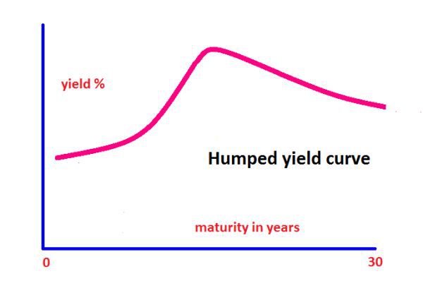
The final yield curve is referred to as the humped yield curve, and this may also adopt a flat shape as well as the humped version shown in Fig 2.17.
Fig 2.17
Humped Yield Curve
In order for the yield curve to take on this shape, it has to pass through a period where the long term yields are the same as short term rates. When this happens we get a flat yield curve or one that is slightly humped, generally in the middle of the curve.
Where this happens in the economic cycle, is generally, although not always, when the yield curve is moving from a normal to an inverted yield.
In other words, we are potentially seeing the economy beginning to slow, with the yield curve in transition. However, not all humped or flat yield curves make the full change to an inverted curve, but they often do, giving an excellent and early warning signal the economy is slowing and potentially moving into recession. Once again, a signal of lower interest rates.
In simple terms this is how the yield curve works, and what it reveals about the broader economy, investor sentiment, and where you are in the economic cycle.
The yield curve and yields are both powerful and relatively simple to understand, once you begin to appreciate the supply and demand within the underlying bonds themselves and the signals this price action is generating.
As I mentioned in the introduction, most forex traders never consider the bond markets as relevant, which is a great mistake.
The second reason they are ignored is simply most forex traders are short term intraday scalpers, and therefore believe the bond markets are only useful for longer term trading.
Whilst this may certainly be true when considering the yield curve, this is definitely not the case when considering the intra day price action on the Treasury Yield index charts, or indeed on the ETF MUB chart. Indeed, using price action as one of the technical tools in the traders toolbox, this is even more powerful.
Remember however, until the quantitative easing programs are finally concluded, the bond markets will remain distorted for years to come, a fact which also applies to bond yields.
Although the rule book has not been torn up completely, it has certainly been put to one side for the time being, as all market analysis, whether technical, fundamental or relational, has to be viewed in a cautious light.
True price discovery will only return to the markets once these artificial programs of economic stimulus have come to an end. Until then, we have to be cautious, be aware of the pitfalls and changes, and try to use as many analytical methods to cross check our analysis and risk assessment on each trade. Bonds are one of the cornerstones, and should be part of every forex traders armoury.
At this point, let me just say a word or two about the so called 'bond vigilantes' who you may have read about in the media. As the name implies, these are large organisations, hedge funds and bond funds, who take it upon themselves to sell large bond holdings in order to drive up yields, making borrowing more expensive as a result.
These organisations are primarily motivated by concerns over who will be the primary buyer of bonds once the FED has concluded its various QE programs. Their concern is simple. Who will buy all the devalued bonds once the FED withdraws from the market?
This is not an unreasonable view, but one which has added a further layer of abnormal and volatile price action to the US Treasuries market.
Once again, this is yet another factor which has appeared to make analysis of the markets even more complex following the financial meltdown, for traders. The message is clear and simple. Use all the markets and tools available to quantify and analysis risk.
No longer is it possible to succeed as a forex trader using one chart and one form of analysis. The odds are no longer in your favour. Hopefully this introduction to bonds will have convinced you not only is the information there, it is easily available. It simply requires some effort and a little explanation, which is what this book is all about.
Finally let me cover one of the bond markets I mentioned right at the start of this chapter which is the so called Eurodollar market, and here we turn to the futures market.
Futures will be explained in detail in another book, but this particular contract was introduced by the CME in 1981, and is now considered to be one of the fundamental building blocks of the interest rate market. Eurodollar futures are the most active short term interest rate futures contacts traded worldwide.
The contract is based on a $1million dollar face value with a three month maturity. It is a cash settled contract, with a quarterly cycle, and is traded both on the floor of the exchange and increasingly on the electronic Globex exchange, so prices are available virtually 24 hours a day.
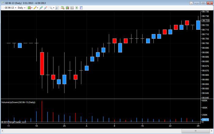
The contract is quoted in terms of the IMM three month LIBOR index points, which is equivalent to 100 minus the yield on the security. So for example if the yield is 1.2% the index is 98.80. The minimum price fluctuation varies on the contract, with the nearest contract based on one quarter of a basis point or 0.0025%, and further contracts moving to one half of a basis point at 0.005%.
The ticker symbol for the contract on the CME for open outcry is ED and for the Globex market is GE. The chart in Fig 2.18 shows the daily price action for the contract, and again we have volume, a huge advantage to those traders who trade using price action and volume.
Fig 2.18
Eurodollar Future on Globex
Once again, as we saw earlier, the interest rate market gives us two views of market sentiment, money flow and risk appetite, one based on an intra day basis and the other a longer term view based on the yield curve. With Eurodollar futures we can take the same approach, coupled with volume.
Pricing patterns in the Eurodollar futures markets have a close association with money and flow, and therefore mirror the associated yield curves. Short term rates are driven fundamentally by monetary policy, whilst longer term rates are largely driven by inflationary expectations, with the yield curve reflecting these views on one chart. In simple terms, if the yield curve is steep, yields are expected to rise. If the yield is inverted or flat, yields are expected to fall.
There are many sophisticated strategies which futures traders adopt to hedge and take positions in the market, which is beyond the scope of this book.
For us as forex traders, the key point is this – short term rates are driven by the FOMC monetary policy, and as such, any comments or the release of the monthly FOMC minutes will impact the market, and seen in the price action as a result.
For intra day or short term traders this helps to establish money flow and risk appetite, which in turn will be reflected in the currency markets. Longer term rates are driven by the expectation of inflation, which is a key component of commodity markets covered in the next chapter.
By considering all three markets, the US Treasury markets, Unibond markets and Eurodollars, as a forex trader you will have a clear view, both in the short, medium and long term of risk.
Risk and return on money is what drives the markets, and if you have a clear view, this will then be reflected in the currencies you trade. No longer will you wonder why a currency is being bought or sold. You will have a clear understanding of why, and more importantly where the buying or selling is taking place.
