Chapter Eleven
Secondary Perspectives
One reason why financially educated people want to keep their money moving is because if they park their money in one asset class, as many amateur investors do, they may lose their money when cash flows out of that asset class.
Robert Kiyosaki (1944-)
I have called this chapter, Secondary Perspectives, as I would like to introduce some of the more sophisticated approaches to market analysis, which combine aspects of relational analysis, with associated analytical techniques, such as ratio analysis.
Ratio analysis is an approach widely used when analysing companies and their performance, and can be applied in a similar way to gauge market performance using indices.
In this chapter I also want to consider the CFTC data, which gives us a complementary view of the market, and round off by looking at a particular set of instruments, namely ETFs, which are increasing in popularity, and once again provide us with an alternative way to analyse the market using volume.
The first ratio I would like to introduce is known as the TED spread. The TED spread is all about risk, and although it is in fact a ratio between two instruments, it does appear on a single chart.
TED & TIPS
The TED spread gives us a view on the credit markets or the cost of money, and the reason it's called the TED spread is because it was originally established as a measure of the difference between interest rates on 3 month T bills and the 3 month Eurodollar contracts with identical expiration months. The T comes from the T of T-bills, whilst the ED is the ticker symbol for the Eurodollar futures contract on the CME, so the two were simply joined together to come up with the TED.
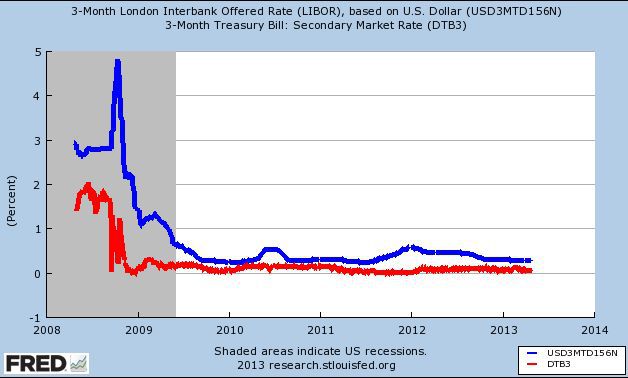
Today, the TED spread measures the difference between the interest rates on a 3 month T-Bill measured against the 3 month LIBOR rate. LIBOR is the London Interbank Offered Rate. It is a very simple calculation. For example, if the LIBOR rate is 2.75% and the equivalent rate on the T-bill is 1.75%, the TED spread is the difference between the two, in other words 1%. This is normally expressed in basis points so the difference is simply multiplied by 100, However, charts do vary. Some record in this format, whilst others present the spread in the true percentage difference.
The question of course is, what does the TED spread chart tell us?
Despite the financial crisis of the last few years T-bills are universally perceived as risk free, whilst LIBOR on the other hand reflects the interest rates banks are prepared to lend money to one another. Wholesale lending if you like.
The TED spread reflects the difference between the rates at which lenders are prepared to lend money to the US government and what banks are likely to charge each other. So, it is an excellent proxy for credit risk.
Typically, the spread is represented in basis points so a 0.25 percentage difference would be appear as a 25 basis point spread; a 0.50 percentage difference would appear as a 50 basis point spread and so on. On the chart the spread will be appear as a simple number somewhere between zero and 500. But as I said earlier, this does vary from one chart to another.
The highest number ever recorded was 463 in mid 2008 when the financial crisis was at its peak. This meant at this point there would have been a 4.63% difference in interest rates between the Libor rate and the US 3 month T-bills.
But, how do we read the TED spread chart?
Put simply, as the TED index rises it is denoting a widening spread, which signals increasing concerns about credit risk for two reasons. First, it could be as a result of banks becoming increasingly nervous about lending to one another. Or second, it signals investors are flocking to safe haven investments such as US treasuries. In other words, LIBOR rates are rising and the yield on Treasuries is falling.
A TED spread that is falling denotes a narrowing of the spread and tells us credit markets are functioning. In this case, the LIBOR rate is falling, so risk is considered to be low in the wholesale banking market, and in addition, investors are more willing to accept risk by selling T-Bills, with a consequent rise in yields.
If the spread is widening and the index on the chart is moving higher, we can assume the market is not in the mood for risk. In order words it is a 'risk off' environment. Money flow is likely to be into safe haven assets and safe haven currencies and away from risk assets such as equities, commodities and risk currencies.
Investors are moving into T-Bills as they believe stock markets are likely to fall, with the spread increasing and the index rising.
A widening spread can also be an indication the credit markets are not functioning correctly, and can therefore be a potential sign of economic contraction, because if people cannot obtain credit the economy is unlikely to expand.
What if the TED spread is falling or the spread is decreasing with the index falling? In this case it tells us the opposite of the above.
There is a lower risk of default, so wholesale interest rates between banks will be lower, investors are selling bonds and T-Bills as they believe they will obtain a better return in the stock market and from higher risk asset classes. Finally, with credit markets working normally, we can expect to see economic expansion as a result. At first glance this can appear a complex index to follow. In reality it isn’t, and whilst it is not one you are going to watch every day, you do need to consult it periodically to check for any clues or signals of what is going on in the money markets. And, in particular, watch for any signs of changes in risk appetite and market sentiment.
Until recently it was relatively easy to find a chart for the TED spread. It used to be freely available at Bloomberg as part of the charting options. However, Bloomberg recently decided to withdraw the chart of this index, so the place to go now is to head over to
http://www.stockcharts.com
and enter the ticker symbol $TED which will bring up the respective chart.
As I said earlier, this is not a chart to watch on an intraday basis, but rather on a daily or weekly basis. This will give you an alternative perspective on risk and risk appetite as measured using the ever changing spread in this relationship.
Just like the VIX in the previous chapter, which is the premier fear indicator, the TED index works inversely with equity markets. In other words, if equity markets are rising the TED index will be falling, and conversely when stock markets are falling, the TED index will start to rise. Anything about 100 or 1% will set the alarm bells clanging, while a move below 50 or 0.5% is where markets are complacent and risk appetite it rising.
You can find an alternative to the TED spread index by visiting the
Federal Reserve Bank of St Louis
, and creating your own chart, which is shown below. I show you how to do this in the next section when we look at the TIPS spread.
Fig 11.10
TED Spread - Courtesy of the Federal Reserve Bank of St Louis
Another important secondary index is the TIPS spread. Like the TED spread this one is not really an index at all, but a measure of the variation between two interest rates, but I’ve included it here, so the TED and TIPS sit together in the same place within the book.
The TIPS spread is a little more difficult to construct, as we have to create the chart ourselves using two different instruments, but it is yet another important economic indicator which this time tells us about inflation.
Like the TED index, this is not a chart we look at constantly, but simply one to refer to now and again, for a longer term perspective on the economy and the prospects for inflation.
The good news is it is very simple to understand as the chart is a simple comparison between the yield of TIPS which are T
reasury I
nflation P
rotection S
ecurities, hence the acronym TIPS, and our old friend the conventional US Treasury with the same maturity date.
The reason the TIPS spread is so important is that the payments for TIPS adjust for inflation, whereas the simple Treasury note or bill does not. This gives us a direct and simple view on the prospects for future inflation.
The TIPS spread is one of the few market based measures of inflation expectation, and the spread is therefore the difference between a normal bond, usually the ten year Treasury bond and an inflation index bond of the same maturity. Moreover, the principle reason for watching the TIPS is that inflation index bonds are benchmarked using the CPI, the Consumer Prices Index, a term I will explain in the next section of the book.
In plain English, the wider the spread between the two yields the higher investors‘ expectations are of inflation, whilst the narrower the spread between the two yields the lower investors’ expectations. If the spread is widening, traders and investors are expecting inflation, and conversely if the spread is narrowing, inflation expectations are declining. This is another key measure used by central banks to gauge the current inflationary pressures in the economy and whether to manage this through the interest rate mechanism.
I hope, by now, you are beginning to see how powerful related markets and analysis of these relationships can be in providing a fully formed view of the market. Perhaps, you can also begin to see why so many forex traders fail. However, I do understand some of this can seem overwhelming when you first start, but you must remember some of these charts and indices are only checked occasionally, not every minute of the day.
Furthermore, whilst there appears to be a lot to do each day, once you have a routine, it will only take a few minutes to check the latest charts to see what these indices are telling you. This quick check is something you should do before going on to your detailed analysis of the particular currency pair you are thinking of trading.
Constructing the chart for the TIPS can be a little complicated as there are only a few places on the internet which have this chart, but you can find it here :
https://research.stlouisfed.org
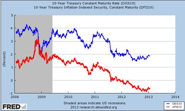
Click on the Data Tools tab and from the drop down box select the 'create your own graphs' option. This will open your FRED graph where you can create your own TIPS spread chart. To do this, enter the following ticker – DGS10 - in the Add Data Series box. This is the 10 year Treasury Constant Maturity Note.
Once done, click on the Add Data Series below to add your second instrument which in this case is – DFII10 – this is the 10 year Inflation Indexed Linked Note.
Select the same time period of 5 years or 1 year below for each instrument, and click the redraw graph button at the bottom of the screen.
You should now have a chart with two lines which converge and diverge. You now have your own TIPS spread and a personal view on inflation. Remember this is not a chart to check daily, but will help to frame some of the economic data releases, in particular when we begin to look at fundamental analysis in the next section of the book. When the Federal Reserve release their monthly statements on the economy and possible changes in interest rates in the future, this chart will help you understand why.
Your chart should now look something like the one in Fig 11.11
Fig 11.11
TIPS Courtesy of the Federal Reserve Bank of St Louis
In the previous two chapters we looked at several of the major indices which reveal different aspects of these underlying relationships. This all helps to give us a view of the markets and, as forex traders a deeper insight into what is actually happening, and more importantly, what is likely to happen in the future.
This is still a relatively one dimensional view. After all an index is just an index, so in order to try to give us a more descriptive three dimensional view, we use a technique called ratio analysis.
Ratio Analysis
Ratio analysis is a technique where we compare one index with another, in order to arrive at a deeper analysis. In some ways it is similar to the TIPS and TED spreads where two instruments are compared to reveal market sentiment or economic activity.
The simplest analogy I can think of to explain ratio analysis is if we were to look at a chart for the the price of petrol, which would probably only tell us petrol prices were rising or falling. However, if we were to compare the price of petrol with the price of oil this might tell us a little more, and may even surprise us. So ratio analysis at its simplest level is comparing one price chart or index with a related or tangential market which, as a result, reveals deeper market information for us as traders.
These markets or indices are rarely directly related but it is this cross market analysis that can be so revealing.
Here are some examples of ratio analysis which have a direct impact on currencies.
In many ways we have already touched on ratio analysis by looking at relationships such as gold and the US dollar where I introduced you to some of the basic concepts of relational analysis. A good place to start is with gold as we consider some of the simple relationships and ratios that work in the currency markets.
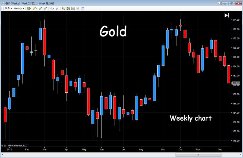
Fig 11.12 is the weekly chart for gold using the ETF with the ticker GLD.
Fig 11.12
Gold Weekly Chart
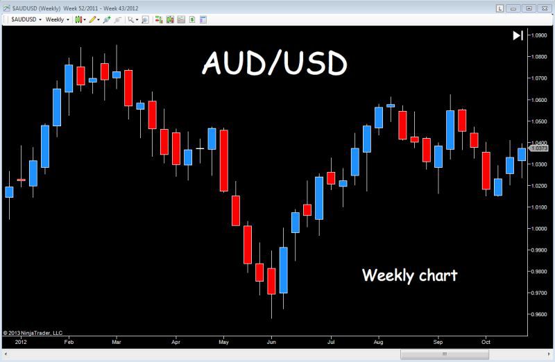
Now compare this with the Australian Dollar US Dollar weekly chart in Fig 11.13 over the same period.
Fig 11.13
AUD/USD Weekly Chart
Australia is one of the worlds largest gold producers, and is currently ranked third in the world in terms of production. The Australian dollar is therefore sensitive to the price of gold and the pair, which are quoted with the Australian dollar first as the primary currency, will tend to move in step. Therefore, as the price of gold rises, this is likely to be reflected in strength for the Australian dollar, and likewise, a fall in the price of gold may see the Australian dollar weaken.
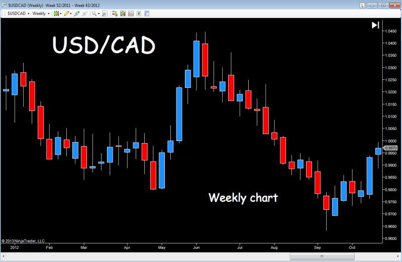
The gold effect is also seen in some of the other commodity currencies such as the New Zealand dollar and the Canadian dollar. In the case of the Canadian dollar this is quoted as the counter currency, so as the USD/CAD falls, this is reflecting strength in the Canadian dollar and the price of gold, (and other commodities) will be rising.
Whilst New Zealand is a much smaller producer it still ranks twenty fifth in the world, so movements in gold will be reflected in the New Zealand dollar too. The NZD also has other major influences such as interest rate differentials and the carry trade, as do other high yielding currencies such as the Australian Dollar, so please don't run away with the idea this is the only relationship that influences the pair. It isn't, there are many others, and this is just one, with gold.
Fig 11.14 is the weekly chart for the Canadian dollar vs the US dollar (USD/CAD) which reflects this inverse relationship.
Staying with gold, the next one may surprise you a little but the Euro also tends to rise when gold rises as both are considered as alternatives to the dollar, gold as a safe haven and the Euro as the first reserve currency 'in waiting'.
Fig 11.14
USD/CAD Weekly Chart
Now whilst all of the above are conditional on changes in the price of gold, all of these are underpinned by the generally inverse relationship between gold and the US dollar, so as gold prices rise the US dollar tends to fall, a relationship we studied earlier in the book. This is one of the complex issues we face as forex traders, which is this.
When considering a currency pair, what are the factors driving the pair? For example, with the Euro vs US dollar, is it strength in the Euro, or is it weakness in the US dollar? What impact are commodity prices having on the currencies which make up the pair? Is the driver due solely to the direction of the US dollar, or are other factors playing a part?
Learn to identify and unravel these factors and your trading success will increase exponentially. After all, if we can identify why a currency is strong or weak, we can track this in different pairs and in different ways, using all the techniques and analytical tools you will discover as we move deeper into the subject.
The final currency pair which has a strong association with gold is the Swiss Franc, and there are two reasons for this.
First, the Swiss banking system holds almost thirty percent of its reserves in gold, and therefore any change in the price of gold is likely to be reflected in the currency. Second, the Swiss Franc is also seen as a safe haven currency, partly due to the underlying gold in the banking system, and partly because Switzerland is seen as a safe and stable country. Furthermore, Switzerland likes to protect its banking clients from the prying eyes of the tax authorities.
The most popular currency pair is the USD/CHF (Fig 11.15) with the Swiss Franc as the counter currency against the US dollar. So just as with the USD/CAD we considered earlier, this pair too has an inverse relationship with the price of gold.
The USD/CHF pair will fall as gold rises and vice versa, just as with the USD/CAD.
Fig 11.15
USD/CHF Weekly Chart
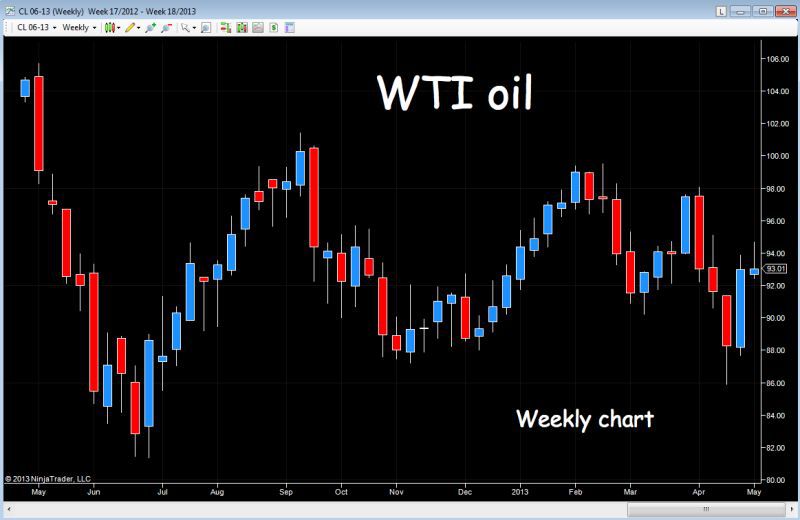
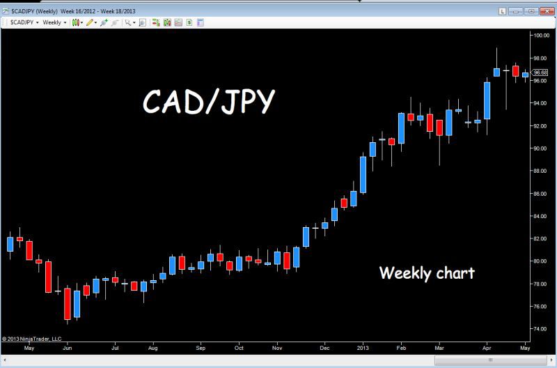
Finally and, staying with the commodity theme, I have introduced this one before, but as oil prices rise and fall, the impact of this price action will be seen in several pairs featuring the Canadian Dollar, primarily against the US dollar and the Japanese Yen.
Fig 11.16 is a weekly chart for WTI oil, followed by the equivalent charts for the Canadian Dollar against the US dollar and the Japanese Yen.
Fig 11.16
WTI Crude Oil Weekly Chart Over 12 Months
Fig 11.17
USD/CAD - Weekly Chart Over 12 Months
Fig 11.18
CAD/JPY – Weekly Chart Over 12 Months
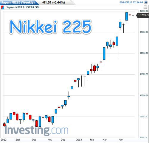
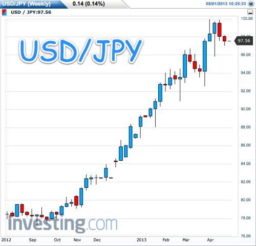
However, before moving to consider more complex studies, let's look at a couple of examples of equities and currencies and, in this case it is the Nikkei 225, the primary Japanese equity index and the US Dollar vs Japanese Yen pair (USDJPY), which tend to move in the same direction for the simple reason the Yen is also considered to be a so called safe haven currency. Therefore, if Japanese stock markets are falling, investors will move from a risky asset class such as equities into a safe haven currency such as the Japanese Yen.
As the Nikkei 225 falls, the USD/JPY pair are also likely to fall.
In addition, this relationship is further reinforced since selling of Japanese equities, is reflected in the consequent buying of Yen denominated safe haven assets such as bonds. However, as always this view has to be tempered by the fact the US dollar is also a safe haven currency, and once again it is a question of understanding and unravelling whether price movement in the pair is being driven by the US dollar, or the Japanese Yen. This is always the conundrum, and is one of the many reasons why looking at these relationships using relational analysis, can give us the clues and signals which will help us solve this problem.
Fig 11.19
Nikkei 225 – Weekly Chart Over 9 Months
Fig 11.20
USD/JPY – Weekly Chart Over 9 Months
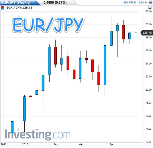
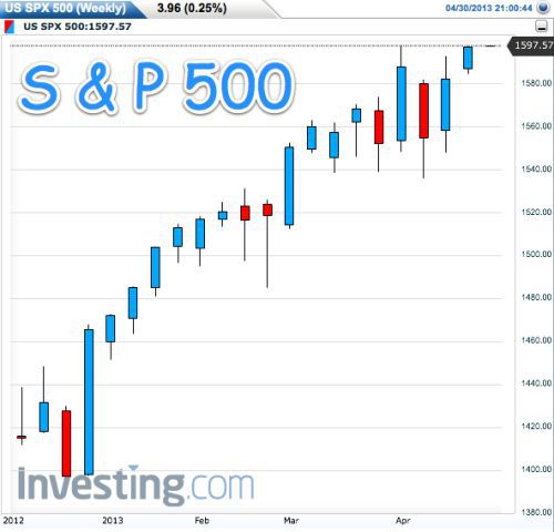
One other relationship that stands out between currencies and equities is that between the Euro Yen pair (EURJPY), and the US S&P 500 index. Here again it is the risk aspect which drives the money flow, so if investors are nervous, they will move out of equities and into safe haven currencies such as the Yen.
In this case, the Euro Yen currency pair will fall as the S&P falls and rise as the index rises Fig 11.21 and Fig 11.22 are both weekly charts over a 3 month period.
Fig 11.21
EUR/JPY
Fig 11.22
S&P500 Weekly
Finally to conclude this section let's take a look at one of the key relationships between markets of the same asset class. So far we have looked at money flow between assets, but what about money flow as reflected in markets with the same risk profile? And here the same principles apply.
The two indices to watch are in the Nikkei 225 and the S&P 500, which will almost always move in the same direction given the close relationship between the two economies. Therefore, if you are trading in the London session as the European and UK markets get underway, always check the Nikkei 225 for a view on overnight market sentiment, which will provide clues to trading sentiment in London and the US sessions.
Fig 11.23
Nikkei 225 – Daily Chart Over 3 Months
Fig 11.24
S&P 500 – Daily Chart Over 3 Months
Having covered some of the basic relationships let me move up to the next level and consider more complex relationships and ratios which give us a little more than just a simple direct comparison.
I also want to make the point you don’t need to check these every day. Some are long term ratios, such as with the TED and TIPS spreads. They are useful because they give us a mental picture of where we are in the longer term cycle, whilst others will be shorter term and more relevant for intraday traders. And this is particularly true when we look at bonds.
However, as a general rule of thumb this type of analysis is an analytical tool designed to provide a framework against which to trade. It is an overview, a birds eye view, as we survey the financial landscape for clues and signals as to the broader economic outlook. This overview will reveal trends in inflation as well as potential turning points in related markets which, in turn will reveal money flow, risk and market sentiment.
In the above examples where we have considered commodities and currency pairs, an intraday trader would almost certainly have live charts, along with bond yields, major indices and the sentiment indicators such as the VIX. All would be telling the market’s story in their own unique, yet interrelated way. Add to this analysis the power of technical price action coupled with volume and backed by an understanding of the fundamentals driving the markets, and you have the complete picture.
These are the insights and tools I am trying to deliver in this book. The tools which allow you to see the whole picture and not simply one simple price chart for one simple currency pair. The forex market is far more complex than this, and is one of the reasons why it is the most difficult market to comprehend and trade.
However, to return to gold, but this time to consider the gold oil ratio which has a strong inverse relationship to stocks and market sentiment. This simply means as stocks rise this ratio will fall and vice versa.
Fig 11.25 is a simple chart showing this ratio over an approximate 12 month period.
Fig 11.25
Gold/Oil Ratio
What does this chart and ratio reveal about risk and related markets? In simple terms, a falling Gold to Oil ratio, as we can see here in the last few weeks on the right hand side of the chart, suggests a stabilisation in oil, which is usually accompanied by a rise in risk appetite for equities and energy currencies in particular. The associated fall in the price of gold, is suggesting an increase in bond yields as money flows from bonds and into equities. In addition, there is also the simple logic, that as the ratio begins to fall, this is a signal of possible rising energy prices which generally lead stocks higher, particularly when an economy is moving from a recessionary period into the early expansion phase.
This ratio is expressed mathematically as the per ounce price of gold, divided by the cost of a barrel of crude oil, and therefore tells us how many ounces of gold it takes to buy a barrel of oil.
What makes this ratio more meaningful is the lack of correlation between these two commodities, both of which are considered (in different ways) to be bellwethers of inflation. This can lead to large differences, with the ratio varying widely over time. For example, since 2001, one ounce of gold could have bought between 6 and 24 barrels of oil at various times.
In the middle of 2008, as the price of oil surged, the ratio fell to an historic low of 6, before climbing back fast to 24 following a sharp decline in oil when the price fell back below $100 per barrel.
This ratio is also considered to be one of the bellwether ratios for the US economy with the norm considered to be around the one to fifteen level. In other words, if a barrel of oil is $100 dollars and gold is $1500 per ounce this is the median point for the ratio.
How do we use the gold oil ratio?
The ratio can be used in as many ways you can think of. It can be used as a 'reality check'. It can be used to draw conclusions as to whether oil or gold is over or under-priced, and from there to consider the impact on the economy and, perhaps more importantly, on oil or commodity related currencies.
When the ratio fell to an historic low of 6 in 2008, as the oil price peaked at $147 per barrel we could have had three outcomes to bring the ratio back to its median of 15.
First, oil prices could have stayed at this level, and gold would then have had to rise to over $2200 per ounce. Second, gold could have stayed at its then current price at just under $900 per ounce, with oil falling to $58 per barrel. Third, oil prices could have fallen and been matched with a rise in the price of gold.
The principle idea behind the ratio is that it is premised on the fact crude oil prices are one of the main contributory factors to inflation. Increasing oil prices signify an increase in prices at the pumps. The cost of manufacturing and transporting goods also increases, all adding to inflation. Inflation is linked to commodities, and precious metals will then appreciate in such an inflationary environment due to demand. If both oil and gold are rising the ratio may remain flat and settle at the median level. This conclusion has, of course, to be validated by our analysis in other markets such as bonds and equities and further reinforced by our technical analysis of the price charts for both commodities.
However, the ratio should not be viewed as a chart in isolation, but rather as a way of giving you an alternative perspective on the price of both commodities. In addition, the ratio will also give you a view on inflation and the prospect of inflationary pressure. Your analysis will also encompass many of the fundamental topics in the next section of the book, which will combine to give you a feel for the economic cycle in the short to medium term.
Another ratio we look at regularly is the S&P 500 against the VIX both, of course, equity related, but nevertheless an excellent ratio, which when plotted gives us a technical view of risk and fear and therefore market sentiment. As a result, this provides us with a strong visual picture of potential tops and bottoms in the risk markets of equities and commodities, with consequent money flow into bonds and away from risk currencies. Fig 11.26 reveals the power of this relationship which is almost perfectly inverse.
As the VIX falls the S&P 500 rises, and vice versa. The key here is the VIX. Once we see the index trading down to low levels, and into single figures, this is the first warning of danger, of a potential change in longer term risk sentiment in the market. There is no guarantee this will happen quickly, as markets can stay at these extremes for some time, but we know it will happen, it's just a question of when.
Fig 11.26
VIX/S&P500
Gold DOW Ratio
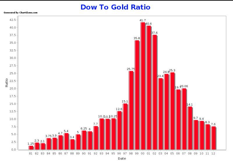
Finally in equities we look at the gold Dow ratio which measures the value of all the Dow 30 constituent companies priced in gold. In other words how much gold would it take to buy each individual stock in the Dow 30?
Looking at a ten year period between 2000 and 2010 at the start of the decade it would have taken 41.7 ounces of gold to buy one stock from each company. Ten years later it took just 9.4 ounces, a simple but stark message for stock investors the value of these stocks had plunged in the last ten years relative to gold
If this trend continues we could see these stocks move towards one ounce, only seen three times in the last century and all precursors to a long bear market. However, whilst this is a longer term ratio is does provide us with an interesting link between the ultimate safe haven and hedge against inflation (gold) against the returns on risk based assets such as equities.
Fig 11.27
Dow/Gold Ratio Chart
Commodities & the US Dollar
Finally, I would like to move to one of the most important indices we looked at previously, the CRB or CCI index, and here I would like to consider three ratios or relationships in detail.
The first is with the US dollar and, as you would expect, this is broadly inverse and what we should expect to see as virtually all commodities are priced in the US dollar. However, we keep an eye on this relationship just to see if it is holding firm, as any breakdown could provide clues as to changes in sentiment or risk.
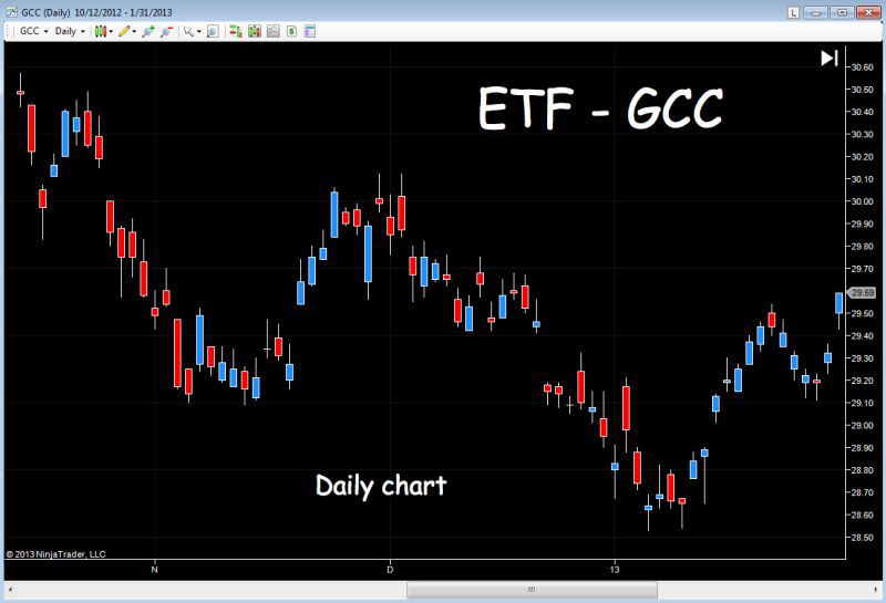
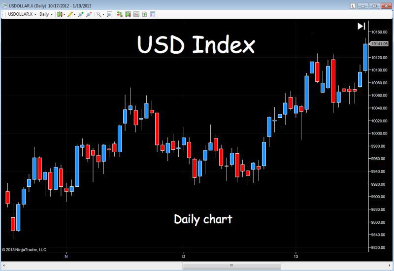
Fig 11.28 and Fig 11.29 show two charts, one for the CCI and the USD index respectively, over the same three month period and based on daily price action. And the important point to note here is that whilst the relationship was as expected during November, it broke down into December and for parts of January. The reason, as explained earlier, was largely due to surges in equities, which saw a consequent flow of money out of safe haven coupled with a rush to high returns in stocks as investors moved fast into risk assets. Stocks were seen as offering better returns than commodities, and hence the breakdown in the relationship.
However, this breakdown was also reflected in the next relationship. The CRB and 10 year T-note. As the king pin of the markets, the US dollar, also fell out of step which I explain next.
Fig 11.28
CCI - ETF GCC Daily Chart
Fig 11.29
US Dollar Index Daily Chart
CCI (CRB) & Bonds
The next relationship is the CCI or CRB with bonds and, in particular with US treasuries which is yet another of our key relationship. What does the CRB or CCI vs US bonds relationship tell us?
First, there is generally a positive relationship where higher commodity prices will see bond yields rise and bond prices fall, reflecting risk appetite and rising inflation as investors seek higher returns in riskier asset classes.
The second reason is one we touched on previously, which is the leading aspect of commodity prices. As commodity prices tend to lead inflation they can often signal likely changes in interest rates, moving forward. The reason for this is that it takes time for higher commodity prices to filter through into the economic system and ultimately be reflected in the data and statistics produced by governments and central banks. Statistics such as the CPI and PPI numbers, which we're going to look at in the next section of the book.
Therefore, in comparing the Commodity Index with the yield on the 10 year US Treasury note, gives us a unique view on the potential for interest rate rises and, of course the corollary, falls in interest rates, which are equally important.
Ultimately, rises in interest rates drive an economy back into recession with the Commodity Index falling as bond yields fall, as money flows back into bonds and away from riskier assets.
Unfortunately, in the last few years the US bond market has become distorted by the action of the US Federal Reserve in its attempts to weaken the US dollar severely by printing money. In addition, the currency wars continue unabated as central banks around the world desperately pursue measures to ensure a triple dip recession is avoided. No one wants a strong currency which is leading to distortions in all of these once key relationships.
Whilst writing this book, we have had a situation with a falling US dollar and falling commodities. The relationship has broken down temporarily, and is a stark reminder no relationship, no matter how solid in the past can be guaranteed in the future. This has been proven many times in the last few years, with markets distorted by so much money. And, as I said earlier in the book, the rule book has been torn up. So, it's just as important to understand this fact as it is to understand these relationships.
In this example we have the CCI and the 10 Year US T-Note yield over a three month period and what we expect to see is as follows.1
If commodity prices are rising, and the CCI is rising, this signals positive risk sentiment, which should be reflected in the yields on US T-notes (and others) in rising yields, as money flows from bonds and into risk assets. In other words, this is a positive direct relationship.
Equally if yields are falling the CCI or CRB should be falling as well, reflecting money flow into safe haven and away from risk.
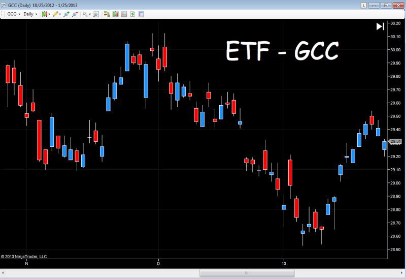
But as you can see from the charts in Fig 11.30 and Fig 11.31 almost the exact opposite is happening.
Yields through December rose, yet the CCI index fell. Finally, in January the relationship stepped back into line with rising yields and a rising CCI index. But not for long, breaking down again in the last few days of January with an inverse relationship back in place.
Fig 11.30
GCC - ETF Daily Chart
Fig 11.31
10 Year TNX
And the reason has to do with the US dollar. If the US dollar relationship, which underpins all others, falls out of kilter, this will also be reflected in all these secondary relationships and ratios which are underpinned by the first.
As we saw earlier, in November we had a falling CCI index and a falling US dollar index which is an anomaly, and largely triggered as a result of a headlong rush back into risk assets. This was triggered by benchmark stock markets moving higher very quickly and through some key technical price levels, having broken out of an extended period of sideways price action.
Furthermore, this behaviour also has to be seen against the backdrop of the last few years, with investors constantly fearful as one financial crisis has followed another, with safe havens being sought out in both paper and hard assets.
The move higher in 2013 was much the same as a dam bursting, with a flood of money into risk as investors, fund managers and hedge funds scrambled onto the fast moving train, selling anything and everything in an effort not to miss out. Commodities were no longer in demand as the key risk asset, and consequently fell with the US dollar index. Bond yields rose as expected, but with the underlying distortion of the US dollar selling off, these once reliable index relationships stalled, and reversed.
Market behaviour over the last few years, and probably for the next few, is likely to be characterised in this way. This is part and parcel of understanding how the markets work, and in their own way give us another important signal – an anomaly of what we would normally expect to see. This in turn makes us ask the question, why? Which hopefully will lead us to a common sense conclusion based on sound market analysis and understanding market behaviour at that point in history.
A valuable lesson learnt and one I cannot stress too strongly so let me just recap on the above.
Normally when the USD index falls, the CRB or CCI would rise because it is an inverse relationship.
As the USD index falls, bond yields rise, as money is flowing out of safe havens and into riskier assets.
From the above we should expect to see the CRB or CCI rise with bond yields in a positive relationship.
In other words one relationship, CRB/USD is inverse, whilst the CRB/T-note yield is positive.
All these relationships do fall out from time to time and the key is to understanding first, what they should
be, all things being equal. Second, if they have fallen out, to ask why
?
ETFs
Moving on to consider some of the other 'secondary' relationships that can help us to understand and answer this question, as well as others, let's move to exchange traded funds or ETFs.
These are a relatively new instrument, having originally been introduced to the US markets in the early 1990s, the first being a fund which tracked the performance of the S&P 500 index.
Since then, the market for these instruments has grown exponentially and they are now widely available in all markets.
They are traded on most of the international exchanges, and just like any other stock or share, their price changes second by second during the trading session as the underlying asset or index moves accordingly.
In other words, they are derivatives or derived from an underlying asset, which for the purposes of this book are currencies, all of which are quoted against the US dollar.
There are different types of ETFs. Some work inversely. In other words, they rise as the market falls. However, for the purposes of this book I am only going to focus on those ETFs which track their underlying asset.
One final point. The fund which underpins the ETF holds the physical currency or a futures contract to buy the currency, so in buying or selling these instruments, you are actually holding the physical currency at the face value of the ETF.
In many ways this is a classic example of how currencies have moved from pure speculation to one where they are considered to be an asset class in their own right.
However, as forex traders why should we be interested in ETFs?
First, it's possible to trade forex markets using these instruments and, just like a stock or share, they can be bought and sold in a regulated exchange.
Second, the reason they are important to us is that, just like a stock or share, these instruments report volume, because they are bought and sold through the exchange. And, as I have said many times before, volume and price are vital in forecasting future market direction. With ETFs we have true reported volume associated with a currency.
The question, is who is buying or selling? In this case it is hedge funds, private individuals and speculators, but predominantly hedge funds as a hedge against currency movements in large portfolios. It is primarily the professional money.
This is important when we start analysing volume. As traders we want to make sure any analysis is based on following the professional (the insiders) money. We don’t
want to follow the retail traders who are generally on the wrong side of the market.
Richard Wyckoff, one of the great iconic traders of the past who understood the power of volume said there were: "usually one or more large operators working in every stock. Sometimes there are many"
. His purpose in studying the charts was to uncover their motives, their 'game plan' and in doing so would ensure he was trading with them and not against them.
In many ways this is the main purpose of this book. It is to explain how you too can learn to trade with the professionals, the insiders, the 'large operators' and not be crushed by them.
Finally all the ETFs I mention here are plain, vanilla and not leveraged. There are a huge number, and many of them have hidden dangers. Some are very
highly leveraged to gear up profits fast, but equally losses can grow just as quickly. Some work inversely to the underlying market, so as the market rises, the ETF falls. So you have been warned.
The following is a list of ETFs to watch which can give a different perspective on the currency under investigation. As always we start with the US dollar and I’m going to list all the tickers here for you, and then tell you where you can find live prices, which is free.
UUP : US Dollar
FXA : Australian Dollar
FXB : British Pound
FXC : Canadian Dollar
FXE : Euro
FXY : Yen
FXF : Swiss Franc
FXM : Mexican Peso
XRU : Russian Rouble
FXS : Swedish Krona
BZF : Brazilian Real
CYB : Chinese Yuan
ICN : Indian Rupee
BNZ : New Zealand Dollar
SZR : South African Rand
What we have in effect is a chart for each currency, with exchange volume. And the best place to get live data, for free, on all the above ETFs is at:
http://www.freestockcharts.com/
You will need to download the software onto your own pc, but it's excellent and provides a great free resource for watching the ETF market.
The ones I suggest you follow from this list are the UUP, which is the biggest ETF by market capitalisation. The UUP tracks the US dollar index, so once again this gives us an alternative perspective on the US dollar, coupled in this case with volume. The UUP has a simple direct relationship, so as the US dollar index rises, so will the UUP and vice versa.
Next in terms of size comes the FXA with the Australian dollar, which confirms the importance of this currency, followed by the Canadian dollar, the Swiss Franc the Euro and the Yen.
It's interesting the commodity currencies have larger market capitalisation than the Euro and the British pound. The British pound fund, by the way, comes after the Yen. As you would expect, the larger the market capitalisation, the more liquid the pair and the more volume activity you will see.
Some of the smaller ETFs above may move very slowly, so my advice is to focus on the larger ones highlighted above.
Finally, a word of warning. PLEASE, stay away from some of the exotic leveraged ETFs and inverse ETFs. Over the years I have received many emails from traders who failed to understand how they worked. One in particular was very sad where the person concerned had lost over 70% of their pension in one such fund, so please be careful. They are, a valid way to trade and have many advantages and we will return to them again later in the book.
COT Data
To round off this chapter I’m going to explain one of the more intricate pieces of relational data we can use in analysing the currency markets. And this is the COT report, which stands for the C
ommitment o
f T
raders report.
This report is issued each week by the CFTC, the
Commodity Futures Trading Commission
which is the financial regulatory body in the US, responsible for administering and regulating all trading in US markets.
Every Friday afternoon, the CFTC issues a report which provides a wealth of information about the futures markets, and in particular, the changes in trading volumes across a huge range of commodities, currencies and treasuries. Buried within this report is the information we use as forex traders to give us yet another perspective, from a secondary piece of market information. However, there are two problems with this report.
First, it is extremely long, complicated and full of jargon, and it is not presented in an easily digestible format.
Second, it is based on data, up to and including the previous Tuesday, so by the time it is published it is always three days out of date. Nevertheless, it is another useful piece of the jigsaw and one which gives us an insight into the weight of money in the market, and where it is for each of the major currencies. Yet another view of market sentiment for each currency and another view which is based on volume.
The best way to use this data is to keep it very simple. But the data can be used in many different ways. The explanation here is based on my own interpretation.
Every Friday afternoon at 15.30 EST, the CFTC releases all the data covering the previous week’s trading in futures and options, in a series of consolidated reports from all the major exchanges covering the four capital markets.
The data is based on figures to the previous Tuesday which are then consolidated into the report released three days later on the Friday.
Until recently, the CFTC only produced this data in one format. However, in 2009 this all changed. A more detailed report was devised which reported the figures in a revised format.
In theory, the logic was to provide more transparency for everyone. Unfortunately the exact opposite appears to have happened resulting in the CFTC producing even more complex and jargon filled reports.
Fortunately for us, the CFTC does still produce the old report in its simple format, and this is the one I prefer to use. This version of the report gives me all the information I need in a quick and relatively easy way and this what I want to share with you here.
I’m going to show you where to find the information, what to look for, and then I’ll explain how to use the data in the reports.
The weekly data is issued on the CFTC site at
http://www.cftc.org/
and on the home page we look for the market reports tab at the top of the page.
Fig 11.32
Market Reports
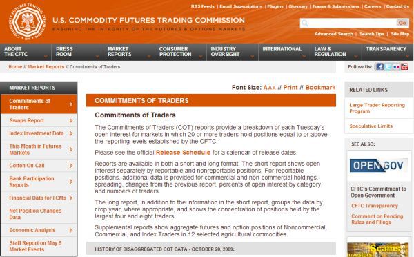
Hover over this tab, and a drop down menu will appear, and from this menu click on the first which is 'Commitments of Traders' which will open the page shown in Fig 11.33:
Fig 11.33
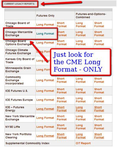
Scroll down the page and ignore everything including ‘disaggregated reports’ and look for the following as shown in the image. The ‘disaggregated reports’ are the new style format, and very confusing in my opinion, so please ignore them. Instead what you are looking for are the current legacy reports which appear lower down this page and appear as shown in Fig 11.34.
Current legacy reports simply means the old style reports which are the ones we want. Next look for the CME which is the largest exchange, and so called 'long format' report and futures only which is in the left hand column. Fig 11.34. Click on this and it will open the report for the latest week.
Fig 11.34
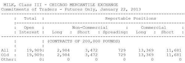
As you will see when you start to do this analysis for yourselves the report covers a wide range of commodities as well as currencies, and the CME report always starts with milk. As shown in Fig 11.35.
Fig 11.35
Therefore, we need to scroll down the report in order to find the section on currencies. This section begins with the Russian ruble, followed by the Canadian dollar, Swiss franc, Mexican peso, British pound, the Japanese yen, the Euro, the Brazilian real, the New Zealand dollar, and finally a little further down the report comes the Australian dollar.
Let's take a closer look at one of these reports before moving on to how to find the other data we need on the same site.
In this case I've taken the Australian Dollar (Fig 11.36) as an example, but all the other currencies will be presented in exactly the same way. I apologise for the poor quality of the image, but this is taken directly from the CFTC site where as you will see, the quality of text is poor.
Fig 11.36
Australian dollar
The top line tells us it is the report for the Australian Dollar and the CME and below we can see we are looking at the futures only for the date.
The first piece of data we want to focus on is on the left hand side of the table, and in the second column where we have the word Total
. Immediately below its says Open Interest
.
What we are looking at here is the total number of futures contracts on the Australian Dollar which were open when the data was recorded the previous Tuesday. Open interest simply means contracts that are open or live.
In this case we can see that on the 22nd January 2013 there were 208,776
open interest contracts on the Australian Dollar at the CME on this date. Immediately to the right of the words 'open interest' we have two headings. The first says non commercial
and the second commercial
and beneath these headings we have the words 'long' and 'short'.
Please IGNORE
the heading entitled 'spreading'.
Below the long and short headings are the numbers, and in this case we have 143,776
and 46,765
for the non commercial, and 21,291
and 141,610
for the commercial respectively.
The terms 'Commercial' and 'Non Commercial' refer to the broad class of futures traders, with non commercial simply meaning those large speculators and commercial hedge funds who hold positions in the futures market for themselves or their clients.
The commercial group would be the banks who are holding positions for their clients, generally as a hedge against future currency transfers for goods and services and therefore not buying or selling as a speculative trader. They are there simply to hedge their clients against currency risk. For me, this latter group is of no interest, as the contracts have been placed with a neutral view of the market and with no bias whatsoever.
Finally, on this line we also have the 'non reportable' grouping which is the small retail traders who are generally wrong and are sometimes used as a contrarian indicator as a result.
In my opinion the only group to watch is the non commercial group as this is the group that buys and sells on a purely speculative basis. These are large professional groups trading large contract sizes.
Therefore, the only data that is of interest to us in each report and for each currency is as follows:
-
The Total for Open Interest which in this case is 208,776
-
The Non Commercial Long – in this case 143,776
-
The Non Commercial Short – in this case 46,765
These numbers on their own tell us very little, but the key point here is to compare them with the previous week's figures, and against the figures for the weeks further back. This exercise allows us to build up a picture of the changes, week by week.
The total open interest figure is telling us whether futures trading in the Australian dollar is rising or falling, in other words it is a measure of volume.
For example, if the Australian dollar is rising strongly on falling futures volumes, clearly this is an anomaly and we need to look elsewhere for an explanation.
Alternatively, we may see a large build up in open interest with very little price movement, possibly telling us the market is weak at this level.
This rise and fall in volume in the futures markets for the currency, will then be a function of our volume analysis on the chart.
Next we consider the difference between the long and the short position, which in this case would be 143,776 – 46,775. In other words, the market at the moment is heavily long the Australian dollar, net long 97,001 contracts. This is often the figure you will see reported in the financial press, where a currency is net long or net short. This is generally the figure being referenced
Over time you will start to build a weekly picture of this difference, which in turn will also tell you whether this is a high medium or low figure. In other words, where the currency is in relation to an extreme in the futures market. If the currency is strong and this is an extreme net difference, this could be signalling a turning point in the market. The same would be true at the bottom of the market where the difference would be net short.
Moreover, the reverse is also true. If the net difference is low there is no market bias, and the currency may be set for a period of consolidation. In other words, the professional money is neutral on the currency. However, once this starts to shift, either to the long side or the short side, this is signalling the sentiment of the professional money, information we would be foolish to ignore.
Therefore, each week we look at all our currencies and pick off the weekly figures to check two things. First, the sentiment for the currency as shown by the non commercials and, second whether there has been any significant shift in sentiment, as indicated by a shift in the net long or short position.
If there has been a significant shift from net long to net short, we ask ourselves – why? Then check our price charts and our other indicators for market sentiment and analysis. If there has been a shift from long to short, has net sentiment increased in one direction dramatically or stayed much the same? Again, we check our price charts to confirm.
Finally, is the open interest volume rising or falling and how does this compare to the price action on the chart? Does it confirm the price action or is there an anomaly?
For new traders this may seem a little overwhelming, but in fact all you are looking for is three numbers:
-
The total Open Interest
-
The Long numbers for the Non Commercial group
-
The Short numbers for the Non Commercial group
From there you simply do this for each currency and it's done. It takes a few minutes on a Friday evening as you wind down at the end of the week.
You will need to build up some historic data as you construct your own simple spreadsheet of figures and these can be found as follows:
Simply scroll back up the page, and in the left hand sidebar you will find a secondary menu below the first, with a tab called 'Historical Viewable' (Fig 11.37) . Click on this menu link and you will find the legacy reports going back several years.
Fig 11.37
If you think this analysis is only for longer term traders, think again. What this data is giving you is market sentiment for a hugely influential group of traders. And if they are net long, then as an intraday trader, would it not be better to be trading with them or against them? Provided all your other analysis suggests the same.
I cannot stress this too strongly. Trading is all about quantifying risk, and if this simple piece of analysis helps to reduce the risk on a trade - great. For longer term traders it is self evident. This is a powerful item of data to use.
However, the COT report is far from perfect, and has many critics. These critics argue it is worthless as it is always out of date by at least 3 days. My own view is different.
I accept its imperfections and would never make any trading decisions based purely on what it is telling me. Rather, it is a simple piece of analysis which I do each week, as it builds into a longer term picture.
The COT report does not give buy and sell signals, but like many of the other techniques and principles I have explained in this chapter, provides a framework against which we can assess market sentiment.
With the COT report, with all its flaws, we at least have a mechanism for seeing the professional money flow in a pure market. Whether they are right or wrong is, of course, a point for debate.
Nevertheless, this is the professional money we are watching, and is more likely to be on the right side of the market than the small non reportable positions of the retail traders. However, this is a conclusion you have to reach yourself. All I can do here is put forward the case and explain how to find and use the information which I believe is relevant, to both intra day and longer term traders.
In the next section of the book we are going to move away from relational analysis and focus on the fundamentals and economics that drive the global economies and currency markets.
