Chapter Nineteen
Technical Analysis Techniques
The paradox is you have to listen to the market and yet form an independent opinion.
Kerr Neilson (1950-)
In the previous chapter I looked at some key technical indicators which can help to make sense of price behaviour. They are also the ones I use, with volume being the the most important.
I started my trading career as a student of price and volume and, it is the methodology I have used consistently in every market and instrument I have traded and invested in. I accept not all traders and investors will agree with this approach. However, there are, as they say, many roads to trading success. For me, using volume and price to determine market direction seems the most logical and continues to deliver consistent and profitable results. I explain the methodology in more detail in my book,
A Complete Guide to Volume and Price Analysis
.
In this chapter I would like to consider a number of simple techniques which traders can also use to determine changes in market direction. These techniques are rooted in an analysis of the chart itself and the patterns created by the candles themselves. The first of these is what traders refer to as ‘support and resistance’. Support and resistance are price levels or zones created on a chart. They are points at which price pauses, stops and sometimes reverses.
Support & Resistance
Support and resistance is one of the cornerstones of technical charting,but here too with so many traders watching the same charts, the question is whether there is an element of a self fulling prophecy. However, regardless of the reasons why these levels or zones are created, it is still a powerful and important trading technique. Support and resistance works on all charts in all time frames, from tick to time charts. It is used in all trading strategies, from intra day scalping to longer term position trading and investing. Furthermore, as a technique it is simple and easy to use, and is one which also helps in any validation of price behaviour.
Support and resistance price levels and zones are created because markets primarily move in one of three ways: markets go up, markets go down and markets move sideways. It is when markets move sideways areas of price congestion (or consolidation) are created. These are zones where the price simply moves up and down within a relatively small price range, neither up nor down, but simply oscillating like a vibrating string. These levels are defined by price alone, nothing else.
Like other technical analysis techniques, these movements can be found in all time frames and in all markets and instruments. Price congestion is so important because it is when the market has paused and the bulls and the bears are battling for control of overall market direction. This battle can continue for some extended time. It could could be minutes, hours, days or even weeks as neither side is able to dominate the other. This results in this 'choppy' price action, with the market moving sideways creating a region of price congestion. Markets spend more time moving sideways than they do in trends, generally between 70% in congestion and 30% of the time in a trend, making it all the more important to identify any new trend as quickly as possible, which is why support and resistance is so important.
However, there is a far more significant reason to be able to identify and recognise when markets are in their congestion phase which is this. It is during these periods the market is preparing to either develop a new trend, or to continue an old one. It is in within these regions of price congestion, that trends are borne. The analogy I always use is that of the salmon, returning upstream to spawn their young. It really is that simple. Many traders become impatient when markets move sideways. Not me. And if you remember in the introduction to technical analysis, I mentioned Wyckoff’s second rule, that of cause and effect. Price congestion is a classic example. In other words, the longer the market is in a congestion phase, the longer the trend will last once the market breaks away. And of course, one of the key signals we use to validate any breakout is volume. Now perhaps you can start to see how everything fits neatly into place in this three dimensional world. In addition volume also reveals the lack of participation in such phases of price action, and the classic example here is ahead of a major news release. Price action narrows, spreads become small, and volume drops away to low levels.
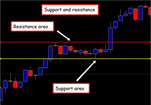
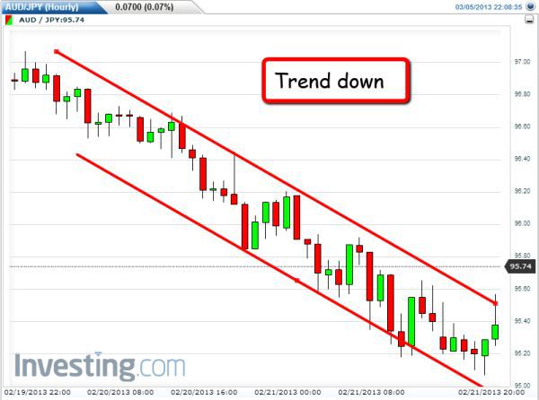
In Fig 19.10 I've highlighted what is referred to as the price 'congestion area' with two lines, one above and one below, which show how the market has remained contained within a narrow range for some time. Beginning with the lower or support line, what is happening here is the market has been bullish for some time, but starts to run out of steam, as all markets do. No price ever goes up in a straight line or down in a straight line, but in a series of steps, rather like the stairs and landings in an old fashioned house, first rising, pausing, then rising again.
On the chart I have drawn two lines, the upper line we call the resistance, and the lower line we call support. The market has moved higher and fallen back to the lower line before rising again, then falling back once more creating what we call an area of price support at the lower level.
In other words this price area on the chart is acting as invisible support, a platform or safety net, if you like, which prevents the price falling lower every time it arrives at this level and tests.
Fig 19.10
Support & Resistance
The longer the price continues to move higher and lower within this price region, the more defined becomes the area of support. In this case eleven candles have formed in this narrow range. So this lower level defines a level of price support, as each time the market looks as though it may be falling, the invisible support area comes to the rescue and helps the price recover once again.
The second line, above the price action, is referred to as a level of price resistance, since here it is the exact opposite of price support. Each time the market reaches this price level it bounces off just as if there were an invisible ceiling in place. This stops the market moving higher and creates the so called 'price resistance area' on the chart.
Traders will see this action happening in all time frames and in forex, the longer a currency pair is in sideways consolidation, the more important this price region becomes for reasons I will explain.
At some point, of course, the market does eventually break away from the price congestion area and develops into an important price trend. However, the price area left behind then becomes a key price region for future price action, and the best way to explain this is with the example annotated in Fig 19.11.
Fig 19.11
Support & Resistance - Breakout
On this chart the most important candle is the one annotated at the point where the price action has moved away to the upside of the price congestion with the 'breakout' candle.
In this case, the resistance level has now been breached, the glass ceiling broken, and the market is now moving firmly higher. However, at some point in the future the market may move back down to this price level to test the price congestion. The original area of price resistance has now become a potential area of price support. What was the 'ceiling' has now become the floor, and a new area of price support.
The easiest way to imagine support and resistance is to think of it in terms of standing in front of a house. If the front facade of the house were removed the house would be in cross section with all the floors and ceilings exposed.
If movement through this imaginary house were only through the floors and ceilings, it is easy to see how a ceiling would become a floor and vice versa. This is the principle on which historic price congestion works, creating these floors and ceilings in all time frames. In our example here, what was the ceiling has now become the floor and as a result provides a powerful platform of support to the move higher for two reasons.
First, it is a 'natural' area of protection if the market moves back to test this region in the future, as it takes additional effort to move back and through these deep areas of congested price action. So it provides traders with an additional 'comfort level', a natural place to position a stop loss for example. Second and more importantly, any breakout from such a trading range sends a powerful signal of a new trend starting to develop.
In other words, the market has moved higher, paused, built a platform of support for itself, before moving higher once again, with this solid platform now acting as support. This is the principle of a breakout and if this is accompanied by the requisite and associated volumes, gives traders a clear and unequivocal signal of a new trend and a valid entry signal, or continuation of an existing one.
In the example in Fig 19.11, the market had been bullish, it then paused, moving into sideways congestion, before breaking out and continuing higher. This is a powerful signal as the market is clearly not prepared to fall and even if it does reverse in the short term, there is a strong and natural platform of price support built into the chart. This is often the case, once a move away develops, the old region of price is often retested.
The opposite of this action is where a currency pair has started to sell off, but then pauses and moves into sideways congestion and as before, the resistance level is shown above and the support level is marked below. The pair remain in this tight range for some time and at this point, traders have to be patient and wait as the pair could reverse from this level bouncing off the developed platform of support and return to a bullish phase. Alternatively, the pair may continue with the current trend, but either way traders simply have to wait.
As we can see in Fig 19.12 the pair eventually breaks through the support line, which then becomes resistance to any attempt to reverse higher. Once the price has broken through the support, this is now a powerful signal the bearish trend is set to continue, and with a strong platform of price resistance now above, is adding further downwards pressure to the move lower, as well as providing protection to any reversal in the short term.
Fig 19.12
Support & Resistance - Bearish Breakout
Whenever a market starts to trade in a sideways congestion area, traders know at some point the market will eventually break either to the upside or downside. A breakout will occur, so patience is the order of the day.
Second, and following on from the first point, once a break occurs from this range, this is an excellent signal the market is now set to trend in the direction of the breakout. If the market breaks to the upside, the trend should continue higher with bullish momentum and conversely a break to the downside should see a bearish trend established in due course.
Finally, these areas of price congestion provide natural barriers to any retracement of the market should it return to re-test these areas of support or resistance. These price regions can also be good places for any stop loss. Areas of price congestion also offer an extra layer of protection, so if the break is to the upside and a long position is taken, any stop loss could initially be placed below the underside of the price congestion. Conversely, in any break to the downside and a short position is entered, the stop loss could initially be placed above the price congestion area.
In both cases, the price congestion acts as a natural price barrier to any minor change in direction of the market.
There is a further aspect of support and resistance in that not all areas of support and resistance areas are created equal. These areas or zones come in all shapes and sizes. However, as a general rule, the governing factor for their strength or weakness is time. Put simply, the longer the price congestion lasts, the greater the significance and strength of any breakout.
For example, any breach of support or resistance in a market or instrument that has been consolidating over a number of days or weeks, will be extremely significant. Plus, the impact and duration of the break is likely to result in a strong and positive trend. Moreover, this is a direct reflection of Wyckoff’s second principle of cause and effect. In other words, the greater the cause (time it takes) the greater the effect (consequent price move).
By contrast, any break away from price consolidation on a short time frame chart may not be so dramatic and will simply be proportionate to the time frame in which it occurs.
This is also a reason why trading using multiple time frames is so powerful, since this gives traders an insight into the market’s likely direction, not only on the intra day consolidation phases which constantly recur, but also on the price action in the slower time frames. By comparing and contrasting the price action across multiple time frames traders can become more confident in their trading decisions.
For example, if on a longer term chart the market has broken out of a recent, strong period of sideways consolidation, any trade taken in a lower time frame is likely to have some momentum and trend strongly, as a result. This not only gives traders confidence, but also helps to reduce the risk on the trade itself.
This is one of the many advantages of trading using three time frames. Here, it is not just about validating price and volume, but also includes support and resistance together with candles and candle patterns. After all, if a valid breakout occurs on an hourly, chart any trade taken in the same direction in a lower time frame is likely to be less risky, be more successful and deliver more profit. Trading multiple time frames is a technique I teach in all my online and live seminars. So please do consider using this approach. It’s immensely powerful and will give you a very different perspective along with lowering the risk.
The further point I want to make about support and resistance levels and areas of price congestion relates to time, and in particular the number of times an area is tested before it is breached. As a general rule, the more times a level is tested before it is broken, the greater its significance and strength, if and when it is re-tested. In other words, if a support or resistance level is created with just two tests before breaking out, this is weaker than a level created with three tests or four and so on. The same principle applies when levels are re-tested in the future. So, if an area of support or resistance is tested in the future, the more times it holds and fails to break, the stronger it becomes and the more likely it will hold.
To summarise and to try to put it into context. First, support and resistance levels are not a guarantee nor are they a cast iron trading certainty. Instead, they are an extremely reliable analytical technique and more often than not they work, and work well.
However, traders should not think they are some form of concrete wall that will never be broken. You should consider them as elastic bands and build in some tolerance to the levels on the chart. This also applies to drawing the lines of support and resistance. As traders we need to adopt an element of 'poetic licence' when drawing these lines on a chart and remember that technical analysis is an art, and not a science.
Second, support and resistance is a fantastic tool for anticipating and planning trading opportunities in the future, provided traders are prepared to be patient. Whenever markets are trading in a narrow range it is easy to become impatient and try to second guess which way the market will break.
It is difficult to be patient, but once the break has occurred it generally heralds the start of a good trend, and is therefore worth the wait. Always remember, that drawing support and resistance lines is not an exact science. At best it can only ever be a ‘best fit’. It is never possible to try get all the highs and lows of the candles to line up. Some candles will have their wicks above the line and others below. What is important is that most of the extremes are touching these lines. Not every single candle will line up, and the market is never that precise anyway. Therefore, a ‘best fit’ is good enough. Furthermore, it is important not try to create levels of support and resistance when they are not there.
Another feature of support and resistance is a ‘fake out’ which is where price appears to be breaking out, only to pull back into the congestion area once again. This can, and does happen and it is sometimes difficult to avoid being caught out. The solution is a combination of patience, judgment and experience. One solution is simply not to enter any trade until there has been a clean ‘break and hold’ away from the sideways congestion. However, it is a judgment call and one which is, again, more art than science. For volume traders however, this is not an issue as volume always confirms if the move is genuine or fake.
In summary, support and resistance is another of those essential tools for validating and identifying future price behaviour. And one last point. These areas are also excellent in terms of judging the return on any trading position. After all, if there is deep congestion overhead, the market is likely to struggle in any mover higher. If congestion is light or perhaps some distance away, then the market is likely to move higher easily. This is the best way to judge a trading opportunity - not some absurd risk/reward ratio of 2:1 or 3:1. This is nonsense. Use the charts to give you this information, and nothing else.
Chart Patterns
A similar and related tool to support and resistance also used for validating price is the use of patterns on a chart. These are specific patterns of price action which are created in all charts and in all time frames. What is remarkable about them is they are consistent and recur. However, one reason they recur could simply be the market’s memory as it runs into old price areas where weak traders are looking to exit positions. Alternatively, these patterns could be the result of a self-fulfilling prophecy.
Indeed, there continues to be a heated debate as to whether all technical analysis is nothing more than a self-fulfilling prophecy, given the number of market participants who are all looking at the same charts and using the same tools. Suffice to say, traders need to know and understand certain patterns just recur and they should be monitored, not only on the chart being traded, but also in slower time frames to assess the risk of any trade.
There are many patterns which have been identified, but here are my top five and the ones I like to watch and use in my own trading and market analysis.
Triangle
The first of these patterns is in fact a group of three which are all related and form a triangle pattern on the chart. This pattern is similar to support and resistance in that the triangle represents a market which is consolidating in a tight trading range. On this occasion however, the price action is contained within a triangle formation which can be drawn around the price action generally in one of three ways.
It can be drawn as a pennant, a rising triangle and, finally a falling triangle
The pennant pattern is so called because the shape resembles a pennant or flag. This pattern is also referred to as a ‘flag’, but I prefer to call it a pennant. As always the best way to explain the pennant is with an example.
The example in Fig 19.13 is the hourly chart for the CAD/JPY (Canadian/Japanese Yen) currency pair. The pair is clearly moving sideways, but this time the highs and lows of each price candle are gradually moving in an ever smaller range within the trading period. What is happening is that the low of the session is rising each time, and the high of the session is falling each time. This ultimately results in a typical pennant formation, which is a falling sloping line bounding the price action to the upside, and a rising sloping line bounding the price action to the down side. This creates this unique pattern which resembles a pennant attached to a flagpole, as the price continues to move in an ever narrower range. As the price action moves it tightens towards the pennant.
Fig 19.13
Pennant Pattern
In many ways this type of price action can be likened to a coiled spring, which is being wound tighter and tighter until eventually it releases all its energy in an explosive break, and this is typically what happens with a pennant formation.
The market winds itself up with the price action moving in an ever narrower range, as it moves toward the point of the pennant until suddenly, the coiled spring unwinds and all the pent up energy is released, generally resulting in a dramatic and rapid move away from the congestion area.
The issue with this pattern is traders never really know which direction the market will move on the breakout. However, this is not a problem as we are not in the business of guessing, so must simply wait for the market to reveal which way prices are likely to go. And, just like support and resistance patterns, once a pennant starts to form patient traders know once price breaks away, a sustained trend is likely to follow.
Again, as with support and resistance formations, time is also a key factor. In other words, the longer the price action continues, the more explosive the eventual breakout and the more weight this carries for the pattern. For example, a pennant on a five minute chart will have less weight than one on an hourly chart which, in turn will carry less weight than one on the daily chart. Therefore, it is vital traders check for these chart patterns across all time frames
There are two other triangular patterns which are variants of the pennant, and these are known as the rising triangle and the falling triangle.
Rising Triangle
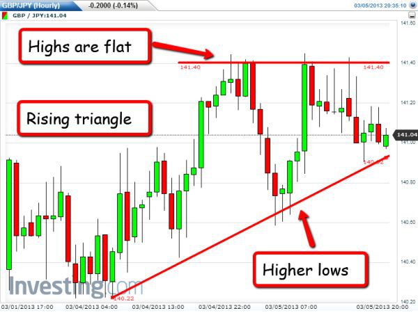
The rising triangle which is shown in Fig 19.14 is an example of where, once again, prices are consolidating in a narrow range.
Fig 19.14
Rising Triangle Pattern
However, in a rising triangle the low of each candle is higher than the previous and results in a rising sloping line to the underside of the triangle. Meanwhile, the high of each candle tends to remain fairly flat, at much the same price level resulting in a horizontal line.
The key difference with both the rising and falling triangle pattern is that traders have a fairly good idea of the direction of the breakout. In the case of the rising triangle it is the line to the underside of the triangle which is significant. It is this line which holds the clue as to the likely breakout, which in this case is likely to be to the upside. In a rising triangle each candles closes with a higher low, suggesting upwards momentum. This is logical because if the lows were lower, this would suggest a weak market. Clearly on every candle, there is less desire to fall, since each low is higher than the last, which is why traders can expect to see this pattern break higher. This is what the price action is telling us.
However, with all price patterns traders have to be patient, wait and not second guess.
Falling Triangle
The opposite of the rising triangle is the falling triangle. In a falling triangle the high of each trading candle is lower, resulting in a downwards sloping line, and the low of each session creates the horizontal base of the triangle, as shown in Fig 19.15.
In the case of a falling triangle pattern, traders can expect to see a break to the downside signalled by the lower highs of each session. The price behaviour is clearly signalling weakness, since the highs of each candle are struggling to move beyond those in the recent past. A falling triangle is a signal of a bearish breakout once the floor of the triangle is breached.
Fig 19.15
Falling Triangle Pattern
These are the three triangular patterns I am always looking for in forex (and other markets), simply because they provide some excellent clues as to future breakouts once a pair starts to consolidate. They are worth waiting for, but patience is key.
Any breakout from a consolidation pattern is, of course, only the start and there are strategies which traders can use to take advantage of this type of price action. These include using options. Whilst these can be complex and a topic for a separate book, nevertheless option strategies are becoming increasingly popular with retail forex traders. Currency options also include strategies for longer term trading as well as short term scalpers and in both cases, chart patterns play a big part of the trading strategy.
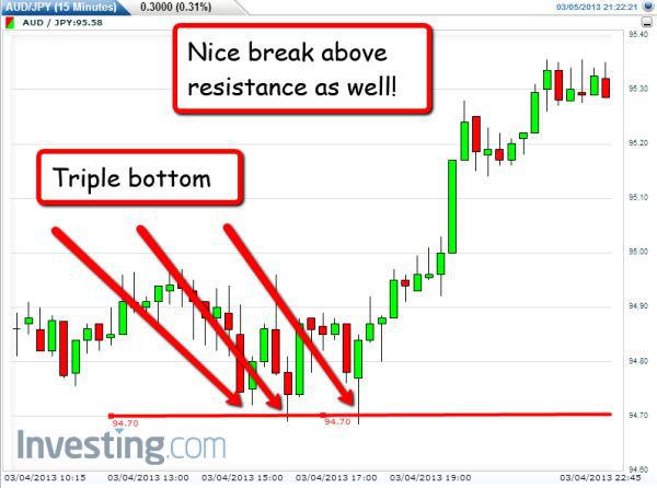
Triple Top
Finally, to round off this section on my top five chart patterns, the last two I always look for are, triple tops and triple bottoms. And the reason for including these two is that they are often the signal for a major turning point in a market or instrument.
Fig 19.16
Triple Top Pattern
The triple top example in Fig 19.16 is a good one. A triple top occurs on a chart at the top of a rally, at a point when a market is beginning to struggle to move higher. Indeed, in this example a fourth top was almost formed.
In the price action associated with a triple top a market tries to break higher once, then a second time before trying for a third time. With this failure, prices are likely to start moving lower, simply because the market has failed to break this price level on three separate occasions which suggests weakness. Furthermore, any move lower from a triple top can also be fast and furious.
The triple top price action is a classic sign of weakness in a market, and with all these patterns, they can be seen in all time frames. Naturally, any triple top on a longer term chart such as a daily or weekly would also suggest any bearish trend lower is likely to last for some considerable time. What is also interesting from the example in Fig 19.16, was the break below the platform of potential support, which failed to hold the move lower, adding further bearish momentum to the price.
But once again traders have to be patient, and wait for the third failure to occur. The pattern is given additional weight if each top results in a strong reversal candle such as a shooting star or a bearish engulfing pattern. In this example there were two shooting star candles which would have been validated with the associated volume.
Triple Bottom
The triple bottom pattern is the mirror image of the triple top with traders expecting to see the market move higher and develop a longer term bullish trend.
In the case of a triple bottom the market has reached a price level which has subsequently created a strong level of support. At this level the market refuses to fall any further, and following a third attempt should then start to move away and develop a sustained and longer term trend higher using this support platform as the base.
Fig 19.17
Triple Bottom Pattern
What was also very nice in the example in Fig 19.17, was the break through the potential resistance, which then gave the break to the upside some additional momentum.
As with the triple top, the triple bottom will have added significance if the lows are accompanied with strong reversal candles such as a hammer, a bullish engulfing candle, or even the long legged doji candle, and the longer the timeframe the greater the significance and impact.
So, in summary these are the five candle patterns I look for across all the markets and instruments, both on the short and longer term charts. There are, of course, many, many other patterns such as the ‘head and shoulders’ and ‘cup and handle’. However, in my years of watching charts and trading, the five listed here have been the most consistent. They are also straightforward and very easy to spot on a chart. You cannot miss them, and when these patterns reverse or break out, the resultant trends are generally strong and can last a reasonable length of time, regardless of the time frame being traded.
The advantage of these patterns is that once validated they can also give you the confidence to stay in a trade. However, as always as traders we must remember the creation of these patterns is not scientific. Price points will not always line up precisely, so there must always be a degree of leeway when drawing any lines or joining up the price points to mark up a pattern.
Flexibility in drawing lines and joining price points are also applicable to trend lines which I have already covered as part of support and resistance. The lines drawn on a chart to mark the areas of price consolidation for support and resistance are trend lines, but on a horizontal plane. Two parallel lines are drawn which define the upper and lower range of the oscillating sideways price action.
Trend Lines
The trend lines in this section refer to those which help to mark the price action as it moves higher or lower. However, the forex market, like all other markets and instruments, never moves in a straight line. Instead, markets move in a series of steps, creating a series of higher highs in an uptrend, and a series of lower lows in a downtrend.
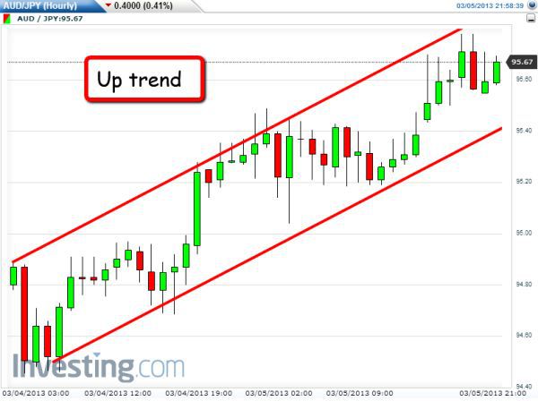
From the example in Fig 19.18 here the market has been rising steadily and creating the classic pattern of series of higher highs, and higher lows, as the trend develops further. It is these price points which are joined together to form the trend line. The trend line is now a channel with an upper and lower line, as with the support and resistance channel.
Fig 19.18
Up Trend Pattern
In this case the channel is sloping upwards to define an upwards trend, and equally in the example in Fig 19.19 the trend is sloping downwards with a series of lower highs and lower lows creating a channel of price action.
From these examples some traders may question the use of these lines given the trend has already formed. However, the purpose of creating the trend lines is what they reveal about price support and resistance.
Fig 19.19
Down Trend Pattern
Trend lines are not simply there to state the obvious. In other words, that a trend has been created. Instead they are there to help identify the points at which the price may reverse. They help to identify points of price support and resistance which are one of the key building blocks of technical analysis.
These points of support and resistance are equally important once a trend has begun to develop. However, an important point to note is that traders should never try to create a trend where none exists. It is very easy to fall into this trap, and the easiest way to avoid it is to only draw a trend line when there are three or more price points which can he joined with a straight line. Then, and only then has a valid trend line been created. Some technical analysts consider two price points sufficient. I don’t, for the simple reason that in using only two points a trend line can be made to fit what a trader wants to see, and not what is actually happening. So my advice is to always use at least three points.
The second reason for always using three points is this also suggests a stronger trend is in place. It relates back to classical support and resistance theory where the greater the number of times a price level is tested, the stronger that level becomes. The same applies with trend lines, and with three points in place traders can assume a strong trend is underway.
As I mentioned earlier, the key to trend lines is not that they necessarily reveal whether there is an up or down trend in place, but that the lines identify the potential areas of support and resistance in the trend as it moves higher or lower. And it does this in two ways.
Looking back at Fig 19.18 where there is an example of a rising trend, it is clear that, as the trend moves up, the market pulls back and tests the trend line. This then provides support to the upwards move higher and, as such, gives traders three signals.
First, the trend is likely to continue higher as the trend line has provided a level of support. This is important as it helps traders stay in any existing positions as the price moves higher and therefore are less likely to be panicked out of any trades.
Second, this can then provide traders with a potential entry signals, if not already in a trading position. Finally, the upper trend line acts in the same way and can provide traders with a possible exit point, particularly if entering a new position as the market could pull back once it hits the upper trend line, which is the resistance line.
Naturally, at some point, one or other of the trend lines will be broken, and the price action will break above or below the price channel. This could signal two things. First, the current trend has broken down, and secondly it could be the start of a reversal, and the subsequent creation of a new trend in due course.
The same is true for a downtrend which is detailed in Fig 19.20. In this example the market is moving lower in a series of lower highs and lower lows, and the trend lines are in place. Each touch and move lower from the upper trend line is a confirmation of the trend remaining in place, and as such is a potential entry point if no trade is already in place. Alternatively, it could also provide confirmation to stay with a trade already taken. The move lower is also suggesting a potential target for the trade as well as an exit point as the trend moves lower.
Fig 19.20
Down Trend Pattern Second Example
Ultimately the upper trend line will be breached, signalling a potential reversal and establishment of a new trend in due course.
As with all aspects of support and resistance and chart patterns, time is key. For example, a trend in a one day chart will have more significance than a trend on a one hour chart, which in turn will have more significance than a trend on a five minute chart.
Equally important is the number of times the trend lines are tested. Just like support and resistance in sideways moving markets, the greater the number of tests of an upper or lower trend line, the more strength this will give to the overall trend. Most good charting packages will have the option to create trend lines automatically simply by highlighting a particular price point on the chart.
Finally, to round off this chapter, and also to complete this introduction to price action and technical analysis, I would like to end with one of the most powerful techniques any trader will ever learn about price behaviour, and which really pulls together all these concepts and ideas.
This technique is the cornerstone of the price action methodology I teach in my seminars and live trading rooms.
As I wrote earlier in the book, markets really only move in three ways. Up, down or sideways, but spend the largest percentage of their time in congestion or consolidation, moving sideways. This is why the concept of support and resistance is so important in understanding price behaviour. But, how can we identify where the price is at any point in this cycle?
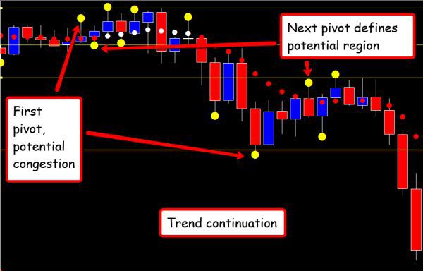
In order to identify what the price action is doing, and where it is in this endless cycle, it is necessary to break the price action down into the stages of this process. A process which is repeated over and over again in all time frames, and in all markets, and to explain the principle I want to use the example as shown in Fig 19.21
Fig 19.21
How The Markets Move
In this example it’s clear the market has been rising steadily. Throughout this phase of price action, the market rises, pulls back but then rise again, and continues on its journey.
At some point however, a pivot high is formed as shown by the first dot which marks the start of a 'potential' congestion phase. At this point, it is not clear whether the price action is entering a congestion phase, or whether this is simply another minor pause point before the price action reverts higher once again.
However, on this occasion, the market pulls back for the first two bars, and then on the third candle a pivot low is posted. With the posting of this second pivot, two levels of a potential congestion area, have been defined. The pivot high to the upside and the pivot low to the downside. The next step is wait for either level to be confirmed, and two bars later, a second pivot high is posted, which confirms the upper region of price resistance as shown by the line above.
The market then moves back lower again, and a further pivot low is posted, confirming the lower support level, before moving higher once again to post a further pivot high. There is now an extremely well defined area of congestion, defined by the pivots to the support and resistance areas.
In addition, the trend dots have flattened, clearly signalling and confirming the price action is preparing to enter into a congestion phase of the trading cycle. The price action then breaks out of the congestion zone, defined by the two lines, and starts to move lower, confirming, that on this occasion we have the start of a trend reversal.
With deep resistance now overhead, this gives us a good, potential low risk entry position as the price moves away from the congestion phase.
This price behaviour is repeated endlessly in all markets and instruments. In forex it can be seen in every currency pair and in every time scale. It is the power of the simple pivots which help to define these areas so clearly, with the trend dots then adding further clarity to the overall picture. The first pivot to form gives an initial signal of the potential start of a congestion phase, and provided a subsequent pivot low is formed shortly after, this defines the upper level and lower level of the initial congestion phase.
It is important to note at this point the market may simply continue higher from the pivot low, and not post another pivot high, in which case this was simply the normal pattern of pull backs and reversals that are all part and parcel of price behaviour. Indeed, on the extreme left, there is an example of where the market posted a pivot high followed by a pivot low, but with no subsequent pivot high to confirm the congestion and set the levels in place, the market simply paused and moved on. The lack of a subsequent pivot high simply meant the trend remained firmly in place at this point.
A second example in Fig 19.22 is where the trend continued and did not reverse, but simply moved into congestion, before moving on again in extending the trend further. Here, the market had been moving lower, and the price action posted two congestion phases in the same trend here.
Fig 19.22
Trend Continuation
First, the price action moves into the initial congestion phase, and posts a pivot high and pivot low, which sets the potential level for the support region, followed shortly after by a pivot high, which sends a signal the price is potentially moving into a congestion phase. The next pivot low confirms the floor of support before two further pivots are posted to the resistance level. The trend dots flatten to confirm the price behaviour, before there is a break below the price support area, with the trend dots moving lower and also changing colour to confirm the trend remains in place.
This price action is then repeated at a lower level, with the pivot low forming first followed by the pivot high to define the resistance level once again, before the third pivot forms to confirm the support area once more. The trend dots go flat, but on this occasion, do not change colour, and ultimately the price breaks below the support floor once again, to confirm the bearish trend remains firmly in place for the time being.
This is the price behaviour the markets follow every day, and on every chart from tick based to time. It is the function of price behaviour, which once understood, is easy to interpret and follow, and using some simple tools, indicators and techniques, coupled with the power of price support and resistance, will truly give you an insight into market behaviour which will set you apart as a master forex trader.
This principle of price congestion is another I cover in detail in my book on Volume Price Analysis, as it is a key concept and goes hand in hand with volume and price analysis. The single reason price congestion areas are so important is this. The problem we all have as traders, whatever the instrument or market, is to identify when a trend is developing, and to take advantage accordingly. Easier said than done. However, this is the power of a congestion phase and being able to recognise this in real time at the live edge is key, and the same applies to trends and trend development.
Congestion phases are the spawning grounds for trends, and just like salmon returning up river to rear their young, is is here trends are created and borne. From there they develop and grow and eventually breakout, and just like the young salmon, return to the sea as fully grown fish. The salmon is the analogy I use all the time to explain congestion phases on charts. I cannot stress their importance too strongly. Many traders view them as ‘lost’ trading opportunities, and impatient to trade, they are then whipsawed out of the market time and time again.
Markets moves sideways for a reason. They are building strength for the next phase in a move, which may be a continuation or a reversal. It doesn’t matter. One thing we can be sure of is this - when the market does break out, a trend will develop, and as traders, all we have to do is to validate that breakout using volume and price analysis.
Understanding where we are in the journey of price action, is what price congestion is all about, and using the simple process outlined above, the pivots give us simple signals of where we are in the journey. They are markers, signposts, street lamps if you like, marking the side of the road, and lighting our path ahead. Once we are in a congestion phase, all we have to do is wait, be patient and once the move away from this region occurs, to validate it using volume price analysis, which itself is then validated using multiple timeframes.
Technical analysis and VPA of course apply to all markets. When using our relational techniques they can be applied to charts for bonds, indices or equities. They work on futures, ETF’s and spot markets. A chart is a chart, and provided there is volume displayed, we have the ultimate in analytical techniques. Not everyone of course is a believer. I started my own trading journey using volume and it has shaped my trading career over the years. I hope it will do the same for you.
When combined with my three dimensional approach to trading, I truly believe this is the only way to succeed as a forex trader. As I have said many times throughout this book, the forex market is the most complex of all the capital markets, but I hope that in reading so far, you will be able to take away, some if not all of the knowledge and experience I have tried to convey here. You may feel slightly overwhelmed, but trust me - learn a little every day, and you will slowly become that master forex trader we all desire to become.
In the final chapter I would like to round off this book by considering some of the characteristics of currencies and currency pairs, take a look at the majors, the cross pairs and some exotics, as well as explain the currency matrix.