Chapter Thirteen
Let’s Get Started
Risk comes from not knowing what you are doing
Warren Buffet (1930-)
As I have already said earlier in the book, there are only two risks in trading. The first is the financial risk, and managing that risk using simple rules. This is all part of your trading plan and money management once you have taken a position in the market. This risk is easy to define and easy to manage.
The second risk, is the risk you are taking on the position itself. Is this a high risk, medium risk or a low risk? Everything you do as a trader should be geared to answer this simple question:
‘how much risk am I taking on, in opening this position in the market?’
This is the only question we are ever trying to answer. Everything we do, from deciding on our approach to the market, to analyzing charts, assessing fundamental news, or using our indicators, is focused on answering this question. If the risk is high, this is fine, as long as we understand that this is the case, and if so, we are unlikely to be holding this position very long. If the risk is low, the chances are we will be considering this as a longer term position.
You may never have thought of it in these terms, but this is what trading is all about. Trying to quantify the risk on each and every trade, and acting accordingly. After our analysis is complete we either make a decision to accept the risk and take the trade, or reject it, if we feel the risk is too high. And that, in simple terms, is all we are trying to do each time.
Therefore, let me start to walk you through the complete process from start to finish, to try to give you a better understanding of how all the pieces of this puzzle fit together. I accept in doing so I have had to make some assumptions. For example, I cannot possibly cover every method or strategy, but the example I use here, will I hope, answer most, if not all of your questions.
The approach is universal. It is the one I use myself, and adapt slightly for other markets, but principally this is what I do every time I consider taking a new position. It has taken me many years to develop, but it suits me, my trading style, and it works. There are many others, and many other techniques, but I hope this will at least give you the foundations for building or modifying what I cover here, to suit your own style of trading and method.
Step One
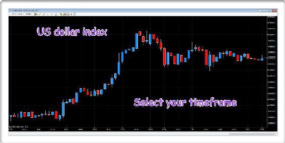
Step one - start with our major currency indices, and consider the timeframe most appropriate to your trading strategy. In the examples below we have both the US dollar index and the Yen index on 15 minute charts. You may also consider having two or three charts of each with different timeframes, just to give you the overall perspective. A 15 minute with perhaps a 60 minute and a daily chart will then provide you with a ‘landscape’ on the US dollar. You can also do the same with the Yen index.
Fig 13.10
- US dollar index 15 minute chart
Fig 13.11
- Yen index 15 minute chart
Step Two
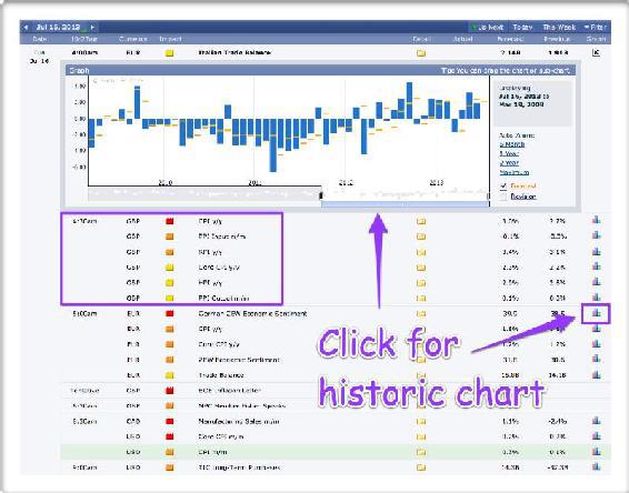
Next, check the fundamental news releases for the trading day ahead, and also for the week. I recommend Forex Factory, as I find it easy to use as it covers all the major news releases for the major global economies. Don’t forget to click on the icon on the right hand side, which will then open the historic chart as shown below.
Fig 13.12
- Economic calendar Forex Factory
Step Three
Next we move to our trading platform and for the remainder of this example I am going to use the MT4 platform. At this stage we want to identify strength or weakness in the various currencies, and in particular whether a currency is oversold or overbought. In other words, whether a currency is approaching a possible reversal point, and therefore a potential trading opportunity. Whilst you can do this manually, and cross check with all the charts and timeframes, I personally use a currency strength indicator. This displays all the information visually and instantly, in any timeframe, which is how I believe currency strength indicators should be used.
In other words, not only does an indicator have to provide information that helps you in your decision making, it must also be part of your methodology. In my opinion this is the correct way to use an indicator. My underlying methodology is volume and price, so any indicator is there either to provide a ‘heads up’ early warning signal, or help to validate the initial analysis.
The currency strength indicator I have used here is my own, and one I developed for my own trading. If you were to only invest in a single indicator, I would suggest a currency strength indicator is essential as it breaks this complex market down into the building blocks of this market, the individual currencies themselves. It reveals instantly so many things in all timeframes. Whether a currency is overbought or oversold, which currencies are rising or falling strongly, which are moving sideways, and which are moving together and therefore not in a trend. All this and much more is presented visually and quickly for you, and again using the indicator in multiple timeframes is key. You can find all the details of this indicator and several others at
https://www.quantumtrading.com
.
This is the way I use indicators in my trading. They are not
there to provide signals to be taken without thought. They are there to provide information and insights that would be difficult or impossible to produce manually or quickly. The analogy I often use here is of an old fashioned manual typewriter, and a modern computer. Both will produce the same result, a letter, but the second will do it a great deal quicker and editing is a little easier too.
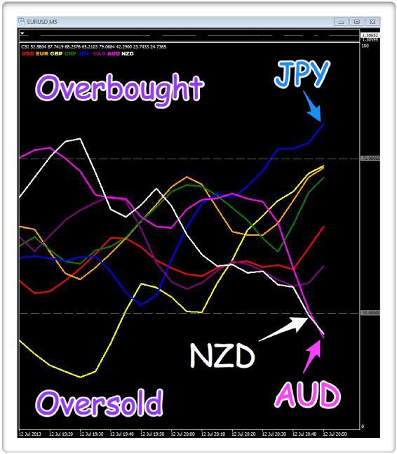
In Fig 13.13, the indicator shows us strength and weakness in an individual currency, each of which is represented by a different color. In this example, using a 5 minute timeframe, the Japanese yen (JPY) has moved into the overbought region, with the Aussie dollar (AUD) and the New Zealand dollar (NZD), both moving into the oversold region.
Fig 13.13
- Currency strength indicator 5 minute
This gives us our initial simple starting point for further analysis, and here we have two currency pairs to consider. The first is the AUD/JPY and the second is the NZD/JPY. Remember this is only on the 5 minute timeframe, so here we are looking at short term scalping opportunities. The currency strength indicator is our early warning radar, an advance warning of a possible change ahead in this timeframe. Now it’s time to move to the next stage which is to consider these two pairs in more detail, and in particular using volume price analysis. Both of these will also be in our yen currency matrix, once we get to this stage.
Step Four
Suppose we decide to focus on the AUD/JPY for our analysis. Perhaps we are aware of a change in risk sentiment in other markets, and this is often the case when the US markets open and the fundamental data begins to appear. Markets react, and changes in sentiment are very common, with investors and speculators taking on more risk as a result.
Our starting point is therefore the 5 minute chart to match our timeframe on our currency strength indicator. What is our volume and price relationship signaling at this stage?
Fig 13.14
- AUD/JPY 5 minute chart
Starting with the price action a little earlier in the session. Here we saw the pair trading sideways for an extended period of time, before finally breaking below the floor of support, shown with the solid line (Breakout on rising volume) on the chart. This breakout was accompanied by high volume, so we know from our volume price analysis this is a genuine move lower. The wide spread down candle, immediately below the solid line, is associated with high volume, which is what we expect to see. The volume is validating the price so all is well. The pair then move lower again with another wide spread down candle, and this is where the price action moves into the box (Our focus), shown on the chart. This is the price action the currency strength indicator is now signaling, a potential pause and reversal in the AUD/JPY from this level.
We are now paying attention, and initially we see a minor rally higher, with above average volume, following the wide spread down candle, but the second of these up candles looks weak. After all, if we use the first up candle as our ‘yardstick’, here we had a relatively wide spread candle, and yet on the subsequent candle, the same volume produced a very narrow spread candle. Clearly there is some weakness in the move, and the selling pressure has not yet been absorbed.
This is one of the key points I highlight repeatedly in my book, ‘
A Complete Guide To Volume Price Analysis
’, a market, in whatever timeframe, will rarely turn on a sixpence (or a dime). Selling pressure, (or buying pressure) takes time to be absorbed. It’s a ‘mopping up’ exercise. The market stops, rises, then falls back as the final elements of the selling are absorbed, and the market prepares to reverse. This is why you have to be patient and not jump in at the first sign of a potential reversal.
Our patience here is rewarded. Three candles later, we see a signal which really grabs our attention.
Now we are seeing the selling being absorbed in preparation for the move higher. Here we have ultra high volume again, but look at the price action. It is a narrow spread down candle with a deep lower wick, which is exactly what we want to see. This is sending us a loud and clear signal the buyers are stepping in. The sellers have been overwhelmed, and the buyers are coming in at this price level, and pushing the price higher.
This must be the case. After all, if this were selling volume, the candle would be the same as that six candles earlier (wide spread and down). It is not, and in addition it has a deep lower wick. The buyers have ‘bought the market’, taking it back higher and closing near the open, so clearly this is buying volume and not selling volume. The next candle confirms this with a narrow spread down candle, and above average volume. Clearly the downwards momentum is running out of steam.
This looks like a promising picture. What do we do next?
At this point, all we have done is to consider one timeframe. The 5 minute on our currency strength indicator and the 5 minute chart for the AUD/JPY. Now it’s time to start looking at other timeframes to confirm this potential set up, and to see what the charts are revealing.
Moving to the 15 minute chart for the same pair.
Fig 13.15
- AUD/JPY 15 minute chart
Now this is starting to look very
interesting indeed. Why?
The pair has been falling in this timeframe too with the move lower associated with rising volume, confirming a genuine move. The volume is validating the price action. We then approach the box on the chart which is where volume and price grabs our attention. The first signal is the wide spread down candle, but look at the lower wick. The closing price has recovered almost half of the price action from the low of this candle, an early sign buyers are entering the market. After all, if this were not the case, the candle would have closed on the low of the session, given the associated volume. It hasn’t. It has closed almost half way back up, so this must be buying. A narrow spread down candle with high volume follows, before we get really
excited. Two hammer candles, one after the other. Now the alarm bells are ringing loud and clear. We are seeing a buying climax in this timeframe, and this is looking promising to take a position. A hammer candle, after a steep fall, such as this is a strong initial signal. Two hammer candles together adds further weight to the analysis and signal.
Once again, the question is, what do we do next?
We are going to be focusing a great deal on the subject of risk in this chapter, and here we are trying to judge the risk associated with the trading opportunity. All we are trying to do now is to judge the probability of this being a positive, or a negative trade. We know we cannot have all positive trades, but in taking a position we are simply making a judgement based on our assessment of the risk. And we have already started to do this in several ways.
First, our currency strength indicator has given us a ‘heads up’ on the possible reversal in trend. It's not a signal to enter or exit, merely a ‘guidance system’ to point us in the right direction. Next we looked at our volume price analysis on the same timeframe, always the starting point as a volume based trader. What is this telling us? Is this a possible reversal in trend, and if so, can we qualify this analysis further? The answer is yes, by considering the 15 minute chart. This is giving us a strong signal of a potential trade, with a good chance of success. However, can we quantify risk further, and if so how? The answer is to consider an even slower timeframe, in this case the one hour chart. Why? Well let’s take a look at the chart, and I’ll explain.
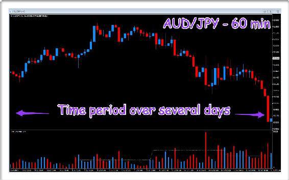
Fig 13.16
- AUD/JPY 60 minute chart
Each of the candles here is over a 1 hour period, so we are looking at several days of price action, and the question we are trying to answer in our own mind is quite simple. In considering this scalping position on a 5 minute chart, are we trading with the ‘dominant’ trend or against it? And two important trading concepts fall out from this simple question.
- Quantify the risk on the position
- Quantify the time in the market
In this example, we can see on the hourly chart for the last few days the AUD/JPY has been moving lower. The market is bearish in this timeframe. If we are going to take a bullish position on our 5 minute chart, we are trading against the dominant trend. In other words the risk on the trade is higher. Why? Because we are trading against the ‘longer term’ trend, what is known as counter trend trading. In effect, what we are considering trading here, is a ‘pullback’ or a ‘reversal’ in a longer term trend. Therefore the risk on the trade is higher, it has to be, as we are trading against the dominant trend.
This leads us to a second important concept which is this. If we are trading against the dominant trend, we know we are unlikely to be holding this position for very long. Why? Because, as we have already seen, we are trading against the major trend in a higher time frame, and are therefore trading on a pullback or a minor reversal, so any move is unlikely to last long, unless this is a change in the longer term trend as well.
These are two key questions which help to quantify the risk on taking this position. First, are we trading against the dominant trend? If we are, the risk on the position is higher, it has to be. Second, if we are indeed trading against the dominant trend, we are going to manage this position very closely. It is not a position we are going to let run and run. The risk will be far too high. This is all we are doing here. Attempting to quantify the risk in taking this position, before going ahead.
At this stage, you probably have several questions, which I will try to answer. And the one I am always asked is what timeframes to consider when looking at the ‘dominant’ trend? This is a difficult question, but my answer is always the same, as everything is relative to the timeframes being traded. After all, in the above example, you would not consider a weekly chart as the dominant timeframe. It is far too slow, and irrelevant to your trading chart. It tells you nothing of value. Trends can be on a 1 minute chart through to a weekly or a monthly chart, they are all trends, but occur in different timeframes, and whenever you take a position, you will always be trading against a trend in some higher timeframe. And the example I often use to explain this is gold.
If you consider a monthly chart for gold, the commodity rose from $250 per ounce to almost $2,000 per ounce in a ten year period. No one would suggest in this time frame, intraday trading shorting gold was a high risk trading position. It is all relative, and a combination of experience, and common sense. The point is this. All price action is self similar, and what may be a bullish trend in in one timeframe is bearish in another. This is why remaining focused on your 'trading window' is key.
A scalping trader on a 5 minute chart would consider a 60 minute chart as the dominant trend. A medium term trader using a 60 minute chart would consider the daily chart as their dominant trend. And a longer term daily trader would consider the weekly or perhaps the monthly as the dominant trend. There are no hard and fast rules here, just common sense. For a short term trade on a 5 minute chart, the 30 minute chart would also be useful. It is simply to put the position into perspective. To frame the trade if you like, to give it context and meaning, and above all, to try to quantify the risk on the position. This is all we are trying to do here. To trade with the momentum of the market.
And finally, to answer a further point which often comes up on this issue. There is nothing wrong with trading against the dominant trend whatsoever. I do it all the time. But, and here’s the corollary, I do it in the full knowledge I am taking on more risk on the trade, and that I will probably not be holding this position for very long. At this juncture, what do we do next?
Remember the currency matrix? The matrix is what we check next to see whether the move in the AUD/JPY is the result of yen strength, or Aussie weakness.
Fig 13.17
- The Yen currency matrix
And the matrix is painting an interesting picture. If we work our way across from left to right, and top to bottom. The NZD/JPY and the AUD/JPY are very similar with strong volumes, and price action which is starting to flatten out. On the USD/JPY we can see the buying of the yen here has already begun, a good sign this pair is leading the way. This is also the same for the GBP/JPY which has reversed ahead of the others. Finally the EUR/JPY and the CHF/JPY are much the same as for the NZD/JPY and AUD/JPY, with very similar volume profiles and price action. So what is the currency matrix telling us?
Very simply, all the yen pairs are reaching potentially oversold positions, and are either preparing to reverse or, as in the case of the USD/JPY and the GBP/JPY, have already started to move higher. This is a good signal, and once again gives us the confidence to take the trade. The currency matrix is telling us the move is yen driven, since this is appearing in all the other pairs. Once again, as with all this analysis, we are quantifying risk in preparation for taking a position in the market. These are all based on a 15 minute chart, but equally you could change these to the 5 minute, or any other timeframe you choose. The important thing is you use the same timeframe for your matrix as the chart you are looking to take the trade in.
And once again this is a process I automated for myself and created a currency matrix indicator, which makes life much easier, as all the information is displayed on one table, and changing timeframes is easy and quick. Again you can find details of this at
https://www.quantumtrading.com
We are now ready to take a position in the market. We have completed our analysis, and based on this assessment of risk, we would either take the position, or reject it accordingly.
Let’s take another example, just to demonstrate the same process applies whatever your strategy and tactics. Here we are moving to a weekly timeframe, so if you are starting out and perhaps have a full time job, this longer term approach allows you to learn to trade, but continue to work, as you build up your knowledge and experience. However, the process is identical, and as always we start with our currency strength indicator, as our radar on the market of where to look first.
Fig 13.18
- Currency strength indicator weekly
Once again, what we are looking for here are currencies which are either overbought or oversold at the extremes, but in this case on the weekly timeframe. A reversal trading set up. Here we have the euro (EUR) in the overbought area, along with the US dollar (USD), while the Australian dollar (AUD) is in the oversold area. Here we have a choice, either the EUR/AUD or the AUD/USD. Let’s take the AUD/USD as this is a major currency pair, and therefore more liquid as a result, but the EUR/AUD would be equally appropriate, although with a wider spread.
Here's the weekly chart for the AUD/USD, and the question we need to ask ourselves, based on the currency strength indicator, is whether the time has come to buy the AUD/USD?
Fig 13.19
- AUD/USD weekly chart
This is a great chart, as it has several interesting features, all of which are relevant in considering the future direction for the pair in this timeframe. First, the extended period of sideways congestion, which I have shown with the two solid lines, lasted several months, and really does demonstrate how patient you need to be when trading these timeframes. Notice the number of times the upper level of 1.0600 was tested, and each time failed, building further resistance at this level on each failure. Finally the pair broke below the floor of support, creating a nice price waterfall as the pair moved lower, and associated with rising volume, for much of the move, another case of volume validating the price action.
However, note the volume and price action of the last few weeks. First we have wide spread down candles, with very high volume as expected, but this is followed by a narrow spread down candle, with identical volume. Is this the first sign of stopping volume, of buyers starting to come in at this level? Note also this candle has an upper wick. The buyers have tried to push the market higher but failed. However, it is a possible signal bullish sentiment is starting to appear. This is followed by a similar candle, a down candle with a narrow spread, but with very high volume. The downwards price action is slowing, and the volume associated with these candles is starting to fall, not dramatically, but slowly.
Finally, we see our first up candle on high volume, the penultimate candle. This is often referred to as a gravestone doji and can be the precursor to a reversal in trend. Why? Because it is the first strong signal buyers are coming into the market, and in this case, it’s associated with high volume too, an early warning to pay attention. The selling has overwhelmed this initial attempt, but signals the buyers are returning. Now we are looking for a follow through on this bullish sentiment, and the next candle, which has yet to complete on the week, is certainly confirming a picture which is developing nicely.
Given we are looking at a weekly chart here, let’s take a look at the timescales either side, using the daily and the monthly, in order to have a perspective against which to frame the weekly chart. And starting with the monthly chart, here we see the weekly price action condensed into a handful of candles, with the recent negative sentiment contained in two wide spread down candles, but which are associated with rising volume.
Fig 13.20
- AUD/USD monthly chart
The small up candle is the month just forming, and as we can see, the price action has narrowed considerably, but with well above average volume already, even though this is only half way through the month. This could be the first signal of a change in trend in the longer term. In addition, the price action in this timeframe is also approaching and testing a level of potential price support, which may provide an additional platform for any recovery from this level. It therefore appears the monthly candle is confirming the weekly picture. Finally let’s move to the daily chart for an ‘exploded’ view on the weekly.
Fig 13.21
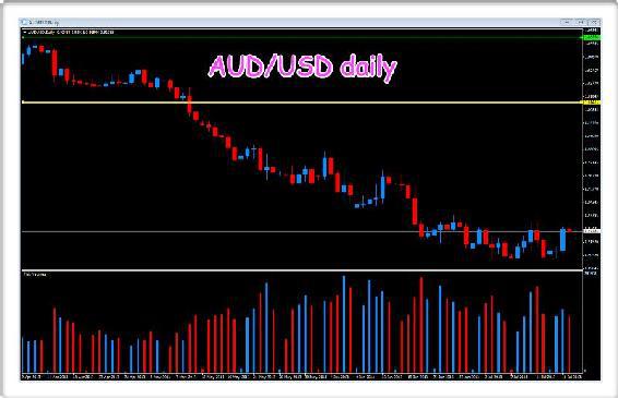
- AUD/USD daily chart
Here we see an 'expanded view' of the weekly chart. This gives us a very different perspective which is so important. When considering longer term timeframes, it's very easy to look at one candle on a weekly or a monthly chart, and to forget that within such a candle you also have all the daily price movements. What is clear from the daily chart here, is that the AUD/USD is in an obvious period of consolidation. The ‘floor’ of the potential support area is now in place below, and the ‘ceiling’ of the price resistance is also clearly defined above. What is also evident looking at the general trend in volume from left to right, is volumes have been rising generally. Notice in particular, (confirming what we saw on the weekly chart), volumes over the initial downwards move have been rising, confirming a valid move. These volumes appear to have reached a maximum, and as the pair move into sideways congestion, we should expect to see further signals in preparation for a breakout and possible move higher.
If I were looking at this and assessing the risk, my decision at this stage would be to take a ‘wait and see’ approach. It is far too early to make a decision just yet, but it is certainly a pair to watch, and what I would be looking for here, are signs of a buying climax on the daily and weekly charts, and confirmed on the monthly. In addition, I would also be watching for any breakout on the daily chart beyond the current ceiling of resistance. Provided any move away from this region was associated with high volume, this would give a strong entry signal for a longer term position. The point is this, that whatever timeframe you are trading, the approach and your analysis of the risk are the same. You are simply making a decision about the risk on the position, whatever the timeframe.
Finally, we would then move to the currency matrix, to search for any confirming clues or signals which could tip the risk more in our favor.
Fig 13.22
- AUD currency matrix
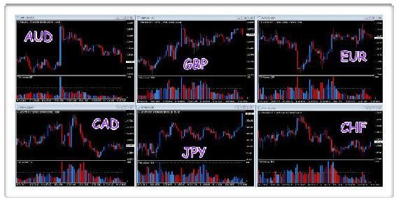
Wow, this gives us a huge amount of additional information, and really offers a ‘six’ dimensional view of the Aussie dollar, against all the other major currencies. Let’s see what other information we can gather here in helping us to further quantify risk on taking this position in due course.
And the first thing to note before we get started, is unlike the previous example, where the counter currency was the yen in every case, here the counter currency differs. In this case we have four pairs with the Aussie dollar as the base currency, but two pairs, the British pound and the euro, where the Aussie dollar moves to the counter currency. What this means is these charts will be the inverse of the others. On one chart, weakness in the Aussie dollar will see the pair fall, whilst on another chart, the pair will be rising. This is great, as it gives us a much more rounded view of what is happening to the Aussie dollar. After all, on one chart we will be seeing a possible buying climax, whilst on the other, this will be mirrored with a selling climax, so a real ‘multi dimensional’ view of the currency, simply by considering the currency matrix.
Moving around the charts as before, and starting at the top left and moving across, we have already considered the AUD/USD, and alongside this is the AUD/JPY. Not such a dramatic ‘sell off’ here, but nonetheless reflecting the weakness in the AUD. Note the rising volumes confirming the move towards a possible buying climax, and of particular importance is the price congestion phase. We have three down candles, all with narrow spreads, and yet associated with very high volume. This is stopping volume and absorption of the selling pressure. It has to be because if the sellers were still in control, the AUD/JPY would have moved lower on such volumes. It hasn’t. It has moved into sideways consolidation at this level, and therefore this must be buying volume. However, note the buying here, with the volume falling at present, so a possible sign the market is not quite ready to rally higher just yet.
Moving to the AUD/CHF at the top right we have a similar picture, with strong and rising volumes and narrowing spreads, all signs of buying and stopping volume at this level. This is also confirmed with the AUD/CAD on the bottom left, with rising volume and a series of narrow spread candles, although here, the pair have yet to find a sustained platform of support.
Finally, we come to the ‘inverse’ pairs, the GBP/AUD and the EUR/AUD. Here the price action is rising as the Aussie dollar weakens, and the great thing to note is that despite this, the picture is the same. Volumes have risen consistently as these pairs have risen also, and now the weakness of the Aussie dollar is clear to see. The buyers who have taken these two pairs higher, are now starting to struggle, with both 'topping out' and creating sustained areas of price resistance as a result. These are mirror images of the pairs above, and really confirm the trend we have seen in the Aussie dollar is almost entirely driven by weakness in this currency, since it is reflected in all the other pairs in the matrix.
All we need to do, is be patient and wait for the inevitable breakout which will come in due course, and which will duly appear not just on the AUD/USD chart itself, but also on the currency matrix. This is the power of the matrix. It’s a simple idea, but one which reveals so much, and gives you the confidence when taking a position, knowing you have assessed the risk in a simple but logical way.
At this point I would like to introduce a further concept, but again one which is based on considering multiple charts and multiple timeframes. We are going to take another example shortly and walk through the complete process from the initial analysis, to order entry, stop position and management, and finally the exit from the position. However, let me explain how you can also use different timeframes in another way, and here we are back to the start of our analysis with the currency strength indicator.
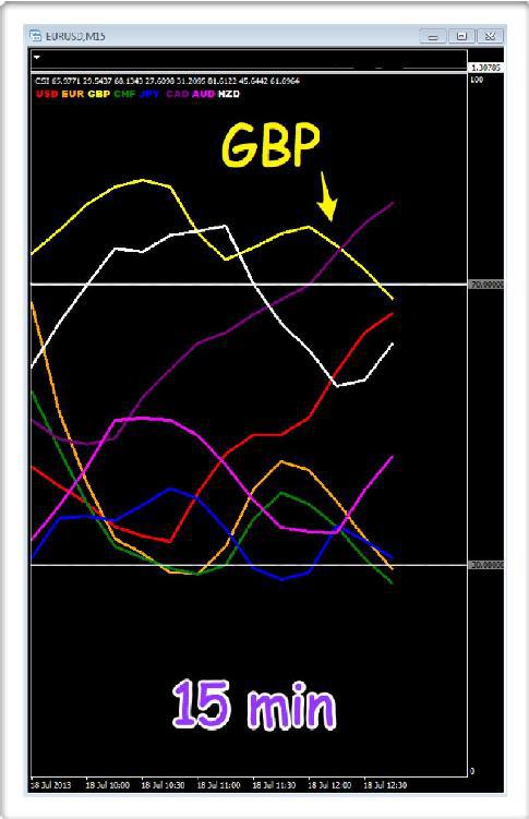
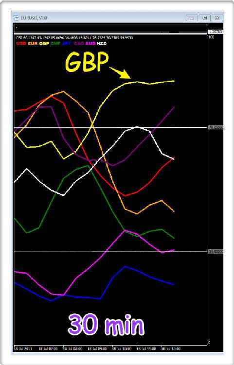
Here we have three timeframes, a 15 minute, a 30 minute and a 60 minute, and all I want to focus on is one currency, the British pound (GBP).
Fig 13.23
- Currency strength on 15 minutes
Fig 13.24
- Currency strength on 30 minutes
Fig 13.25
- Currency strength on 60 minutes
What are these three timeframes telling us about risk, and in particular any risk associated with taking a position in the British pound? And, the answer is very simple.
Suppose we were a scalping trader considering a short position in the pound. On the 15 minute timeframe, the pound has reached an overbought state and has since ‘rolled over’, so we can safely assume the pound in this timeframe is being sold. Now let’s move to our 30 minute chart, what’s happening here? The pound is still in the overbought area on the indicator, but has yet to start moving lower in this timeframe. Finally we move to the 60 minute chart, and we can see the pound is heavily overbought, but has not yet started it’s move lower.
The question is this. How does this help? And the answer is very straightforward. If we are going to take a short position in the pound, wouldn’t it be comforting to know we are trading with the longer term trends as well? And this is precisely what is being revealed here. In taking a short position in a fast timeframe (perhaps on the 15 minute chart or even the 5 minute chart) we can be pretty sure that in due course the pound is going to reverse its trend in the slower timeframes also. After all, no currency ever stays overbought or oversold for ever. They always have to snap back eventually, since unlike equity markets a currency never goes to zero.
The analogy I use here is of a pebble in a pond. Imagine you are in a boat in the centre of a small pond, and you drop a large stone into the water. The ripples move out and away from you, eventually reaching the side of the pond. This is what happens when we look at price action in multiple timeframes. Any change in trend happens on your fastest timeframe first, in this case the 15 minute chart, then gradually ripples out to your 30 minute chart, and finally it reaches your slowest chart, the 60 minute chart. This is what is happening here.
The change in sentiment for the pound moving from buying to selling began with the currency rolling over in the 15 minute chart, but has not yet reached the 30 minute or the 60 minute.
However, with the currency now very ‘over extended’ on the slower timeframes, this is now not a question of 'if', but 'when'. In taking a short position on the pound therefore, we are able to quantify the risk, simply by considering other timeframes on the currency strength indicator. It’s as simple as that.
In other words, the risk on this position is low, since we are going to be trading with the dominant trend over the longer timeframes. This picture will also be reflected once we start to consider the charts in the different timeframes, but by using the indicator in this way we get an immediate ‘heads up’ before taking our analysis further. This is the power of using multiple timeframes. Here we are trading with the dominant trend in both the 30 minute and the 60 minute, so we can conclude two things.
First, the risk on any position will be low. Second, we can hold this position for some time, as we are not counter trend trading, but trading with the longer term trend. Even if we see minor pullbacks or reversals on our faster charts, we can be comfortable in the knowledge on our slower timeframes, the currency has some way to go before reaching the opposite region on the chart, which in this case is moving to oversold.
Naturally, there are never any guarantees in trading, and the currency may stay overbought for some time, but eventually it will move. It has to, and in many ways forex trading is really about timing, as ultimately all traders are proved right, it’s just their timing that was wrong.
Finally, in this example once we had isolated the British pound, we would focus on the oversold region to select the counter currency for further analysis.
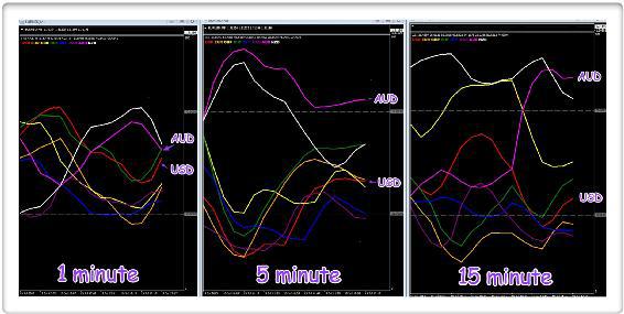
I now want to consider some further examples in ‘real time’ and in the next few pages, I’m going to walk you through all the various aspects of identifying, entering, managing and then exiting positions, together with the elements you need to consider in a complete ‘cycle’ from start to finish. Everything you need to think about and do, as you open and then close a position. And the starting point as always is our currency strength indicator.
Fig 13.26
- Currency strength indicator, multiple timeframes
This is where we begin our analysis, and as I explained earlier in the chapter, using multiple timeframes applies to every aspect of our analysis, as well as in our trading methodology and approach. I can only stress again that trading success is about quantifying and managing risk, and if we can use tools and indicators to help us achieve this simple goal, use them.
As you can see from the indicators, we have some interesting price action across the timeframes, and just as a side note, if you are using the MT4/MT5 platform, from which these images are taken, the 1 minute, 5 minute and 15 minute timeframes are an excellent combination for intraday scalping. I’ll explain more about the set up and approach as we move deeper into these examples, but it's a nice combination.
Again we are looking at possible reversal opportunities here which delivers the maximum possible return, but this is just one of many tactical approaches. I've used it here to highlight various points, but equally we could be looking at an example where two currencies are rising and falling strongly, so a trend is already underway and we are looking to join the move.
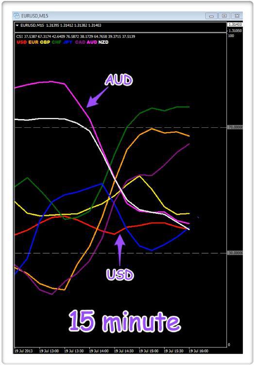
Starting with the 1 minute, we can immediately see some possible opportunities here. In the overbought region at the top we have the Aussie dollar (AUD) and the New Zealand dollar (NZD), whilst at the bottom, in the oversold region we have all the other currencies, so we are really spoilt for choice. But what is happening on our 5 minute chart? And, here we have the Australian dollar (AUD) climbing towards the overbought region along with the New Zealand dollar (NZD), whilst all the other currencies are diving towards the oversold area, with the US dollar (USD), the euro (EUR) and the Canadian dollar (CAD) already deep in this region, with the others moving sharply lower to join them.
Finally, moving to our ‘slowest’ timeframe, the 15 minute chart, here we can see the New Zealand dollar (NZD) has turned lower, but now appears to be pushing back higher into the overbought region, whilst the British pound (GBP) has already started to turn lower. The other currencies still have some way to go before they reach the extremes on the chart. The US dollar (USD) is now moving lower once again having had a brief rally higher, whilst the Australian dollar (AUD) is rising strongly, but it too has some way to go before it reaches a firmly overbought position. Moving to the oversold area, the euro (EUR) is already there along with the Canadian dollar (CAD), and the Swiss franc (CHF) and the Japanese yen (JPY) look to be joining them shortly.
Clearly we are spoilt for choice, but there are several things to bear in mind.
First, let’s focus on the US dollar (USD). On the 5 minute chart, whilst it is in the oversold region, it appears to have a little way to go before turning, whilst on the 15 minute chart, it has yet to reach this region, so this looks very promising for considering a long position on the US dollar. The second point with regard to the USD is any spreads are likely to be tighter, and in addition liquidity will be good as we will be trading a major currency pair. The spread is an issue as a scalping trader, and something we always have to have in the back of our minds and as such, the US dollar should always be your initial focus of attention, before moving to the cross pairs, if nothing is available. In this case, it appears as though the US dollar may be setting up to reverse in due course.
Against the US dollar, we could consider the Australian dollar (AUD), which has yet to reach an overbought area on either the 5 minute or the 15 minute, but is already looking very ‘over extended’ on the 1 minute chart, with the US dollar at the bottom and the Australian dollar at the top. In addition to the AUD, the New Zealand dollar (NZD) is also following a similar path, and on the 15 minute chart is deep in the overbought region, and this would be one to consider also.
Now let’s scroll forward 30 minutes, and see what happened as the markets moved on.
Fig 13.27
- Currency strength indicator, 30 minutes later
The period of price action being recorded here was late in the London session, and just ahead of the US session. There was little in the way of any significant fundamental data due, with the markets focusing instead on Day 1 of a planned G20 meeting, ahead of the weekend.
As we can see from the above charts, the AUD/USD certainly seems to have been a good choice. Let’s look at what happened over this 30 minute period. First the Aussie dollar initially
continued higher into the overbought region, on both the 5 minute and the 15 minute charts. At the same time the US dollar also
continued deeper into the oversold region, setting things up nicely.
Then as we scroll forward in time, the Aussie dollar starts to fall on the 5 minute chart, with the US dollar gradually starting to rise simultaneously, on both the 5 minute, and 15 minute charts. But, as we can see, whilst the Aussie dollar has already turned on the 5 minute chart, it has yet to show any great momentum on the 15 minute chart.
Finally, and just to complete the picture, we can see the Aussie dollar and the US dollar are moving in the middle region of the chart, and this simply reflects a period of price congestion in this faster timeframe.
Now let’s move to the charts themselves and see how this price action plays out using volume price analysis. Please note, whilst the charts are shown separately here, for trading, they would be on one screen or on multiple screens.
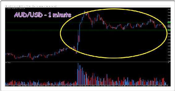
Fig 13.28
- AUD/USD 1 minute chart
The volume and price action is shown by the ellipse on the chart.
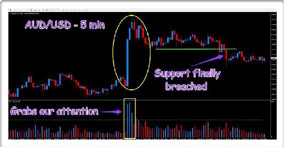
What is immediately obvious from the one minute chart is the sheer scale of the volume associated with the rapid move higher for the AUD/USD, but look at the price action near the top of this move. Here we have ultra high volume bars associated with narrow spread up candles. Clearly a move that is running out of steam. After all, look at the volume bars associated with the earlier price action. These are enormous, and sending a clear signal of a possible selling climax at this level. Now we have to be patient. As I have said many times before, markets do not reverse immediately. We have to be patient, and following this surge in volume, the pair are now moving sideways in this timeframe and what we are looking for is a breakout from the narrow congestion phase of price action as shown by the two horizontal lines. These define the resistance and support regions on the chart as we wait for a break below the support region for a continuation of the bearish trend.

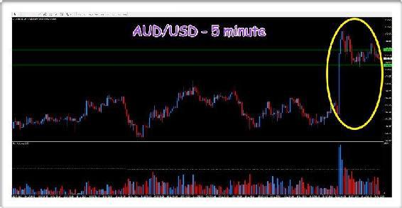
Fig 13.29
- AUD/USD 5 minute chart
Now we've moved to the 5 minute chart which reflects the volume and price action in a slower timeframe. Here we have a similar pattern, with the initial surge higher on extremely high volume, signaling weakness as it reached the top on the third bullish candle, before moving lower and into the sideways congestion phase, mirrored on the currency strength indicator.
Finally we move to the 15 minute for our ‘longer term’ perspective.
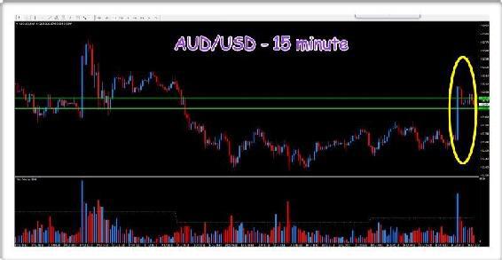
Fig 13.30
- AUD/USD 15 minute chart
Here again we have the same picture, but the surge higher is condensed to one bar, with the price action again circled. However, what is also interesting here, and gives us additional confidence, is the price action to the left of the chart. This was from a couple of days earlier - note the volume and price pattern. A huge surge in volume with a sudden and dramatic move higher, only for the market to consolidate and then move lower in due course following a congestion phase. The current price action looks like a repeat performance, and the volume bar on the left of the chart gives us our 'benchmark' for assessing today’s volume bars. As traders we have to be patient and wait. If we are wrong, we are wrong and we simply move on. Our stop loss, which I am going to cover in more detail shortly, will take us out of the market.
Now let’s check on our USD currency matrix to see what the other major pairs are doing and whether there are any clues or signals there for us to follow.
Fig 13.31
- Currency matrix USD
And what an interesting picture it is too, and the reason I chose this trade was to highlight exactly this point. So what is happening with these major currency pairs?
First, the AUD/USD. We are waiting for the pair to move lower, and break through the potential platform of support, which has happened as I was writing. This position is now developing nicely. However, moving to the other pairs, is this move more reflective of Aussie dollar weakness or US dollar strength, as this will then dictate the risk on the position?
If we start with the EUR/USD what has happened here? Remember, the counter currency is the same as for the AUD/USD, so strength or weakness in the US dollar, should generally see the pair moving in a similar direction.
However, as we can see here, the EUR/USD is actually rising, so the US dollar is being sold here in favor of the euro, the opposite of what is happening in the AUD/USD where the US dollar is being bought. Is this a warning signal? Perhaps? Moving to the top right hand corner of the matrix, the USD/JPY has been moving sideways for the day, and lacks any clear direction. Here there is little bias for the US dollar.
Next is the USD/CHF in the bottom left hand corner, and here we see the US dollar being sold again, this time against the Swiss franc, and moving inversely to the EUR/USD, as expected. Alongside is the GBP/USD, another pair lacking any firm momentum for the US dollar. Finally at the bottom right of the matrix we have the USD/CAD and here too we see the US dollar being sold, this time against the Canadian dollar.
To summarize. Of the six major currency pairs, three are seeing the US dollar being sold, two are moving sideways and one where the US dollar is being bought. And the one where the US dollar is being bought is the AUD/USD. At this point we need to ask ourselves, one simple question. What is the risk on this position? Is it high, medium or low? And to answer my own question, you should have realized by now, the risk is high.
Why?
It is the power of using a currency matrix. If the US dollar was being bought or sold universally across the major currencies, the risk on any position would be low, since we know the driving force is the US dollar. In this case, the AUD/USD is the only
currency where the US dollar is being bought. From which we can deduce this is a high risk trade. It has to be, since we are taking a position in a pair against the weight of the market, which is doing the opposite and selling the US dollar.
Whilst we were correct in our analysis, and would have made money here, the development of the trade was very slow, with several periods of sideways price action, and we’ll take a look at those in a moment on one chart. But in addition, this lack of momentum in the US dollar was also very visible on our currency strength indicator.
And here I am considering the indicator on a 15 minute timeframe, but have taken the 5 minute chart for the AUD/USD, zooming into the chart as much as possible to highlight all the detail associated with the volume and price behavior.
Fig 13.32
- Currency strength indicator five hours later
This really encapsulates the AUD/USD trade in a simple visual way. Fig 13.32 shows the journey of the two currencies over a five hour period throughout the remainder of the trading session.
First, we can see the Aussie dollar (AUD) has fallen over this period, moving from the overbought region where we first took notice, down towards the oversold region at the bottom of the chart. It still has some way to go before it reaches this area, and this was the price action we saw on the chart. However, as always in the currency market, it takes ‘two to tango’, and the US dollar (USD), really tells it’s own story. When we first considered this position as a possible trading opportunity, the US dollar was well established in the oversold region of the chart, and therefore potentially looking to reverse higher and back towards the overbought region in the longer term.
However, since then, all we have seen is the US dollar meander along, lacking both direction and momentum, and the reason for this is not hard to understand once you consider the currency matrix. With the US dollar only being bought against the Australian dollar, and either having no direction or being sold, against the others, it's hardly any wonder it lacks momentum.
This is the power of the currency matrix. It reveals the strength of buying and selling of currencies across all
the major pairs, and in doing so tells us so much as forex traders. Had we just focused on our chosen pair, in this case the AUD/USD, the consolidation phase would have been self evident, but with no other means of assessing risk. The matrix gives us that tool, the means to assess risk. This is why I wanted to use this example. It would have been very easy to find some simple examples where everything worked perfectly, with some nice positive trades. The forex market is far more complex, but with the simple device of a currency matrix, and reinforced with a currency strength indicator, the nuances and forces driving each pair become instantly visible.
Turning to the price action and associated volume for the same period, using the 5 minute chart, here we can see both in greater detail.
Fig 13.33
- AUD/USD 5 min chart, five hours later
The currency strength indicator gave us our initial ‘heads up’ and from there, one of the charts we considered was the 5 minute, as shown in Fig 13.33. The first signal to grab our attention was the volume. It’s clear from the chart we had a market moving sideways on average to low volume, when suddenly over a 15 minute period, sustained and massive volume appears on three successive candles. The second volume bar is actually higher than the first, but the price spread on the second candle is actually narrower than on the first. This sets alarm bells ringing as now we have a yardstick for the volume price relationship from the first candle, and our conclusion from the second candle is the market is struggling to move higher at this level, and indeed within the volume bar there must be some selling. If it were all buying, the price spread would have been the same as on the first candle, and it isn’t. The only conclusion we can draw is there is weakness appearing, and this is possibly a trap up move with the Interbank market makers selling heavily into the move higher.
The third candle in this sequence appears, and adds further weight to our analysis. The spread on this candle is much narrower than on the first two, but look at the volume, it is still extremely high, a very strong signal of potential weakness at this level. And the market duly starts to sell off, and begins to slide lower, before moving into a period of sideways congestion. The volume has now returned to more ‘normal’ levels, as the price action moves higher and lower, creating the ceiling of resistance and floor of support which are so important in technical trading. For any continuation of the move lower, the support level needed to be breached, which duly occurred, before the pair moved into a secondary period of consolidation at a slightly lower level on the chart.
And the reason? In this case the US dollar was not being bought or sold universally across the market. The net result was a much higher risk on the trade. In this case we would have made money, but this is not always the case. We may have decided to take the position anyway, knowing the risks. There is nothing wrong in taking this view. What I have tried to highlight here, is an easy way to assess the risks. Whether you choose to take such trades or let them pass, is a personal choice, and one only you can make at the time. Any decision will depend on your attitude to risk, and whether you are perhaps a cautious trader, who only considers low risk trades, or one who is more aggressive and prepared to take on a little more risk. As always, there is no right or wrong answer here, only what is right for you.
So What Happened Next....?
Towards the end of the trading session the AUD/USD broke through the second level of price support with a wide spread down candle, almost taking the pair back to where it started.
Fig 13.34
- And finally!
In case you were wondering, this section of the chapter was written in real time. In other words, as the price action unfolded, so I described what was happening on the screen, something few other books have ever done. As the position progressed, I analyzed and wrote about the price action in this chapter. It was the only way I could think of to show you the processes in ‘real time’ starting from the point when the first signal is flagged, and then through the steps of analysis and assessment as the subsequent price action unfolds. Fig 13.34 shows the price action towards the end of the session approaching the weekend, and as you can see, the pair finally lurched lower again. At this point, it is decision time. Do you close out, or leave this position open over the weekend?
This is a discretionary decision, with no right or wrong answer. It is a topic we will cover in the next section, as we start to consider the process of position management, and the decisions you have to make as the price action unfolds.
That was our AUD/USD trade. It worked out well, but was a higher risk proposition, and that risk was reflected in the time it took to develop. With little momentum, there was always the added danger of a sharp reversal at any point, which is why we always trade with a stop loss, which I am going to cover in the next section. There we are. An interesting trading opportunity which delivered several important lessons.
Now I’ve covered the basic concepts of how to judge the risk on a position before you enter the market, let’s move on to one of the most difficult aspects of trading. As someone once said, getting in is easy, it’s getting out which is the hard part, and this is indeed one of the truisms of trading. It’s very easy to hit the buy or sell button and then start to wonder what to do next. And the reason it is so hard is not difficult to understand. This is the point at which your emotions start to take hold, and logic and common sense disappear.
And in case you had forgotten, let me just repeat my own thoughts on the whole subject. What I call the three simple steps to trading success. Getting in, staying in and getting out. There are many people who suggest that within your trading plan, you should follow a prescribed ‘set up’ before entering the market. Once in the market, you then follow another set of prescribed rules to manage and exit any position.
My view on these suggestions is very simple. If any prescribed set of rules worked consistently, those traders using those rules would have crushed the financial markets by now. No such approach works, nor ever well. They may work for a time in certain markets, then fail. And this is the point. The market is different every day, constantly moving and shifting direction as it is driven by the twin emotions of fear and greed (or panic and complacency). Therefore, each and every decision you make in getting in, staying in and getting out, has to be discretionary, and based on what you see, not what your prescribed rule set may say. The only rules you follow ‘blindly’ are your money management rules, and trading with a stop loss, which goes without saying.
Therefore, taking each of these steps in turn, I want to cover the main points of these three stages.
Getting In
Opening a position is the easy part, we can all do that, almost without thinking, and this is the problem. It is what most traders do with little thought, and no planning whatsoever. Remember, plan your loss not your profit.
In the above AUD/USD trade, I hope I explained in detail the steps to take in assessing the risk on any opportunities, before you press the buy or sell button, but let me just recap the essential points as follows:
- Start with the economic calendar for the day ahead. Note key releases and keep these in mind as you will have to decide whether any positions are taken ahead of, or after the news. Always consider all releases, even those in countries whose currencies are not on your platform. Economic data from China and the major economies will move the markets dramatically
- Begin your search by considering currencies which are overbought or oversold in multiple timeframes or strong trends if you prefer
- Then analyze the charts in multiple timeframes and look for confirming signals of volume and price, along with breakout patterns, plus support and resistance
- Check the strength or weakness of the currencies in the currency matrix for confirmation of momentum in all other pairs
Once you are happy, and have found what you believe is a low risk opportunity, it’s time to get in.
At this point you have to consider your trading rules on money management, and this is where we need to talk in detail about the stop loss order, and in particular, where and how to place this in the context of your trade.
A stop loss order, is just that. It is your order in the market which when triggered stops any further loss. It is the order which protects your trading capital, and you never, ever, open a new position without one. Some people refer to ‘mental stops’ - ignore them. If you do not have the discipline to place a stop loss order, one thing is immediately clear. You do not have the mental strength to take a loss. If you did, placing a stop loss order would not be an issue. It is an issue for these traders, who then avoid it by pretending to themselves they have a ‘mental’ stop loss which they will then place if required. Guess what, they never do, because this highlights the much deeper issue they have, namely of taking a loss in the first place. Trading is not for everyone. As you saw in the chapter on psychology, the mind is a complex and powerful force, and we are all different. The ability to take a loss is key. It is fundamental, which is why a ‘mental stop loss’ is nonsense and symptomatic of deeper issues.
-
Rule 1 -
NEVER OPEN A POSITION WITHOUT A STOP LOSS
Fig 13.35
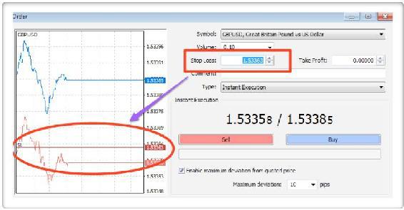
- The stop loss order in MT4
Fig 13.35 shows the entry order pane from the MT4 platform, and one of the many reasons this is such a great platform to use, is its simplicity of opening and closing positions. It really couldn’t be any easier.
The stop loss order is placed at the same time as you open your position, and for a short position, will be placed above the market. For a long position it is placed below. If you are short and the market moves against you, then it will be triggered and close your position. Equally if you are long, and the market reverses lower, the order will be triggered and your position will be closed.
Here is another rule, and the second one which always applies to any stop loss order.
-
Rule 2 -
NEVER MOVE A STOP LOSS IN THE OPPOSITE DIRECTION TO THE POSITION
And the reason for this is much the same as with the ‘mental’ stop loss. Suppose you have taken a long position in a currency pair and placed your stop loss 20 pips below the market. The position starts to move against you and begins to approach your stop loss order. You decide to move it lower, and away from danger. This is the same problem the ‘mental stop loss’ trader has. A fear of taking a loss, so the stop loss is moved lower, away from the market which is threatening to close the position. This is why you can never move a stop loss in the opposite direction to the position you have taken, as once again it reveals deeper psychological issues.
Both of these rules should be written into your trading plan, and never broken. However, it is perfectly acceptable to move your stop loss in the same
direction, as you are now moving it for a very different reason, namely to lock in profits. This is entirely different, and something I cover shortly.
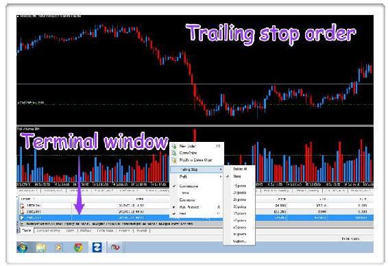
The stop loss is a very simple order in the market, which you place at the same time as opening any position, and which will protect your capital from any major loss. There are however, variants of the stop loss, and the one to mention here is the trailing stop loss. This is a little more tricky to open on the MT4 platform.
Fig 13.36
- Placing a trailing stop loss order using MT4
The trailing stop loss order is placed using the Terminal window, (left click on View>Terminal) which then displays live orders in the market. To place the trailing stop simply right click on the order, and left click on the Trailing Stop option from the pop up window. The options shown in Fig 13.36 will then appear, where the trailing stop can be set to a specific number of pips or to a custom number of your choice.
What is the difference between a standard stop loss order, and a trailing stop loss order, and what are the pros and cons of both?
Whilst the stop loss order is designed to do one thing, to stop any further loss, the two orders work in different ways. The standard stop loss is placed in the market at one price, and then only moved if and when you
decide. The trailing stop loss moves automatically and ‘trails’ your position higher or lower. It is set to a certain number of pips which are maintained as the position moves. If you have a long position, and you've set your trailing stop loss at 20 pips, the stop loss order will move higher as the position moves higher.
It will maintain this relationship at all times, and does not move lower in the event of a pullback in the market. You can think of the trailing stop loss as an automated way of locking in any profit with the system managing this for you. The only decision you make is in placing the stop loss initially, and the distance from your position. Once set, the order stays in the market until it is triggered and closes your position, or you close the position and cancel the order.
There is always a debate about whether a manual stop loss is better than an automated stop loss (trailing stop loss), and I have my own views on this, as you might expect. To nail my colors firmly to the mast, I believe the manual stop loss is the better of the two, and here’s my reason why. But, as always, this is a personal decision and you may find you prefer the automated approach with a trailing stop loss, and indeed this may be the best solution for you, particularly if you are working and only trading part time.
I am fortunate and have the luxury of being able to sit in front of a screen all day, so order management for me is very easy. For others it is more difficult, so my comments here are really intended for the time you are able to devote to trading. And here the trailing stop loss has its place.
Let me start with what I believe is the ideal approach, and my reasons. I have used a manual stop loss system in all my trading for two reasons. First, I have the luxury of being able to sit in front of a screen all day. Second I believe it is the best approach for the simple reason stop loss placement and management is also an art, and not a science.
The same is true of technical analysis, it is an art and not a science and never will be, so by setting a ‘mechanical’ order in the market implies the market moves in prescribed increments. It does not, and just as in placing the stop loss, which is dictated by the price action, so is the management of any stop loss thereafter. In other words, what I am suggesting here is stop loss placement and subsequent management should be dictated by the price action, and not by you. I guess this is the same issue I have with take profit levels set by traders. Why should the market know or care about what you want or decide that you want - it doesn’t. Every decision needs to be discretionary, and this applies equally well to the placement and management of the stop loss.
I could write a book on this topic alone, but I’m going to summarize it here, so you can decide for yourself which is the best approach, and also which suits your personal circumstances. As I said earlier, this is the goal, if you have the luxury of trading full time. If not, the trailing stop may be the best and only solution to help as you learn.
The first question is where do you place a stop loss? The second question which follows is how and when do I move it?Remember, this is an art not a science and there are no right or wrong answers. It takes practice and experience, and will also depend on the pairs being traded. Some will require wider stop loss positions, others can be placed with less width.
Again this will depend on the pairs and also your trading strategy which we discussed earlier in the book. But, your stop loss position must fit in with your money management and trading rules to ensure you are not breaking any of these.
Let’s start with one or two examples which will help to clarify and explain this key concept.
Fig 13.37
- Stop loss placement, short
In this example, from the USD/CAD on the 5 minute chart, suppose we have seen the initial weakness, and then the ‘telegraph pole’ of volume, sending a strong signal of a bearish market, and we decide to take a short position. We enter the market somewhere in the area marked with the ellipse, but where to place the stop loss? And here the market has given us a natural price level, where it paused and reversed earlier in the session, shown with the horizontal line at the top of the chart (Stop loss here).
This gives us our target, and we can place our stop loss beyond this price, either close to or further away, depending on our money management rules and contract size being traded. In this case the distance is around 12 pips, so we may decide to move this further and allow for a 15 or 16 stop loss. But the key point is this. We have placed our stop loss based on what the market is telling us, and not
what we think. Provided we adhere to our money management rules, this can be moved further away, but the chart sets our minimum price level for the stop loss position. The market has created this for us, naturally.
We would manage the stop loss in the same way, using the market’s own price patterns to tell us where and when to move it lower. In this case, we would almost certainly wait for the break below the congestion phase, and then move it down to just above this level. And the reason why is once again, we are allowing the market to dictate these levels for us, and in creating support and resistance areas, these are also excellent reference points for stop loss management.
After all, once the market has broken out from a congestion phase, as here, and moved lower, what better place is there to move a stop loss than just above the resistance level, which is now providing us with our own natural barrier in the event of any market reversal. This is yet another reason why support, resistance and congestion phases are so important to understand. Not only do they provide trading opportunities, they also offer natural levels for stop loss placement, and stop loss management as the position develops.
Moving to another example, this time with a trade to the long side, the principles here are exactly the same. We let the market dictate the optimal place for the stop loss.
Fig 13.38
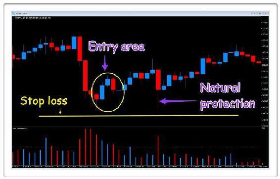
- Stop loss placement, long
Once again this is an intraday trade, this time on the 15 minute chart of the GBP/JPY. The pair has fallen sharply, on narrowing spreads and rising volume, a strong signal of buying coming into the market. The last two hammer candles create the natural levels for our initial stop loss positioning, with the low of the wicks setting the price level for us. Our stop loss goes below these hammer candles, with the market once again defining this for us. And several candles later, we can see why. A sharp move lower, with the market testing this level before continuing on its way higher. Once again we have our stop loss in an area of ‘natural protection’ created by the market.
The important point is this, and why I prefer not to use an automated trailing stop loss. When using one, you will find your positions stopped out more often, as your MT4 platform does not make any discretionary decisions. It moves the stop loss up maintaining the relationship you have set, it has to, as it cannot make a decision on its own. In this example we would probably have been stopped out in the pullback, whereas with a manual approach, we would now be considering moving our stop loss higher following the break above the resistance level, which has created its own support area below.
Once you have decided on the level of your stop loss, it's a simple calculation to make sure the size of lot you are trading fulfills your money management rules, and which we looked at earlier in the book. If so, you are ready to go.
As you will see in the next section, we use support and resistance levels in every aspect of our position management, and exit from the market. This underpins my own trading methodology. Let the market dictate these levels for you. It is much better at doing this than you can ever hope to do. The choice is yours and I do accept a trailing stop loss has its place, particularly if you are working full time as well. It will certainly help to protect your positions while you are away, but please aim to move to a manual system as soon as you can. It will help you enormously and give you more consistent results in the long term.
Finally, just to round off this section on getting in, let’s just consider the entry order itself.
There are many different types of orders, and I can honestly say that in almost 20 years of trading, I have only ever used one, namely a market order. You will come across many others, from limit orders, to one cancels the other orders, and several others. Of all of these, the market order is the simplest, and just like the stop loss order, the description tells you everything you need to know. When you place a market order the price is executed ‘at the market’, in other words at the current market price. This is the simplest of all order types, and as I say, the only one I have ever used. The reason - it is very simple and any position is filled at the market as soon as you press the buy or sell button. There are many other far more sophisticated ways of entering the market, but this is the one I have used and recommend as you get started. It is both simple to use, and simple to understand. The only time it will not be executed immediately is if your broker rejects it and sends a re-quote, in which case it might be time to change your broker.
The only other type of order you may find useful are those which are executed at a price, above or below the current market level and known as limit orders. These have their place, and one thing you will certainly find, is your decision making in terms of placement is more 'considered' and thoughtful. That said, they are subject to triggering on false moves, so far from perfect, but again you may find them useful if you cannot be at the screen full time.
Staying In
We have pressed the button and our market order is now live, with our stop loss order also placed. What do we do next?
This is the stage where our emotional responses can start to take hold. We are now seeing our position move up and down, second by second, and everything we do from now on, until we have closed the position, is to manage our emotions, and make any decisions calmly and logically. After all, what is the worst that can happen? Are we going to lose all our money? No, we have a stop loss in the market, so what is there to worry about? The answer is nothing! The key now is to manage our position and neutralize some of these emotions from our decision making wherever possible. The first thing to do here is to switch off any screen which displays monetary value. In the MT4 platform this is easy, as the trading terminal is only displayed when selected as an option at the bottom of the screen. With other platforms it can be more of a problem. But remove it you must, as we only want to focus on pips not money when live in the market. It is a simple trick, but one that works well. Pips and money are very different, and as you get started, you will find it much less stressful to focus on the pips, and not the money. Try it and see for yourself!
We now have a position in the market and my own trading screen would look something like this:
Fig 13.39
- Trading screen layout
This is from my MT4 platform, and as you can see has four screens.
On the left I have my currency strength indicator set at 15 minutes, which is the same as my trading timeframe chart. To the right of this I have three charts, for the same currency pair, but set in three different timeframes. The one at the bottom left is 5 minute, the chart at the bottom right is set to 15 minutes, and the one at the top is set to 30 minutes. I have only included the volume indicator for our volume price analysis, and a simple pivot indicator, which is dynamic and helps to define support and resistance regions as they build. I do use other indicators myself, but have left them off the charts for clarity.
You may decide to add your own indicators at this stage. There are many to choose from, and most are freely available in MT4 and other platforms. There is nothing wrong with using indicators such as Simple Moving Averages, Bollinger bands, Fibonacci levels, and many more, as long as they help you in the decision making process of your underlying trading methodology. My own method is based on volume price analysis in multiple timeframes, and every indicator I use is there to help support my analysis and validate my trading decisions, as well as deliver clear information on the underlying currencies and currency pairs.
We are now ready to manage our position, and eventually exit the position. Both are based on some very simple concepts, which are as follows:
- If the currency strength indicator is good enough to get us in, it is good enough to keep us in, and get us out
- If volume price analysis is good enough to get us in, then it's good enough to get us out
- If support and resistance is good enough for defining stop loss levels, then it's good enough to get us out
In other words, if we believe the techniques and analysis are good enough to base our risk decisions on getting in, then equally, and by inference, they must be good enough to keep us in and get us out again.
So let’s start by considering multiple timeframes, where we have two workspaces. The one in Fig 13.39, which is our ‘trading workspace’, and the other in Fig 13.40, which is our ‘currency strength workspace’. Both are set to the same timeframe intervals of 5 min, 15 min and 30 min.
Fig 13.40
- Currency strength indicator, multiple timeframes
Starting with the trading workspace, and recalling the two analogies I used earlier, of a three lane highway or the stone in the pond. This is where it plays out for real.
Our ‘primary’ trading screen is the ‘middle lane’, which in this case is the 15 minute chart, but you could set up any combination you prefer to suit your own trading tactics. With the MT4 platform you are limited to the preconfigured chart times, so as a scalper you might prefer to create a 1 minute, 5 minute, 15 minute combination, whilst for longer term trend trading you might opt for the 1 hour, 4 hour and daily chart. Whatever your chosen timeframes, the middle timeframe is your trading chart, whilst the two on either side provide the faster and slower detail to help you manage your position, once you are in the market. This is one of the advantages of the MT5 platform, where you will have greater freedom in choosing your timeframes, as it offers many more choices.
The fast chart, in this case the 5 minute chart, is a ‘close up’ view of the currency pair. The price action under the magnifying glass if you like. This is where you will see any possible changes in trend happen first, along with any minor reversals and pullbacks in the market. Any longer term reversal will then filter its way to the 15 minute chart, and ultimately to your 30 minute chart. Your fastest chart is your ‘heads up’ to any possible major reversals, which will then ultimately appear on your slowest chart. If you are a novice trader, seeing the market moves in ‘high definition’ on your 5 minute chart, can be a little off-putting, and watching this too closely can alarm you, particularly if a price move is against your position. The trick here is to focus on the slowest timeframe. This is your ‘dominant’ timeframe, and here it is the 30 minute chart. This is giving you your broader perspective on the price action - a more considered view, a longer term view, where the price action is ‘calmed down’, smoothed out and not so frenetic. This is one reason why longer term trading is often considered to be less stressful. When you think about it logically, there are six 5 minute candles contained in one, 30 minute candle, and in looking at one 30 minute candle, all the up and down price action is ‘filtered out’ into one simple bar.
Once we have a position in the market, you will be scanning from the left to right and back again, starting with the 5 minute chart, across to the 15 minute chart and up to the 30 minute chart, before coming back down again. The question now is, what are we looking for?
Very simply, just as we considered volume and price as confirming our analysis from our currency strength indicator, now we are looking at this relationship to confirm our position, to validate any moves, and also for any signals of a major reversal against us. Therefore, if we are short and perhaps entered after a selling climax of volume, we are now looking for the opposite, and a series of hammer candles and a buying climax which may signal the end of the move.
A market will never move higher or lower in a straight line, and in any minor reversal or pullback, we are again looking at our volume and price for confirmation these are simply pause points, and not reversal points. To confirm this, once again we will be referring all our analysis across multiple timeframes. Remember a two candle reversal on a 15 minute chart, is a shooting star or a hammer candle on a 30 minute chart, and this is one of the many advantages of trading using this arrangement of charts in multiple timeframes. It is very easy to see one of these candles in a single time frame, but less easy to spot these patterns of price action when combined into slower timeframes.
Next we have support and resistance. Here we move to our pivots which help to define the start of a congestion phase, and also define the upper and lower levels for us. Once a market moves into such a phase, we are then paying close attention across all our timeframes, and waiting for the breakout, which will either confirm the next leg up in the trend, or a possible reversal, which may be our clue to exit the market at this point. If we are long, and the market moves into congestion, but then breaks to the upside and continues the trend, we have two things to consider here:
- Is the breakout associated with strong and rising volume, which is then validating the move higher?
- And if so, should we move our stop loss to the underside of this region and protect some of our profit?
At this point, let me introduce the concept of a ‘risk-less’ position.
Trading is all about managing risk. We have quantified the risk on the trade, and continue to do so throughout the life of any position, constantly checking and rechecking all our charts and indicators. However, we can also reduce the financial risk in a very simple way, and the goal here is to move to a position as quickly as possible, which has no financial risk. In other words, a position which cannot lose. We are then trading with the 'market's money'. And it's very simple.
The goal on every position is to move your stop loss to a point at which your financial risk is zero. In other words, to have your stop loss, above or below the price you entered the market. If you have a long position, with perhaps a 20 pip stop loss initially, you want to move the stop loss up gradually, until it is above the market price you entered the position. Your first move might be up 10 pips, in which case your maximum exposure is only 10 pips, then later you move it up a further 10 pips.
Now you are trading a position which has no risk. The only loss you will suffer should the market reverse heavily against you, is the cost of the spread. Suddenly you have moved from trading a 1% exposure of your trading capital, (or whatever your own money management rule may be) to nothing, or almost nothing. On such a trade you know you cannot lose, and are in effect now trading with the market’s money and not yours, which is a key point. You have transferred the risk to the market.
However, moving your stop loss is a fine judgement. Too close and you may get stopped out in any reversal. My advice is to wait for periods of price congestion and then move it. You may never have the option of course, as other factors come into play such as weak price action, volume spikes or a lack of volume. However, stop loss management should always be at the forefront of your mind, and the desire to move it to a position which guarantees a 'risk-less' trade, as trading with the market’s money carries no risk, which is what we want, every time. Whilst you will not be able to achieve this on every position, even moving your stop loss by a few pips reduces your financial risk, so always focus on this at all times.
Whilst monitoring our position in multiple timeframes, don’t forget we also have the multiple timeframes of the currency strength indicator, which will give you an alternative perspective across the same timeframes as your charts. Once again, we use the same approach, and these should be set to the same combination as for your charts.
Here we would be focused on the 15 minute indicator, with those either side acting as our ‘wing mirrors’ on the market and reflecting the faster and slower timeframes for the currencies being traded. As I said earlier, if the indicator is good enough to get us in, it’s good enough to get us out and we use it in just the same way as for the price/volume relationship on our charts. We are constantly scanning from the fast to the medium and then to the slow, to see where the currency or currency pair is heading. The slow timeframe is our dominant, with the medium speed, the 15 minute in this case, matched to our ‘trading chart’, and the 5 minute showing all the pullbacks and reversals in the longer term trend. Ideally, what we are looking for here is the ‘perfect’ combination.
In other words, a currency and currency pair combination that is rising or falling in all the timeframes. This rarely happens since the fast timeframe will always reflect the price reversals which are part and parcel of the longer term trend, However, what is much more likely, is the 15 minute and the 30 minute will be in agreement, and the decision you will need to make in managing the position is what to do when your ‘trading timeframe’ on the indicator has reached an extreme, but your slower timeframe has some way to go before reaching an overbought or oversold region on the indicator. The decision here will be heavily influenced by the price action on the chart. If the price and volume is suggesting a possible pause point, this may be a good point to exit the position. Alternatively, you may decide to tighten your stop loss, to lock in some extra profit. If the market continues in the same direction - great. If not, you will be stopped out, but with profit in the position. Either way, it's a win/win for you.
The key point is this. As the currencies you are trading start to approach the opposite regions to your entry, this is giving you an early warning to pay close attention to your position. This includes not only considering your charts in multiple timeframes, but also your currency matrix, which is the other primary tool in your arsenal.
Fig 13.41
- Currency matrix 15 minute, major currency pairs
Returning to our AUD/USD trade we followed earlier in the chapter, you can see here towards the end of the session, the buying in the US dollar against the Aussie dollar, was also reflected strongly in the USD/JPY pair, and this would have given us additional confidence for two reasons. First, we have confirmation of strong US dollar buying in another pair, which was lacking for much of the trade, and second, on the USD/JPY, this is a breakout from congestion, a strong signal of a move higher. The volume here is below average, which is only to be expected as this was the end of the trading session. Nevertheless, the same principles apply, and this is the power of the currency matrix at work once again.
To summarize. In staying in and managing our position, it is a constant process of analysis. This is a good thing, as it helps to keep our brain in an analytical state and not an emotional one. We are looking across our charts in multiple timeframes for clues using volume and price. At the same time, we are watching our currency strength indicators, again in multiple timeframes. Finally, we are watching our currency matrix, but in one
timeframe, our primary timeframe, and again for clues and signals on volume and price, as well as unified strength or weakness in our currency. You could of course set up more than one currency matrix using additional timeframes, but this can become a little unmanageable. In addition, we are focused on areas of price support, both old and new, and watching for signs of price congestion using our dynamic pivot indicators. Once the market has broken out from congestion, if it is in our favor, we look to tighten our stop loss, to move to a position with no financial risk as quickly as possible. If the break out is against us, it may be time to exit, but only after checking our other charts and also our other indicators. And of course, in addition considering price action in related markets which reveals so much more. This is why you will find the need to have at least two or three monitors, to manage all the information you need to see simultaneously. But start with one. Others can be added as your trading experience grows.
Managing any position is a dynamic process. It is constantly changing and evolving as new information arrives second by second. Trading using one chart will never give you this three dimensional view which is so powerful. Managing your positions using a multiple timeframe approach, with volume and price at the heart, will give you that perspective which is so important, and which will also help to keep you in for the longer term, whether this is minutes as a scalping trader, or hours and days for medium and longer term strategies. Whichever you chose, the approach is the same - there is no
difference whatsoever.
Now let’s look at the final step in the process, step 3, which is getting out.
Getting Out
First things first. When you close a position, you are in essence reversing your initial order. If your order to enter the market was a buy order, to close the position you are going to sell, and likewise if your initial order to open was a sell order, then to close it is a buy order. On most platforms you do not need to worry about this, as most will offer a very simple ‘close order’ option in the order management, and this is certainly true with the MT4/MT5 platform.
However, some more advanced trading platforms will require you enter the opposite order, and for the same contract quantity. Here for example if you opened your position buying one micro lot, then you need to close it selling one micro lot. If you opened with 6 micro lots, you need to close with 6 micro lots and so on. Some trading platforms will also require you to close any other ‘working orders’ in the market, of which a stop loss would be one.
The good news, with simple platforms such as MT4 and MT5, is you do not have to worry about this at all, and below in Fig 13.42 is the simple button that closes the order completely.
Fig 13.42
- Closing a position in MT4
This is when you decide to close the position yourself, but of course the market may make this decision for you by triggering your stop loss, and you will be out of the market.
There are one or two other factors which may influence your decision making in when, and whether, to close a position, and the first of these is news items, in the form of economic data, press releases, or statements. All of these will move the market, and you need to be very clear in your mind, before you enter the market, as to how you are going to handle these news releases. As forex traders, we cannot avoid them, which is why checking on the fundamental news each day is important, and needs to be included in your decision making process.
If you are an intraday scalping trader with tight stop losses, trading through major news for example is a pointless exercise, as you will get stopped out. No question. However, if you are a longer term trader, with positions which you plan to hold over hours and days, you will almost certainly be able to absorb most, if not all, of the news and the associated market reaction. You have no choice if you are proposing to hold for the longer term, and your stop loss placement will reflect this.
For scalping traders it is very different, and the decision is twofold. First, if there is a major news item ahead, do you enter or wait until the market has reacted and then settled? Second, and most relevant here, is if you have a position, and you know there is a major news release due (and the chances are the market will be moving sideways anyway, waiting for the release), do you close out anyway, either at a profit or loss, or wait and see what happens? Again, there is no right or wrong answer here. You will need to assess each trade on it’s merit, and make a decision accordingly.
Other factors which you will also need to consider in closing a position are rollover, holding overnight, and end of the week. Again, for scalping traders, all of these should be avoided, and if you are holding positions longer term, a big decision here will be whether to hold positions over the weekend. Most professional traders do not, as there are too many factors which can come into play, and the market will then open ‘gapped up’ or ‘gapped down’ on the news. This can be anything from natural disasters, political or financial news, unexpected conflicts or even planned meetings (the G7 and G20 are commonly held over weekends, as are some of the major financial meetings), so think carefully here.
Don’t look back. It is very easy with hindsight to look back at a position and think to yourself, ‘I wish.......’. Every trader when they start does this and it’s called trader regret, and is much the same when we miss out on a nice trade. When you have closed a position, be grateful and move on. If you have made a profit - great. If you are out at break-even, that’s fine. If you were taken out at a loss, that’s good as your stop loss was doing the job of protecting your capital. In other words, all positive news. It is no good looking back and saying ‘I wish I had stayed in longer’. If trading were about using hindsight then none of us would ever be wrong.
The chances are, as a new trader, you will get out too early most of the time. Holding a position and seeing it ebb and flow is hard as the market is designed to ‘shake traders out’. It’s why the market never goes up in a straight line or down in a straight line, and also why I urge you to use multiple timeframes. These will help give you a perspective on the ‘longer term’ price action, and also help you manage your emotions by stepping back a little from the market action. This is what this approach is designed to do, to try to manage and reduce your emotional response to market behavior.
When you close a position, you will always have some doubts in your mind. Have I done the right thing? Have I closed out too early? This is normal. Trading is not a science, it is an art, and your decision to close a position will have many influences. You make the decision based on your analysis and then move on. In trading, we never get in at the bottom, or get out at the top. All we hope for is to try to take the ‘middle third’ of any price move. The rest we give back to the market. If you have taken that middle third, be grateful and move on. If you have broken even or made a small loss, be grateful. You are learning, and your capital is intact and ready for the next opportunity.
Move on, and don’t look back. Over time, your confidence will grow and your ability to hold a position through some volatile price action will also improve, as your confidence as a trader grows with time. The more you look at charts and live prices, the more you will develop an instinct, an intuitive feel, for the price action. It takes time, but it will come. You will develop a ‘sixth sense’ of what is going to happen next.
However, provided you can look at your decision to close, and understand why you took the decision based on cool logic and calm analysis, you have nothing to regret. All you must do now, is to look forward to the next opportunity, as you build your track record of consistent trading decisions based on common sense, logic and your own trading indicators. The three step process of getting in, staying in and getting out, applies to every strategy, whether short, medium or long term. It is simply the charts and the indicators which will differ in the timeframes chosen. The approach however is identical, and works in exactly the same way.
Your decision to close a position will be based on many factors, but the primary ones will be as follows:
- What is volume price analysis telling me? Is the market pausing, about to turn, or perhaps just moving into a congestion phase, before continuing on its journey? Remember, VPA not only helps to get us in, but keeps us in and then gets us out. If we are long, and see selling coming into the market, and possible weakness, then it may be time to close. Equally, if we are short, and see buying coming in, again this may be a signal to consider closing our position
- What is happening in multiple timeframes? What is VPA telling me in multiple timeframes? Are we perhaps running into some areas of price congestion, where resistance or support may come into play? What is our dominant timeframe telling us?
- What is happening in our currency matrix? Is the selling or buying universal across our pairs? Is it strong or is it looking weak? What is VPA telling us here and are we running into any potential areas of congestion?
- What is our currency strength indicator telling us? Are we approaching opposite extremes? Are we pausing? What is happening in our slower timeframes?
- What is happening on the news front and related markets? Are the markets waiting for some news? If so, perhaps it is time to close.
These are all the questions you will be asking yourself constantly as your positions develop in the market. The stop loss is there to remove that particular decision. Every other decision you take is a discretionary one, based on your own analysis. It is one of the many benefits of taking a volume based approach. Your trading brain is constantly in analytical mode, asking questions and finding answers and making a decision accordingly. And this is the way it should be. No software, can ever get you in, keep you in and then get you out. It is for you to make these decisions. After all, you have the most powerful trading indicator available, your brain.
And finally. Remember, staying in a position is the hardest thing to do in trading, even more so if you are in a strong position and see a reversal develop against you. The emotional response is to close and take your profit. Fighting this natural response is extremely hard. The fear of losing something we thought we had is the strongest trader fear of all, and one of the primary reasons many traders struggle to succeed, as the maths of trading is then working against them. Holding a position for the 'big' winners, is key, as these then outweigh the more frequent small losers. So don't worry. You will find this out for yourself trading live, but rest assured, you are not alone and we all have to find coping mechanisms to manage this emotion, of which trading experience is the most helpful of all.
In the last chapter in the book I would like to cover the MT4 platform in a little more detail. This is one of the most popular forex trading platforms, and almost universally available to traders around the globe, and more recently its sister platform, namely MT5.
