CHAPTER 7
MODERN AND POSTMODERN (1930—1980)
It is difficult to summarize the numerous facets of modern architecture. Starting with the modern movement – whose primary figure was Le Corbusier with his social agenda – it evolved into an international style that affected architecture globally. As a movement spanning over forty years, it was not a unified style, but one filled with variations and contradictions. The concrete post and beam structures of the early years, the functionalist curtain walls of the 1950s, the exposed structure of shells and long spans all demonstrate the variety of buildings that fit under the title ‘modern.’ Many of the architects of this era were idealist, utopian, intuitive, functionalist, and interested in urban theory, prefabrication of building components, new technologies, and regional approaches. Charles Jencks insightfully calls this period a collection of modern movements rather than the modern movement (1973). However vast and diverse the architecture, the drawings and sketches by these architects reflect their belief systems, the questions they asked, the building materials they used, and the formal appearance of their buildings.
This period of modern movements extended over a large part of the twentieth century and was permeated with political and social movements, World War II, global migration, and tremendous advances in technology. The world had felt the effects of the Industrial Revolution, particularly machine age construction, materials, and transportation. These developments fascinated architects such as Le Corbusier, who found beauty in trains, cars, airplanes, and ships. Modern architects rejected the ornamental excesses of previous times and found clarity in primary forms and geometric shapes. With beliefs in simplicity, the spiritual implementation of structure, and clean lines, their architecture embraced an idealistic future (Trachtenberg and Hyman, 1986). The opportunities for construction in the postwar economy did much to encourage modern building (especially corporate construction) around the world.
Modernization greatly affected architects’ education, practice, and prominence. Lacking an allembracing theory, there was opportunity for cultural and regional variations within the international style ( Jencks, 1973). Many architects were educated in technical schools or institutes for arts and crafts, such as the Bauhaus. Most of them visited famous sites, to learn from firsthand observation and sketching. As they experienced these monuments (both historic and contemporary), they took home their own interpretations. Many young architects found employment with the ‘greats,’ such as Le Corbusier and Walter Gropius, and used their experiences as a basis from which to develop their individual styles. This cross-fertilization created some interesting ancestry through offices and lineage of influence. This was part of the internationalization of the international style (named for an exhibition in New York), and part of its fallacy. Although sharing some of the same ideals, when these architects returned home they evolved their own attitudes reflecting local construction techniques, regional traditions, and individual modifications. The forms may have looked similar, but many of the social ideologies had changed.
MEDIA
Attitudes concerning practice affected the use of drawings and sketches. Since the turn of the century, architecture was gaining attention. The populations of major cities were aware of contemporary architecture and, in particular, urban renewal efforts. Buildings were viewed as isolated entities and were identified with their architects, becoming objects of personal ideology. The personalities (and egos) of many modern architects commanded headlines for their talents and their exploits. This changed the structure of architectural offices since they required larger numbers of draughts-people. Many factors were affected including who controlled design, the methods of presentation for commissions and competitions, and how drawings were used for publicity. The combination of firms, acquiring engineering departments, consulting, and providing planning services, all contributed to restructuring the profession. Most importantly, the changing role of architects in the design and construction process impacted both the amount and use of drawings and sketches.
Modern architects required more drawings than their predecessors, despite the assumption that simpler, prefabricated, or non-ornamented buildings would require fewer drawings.1 Through history, architects were present on the site to supervise a building's assembly. They could immediately deal with problems and give counsel on material selection. By observing construction methods they could work with the craftsmen to achieve their intended effect. As ‘master craftsmen,’ these historic architects required fewer two-dimensional explanations since they could personally and verbally communicate design strategies. Modern architecture changed all that. Reasons for the architect's loss of control over the total process included a litigious society (’working drawings’ changed to ‘contract documents’), balancing many projects at the same time, and the division of responsibility in the stages of construction. As a result, drawings needed to be more thoroughly explanatory, describing connections and assemblies to insure the building was built as conceived. The traditions of construction had changed, and new materials, with their appropriate details, were unfamiliar to construction teams. The absence of the architect on site made communication that much more difficult; drawings became necessary as the primary mode of communication.
These more plentiful drawings of the modern age may have, in fact, been less informative. Comparatively speaking, sketches commanded more attention as the instruments to resolve construction details and their connections prior to construction drawings. They needed to be more clear and precise to imagine and anticipate the three-dimensional construction in two dimensions. Thus, these architects required more imagination to conceive of the entire project in abstraction before its manifestation. Sketches were a medium to explore the totality of the building, a method to understand proportions and regulating lines, a place to manipulate joints and material connections, and a way to calculate new structural systems. They also communicated information in an intra-office manner, conveying intent to those draughting the contract documents or to consultants outside the firm. Most importantly, drawings and sketches were vital to explaining and exploring the theoretical approaches of their creators.
The architects of the modern movements were very conscious of the revolutionary nature of their theories. They composed manifestos heralding a ‘new’ architecture, and with this change in attitudes, philosophies about the design process also changed. Often perceived as rejecting history, they did not, in fact, eliminate historical reference but interpreted it through a new idealism. These ‘famous’ architects were also concerned with their legacies: they retained sketches and drawings for posterity to make sure that future generations understood their philosophies and intentions. Their scientific and rational idiom was manifest in the quest for sincerity, order, logic, and clarity in their architecture (Richards, Pevsner and Sharp, 2000). These ideological goals showed in the forms of modern architecture, as it did in their two-dimensional representations. Often, this meant utilizing traditional drawing techniques but with new intention.
It was not necessary for these buildings to appear logical and rational, but they needed to be conceived through justifiable methods. Design processes were important to the architects of the modern movements. ‘Universal space’ was flexible space, used for various functions, conceived with rulers and right angles (Richards, Pevsner and Sharp, 2000). Partially emerging from post and beam construction, the ‘squareness’ of these spaces provided a direct relationship to grids and proportional geometries.
One of the most significant changes in drawing involved the use of orthographic projection to achieve these rational buildings. Still using plan, section, and elevation, these architects also employed axonometric drawings. Plans were the most dominant design tool, since they proved to demonstrate rational information. An easy way to view proportions, plans also helped to understand spatial relationships. They indicated rooms in relationship to each other and to the whole. They allowed architects to see the flow of space in an open plan, or to construct patterns of walls. Drawn with straight edges, plans could be based on grids and easily measured, and were used to explore the efficiency and function of the space. Equally rational was the axonometric drawing. Axonometrics were a mechanical version of a three-dimensional drawing where the object was viewed from a corner, and the sides receded most commonly at forty-five, thirty-three, or thirty-sixty degrees from a baseline. These drawings placed all lines parallel and could be easily constructed by moving triangles along a straight-edged base. The axonometric drawings placed the object at a distance from the viewer. Unlike a perspective construction, where the space surrounded or passed the viewer's peripheral vision, an axonometric drawing took an overhead or bird's-eye view. It did not command a one-point view location but gave each side an equal emphasis. The observer was no longer part of the space, but viewed the object in isolation. This distancing presented an unemotional stance, objectifying the subject rather than enticing the viewer's participation. Axonometric drawings can be constructed in less time (with a less complicated process) and still provide a volumetric view. They are more rational because they do not distort propor-tions, and measurements on the XYZ axis are true. Both plan and axonometric drawings can be constructed with straight-edged instruments, leaving little imperfection or subjective qualities.
Sketches were often freehand replicas of these orthographic drawings. The modernist architects were accustomed to drawing in plan, section, elevation, and perspective/axonometric, so they easily continued this practice when sketching. Freehand explorations were obviously less precise and often became combinations of several types of drawings. Architects did not need to take the time to be entirely accurate, since the sketches functioned as a personal dialogue. The fact that sketches were freehand did not necessary preclude them from being proportionally precise. As with descriptive geometry, a method using dividers and proportional systems can be more precise than using measurement.2 Modern architects had methods to find and record proportions, such as x's to indicate the squaring of a space, or symmetry, designating equality. A sketched plan could ignore the thickness/poché of walls without losing its communicative abilities. Likewise, doors and windows added into walls at a later time still indicated openings.
Although still using sketches for recording, evaluating, designing and communicating, the media they employed reflected their architectural approach. Using various types of paper, graphite, ink, and colored pencils, modern architects also added newly refined and precise media and instruments such as rapidiograph pens and felt tip markers. Although used for many years, tracing paper experienced a resurgence and was the surface of choice for design. Although less durable, it was plentiful and facilitated the easy and exact transfer of images. This was important – part of the design could be retained while troublesome aspects were altered. This was substantially more efficient than redrawing and also saved common details that were reused or prefabricated. The medium also allowed minor changes to simple, geometrically conceived designs. The fixed parallel bar of the paraline system assisted rational architecture. Its quick manipulation of horizontals and verticals perpetuated right-angled architecture and made sketching with tools much more attractive. Moving from inches and feet to the metric system also replaced concentration on the human body in architecture with rational proportion, reflecting the modernist concern with the functional over the experiential. Meters demonstrate an abstract idea, while inches and feet encourage comparison to the human body; again, a distancing architecture. Sketches and drawings were seen as a means to an end, rather than an embodiment of architectural thinking or something infused with the essence of experience. Surprisingly, there was still a remarkable amount of very expressive sketches.
The disparagement of drawing did not necessarily stop architects from sketching. The sketches by the ‘strict modernists’ (in the functional/rational sense) such as Le Corbusier, Ludwig Mies van der Rohe, and Walter Gropius are as minimal and functional as their architecture. Later architects imbued their architecture, and similarly their sketches, with regional and expressive elements, including Alvar Aalto, Togo Murano, Luis Barragan, Eero Saarinen, and Louis Kahn. These architects included memory and experience in their architecture and were apt to make more fluid and emotive sketches. Alison and Peter Smithson used ideograms, Aldo Rossi considered multiple views in his sketches, Kunio Maekawa utilized strong horizontal lines and, of course, Frank Lloyd Wright claimed not to have sketched at all. Many of these architects also participated in the construction process, such as Felix Candela, who built full-scale mock-ups of concrete shell structural systems. Architects such as Eero Saarinen relied heavily on models and full-scale prototypes to evaluate and visualize complex building systems and structure.
As unique as their buildings, modern architects used vastly different sketching styles. They responded uniquely to the questions they asked themselves. Since querying the sketch about the relationships between adjoining rooms, an architect may have responded with a plan. Where an architect asked about regulating lines, a diagram in elevation would have been the best method for study. Since there were few rules that guided the techniques of sketches, each architect found unique approaches to their relationships with visual design media. The most striking are sketches by Aalto, where his overlapping wavy lines have been exhibited in nearly all of his sketches. These architects implemented individual conventions and the results reflected their personalities. The variations might suggest signatures that varied from bold lines to delicate tracings. As the art historian Giovanni Morelli found prominent painters from the Renaissance each had a ‘language’ in the way they formed ears or hands, similarly modern architects can be distinguished and identified by specific traits (Fernie, 1995). The period of modern architecture has been massively generalized. Although as the name the ‘international style’ suggests many factions and interpretations were entertained around the world with generally similar ideals.
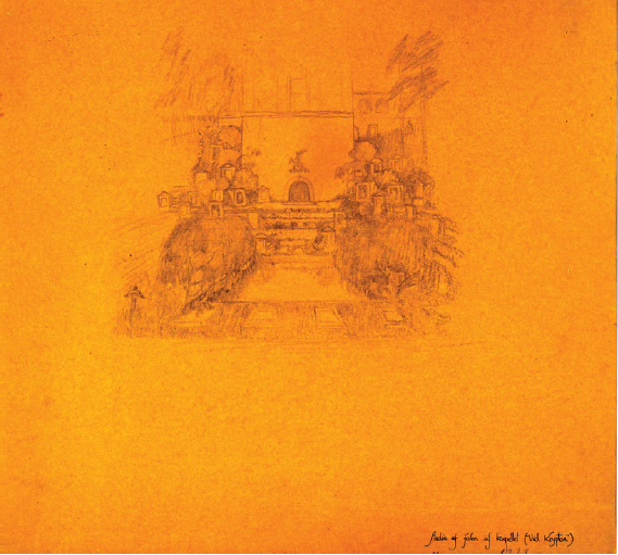
Asplund, Erik Gunnar (1885–1940)
Architect Competition proposal ‘Tallum’; ‘Study of the Chapel Basin’ sketch of the ‘Toward the Crypt’ series, 1915, Swedish Museum of Architecture, 25 × 25 cm, Thick paper
Influenced by the classicism of Italy, Gunnar Asplund blended Swedish national romanticism with the geometric forms of early modernism (Wrede, 1980). His sketches and drawings display an integration of architecture with nature, a distinctive aspect of his work. Born in Stockholm, nearly all of his projects were built in Sweden. He first studied architecture at the Royal Institute of Technology, Stockholm, from 1905 to 1909 (Cruickshank, 1988). After traveling to Germany on a scholarship, he interned for a short time with I. G. Clason.
His early independent projects were primarily houses, but in 1915 he and Sigurd Lewerentz won the competition to design burial grounds at the Woodland Cemetery. Although a relatively small project they successfully incorporated the natural features the site. Having returned from a trip to Italy in 1913–1914, Asplund's chapel in the Woodland Cemetery revealed his interests in both classicism and romanticism (Constant, 1994). For this chapel, a processional walk through the woods culminated in a columned portico with a steeply angled shingled roof. For a short time (1917–1920), additional buildings completed during his career include the Bredenberg Department Store, Stockholm, 1933–1935, and the Woodland Crematorium, Göteborg, 1936–1940. His much publicized City Library in Stockholm, 1920–1928, exhibits a stark cylinder referencing the classical form of the Pantheon and uses a circle in a square motif throughout. Asplund's later work continued to employ vernacular and Nordic references but acquired symbolic qualities (Wrede, 1980).
This sketch (Figure 7.1) was one of a series that Asplund and Lewerentz included in their submission for the Woodland Cemetery competition. The series of perspectives describes their design of various aspects of the cemetery, gardens and burial sites. They named the perspectives in association with the experiential characteristics of the views, such as Urn Walk (Constant, 1994).
The sketch attributed to Asplund, describes a view of a sunken garden. It has been labeled ‘Study of a chapel basin (toward the crypt).’ The crypt in the center of the sketch has been designed as a smooth façade. Around the façade are placed smaller monuments on terraced slopes. To each side of the pool low thick trees have been planted. The sketch shows diagonal striated lines giving it volume. The value (a function of dark and light areas) provides depth and contrast to the perspective, allowing a three-dimensional interpretation. Although the crypt has been situated to the rear, it is understood as being behind the trees. The texture of the trees accents the light façade to make it both a focal point and a destination. The one point perspective has been sketched symmetrically suggesting a certain balance and calmness. Although the parallel strokes might indicate a nervousness, the texture grounds the image.
Caroline Constant describes the design of the cemetery as presenting a ritual procession. She speculates that the architecture allows the visitor to move from dark to light, possibly symbolizing a life after death (Constant, 1994). Asplund's sketch similarly layers the scene with dark and light areas. The open front of the space has been contrasted by the restricted space between the row of trees behind. The dense rendering of the foliage creates a layer in front of the façade, separating one area from the other. The sequence of spaces helps to indicate how Asplund used nature and natural materials to mold and define architectural space, not differentiating interior from exterior volume.
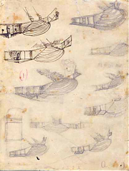
Terragni, Giuseppe (1904–1943)
Monumento ai Caduit, Erba, preliminary perspective sketches, 1928–1932, Centro Studi Giuseppe Terragni, Ink and graphite
Giuseppe Terragni was a leader in the Italian rationalist movement in the early part of the twentieth century. With tremendous energy and devotion to architecture, he built a large repertoire of modernist constructions in his short life. His sketches used firm lines that accentuated the edges and defined the box-like forms of his architecture.
Born in Meda (near Milan, Italy), Terragni studied at the Milan Polytechnic School of Architecture between the years 1921 and 1926. Upon leaving school he opened a practice in Como in 1927. He collaborated extensively with his brother Attilio and his longtime friend Pietro Lingeri. His architectural style was influenced by Russian constructivism and later the work of Le Corbusier and Mies van der Rohe (Pevesner, Richards and Sharp, 2000). In 1928, he joined the National Fascist Party, an event that shaped much of his career.
In 1932 he began work on a building for the Fascist Federation called the Fascio House. As a building for a new political system, Terragni was searching for an equally new architectural language. The project was a headquarters for the party organizers and had to reflect Mussolini's ideas of fascism by evoking the transparency of the party (Schumacher, 1991). An open grid filled with glass dominated the front façade, which was compositionally organized by the golden section and regulating lines (Pevesner, Richards and Sharp, 2000). A few of Terragni's other projects include the Casa Giuliani-Frigerio in Como (1938–1938), Novocomum Apartment Building (1928), the Kindergarten Antonio Sant'Elia (1936), and the Palazzo dei Congressi (1942).
This page of sketches (Figure 7.2) exhibits early studies for the Monumento ai Caduti in Erba from approximately 1928. This monument for World War I veterans reflects Terragni interests in nationalistic architecture. To remember fallen soldiers, the monument was placed at the crest of a hill. A long set of stairs encouraged the visitor to ascend to a compositional structure of convex and concave arcs. On this page, Terragni was concentrating on the configuration of the splayed, and almost baroque, stairs at the bottom of the hill. This sketch was not concerned with locating conceptual ideas but rather the refinement of an earlier, determined form. Here, he was studying the relationship of this base to the retaining wall, and the most appropriate look for a niche and urn. Sketched mainly from the same perspective angle, he was comparing the alternatives three-dimensionally. Using both ink and graphite as media, some of the sketches have been rendered smaller and some larger, scattered across the page. In his hurry, various sets of stairs have been sketched as abstracted arcs, where in other instances, he detailed the rise and tread.
Terragni sketched the stair primarily from one angle, knowing it would be constructed symmetrically. He was most likely right handed, since the forms have been viewed from the left, indicating how he started drawing with the uppermost curved steps, left to right. As bird's-eye perspectives, he was looking down on the scene rather than viewing it from a human's experience. This distancing may suggest his theoretical or ideological attitude toward the project. To support this assertion, it can be noted that he included little contextual information.
Throughout Terragni's architectural career, he designed many monuments. This building type may have allowed him to experiment with his rationalist position by designing structures that did not always require functional space. His theoretical position affected what he sketched and also the techniques he utilized.
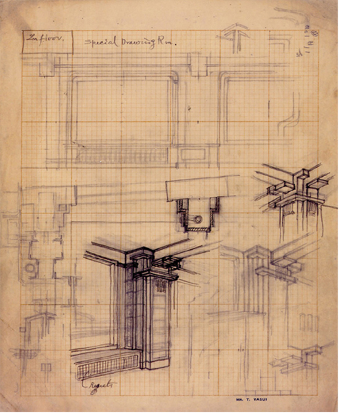
Yasui, Takeo (1884–1955) Japanese
Nihonbashi Nomura Building, Yasui Architecture & Engineers, Osaka, Japan. Graphite on grid paper.
Takeo Yasui began his career in architecture in Manchuria, where he was recognized for his style that infused Japanese architecture with elements from China and the West. Following this experience, he relocated to the city of Kansai in the western part of Japan. There he worked on several office buildings in art deco and modernist style. Returning to Japan, he graduated in architecture from the Imperial University of Tokyo in 1910. At this time, he joined a railway company in southern Manchuria. Again relocating to Japan in 1919, Yasui established private architectural practice in 1924.3
Involved in education during his practice, Yasui taught at Waseda University from 1925 to 1935, and the Kyoto Imperial University from 1933 to 1946. With his active practice, in 1936 he held the prestigious position of Vice-President of the Architectural Association of Japan.
The series of studies on the opposite page (Figure 7.3) concern interior details for a special dining room. The elevation, joint sections and corner explorations have been sketched on grid paper. In units of ten, the grid has been articulated in 100 square components. As a guide, the grid regulates lines and calculates measurement without a ruler. The outlined elevation, although unfinished, shows the primary features of an interior wall. The lines are very straight, both following the grid lines and some so straight they appear to be drawn with a guide. Faintly in the center of the window can be seen markings to tick off measurements. Although the information presented by the elevation is minimal, it does provide proportional organization.
The sketches located lower on the page are variations of a detail that connects beams with a column. They are less rigid in their construction showing the freehand technique. They do not all adhere to the grid and are not necessarily drawn to scale. Yasui did use the grid to guide the vertical lines of the column. The sketches have been strewn across the page not all completed to the same extent. The joint appears to have been expressed by building up layers of wood to celebrate a meeting of horizontal and vertical elements. Yasui has combined small pieces to create many horizontals and verticals where their repetition resembles ornament.
Decoration can be viewed as application of unnecessary elements, where ornament may be considered the expression of a material, detail, or connection. Modernist architects would condemn the use of unnecessary elements, reveling in the function of the structure. Here Yasui, does not strip down the point of connection but emphasizes the joining of two materials. Here he was celebrating the exposed beams and the point of their intersection rather than hiding their relationship.
Concerned with how the pieces fit together Yasui has also studied the joint in section. One can also see numerous beginnings sketched around the borders of the page. These half thoughts most likely represent tests, rejected intentions, and new directions in his thought process. These beginnings have been sketched with pencil, and some lines are reinforced with double strokes. The joint studies use a combination of perspective and axonometric, allowing Yasui to view in three dimensions.
The theme of the architecture blends traditional methods of woodworking with contemporary space. It is easy to view where the Arts and Crafts movement found their origins. These details strongly resemble the work of Frank Lloyd Wright, as he is known to have studied Japanese architecture.
This sketch emphasizes the span of Yasui's life and how he bridged into modernist style. The sketch also conveys the move from traditional understanding of construction and joinery to a period where the sketch could facilitate the design of new paradigms.
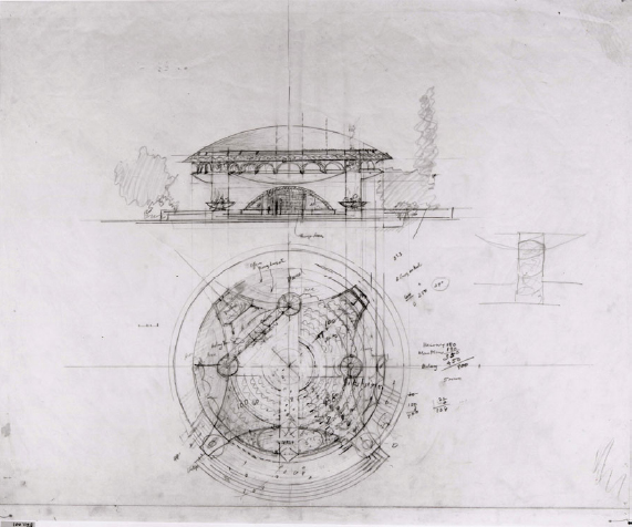
Wright, Frank Lloyd (1867–1959)
Annunciation Greek Orthodox Church, Wauwatosa, Wisconsin, 1956, The Frank Lloyd Wright Foundation, FLLW 5611.001, 37 × 30 in., Graphite pencil and color pencil on white tracing paper
A true icon of the twentieth century, Frank Lloyd Wright's work has been honored around the world. In reference to his design process, he claimed to bypass conceptual sketches entirely, progressing directly to a finished drawing stage (Hewitt, 1985). Although no one can doubt the tremendous imagination of Wright, there remains evidence of his use of sketches. Many of these images were a combination of ruled and freehand drawings indicating the semblance of a sketch.
Born in the upper Midwestern United States, Wright's family settled in Spring Green, Wisconsin, an area of the country which proved to be important to his work. Its gently rolling hills provided the impetus for his Prairie-style houses. He initially studied civil engineering. Eager to learn about architecture, Wright moved to Chicago and found work with the office of Adler and Sullivan in 1888. He learned from (and greatly respected) Louis Sullivan, and after several years was responsible for the firm's domestic commissions (Kaufmann and Raeburn, 1960). Wright established his own office in 1893, primarily designing houses. Speculating on new spatial qualities for domestic life, the Usonian Houses relied on simple massing, with flat roofs accenting their horizontality (Roth, 1979). The Prairie Houses integrated architecture with the landscape and featured cantilever roofs and open plans containing large central hearths (Kaufmann and Raeburn, 1960; Roth, 1979). Always concerned with his interpretation of the Organic (the relationship of parts to each other and an analogy to the growth of organic plant life). Several of his more celebrated projects were the Robie House (1906–1909); Imperial Hotel in Japan (1915–1922); Johnson Wax Administration Building (1936–1939); the Guggenheim Museum (1956–1959); and especially Taliesin in Spring Green, his home and studio, and Taliesin West in Arizona (Roth, 1979).
This page (Figure 7.4) describes Wright's typical sketching technique. In this design for the Annunciation Greek Church in Milwaukee, the patina of his process shows as he layers guidelines, ruled lines, erasures, shading, and notes. The sketch displays a front elevation and a circular plan; they correspond to each other so that Wright could easily transfer measurements. With this technique, he could also study how the decisions made in plan affected the elevation and vice versa. To relate these drawings to each other, he used ruled guidelines for accuracy. Onto this drawing he sketched freehand details and changes reflecting his design exploration. The page indicates notes identifying the bronze doors and numbers in the margins of the plan. The seats for the sanctuary show as wavy lines. Stairs and planters have been sketched over structure, and ornament on the dome above has been indicated on the edges of the outer circle in plan. The drawing has been worked over with erasures, shading, layers of guidelines, and moved walls.
The patina indicates the method he used for development of the project. Patina is the oxidation on the surface of bronze. This concept of the transformation of a surface can be extended to other materials, and might involve wear or discoloration. In this sketch, the marks left by Wright's hands express his absorption while contemplating the interior spaces. This can be evidenced by erasures that smear and change the surface of the paper.
Although Wright may have drawn schemes directly from his imagination, he still relied on sketches to visually develop the details and spatial relationships. This page also suggests that his early images were not considered sacred. He felt comfortable writing notes and calculations, and sketching alterations onto an initial idea.
Griffin, Marion Mahony (1871–1961)
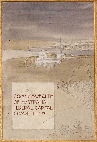
Federal Capital competition, left panel, view from summit of Mount Ainslie (Part A), 1911–1912, National Archives of Australia, Series #41854 38, Accession #A710/1, 63.2 × 232.7cm (A, B, and C panels), Watercolor
Australia's first internationally recognized architects are best known for their winning plan for the capital city of Canberra. Although the work of their architecture firm displayed the name of Walter Burley Griffin only, it is recognized that Marion Mahony Griffin was his partner, collaborator, and an architect in her own right. They jointly designed the competition plan of 1911, and Marion has been credited with the large watercolor perspective illustrated on the opposite page (Figure 7.5) (Turnbull and Navaretti, 1998).4
Marion graduated from Massachusetts Institute of Technology in 1894, and she immediately accepted employment with her cousin Dwight Perkins in Chicago. Walter attended school at the University of Illinois, Urbana-Champaign, from 1895 to 1899. It was in the office of Frank Lloyd Wright where they met. Walter left Wright's office to enter private practice in the Chicago School, primarily designing houses of the ‘Prairie’ style. While with Wright, Marion held a position that may be likened to head designer and was responsible for many of the presentation renderings of the office (Turnbull and Navaretti, 1998).
After their winning entry, the pair moved to Australia where Walter accepted the position of Federal Capital Director of Design and Construction. During this time, they designed and built projects such as the Capital Theater in Melbourne (1924); Incinerators in Willoughby and Pyrmont (1934); and the subdivision development at Castlecrag/Haven Estate (Turnbull and Navaretti, 1998). Their architecture took on an Australian character by integrating the architecture into the site, contrasting heavy masonry with delicate appendages, and incorporating indigenous plants (Turnbull and Navaretti, 1998).
This watercolor from their Canberra competition entry provides a persuasive view of the grand layout for the city. It may be considered a sketch because, as a competition entry, it is a brief indication of an idea. This sketch is the left panel of Marion Griffin's watercolor triptych. It shows a view not from directly overhead, but a dramatic approach to the city. Entitled ‘view from the summit of Mount Ainslie,’ it was sketched from site information provided in the competition package, with the hill described as being 800 feet above the plain on the outskirts of the proposed site. The watercolor image has been rendered in muted shades of green, gray, and blue, using typical techniques of Art Nouveau or the Arts and Crafts graphic imagery prevalent at the time. The metropolis fades beyond the lakes, helping to articulate the great scale of the project using a sfumato technique. The atmospheric, cloudy sky has been broken by the sun shining directly over the capital building.
This view of the proposed city helps to understand the purpose of a competition entry. Without a commission, an entry hopes to persuade a jury through the use of imagination; the submittal must attract attention over the other contestants. Its purpose is to seduce the viewers with the ideas of the project, since the scheme has not yet been fully resolved. It must provide sufficient information without the detail necessary for construction drawings. Without a firm building in mind, such a sketch can be the medium to envision the future in compelling terms.
Marion Griffin, having rendered drawings for F. L. Wright, was certainly familiar with techniques of seduction through images. Wright's architecture was presented from dramatic perspective angles with pastel colors, presenting an atmospheric totality of the building incorporated into its site.
Saarinen, Eero (1910–1961)
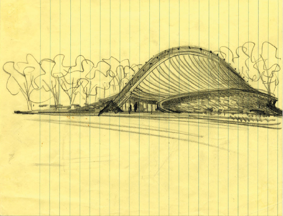
David Ingalls Rink perspective study, c. 1953, Yale University Library Archives, #5081, 8.5 × 11 in., Dark pencil on yellow notebook paper
Although it is difficult to label his architectural style, Eero Saarinen approached modernism by considering the design of each project from its unique context and program, some with dramatic sculptural and structural expression (Saarinen, 1962; Román, 2003). Most interesting about Saarinen was his distinctive design process that involved the extensive use of sketches and models.
Saarinen was born in Finland where his father was the prominent architect Eliel Saarinen. The family emigrated to the United States in 1923, when the elder Saarinen accepted a position at the University of Michigan. Eero Saarinen studied sculpture at the Académie de la Grande Chaumière in Paris in 1929 and the Graduate Program of Fine Arts at Yale University to study architecture. In 1938, he worked briefly for the designer Norman Bel Geddes and then returned to Michigan to begin work with his father. They collaborated on many architectural projects until Eliel Saarinen's death in 1950. With his own practice, Eero Saarinen designed projects such as the Jefferson National Expansion Memorial in St. Louis (1948–1964); Kresge Auditorium and Chapel on MIT campus (1953–1956); the United States Embassy, London (1955–1960); Trans World Airlines Terminal, New York (1956–1962); and Dulles International Airport in Virginia (1958–1962). Constantly exploring new materials and technologies for building, Saarinen experimented with shell structures and tension construction in such projects as TWA, Ingalls Hockey Rink, and Dulles Airport.
Such structurally innovative constructions were difficult to imagine, and also challenging to envision through drawings. Using models, Saarinen and his office were able to comprehend and explore complex forms (Román, 2003). The projects were often first imagined as two-dimensional sketches. They were then modeled to analyze form, connections, and structural integrity. The final part of the process was to translate the project into construction drawings. This process allowed Saarinen to visually understand the form of the buildings and suggests that the use of models allowed him to easily keep track of the progress of projects in his office. This page (Figure 7.6) shows a perspective sketch from the design phase of the Ingalls Hockey Rink in New Haven, Connecticut. On first observation, this sketch appears to have a definitive look that might imply it was rendered after the completion of the building. Comparison to the finished structure, however, indicates the sketch was employed earlier in the process.
Sketched on yellow notebook paper with soft graphite pencil, the image is fluid, as the smooth line of the arched spine has been sketched in a continuous stroke. Shadows, foliage, and texture enrich the three-dimensional illusion and contextual qualities. One aspect that feels unresolved is the connection of the spine to the ground in front of the entry doors. Here the graphite appears darker, possibly because Saarinen reworked the terminus, hoping to find a solution with the perspective.
It would be difficult to visualize the fluid deformation roof without first having studied the structure of the arc. It is likely that Saarinen sketched this image as a reflection of a model. The ridge is dominant, but in the finished building, the ends have been turned up toward the sky and one end was finished with a sculptural piece. The entrances have also been altered from this early sketch. In the built version, the roof extends to become an overhang and the curve frames the doors. Saarinen's design process assisted him to understand complex forms, as is evidenced by this beautiful and confident sketch.
Le Corbusier (1887–1965)
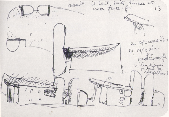
Plate #322, Sketchbook 18, Volume 2, sketch of Notre-Dame-du-Haut, Ronchamp, February 1951, Le Corbusier Foundation/ARS, Carnet E18, 15 × 10 cm, Ink on sketchbook paper
Charles-Edouard Jenneret, better known as Le Corbusier, needs little introduction. He was the prominent figure in modernist architecture and crucial in the development of the international style. Although sketches remain from specific projects he designed, recently four volumes of his sketchbooks have been published. These sketchbooks were specifically saved and numbered by him, and were found (after his death) carefully stacked in a closet (Le Corbusier, 1981). They include travel and conceptual sketches, distinct from sketches in his office for specific buildings.
Le Corbusier was born at La Chaux-de-Fonds, Neuchâtel, Switzerland, in 1887. His early education included vocational school at the Ecole d'Art. Encouraged by a teacher, Charles L'Eplattenier, he left to study architecture. In 1907, he embarked on an extended visit to Italy; upon his return, he found work with the architect Auguste Perret. In 1913 he opened his own firm and began experimenting with ideas for the Dom-ino House. Conceptually, this building system consisted of a rectangular ‘skeleton’ made of reinforced concrete (Tzonis, 2001). In 1917, Le Corbusier moved to Paris, further exploring the building technology of concrete.
Around the time he entered practice with his cousin Pierre Jeanneret in 1922, Le Corbusier began to combine the elements that defined his rational and functional approach to architecture. Le Corbusier's large body of built work includes the Unité d'Habitation, Marseille (1949), and the Dominican Monastery of Sainte-Marie-de-la-Tourette (1952).
The published sketchbooks provide rich insight into Le Corbusier's thought processes and sketching techniques. Undoubtedly, the travel sketches were used to remember visual information, as sights could be noted and retained for further use. Other types of notations occur in his sketchbooks, such as codes for colors, train reservations, recordings of types of trees, hand and sun symbols, and written analysis and evaluation (Le Corbusier, 1981). Some of the sketches show a firm and definitive pencil technique, while others have a wavering, slow deliberation.
This sketch (Figure 7.7) shows early ideas for the non-rational Chapel Notre-Dame-du-Haut, Ronchamp (1955). Uneven and scratchy lines were used to explore the chapel in plan and elevation. A single line gestured the arc of the chapel on what appears to be a roof plan. The rounded light wells have been roughly shaded and appear lumpy. Le Corbusier is studying the relationship between the massing of the roof and the vertical towers. The two lower elevations, which resemble perspectives, show variations for the shape and volume of the roof. Indicating his concern for this roof/wall proportion, he minimized the window openings to simple parallel lines. The roof to the right has been identified with the letter ‘a.’ On the legend which describes his symbols, ‘a’ has been translated as arrondi, ‘round.’
Given the abstract qualities of the sketch, Le Corbusier may not have trusted his memory. He needed a written note to remind him of that moment in the process when he was thinking about the curve of the eave. He also made notes of his personal dialogue, writing ‘attention’ to remind himself about fissuring. This may indicate something vital to the design and construction of the roof that required subsequent examination. Considering the briefness of the sketch, it is clear that Le Corbusier depended upon additional written messages to later recall his design intention. The sketchbooks were for him a discussion about design and also represented memory devices.
Gropius, Walter (1883–1969)
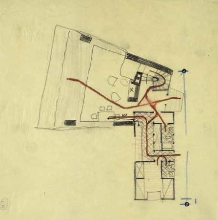
Lorant Residence, Arlington, VT; sketch of plan with circulation routes, 1942, Busch-Reisinger Museum, Harvard University Art Museums, BRGA.95.2, 22.9 × 22.8 cm, Graphite and colored pencil on paper
Emerging from his role as an educator at the Bauhaus, Walter Gropius had tremendous influence on generations of students and was a profound figure in the modern movement. A consummate collaborator, his rational architecture was less about the object and more about social responsibilities and industrial standardization.
Starting his life in Germany, Gropius studied architecture at the Technische Hochschule in Berlin and Munich, finishing in 1907. That same year he began working for Peter Behrens, and three years later he left to start his own practice. His first significant commission, assisted by Adolf Meyer, was the façade for the Fagus factory in 1911. Predating many modernist buildings, the factory found an appropriate industrial vocabulary with clear modern intentions. Various house projects followed, along with the design of the industrial buildings for the Cologne Exhibition of the Deutsche Werkbund Congress.
Combining the Higher Institute of Fine Arts and the School of Applied Arts, the Bauhaus was formed in 1919 with Gropius as its director. He emigrated to Britain and then the United States in the mid-1930s, when he was summoned to head the Graduate School of Architecture at Harvard. His architectural practice often collaborated with Marcel Breuer and he was a founding member of the firm The Architect's Collaborative (TAC). Other projects of note, in which he had primary responsibility, include the United States Embassy in Athens (1956) and a skyscraper for Grand Central Station, New York City (1960) (Berdini, 1985; Fitch, 1960; Isaacs, 1991).
Drawings by Gropius reveal the rational clarity and functionalist approach of modernism (Tzonis and Nerdinger, 1990). His drawings and sketches were most often graphite on paper, primarily employing the conventions of plan, section, elevation, and axonometric. This sketch (Figure 7.8) is a design for the Lovant Residence in Arlington, Vermont (1942). Although the project was never constructed, the program specified a small house equipped with viewing windows on a ninety-acre site (Tzonis and Nerdinger, 1990).
This plan shows circulation paths sketched in red. Obviously concerned about the material thickness of walls, Gropius used poché to add weight to structural walls. He also differentiated the floor surfaces by shading certain areas and crosshatching others. These visual indicators help to emphasize that the house was to be built using local materials, fieldstone, and wood. The careful control of pro-portion and the consideration for spatial relationships indicate that Gropius used this sketch for con-centrated and deliberate thinking.
The red paths are the most distinctive part of this sketch. Gropius was visually ‘walking’ his pencil through the house, checking the efficiency and flow of the circulation. The circulation in this small house seems particularly chaotic in the entry vestibule, where all of the paths intersect. In later versions of the house, Gropius eliminated the ‘L’ of the kitchen and designed it as a galley space, thus simplifying the options for circulation. The patterns of movement have been separated between public and private. For example, the lines from the maid's room through the kitchen to the dining table are separated from the entry, living, and guest toilet. To further support this interpretation, a thin line starts on the kitchen counter and ends with an arrow on the dining table (additionally indicated by the only measurement on the sketch, ten feet). Most lines consist of single weight; conversely, the circulation paths have been sketched over as if he was walking the possible routes several times. Gropius’ reputation for efficiency would support a theory that he was concerned with the economical delivery of food and the distances of travel through the space.
Mies van der Rohe, Ludwig (1886–1969)
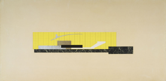
Theater project combined elevation and section, May 1909, The Museum of Modern Art/SCALA/ARS/Art Resource, #717. 1963, 121.9 × 243.8 cm, Graphite, ink, and cut and pasted papers
The architecture of Ludwig Mies van der Rohe was based on the ideology of a new technology, manifest in steel and glass. As an accomplished rationalist, he was objectively interested in the efficiency of construction as well as the expressive qualities of structure (Blaser, 1997). Mies also used a formal, geometric, and proportional system to order space according to its function.
The son of a builder and stonemason, Mies was born in Aachen, Germany. He was schooled in Berlin at the School of the Museum of Arts and Crafts and the Institute of Fine Arts. In 1905 he entered the profession of architecture, working with Bruno Paul in Berlin, and then Peter Behrens in Neubabelsberg. In 1924, he founded the group called The Ring in rebellion against the conservative establishment of architects in Germany. Becoming involved in the education of architects, Mies took the position as the director of the Bauhaus (1930–1932). Prior to World War II, in 1938 he immigrated to the United States to direct the future architecture program at the Illinois Institute of Technology in Chicago. Building his practice in Chicago, he completed projects such as the Crown Hall on the campus of IIT (1950–1956); Farnsworth House (1945–1951); the Seagram Building, New York City (1954–1958); and the Toronto-Dominion Center (1963–1969) (Blaser, 1997; Cohen, 1996; Drexler, 1960; Schulze, 1985).
Mies had begun his career with theoretical projects of houses and glass skyscrapers, but his first prominent project was the Barcelona Pavilion (the German Pavilion at the International Exhibition in Barcelona in 1928–1929). A building without a program, the Pavilion was an open plan of glass and green marble with slender columns clad in chrome. Its ambiguous enclosure of horizontal and vertical slabs found its ornament in the rich materials.
At the Bauhaus, Mies encouraged his students to develop their projects with vast numbers of sketches before committing to final drawings (Cohen, 1996). Mies’ sketches, from the collection at the Museum of Modern Art, show mostly plans accompanied by interior perspectives and elaborate construction details that show connections (Drexler, 1986).
An unusual technique Mies employed was that of collage. These paper constructions were abstractions, not intended to portray spatial qualities. They may be considered sketches since they present a basic outline, pertain to conceptual thinking and provide little pictorial orientation. Pieces of cut paper were pasted in juxtaposition so as to make a semblance of a parti. The constructions were often combinations of elevation and section, in order to study the compositional proportions that expressed the essence of the project. This image (Figure 7.9) represents such an example. Using five or six pieces of colored paper, Mies has carefully cut rectangles to place in comparative positions on the page. He used bright yellow paper drawn over with a grid, resembling fenestration or an abstract pattern. In the center has been placed a very dark rectangle surrounded with light gray, tan, and white pieces.
This collaged sketch is really about precise and imprecise. The paper has been cut very neatly and shows exact proportions. The forms reflect Mies’ bold and simple rectangles which act as planes slicing through space. In contrast, the composition of pieces is simultaneously imprecise. These cutouts are not plan, section, or elevation; they suggest building blocks and are therefore alluding to spatial relationships and construction. Without a ground line, the assembly provides little orientation. The proportions may be valid from any direction. This collage from 1909, early in his career as an architect, reveals Mies’ penchant for the De Stijl-like juxtaposition of horizontals and verticals.
Kahn, Louis (1901–1974)
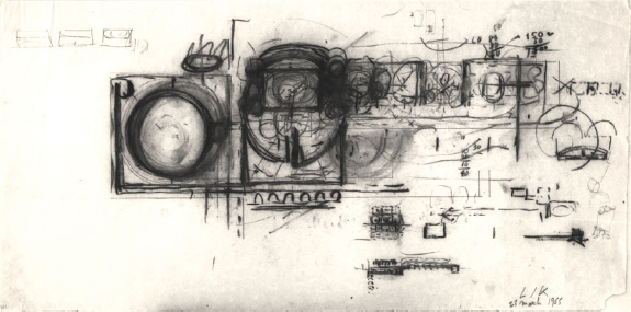
President's Estate, the First Capital of Pakistan, March 23, 1965, University of Pennsylvania and the Pennsylvania Historical and Museum Commission, #675.108.23, 30.5 × 61cm, Graphite and charcoal on white trace
As a departure from the strict functionalism of modernism, Louis Kahn spoke in terms of the poetics of architecture. His passion showed not only in his buildings, but in his devotion to the dialogue of sketching.
Born in Estonia, Kahn immigrated with his family to the United States when he was very young. He studied architecture at the University of Pennsylvania, Philadelphia, from the years 1920 to 1924. After graduation, he worked with John Molitor, the city architect; William H. Lee, architect; Paul P. Cret, architect; and the firm of Zantzinger, Borie, and Medary Architects in Philadelphia. Kahn began independent practice in 1935. His first high profile building came with the commission for the Art Gallery at Yale University (1951–1953). Other projects in his prolific career include: Richards Medical Research Building, University of Pennsylvania (1957–1964); Salk Institute Laboratory Building, California (1959–1965); Sher-E-Banglanagar National Assembly, Dacca, Bangladesh (1962–1974); Kimball Art Museum, Texas (1966–1972); Library, Phillips Exeter Academy, New Hampshire (1967–1972); and the Center for British Art and Studies, Yale University (1969–1974). A critic in architecture at Yale for several years, he also taught at the University of Pennsylvania from 1957 to 1974 (Yoshida, 1983).
Kahn promoted a turn from functionally social architecture to the experience of architecture. This spiritual approach took a new look at materials and texture, and especially the effects of light. His massive walls articulated architectural space, and his juxtaposition of materials such as concrete, steel, and wood presented a strong sense of materiality in construction (Yoshida, 1983).
Marshall Meyers, a designer in the office, writes that Kahn's early design process always started with notebook sketches (playing with the program) and progressed to analysis and critique to determine if the idea was viable. Kahn would rework and refine the project continuously through to construction drawings. He would sketch fervently as he described his ideas to his employees (Yoshida, 1983). In his lectures on drawing and sketching, he spoke about how one should not imitate exactly, but be critical about the conceived image and find significance in it. He spoke of his love of beginnings and enjoyment in learning (Latour, 1991).
Kahn's sketches show a bold hand, as he often used charcoal or a soft pencil, altering, reworking, and emphasizing different aspects of the sketch. This sketch for the President's Estate, the First Capital of Pakistan (Figure 7.10), displays his enthusiastic dialogue with his sketches. Done with charcoal and graphite on tracing paper, the plan shows large forms contrasted by a few delicate diagrams. It is likely that where he drew lines over and over on a circle, he was not attempting to achieve the perfect curve but to emphasize the power of the shape. The fluid and expressive strokes suggest a passion that involved his entire body. The large circles on this sketch necessitated a full sweep of his arm on the relatively large sheet of paper, 30.5 × 61cm (approximately 12 × 24 in.). With this much charcoal it was doubtful he could have kept his hand or arms clean. He was intellectually, emotionally, and physically interacting with the sketch. Immersed in the making, he had rubbed out, crossed out, and drawn over many aspects in the sketch as if it spoke to him. This discourse, and his absorption with the visual media, suggests an intense concentration that engaged his whole being in the process.
Villanueva, Carlos Raúl (1900–1975)
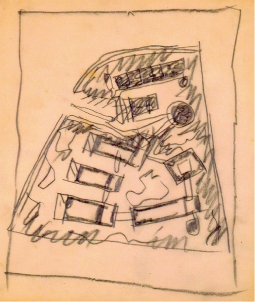
Museo Soto sketch, c. 1969, Fundación Villanueva Caracas, #3219r, 21 × 18cm, Graphite on sketch paper
Known for his urban renewal projects in Venezuela and for organizing professional architecture and planning associations, Carlos Raúl Villanueva promoted a modern architecture balanced by respect for the preservation of the colonial architecture of Latin America.
The son of a Venezuelan diplomat, Villanueva was born in Croydon, England. He studied at the Ecole des Beaux-Arts and received a diploma in 1928. Relocating to Caracas, he began private practice the following year. Although beaux-arts trained, Villanueva led the modern movement in Venezuela, reflecting his contemporaries’ work in Europe. He successfully integrated art into his architecture and translated modernist concrete forms to the sunlight of the tropics, using screens, reflection, and shading devices. One of his most celebrated projects was the elementary school Escuela Gran Colombia (1939). A building to attain the social ideals of modernism, it rejected historical precedent. Other buildings designed by Villanueva include the Olympic Stadium (1950–1952), El Paraiso Housing Development (1954), and the University City projects, School of Architecture and Urbanism, Pharmacy Building, and the Olympic Swimming Stadium (1957), all in Caracas (Van Vynckt, 1993; Villanueva and Pintó, 2000).
Paulina Villanueva explains that her father had a distinct method of using sketching during his design process. He sketched with ‘strong yet precise strokes that enabled him to compose complex ideas with few lines’ (Villanueva and Pintó, 2000, pp. 9–10). She recalls that he would sketch many small images to reach a design solution and continually revisit those first sketches. To achieve these bold and efficient sketches he used a blunt pencil. The resulting heavy line provided a concise outline. Although he destroyed many of his drawings and sketches, considering them as only part of the process, a few of these graphically robust images remain, primarily from his final projects.
Villanueva's sketches appear consistent with his architecture. The straightforward expression of edges, abstract shape, and precise proportion reflects his use of bold modernist forms. This page (Figure 7.11) presents a preliminary study for the Jesús Soto Museum of Modern Art in Bolivar City, Venezuela. The sketch, dating from the late 1960s, shows a site plan of the museum and describes the juxtaposition of the various buildings. At this early stage in conceptual design, he was not concerned with straight lines or details. This shows in the minimal forms that describe buildings, some with only four lines. Several of the buildings have been roughly darkened and others appear unfinished, such as the overhangs/porches on the galleries. The sketch is an attempt to quickly comprehend the whole site. Concerned with contrast that could help him visualize the context, he shaded the ground with bold texture using a continuous zigzag stroke.
Considering the series of sketches that exist for this project, the design evolved as to location of the parking, placement of the irregular central plaza, and shape of several buildings. The three rectangular gallery spaces that face the curved street remained consistent throughout the process. Here he held fast to the bold and strong forms, using them to anchor the site.5
Villanueva utilized an economy of lines for these first studies. He was recording forms as they presented themselves, not eliminating their potential. This is evidenced by the fact that he did not take the time to erase and redraw shapes. Villanueva was comfortable visualizing a spatial organization from a small sketch, then critiquing its qualities for the evolution of the scheme. The abstraction of the small sketches did not hinder the early development of the design. Most importantly, he was able to ‘read’ these partial forms to translate them into architectural form.
Aalto, Alvar (1898–1976)
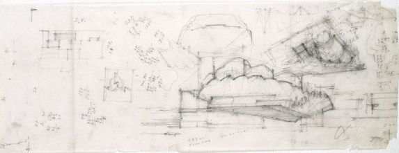
Preliminary studies for Finlandia Hall, Helsinki, 1962/1967–1971, 1973–1975, The Alvar Aalto Museum/Drawing Collection, 30 × 75cm, Pencil on tracing paper
Alvar Aalto, a Finnish architect first influenced by the international style, created an architecture combining modern and vernacular. Interpreting Aalto's approach, Winfried Nerdinger describes his architecture in terms of ‘human functionalism’, where the work was less about ‘formal, economic or constructional constraints’ and more concerned with human purposes (Nerdinger, 1999, p. 15). Much of this approach integrated Finnish cultural identity, and acquired undulating, fluid forms, particularly when viewed in plan.
Aalto began his architectural observations in the small town of Jyväskylä. He completed his formal education in architecture at the Helsinki Technical University in 1921. Initially traveling to Stockholm, he began his internship with Arvid Bjerke in Gothenberg. His first major commission came when he won first prize for the Southwestern Agricultural Co-operative Multiuse Building Competition. The Co-operative was constructed between 1927 and 1929, and another important competition success followed in 1929 with the Tuberculosis Sanatorium in Paimio. He became known in the international arena through his design of the Finnish Pavilion at the World Exposition in Paris (1937) and the Finnish Pavilion at the New York World's Fair (1939) (Pearson, 1978; Schildt, 1989; Nerdinger, 1999). Other important projects include: Villa Mairea (1938–1939); Baker House, Senior Dormitory at MIT (1946–1949); Säynätsalo Town Hall (1951–1952); University of Technology in Otaniem (1955–1964); Opera House at Essen (1959–1961); and Finlandia Hall, Helsinki (1967–1971).
The extensive archive of Aalto's drawings and sketches reveals his unique hand. Besides the light touch and fluid lines, these lines show strong ending points, as if he was hesitating before removing the pencil from the surface or was reinforcing prominent edges. He entered a dialogue with the images, as they contain notes, calculations, and, in many instances, have been oriented from numerous directions. This immersion in the conversation through the sketch also shows marks where he rested the pencil or prodded the sketch for emphasis. Aalto frequently strengthened important walls or boundaries by continually drawing over his lines. The sketches suggest that he held the drawing instrument so loosely that the image appeared to be articulated independent of his hand. This tech-nique gives the sketches a lively, pulsating quality, that could be compared to a Ouija board, where the light touch enables the line to take on a life of its own.
This early sketch for Finlandia Hall (Figure 7.12) demonstrates Aalto's design process, describing the indirect flow of spaces and the non-geometric theme of his mature work (Fleig and Aalto, 1995; Schildt, 1989). Alternating between section and plan, this sketch has been crowded with calculations and partially complete forms. The lower section drawing addresses Aalto's concern for the acoustic qualities of the auditorium in profile. The undulating form of the ceiling also anticipates construction issues. The remainder of the page has been strewn with partial design beginnings, possibly rejected as unpromising directions. The intensely worked plan and section indicate Aalto's absorption in his design process. To animate is to inspire or endow with life. It can also mean to breathe life into or put into motion. Aalto's repeated lines tend to give his sketches a nervous animation suggesting his interaction with the project as a living being. Its liveliness reflects the constant motion of his hand and also breathes life into the future building.
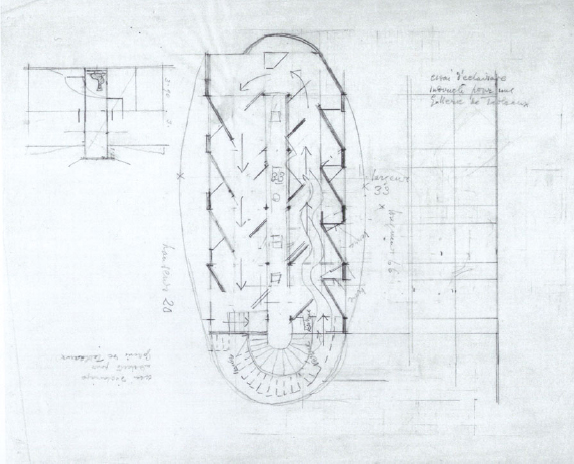
Gray, Eileen (1879–1976)
Plan, section and elevation, V&A Picture Library, AAD/1980/9/16, 10 8 in., Pencil on paper
Best known for her lacquer work, carpet weaving, and interior design, Eileen Gray built several architectural projects in the early years of the twentieth century. Despite her lack of a formal architectural education, her sketches and drawings show an understanding of architectural space, and her buildings, a sensitivity for materials.
Gray was born in Ireland as Kathleen Eileen Moray Smith. Her higher education began at the Slade School of Fine Arts in London. In 1902, she moved to Paris to study drawing, and the same year encountered the restoration of antique lacquer with D. Charles in London. Having inherited sufficient wealth to be independent, in 1907 she returned to Paris to work with the Japanese lacquer master, Seizo Sugawara. By 1910, Gray established a lacquer workshop and a weaving atelier. She opened a decorating shop called Jean Désert in 1922, receiving commissions for interior design. Near this time, she met Jean Badovici, an architectural critic and editor who had received formal education in architecture. He encouraged her talents in architecture and between 1926 and 1929 she built a house for herself and Badovici in the south of France at Roquebrune. Literature establishes that they collaborated on this house, but that Gray designed the project and Badovici's role was that of critic (Constant and Wang, 1996). The house was titled E. 1027 Maison en bord de mer. Located on the shore, the design reflected Le Corbusier's tenets of modern architecture. The house was set on piloti, organized in an open plan with a terrace overlooking the sea. Gray designed the furniture, successfully integrating it with the architecture. Her architectural work includes another house for herself, the Tempe à pailla in Castellar, several apartment renovations in Paris, and numerous unbuilt projects (Hecker and Müller, 1993; Constant, 2000; Constant and Wang, 1996).
This sketch page (Figure 7.13) dates approximately from the 1930s and presents a plan for an art gallery (Constant and Wang, 1996). It references alterations made for her Vacation and Leisure Center (Exhibition Pavilion) in Le Corbusier's Pavilion des Temps Nouveaux. The pencil sketch shows a ruled floor plan with a small section to the right and a faint elevation on the left. The page contains several notes, dimensions, proportional guidelines, and an outlined lozenge shape. This approximate ellipse constitutes the spatial theme of the project, and reflects her concept for circulation through the space. In a fairly small room, Gray was studying sophisticated solutions to lighting the surfaces of the exhibition. The section shows a diagram for light to be emitted from a clerestory. The skylights, situated directly above the sculptures in the center, provide an additional source of illumination. The openings in the walls have been set at forty-five degree angles to experiment with reflected light bouncing off diagonal surfaces.
Gray was walking through the experience of the space with her pencil. She used arrows for the intended direction of the visitors’ movement. She also employed wavy parallel lines to express the width of the flow around and between the display panels. In this way, she was visually questioning the scale of the spaces. This also provided an indication of the way observers would perceive the exhibition panels. This zigzag path was a method to move people through the gallery and to provide as much wall area for artwork as possible. Understanding how artwork requires indirect illumination, Gray could envision the light permeating the space from behind the visitors by inhabiting the sketch herself. Sketched lightly in the center she even locates the placement of these objects. The development and evaluation of the project occurred as she sketched and allowed her to project herself into the proposed interior space.
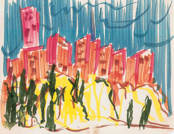
Barrágan, Luis (1902–1988)
Lomas Verdes, Mexico City, 1964–1973, color marker, Barragán Foundation/ARS
Winner of the prestigious Pritzker Prize in architecture (1980), Luis Barrágan is known for his bold use of color in the design of Mexican regionalism with Mediterranean flavor. He was particularly adept with the integration of landscape and architecture that responded to the environment of his native Mexico (Van Vynckt, 1993).
Born in Guadalajara, he received an engineering diploma with some experience in architectural studies. Aware of the modernist initiatives surfacing in Europe, he traveled to Paris to attend lectures by Le Corbusier. His year in Paris was part of a lifetime of travels, especially to Europe (the Mediterranean coast) and North Africa. The simple forms he observed in North Africa influenced his use of clean shapes constructed in concrete. He built small projects between 1927 and 1936 before starting speculative housing projects in 1936. Founder and director of the Jardines del Pedregal de San Angel, Mexico City (1945–1952), Barrágan opened private practice with Raul Ferrera ( Júlbez, Palomar and Eguiarte, 1996; Smith, 1967).
After the early 1940s, his projects were concerned with a blend of vernacular and international styles. He designed several churches such as the Convent of the Capuchinas Sacramentarias (1952–1955), but the buildings most representative of his work were the San Cristobal Stable and the Egerstrom House completed in 1967. This building complex makes use of his skill in landscape design and of massive walls of color. The large flat planes, in a shade of bright pink, have been contrasted by geometric fountains and pools.
Barrágan often sketched using color media. Many of his sketches are bold and abstract, where he employs a blunt lead for a heavy line or chooses media that will give him bright colors. Some of these sketches appear surprisingly minimal, using the fewest lines possible. This sketch (Figure 7.14) represents a study for the Lomas Verdes Project. Beginning approximately 1965, Barrágan and Sordo Madaleno collaborated on various dwelling types and monumental entrances for the subdivision Lomas Verdes. In the early 1970s, streets were laid out and building sites were sold, although in the end little infrastructure was actually constructed (Zanco, 2001). Barrágan and Madaleno had planned for extensive gardens and landscaping, which has been reflected in this sketch.
The sketch exhibits bold vertical lines, accented by equally bold wavy ones. Sketched with a felt tipped pen, the image has been rendered in bright colors – blue for the sky, red and orange for the buildings, yellow and brown for the hillside in the foreground, and green abstractions to represent trees. The streaky lines have been drawn quickly, evidenced by the transparency and very straight strokes of the felt marker. The white showing through behind the color reveals how the ink skipped across the paper. This is unlike the dense saturation of color that happens when the marker rests on the surface. The buildings were drawn first and the sky later, giving the image background and con-text. The buildings have been set atop a mound, making them seem as though they have grown out of the hills. Each structure has been given a few strokes of the marker for windows. Without these indications of openings, the shards of buildings could have been interpreted as sheer-faced rock. Interestingly, the buildings have been treated very similarly to the background of the sky. This could be a factor of the medium's properties or an intentional tactic to avoid differentiation between build-ing and landscape. Barrágan's architecture, although rectangular and regular, had a unique ability to appear integrated into the landscape. Considering the use of bold color in his architecture, it is fitting that the sketched with bright colors.
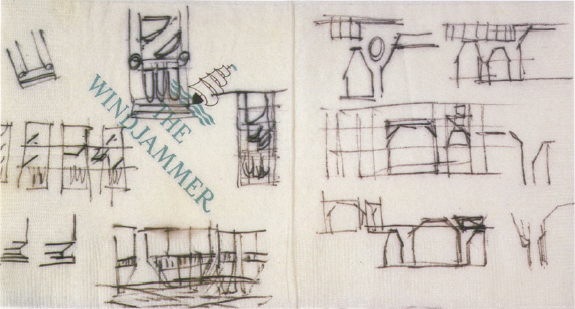
Moore, Charles Willard (1925–1993)
Elevation studies for campanile and arcade, 1975–1978, The Charles Moore Foundation for the Study of Place, 5 × 10 in., Ink on paper napkin
An eclectic and playful architect, Charles Moore was an early critic of modernism. Advocating a humanist approach, he often designed colorful buildings evoking historical precedent. Moore sketched constantly using any media at hand, as seen by his many paper napkin sketches. Very facile with pencil and paper, he would sketch to illustrate even non-architectural dialogue ( Johnson, 1986). He attended Princeton to earn both a Masters in Fine Arts and a Ph.D., in 1957. He started his practice with private homes, building numerous houses, including eight for himself, over the course of his life ( Johnson, 1986).
A dedicated educator, Moore taught and administrated architectural programs in several universities, including Berkeley, Yale and University of California. Some of his best known projects include; Sea Ranch, California (1960s), Kresge College and Faculty Club, University of California, Santa Cruz (1966–1973), St. Matthew's Episcopal Church in California (1979–1983), and Beverly Hills, Civic Center (1982) ( Johnson, 1986).
Moore had great talent for working collaboratively with clients and community groups ( Johnson, 1986). His architectural projects primarily consisted of simple geometric shapes using compositional balance. Moore's work found distinction in its playful treatment of colors, cutouts, and graphics, and the symbolism was often humorous. The Piazza d'Italia (1975–1978), a small downtown park sandwiched between buildings in central New Orleans, exemplifies this light attitude. The small plaza features water surrounding an island formed in the shape of Italy, with an arcade of columns that has been painted in shades of red and ochre.
The varied and plentiful sketches by Moore express the enthusiasm of his architecture. He often used color and whimsical features in his drawings. Seldom erasing an image, he sketched quickly, dancing between thoughts. The gesture of his body and this continuous dialogue create a narrative of his thinking. Illustrated by this sketch (Figure 7.15) on a paper napkin, one can view evidence of his intense vision. The napkin has been imprinted with the words ‘The Windjammer,’ the name of a restaurant. It is possible to imagine a scenario that puts Moore in the restaurant awaiting his meal and entering into a conversation about the Piazza d'Italia in New Orleans. Choosing the nearest drawing materials, he began to explore the form of the campanile and arcade. The two sides of the napkin show that he sketched from opposite directions. The reversal may have also derived from the presence of another person. To show the napkin and continue the conversation could have changed the direction of his groundlines. Moore was exploring the proportions and composition of the series of arches with very small sketches, since the cocktail napkin was only five inches square.
Moore's design sketch includes the campanile, with its simple geometric forms, and arches viewed through the exposed structure. Accenting the joints, he drew circles at crucial intersections. He was also trying variations and testing the composition of the three separate pieces that made the vertical tower. On the right half of the napkin he was concentrating on the arcade, where he was grouping various sized arches. The little sketches, some only an inch high, allowed him to view a comparison between forms very quickly.
Moore understood that the physical sketch was no longer valuable after the thinking process was complete. It was more important to sketch at the moment, rather than wait for an appropriate piece of paper. He found the closest and most convenient media at the time, afraid that his ideas would escape him. Since the sketch has been retained and published, he must have put it in his pocket for further reference.
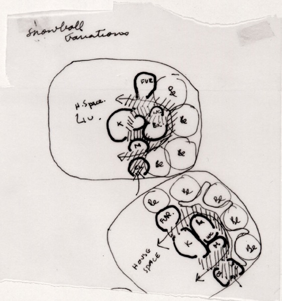
Smithson, Alison (1928–1993)
Sketch plans for two Snowball Appliance Houses, 1957, Canadian Centre for Architecture, DR 1995:0052, 12 × 11.5cm, Pen and black ink on tracing paper
The Smithson's greatest influence on the architectural world came through their writing, teaching, and competition entries. Although devoted to professional practice, they balanced building with theory, disseminating their ideas concerning social issues of housing.
British by nationality, Alison was born in Yorkshire and Peter in County Durham. They met while studying in the Department of Architecture at the University of Durham, Newcastle. Marrying in 1949, they won the commission to design the Hunstanton Secondary Modern School. Active in CIAM, the Smithson's organization of the 1953 conference earned them the adage Team X. Their colleague Reyner Banham described their work as brutalist, with dominant use of concrete structures and rationalist form. The Smithson's writings challenged architects to re-examine basic tenets about housing and urban theory. They designed the prototype House of the Future (1956); headquarters for The Economist magazine in St. James’ Piccadilly (1964); British Embassy in Brasilia (1964) (unbuilt); Garden Building at St. Hilda's College, Oxford (1967–1970); Robin Hood Gardens apartment complex (1966–1972); and buildings at Bath University starting in 1978.
Interested in social aspects of living, the Smithson's most prominent housing project was the Robin Hood Gardens. They designed rows of apartments in linear buildings dispersed with plazas. Eventually unsuccessful because of crime, their sensitive architecture could not keep the complex from falling into social disarray.
Constantly exploring theoretical ideas, the Smithsons used sketches extensively. Many of these sketches take the form of diagrams that they called ideograms (Smithson, 2001). These simple images were often very small, using few lines. With these sketches the Smithsons were critically reviewing conceptual theories (analysis) while demonstrating a visual communication between the two of them. With their precise qualities, the sketches feel cartoon-like, having firm, unbroken lines and act very much like a parti. This sketch by Alison (Figure 7.16) is a diagram for an appliance house. Iterated in black ink on tracing paper, the lines are single thickness, some showing heavier and others lighter, as if two pens were used. Soon after the prototype for the House of the Future, the appliance houses were based on the concept of prefabricated housing. This intention was not so much concerned with the manufacture of these units but with the spaces necessary for the inhabitants. The Smithson's had been conceiving of two different organizations, one linear and the other clus-tered like a snowball.6 This small sketch shows numerous circular shapes within a larger enclosure of the snowball parti. The notion of this house was to gather all of the ‘appliances’ or functional aspects of the house (on one side) leaving a large area for family living.
These very concise sketches reveal Alison Smithson's thinking. The bedrooms remain circles in each iteration, possibly because circles are faster to draw than squares and these sketches were not concerned with the bedrooms but rather the ‘appliance’ spaces. With this example, Alison Smithson was rendering the functional spaces of most concern to her, abstracting the rooms less important at the moment. More time has been taken to sketch the kitchen, for example, although it takes on an amoeba shape. This sketch emphasizes the popularity of ‘bubble’ diagrams. A technique to study only one aspect of a project, bubble diagrams are not plans in a strict sense, but show adjacencies. Here the ‘bubbles’ inflluenced the shape of the rooms in this early stage of the process.
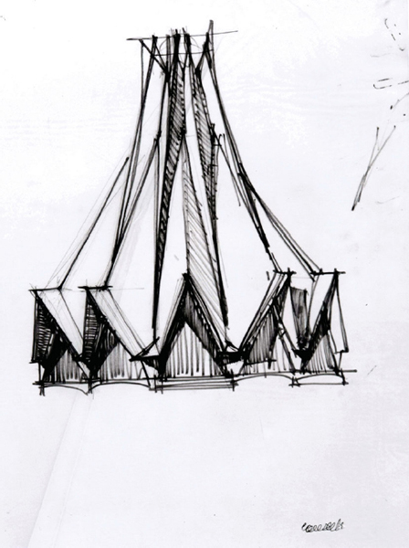
Candela, Felix (1910–1997)
Paragnas en San Jerominio, 1960, Avery Architectural and Fine Arts Library, DR 69-12, Approx. 12 × 16 in., Marker sketch with shadows
From an early fascination with mathematics and structural shell construction, Felix Candela designed many innovative buildings, primarily in Mexico. He received an engineering education at the Escuela Superior de Arquitectura in the city of his birth, Madrid (1927–1935). As a result of his military service he emigrated to Mexico as a refugee. Newly settled in Mexico, Candela teamed with his brother Antonio to start the construction company Cubiertas Ala. The Cosmic Ray Pavilion for the University City, Mexico City (1952), provided one of his first opportunities to experiment with shell construction. This building gave him international attention and other projects followed such as the Church of San Antonio de las Huertas, Mexico City (1956), and the ‘umbrella’ structures used in warehouses. In 1971, he emigrated to the United States and he continued to provide services as a structural and construction consultant, architect, and university professor in Mexico and the United States until his death in 1997 (Smith, 1967; Van Vynckt, 1993).
Depending on intuition and experimentation balanced with calculation, Candela, although often an architectural consultant, was able to influence design through the requirements of the structure. His attitude emphasized economic and material efficiency, and the inherent strength of concrete reinforced with steel mesh. Many of his shell structures were remarkably thin where he was able to find strength in such shapes as warped hyperbolic paraboloids (Smith, 1967; Van Vynckt, 1993). The graceful shapes were particularly appropriate for ecclesiastical architecture, and he collaborated on projects such as the Church of San Josè Obrero in Monterrey (1959) and the Chapel of San Vicente de Paul, Coyoacan (1960).
This sketch (Figure 7.17) is a study of a concrete shell structure. It was sketched on tracing paper, first outlined with pencil guidelines and then reinforced with a felt pen. The left side of the sketch has more guidelines and appears more controlled. The right contains fewer pencil lines and more corrections occur with the ink lines. This may stem from his eagerness to see the whole impression quickly, before he constructed all the guidelines. Or perhaps he was impatient to view the whole and, having understood its shape, could quickly finish the right half less carefully (particularly true if Candela was right handed).
With brief guidelines to follow, the sketch shows firm, definitive lines. Most of them have been rendered as a single mark, but a few have been corrected to refine an angle. With the shape mind one could speculate that he was concerned with the look of the entire shape since he used an elevation view. He may have needed to comprehend its totality, because it had been studied previously in diagrams. Because of his extensive experience with concrete shell structures, he may have intuitively understood the structure once it emerged on the page.
Candela's primary concerns are revealed in what he sketched and what he left out. The dimensions of the folded plates were important as he tried to show depth through shadows. He was obviously concerned with the structure over contextual issues, since the sketch sits alone on the page. One may speculate that the building was either a prototype, or that he was comfortable in allowing the primary architect to be worried about the concerns of the site and program.
This sketch may have been used to comprehend proportions. Candela may have needed to view the folds in relationship to the height and angles of the incline. He was also studying the contrasting texture of materials. Most likely, he was anticipating glass on the inside of the peaked arches because these areas have been rendered differently than the concrete.
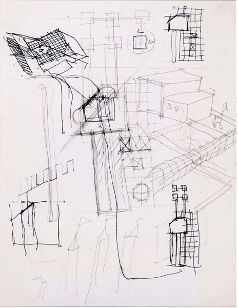
Rossi, Aldo (1931–1997)
Perspective sketches, sketch plans, and detail sketches for the Centro Direzionale, Florence, 1977, Canadian Centre for Architecture, DR 1987; 0152, 29.7 × 21cm, Blue ballpoint pen and black felt tip marker on glossy white paper
Aldo Rossi left a tremendous amount of thought-provoking sketches representing his design process. These playful sketches were part of intense research and also served as a method to facilitate his imagination (Rossi, 2000).
Rossi was born in Milan and attended the Milan Polytechnic, graduating in 1959. Upon leaving school, he became an assistant to Ludovico Quaroni at the School of Urban Studies in Arezzo. Also in 1959, Rossi joined the Il Contemporanco editorial staff, becoming editor of Casabella in 1964. Beginning his architectural career with competitions, theoretical, and small projects, he also held positions in academia – professor at the Milan Polytechnic, the Federal Polytechnic of Zurich, and the University of Venice. Serving as visiting professor in such schools as Cornell, Cooper Union, Yale, and Harvard, Rossi questioned paradigms of architecture and the city. He published his first book, The Architecture of the City, in 1966 (Rossi, 1981).
Rossi's architecture references recurring themes of ritual and memory. He felt strongly about place as a regional, cultural, and yet global concept (Rossi, 1981). Rossi received the Pritzker prize for architecture in 1990 in consideration of his body of work, including the Cemetery of San Cataldo, Modena, Italy (1971); Teatro del Mondo, Venice (1979); Civic Center, Perugia, Italy (1982); Carlo Felice Theater, Genoa (1983); and Center for Contemporary Art, Vassiviére, France (1988).
Rossi's vast number of published sketches demonstrate how he utilized images in the process of design and as a dialogue between the past and the future. These pages are layered with elevations, bird's-eye axonometric views, and distorted perspectives, constantly utilizing the sketch to enforce multiple viewpoints (Rossi, 2000). Many of the sketches, as part of complete pages, intersect and overlap with these views. Rendered in color with active, fast lines, the sketches often include full context and become dense conglomerations of cities. Paolo Portoghesi writes that Rossi's interest in viewing a design from many angles stems from an idea of torsione, or twisting. This use of torsione, was ‘a means of maintaining contact with memories without abandoning them’ (Rossi, 2000, p. 13).
This sketch (Figure 7.18) reflects the playful nature of Rossi's design process. The page contains axonometric, plan, and plan/oblique sketches, all oriented to provide multiple views. The images show two types of pen, one lighter in tone, and the other facilitating a free flow of ink and rendering a darker line. Here, a second layer refined his first thoughts and acted as guidelines, encouraging a level of critique. Several of the brief plans have been dimensioned or reinforced to show he studied them more thoroughly than others. At the bottom of the page has been placed three slender towers topped with fully extended flags and a door piercing a crenellated wall. The largest axonometric, describing two adjacent buildings, has been flanked by a yard appearing to contain a giraffe or a horse.
The cube-shaped plan/oblique to the upper left has been detailed with a pediment over the door, a cut corner, and a long walkway. The building appears surprisingly like an animal, especially since it was given two blue ink eyes. The remainder of the page has been left relatively monochromatic, accenting the eyes. Perhaps as Rossi was sketching the small structure, with its corner cut ears and the pediment nose, he could not resist adding a circle to enhance the nose and two blue eyes. This page reflects Rossi's strong sense of architecture as being permeated with memories and evoking associations.
NOTES
1. Suggested by Dr. Marco Frascari in a seminar at Georgia Institute of Technology, Atlanta, Georgia, USA, in the late 1980s.
2. Another example of a theoretical concept introduced by Dr. Marco Frascari.
3. Biographical information on Takeo Yasui provided by So Hatano, Researcher at the Tokyo Institute of Technology, Japan.
4. Information provided by The National Archives of Australia.
5. Paulina Villanueva kindly sent me a series of sketches describing the early phases of this project. She explained that Villanueva considered proportions at this early stage. Since she was given the task to translate the sketched thought into a drawing, she questioned the preciseness of his sketch. Paulina writes that he took out a wooden ruler and showed her the precise measurements of the sketch.
6. Background information about this sketch provided by the archives of the Canadian Centre for Architecture, Montreal.
BIBLIOGRAPHY
Allen, G. (1980). Charles Moore. Whitney Library of Design.
Altherr, A. (1968). Three Japanese Architects, Mayekawa, Tange, Sakakura. Verlag Arthur Niggli AG/Teufen.
Andersson, H.O. and Bedoire, F. (1986). Swedish Architecture Drawings 1940–1970. Byggförlaget.
Baker, G.H. (1996). Le Corbusier: The Creative Search. Spon.
Berdini, P. (1985). Walter Gropius. Nicola Zanichelli Editore.
Blaser, W. (1965). Mies van der Rohe. Praeger.
Blaser, W. (1997). Mies van der Rohe. Birkhäuser Verlag.
Bognar, B. (1996). Togo Murano: Master Architect of Japan. Rizzoli.
Busignani, A. (1973). Gropius. Hamlyn.
Cohen, J-L. (1996). Mies van der Rohe. E & FN Spon.
Constant, C. (1994). The Woodland Cemetery: Toward a Spiritual Landscape, Erik Gunnar Asplund and Sigurd Lewerentz 1915–61. Byggförlager.
Constant, C. (2000). Eileen Gray. Phaidon.
Constant, C. and Wang, W. eds (1996). Eileen Gray: An Architecture for all Senses. Deutsches Architecktur Museum/Harvard University Press.
Cook, J.W. and Klotz, H. (1973). Conversations with Architects. Praeger.
Cruickshank, D. ed. (1988). Erik Gunnar Asplund. The Architect's Journal.
De Long, D.G. ed. (1996). Frank Lloyd Wright: Designs for an American Landscape, 1922–32. Harry N. Abrams/ Canadian Centre for Architecture/Library of Congress/Frank Lloyd Wright Foundation.
De Long, D.G. ed. (1998). Frank Lloyd Wright and the Living City. Vitra Design Museum/Skira Editore.
Drexler, A. (1960). Ludwig Mies van der Rohe. George Braziller.
Drexler, A. ed. (1986). An Illustrated Catalogue of the Mies van der Rohe Drawings in the Museum of Modern Art. Garland Series.
Eisenman, P. (2003). Giuseppe Terragni: Transformations Decompositions Critiques. Monacelli Press.
Fernie, E.C. (1995). Art History and Its Method: A Critical Anthology. Phaiden Press.
Fitch, J.M. (1960). Walter Gropius. George Braziller.
Fleig, K. and Aalto, E. (1995). Alvar Aalto, Volumes 1–3. Birkhäuser.
Frampton, K. and Futagawa, Y. (1983). Modern Architecture 1851–1945. Rizzoli.
Giurgola, R. and Mehta, J. (1975). Louis I. Kahn. Westview Press.
Hecker, S. and Müller, C.F. (1993). Eileen Gray: Works and Projects. Editorial Gustavo Gill.
Hewitt, M. (1985). Representational Forms and Modes of Conception. Journal of Architectural Education, 39/2.
Holmdahl,G., Lind, S.I. and Ödeen, K. eds (1950). Gunnar Asplund Architect 1885–1940:Plans Sketches and Photographs. AB Tidskriften Byggmästaren.
Isaacs, R. (1991). Gropius. Little, Brown and Co.
Izzo, A. and Gugbitosi, C. (1981). Frank Lloyd Wright: Three-quarters of a Century in Drawings. Horizon Press.
Jencks, C. (1973a). Le Corbusier and the Tragic View of Architecture. Harvard University Press.
Jencks, C. (1973b). Modern Movements in Architecture. Anchor Books.
Johnson, E.J. ed. (1986). Charles Moore: Buildings and Projects 1949–1986. Rizzoli.
Júlbez, J.M.B., Palomar, J. and Eguiarte, G. (1996). The Life and Work of Luis Barrágan. Rizzoli.
Kahn, L.I. (1975). Light is the Theme: Louis I. Kahn and the Kimbell Art Museum. Kimbell Art Foundation.
Kahn, L.I. (1981). Drawings/Louis I. Kahn. Access Press/Max Protetch Gallery.
Kahn, L.I. (1987). The Louis I. Kahn Archive. Personal Drawings: The Complete Illustrated Catalogue of the Drawings of Louis I. Kahn. University of Pennsylvania/Pennsylvania Historical and Museum Commission.
Kahn, L.I., Scully, V.J. and Holman, W.G. (1978). The Travel Sketches of Louis I. Kahn. The Academy.
Kaufmann, E. and Raeburn, B. (1960). Frank Lloyd Wright: Writings and Buildings. Frank Lloyd Wright Foundation/Meridian.
Keim, K. ed. (1996). An Architectural Life: Memoirs and Memories of Charles W. Moore. Little, Brown and Co.
Kultermann, U. (1960). New Japanese Architecture. Praeger.
Latour, A. ed. (1991). Louis I. Kahn: Writings, Lectures, Interviews. Rizzoli.
Le Corbusier (1981). Le Corbusier Sketchbooks, Volumes 1–4. The Architectural History Foundation, MIT Press and Foundation Le Corbusier.
Littlejohn, D. (1984). Architect: The Life and Work of Charles W. Moore. Holt, Rinehart and Winston.
Lobel, J. (1979). Between Silence and Light: Spirit in the Architecture of Louis I Kahn. Shambhala.
Lyndon, D. (1994). Chambers for a Memory Place. MIT Press.
Reynolds, J.M. (2001). Maekawa, Kunio and the Emergence of Japanese Modernist Architecture. University of California Press.
Nerdinger, W. (1985). Walter Gropius. Bauhaus-Archiv/Busch-Reisinger Museum.
Nerdinger, W. ed. (1999). Alvar Aalto: Toward a Human Modernism. Prestel Verlag.
Pearson, P.D. (1978). Alvar Aalto and the International Style. Whitney Library of Design.
Pevesner, N., Richards, J.M. and Sharp, D. (2000). The Anti-Rationalists and the Rationalists. The Architectural Press.
Quantrill, M. (1983). Alvar Aalto: A Critical Study. Schocken Books.
Richards, J.M., Pevsner, N. and Sharp, D. eds (2000). The Anti-Rationalists and the Rationalists. The Architectural Press.
Román, A. (2003). Eero Saarinen: An Architecture of Multiplicity. Princeton Architectural Press.
Rossi, A. (1981). A Scientific Autobiography. Oppositions Books/MIT Press.
Rossi, A. (2000). Aldo Rossi: The Sketchbooks, 1990–1997. Thames and Hudson.
Rossi, A. edited by Adjmi, M. (1991). Aldo Rossi: Architecture, 1981–1991. Princeton Architectural Press.
Roth, L.M. (1979). A Concise History of American Architecture. Harper and Row.
Ruusuvuori, A. ed. ( 1981). Alvar Aalto, 1998–1976. Museum of Finnish Architecture.
Saarinen, E. edited by Saarinen, A. (1962). Eero Saarinen on His Work. Yale University Press.
Schildt, G. (1989). Alvar Aalto: The Mature Years. Rizzoli.
Schulze, F. (1985). Mies van der Rohe: A Critical Biography. The University of Chicago Press.
Schulze, F. ed. (1989). Mies van der Rohe: Critical Essays. The Museum of Modern Art.
Schumacher, T.L. (1991). Surface and Symbol: Giuseppe Terragni and the Architecture of Italian Rationalism. Princeton Architectural Press.
Smith, C.B. (1967). Builders in the Sun: Five Mexican Architects. Architectural Book Publishing.
Smithson, A. and P. (2001). The Charged Void: Architecture. Monacelli Press.
Stewart, D.B. (1987). The Making of a Modern Japanese Architecture, 1868to the Present. Kodansha.
Suzuki, H., Banham, R. and Kobayashi, K. (1985). Contemporary Architecture of Japan, 1958–1984. Rizzoli.
Trachtenberg, M. and Hyman, I. (1986). Architecture: From Prehistory to Post-Modernism. Abrams.
Turnbull, J. and Navaretti, P.Y. (1998). The Griffins in Australia and India: The Complete Works and Projects of Walter Burley Griffin and Marion Mahony Griffin. The Miegunyah Press.
Turner, J. ed. (1996). The Dictionary of Art. Grove.
Tyng, A. (1984). Beginnings: Louis I. Kahn's Philosophy of Architecture. Wiley.
Tzonis, A. (2001). Le Corbusier: The Poetics of Machine and Metaphor. Universe.
Tzonis, A. gen. ed., Nerdinger, W. ed. (1990). The Walter Gropius Archive, Volumes 1–4. Garland Publishing/ Harvard University Art Museums.
Van Vynckt, R. ed. (1993). International Dictionary of Architects and Architecture. St. James Press.
Villanueva, P. and Pintó, M. (2000). Carlos Raúl Villanueva. Princeton Architectural Press.
Walden, R. ed. (1997). The Open Hand: Essays on Le Corbusier. MIT Press.
Wrede, S. (1980). The Architecture of Erik Gunnar Asplund. MIT Press.
Wright, F.L. (1953). The Future of Architecture. Horizon Press.
Yoshida, Y. ed. (1983). Louis I. Kahn: Conception and Meaning. A+U, Architecture and Urbanism.
Zanco, F. ed. (2001). Luis Barrágan: The Quiet Revolution. Skira, Barragan Foundation/Vitra Design Museum.
Zevi, B. (1980). Giuseppe Terragni. Zanichelli Editore.