Chapter 23
Gothic Script in England c.1300–1500
Gothic in England 1300–1400
The term “Gothic” can be misleading. As recently stated, “It refers (or should refer) not to a group of scripts, or even a category of script, but to a prevailing attitude towards what constituted elegance in handwriting, and the features of style that produced it.”1 Now often loosely applied to all handwriting of the so-called “Gothic period” (1200–1500), it originated among the early Italian humanists as a derogatory term and was introduced into English by the diarist John Evelyn (1620–1706). In the not so recent past “Gothic,” when applied to handwriting, was often taken to specify the script known as Textura (as it still does on the website of Digital Scriptorium, http://www.columbia.edu). Textura or text hand (from the Latin texere, “to weave,” because the letters look as if woven together), had evolved from the twelfth-century set book hand (“Protogothic”) and by the first quarter of the fourteenth its letterforms were fully developed.
The most obvious features of Textura are the angularity of its letterforms and its lateral compression. This angularity can be seen in the pointed arches at the tops of the minims, m and n, in the lozenge shape of the letter o, and in the stem of t, which instead of curving at the foot was broken where the pen changed direction on the page. The space between letterforms was much reduced. This was achieved by the fusion or “biting” of adjacent bow strokes wherever they occurred, so that we find the linking together of letters such as be, pa, de, and do. Although d with an upright ascender was maintained in this script for a long while, it was gradually abandoned in favor of the round-backed form, since it was difficult to make bitings with an upright ascender. Other characteristic features of Textura are the two compartment a, and the use of a two-shaped r after the letters b, d, h, and p as well as o. The space between lines was greatly reduced, with shortened ascenders and descenders, g hardly coming below the line. Plate 23.1 (Columbia University Rare Book and Manuscript Library, Plimpton MS 028A recto),2 a single leaf from a mid-fourteenth-century Bible, written perhaps for the nuns of the convent of St. Radegund, Cambridge, provides an example of a typical page. Note “bellator” (col. 1, line 2), “cadent” (col. 1, line 3) “obprobrium” (col. 1, line 6), and “egressus” (col. 2, line 8).

Plate 23.1 Columbia University Rare Book and Manuscript Library, Plimpton MS 028A recto.
The appearance of a page written in Textura, a script where letterforms were pointed and broken wherever possible, thus looked completely different from one written in the round and open “Protogothic.” The ductus (a combination of the angle at which the nib was cut, the quill was held, and the sequence of strokes making up a letter) led to a regular alternation in Textura of thick and thin strokes producing a graphic image which remained fashionable until the end of the Middle Ages. Four different grades of Textura existed, distinguished by their different treatment of the feet of the minims. The fragmentary remains of a poster displayed by an early fourteenth-century Oxford writing master exhibits each of these grades, although it gives no names to them.3 The adjectives used today to qualify the term Textura, prescissus, quadrata, semi-quadrata, and rotunda, are derived from fifteenth-century continental writing masters.
The oldest and most prestigious grade was prescissus (“cut off”) or sine pedibus (“without feet”) in which the minims have no serifs at their feet but end flat on the writing line. This variety, seen in a number of psalters produced in East Anglia, reached its apogee in the famous Luttrell Psalter (London, BL, Add. 42130), commissioned sometime in the second quarter of the fourteenth century by Sir Geoffrey Luttrell, a wealthy Lincolnshire landowner (d. 1345).4 It was time-consuming and expensive to produce a volume in this script and quadrata (“square”) came to be preferred, although it too could be costly. It took the scribe Thomas Preston two years to copy a missal for Abbot Litlyngton of Westminster (d. 1386) and cost the abbot £4 for Preston’s board and lodging over that time. In quadrata the minims are finished with diamond-shaped serifs, as in the recently discovered Macclesfield Psalter, also produced in the second quarter of the fourteenth century.5 During the century prescissus was gradually replaced by quadrata, the grade which survived into the age of the early English printed book as “black letter” type. The third variety was known as semi-quadrata (“semi-square”) where some of the minims had lozenge-shaped feet and others did not; this was often used for academic texts for much of the century,6 but the increasing number of longer texts to be copied led to its deterioration. Finally, one encounters rotunda (“round”), where the minims were finished with a simple upward flick of the pen. Texts in Middle English were written in one of these last two varieties before Anglicana came to be widely adopted.7
In the course of the fourteenth century English scribes increasingly began to employ a script to copy books that had evolved from the everyday “business” or cursive handwriting of twelfth- and thirteenth-century documents. Until the twelfth century there had been no difference in the script of books and documents, but with the increasing bureaucracy of the Norman state, the growth of towns and trade, and the rise of the legal profession, the pressure was on copyists to produce documents much more quickly than before. The work rate demanded of them led to a modification of letterforms such that by about 1230 many documents and registers were being written in a fully developed documentary script, for which the palaeographer Neil Ker adopted the name Anglicana.8 Medieval people did not attempt to categorize different models of handwriting in the analytical terms that some modern scholars do, but they did recognize different national hands. Thus, for them, Anglicana or “English letters” denoted different scripts at different times. Among the books Cardinal Guala Bicchieri, papal legate in England 1216–18, left to S. Andrea, Vercelli, in 1227 were a Bible and homiliary both in “littera Anglicana.”9 Given the date and the contents of these volumes, they must have been in the monumental set book hand of an age Ker characterized as the “greatest in the history of English book production.”10 On the other hand, when Joan de Walkingham of Ravensthorpe, Yorkshire, (d. 1346) left “quemdam librum scriptum littera Anglicana,” as distinct from a psalter “cum littera grossa,” she surely referred in the first instance to a book in the cursive book hand we today call Anglicana.
The key features of Anglicana are two-compartment a, d with a looped ascender, an “8”-shaped two-compartment g, long r whose stem descended below the general level of the letterforms, and the cursive capital form of final s.11 The Statuta Vetera, a collection of ancient statutes from Magna Carta (1215) to the end of Edward II’s reign in 1327, was an essential text for a lawyer to own. A copy dating from around the turn of the fourteenth century is written in the characteristic hand of the period (Plate 23.2, Plimpton MS 272, fol. 73v), with elaborate forked ascenders (l in “Gloucestr,” line 6; b in “pa-ciebantur,” line 8), r with a pronounced shoulder stroke (“regno,” line 7), and the heavy oblique downstroke of the looped ascender of d (“apud,” line 6). The limb of the letter h (as in “exheredacionem,” line 7) barely descends below the level of the other letters. The features of this type of handwriting changed frequently, and hence it proves much easier to date than Textura. In a copy of the Wycliffite New Testament from Norwich Cathedral Priory (Plate 23.3, Plimpton MS 03, fol. 3), written around the end of the century or beginning of the fifteenth, the elaborate forked ascenders have disappeared, the letter r has lost its shoulder stroke but the connecting stroke between its descending stroke and the following letter is prominent (“marie,” col. 2, line 1, “crist,” col. 1, line 5), and the limb of h now descends well below the level of other letterforms to avoid any possible confusion with the letter b (“housbond,” col. 1, line 2, “whiche,” col. 1, line 3). And at the turn of the century the shaft of t is just beginning to protrude above the head stroke (compare “þat,” col. 1, line 4 with “vnto,” col. 1, line 7).
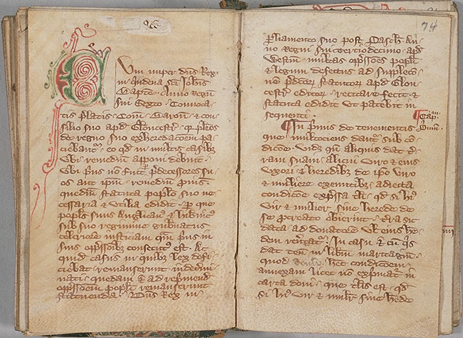
Plate 23.2 Columbia University Rare Book and Manuscript Library, Plimpton MS 272, fols 73v–74.
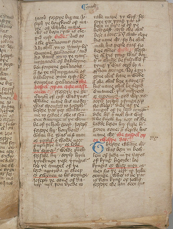
Plate 23.3 Columbia University Rare Book and Manuscript Library, Plimpton MS 03, fol. 3.
The adoption of Anglicana as a script in which books could be copied reflects the growth of literacy among the laity.12 This was the current handwriting (written with a running pen so that letterforms were joined up) that merchants and lawyers had become accustomed to in the course of conducting their day-to-day business, both as readers and writers. While reading and writing are separate skills, it is possible (as Michael Clanchy has suggested)13 that medieval children learned to read and write from their primers. The primer, a book which Chaucer’s “little clergeon” studied at school, opened with the sign of the cross and was followed by the letters of the alphabet, the Lord’s Prayer, the Hail Mary, and Creed (the basic articles of faith that every Christian should know). When a child had mastered the alphabet and learned to read and memorize the following prayers, he could use his primer as a copybook, learning to make his letters in imitation of the alphabet at its beginning. The survival rate of primers is poor, as they were read until worn out, but one that does survive, a rare late-fourteenth-century example with the prayers written in Middle English, is written in Textura.14 Whether or not at some stage primers provided copy for children to learn to write from, wax tablets would presumably have been used to practice one’s letters, as they were at Lübeck, Germany.15 While no such tablet with practice alphabet is known to have survived from England, a twelfth-century slate with the alphabet incised on one side and the Lord’s Prayer on the other has survived from Hastings, Sussex, and early fifteenth-century slates from medieval Scotland also contain examples of someone practicing the formation of letters.16 In scratching one’s letters into wax or incising them onto slate, it would be impossible to write a set hand like Textura – much easier to use the cursive hand that documentary scribes used. The clumsy way that some scribes, such as the London alderman Arnald Thedmar (d. 1275), or the scribe of a late-thirteenth-century compilation of Latin, French, and Middle English texts stab at their letters seems to reflect scribes accustomed to writing on wax.17
Scribes soon began to feel the need to produce a more dignified version of the script than basic Anglicana when copying books. As with Textura there were different grades of Anglicana depending on the degree of formality with which it was written. In the basic grade the letter m was formed with a single multiple stroke, but in the more formal grade, “formata,” the pen was lifted between strokes and the minim often furnished with feet. The distinction between these two grades arose from that made between the enrolling hand (that is, the more hurried and less careful handwriting used in writs and office copies of documents issued) and the engrossing hand (employed for more important documents such as charters or letters patent).18 As once scribes had deployed a hierarchy of scripts to distinguish titles, chapter divisions, and other divisions in a text, so now scribes deployed these different grades of Anglicana to distinguish titles or quotations within a text. A page from a late-fourteenth-century copy of a Latin translation of Euclid’s Elements with the commentary of Campanus of Novara (d. 1296) shows how the different sizes of the handwriting helped the reader to distinguish immediately between Euclid’s text and Campanus’s commentary (Plate 23.4, Plimpton MS 160, fol. 10), as today we might use different sizes of font. In the formata, the larger square hand, the short s does not protrude above the general level of the other letters (“partis,” line 6) and the minims are furnished with feet (m in “ipsam,” line 6) in contrast to these letterforms in the commentary. An even more formal grade of Anglicana, Bastard Anglicana, emerged in the middle of the century, better spaced and with greater attention to calligraphic details. It is called a “Bastard” hand because it incorporates features derived from a “noble” script, that is Textura (with “bitings” and a straight-sided two-compartment a) and a “base” cursive script, Anglicana.19

Plate 23.4 Columbia University Rare Book and Manuscript Library, Plimpton MS 160, f10.
Toward the end of the fourteenth century, scribes began to use a third script, called Secretary after its descendant, the Tudor and Stuart “secretary hand,” published in the first writing manual printed in England, 1571.20 Secretary was also a cursive hand but, unlike Anglicana, it had not evolved from a native script but was imported from France. There it had developed from the version of the Italian “scrittura cancelleresca” used by scribes employed at the Papal Chancery at Avignon. The influence of French cultural models helped the new script’s diffusion throughout Europe.21 It was adopted by English messengers on business in France, and first appears in episcopal registers and in documents issued under the Royal Privy Seal because most Privy Seal documents were written in French during the fourteenth century.22 The introduction of Secretary brought a new style of penmanship to England. Instead of the curved strokes of Anglicana, Secretary had broken ones traced in different diagonals: as seen in the diamond-shaped single compartment a, the broken lobes of the letters d, q, and o, and the stems of c and e. Key features of Secretary are the form of a, a single compartment g with a lobe traced like a and a tail stroke, short r with a thin shoulder stroke rising from the bottom of the stem (sometimes r could almost be mistaken for a “v”); and a kidney-shaped final s at the end of words. It was not, however, until the fifteenth century that it began increasingly to be used by those who copied books as well as those who copied documents. As with Anglicana the emergence of Secretary was an important development in the history of English book production, promoting the emergence of less expensive books for the growing reading public among laymen and women in the fifteenth century.
Gothic in England 1400–1500
In the fifteenth century, English scribes basically had the choice of three different scripts, Textura, Anglicana, and Secretary, depending on the kind of text they copied. Textura, the most imposing in appearance, was employed in copies of the Bible, liturgical manuscripts, and Books of Hours. It was also used where text was on display in the public arena, such as the lettering on monumental brasses, inscriptions in stained glass windows, and on posters. A petition by John Elvet, archdeacon of Leicester 1392–1405, complains that one John Belgrave had defamed his official, Walter Barnack, by fixing “priuement et maliciousement vn bille escript de mayn de texte” to the door of St. Martin’s church, Leicester. The petition itself, however, is written in the new Secretary script.23
Fifteenth-century Textura was written with “almost mechanical precision.”24 Letterforms were taller and stiffer than in the previous century such that a page consisted of lines of writing with letterforms consisting of upright heavy thick strokes. This resulted in a pattern on the page of “chiaroscuro” (light and shade).25 The serifs at the tops of letters and the feet of the minims bound letters together within a word and helped to discourage the reader from skipping inadvertently from one line of text to the next (eye-skip is a common cause of textual error). Already in the fourteenth century scribes had begun to link the head and feet of letters (as is very evident on monumental brasses). The ornamental nature of the script was further emphasized by adding otiose hairline strokes to letters at the end of words.
Since Textura is a calligraphic script that had become so stylized and uniform, the decoration of a manuscript can be a more helpful indicator in assigning a date to it than its handwriting. Few medieval manuscripts were precisely dated by their scribes, so unless content provides internal evidence as to when a book was written or there is some external evidence (for instance, an owner’s coat of arms), the scholar has to make an educated judgment based on a manuscript’s script or decoration. Along with greater scribal precision in writing Textura had come a greater interest in the appearance and layout of the page. While Textura had crystallized, artistic style had not, and art historians can discern change and development in the decorative style of miniatures and the use of motifs in the borders that frequently decorate manuscripts written in Textura.26
Textura, deemed the most prestigious of the three available scripts, was the script thought appropriate for copies of the Bible. In the late fourteenth century the first complete English translation of the Bible emerged, attributed to the theologian and religious reformer, John Wyclif (d. 1384), or to his followers. Despite the later prohibition by Thomas Arundel, archbishop of Canterbury (d. 1414), against this translation, some 250 copies of the Wycliffite Bible survive. In several manuscripts of the early version of the text the scribes preferred to use Anglicana (Plate 23.3, Plimpton Add MS 03, fol. 3),27 but for the later version Textura became standard.28 The choice of the latter, the script of Latin bibles, presumably was preferred in order to make a suspect text look authoritative. Hence a copy of the later version of the Wycliffite New Testament written c.1420 (Plate 23.5, New York, New York Public Library, NYPL MA 066, fol. 260v). In both specimens, as well as the letters of the Latin alphabet, the scribe has used the Runic letter þ (“thorn”) in words like “þe” (Plate 23.3, col. 1, line 2; pl. 5, col 1, line 4) and “þat” (col 1, line 7).
Plate 23.5 New York, New York Public Library, NYPL MA 066, fol. 260v.
When writing English, as well as “thorn” for “th” many scribes also used “yogh” (descended from the Insular form of g used by Anglo-Saxon scribes) for both “g” Plate 23.5, col. 1, line 8 “3eue”) and “gh” (Plate 23.5, col. 2, line 9 “si3t”). Because of these orthographic alternatives an early fifteenth-century compiler of a concordance to the Wycliffite New Testament felt it necessary to explain to the reader that he would find words beginning with þ in his copy under “th” in the concordance, while words beginning with yogh, since it is “figured lijk a zed,” were under z.29
It was not only in Textura manuscripts that the appearance of the page was important. From the late fourteenth and in the first half of the fifteenth century scribes frequently employed Anglicana Formata in vernacular manuscripts, which were increasingly in demand as a result of rising literacy among the laity. Several copies of John Gower’s Confessio amantis were produced in the early fifteenth century by the same scribe, who seems to have been a full-time copyist, since he also copied Chaucer’s Canterbury Tales, Piers Plowman, and John Trevisa’s translation of Bartolomaeus Anglicus’ De proprietatibus rerum.30 He wrote a careful and disciplined hand (Plate 23.6, Plimpton MS 265, fol. 135) that shows some influence of the recently introduced Secretary script in the broken lobe strokes of letters such as d and o and in the use of kidney-shaped final s (“answerd,” col. 1, line 3; “goode,” col. 2, line 3; “þis” and “Manachas,” col. 1, line 2). The shaft of t now protrudes above the headstroke (that is, t is now written with a cross bar), and in this larger squarer version of Anglicana the round-backed d has acquired a more upright back (“deþ,” col. 2, line 1). The layout is carefully planned to help the reader find his or her way around the text with filled lombards at minor divisions of the text and the Latin gloss in the second column (lines 5–7) and the marginal commentary written in red.
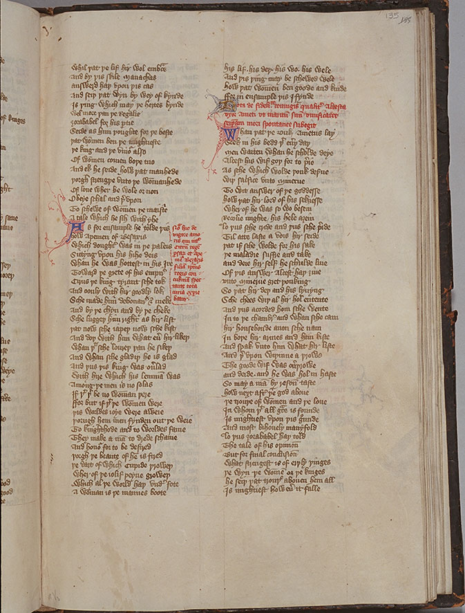
Plate 23.6 Columbia University Rare Book and Manuscript Library, Plimpton MS 265, fol. 135.
In another copy of the text (Cambridge, Trinity College, MS R.3.2) the scribe worked with four others, including the scribe who copied both the Ellesmere manuscript of the Canterbury Tales, illustrated with portraits of the pilgrim-narrators, and the more workaday Hengwrt manuscript of the text . He too employs Anglicana Formata.31 The lack of coordination between the different scribes’ stints and the absence of any evidence of overall supervision in the Trinity manuscript provides important evidence for our understanding of the organization of the medieval book trade. The scribes are likely to have been independent craftsmen living in the same neighborhood (in London this was Pater Noster Row, near St. Paul’s Cathedral) who could call on one another’s help in producing a volume, rather than working together in a single scriptorium or workshop.
Anglicana was increasingly influenced by Secretary script. A copy of Trevisa’s translation of the popular encyclopedia, De proprietatibus rerum by Bartholomaeus Anglicus, owned by Sir Thomas Chaworth, M.P. for Nottinghamshire (d. 1459) is one of three surviving books shown to be Chaworth’s by the presence of his coat of arms (Plate 23.7, Plimpton MS 263, fol. 299v). They are all professional and expensive productions, but whereas the “Wollaton Antiphonal,” as a liturgical book, is written in Textura, his Trevisa, being in the vernacular, is in Anglicana Formata, dating from the second quarter of the century.32 Secretary influence can be seen here in the angular broken strokes of letters such as d and o, the simplified form of w (“what,” line 3 and “when,” line 6, as opposed to the more complex form in “ichewed,” line 6), the use of short r (“first,” line 1), and the horns (small projecting strokes) that occur where the pen changes direction on the page (for example, e in “lasse,” line 4 or g in “restynge,” line 2). Sir Thomas’s will survives and mentions several other books, some for his chapel and others in English, but they cannot now be identified.
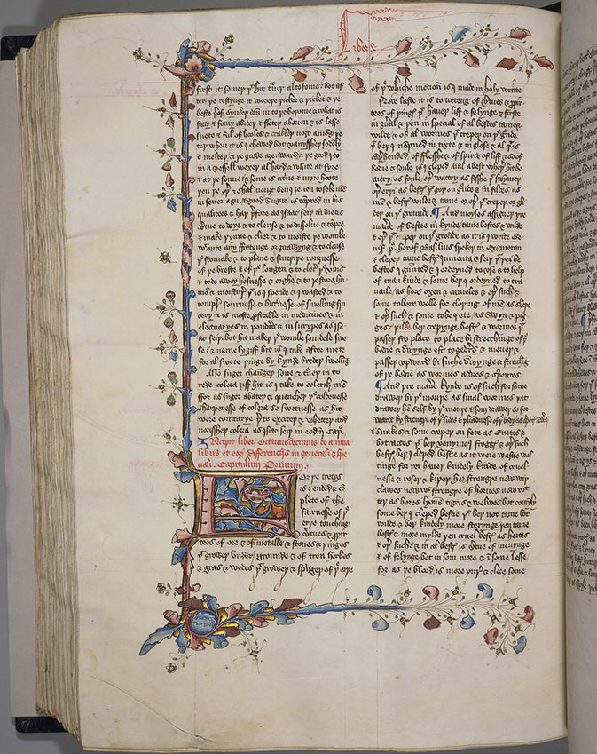
Plate 23.7 Columbia University Rare Book and Manuscript Library, Plimpton MS 263, fol. 299 v.
Toward the end of the century the handwriting of scribes writing Anglicana can often convey an impression of irregularity. A page from a commonplace book (Plate 23.8, Plimpton 259, fol. 39v) presumably written for his own use by the scribe is not written with any concern for calligraphy, although it is provided with a fine strapwork initial. The writing sprawls across the page, and the size and proportion of individual letters vary (compare w in “whan” with that in “two,” line 6), while descenders frequently trail into the letters of the line below (as r in “fowre,” line 4, “numbrys,” line 6; y in “wretyn,” line 15).

Plate 23.8 Columbia University Rare Book and Manuscript Library, Plimpton MS 259, fol. 39 v.
By the middle of the fifteenth century Secretary had been adopted for copying vernacular texts. Already the poet Thomas Hoccleve had produced a volume of his poetry in it for presentation to Joan, Countess of Westmorland, sometime between 1422 and 1426.33 Hoccleve, as an official in the Privy Seal Office, was accustomed to writing documents in French and so this script would come naturally to him. However, it would not make sense to give Joan a book copied in Secretary, although his hand is firm and clear, if she or someone in her household had not also become accustomed to it, perhaps through checking accounts or receiving incoming missives.
Malcolm Parkes has called attention to the importance of the influence of fashion on later medieval handwriting.34 By the time a copy of Lydgate’s Fall of Princes (Plate 23.9, Plimpton MS 255, fol. 25v) came to be copied in the mid- to later fifteenth century English scribes and readers had become familiar with the kind of current handwriting found in French books through manuscripts brought back home by those returning from the English occupation of France. An awareness of French attitudes to style and decorum in books “initiated new trends in fashion among English scribes and their patrons…. Commercial scribes seem to have regarded handwriting influenced by Lettre courante as an economical, yet stylish book hand particularly appropriate for copies of vernacular texts, and used it throughout the rest of the century.”35 A more up-market variety was influenced by Lettre bastarde, as seen in this copy of the Fall. The hand splays across the page, the forward slant indicating the speed with which it was written. French influence is seen in the short curved ascenders finished with small loops (for example, k in “took,” and h in “him” col. 1, line 1) and the long, tapering descenders (p in “pepill,” col.1, line 2, f in “deifei,” col. 2, line 2, and long s in “rehersith” col.1, line 5). A distinctive form of the letter g with its tail ending in a crescent-shaped curve enables the identification of this scribe in two other copies of the text, as well as a copy of the Canterbury Tales.36 Although this copy has many leaves missing, those that remain are eye-catching, with gold initials marking major divisions in the text.
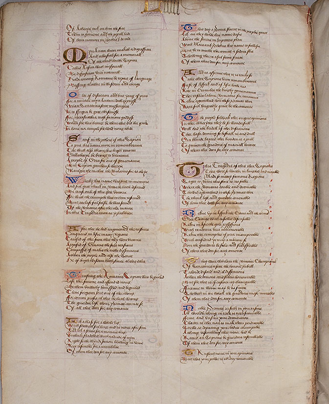
Plate 23.9 Columbia University Rare Book and Manuscript Library, Plimpton MS 255, fol. 25v.
However, many scribes in the later fifteenth century adopted a more “pick and mix” approach to handwriting, that is, graphs appropriate to Anglicana and Secretary could be employed together within an individual’s repertory of letterforms. A scribe’s decision to use one form rather than another was a matter of choice; hence the composition of such mixed hands varied. A copy of the Nova Statuta (containing the Statures of the Realm from the reign of Edward III and continued up to various dates in various copies) was a required volume for lawyers. Although one’s initial impression is that the copy seen here dating from the second quarter of the fifteenth century (Plate 23.10 Plimpton 273, fol. 53v) looks as if it were written in Secretary with the pronounced spiky appearance of the hand, apart from a pronounced preference for the single compartment Secretary a (“cas,” line 1, “hastiment,” line 4) as opposed to the Anglicana form (“contrarie,” line 11), other letterforms belong to Anglicana: long r (line 5 “remedie”), g (“ordeigner” lines 4–5, “beignent,” lines 10–11), and sigma-shaped final s (“freres,” line 3). An Index to the Statutes of the Realm (Plate 23.11 Plimpton Add MS 03, fol. 4v), on the other hand, appears written in small neat Secretary typical of the mid-fifteenth century with small looped ascenders, though on closer inspection it can be seen that both Secretary and Anglicana features occur. Thus the scribe uses the Anglicana long r (“caried,” line 3; “from” line 5) alongside Secretary short r (“Chauncerye,” line 1; “caried,” line 2); Anglicana two-compartment g (“alleggyd,” line 10) alongside a Secretary g that looks like a “y” with a flat top and protruding horns (“passage,” line 12). However, he appears consistently to use the Secretary form of a. The letter v has a heavy approach stroke both initially and in the middle of a word (“vitail,” line 2; “avauntage,” line 24).
Plate 23.10 Columbia University Rare Book and Manuscript Library, Plimpton MS 273, fol. 53v.
Plate 23.11 Columbia University Rare Book and Manuscript Room, Plimpton Add MS 03, fol. 4v.
Toward the end of the century the scribe of a copy of Walter Hilton’s Scale of Perfection (Plate 23.12 Plimpton 257, fol. 25v) employs Secretary g (“regarde,” line 2), r (“sauter,” line 6), and final s (“þus,” line 6), but consistently prefers Anglicana a (“regarde,” line 2). The ascender of d is no longer looped (“shuld,” line 3), the tall shaft of t now protrudes well above the cross bar (“hit,” line 1, “prophete,” line 8), and v is written with a heavy approach stroke (“voce,” line 10). By now þ looks like a “y” (“þat þei” line 2), and the scribe still uses yogh (“3eueþ,” line 3). The Latin quotation or lemma is written in a rather clumsy Textura.
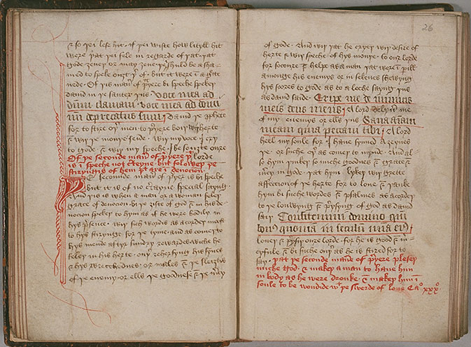
Plate 23.12 Columbia University, Rare Book and Manuscript Room, Plimpton 257, fol. 25v.
However, handwriting was becoming increasingly idiosyncratic, and after William Caxton’s introduction of the printing press to England in 1476 hand-written books gradually ceased to be the normal method of producing and disseminating texts. In the sixteenth century, while Secretary remained in use as the principal script for letters, documents and the occasional book, Anglicana tended to survive only within government offices and the law.37