

Figure 6-47: A time exposure of downtown Los Angeles on a rare clear evening taken using “Standard” (left) and “Autumn” (right). I kind of like the extra reds added to this kind of a shot. The Creative Styles feature just saves you the trouble of doing these kinds of image tweaks in Photoshop later. |
Figure 6-48 The Creative Styles screen allows you to set your own unique style comprised of a collection of image-tweaking variables: color space, contrast, sharpness, and color intensity (saturation). |
Q: “Are all these choices really necessary? Which ones do you use?”
A: Some people love the fact that you can do all these neat things in your camera without ever having to visit your computer later on. I will say that, when combined with other settings (keep reading!), you really can tailor a kind of emotional feel to your subjects using these combinations of settings. But I’m of the “It’s better to make those decisions later in post-processing” school of the thought, so with one exception I don’t really bother with these.
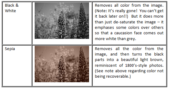
What’s the one exception? B&W mode. When shot in RAW+JPG mode, this allows you to really pre-visualize how your B&W images will come out, and then you can tweak them a further degree in postprocessing by starting with the RAW file and then controlling how each color translates into which shade of grey. It’s a way to get exceptional control over the look of your B&W images, and it’s much more versatile than just shooting with B&W film.
Figure 6-49 Your current Creative Style and its associated tweaks are visible on the main screen (highlighted in yellow). And here is a “before” and “after” shot showing the collective impact of these tweaks. |
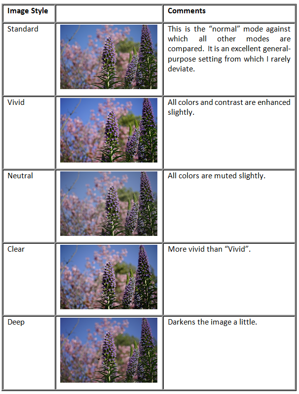
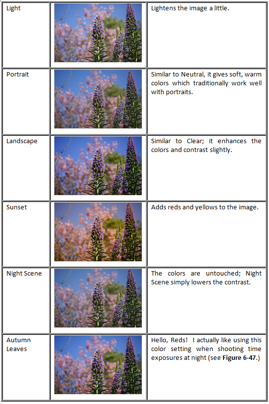
So those are the “Image Styles” (color tweaks). Now pick up your camera and go to MENU -->  5 --> Creative Style (or access it via the Fn menu if it's still there) and scroll down to the last six choices (they’re numbered). Select one of these numbered memory locations, then move RIGHT to highlight the Image Style associated with that memory location. You can then use the UP and DOWN buttons to see them all. Press the center of the multi-selector to select one. These customizable Creative Style slots can be handy in case you want to configure six pre-sets using Autumn color palette (just to give an example).
Okay, time for an illustration. Let’s say you want to modify the Creative Style called “Vivid” so that the images it produces have a little more “punch” right out of the box, so they will look most impressive when you plug your memory card directly into your inkjet printer and say “Here, print these!”. To achieve this effect, you might want to set the Contrast to +2, the Saturation to +1, and the Sharpness to +1 (in addition to getting Vivid’s enhanced colors) to all the pictures you take. Here’s how to achieve this step-by-step:
 5 --> Creative Style --> [Hit “Enter”]. Figure 6-48 is seen.
 ). Once the Contrast icon is highlighted, move UP twice, and watch the icon’s value change to +2.
 ) to +1
 ) to +1.
You can see the changes you’ve made to your Creative Style by looking at the main display screen (Figure 6-49a – yellow box). Just for fun, Figure 6-49b and c shows a “before” and “after” view showing that indeed, a collection of tweaks really can make a subtle yet visible difference.
So that’s the story behind Image Styles and Creative Styles: Image Styles represent color tweaks to the image, while Creative Styles are the camera’s 6 memory locations in which you can store (and instantly recall) combinations of image tweaks, including Image Style, contrast, saturation, and sharpness. On the next page I’ll show you some examples of what the settings do.
Contrast Setting
The first variable you can change after selecting an Image Style is contrast. Contrast is a difficult thing to describe, but you know instantly if your pictures don’t have enough of it. Basically it is “how white are the whites, and how black are the blacks?” If you are going to have your pictures processed at a 1-hour photo lab, then they almost always adjust the contrast for you and there should be no need to change this setting.
Figure 6-50 gives examples.
Figure 6-50 The Contrast setting from -2 to +2. |
This setting increases or decreases the intensity of the colors, adjustable from –2 to +2. See Figure 6-51 for examples.
Figure 6-51 The Saturation setting from -2 to +2. |