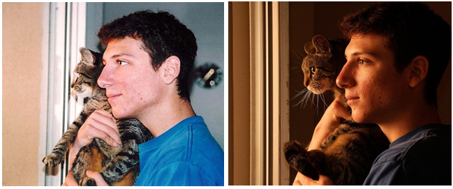
Figure A-7: It’s all about light. The right kind of light can transform an average picture into something remarkable.
Light is everything in photography. It can make the difference between a mere snapshot and a beautiful shot which conveys emotion. To see this, let’s look at the example from Figure A-7.
Both pictures were taken within minutes of each other. The first picture was taken with the camera’s pop-up flash. The second picture captured other available light which added a certain warmth and drama to the picture.
|
Figure A-7: It’s all about light. The right kind of light can transform an average picture into something remarkable. |
Many other examples will be shown throughout the rest of this appendix (and a great example can be found in this blog post: http://bit.ly/1lwRntx), but the upshot is be aware of the quality of the light! Most of us are oblivious to whether light is harsh (like on a bright sunny day) or soft (like on a bright cloudy day), because our brains adapt to bad light in all sorts of amazing ways. But as described in the “Histograms” section a few pages ago, the camera can see less than you can, and so providing the right kind of light for the camera can greatly increase the quality of the shot and, in some cases, help give your images an emotional feel.
The first general rule is, “Soft light from a nearby open window is often best for portraits.” It creates a diffuse light which is quite pleasing to the eye. Figure A-8 provides examples.
Figure A-8: Be on the lookout for diffuse window light. These are examples of the right light creating an ideal picture. |
If you think you’re in a harsh light situation, the best thing you can do is use fill-flash if your subject is within flash range, as in Figure A-9.
Figure A-9: Fill Flash can help! Harsh light like that on the left image can often be made less harsh by using the fill flash (right). |
It’s true that image composition -- how the photographer frames the shot -- which differentiates the "snapshots" from photographic masterpieces. The compositional rule that you are about to learn is used by all artists, even those who do painting and drawing.
Imagine that your viewfinder is divided into thirds (vertically and horizontally), as in the illustration below. The "Rule of Thirds" simply says that if you place your subject close to any of these imaginary lines instead of in the direct center, it will result in a substantially more pleasing picture. (Results are even better if the subject is placed at any intersection of these lines!) Some examples are below.
|
The Frame is divided into thirds, both vertically and horizontally.
|
|
Placing the subject near the lower third (where the yellow line is) makes for great sunsets. |
|