The Users report gives administrators the ability to focus on a particular user or a particular activity, as well as to compare users by selecting different metrics and filters.
Above the account activity report, you will see a dynamic timeline that shows your users' activity through time; this can give you many insights into your team's activities. Click on the name of the metric to see a list with all the available options:

Below the timeline, you will see a dynamic table with aggregate information that will allow you to easily compare your users:
If you click on a column name, the chart will show the timeline for that metric, and you can select the columns on display by clicking on the Select columns  icon (the icon that looks like three gray lines) and choosing the metrics you are looking for.
Since there are so many metrics that you can select, G Suite has selected the three that are usually the most used so you can quickly go to those reports; once there, you can change the active timeline or the visible columns as you see fit.
These are the default activity reports:
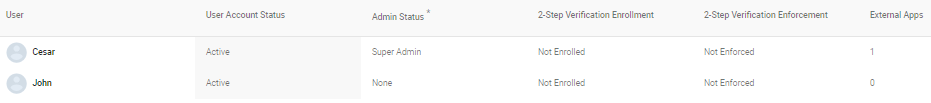
- Account activity: This will show you a table with User Account Status, Admin Status, and 2-Step Verification Enrollment as the default columns. On top you can see a timeline that shows the User Account Status evolution, click on the title to change the metric to Admin Status, or 2-Step Verification Enrollment:

- Apps usage activity: This will show you the Total Storage Used timeline, a table with Total Storage Used, Total Emails, Files added, and Search Queries as the default columns:

- Security: This will show you the External Apps timeline and a table with External Apps, 2-Step Verification Enrollment, External shares, and Internal shares as the default columns:

Being able to understand user reports will help you stay on top of almost any relevant aspect of their activity within the domain, which can be extremely useful for human resources when it comes to finding what makes your team more productive, focusing administrative efforts, and helping prevent security problems. These are just some of the many ways you and your team can take advantage of G Suite user reports.
Reports are a great tool for analysis, but we might need more specific information when we need to dig deeper, so let's explore audit logs in the next section.