A pretty little city, Providence, once you’ve moved your stuff into your first-year-painter’s studio, the curtains are up to block the afternoon sun, and the humidity has let up so you can stop sweating all the time. In the studio like a freshman in your first dorm. Imagine all the passion, all the hard work you came here for, in this space. Providence is so different from Newark, different from anything New Jersey.
A city to savor. Even before you settle in as a graduate painter, you can be a tourist there on the weekend, when, just as it gets dark, there come tonitruous drums, Andean flutes, and Handel’s Water Music—all mythopoetical past. WaterFire.
WaterFire sends open boats down the Providence River, each with a bonfire, some with a juggler twirling blazing batons. The black-clad people on the boats light braziers stacked with wood along the riversides, a contrast of inky violet and fiery cadmium yellow against the backdrop of night. Smartphones flash. All your feral water + fire instincts kick in, remanding you to millennia before smartphones, before email, before the internet, before houses, before clothes. It’s cool enough to wrap up in your bearskin, as your face and fingers protrude into nature’s air. WaterFire sticks you back beside the bonfires of summer camp, what they call a simpler, better time. Yes, a fine place to be, Providence.
Providence was too far from Newark for me to commute daily, as in New Jersey to Mason Gross. I took a North Main Street apartment building full of RISD students that overlooked a brook. My place was one and a half stories up from the street, one bedroom, nice and cozy. I walked about twenty minutes to my painting studio in the Fletcher Building on Union and Weybosset Streets. First-year graduate painting students shared studios, meaning one large room divided in two, with one studio nearer the windows—mine—the other without windows but more wall space, next to the hall, Juhyun’s. We were the two non-white students in our cohort of nine.
In my first month at the Rhode Island School of Design, I experienced something I scarcely felt during my years of harried parental worry, historical organization presidential torture, and THWP chores: contentment. I was feeling so good and so free, so liberated. My mother was safely dead, her affairs wound up. My father had sloughed off the worst of his grief and even some of his depression. He was attending noontime concerts at the University of California–Berkeley, as we used to do before he retired from the university Chemistry Department many years before. My husband agreed to my relocating to Providence, visiting every couple of weeks or so with our two traveling tabby cats. I concentrated on what I could see and the art I could make. I felt so free.
My daily walk to my studio in the Fletcher Building, an un-Jersey commute, no train, no automobile, no parking worries, took me down Main and Canal Streets to Westminster Street over Weybosset and Union Streets. What I saw on my walk was an old city—well, in American terms—with handsome buildings dating from when Providence was a hub of finance (thanks to the Atlantic slave trade, banking, and insurance) and manufacturing (producing machinery, tools, jewelry, hand-wrought stonework), with costly decoration just for the hell of it, names and purposes cut in stone on pediments, now saddened by “Space available” and “For lease” on too many storefronts. Many of the beautiful older buildings were in use as apartments or, in the case of Fletcher, as artists’ studios. RISD’s soaring Fleet Library at 15 Westminster Street was the renovated Rhode Island Hospital Trust National Bank building.
New-student orientation introduced me to that fabulous library, and I never left—I, who have been carting books home from libraries since time immemorial. Like every other physical space at RISD, Fleet Library is handsomely designed; RISD is not a design school for nothing. The stacks are open, so I could just pull books, any books, off the shelf, settle down on the floor or in an easy chair, and look through as many books as I could carry. Idly browsing the stacks, I discovered a row of books on the French painter–textile artist Sonia Delaunay with knock-your-socks-off color and geometry. I sat on the floor for an hour with her work, no particular goal in mind, just looking. Beyond the books in the regular collection, and of special interest to me, was the collection of artist’s books on the second floor, a place I visited often, for I saw artist’s books as my own destiny. I could do that, I reckoned, knowing I had plenty of time for learning the craft. I was free.
Fleet Library (55,000 square feet, 155,000 volumes) is bigger in size but smaller in collections than Princeton’s Marquand Library (46,000 square feet, 400,000 volumes), a treasure of national scale. But Fleet Library does something Marquand doesn’t: it lends books to students. For instance: both libraries hold Mirela Proske’s Lucas Cranach the Elder, published in 2007, the most recent book on this pivotal Northern Renaissance painter. With the well-groomed Princeton campus outside picture windows, I could read it comfortably in Marquand. I could scan a limited number of pages to download on a flash drive or email to myself. I couldn’t borrow it.
But from Fleet, I could check it out and take it home. Read it propped up on my tummy lying on my couch. This meant a lot, as I was making my own art inspired by Cranach and Romare Bearden, stretching out my image and my inquiry in Fleet Library’s bower.
How I got to Cranach and Bearden is a longish story that has to do with my art and the bounty of a library I could roll around in and borrow from and investigate at leisure. And investigate at leisure I did, perhaps so much at leisure to bore you with the details I pursued in a myth that said so much about spitefulness and lust and beauty and bribery and war. Bear with me again in this spirit of unfettered pursuit in a library where my time was all my own to spend there. I had in mind somewhere down the road making an artist’s book on the subject of personal beauty, whose Western history goes back to Greek mythology and the judgment of Paris. I had discovered the erotic dimension of the story many years earlier in Hubert Damisch’s The Judgment of Paris (Le jugement de Pâris. Iconologie analytique). All on its own, the judgment of Paris deserves the artist’s book that RISD was helping me envision.
Here’s the story. The judgment of Paris begins with the gods at the wedding feast of Peleus and Thetis, a pairing that does not withstand feminist investigation. Peleus, king of the Myrmidons of Thessaly, had abducted Thetis, a sea nymph, after Zeus and Poseidon, both of whom were in love with her, had decided to give her to Peleus. To give her to Peleus. She refused Peleus at first, but he bound her up while she slept, thereby convincing her to marry him. This is how making up a woman’s mind was done back then.
Was Thetis happy at her wedding feast? Myth does not say or hint at whether that’s even a fitting question. Myth does say that Eris, the goddess of discord, had not been invited—understandably. Eris came anyway. Throwing a golden apple inscribed “For the Fairest” into the party, she sowed her discord. Three goddesses—Hera, wife of Zeus; Athena, Zeus’s daughter; and Aphrodite, the goddess of love—struggled over the apple. Zeus, husband and father, recognized an impossible decision. He handed the apple to Hermes and sent him and the three goddesses to Paris, a Trojan prince in temporary employment as a shepherd and presumably free of Zeus’s entanglement in these godly family values. Are you still with me?
To win the golden apple, the goddesses bribed Paris with extravagant promises. Hera offered him imperial power over Asia and Europe; Athena offered wisdom and military might; Aphrodite offered the most beautiful woman in the world. Paris gave in to lust. He decided for Aphrodite and for Helen (daughter of Zeus and Leda), queen of Laconia, wife of Menelaus. Getting into Helen’s bed necessitated her abduction, the habitual means of securing a female sex partner. Abduction set off the Trojan War.
If you want to know the rest of this part of the story, here it is: Paris killed Achilles, the war’s greatest, handsomest, bravest warrior, the son of Peleus and Thetis, with an arrow to his heel. In that same battle, Philoctetes mortally wounded Paris, whose first wife, Oenone (turns out he already had a wife), possessed means to heal him. But Oenone was still annoyed with Paris over his running off with Helen. By the time Oenone got over her chagrin, Paris had died. Oenone threw herself on his funeral pyre. As we used to say in the twentieth century, what goes around, comes around.
What a story! No wonder the judgment of Paris has attracted artists and writers since the ancient Greeks.
Reading up on Romare Bearden in Fleet Library, I made the serendipitous discovery of a print Bearden had made, inspired by the Judgment of Paris of Lucas Cranach the Elder. I brought home the book on Bearden to scan the image for my studio wall, next to Cranach and Raphael. Studio walls were for display of what inspired us or what we wanted to borrow from or what we were working on, a kind of rotating art exhibition, our own personal musée imaginaire.
Bearden is usually identified as an African American painter and the postwar American pioneer of the use of collage, which is correct, as far, not nearly far enough, as it goes. As an undergraduate art major at Berkeley in the 1960s, I was aware of Bearden’s early figurative work, which did not particularly move me—too muddy, too blocky in the style of the times. Give me his later collages. While taking a special interest in African American history and culture and his black artists’ community in New York, Bearden never limited his artistic vision, not in terms of subject matter, not in terms of process.
He studied with the German expressionist George Grosz at the Art Students League.
He pursued philosophy and art in Paris. Always interested in art in its broadest international scope, he counted André Malraux’s Musée imaginaire as a seminal influence.
Bearden’s wide range attracted me too, so you can imagine my delight in Fleet Library on finding Bearden’s 1969 collagraph on Cranach’s Judgment of Paris, part of his Prelude to Troy series. What on earth is a collagraph?
A collagraph is a print of a collage combining two techniques I’d already been interested in, collage and printmaking. To make a collagraph, you cut out shapes of paper and textiles of various textures and paste them down. The cutting and pasting create an uneven (“tonal”) surface. Then you roll ink over the uneven surface knowing that ink will pool in the spaces where the different surfaces meet. Place paper on top and run the sandwich through a press. The ink around the raised portions of the collage creates line, while the uneven surface makes the paint thicker and thinner and, therefore, darker and lighter. To increase contrast, Bearden would have rubbed away and added ink after the plate went through the press. In his graphite gray monochrome collagraph of the judgment of Paris, the two processes of collage and printing produce collagraph’s characteristic textures.
The collagraph linked me to Bearden in Harlem. In Harlem, Bearden was a close friend of the writer Albert Murray, who figures in African American literary history. The collagraph also linked Bearden—and, so, linked me—to Cranach the Elder, a court painter in Saxony, Germany, living in Weimar, a close friend of Martin Luther.6 Cranach the Elder’s Judgment of Paris is one of the three most famous of scores of works on this theme. The other two are Marcantonio Raimondi’s 1517–1520 etching, made in Rome from a drawing by Raphael, and Peter Paul Rubens’s 1639 painting, made in Antwerp.
Cranach the Elder depicted in Gothic style a much quieter scene than Raimondi and Raphael. Cranach shows three slender, pale young women, perky of breast and behind, who are nude but for hats and jewelry. Looking at one woman coquettishly holding her ankle and another glancing over her shoulder and flexing her fingers, I’d call Cranach’s goddesses adolescent girls. Certainly these are the cutest, youngest goddesses of the three popular renditions. The young women stand beside two male figures, Hermes and Paris, both men in full armor, with a horse tied to a tree behind them and in the distance, a craggy, oxide-green mountain landscape and a pale, cobalt-blue sky. Hermes’s orange armor provides the main spot of contrasting color.
The more I learned luxuriating in the freedom of Fleet Library, the better this story got, with abductions, discord, bribes, the most legendary war in Greek antiquity, female beauty, repeated pictorial treatments. In addition to Cranach the Elder and Raimondi and Rubens, I discovered works by Botticelli, Wtewael, Watteau, Angelica Kauffman, Renoir, Cézanne, Dalí. RISD gave me this. Back home in New Jersey in the perturbation of normal life, I could not have lolled around in these images, painters, and art history. Yes, RISD gave this to me. Thank you, RISD.
Thank you, RISD, for the time to stretch out and follow leads—in the library and in my painting studio. I was euphoric.
Euphoric.
This was what I came to art school for, exactly what I sought at RISD. Freedom. I devoted hour after morning hour to the printmaking studio, fumbling with processes, learning to make prints in step by steps of learning. I had time for the details of countless mistakes. Perfect.
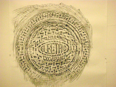
One day on Canal Street, a feeling crept over me as an unusual sensation I could not name as I carried out an assignment. In “drawing” class, Teacher Kevin had assigned us a piece he described as indexical. What he meant was an image made by the physical being of the object, not a line drawing. This assignment let me act on my image of Providence. On my daily walk from apartment to Fletcher, I had admired the city’s ornate manhole covers, artful citations of companies’ cables snaking below, changing names as the utility companies were bought and sold. Kevin’s assignment let me make a rubbing of one of Providence’s amazingly detailed manhole covers for my indexical drawing.
I found a perfect example on Canal Street, near Park Row at the end of the Roger Williams National Memorial. It was a sunny fall day, warm enough for comfort but cool enough not to sweat. Carrying a piece of 48" × 60" cold press watercolor paper and a stick of compressed charcoal, I made myself understood by the parking lot attendant on the corner, who lent me two orange traffic cones to hold down my paper. I stretched out my paper, anchored it with cones, got down on the sidewalk, and rubbed. It was like building a sand castle at the beach down there on the ground, rubbing and rubbing, never minding the physical effort. The paper’s tooth held the grease of the intensely black compressed charcoal, producing an image of high contrast and, in its text, a testament to the history of the city. How I might have looked to passersby or motorists never entered my mind.
Providence Manhole Cover, 2009, compressed charcoal on paper, approx. 36" × 36"
As I knelt on the sidewalk rubbing paper on a manhole cover, the feeling spoke its name: happiness. Yes, again, euphoria. The euphoria of doing physical work on my knees over a big piece of thick watercolor paper and making black marks in the sun, creating a black and white and gray image I had never made before.
This was not quite like the contentment I had felt in my Mason Gross years before all my commitments crowded out lasting satisfaction. In New Jersey I was daily in transit between home, with my regular life, and art school. This RISD happiness came with the relief that my other responsibilities were behind me. This sense of freedom made it all feel quite new, with freedom the quality I have always associated with art making. I was so happy.
In the drawing crit, we put up our work. Juhyun had blotted her lipstick several times to create a textured monoprint. Collin had channeled Robert Rauschenberg and driven his car over inked paper to make a drawing textured by tire tracks. All very good, very interesting. My turn. Teacher Kevin and knowing fellow student Mike dissed my beautiful manhole cover rubbing as hackneyed.
Don’t you know that artists made manhole rubbings, like, back in the ’90s?
Manhole cover rubbings are so over.
I rolled up my rubbing and tucked it in the corner of my studio.
IN MY PAINTING studio I spent hour after hour in the afternoons making drawings that ranged from interesting to boring. Though flopping around visually, I was feeling at home, just taking the time to do what I was doing. My apartment’s dining table, my all-purpose table, incidentally the spot where I ate, was a work space for classroom assignments, covered with work and the leavings of work: paper, ink, colored doodles, knives, adhesive, and paint. With no one else to accommodate, my art supplies took over my space, boundless in color and texture. These were the things I lived with. In the evening I drew and painted and monoprinted smaller pieces on my dining table. In my apartment-slash-studio, art making never stopped. It didn’t have to. Freedom.
One evening, after a day of painting all day in Fletcher and a salad and a glass of red wine at Tazza, I returned to the apartment. At my table, I made a piece. No, the piece made itself. The piece made itself from paper scraps left over from my other work.
My eyes moved my hand.
My hand moved in its old familiar writing rhythm, left to right.
Horizontal lines.
The movement of some other hand, the hand of Omar Khayyam’s “moving finger.” The moving finger of the Rubáiyát, having writ, moves on. Like in writing rhythm, but not the same. Not writing history; no facts, no events. This hand untethered from the past. Drawing at my table, my hand freed of intention. The “moving finger,” not of Omar Khayyam, but of Len Barry’s pop song from 1967. (How did you remember that?) Barry quotes Khayyam and instructs you:
Today is history,
don’t let it
give you misery.
Forget it.
Just remember me.
I said it.
My kitchen table’s moving finger, no discursive meaning. No word, no figure. Having writ moved on, only the meaning of what can be seen: color, composition, texture, shape, and size, like cloth woven on a narrow loom in Mali or India or Providence, Rhode Island.
Out of six leftover pieces of paper about 6" × 12" each, there came a long narrow drawing, colored ink on paper, reaching across horizontally. A scroll whose narrative—it is a narrative—cannot be read. The sections don’t quite line up. The wet-into-wet painting looks unstable. Against unjustified lines of pale, iridescent primary cyan, burnt sienna, and burnt umber, it collaged bright little colored shapes cut from other drawings. Tiny saturated quotations from who knows where. The lines flowed beneath the collage, unhindered by disparate colors and shapes. Where is this thing going? I don’t know. The drawing process took over; I could not stop. I had to stop. Going on past 11:00 p.m., I pulled myself up short and went to bed.
The piece is abstract, tempting you to read it. But it makes no sense whatever. A second coming of my one hundred drawings for Hanneline. Same abstract spirit. Its name? Only the noncommittal Long Piece, not the useless Untitled, but the next thing to it.
Long Piece, 2009, ink and paper collage on paper, 71 ½" × 6"
Long Piece lacks subject matter, utterly. It was the most popular piece in my midterm crit.
I GUSHED TO a couple of friends, “I’ve learned more in a week and a half at RISD than in my whole undergraduate education!”
That’s an exaggeration—a gigantic exaggeration. But I did learn a very great deal at RISD in just a few days, so quickly it felt revolutionary. How I learned:
In my first crit with Teacher David, he identified himself by field:
My bailiwick is formal properties of painting, such as color and composition.
He asked me to talk about the composition of Cranach’s Judgment of Paris on my wall, which I really couldn’t do, so he explained about sight lines and movement through the piece, how it’s divided in half and quarters, and the diagonals moving through the painting. He contrasted the movement through the Cranach with the looping squiggles of the Rubens.
Then Teacher David wanted to see some of my work. I showed him the black-and-white gestural drawing from my admissions portfolio.
This drawing points in the direction my work will be moving in, I said with a measure of pride. The 24" × 18" charcoal drawing inspired by a model’s pose contrasted emphatic mark making with passages of smudged gray. It was clearly figurative but not totally mimetic. I thought it possessed a nice feeling of movement and a hint of abstraction.
David looked at it:
It’s a beautiful drawing, and well made. Nice gestural marks, good sense of depth, great line quality. But it’s very twentieth-century. It reminds me of Arshile Gorky.
Arshile Gorky or no, I recognized mid-twentieth-century as not a good thing.
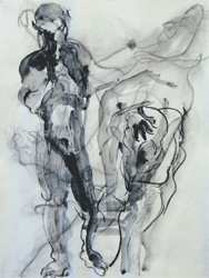
Twentieth-Century Drawing, 2008, ink and graphite on paper, 24" × 18"
Then I showed him another piece of mine I also liked, the series of charcoal drawings of the Harriet Tubman memorial dedication.
This is more contemporary, he said. I like its raw and primitive character. Nice flattened space.
Raw and primitive. Skipping over “raw” and “primitive,” I heard flattened space as something I’d been scolded about at Mason Gross. But with Teacher David, this was not a problem; to the contrary, it was a mark of contemporary style. He added,
Today most artists draw from photographs—plein air painting is dead. Photographs flatten space.
Whoa! Wasn’t that a relief. Voilà! No more need to feel apologetic about painting from photographs and producing flat spaces.
Teacher Irma (same Teacher Irma as at Mason Gross) came for an auspicious crit in the afternoon, offering to give me a tutorial on acrylic paints a week later. She approved of my beauty project, provided it not become a straitjacket. I said my goal would be to make one hundred paintings of all sorts: figurative, abstract, and all between. Irma agreed—what I would need to do is produce masses of work. You have to make a lot of work, she said, because 85 percent of what artists make is junk.
This comforted me, to the point that I later quoted it back to her. (Maybe not a good idea.)
The evening’s “drawing” class had no drawing in it. It was show-and-tell about embarrassing experiences and songs, funny videos, and other ways of getting acquainted. We showed videos, and Anna’s, the last and best, was a Saturday Night Live skit, “Dick in a Box.” Highly recommended.
When my turn came to play a piece of music I was embarrassed to admit liking, I played Pat Metheny’s “James,” so soft and orange-ly feel-good. But even if I didn’t want to own it, “James” fit my euphoria, my happy, sappy mood those early RISD days.
I WAS ENJOYING an interdisciplinary course outside the Painting Department: AD Colab, for “Art and Design: Interdisciplinary Collaboration in Theory and Practice,” taught by a painter and a textile designer. It embraced the increasing interrelationship between art and design, which made a lot of sense to me, with artists now using design tools and designers embracing complexity and contradiction, approaches traditionally associated with fine art. Students from various disciplines would read and discuss key texts and collaborate in joint projects to stretch our imaginations. We would visit New York artists and designers working at the intersections of the two fields. Even better, Duhirwe, a printmaker, my sister African American, was also in the course. A beautiful thirty-two-year-old who felt older than her twenty-something peers, she was originally from Rwanda and had attended Spelman College. We became and remain friends.
In AD Colab I saw all kinds of student work, some fitting into the students’ home departments, some not. Duhirwe the printmaker was making sculpture and paintings. Kai, a German architecture student, presented a labyrinthine video in our initial slide night. We visited artists and design-oriented companies like Printed Matter (artist’s books) and Dieu Donné (hand papermaking and collaboration with artists). With a stimulating breadth of intellect and process, the class ranged far beyond painting.
On one New York visit, AD Colab class met with the hot (youngish) artist Paul Chan, whose then current project looked like porn to me (with my lying twentieth-century eyes) but which he defended as an homage to the Marquis de Sade, whose thought, Chan reminded us, encompassed more than sadism. We had a good Q and A with Chan, during which he maintained that art isn’t a thing but an idea. Given its status as objects that are marketed for sale, I disagreed. Later, on the subway to Pentagram Design, I had a rewarding talk with Teacher Brooks that began but did not end with his agreeing that the marketing infrastructure around art seals its status as material objects.
Swaying in the moving subway train, I told Brooks that reading for class had proved very useful to me, caught as I am between art and design, as in my book projects, books being considered part of design, but at the same time, my belonging to the Painting Department, the heart and soul of the fine arts. I started telling him about a book project I envisioned about a trip across Canada that Glenn and I had recently taken.
When we started our trip, I said to Brooks above the subway clatter, I was taking photos of Glenn and me in memorable tourist settings: Here we are in front of a soaring mountain in the Rockies. Here we are before a dramatic waterfall. You know, usual vacation photographs.
Once I decided to make an artist’s book about our trip, my strategy changed:
I switched my photo documentation to the everyday objects that characterized Canada, like electric line pylons, traffic signs, and roads.
Brooks interrupted,
You have shifted your attention from the figure to the ground.
Lightbulb went off over my head right there in the subway car.
In his field of textile design, he explained, the ground is as important as the figure, because in textiles you can’t just leave any space unattended.
So here was yet another moment of learning on a theme I’d heard in Mason Gross crits. I now saw that my Arshile Gorky drawing neglected parts of my composition, the ground, and concentrated too exclusively on the figures that claimed my attention. Ground makes a scene; it’s what gives an image local specificity.
MY STUDIO MATE Juhyun was from South Korea. At the barbecue for first-year painting graduate students hosted by Teacher David, Juhyun assured me she was a serious student, not a typical rich Korean girl, and not just because she was nearly thirty. She was my suite mate, but not for long. By late fall she got married in Korea. Pregnancy forestalled her returning for spring semester classes.
That early evening at the barbecue, Juhyun said the RISD undergraduates were so heavily Korean because the families swore by the U.S. News and World Report rankings that put Yale and RISD at the top for art schools. RISD was getting a very select group of young Korean students.
My experience with Korean undergraduates came in a typography course recommended by faculty aware of my interest in text. Like all RISD undergraduates, the typography students were very skilled, and, unlike me, they were used to the software we used, the diabolical Adobe Illustrator, an instrument of torture with hooks and chains. Illustrator works off vectors, not pixels like Photoshop, which did not snarl me nearly so much. The undergraduate typographers generously showed me that most of the tools I needed from Illustrator I could find in Photoshop. The kids were great, even though, like the undergraduates at Mason Gross, most of their preferred imagery came from popular culture, especially from advertisements. Too much pinkly Hello Kitty for my taste. But a source of inspiration in design.
Moving into my apartment and into my studio, I had already discovered that RISD was very heavily Korean, with the undergraduates mostly immigrant and some of the graduate students Korean American. Black students, immigrant or native, were awfully rare. I found one friendly young man in textiles, an undergraduate, so I didn’t see much of him. There was my friend Duhirwe the printmaker, and Rubens, a second-year painter, from Brazil, with a Brazilian awareness of the African diaspora. Rubens wasn’t black, but he carried a social consciousness drawn from many years’ residence in the United States.
I couldn’t help feeling that the presence of so many young immigrants—wealthy young immigrants, because RISD offered next to no financial aid—tipped the atmosphere away from social engagement, away even from social awareness. Fostering immersion in the visual, art at RISD seemed to exist in a sphere apart from the tensions of American society.
This came initially as a relief. How fortunate I was, I felt, how grateful was I for the chance to devote myself single-mindedly to my artwork! For the most part, American politics, especially American race issues, did not distract me from my work at hand.