COLOR
Nothing says more about a home and its owner than the hues chosen throughout the house. Color can set a mood, camouflage architectural flaws, and—depending on your belief system—bring auspicious blessings to your bedroom and your bank account. Color also delineates genius from gauche. Consider and shudder at the horror, for example, of how Ludwig Mies van der Rohe’s iconic glass-walled Farnsworth House would have looked executed in Floridian teal instead of pure white. Or a Mondrian painting in pale pastels. These artists knew that as impressive as their creations might be in a sketch, the finished product elicits a visceral response from admirers—on a physical and emotional level—only if it is realized in the most compelling colors.
The modern home is no different than those great modernist masterpieces. Your collection of designer furniture, quirky art, and rare first editions will fall flat if displayed against a dusty rose wall or a navy blue ceiling. A wonderfully bleak bedroom will cause nightmares if the mattress is covered with a cherry-red quilt. Unfortunately, an inferior palette can destroy even the best-laid design plans. Therefore, it’s essential to learn how colors relate to one another, how designers measure and qualify different shades, and to understand the difference between Pantone spot and process colors.
Color Theory
Before you can make an informed decision about the paint palette for your home, it’s important to educate yourself about how color is measured and identified. Then you can expertly choose the correct shade of white for walls and ceilings.

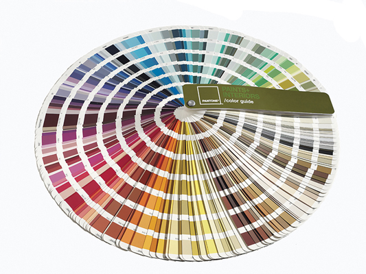
PANTONE COLOR MATCHING
Standardized color matching system that allows reproduction of exact shades. Using the Pantone system, individuals and manufacturers can make sure that colors will match without having to compare hues in person. Many states and countries use the Pantone system to measure and regulate the colors of their flags; it’s worth investing in a guide if only to display prominently on your desk.
NATURAL COLOUR SYSTEM (NCS)
This process for evaluating hues was first presented by the Swedish Colour Center in 1969. It measures color by evaluating the amount of black, saturation of color, and a percentage value between two of the opponent-process colors—red, yellow, green, or blue. Given its Scandinavian origins, this is the preferred system.
MUNSELL COLOR SYSTEM
Developed by Professor Albert H. Munsell in the 1900s, this system evaluates colors on three dimensions: hue, value (lightness), and color purity. Colors are identified by three numbers that relate to the three dimensions.
PRACTICAL CONSIDERATION
To impress your friends and colleagues, purchase the software that converts the three different systems.
White Out
We’ve culled from the thousands of shades and combinations of commercial paints to create the ultimate palette for a modern interior—whites that turn blue, especially in shadow. Bring this swatch sheet to your paint purveyor for an exact match.

EGGSHELL

SOFT WHITE

CONGEALED CUSTARD

PEARLESCENT

KNIGHT WHITE

CRISP LINEN

MR. WHISPERS

DOVE

PURE PUTTY
Preferred Brands
Although, once on the walls, no one may be able to tell the difference, it’s essential that you choose expensive, superior paint brands over the hardware store varieties. Low-VOC and eco-friendly lines garner even more congratulatory attention.
We suggest the following makers:
 Donald Kaufman Color
 Pantone with Fine Paints of Europe
 Farrow & Ball
 Mythic
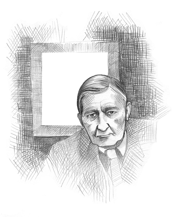
As we begin principally with the material, color itself, and its action and interaction as registered in our minds, we practice first and mainly a study of ourselves.
JOSEF ALBERS (1888–1976)
A student and professor at the Bauhaus, Albers dabbled in furniture and glass design before moving to the United States with his wife, fellow Bauhaus student Anni, when the Nazis shut down the German institute. He ran the painting program at the famed Black Mountain College in North Carolina, where he taught everyone from Cy Twombly to Robert Rauschenberg. A color theorist and abstract painter, he rarely socialized and lived a monastic sort of life.
 Notable Works: Interaction of Color (book).
Fantastic Four
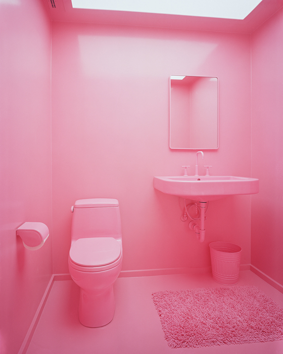
White is the only choice for expansive walls and ceilings, as it complements angular architecture and adds gravitas to a prefab structure. However, certain areas may benefit from a bold shock of color. A powder room, for example, is enlivened by a vivid pink wall. The juvenile appearance of a child’s bedroom, on the other hand, can be tempered by somber black. In order to keep the interior palette restrained and sophisticated, use CMYK as your guide. Long employed by print designers, this four-color subtractive system works so well with modern interiors because each color (C: cyan, M: magenta, Y: yellow, K: black) subtracts brightness from white.

CYAN
Kitchens, baths, and media centers
YELLOW
Baths, living rooms, and closets
MAGENTA
Powder rooms, bachelor bedrooms, and garages
BLACK
Nurseries and play areas

