
Paul Maliszewski
In a plain black specimen box, the sort used for displaying rare butterflies, something has gone awry. A series of black squares and white squares lies piled at the bottom, pins stuck through their centers. One white square hangs in place, still pinned but only barely. Another pin is stuck in the board but holds nothing in place. Bits of lettering have collected at the bottom, too, a The and a Luzhin and a Defense. Another bit reads Vladimir Nabokov. This assemblage, created by the designer Paul Sahre, appears on a recent paperback edition of Nabokov’s novel from Vintage Books, which reprinted it and the rest of his fiction in 2009 and 2010. Each cover for the new editions features a photograph of a specimen box, with the contents—including pins, bits of paper, a cutout bow tie, and a match, just extinguished, its smoke caught forever dissipating behind glass—arranged by the designers. It was John Gall, the art director at Vintage, who thought to unify the paperback covers using specimen boxes. Despair, with its cover fashioned by Jason Fulford and Tamara Shopsin, features two bands of color—red, orange, yellow, the entire chromatic spectrum—pinned at the top and bottom of the box. In the middle, surrounded by a field of flat black paper, the designers have pinned a plain white strip of paper, a label really, with Despair written in a neat and deliberate cursive. Fulford and Shopsin’s cover, like many of the designs in the new series, is both visually interesting and, for those who read the novels back when they were covered by other drawings or photographs, strikingly representative. The new designs have a stateliness and a light touch, and they manage to gesture toward the subject matter of the books, the characters and their predicaments, without ever being leading or pedantic. It’s a great balancing act, to be sure, as earlier generations of artists can attest and Nabokov himself surely knew well.
In late March 1963, a letter and package from George Weidenfeld arrived for Nabokov. Nabokov was in Montreux, Switzerland, living in the sixth-floor apartment in the Palace Hotel that had become his home with his wife, Véra, shortly after the success of Lolita. Now, with Pale Fire published the previous year, Nabokov was between novels, considering new projects and discovering exactly how much the work of shepherding and minding the proper translations of The Gift and The Eye into English and Lolita into Russian demanded of his time. He was sixty-four. Weidenfeld, the chairman of Weidenfeld and Nicholson, Nabokov’s longtime British publisher, had written for a simple reason—to ask the author to sign a paperback copy of Laughter in the Dark for Sir Allen Lane, the founder of Penguin Books.
Weidenfeld had enclosed the book in the package. An engraving by Morton Dimonstein of a man in a thick, purple coat, black tie, cuff links, and pin-striped pants decorated its cover (1). The broad-shouldered man had a vaguely porcine face set with two black hollows for eyes. He appeared to be laughing. His head was thrown back, in any case, and his nostrils were flared. While he gripped his arm and clutched his side, as people will when they laugh, the effect was not all that light or mirthful.

In his letters, Nabokov never concealed his dislike for Penguin U.K.’s paperbacks of Laughter in the Dark and Nabokov’s Dozen. He also didn’t welcome any design that incorporated what he called “Russian stuff.”
1. Laughter in the Dark, Penguin U.K., 1963 (illustrator: Morton Dimonstein).
Nabokov, as it happened, didn’t think much of the laughing man. He also disliked autographing books—doing so only infrequently or for close friends and family. In this case, however, Nabokov signed the novel—“since you are so eager about it”—and wrote back to Weidenfeld, using the letter as an ideal opportunity to make clear his feelings about the artwork. “I want to put on record . . . that I find the cover design of this edition atrocious, disgusting and badly drawn besides having nothing to do whatever with the contents of the book,” Nabokov wrote. He mentioned also that Penguin’s cover for a British edition of Nabokov’s Dozen (2) was still a sore spot for him, finding it “pretty bad and insulting.” That cover, by Jerzy Faczynski, featured a cartoon man with an uncanny resemblance to the author, bursting out of assorted cartoon flora in full coat, tie, and sweater, with a butterfly net raised above his head like a gavel, his entire body bent forward, intent on capturing a butterfly easily larger than his head. Nabokov suggested that perhaps Weidenfeld could use his influence to have Penguin replace the engraving with “a pretty dark-haired girl, or a palmtree, or a winding road, or anything else for this tasteless abomination.” In the event that the laughing man couldn’t be made to disappear, Nabokov requested that at the very least, Weidenfeld show his letter to the right people at Penguin.
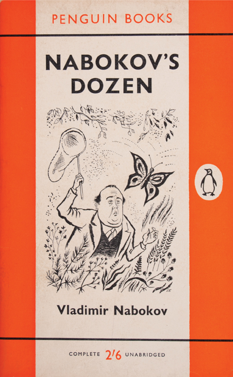
2. Nabokov’s Dozen, Penguin U.K., 1960 (illustrator: Jerzy Faczynski).
Though Nabokov’s indignation with the two Penguin covers reveals a more general frustration with some of the illustrators who worked on his books, the key part of the letter to Weidenfeld is not its bold parade of adjectives or the eloquence of the author’s anger. Nabokov surely knew enough about publishers to realize that nothing so drastic as a new edition would come of his letter. Penguin was not likely to reprint any book because of cover art, however insulting or atrocious it might be. Perhaps this is why he chose instead to delineate, as judiciously as was possible, a new relationship for himself and his British publishers, writing in the same letter, “And please do put it in your future contracts with them [Penguin] that I have to be consulted about cover designs.”
When The New York Times Book Review, in 1965, asked Vladimir Nabokov and a number of writers to describe in 150 words what paperback books meant to their careers, Mickey Spillane, James Michener, Erskine Caldwell, and others wrote at length about paperbacks in the context of publishing, the place of inexpensive books in the history of reading, and the positive effects they saw in reaching a wider audience. Nabokov submitted only three words, by telegram: “Neat little things.” Nabokov’s Selected Letters: 1940–1977, which includes this telegram, also preserves enough correspondence about paperbacks, particularly their artwork and proposed designs, to make it clear that the author thought quite a bit more about paperbacks than those three words can capture. Art and design considerations arose over nearly all of his books—often several times, as publishers reprinted them. In the same spirit, Nabokov routinely edited and approved his publishers’ blurbs and promotional materials, so as to guarantee they didn’t distort or misrepresent his books. He even had criticisms about the lettering: “The coloration of the word ADA recalls at first blush the nacrine inner layer of a dejected shellfish. . . . At six paces the D of the title looks like a badly deformed O.” Nabokov’s correspondence about book design tells a story about his sensibility, revealing how and why he wanted his aesthetic vision to include the entire book, from his text to their artwork, blurbs, and binding. The letters reveal the willful determination and certainty necessary for Nabokov to realize the perfectly reasonable goal of seeing his vision translated into a physical book. Finally, they tell a larger story about the making of the books, providing behind-the-scenes glimpses of their production and the artists who designed them.
The letter to Weidenfeld was by no means a first, for Nabokov had, on many earlier occasions, taken an interest in the design of the dust jackets and covers of his books. Writing to his editor in 1947 about the U.S. edition of Bend Sinister, Nabokov asked if any dust jacket had been created already, suggesting, “I should like it as sober as possible.” Writing in 1950 about the Harper & Brothers edition of Conclusive Evidence, the autobiography and portrait of the artist as a young Russian that Nabokov would later revise and publish as Speak, Memory, the author said he’d not yet seen the “blurb, jacket, or binding.” About the jacket, he cautioned, “I trust there is no ‘Russian’ stuff—churches, pagodas, samovars—being considered. . . . I’ve had something of the sort inflicted on me by an English publisher.”
Nabokov had good reason to suspect that the iconography of Russian stuff would adhere to his books were he not keeping watch. Actually, it happened anyway: The onion dome of a St. Basil–esque cathedral is tricked up like a carnival, in electric neon green, orange, and pink, for Grosset’s 1960 Universal Library paperback of Speak, Memory, and sketched abstractly on a 1969 Danish paperback of the same book. Faczynski drew a picture for Pnin that represents the professor’s Old World sensibility adrift in a New World setting by rendering a dense nest of skyscrapers above the figure’s left ear with more of those onion domes and cathedrals suspended over his right (23). But the colossus of Russian stuff, in the form of a giant-size chrome samovar, can be found on the 1973 paperback copy of Glory in its Hebrew translation (3). A flower sprouts from the samovar’s top, next to which is proudly planted the British flag.
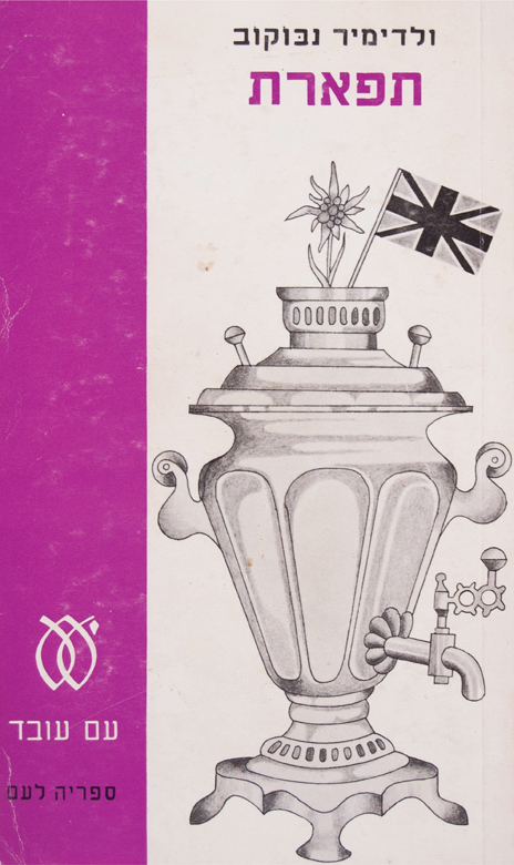
3. Glory (Hebrew-language edition), Am Oved, 1973 (artist unknown).

23. Pnin, Penguin U.K., 1960 (illustrator: Jerzy Faczynski).
Although Nabokov’s vigilance against shoddy or misleading artwork was lifelong, the wider publication of Lolita effectively changed everything. A bestseller in hardcover for Putnam in 1958 and 1959, Lolita, according to Kenneth C. Davis’s Two-Bit Culture: The Paperbacking of America, went on to sell 3.5 million copies of the Fawcett paperback in 1959 alone. The book’s popularity—Nabokov memorably told The Paris Review in 1967, “Lolita is famous, not I”—stirred up deserved attention for his earlier work. Expectations greeted each new title, and international editions as well as affordable paperbacks of all the novels steadily proliferated. Not surprisingly, Nabokov’s letters about cover art also multiply and intensify, his vigilance clearly heightened.
For one thing, Lolita’s fame and the larger printings and wider circulation of the books that accompanied it meant Nabokov could now use the covers to criticize themselves; more like this, he could instruct, and less like that. In January 1959, shortly before delivering his final Cornell University lecture, Nabokov wrote to Weidenfeld about the publisher’s forthcoming edition of Lolita. Weidenfeld was eager to publish or reissue all of the author’s books. Nabokov asked only that Weidenfeld look at two other editions of Lolita before making any decisions. “May I suggest that you take a look at the pictures on jacket and cover of the Dutch edition. They are perfectly and enchantingly right. On the other hand, the Swedish edition has a horrible young whore instead of my nymphet.”
What emerges from Nabokov’s letters about the design of his books is his passion for meaningful stylization, done with purpose, sense, and accuracy, and avoiding clichéd formulations. Nabokov didn’t just evaluate book designs this way, he composed his fiction according to the same standards. It’s impossible, for instance, not to think of the novels, with their precise details and subtly recurring patterns, when reading Nabokov’s letters about butterflies. Writing about a proposed cover for the U.S. edition of Collected Poems, Nabokov said the pictured butterflies “have the bodies of ants,” and, later in the same letter, “the wings should be attached not to the abdomen but to the thorax.” Another butterfly, on the book’s title page, had the head “of a small tortoise,” and the pattern on its wings was all wrong for the poem it was supposed to refer to. A picture of a tuna for Moby-Dick, was Nabokov’s analogy.
Nabokov chased butterflies across Europe and the American West and pursued lepidoptery for much of his life as a committed amateur—amateur in its original sense, of one who loves his vocation. His first university job in the U.S., in fact, was not teaching literature, but working at Harvard’s Museum of Comparative Zoology as a research fellow, where, according to Guy Davenport, Nabokov could be found “counting scales on butterfly wings and sorting out species according to the shape of their genitalia.” So any proposed design featuring a butterfly could be doubly troubling for Nabokov: It might misrepresent his work as the writer as well as distort natural history, to the acute embarrassment of the scientist. In a 1968 letter to Heather Mansell, who was preparing Speak, Memory for publication by Penguin in London, Nabokov pointed out that the two butterflies pictured “have nothing to do with the Russian background of the book since they do not occur north of Europe.” Mansell telegraphed Nabokov at Montreux just days later, asking Nabokov to reconsider his objection, drawing his attention to a butterfly he included as a plate in the hardcover edition. Nabokov responded with a lengthy catalog of distinguishing characteristics:
My butterfly differs in male organ, wing shape, upperside coloration, and underside pattern from your butterfly. Yours is a butterfly widely distributed throughout the southern part of central Europe and Russia; mine is an extremely rare freak, possibly a hybrid.
Taken together, his objections reveal how dearly Nabokov valued the well-turned detail. Its importance is apparent throughout his books, of course, but he articulates it nowhere as directly and forcefully as in his letters. Perhaps anticipating that each inaccuracy that flitted around the butterfly drawings could be too easily swept under the broad rug of artistic license, Nabokov set out to describe his principles of stylization to the Doubleday editor Pyke Johnson, Jr. Although cover art provides the specific occasion for his comments here, the principles he’s setting out say as much about his writing. Of the antlike bodies, for example, Nabokov wrote, “No stylization can excuse a simple mistake.” Nabokov believed stylization required a certain responsibility to the original. He continued, “To stylize adequately one must have complete knowledge of the thing.”
And here’s Nabokov on symbols and symbolic design, from a 1966 letter: “The only symbol a broken butterfly is of is a broken butterfly.”
Three years after dispatching with the symbolic butterflies, Nabokov received several symbolic flowers in the mail: a proposed design for the British paperback of Ada. Nabokov, who seems like he would have picked one precisely described, well-evoked thing over ten symbolic stand-ins, took issue with the artist’s orchid, which he said resembled a vulva. He promptly ordered another bouquet and wrote, “I am emphatically against this symbolic design. I want three or four non-anatomical genuine orchids, prettily colored, garlanded around ‘A D A.’ ” Nabokov included his own drawing with the letter, suggesting that the publisher’s artist could use it, multiplying and stylizing from his rendering, perhaps, “but not freudianizing those innocent blossoms.”
The proposed designs and their revisions continued to arrive in Montreux, and the sad parade of rejects—including those symbolically broken butterflies as well as a pair of Siamese twins bisected by a chessboard, a face with wings, a skull with a monocle, a mauve beatnik, and the “puny professor Milksop”—left again in the morning’s mail or exited with the trash. In 1963, Nabokov decided to develop his own in-house artist and asked his son, Dmitri Nabokov, to provide an illustration for Invitation to a Beheading. Dmitri had previously done a similar sort of literary pinch-hitting as his father’s translator, for much the same reason he was now asked to turn cover artist: good ones were apparently in short supply.
Finding a capable translator presented Nabokov with a similar set of problems as insisting on good cover art. Illustrating demanded that artists create a pictorial representation of a book—in other words, translating words into an image. To explain what he liked about Dmitri’s cover (4), for example, Nabokov wrote, “It is in the spirit of the book and translates some of its poetical quality” (emphasis mine). Translating required that writers create an entirely new book (or poem or story) that somehow remained absolutely faithful to every word of the original. Both cover artist and translator had to be responsible to and respectful of the original book. A hastily done piece of cover art might mislead a reader to imagine Dolores Haze as a platinum blond or, at worst, steer a reader away from a book, but a clumsy translation, with turgid, stiff locutions, improbable dialogue, or unasked-for revisions of the original, could simply ruin the entire reading. Nabokov was troubled, according to his biographer, Brian Boyd, by how difficult it was to find a worthy translator for his Russian works. The problem so concerned him, in fact, that he began writing his fiction in English.

4. Invitation to a Beheading, Penguin U.K., 1963 (illustrator: Dmitri Nabokov).
Recovering a sense of what the proposed artwork for Invitation to a Beheading even looked like is now nearly impossible. It arrived in the mail for Nabokov’s approval, prompting him to seek Dmitri’s help. That much is clear. Still, his reply of April 13, 1963, while not descriptive, provides a glimpse of the rejected work, establishing at the very least that the drawing’s primary element was a “macrocephalic homunculus,” which does start the mind racing. “I am returning your sketch and am sending you another one,” Nabokov wrote, not identifying its artist. “I would be happy if you could use it as it is.” And they did.
Dmitri also drew cover art for The Gift and The Defense for British paperback editions (5 and 6). His contribution to The Gift, published in 1966, looks deceptively simple, even naïve, with its soft colors and pencil shading, but it encapsulates many crisp details from the book, such as a ring of skeleton keys on the floor and a framed butterfly on the wall. Bear in mind, it was either this cover or the symbolic broken butterfly. His artwork for The Defense, reinforced by Bruce Pennington, an artist for Panther, conveys more of a sense of the story than do most other covers, which settle lazily for photographs, abstractions, or collages of chessmen and chessboards. In the novel, Luzhin is a chess master from St. Petersburg who suffers a breakdown and seems to abandon the world of competitive chess. Postbreakdown, he begins, secretly at first, to replay his last game. The people around him, he imagines, are pieces in that match, and thus dangerous. Dmitri’s cover is a chessboard world, where the sidewalk is made of dark and light squares and the trash cans cast ominous shadows in the shapes of a rook and a pawn.

Nabokov’s son, Dmitri Nabokov, provided cover illustrations for Penguin U.K.’s edition of Invitation to a Beheading (1963) and Panther’s editions of The Gift (1966) and The Defence (1967).
5. The Gift, Panther, 1966 (illustrator: Dmitri Nabokov).

6. The Defence, Panther, 1967 (illustrators: Dmitri Nabokov and Bruce Pennington).
Until his death, in 2012, Dmitri oversaw and managed this father’s estate, balancing global literary and legal duties that involved everything from overseeing the publication of the collected short stories to a second movie adaptation of Lolita to copyright issues raised by an Italian novel billed as Lolita from Lolita’s viewpoint, to his speeches before various centenary conferences. When time permitted, he would occasionally send an e-mail message, through an assistant, to an Internet list devoted to Nabokov’s writing.
In March 1997, I posted a query to that list about Nabokov and paperback art. Several people said his letters were the place to begin, while others enthusiastically described the paperback editions they had acquired over the years. Dmitri contacted the list shortly too, responding to the thread of discussion and confirming the existence of his artwork. “I . . . confess . . . to being a fringe closet book jacket designer,” he wrote.
I hadn’t yet seen his covers. The letters did indeed mention them, but really only in passing and never by name. At best they provided only cursory descriptions. I e-mailed the assistant, from whom all communication seemed to originate, and received a short note back. She had made Dmitri aware of my posting: “He has asked I (for your eyes only) e-mail you his FAX contact for this date.”
That night I wrote my letter and faxed it to him somewhere in Switzerland. Unsure if the number would mysteriously expire or change abruptly with the date, I made sure it was sent well before midnight. About a week later, his reply arrived.
Were publishers initially surprised by Nabokov’s wanting to approve all illustrations? Did they believe it unusual for an author of his stature to take a personal interest in this aspect of publishing?
“It varied,” Dmitri wrote, “and still does. The better—and nicer—ones have tried to keep us happy.”
Other than the letters, what else did his father say about illustration? What qualities did he require for a good cover illustration?
After explaining that he prefers to avoid speaking for his father, Dmitri provided four desirable possibilities for good covers:
1) a literal echo of the theme or setting
2) a poetic/pictorial suggestion of the book’s style
3) a beautiful design with no emphasis on direct association
4) a tasteful title, unillustrated
To these he added a rule of sorts, “5) in any case, no poshlost!” Poshlost, a Russian word that doesn’t readily translate, is best understood as a sensibility that embraces clichés and trash and is satisfied by them. In the calculus of the crass, plenty of people and things may be vulgar or corny, but poshlost, which Nabokov wrote about in his study of Nikolay Gogol, who he felt was the sensibility’s most incisive critic, is reserved for those who congratulate themselves on being vulgar and corny. At Cornell, Nabokov devoted a lecture each year to identifying and cataloging poshlost’s most recent outbreaks and flagrant offenses. Children with freckled faces in advertisements received several citations. Perhaps examples of cover art did as well. According to Boyd, the lecture became a campus event, with crowds of unregistered students, faculty, and staff attending.
In October 1999, I wrote Dmitri again. My library had managed to locate each of his covers, but I needed his permission to reprint them. As a final question, I asked what illustrating his father’s work meant to him.
Dmitri wrote back, this time from Florida. He was in the middle of cleaning up the damage caused to one of his houses by Hurricane Irene, which had hit Palm Beach two days before, and digging out from under what he called his “ever-growing hurricane of work”:
What did it mean to me? . . . My ever-optimistic father asked me to try my hand at cover art just as he asked me to translate when no acceptable translators could be found. He offered some ideas for the drawings. Having seriously studied art in his childhood and drawn the marvelous dedication butterflies, he might have done better himself. . . . I am no artist—except for some patent sketches connected with a couple of minor technical inventions of mine and a handful of amateurish landscapes—but this was great fun. I recall having worked on a drawing for Laughter in the Dark as well, but I was not pleased with it. I also vaguely remember other proposals for other authors, which, for various reasons, I did not accept. Like Gregor Samsa who, after his metamorphosis, did not realize beetles could fly, we are all capable of unexpected things. Sometimes I wish I had done more covers; then again, I like to quit while I’m ahead.
When Nabokov wrote to Walter J. Minton, of Putnam, in March 1958, he was seeking not revisions or a rethinking of some proposed design; he was simply looking for an artist for Lolita. Putnam planned to publish the novel in July, and while Nabokov and Minton could have had no idea how much of a sensation the book would cause, Nabokov surely knew his novel could not have just any cover. Since the book’s 1955 publication in Paris, by the Olympia Press, Lolita was perhaps the most talked-about book not to be widely published. Unfortunately, much of the talk, and the book’s growing reputation, focused on its supposed salaciousness. A cloud of scandal and taboo had already, for some people, settled on the title. It did not help matters that the Olympia Press and Maurice Girodias, its owner, had, to date, two real publishing interests: erotica and difficult literary works often assumed to be erotica. Nabokov knew that the wrong cover now, on the American edition, especially a cover that in any way confirmed or played up the preconceptions that the book offered a titillating, naughty read, could obscure the novel he had written with the novel they would advertise it to be. So Nabokov then was looking for a very particular kind of artist. “Do you think it could be possible,” he wrote, “to find today in New York an artist who would not be influenced in his work by the general cartoonesque and primitivist style jacket illustration?” While this question is specifically about Lolita, as the other letters on cover art suggest, the author’s need was more general: Nabokov, quite simply, did need a particular kind of artist. As Dmitri could not very well be expected to illustrate every title, any prospective answer to the question had to emerge from the ranks of New York City’s working artists.
For artists who relied on paperback covers for their livelihood, Dmitri Nabokov’s experience will read like a most wonderful fairy tale. Milton Glaser, who created two covers for Pnin in the late 1950s and early ’60s and is now one of the country’s leading designers, presiding over Milton Glaser, Inc., described what it was like starting out in an industry that seemingly always operated under tight, unforgiving deadlines. Glaser remembered juggling assignments typically for seven or eight books at a time. Robert Maguire and Ted CoConis, both artists who contributed work for Nabokov paperbacks, Maguire in the 1950s (7–9) and CoConis in the ’70s (10–12), needed to have at least four projects going at once. Paul Williams, who painted three Nabokov covers (13–15) in the late 1960s and early ’70s, recalled, “The pressure was not as bad as in advertising work, which is what I mainly did. Books, however, did not pay well generally at the time. We did as many assignments as we could, as they came.”

Robert Maguire’s 1958 cover features Steve Holland as the face looming in the background. Holland, who may be best known for playing Flash Gordon in the 1950s television series, was a regular model, Maguire recalled. “I could recognize Holland in another artist’s cover just by remembering the way he imitated motion—running, for instance—or just by how he held his body.”
7. Laughter in the Dark, Berkley, 1958 (illustrator: Robert Maguire).

8. Photograph of Steve Holland, by Robert Maguire (study for background of his Laughter in the Dark cover illustration).
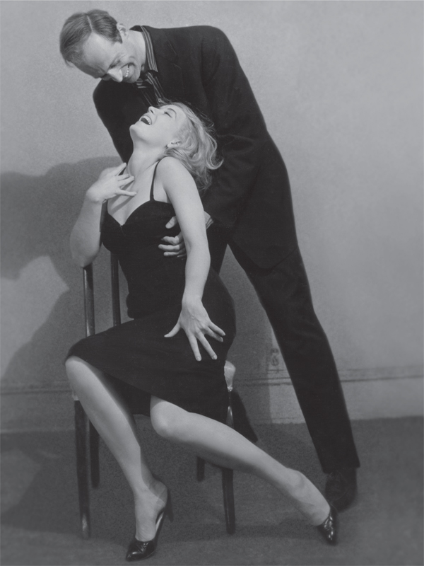
9. Photograph of two models, by Robert Maguire (study for Laughter in the Dark cover illustration).

Ted CoConis created three Nabokov covers for Fawcett between 1969 and 1974.
10. King, Queen, Knave, Fawcett Crest, July 1969 (illustrator: Ted CoConis).

11. Ada, Fawcett Crest, May 1970 (illustrator: Ted CoConis).

12. Transparent Things, Fawcett Crest, January 1974 (illustrator: Ted CoConis).
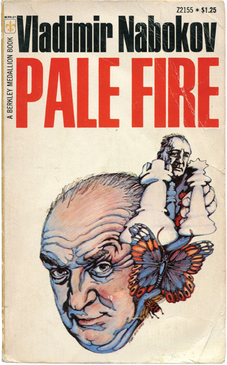
Berkley published its paperback Nabokovs with these covers by Paul Williams between 1968 and 1972.
13. Pale Fire, Berkley Medallion, July 1968 (illustrator: Paul Williams).

14. Lolita, Berkley Medallion, December 1971 (illustrator: Paul Williams).

15. Laughter in the Dark, Berkley, 1972 (illustrator: Paul Williams).

Stanley Zuckerberg painted these covers for three of Popular Library’s Nabokov titles published between 1959 and 1963.
16. Spring in Fialta (Nabokov’s Dozen), Popular Library, September 1959 (illustrator: Stanley Zuckerberg).

17. Nabokov’s Dozen, Popular Library, date unknown (illustrator: Stanley Zuckerberg).

18. The Gift, Popular Library, July 1963 (illustrator: Stanley Zuckerberg).
With Nabokov’s help, Milton Glaser created two covers for Pnin. “The first drawing for the hardcover book was the one in which I received the letters from Nabokov,” Glaser wrote, “and one can tell by the rather cramped and overly cautious quality of the drawing. The second drawing was done several years later, with the existing knowledge of what Pnin looked like. I was able to do a drawing that now strikes me as being more graceful and less self-conscious.”

19. Pnin, Doubleday, 1957 (illustration: Milton Glaser).

20. Pnin, Atheneum, 1964 (illustration: Milton Glaser).
If any artist even noticed or paid all that much attention to the fact that he was illustrating books for Nabokov, his hectic schedule left little time to savor the experience. To give some idea of how quickly artists had to work and how inconsequential the author’s name was to what they did, to say nothing of the author’s actual writing, one artist, who was unsure if I’d found all his paperback Nabokovs, wrote, “These two were done at Berkley—I don’t know if they are Nabokov books: Salambo and Deer Park.” (Salambo is by Gustave Flaubert, Deer Park by Norman Mailer.) The pace of the artists’ jobs was breakneck, and the pressure was great to produce acceptable, photo-ready artwork. Nabokov’s letters testify to as much. Remember those butterflies with the bodies of ants? Nabokov returned them to the publisher with his letter on March 15, 1968, and received their carefully revised offspring quickly enough for him to respond with a second letter on April 15, leaving little time for the leisurely drawing of butterflies. Nabokov’s preferences were immediately evident in the letters, but the role of the people receiving these letters, the artists responsible for the designs, still appeared sketchy.
Robert Maguire started illustrating professionally in 1948, after two years of art school. He created the cover art for Laughter in the Dark for Berkley in 1958. In 1999, when I contacted him, Maguire was retired and living in New Jersey. He still painted every day, mostly still-life arrangements with Chinese porcelain figurines. I phoned him on Sundays, and would find him painting, watching a football game on television, or getting ready to stop one and start the other.
Maguire described how a typical job might go. After receiving an assignment, he’d sketch, and return to the publisher two days later with all his proposals. These would be rough gestures, with only enough detail to suggest the overall composition. “Early on, I’d return with eight or ten sketches per assignment,” he said. “But as I gained experience, I only brought in three or four. I was probably overly conscientious in the beginning.” An art director looked over the artist’s ideas and chose one. Most publishers then needed the artist to deliver the completed painting within a week.
After getting a design approved, some artists, including Maguire, worked next with models, photographing them in whatever poses or costumes an assignment called for and using the pictures as a basis for their work. In Maguire’s early years as an artist, he photographed the models himself. He also had to pay them—$25 per hour was the going rate—and it wasn’t until the late 1960s that publishers picked up a portion of his expenses. Maguire kept the photographs he based his Nabokov paperback illustration on, but not because it was a novel by Nabokov or because he felt any particular attachment to that job. The Nabokov book was one job of many, one of hundreds, and Maguire just happened, luckily, to hold on to a lot of his original paintings and preliminary materials.
One of the models for Maguire’s Nabokov cover was Steve Holland, an aspiring actor whom Maguire photographed regularly. On Laughter in the Dark, Holland stars as the large face in the background (7–9). Holland’s manner was too wooden for the screen, according to Maguire, but he made a good paperback model and, later in life, played Flash Gordon in the 1950s television series. “I’d work with the same models until they started to look too familiar,” Maguire said. He always found it easier to work with the same people, because they better understood what sort of pose or expression he required. But using the same men and women over and over also meant he had to disguise them. No publisher wanted every book to have the same faces on it. “Just so I didn’t have to find new models, I’d change their hair color or style,” Maguire said.
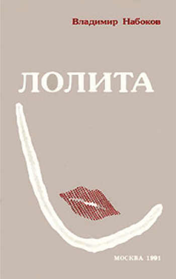
7. Moscow: ANS-Print, 1991. [256 pp., 500,000 copies; paper.]
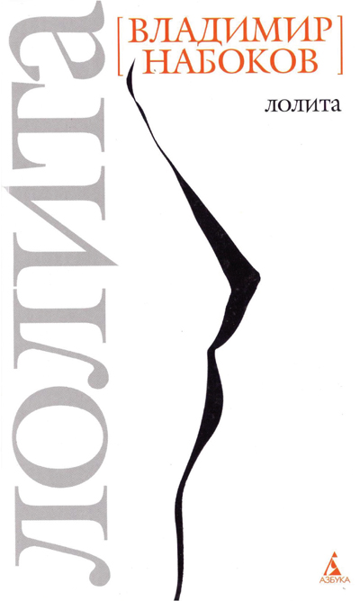
8. St. Petersburg: Azbooka-klassika, 2006. [447 pp., 7,000 copies; hardcover.]

9. Moscow: Vodolei, 1991. [Design by V. I. Kharlamov. 317 pp., 300,000 copies; hardcover.]
By the time Ted CoConis started illustrating—he designed three Nabokov covers for Fawcett Books between 1969 and 1974—publishers were already paying the artists’ hired-model expenses. One of CoConis’s paperback models became his wife. Kristen CoConis, who fielded my questions, conferred with Ted, and answered the e-mail, said she met her husband while he was painting the cover for Transparent Things, but it was her best friend, a fellow model, who had actually posed for that one. Neither CoConis remembered any correspondence with Nabokov about the covers, although Nabokov purchased the original artwork created for Ada, through a representative, shortly after its completion.
CoConis turned in a stylistically varied set of covers for Nabokov’s novels. His King, Queen, Knave is traditional, what Kristen called a “clinch scene,” industry parlance for a steamy, passionate painting with a couple embracing and kissing, clothing sometimes optional. The cover wouldn’t appear out of place in a lineup of romance novels. But the other two CoConis covers feature a series of overlapping and repeated images. Where the first cover is figurative and simple, these covers are more abstract and intricate, like works in stained glass, if stained glass suddenly became the medium of choice for psychedelic expression. It all depended on the art director, Kristen said. “Ted had a lot more latitude with Ada and Transparent Things, and he created each design based on his interpretation of Nabokov’s work.”
From the art director’s preferences to the cost of hiring models, artists for paperbacks labored under an enormous set of sometimes conflicting and even contradictory requirements and guidelines. Innovation was discouraged by a publishing industry focused on repeating the successful books of the recent past, chiefly by mimicking their appearance. At every stage of their work, the artists received feedback from art directors and input from the marketing department, always mindful of what sold well the month before—were covers with blonds in fact more popular than those with brunettes? Did covers set at night eclipse those with sunlight? Editors sent the artists notes, and sometimes advice came directly from the author. Limitations of time, space, resources, and printing technology could not but affect their final designs. While Nabokov wrote in several letters, over a number of years, decrying certain dominant styles of illustration—including the “cartoonesque and primitivist,” the “primitivistic wobbly,” and “pseudo-realism unconnected with anything in the book”—publishers were not asking illustrators to try to achieve a certain style or effect, whether wobbly or not, but rather to replicate, simply and doggedly, their old efforts. Maguire and CoConis both received assignments with the understanding that an art director saw and liked some earlier artwork of theirs and wondered, Could they create something similar, one more time? Many hands and many minds guided the drawing and painting of covers. An initial question such as “What is possible?” became “What is practical, in this instance, under these conditions, for this publisher and this art director?” even before anyone started sketching.
After reviewing proposed designs for Putnam’s 1958 hardcover edition of Lolita, Nabokov wrote, “I want pure colors, melting clouds, accurately drawn details, a sunburst above a receding road with the light reflected in furrows and ruts, after rain. And no girls.”

27. Lolita (Italian edition), Mondadori, 1975 (illustrator: Bruno Binosi).

28. Lolita (Portuguese edition), Civilizacao Brasileira, 1959 (illustrator: Eugenio Hirsch).
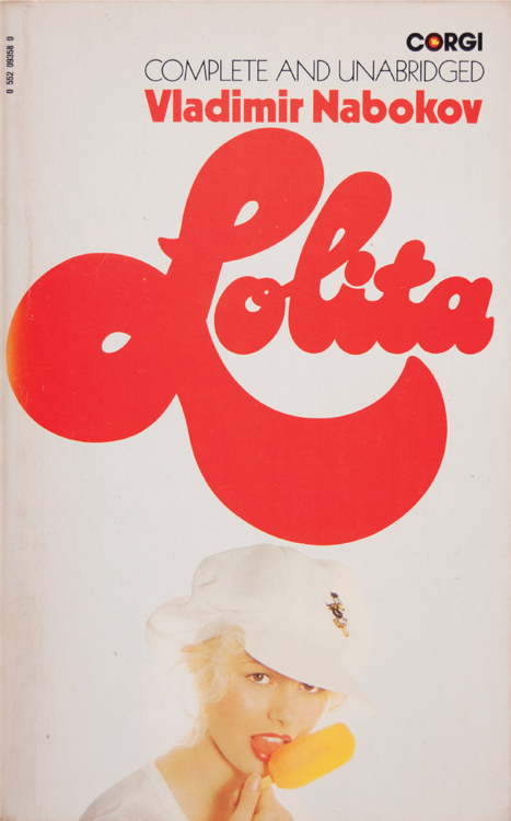
29. Lolita, Corgi, 1974 (designer: Beverly Le Barrow).

30. Lolita (Swedish edition), Wahlstrom & Widstrand, 1957 (illustrator: Stig Södersten).
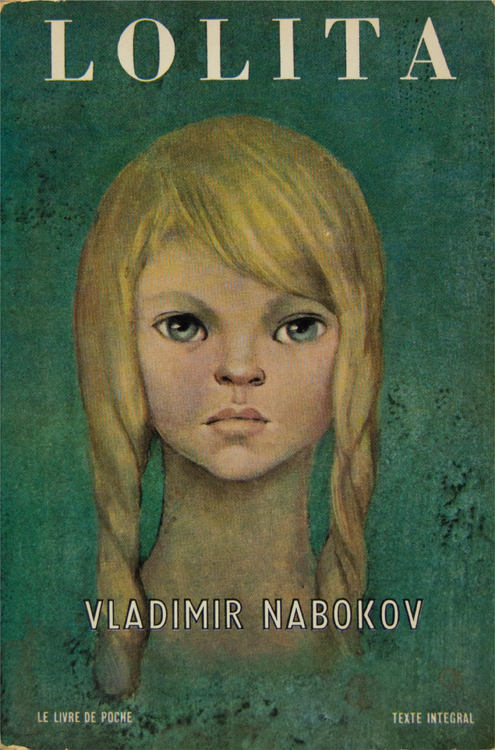
31
31 and 32. Lolita (French edition), Gallimard, 1963, front and back covers (artist unknown).

32
In three of Nabokov’s letters about cover art, he wondered whether the artists had even read his books. An artist working on an edition of The Eye drew a man who resembled Nabokov instead of the novel’s protagonist, “whose features, moreover, delicate and nervous, are quite differently described in the book.” In another letter, Nabokov asked the editor, “Why should a collection of poetical tales be degraded to the rank of a horror movie by a designer who has never read them?” Maguire said publishers he worked for never told him whose book he was illustrating.
They would give me some idea what they were looking for. They might tell me, “Do a cover similar to what you did in this other one, or do a variation of that cover,” or they might give me specifics such as the hair color and so forth, but I never read the books I illustrated for. That’s a shame in only a few cases. Some of the books are complete junk. I was better off not reading them.
For Glaser, as well as the other artists, these early assignments were a form of dues paying: not always pleasant but inevitable. Glaser said he worked in the beginning on dust jackets and covers of paperbacks as a way to break into the business. “When Doubleday contacted me about the Nabokov, this was very early in my career, in the first years of my practice,” he said.
I sent out my own work at the time. Doing dust jackets was a way to get your name out. My name was only beginning to get attention, as people heard about and saw my work. Commercial work was and still is for the big boys. As with most businesses, in order to get started you find you have to accept the jobs that don’t pay as particularly well as others.
Not only did the jobs not pay well—Williams said he received $600 apiece for his Nabokov covers—they also could be frustrating for the artists. Nearly all the artists did some other kind of artwork, from one painter’s Monet-style oils, sold through galleries and his antique store, to another’s long-term series of nude paintings of his wife. They also all gave every indication of preferring to talk about that other work instead of some old paperback cover they painted and hadn’t thought about again since.
Five years after Nabokov wondered if anybody could locate an artist not influenced by the current fashions, an artist who both suited his work and understood his sensibility, he was, perhaps not surprisingly, still searching. In a letter to Germano Facetti, the art director at Penguin U.K., Nabokov wrote, “I object to the style [the designer] has chosen with its, by now academic, simplifications and distortions.” He had, during that time, seen enough cover art, good and bad, to recognize and name with confidence the habitual techniques and pervasive styles of the trade. According to Maguire, however, seeking out a unique style was not always foremost in publishers’ minds. Years after Maguire left Berkley, the publisher of his Nabokov paperback, he happened to run into its art director at the New York City public library.
I’d moved on to other jobs, and it had been ten years or so since I worked for them. I thanked him for giving me all that work, when I was with them. I felt very grateful for that. The art director said to me, “Oh, yes, you always gave us your work on time and what we needed.” That was a deflating moment. I would’ve liked him to have said “We liked your paintings” or something. He didn’t mean anything bad by his comment. That was just what they were looking for: work that was on time and exactly what they wanted.
Publishers of Nabokov’s paperbacks sought a wide audience, sometimes giving the novels the look of mysteries or romances. Yet a paperback design like Signet’s for Laughter in the Dark also included blurbs from Edmund Wilson and The New Yorker, seals of literary approval. Inside, however, a publisher’s note appealed to a different reader altogether: “To go into any details of the plot of this extraordinary novel would be to spoil for the reader as suspenseful and continuously surprising a book as any that has been written (and this applies to detective and ‘suspense’ novels as well).”
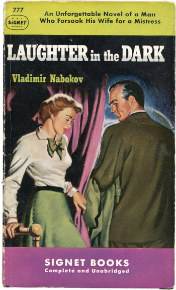
33. Laughter in the Dark, Signet, March 1950, first paperback edition (artist unknown).

34. Laughter in the Dark, Berkley Medallion, August 1961 (artist unknown).

35. Laughter in the Dark (Danish edition), Hans Reitzel, 1960 (illustrator: Preben Zahle).
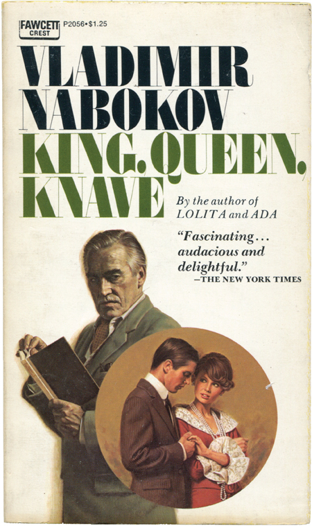
36. King, Queen, Knave, Fawcett, June 1968 (illustrator: Tom Miller).

37. Mary, Fawcett Crest, September 1971 (illustrator: Tom Miller).
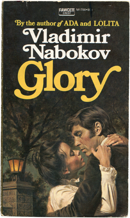
38. Glory, Fawcett, February 1973 (illustrator: Tom Miller).
Sometimes Nabokov did find in New York an artist.
In the fall of 1956, Doubleday was preparing to publish Pnin. As the book’s editor, Jason Epstein forwarded several sketches by Milton Glaser to Nabokov. Glaser had drawn a portrait of the title character, Pnin, a Russian-born professor of his native language, now teaching at Waindell College, a small, fictional institution in New York State. Nabokov thought the sketches were all wrong, however. In his letter to Epstein he said they were executed with talent, but “in regard to my Pnin it is wrong.” Nabokov compared the pictured Pnin to an “underpaid instructor in the English department,” a Republican’s idea of Adlai Stevenson in defeat, and a “puny professor Milksop,” and mentioned that all the details an illustrator could ever possibly need were right in the book, in its first chapter.
Of one artist’s initial portrait of Professor Timofey Pnin, Nabokov wrote, “This corny caricature is meaningless, badly drawn and repulsive. Pnin is an attractive and admirable person.”

21. Pnin, Avon, 1957, first paperback edition (artist unknown).

22. Pnin (Swedish edition), Wahlstrom & Widstrand, 1958 (illustrator: Gunnar Brusewitz).

23. Pnin, Penguin U.K., 1960 (illustrator: Jerzy Faczynski).

24. Pnin, Bard/Avon, August 1969 (artist unknown).
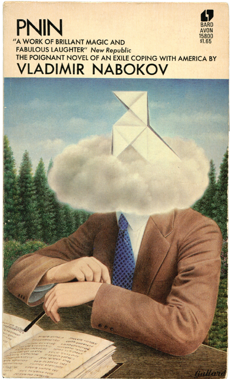
25. Pnin, Bard/Avon, May 1969 (Gervasio Gallardo).

26. Pnin (French edition), Gallimard Folio, 1973 (illustrator: Claude Chevalley).
Had Nabokov’s letter concluded there, with his stern request for radical revisions or for the illustrator to study the insides of his book for a change, the matter would be like the others, all the misshapen, ill-advised butterflies of proposals past. But with this letter Nabokov included pictures of Russian men for Glaser to use as examples for painting his Professor Timofey Pnin. “I am sending you some photographs of Pnin-like Russians, with and without hair.” Nabokov went on to delineate, using the pictures as his reference, at least a dozen exacting points to keep in mind, including the shape of Pnin’s head, the style of glasses he wears, the thickness of his nose, even the space between his nose and upper lip, which Nabokov felt “terribly important.”
Glaser recalled it was an extraordinary experience for him, chiefly because Nabokov had such a precise idea of what his character looked like. With his pictures of the Pnin-like Russians, Nabokov introduced Glaser to the faces of Baykov, Pavlov, and Maslov, Obrastov and Yegorov. They showed “Russian men in public life—soldiers, diplomats, et cetera,” Glaser recalled. “My memory,” he said, “which is faulty at best, recalls that most of these clippings were from Russian newspapers and periodicals and that Cyrillic characters were visible.” In the letter, Baykov and the other Pnin-like Russians were referred to by last names only, but they likely included, among others, a cosmonaut, a prominent economist, the marshall of the Soviet Air Force, and a master puppeteer who had written a widely translated autobiography called My Profession, about puppetry. Also included were a poet regarded as Pushkin’s most notable precursor in Russian verse and Pavlov of conditioned-reflex fame. None of their identities, however, can be known for sure, really, without the actual photographs, and they’re now gone. Glaser said there was less than a remote chance he had the photographs anymore. “They weren’t something you’d keep,” he said. Later he wrote, adding, “I fear the photographs themselves have vanished into the dark pool of history.”
A little over a month after Nabokov mailed his letter and the collection of Pnin-like Russians, another package from Doubleday arrived for him. Epstein had mailed Glaser’s revisions. Nabokov opened it and was delighted. In his reply he called the jacket “absolutely splendid.” He also wrote, “I never imagined that an illustrator could render an author’s vision so accurately.” He even suggested he was perhaps a bit too hard on Glaser’s first proposal, writing, “I am afraid I was a little bitter about the preliminary sketch.”
Boyd, who includes the entire “Pnin-like Russians” letter in the second volume of his biography of Nabokov, interprets the initial letter as characteristic of Nabokov’s grasp of detail. “Nothing could reveal better the precision with which Nabokov always imagined his fictive worlds,” Boyd writes. But the biographer is only partly right. Yes, the Pnin-like Russians letter, like so much of Nabokov’s literary correspondence, speaks, sometimes obliquely and often revealingly, of his own writing. But this particular letter offers something more than sidelong glimpses at what Nabokov valued in writing, for it also illustrates and preserves his own participation in the creation of cover art. Rather than rejecting Glaser’s proposed efforts, as he had and would many more times, Nabokov had taken part in the design process, even going so far as to add, in his own hand, Cyrillic lettering to the cover of the book Glaser’s Pnin carried in his hands. Nabokov had provided Glaser with models to work from. He’d communicated with Glaser in a way an artist would readily understand, in pictures.

39. The Eye, Panther, 1968 (designer: Dennis Rolfe).

40. The Eye, Panther, 1972 (artist unknown).

41. The Gift, Panther, 1973 (artist unknown).

39. The Eye, Panther, 1968 (designer: Dennis Rolfe).

40. The Eye, Panther, 1972 (artist unknown).

41. The Gift, Panther, 1973 (artist unknown).

42. Despair, Panther, 1969 (illustrator: John Holmes).

43. King, Queen, Knave, Panther, 1970 (illustrator: John Holmes). 44. Nabokov’s Quartet, Panther, 1969 (illustrator: John Holmes).
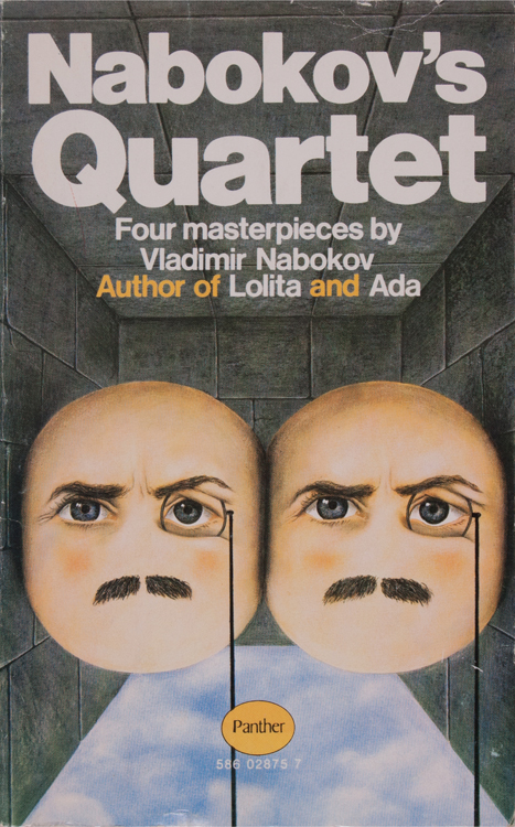
44. Nabokov’s Quartet, Panther, 1969 (illustrator: John Holmes).
Panther, a British paperback publisher, consistently printed disconcerting, highly interpretative covers for Nabokov’s books. Responding to the publisher’s proposed design for Nabokov’s Dozen, the author said, “I emphatically object to this monocled skull.” He got two monocled faces instead (44).
Nabokov never tried to duplicate the success he had with Glaser. Sure, occasionally he’d return the rejects with his own sketch of orchids or butterflies, if only to better keep the artists on track, but his letters show no other occasion when Nabokov’s involvement was as integral to the completion of a cover, when he took such control of the process. If anything, his covers became more plain, bare of artwork. Dmitri said his father increasingly felt his books didn’t require any illustration on their covers, and besides found the current modes of illustrating inadequate to the task. Offered a mauve beatnik for Pale Fire (“horrible, disgusting, tasteless”), Nabokov asked that the cover instead appear “as plain as possible, with no pictorial effects.” Presented the mangled butterflies, with their bodies of ants and wings wrongly attached, Nabokov did what he could to correct the accuracy of the drawings, but concluded by asking the editor to consider the possibility of having no butterflies and no art.
Many of these paperback Nabokovs, ones with art and without, ones artful and artless, some benefiting from Nabokov’s intercession and others never requiring it, have, by now, passed through several hands and owners. They’ve ended up in stacks and piles in yard sales, in upturned boxes at church and library benefits, and on shelves in used bookstores, where a rough, inexact chronology of publishing is preserved. On view, often together in one place, are the Nabokov paperbacks that were available for sale four or five decades ago, shelved alongside Book-of-the-Month Club freebies from the 1970s (Ada is simply everywhere) and propped up against the required, but not-so-well-thumbed reading of last semester’s English classes. Men and women bought these paperback Nabokovs first from wire racks, from bus stations or drugstores, for a quarter or so. These copies of Pnin and Nabokov’s other novels that owe their beginnings to purchases in grocery stores and newsstands capture a Nabokov not often seen anymore, at a moment in his life when his literary reputation was still on the rise. These are books from an era before Nabokov entered the canon. Today, his literary reputation is assured and his standing remains high on all those inevitable lists of the best books of all time. As a result, Nabokov is accorded a decidedly, and fittingly, literary style of publication. His books are available in large-format paperbacks, uniformly designed and looking every bit like a formidable library unto themselves. The paperback Nabokovs, however, hail from an era when it was unclear how the author’s books would go together; he was, after all, still alive and writing. His library remained unfinished. These painted portraits of Nabokov’s characters—some abstract, others figurative, and a few distressingly literal—are, finally, as much portraits of Nabokov himself, estimations as to his place in literature. Vladimir Nabokov wrote, while the many paperback Nabokovs, from the one resembling a cartoon in the Saturday Evening Post to the surreal fantasies, to those redolent of romance or mystery novels, rendered what was written into these ephemeral portraits, which lasted a month or two, depending on how sales went, maybe even a year, before being replaced by the next portrait of the artist. These are neat, little things indeed.
Was it possible, in the end, for Nabokov to find in New York an artist who would design what he imagined? While several covers, such as Glaser’s Pnin and CoConis’s Ada, did please him, Nabokov never really did get what he was looking for. No artist, for instance, ever drew for Lolita the “romantic, delicately drawn, non-Freudian and non-juvenile, picture.” Instead, in many cases, he got exactly what he didn’t want: pictures of girls or of women pretending to be girls. Where was the cover with the soft American landscape of his imagining, with the melting clouds and accurate details? Nabokov saw a road, after a rain, with a burst of sunlight above. The artists and publishers saw only girls, on bicycles or in saddle shoes and skirts. Nabokov alone saw the sunlight reflecting off standing water in the road’s furrows and ruts. He saw a nostalgic highway dissolving into nothing in the distance.
Photographs of books taken from the author’s personal collection and the much vaster collection of Michael Juliar.