Barbara Bloom
Why do people reading in libraries look so sexy? It could be the allure of catching someone in the midst of an intimate moment of thought. Or perhaps it is that having the right book in hand suggests the possession of extensive (to borrow from Nabokov) unreal estate.
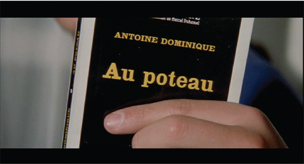
In his films, Jean-Luc Godard has repeatedly used images of his characters reading to tell us who they are, and images of people reading together to tell us where the relationship is heading. In this case, a couple carries on an argument by showing each other titles of books. It is a kind of objective shorthand. If you cannot judge a book by its cover, you can at least draw some conclusions about the person holding it.
In my work, I have often, and from early on, used covers as carriers of meaning, as placeholders for thoughts.
In the 1970s I began buying books for their potentially evocative titles and redesigning their covers. I particularly liked the way combinations of the stacked titles ricocheted meaning off of one another.
I’d thought for years that I would like to offer to collectors a form of portraiture that would consist of perusing their libraries and choosing a collection of books. These books would be placed in a custom-built shelf with redesigned covers.
In the music trade, a “cover” is a new performance or recording of another’s previously released song. It can carry a pejorative meaning, in that the original recording should be regarded as the definitive or “authentic” version, and by implication, all others are lesser.
I love covers, and tend to judge by them.

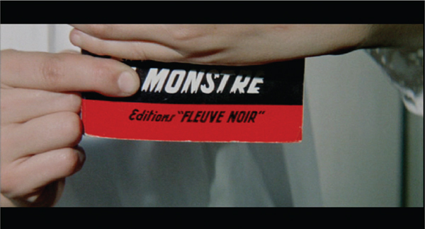
Film stills of a couple with books from Godard’s A Woman is a Woman, 1961
A plywood structure with an initial resemblance to the taciturn, narrative-obstructing objects of Donald Judd, it is also an approximation of bedroom furniture. It is the telling-detail-free centerpiece of a storyline carried out with gleefully indulgent specificity through bedside books. Clues are left for the literate detective. Scattered on the bedside tables are a number of books whose titles tend toward the conniving and suspicious. It’s not a story with a happy ending.

The Bedroom: Marriage on the Rocks. Plywood construction, paperback books with redesigned covers, backdrop paper
Sometimes a response is demanded. The New York Times Magazine ran a piece about the architect Richard Meier, showing his study filled with vertical stacks of Picasso books. Art monographs, large, weighty, expensive, and thick, are highly useful if your purpose is to produce tall towers that are meant less for study than to impress. If your purpose were to, say, read the contents of a book, or if you were, in fact, more interested in function than form, you would have a problem. As I said, some things just cry out for a response.
Full title:
Richard Meier’s Picasso Totem
Richard Meier’s Incredibly Tall and Impressive Stack of Picasso Books
Meier Loves Picasso
I bet he looks at the third from the bottom all the time . . .
Richard Meier is Very Important
Picasso is in Great Company
RM + PP
You Know what They Say About Size
I’m sure PP would have loved RM
I Can’t Even Count That High
Meier even designed the stool
Which book is his favorite?
I wonder how much they weigh?
Etc.
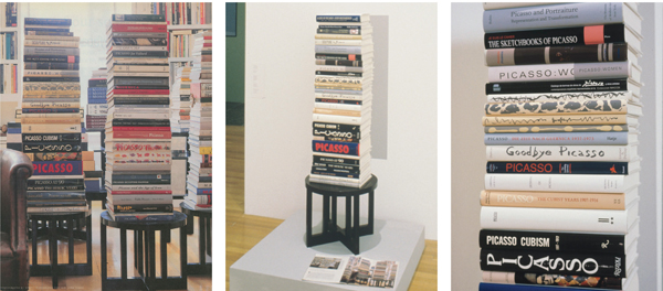
From left: Photo from The New York Times Magazine, showing Richard Meier’s study; copy of Meier-designed wooden stool with stack of dummy books and New York Times Magazine on pedestal; close-up of dummy books (spines only are printed with Picasso-book tiles)
Imagine the scene of Arthur Miller unwrapping a gift from his then wife, Marilyn Monroe.
From a lovely colored gift box, he unwraps book dummies and places them one by one on a shelf. The covers of these books have no text inside. The covers are blank except for the texts on their spines, and these texts are out of focus.
Based on a series of photographs of Marilyn Monroe reading in her home, taken by Alfred Eisenstaedt in 1953 for Life magazine. Seen in the background are Marilyn’s books, which are out of focus, so we can’t discern the titles. The intimate photographs show a quiet and contemplative Monroe, but the titles of the books she is reading (her thoughts, her interests) are a blur, impenetrable, forever a mystery to us. Miller, the dour intellectual, receives her impenetrability, her beautiful out-of-focus quality as a gift. We share in this gift.

From Marilyn to Arthur, 2010. Book dummies and video in shelf.
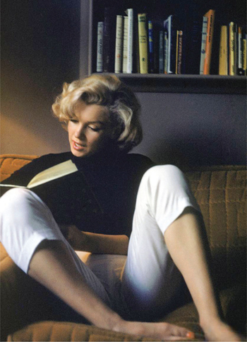
Marilyn Monroe in Alfred Eisenstaedt’s 1953 photo for Life.v
Running parallel to my “cover” story is one that stars Nabokov and his writing. For years I hoped to make an homage to, a portrait of, the author, and perhaps even an attempt at a visual equivalent of his writing.
Drawn to the relentless precision of Nabokov’s prose and also to how that relentlessness resulted in flat-out beauty, and so, without knowing precisely why, in 1991 I went to photograph Nabokov’s butterfly collection at Cornell University. The photographs were used for a piece I designed for Grand Street magazine in 1993. The pages combined close-ups of his butterflies with texts from his books. A tribute with a hint at slipping fiction, biography and autobiography.
A few years later, I was thrilled by an invitation from Glenn Horowitz Booksellers in New York City to design an exhibition of Nabokov’s library of his own books, which had then been recently acquired by Horowitz. The exhibition was to coincide with Nabokov’s one hundredth birthday in 1999. There they were, Nabokov’s own books, filled with his notations, drawings, corrections. A treasure trove filled with his markings, the indications of Nabokov’s thoughts about his work. I set out to design an exhibition that conflated and confused the practices of collecting books and butterflies.
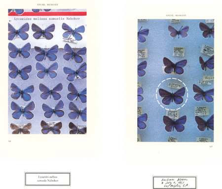
Revised Evidence: Vladimir Nabokov’s Collection of Inscriptions, Annotations, Corrections, and Butterfly Descriptions. 1999.
Most of the exhibition’s many texts were written on four-by-six-inch, lined file cards. As I had a font made from Nabokov’s script, all texts were written in his handwriting.

Font made from Nabokov’s script
In lieu of a catalogue for the exhibition, we published a folder of commemorative stamps honoring the life and literary and lepidopteral work of Nabokov. One stamp in the collection shows details of the corrections Nabokov made in his own books. Another stamp sheet shows butterfly labels, each with the following literary-entomological information: name of character from Nabokov book (in lieu of species); author (collector), Nabokov; locale where he wrote (or “caught”) the character; year of writing (identification).

Commemorative stamp sheets honoring Nabokov
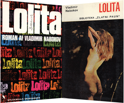
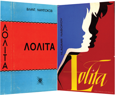
Most of the covers of Lolita in Nabokov’s collection grotesquely distorted the book’s subject to make it more titillating and more palatable. Their Lolita had the attitude and body parts of a postpubescent vamp rather than the attributes of (the whole, obsessively catalogued point of the story) a child.
Literary-entomological Nabokov butterfly cases from Revised Evidence . . . , 1999

Lolita’s in Case: Doubled, folded, and pinned inkjet prints of covers from Nabokov’s own collection of published editions of Lolita. Background: diary page.

Nabokov’s Blues in Case: Doubled, folded, and pinned inkjet prints of Nabokov writing, pinned above labels bearing pseudonyms of the author

Close-up of Nabokov diary from September 18, 1954, memo (to whom?) regarding the whereabouts of the manuscript of Lolita: “in locked table in office key in small box with flowers on lid (presum. peonies).” At this stage he planned to publish the book pseudonymously and was apprehensive that someone might find it.
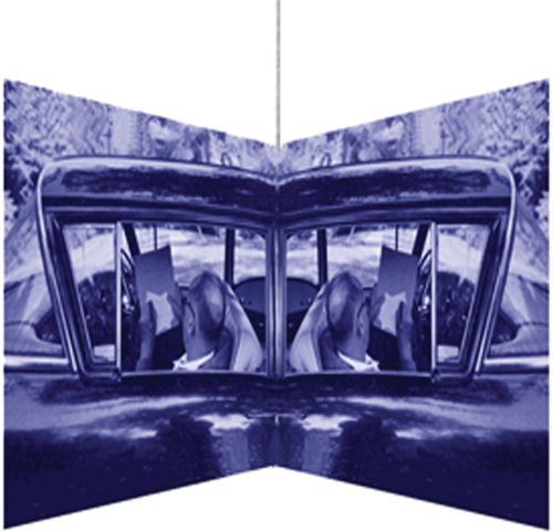
Close-up of doubled and “butterflied” photo of Nabokov in his car, writing pages of the novel that would become Lolita.

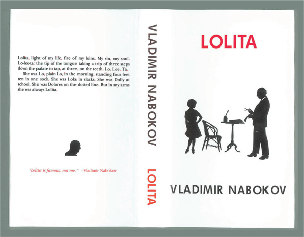
For the front of the cover I designed for Lolita, I used an absurdly apropos silhouette from a collection of Victorian paper-cuts I had found years earlier. It depicts the pompous and paunchy Nabokovian male at the lectern snipping portraits, and a girl with a saucy stance who thrusts her hip at his tendentious scissor-wielding fingers. One does wonder what other purpose the image could ever have served.
On the back cover, the oft-quoted opening lines of the novel are punctuated in a racy red color, including red-dotted i’s.
The most accurate Lolita cover from Nabokov’s collection may be the very first, the Olympia Press two-volume edition, published in Paris when Anglo-Saxon publishers proved skittish: an abstract block of mid-century Modernist green implanted with funereal lettering and a thin, hopeful white stripe, locked within a prickly black fence.
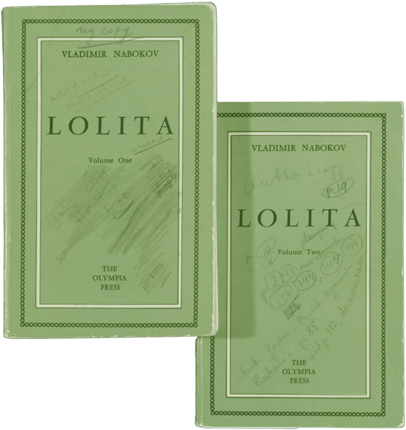
Nabokov’s copies of the original two-volume Olympia Press edition of Lolita, published in 1955, with penciled corrections by the author.
I had volume two recast as a lush carpet: a meeting of the abstract and the plush, one that you can walk or lie on.

Lolita Carpet, 1999, with depiction in wool of Nabokov’s volume two of Lolita.