Chapter 12
Final Checks
In This Chapter
![]() Giving your pages the once-over
Giving your pages the once-over
![]() Using the Design Checker
Using the Design Checker
![]() Discovering techniques for copyfitting text
Discovering techniques for copyfitting text
![]() Adjusting text spacing and line endings
Adjusting text spacing and line endings
![]() Improving page design with special page elements
Improving page design with special page elements
![]() Adding drawn objects, borders, shaded areas, and special symbols
Adding drawn objects, borders, shaded areas, and special symbols
Producing quality desktop publishing means sweating the details. I’m not talking about jumping up and down in your sweatsuit with the Richard Simmons Sweatin’ to the Oldies video, but rather about getting absorbed in the details of your publication before you send it to the printer — where real money changes hands. In this chapter, I look at things you can do to make sure that your publication reflects the care you took in designing it.
The Eyes Have It
The single best piece of advice I can give you about checking your publication is this: Look it over in printed form. Publisher lets you create proof prints; avail yourself of this opportunity. You should also create a proof for an outside printer. The proof is your “contract” that tells the printer “This is what I want.”
You can’t (or at least you shouldn’t) expect to catch all the errors in your publication the first time you look at it. The more people you have look at your work, the better chance you have of finding things that should be changed. Spotting your own errors can be difficult. When possible, try to live with the final design for a while before you commit to spending money for printing.

The Design Checker
The Design Checker, an automated tool in Publisher, attempts to find things that are wrong with your publication. It catches many errors that you wouldn’t be likely to catch until after the publication is printed, such as
 Empty frames
Covered objects
Text in the overflow area
Objects in the nonprinting region
Disproportional pictures
Spacing between sentences
Follow these steps to check your design with the Design Checker:
1. Choose Tools ⇒Design Checker from the main menu or choose Design Checker from the Publisher Tasks drop-down menu.
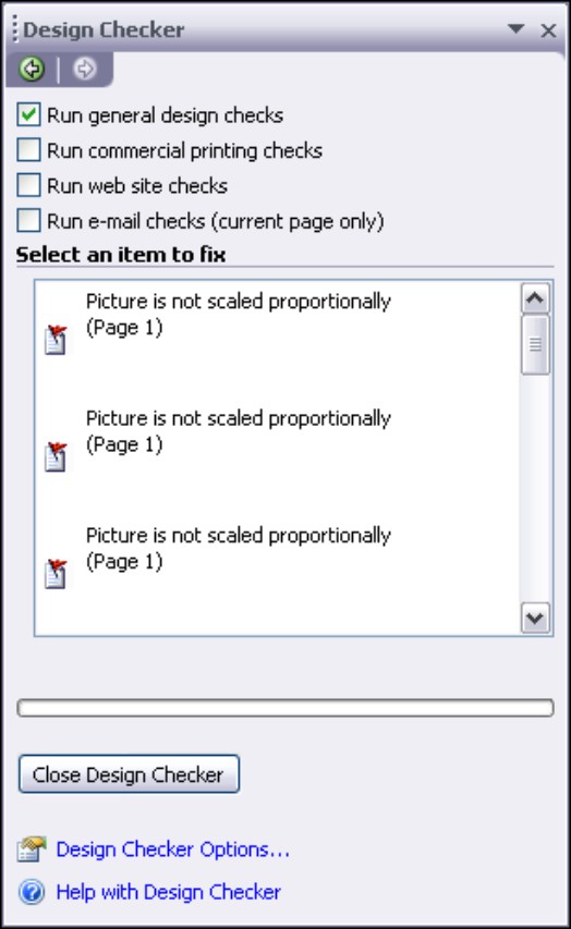
The Design Checker task pane appears, as shown in Figure 12-1.
2. Tell the Design Checker which type of design check you want to run by selecting the appropriate check box:
Run General Design Checks: Checks for problems that would apply to any type of publication, such as missing pictures or a story with text in the overflow area.
|
Figure 12-1: The Design Checker runs a newsletter check. |
|
Run Commercial Printing Checks: Checks for issues that can affect your commercial printer’s ability to print the publication the way you intend. Too many or missing spot colors are common problems.
Run Web Site Checks: In publications that you plan to publish on a Web site, checks for missing (hyper)links and pictures that don’t have alternate text.
Run E-Mail Checks: Checks primarily for problems that cause text to be sent as an image in an e-mail message, causing large messages (an object overlapping text or rotated text for example). It also checks for issues (hyphenated text) that cause gaps to appear in some e-mail viewers.
As soon as you select the type of check to run, the Design Checker starts looking for problems and displays potential problems in the Select an Item to Fix pane of the Design Checker.
3. Click an item’s down arrow in the Select an Item to Fix pane to see options for resolving the issue.
If you’re not sure what the problem is with an item in the Select an Item to Fix pane, choose Explain from the drop-down menu. The Publisher Help screen opens with detailed information about the problem item.
4. Click Close Design Checker when you finish.
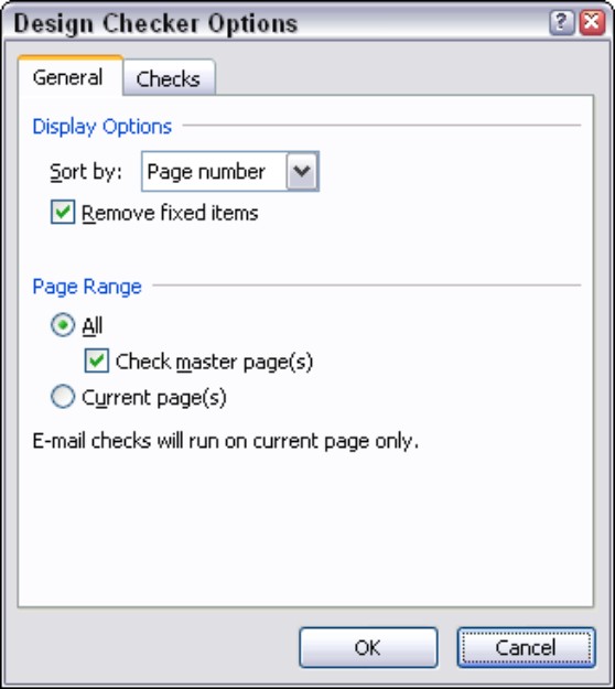
If you want more control over just what the Design Checker looks for, click the Design Checker Options link, at the bottom of the Design Checker task pane. Doing so opens the Design Checker Options dialog box, as shown in Figure 12-2.
|
Figure 12-2: The General tab of the Design Checker Options dialog box. |
|
You can use the Sort By box to determine how to list items in the Select an Item to Fix box: Select Page Number, Description, or Status. If the Remove Fixed Items check box is selected, items disappear from the list as they’re resolved. On the General tab, you can also choose which pages to check. You can select only the current page, all pages including master pages, or all pages not including master pages.
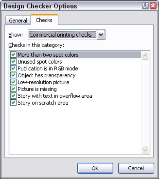
Figure 12-3 shows the Checks tab of the Design Checker Options dialog box with the Commercial Printing Checks option chosen in the Show drop-down list. This tab is handy if you want the Design Checker to ignore certain checks for a specified option. Just deselect the boxes in the Checks in This Category list.
As one of your final checks, you just can’t beat running the Design Checker.
|
Figure 12-3: The Design Checker Options dialog box with commercial printing checks. |
|
Word-Fitting Techniques
When you’re working with a layout to make it look exactly the way you want, one of your hardest tasks is making the text fit into text boxes. If your layout can’t be changed, the amount of text it can hold is set. Also, you might find that the formatted text simply looks ugly.
A common problem in fully justified text is that there can be a large amount of space between words throughout a text box — the text looks as though rivers are running through it. You probably can’t change the justification of your text boxes, but you can work with the hyphenation feature (see Chapter 7) to break words and improve the look of your text. Even the automated hyphenation tool isn’t perfect, so you might want to manually hyphenate justified text. In the following sections, I describe this technique and others for making your words fit into the text boxes in your layout.
Copyfitting
You can rephrase nearly every paragraph to reduce or add words without changing the meaning of the text. (My editor does this to me all the time!) People working with page layout generally don’t have the luxury of being able to edit text — that job belongs to the author or the editor. If you’re both layout artist and author, however, you can copyfit your text by adding and removing words.
.jpg)
1. Select the word you want to look up in the thesaurus.
2. Choose Tools ⇒Language ⇒Thesaurus.
The Research Task Pane opens, and the word you selected displays in the Search For text box. The Thesaurus is displayed as the reference material currently in use in the Research Task Pane. A list of choices from the Thesaurus is displayed in the Research Task Pane display pane.
The Publisher spell checker (see Chapter 7 for information on how to use it) contains more than 100,000 words. The spell checker’s large dictionary doesn’t help you if you use a valid word incorrectly — such as two rather than to.

If you’re working with Microsoft Word, you can use its grammar checker to inspect your text. To open the grammar checker in Word 2007, click the Spelling and Grammar button on the Review tab in the Proofing group on the ribbon. (To check the grammar in your story in Publisher, choose Change Text⇒Edit Story in Microsoft Word from the context-sensitive menu of a text box.)
Incorrect word usage is particularly difficult for authors to spot. The best way to proofread is to have as many people as possible read your publication before you commit to printing it. If your publication is important, you may want to pay a professional proofreader to review it.
Adjusting spacing in headlines
Publisher gives you many ways to adjust the spacing in and between your text frames. Use the ideas in this section as a reminder and check list.
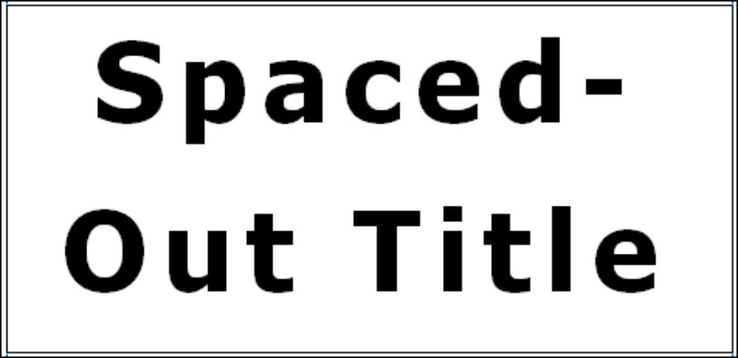
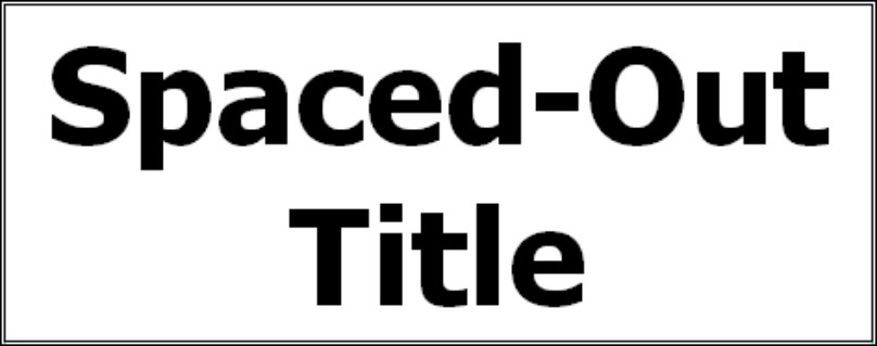
A common error in headlines is having too much spacing between letters and between lines. Headlines nearly always benefit from proper kerning and from reducing the default line spacing that Publisher applies to large letters. Kerning is particularly important in headlines with serif fonts.
Figure 12-4 shows an example of a headline that dominates the page. In Figure 12-5, the headline’s spacing between characters (tracking) was changed from very loose to normal, and the line spacing was adjusted to 1.25 sp. In addition, the headline frame can now be reduced to make the headline less prominent.
If a headline belongs with a block of text, leave more space above the headline than below so that readers have a visual clue that the headline applies to the text that follows.
Another problem to watch for is a headline that breaks across lines in a way that makes the meaning unclear to the casual reader. If you can improve the readability of your headline by grouping phrases, do so. For example, in the headline Gas Prices Top $4 Per Gallon, break the line in front of the word Top rather than behind it. (Then go pull your bicycle out of the garage.)
|
Figure 12-4: A large headline before adjustment. |
|
|
Figure 12-5: The same headline after tracking and line spacing adjustments were made. |
|
Make sure that your headline placement matches the page numbering in the table of contents (if your publication has one). Although many page layout programs automatically renumber the table of contents, Publisher does not. Also, if you use headlines as headers and footers and place these elements in the background, make sure that they’re correct when you proofread the pages.
Getting words to fit in text boxes
One way to make text fit into a text box is to simply adjust the size of the text box. This task is straightforward if only a single text box is on the page. With several text boxes in a multicolumn page layout, however, resizing text boxes can affect all columns simultaneously. One subtle way to work around adjusted text boxes is to play with the lines and spacing in your headlines. If you made the text boxes smaller and now have extra space on the page, you can add a line to a headline or put in a secondary headline to occupy that space. If you made the text boxes larger, you can remove extra headlines to provide more room.
The amount of line spacing dramatically affects the amount of text you can fit into a text box. You can adjust line spacing in
A single text box
All text boxes on a page
All text boxes on a two-page spread
You also can change the spacing before, after, and between paragraphs. If you adjust line spacing, you do so for the entire text box and, ideally, for all text boxes on a page or a two-page spread.
I also like kerning and tracking as a way to slightly alter text to make it fit correctly in a text box. (When you use kerning and tracking in this way, the change isn’t obvious to a casual observer.) Chapter 7 tells you about various techniques for adjusting the spacing between letters in your text.
When you adjust text boxes, pay particular attention to preventing widows and orphans. A widow is a short line at the top of a page or column; an orphan is a word, or portion of a word, on a line by itself at the end of a paragraph.
One common mistake to watch for is two spaces between sentences. This practice is a holdover from the days when people used typewriters — the extra space made sentences more obvious.
Hyphenating and justifying text
Another method for altering the way text fits in a text box is to change the justification. Sometimes after a design is set, however, you don’t have the flexibility to change the text justification. To fit the largest amount of text into a text box, apply full justification and automatic hyphenation to the text box. Remember, however, that you cannot use automatic hyphenation for only part of a text box.
When you use right- or left-justified text (also called ragged text) as opposed to full justification, you often make the text more readable even though you can’t fit as much text in a column. To gain more space, hyphenate.
You can also force a line ending at the position where the automatic hyphenation tool places a hyphen. To do so, move the cursor to that position, click and press Ctrl+- (hyphen). An optional hyphen shows up only when the entire word doesn’t fit on the line. Therefore, optional hyphens aren’t affected by soft carriage returns. If you want to make sure that a word is never hyphenated (at the position where Publisher would hyphenate it), move the cursor to that position, click and press Ctrl+Alt+- (hyphen). I recommend this safeguard for a compound word that already contains a hyphen: for example, double-barreled rather than double-barrel-ed. The common practice is to never end a column or text box with a hyphen.
When you hyphenate text in a paragraph, try to have no more than two consecutive hyphenated lines. Hyphenated text is harder to read and understand. For this reason, some page layout professionals avoid hyphenation, although it greatly increases the amount of work necessary to fine-tune the layout. Whatever you do, don’t hyphenate headlines; they must be readable at a glance.
You can control the amount of hyphenation that Publisher uses by changing an option in the Hyphenation dialog box. Choose Tools⇒Language⇒Hyphenation from the main menu and enter a smaller number in the Hyphenation zone text box to smooth out your ragged edge and to reduce the amount of white space between words. To have fewer hyphens or to have fewer short syllables before and after the hyphen, make the Hyphenation zone larger.
You can also open the Hyphenation dialog box by pressing Ctrl+Shift+H.
Page Improvements
People tend to read a page from the upper-left corner to the lower-right corner. In a two-page spread, that principle applies to the upper-left corner of the left-hand page to the lower-right corner of the right-hand page. Putting your most important page elements along this diagonal path is good design practice.
One useful feature of page layout programs is that they impose a design structure on your pages. Readers should be able to instinctively find common elements, such as page numbers, on a page. I recommend setting common page elements on master pages, one master page for all left-hand pages and another master page for all right-hand pages. With these common elements in place, you can move on to break up the tedium of your pages by having some elements stand out. The longer the publication, the more important it is to have elements that draw the eye to specific sections.
Special page elements
Earlier in this chapter, I describe some techniques for breaking up a page and drawing attention to various sections. The following useful techniques help make your pages more interesting:
Pictures: Pictures instantly attract attention. When you place a picture on a page, it becomes a focus of attention. Putting pictures off the reader’s diagonal path — in the lower-left or upper-right corner of a page or two-page spread — creates an interesting effect. If you use too many pictures, however, you greatly reduce their effectiveness.
Drop caps or raised caps: These design elements are an excellent way to start a chapter or section, and they draw the reader’s attention regardless of where they appear on the page.
Rules and shaded boxes: I like rules and shaded boxes because they’re particularly valuable for making headlines stand out. If you think that a section of text is important, put it in a shaded box.
Pull quotes or sidebars: A pull quote is a short section that highlights the important point you’re making on a page. To make a pull quote stand out, place it outside the text box. Sidebars are longer sections that you want to make stand out. You can reserve sidebars for optional reading or make them central to your text treatment.
Don’t forget that the Design Gallery comes with a selection of specially formatted headlines, coupons, pull quotes, sidebars, tables of contents, and titles. If you create any design elements that you want to use elsewhere, create your own category in the Design Gallery and save those elements under it. I talk about the Design Gallery in Chapter 9, and I like it so much that I wish it were greatly expanded. Figure 12-6 shows you the Design Gallery with the Pull Quotes category selected.
|
Figure 12-6: Pull quotes in the Design Gallery. |

|
Drawn objects
Although most tools in the toolbox can’t draw objects for you, you can use them to create interesting effects. You can also find special shapes on the AutoShapes tool on the Object toolbar. Drawn objects don’t have to be small; they can be major page elements as well. For example, if you’re creating a publication that includes a topic for discussion or the dialogue of a play, you can use a cartoon balloon shape — which is ordinarily used to hold captions — as your entire page frame. Be creative and have fun!
Also, you needn’t be constrained by the shapes that appear in the toolbox. You can combine shapes to create other shapes, such as combining triangles, circles, and lines to create a mountain landscape with the moon rising in the background. When you combine shapes with colors, patterns, gradients, and shadings, you have a wealth of tools at your disposal.
Borders and shading
Borders and shading are helpful ways of separating a section of your page. You can place borders around pictures by using rectangles and circles or create a matted-photograph look by putting colored frames in back of pictures. If you try this technique, consider using bold colors to emphasize the picture.
When you use borders and shading with text, try to understate their presence. If a shaded block is colored gray, keep the gray level at 10 to 15 percent. You can overuse color on a page very easily. Similarly, if you use shading in back of text, make sure that the shading makes your text more readable, not less. As the shading gets darker, it’s more difficult to see black text but easier to see white text. Note that white text, or reversed text, is generally less readable than black text. It works well only in front of black backgrounds and in short phrases, such as headlines.
Borders and shading are valuable when you create tables. The Publisher table frame automatically creates shades and borders for you. If you create an array of information without a table frame, consider adding these features to your work.
Special symbols
If you use capitalization in a paragraph, you might find that using SMALL CAPS looks better, particularly for a whole sentence of capitals. Also, changing a line of capitals to small caps can shorten your paragraph measurably and help you with copyfitting. If you have a paragraph that must be lengthened to fit the text box, consider making the first sentence all caps — especially if the first sentence makes the point for the paragraph or section.
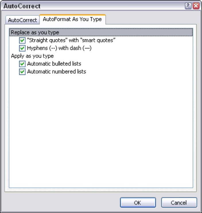
Keyboards have feet (') and inch (") marks for single and double quotation marks. Typographers prefer the use of stylized smart quotes instead: ‘and’ for single quotation marks and “and” for double quotation marks. To automatically insert these symbols into your text when you type single and double quotation marks, choose Tools⇒AutoCorrect Options to open the AutoCorrect dialog box. Click the AutoFormat As You Type tab and select the "Straight Quotes" with “Smart Quotes” check box, as shown in Figure 12-7. (This option is set by default.) If you have text that needs straight single or double quotation marks, you have to turn off the option temporarily. Don’t forget to turn it back on when you finish. You can also use the Insert Symbol dialog box to insert any of these characters.
|
Figure 12-7: The AutoFormat As You Type tab of the AutoCorrect dialog box. |
|
Suppose that you want to align the first character of a headline or a pull quote with the text frame that appears below or above it. A regular quotation mark can disrupt that visual alignment and be distracting. Therefore, you might want to use the hanging quotation mark typographical technique to put an opening quotation mark to the left of the headline or pull quote.
Some page layout programs let you format a paragraph so that it has a hanging quotation mark. In Publisher, follow these steps to create this effect manually:
1. Type a paragraph or pull quote with smart quotes at the beginning and end of the text.
2. Create a small text box that’s large enough to hold the quotation mark.
3. Position the small text box to the left of the paragraph or pull quote for an opening quotation mark or to the right for a closing quotation mark.
Zooming in to see your text is helpful when placing the small text box.
4. Select (highlight) the quotation mark in the paragraph or pull quote and then choose Edit ⇒Cut to cut it to the Clipboard.
5. Click an insertion point in the small hanging text box; then choose Edit ⇒Paste to paste the cut quotation mark into the frame.
Unfortunately, because you have separate text boxes, the hanging quotation doesn’t automatically follow the headline as it moves around on your page. Therefore, group the hanging quotation mark text box with the headline or pull quote text box. Other symbols that typographers use (which might be new to you) are the en dash (–) and em dash (––) in place of two hyphens ( - -) and three hyphens ( - - -), respectively. They’re named en dash and em dash because they’re the width of a capital N and M, respectively, in the font that’s being used. Many desktop publishing programs automatically substitute these symbols whenever you type two or three hyphens. Publisher, for example, automatically substitutes the en dash when you type a space followed by a hyphen, and an em dash when you type two hyphens together.
Good typographical practice recommends using en dashes to indicate a range of numbers (where you would normally put the word to) or when you have a compound word, as in Barrington Smythe–Jones. Use an em dash to set off a parenthetical remark — as I do in this sentence — before you end your thought and use up your brain cells.
If your en and em dashes don’t show up automatically, ensure that the Hyphens (-,- -) with en/em dashes (—) option is enabled on the AutoReplace Format As You Type tab of the AutoCorrect dialog box.
If you look closely at the symbols in different fonts, you find that most fonts contain typographer’s fractions. The 1⁄2 and 1⁄4 symbols appear to the right in the Insert Symbols dialog box, one line down from where the en and em dashes appear. Also, most fonts have characters for copyright (©), trademark (™), and registration (®) symbols. These special characters are best used as superscripts in the same font size. You also find various currency symbols ($, £, ¢), accented characters (Á, ç, é, ô), and ligatures (Æ, æ), for example.
You may require a special fraction beyond the ones offered in a standard character set. Here’s how you create one:
1. In standard text, type the fraction you want, such as 3/8.
2. Format the numbers to the left and right of the division sign at about 60 to 70 percent of the text size.
For example, if you have 12-point text, use 8-point numbers.
3. Format the left number as a superscript and the right number as a subscript by choosing Format ⇒Font from the main menu and clicking the corresponding radio buttons in the Font dialog box.
Don’t forget that you can use non-integer point sizes (such as 11.5) if you’re using TrueType fonts or Postscript fonts and Adobe Type Manager.