Creating a Style for your Books
Before I started publishing books on Amazon, I set up a Word “Style” that could accommodate how I wanted to do things. You can do a very similar process in any Word processor.
I’ll show you how to set this up in Microsoft Word.
If you are fairly new to Word and don’t have a preferred setup in terms of fonts, paragraphs, alignment, margins, etc., then I suggest you start off by selecting one of the presets built into Word and modify that.
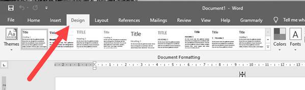
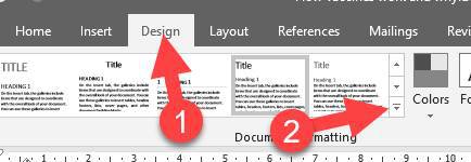
You can do this by clicking on the Design
tab.
There are a number of ready-made document formatting styles that you can select. There are also a number of different Themes
that you can choose from.
Let me show you how to set this up.
From the Themes
menu, select Office.
Each theme in that list will load its own unique set of document formatting styles, which you can view by mousing over them in the Document Formatting
window:
As your mouse moves from one to the next, the text in your Word document will update to show you that style. You will also get a tooltip to tell you the name of the style you are viewing.
Select Black & White (Word).
This gives us a starting point to create our own style.
Which Font?
When writing your book, stick to a plain and simple font and never mix two or more fonts within the same document. Amazon Kindle will over-write your font(s) anyway, but that may not be the case with other eBook publishing platforms, and it certainly isn’t the case when you publish your book as a paperback. Get into the habit of using a single font throughout.
Font size is not critical for Kindle versions because Kindle owners can change the font size on their device. However, if you are going to be creating a paperback from your Word document, it is important. Therefore, I suggest you set up Word to use the correct font sizes from the beginning.
Please note that you can’t just use any font. You need to make sure you have the right to use the font commercially. I am not a lawyer, so please don’t ask my advice on this. You need to read the copyright information of the fonts you have access to. Having said that, any fonts that came pre-installed with Word are probably safe to use.
There are a couple of places you can find free fonts for commercial use:
Quick Style Buttons
On the Home
tab in Word, the ribbon bar has “buttons” for quickly selecting styles for the text in your book.
If you select any text in your Word document, the styles panel will highlight the currently used style for the selected text. Click on one of these style buttons to change a style, and the text will be formatted accordingly. e.g., if you click on Heading 3, the selected text will be styled the way your theme has set up the formatting for Heading 3.
Try it. Select some text in your document.
Click the Heading 1
button, and the selected text will become a large heading. Click on Normal
, and your selected text will be formatted as “normal” text.
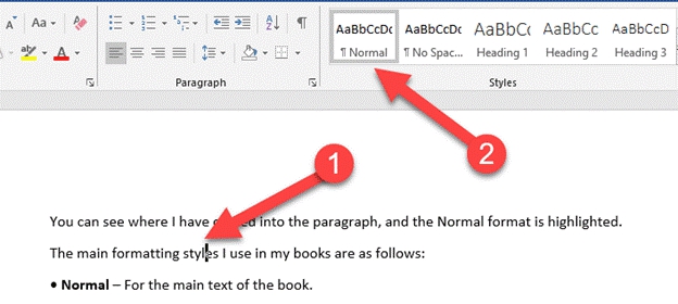
The main paragraphs in your book should always be formatted to the “Normal” style:
You can test this by clicking on a paragraph of your book, and the Normal format should become highlighted:
You can see where I have clicked into the paragraph, and the Normal
format is highlighted.
The main formatting styles I use in my books are as follows:
• Normal
– For the main text of the book.
• No Spacing
–for problems with some justified text that tries to stretch a few words across an entire line. I set this style to left-aligned to prevent these issues.
• Heading 1
– For chapter headings.
• Heading 2
– For the main sub-headers in the chapter.
• Heading 3
– For sub-sections of the main chapter sections.
• Title
– For the title on the cover page.
• Subtitle
– For the subtitle/tagline on the cover page.
• Quote
– For quoting people, websites, or other sources.
You need to make sure that all of these formats are set up to use your chosen font.
Quickly Changing the Default Font for your Style
You can quickly change the font used in a style by clicking the Fonts
button over on the Design
tab:
Select the font you want to use, and all styles will be updated to use that font.
For now, select the Office font, Calibri Light, at the top.
OK, all styles now use this font. However, this does not change the color or size of the text. We need to do that manually.
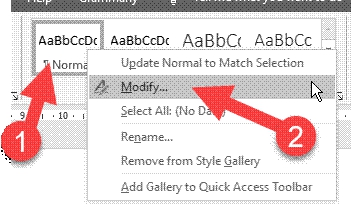
To do that, go back to the Home tab and right-click on the Normal
style button, and select the Modify
option:
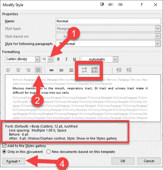
This opens a dialogue box that allows you to change the font style:
I’d recommend that Normal
text should be no smaller than size 12.
Notice that you can also change the alignment of the text, and if you want your paragraphs justified, select the justify button. On the same toolbar, there are two buttons you can click to adjust the spacing between paragraphs. One increases the gap between paragraphs, and the other decreases it. This is the correct way to ensure the spacing between paragraphs is correct. Never type hard line-breaks to leave a space.
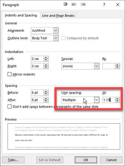
At the bottom, you can see the format specifications as you make the changes. You can see mine now has the 12pt font, justified with line spacing set to 1.08. There is also a 6pt space before each paragraph and an 8pt space after each paragraph.
These are good settings for the Normal style
.
This is almost how I want my paragraphs displayed, with one small change. I want my line spacing a little more than 1.08. I want to set this as 1.15. To do this, click the Format button at the bottom left and select Paragraph
from the menu. This opens up a new screen that allows us to refine the formatting.
Select Multiple
from the line spacing drop-down box and set that to 1.15.
Click OK to close this dialogue box, and OK to close the Modify Style
screen.
We now need to set the sizes of the headers (Heading 1, Heading 2, and Heading 3 are usually the only ones I use in my books). To do this, just right-click the style button and select Modify for each header in turn.
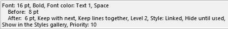
Here are my settings for Heading 3:
I’ve set the size to 14 and made the heading bold and color black. I’ve also clicked the button to increase the space before and after the headline. I have 8 points before, 6 points afterward.
I always add two points to my “normal” text size to use as the Heading 3. I’ll then add two more for heading 2 and two more for heading 1. This is just personal preference, but here is a quick reference for those sizes:
Normal text – 12
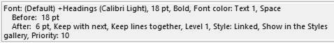
Heading 1 - 18
Heading 2 - 16
Heading 3 - 14
Here are my H2 settings:
Here are my H1 settings:
Obviously, you need to decide on these for yourself and what works best with the type of book you are writing, but the headings are hierarchical, so the Heading 1 should be bigger than Heading 2, which is bigger than Heading 3. Heading 3 should be bigger than the main text to make sure the headers stand out.
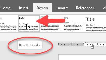
OK, you can now save your style.
On the Design tab, in the bottom right corner of the Document Formatting
options, there is a button:
Click it.
On the drop-down menu that appears, click on the Save as a New Style Set…
option.
Give your style a name, e.g., Kindle Books, and save it.
You can now see that style added to the Custom section of the menu:
The style will now be available whenever you start a new book. Just select it, and your formatting and style options will be loaded for your new book.
If you want to format a pre-existing document, then after you load your book into Word, just go and select your style from the drop-down menu, then save your book again.