
mapping personal memories and landscapes
Having a concept behind your work is important. In my art, I strive to create a connection between the viewer and what I have seen and experienced. Sometimes inspiration comes from memories, random doodling, images, or almost anything around me. The idea, crystallized into words, may emerge at the beginning or coalesce as I move forward in the design. Either way, I have found that a clear direction or road map is essential if I want the design to have an intention.
For quite a long time, I have had the idea of doing a fiber-art map that celebrates two places that were part of my formative years. They were two cherished locations in Tuscumbia and Sheffield, Alabama, where my grandparents lived. My personal memories of these places remain fondly embedded in my mind. At times, there is a sense of these places’ being very real, yet at other moments, they seem very abstract and dreamlike. As a follow-up to the two previous chapters, I think it is fitting to document making a fiber map based on something real and rooted in memory. You may have similar memories of a place in your childhood that could serve as a starting point for your own fiber-art map.
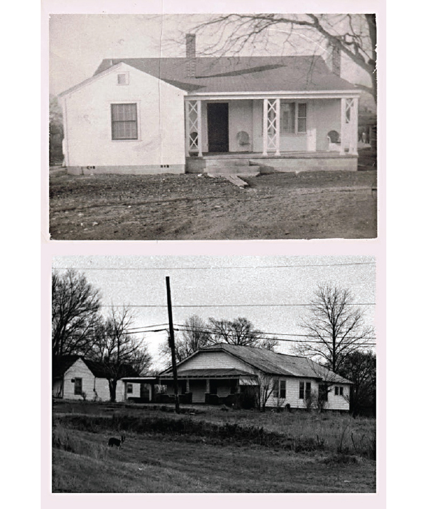
Places where my grandparents lived when I was a child
This chapter is about providing a glimpse into following an idea from conception to completion. The focus will be on the design process, not technique. Consider the following pages as a kind of visual diary about the evolution of one of my works.
“Text me!” This is what I said to my sisters Stacy and Sylvia, as I tried to put together memories of visiting my grandparents. I am the eldest of four sisters who grew up in Connecticut and traveled south each summer with much joy and anticipation. As I awaited their texts throughout the morning, I knew their thoughts would be useful. Below are some of the words they shared with me on my cell phone:
• small-town living
• wide-open spaces
• church
• “Sweet Hour of Prayer” (a classic gospel song)
• sitting and swinging on the porch
• warm summers
• loud crickets
• fireflies
• homemade ice cream
• lots of visitors
• connection to the community
• visiting relatives
• crops
• living by the highway
• everything made from scratch
• Lawrence Welk (our maternal grandfather’s Saturday night TV show)
As I ran through the words and phrases in my brain, I knew it would be important to let the actual words become part of the quilt, so I decided to incorporate text into the map. The words would become one of the details appreciated by the viewer on close inspection of the design. I have used text in other work when I felt words would help convey important feelings (for example, The Economic Landscape, page 77, and African Burial Ground II, page 76), as many artists have to convey ideas about their personal life.
Everyday life can get quite busy, making it difficult to stop and document family memories. While making this quilt, I became a hunter-gatherer of old family photographs. This process became very meaningful to me as it conjured up more memories and led me to connect with family members I had not spoken with in a while, especially those that have become the keepers of treasured, timeworn family photographs. I collaged the words and the family images on a wall in my studio for inspiration. This display became useful reference throughout the design process.
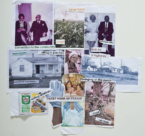
Collage of memory words and family images
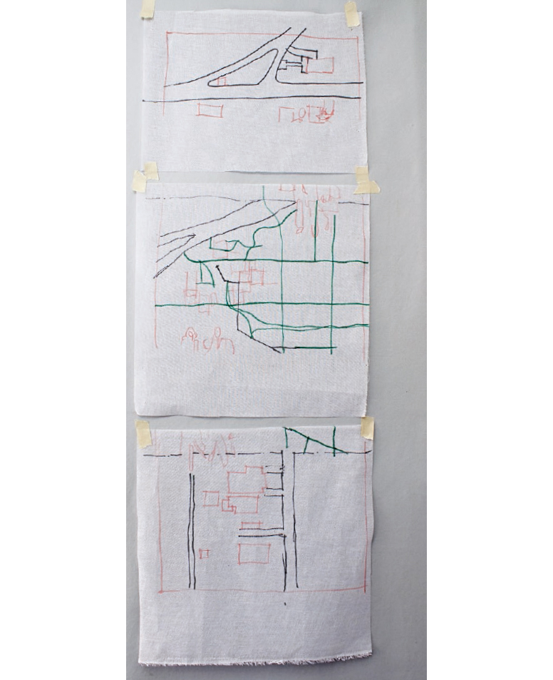
As discussed in Fiber-Art Travel Maps (page 49), there are many ways to find maps. I had started collecting a few maps of the area years ago and stored them on my computer hard drive. These maps were useful, but they were not old enough to depict what was there when I visited as a child. As a result, I altered the maps to reflect what I could remember.

My collection of maps and aerial views
As I studied the maps, I began to see my grandparents’ environment in a different way. I remembered the local trips between the homes. I became aware of the journey as a transition between places with different characteristics. As a result, I started to compare and contrast the two places.
My maternal grandparents lived in a rural environment, where the houses had plenty of space between them. The house was set slightly up a red clay hill, anchoring a wedge-shaped piece of land. Imagine country living beside a southern highway with a cornfield in the backyard. Embracing this idyllic rural setting was the sense of community, despite the distance between the houses in this area.
My paternal grandparents lived in a more dense area, with streets based on a grid. Right across the street from their house was a window-manufacturing plant, whose presence seemed out of scale to the modest homes around it. This was something I took for granted back then, but in hindsight I realize how unusual it was. I am now very aware that these grandparents lived on the border between housing and a small industrial zone. Apart from this context, the great part about their living here was that the nearest relative was just a few houses down the way. I remember all the visitors and times spent sitting on the porch and the treasured garden bench in the front yard. It was a special place to visit, filled with love and pride.
I began moving forward with the design sketches knowing that I wanted to use three maps:
• The site where my maternal grandparents lived
• The site where my paternal grandparents lived
• The route between the two
I knew I needed to revise and augment the maps I had collected. For this project, I worked by hand and on the computer.
To filter out the unimportant details I saw in the map of the area between the two homes, I decided to make a simplified sketch. Placing a piece of tracing paper on top of the map, I made a sketch of the area, highlighting the route with a dark line.

Simplified sketch of the route between my grandparents’ homes
Photo by C&T Publishing
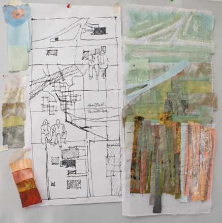
After making this simple drawing, I scanned it to create an image file. After some experimentation, I placed an image file of a map of one grandparents’ site above it and the other one right below. When satisfied with the arrangement, I saved it and printed this design out to create another tracing.

Composite image of three maps made using image-editing software with added photos of my grandparents
Image by Valerie S. Goodwin
Sometimes I enjoy going back and forth between using hand sketches and my image-editing software to explore design ideas. At times, I find this exercise a great way to play with color and contrast. It can also be a good way to tweak the design without committing myself to hours of redrawing. Even though I may spend time doing this, I always allow my work to evolve as I go along.

Design sketch tweaked using image-editing software
As I prepared a sketch of all three areas, I thought about the possible connections between the lines and shapes. I was interested to see how the two larger-scale maps worked with the smaller-scale map of the route. I made a combined design sketch using my image-editing software.
• The red clay earth in Alabama
• The earthy quality of the people
• The green and fertile nature of the land
• The Tennessee River, a powerful landmark of the area
• Using light, medium, and dark fabric to provide contrast and develop a subtle gradation of color from the top to the bottom of the map
Having found the fabric to reflect these goals, I moved on to prep work. I traced the main lines and shapes onto crinoline to make it easier to transfer this information to the fabric later on. I used dark permanent pens so the traced lines could be seen on both sides of the crinoline.

Auditioning fabric
Photo by C&T Publishing

Tracing on crinoline with map underneath
Sections of crinoline with traced lines and shapes
Using some of the methods described in Background Music: The Landscape Layer (page 23), I began to sew fabric to the crinoline. I tried to create a gradation of color to identify the three map zones, going from lighter to darker fabrics vertically. Another goal was to make the top map more organic, the middle one rectilinear, and the bottom one more vertical. Refer to More Backgrounds (page 27) for examples of creating different effects on the background layer of a fiber-art map.

Adding first layer of fabric to crinoline base
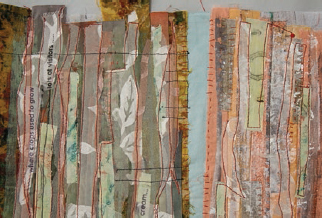
After completely covering the crinoline with the first layer of fabric, I added hand stitching and paint to certain areas. The direction of the stitching and the paint strokes reinforced the geometric ideas I wanted to represent: organic, rectilinear, and vertical.

Painted and hand-stitched background
To create a watercolor effect and to add understated complexity, I began to add sheer fabric to the surface (see The Translucent Layer, page 25).
Sheer fabric added to surface
I created marks in the land by adding machine stitching in contrasting thread, at the same time using the stitching to secure any loose edges of fabric. In addition, I carefully chose the shapes and angles of these lines to work with the geometrical language of each section of the map.

Machine stitching added to surface
After finishing the earth’s surface, I located key lines and shapes, such as streets, by looking at the reverse side of the quilt. As you recall, I had made a tracing on top of the crinoline. The traced lines were dark enough to also appear on the flip side of the crinoline. At this point the previously drawn lines became very useful. I used them to locate the streets near my paternal grandparents’ home. I machine stitched this information from the back, using thread that would stand out on the front. In the photo to the right, you can see the streets highlighted with white paint; a similar process worked well in other sections of the map.

Flip side of crinoline showing black lines representing streets
Front side of quilt with black lines stitched using lines on crinoline
Front side of quilt with roads highlighted using white paint
I worked on the three maps as separate parts. This approach gave me control over each section. In addition, it gave me time to reflect on how I would join them visually and structurally.
I kept the top map, the area where my maternal grandparents lived, light in value. I used soft colors that had the sense of being floral, light, and airy. Perhaps my memories of learning to sew and my grandmother’s flower beds were on my mind.

Top section of map in process
The middle portion of the map represented the place “in between” the two destinations. I remember going from open lands to more developed areas. The decision to use a loose rectilinear pattern on the background was related to the fact that this area was more grid-like.
Another key part of this map was the mighty Tennessee River and the bridge that spanned it. These elements were the important landmarks. Traveling across the bridge to the other side of the river was always a treat for me as a child. My paternal grandparents’ home was not far from the river, nestled against a mix of manufacturing industries.

Middle section of map in process
The bottom section of the map was intentionally darker in value to anchor the bottom of the quilt. This choice also reflects the fact that these grandparents lived on the edge of a manufacturing zone. I decided to emphasize verticality to give this portion of the work a sense of movement beyond the edge.
Despite being near an industrial zone, the feeling of a welcoming small town was apparent. Look closely and you can see where I started to use the memory words discussed at the beginning of this chapter. More paint and sheer fabric were needed to lighten up the feeling of this zone. That concern would be addressed as I completed the quilt.

Bottom section of map in process
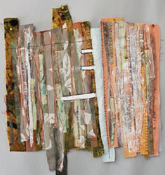
When satisfied with each separate map, I sewed them together. To emphasize that these were distinct maps, I added paint at the top section of each. My technique was to let the paint gradually fade away and become part of the background. Notice that at some points the sections merge and at others they overlap—showing that these maps are all very connected.
My next task was to add the site details as well as the photographs of each home and my grandparents. I printed these images onto inkjet fabric, added fusible web to the back, and placed them in the spots I had designated in my initial sketches.

Paint added to make distinction between maps

Images printed on fabric prepared for inkjet printing
I named the completed piece Landscapes of Legacy. Although this is a finished work, I also realize that this particular work has special qualities that might lead one day to another quilt. It may even become part of a series.
As I make art, I realize that many times one thing leads to another. Writing this chapter and making this piece has been quite a journey, and I don’t think I am done with this subject matter. I know that many memory maps hang out there in my mind. I am excited by this idea and want to create other maps about my memories. Hopefully, after reading about the evolution of this piece, you will make your own memory-based fiber-art maps.

Landscapes of Legacy by Valerie S. Goodwin, 2012, 18˝ × 36˝
