Chapter 7
Mathematics
You can do a lot of maths in R. Here we concentrate on the kinds of mathematics that find most frequent application in scientific work and statistical modelling:
- functions;
- continuous distributions;
- discrete distributions;
- matrix algebra;
- calculus;
- differential equations.
7.1 Mathematical functions
For the kinds of functions you will meet in statistical computing there are only three mathematical rules that you need to learn: these are concerned with powers, exponents and logarithms. In the expression xb the explanatory variable is raised to the power b. In ex the explanatory variable appears as a power – in this special case, of e = 2.718 28, of which x is the exponent. The inverse of ex is the logarithm of x, denoted by log(x) – note that all our logs are to the base e and that, for us, writing log(x) is the same as ln(x).
It is also useful to remember a handful of mathematical facts that are useful for working out behaviour at the limits. We would like to know what happens to y when x gets very large (e.g. x → ∞) and what happens to y when x goes to 0 (i.e. what the intercept is, if there is one). These are the most important rules:
- Anything to the power zero is 1: x0 = 1.
- One raised to any power is still 1: 1x = 1.
- Infinity plus 1 is infinity: ∞ + 1 = ∞.
- One over infinity (the reciprocal of infinity, ∞–1) is zero:
 .
. - A number > 1 raised to the power infinity is infinity: 1.2∞ = ∞.
- A fraction (e.g. 0.99) raised to the power infinity is zero: 0.99∞ = 0.
- Negative powers are reciprocals:
 .
. - Fractional powers are roots:
 .
. - The base of natural logarithms, e, is 2.718 28, so e∞ = ∞.
- Last, but perhaps most usefully:
 .
.
There are built-in functions in R for logarithmic, probability and trigonometric functions (p. 17).
7.1.1 Logarithmic functions
The logarithmic function is given by

Here the logarithm is to base e. The exponential function, in which the response y is the antilogarithm of the continuous explanatory variable x, is given by

Both these functions are smooth functions, and to draw smooth functions in R you need to generate a series of 100 or more regularly spaced x values between min(x) and max(x):
x <- seq(0,10,0.1)
In R the exponential function is exp and the natural log function (ln) is log. Let a = b = 1. To plot the exponential and logarithmic functions with these values together in a row, write
windows(7,4)
par(mfrow=c(1,2))
y <- exp(x)
plot(y∼x,type="l",main="Exponential")
y <- log(x)
plot(y∼x,type="l",main="Logarithmic")
Note that the plot function can be used in an alternative way, specifying the Cartesian coordinates of the line using plot(x,y) rather than the formula plot(y∼x) (see p. 190).
These functions are most useful in modelling process of exponential growth and decay.
7.1.2 Trigonometric functions
Here are the cosine (base/hypotenuse), sine (perpendicular/hypotenuse) and tangent (perpendicular/base) functions of x (measured in radians) over the range 0 to 2π. Recall that the full circle is 2π radians, so 1 radian = 360/2π = 57.295 78 degrees.
windows(7,7)
par(mfrow=c(2,2))
x <- seq(0,2*pi,2*pi/100)
y1 <- cos(x)
y2 <- sin(x)
y3 <- tan(x)
plot(y1∼x,type="l",main="cosine")
plot(y2∼x,type="l",main="sine")
plot(y3∼x,type="l",ylim=c(-3,3),main="tangent")

The tangent of x has discontinuities, shooting off to positive infinity at x = π/2 and again at x = 3π/2. Restricting the range of values plotted on the y axis (here from –3 to +3) therefore gives a better picture of the shape of the tan function. Note that R joins the plus infinity and minus infinity ‘points’ with a straight line at x = π/2 and at x = 3π/2 within the frame of the graph defined by ylim.
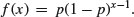
7.1.3 Power laws
There is an important family of two-parameter mathematical functions of the form

known as power laws. Depending on the value of the power, b, the relationship can take one of five forms. In the trivial case of b = 0 the function is y = a (a horizontal straight line). The four more interesting shapes are as follows:
x <- seq(0,1,0.01)
y <- x^0.5
plot(x,y,type="l",main="0<b<1")
y <- x
plot(x,y,type="l",main="b=1")
y <- x^2
plot(x,y,type="l",main="b>1")
y <- 1/x
plot(x,y,type="l",main="b<0")

These functions are useful in a wide range of disciplines. The parameters a and b are easy to estimate from data because the function is linearized by a log–log transformation,

so that on log–log axes the intercept is log(a) and the slope is b. These are often called allometric relationships because when b ≠ 1 the proportion of x that becomes y varies with x.
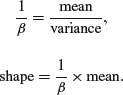
An important empirical relationship from ecological entomology that has applications in a wide range of statistical analysis is known as Taylor's power law. It has to do with the relationship between the variance and the mean of a sample. In elementary statistical models, the variance is assumed to be constant (i.e. the variance does not depend upon the mean). In field data, however, Taylor found that variance increased with the mean according to a power law, such that on log–log axes the data from most systems fell above a line through the origin with slope = 1 (the pattern shown by data that are Poisson distributed, where the variance is equal to the mean) and below a line through the origin with a slope of 2. Taylor's power law states that, for a particular system:
- log(variance) is a linear function of log(mean);
- the scatter about this straight line is small;
- the slope of the regression of log(variance) against log(mean) is greater than 1 and less than 2;
- the parameter values of the log–log regression are fundamental characteristics of the system.
7.1.4 Polynomial functions
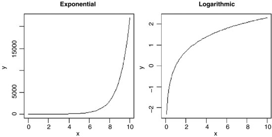
Polynomial functions are functions in which x appears several times, each time raised to a different power. They are useful for describing curves with humps, inflections or local maxima like these:
The top left-hand panel shows a decelerating positive function, modelled by the quadratic
x <- seq(0,10,0.1)
y1 <- 2+5*x-0.2*x^2
Making the negative coefficient of the x2 term larger produces a curve with a hump as in the top right-hand panel:
y2 <- 2+5*x-0.4*x^2
Cubic polynomials can show points of inflection, as in the lower left-hand panel:
y3 <- 2+4*x-0.6*x^2+0.04*x^3
Finally, polynomials containing powers of 4 are capable of producing curves with local maxima, as in the lower right-hand panel:
y4 <- 2+4*x+2*x^2-0.6*x^3+0.04*x^4
par(mfrow=c(2,2))
plot(x,y1,type="l",ylab="y",main="decelerating")
plot(x,y2,type="l",ylab="y",main="humped")
plot(x,y3,type="l",ylab="y",main="inflection")
plot(x,y4,type="l",ylab="y",main="local maximum")
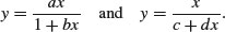
Inverse polynomials are an important class of functions which are suitable for setting up generalized linear models with gamma errors and inverse link functions:

Various shapes of function are produced, depending on the order of the polynomial (the maximum power) and the signs of the parameters:
par(mfrow=c(2,2))
y1 <- x/(2+5*x)
y2 <- 1/(x-2+4/x)
y3 <- 1/(x^2-2+4/x)
plot(x,y1,type="l",ylab="y",main="Michaelis-Menten")
plot(x,y2,type="l",ylab="y",main="shallow hump")
plot(x,y3,type="l",ylab="y",main="steep hump")
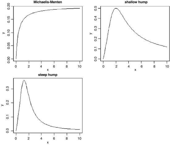
There are two ways of parameterizing the Michaelis–Menten equation:
In the first case, the asymptotic value of y is a/b and in the second it is 1/d.
7.1.5 Gamma function
The gamma function Γ(t) is an extension of the factorial function, t!, to positive real numbers:

It looks like this:
par(mfrow=c(1,1))
t <- seq(0.2,4,0.01)
plot(t,gamma(t),type="l")
abline(h=1,lty=2)
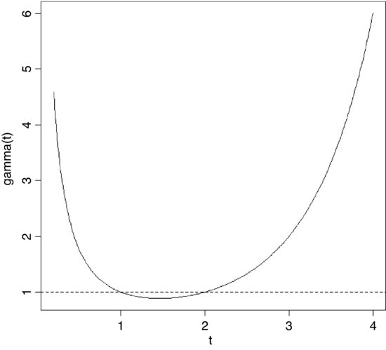
Note that Γ(t) is equal to 1 at both t = 1 and t = 2. For integer values of t, Γ(t + 1) = t!
7.1.6 Asymptotic functions
Much the most commonly used asymptotic function is

which has a different name in almost every scientific discipline. For example, in biochemistry it is called Michaelis–Menten, and shows reaction rate as a function of enzyme concentration; in ecology it is called Holling's disc equation and shows predator feeding rate as a function of prey density. The graph passes through the origin and rises with diminishing returns to an asymptotic value at which increasing the value of x does not lead to any further increase in y.
The other common function is the asymptotic exponential
This, too, is a two-parameter model, and in many cases the two functions would describe data equally well (see p. 719 for an example of this comparison).
Let us work out the behaviour at the limits of our two asymptotic functions, starting with the asymptotic exponential. For x = 0 we have

so the graph goes through the origin. At the other extreme, for x = ∞, we have

which demonstrates that the relationship is asymptotic, and that the asymptotic value of y is a.
Turning to the Michaelis–Menten equation, or x = 0 the limit is easy:
However, determining the behaviour at the limit x = ∞ is somewhat more difficult, because we end up with y = ∞/(1 + ∞) = ∞/∞, which you might imagine is always going to be 1 no matter what the values of a and b. In fact, there is a special mathematical rule for this case, called l'Hospital's rule: when you get a ratio of infinity to infinity, you work out the ratio of the derivatives to obtain the behaviour at the limit. The numerator is ax so its derivative with respect to x is a. The denominator is 1 + bx so its derivative with respect to x is 0 + b = b. So the ratio of the derivatives is a/b, and this is the asymptotic value of the Michaelis–Menten equation.
7.1.7 Parameter estimation in asymptotic functions
There is no way of linearizing the asymptotic exponential model, so we must resort to non-linear least squares (nls) to estimate parameter values for it (p. 715). One of the advantages of the Michaelis–Menten function is that it is easy to linearize. We use the reciprocal transformation

At first glance, this is no great help. But we can separate the terms on the right because they have a common denominator. Then we can cancel the xs, like this:

so if we put Y = 1/y, X = 1/x, A = 1/a, and C = b/a, we see that

which is linear: C is the intercept and A is the slope. So to estimate the values of a and b from data, we would transform both x and y to reciprocals, plot a graph of 1/y against 1/x, carry out a linear regression, then back-transform, to get:

Suppose that we knew that the graph passed through the two points (0.2, 44.44) and (0.6, 70.59). How do we work out the values of the parameters a and b? First, we calculate the four reciprocals. The slope of the linearized function, A, is the change in 1/y divided by the change in 1/x:
(1/44.44 - 1/70.59)/(1/0.2 - 1/0.6)
[1] 0.002500781
so a = 1/A = 1/0.0025 = 400. Now we rearrange the equation and use one of the points (say x = 0.2, y = 44.44) to get the value of b:

7.1.8 Sigmoid (S-shaped) functions
The simplest S-shaped function is the two-parameter logistic where, for 0 ≤ y ≤ 1,

which is central to the fitting of generalized linear models for proportion data (Chapter 16).
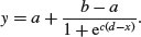
The three-parameter logistic function allows y to vary on any scale:

The intercept is a/(1 + b), the asymptotic value is a and the initial slope is measured by c. Here is the curve with parameters 100, 90 and 1.0:
par(mfrow=c(2,2))
x <- seq(0,10,0.1)
y <- 100/(1+90*exp(-1*x))
plot(x,y,type="l",main="three-parameter logistic")
The four-parameter logistic function has asymptotes at the left- (a) and right-hand (b) ends of the x axis and scales (c) the response to x about the midpoint (d) where the curve has its inflexion:
Letting a = 20, b = 120, c = 0.8 and d = 3, the function
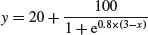
looks like this:
y <- 20+100/(1+exp(0.8*(3-x)))
plot(x,y,ylim=c(0,140),type="l",main="four-parameter logistic")
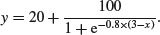
Negative sigmoid curves have the parameter c < 0, as for the function
An asymmetric S-shaped curve much used in demography and life insurance work is the Gompertz growth model,

The shape of the function depends on the signs of the parameters b and c. For a negative sigmoid, b is negative (here –1) and c is positive (here +0.02):
x <- -200:100
y <- 100*exp(-exp(0.02*x))
plot(x,y,type="l",main="negative Gompertz")
For a positive sigmoid both parameters are negative:
x <- 0:100
y <- 50*exp(-5*exp(-0.08*x))
plot(x,y,type="l",main="positive Gompertz")

7.1.9 Biexponential model
This is a useful four-parameter non-linear function, which is the sum of two exponential functions of x:
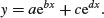
Various shapes depend upon the signs of the parameters b, c and d (a is assumed to be positive): the upper left-hand panel shows c positive, b and d negative (it is the sum of two exponential decay curves, so the fast decomposing material disappears first, then the slow, to produce two different phases); the upper right-hand panel shows c and d positive, b negative (this produces an asymmetric U-shaped curve); the lower left-hand panel shows c negative, b and d positive (this can, but does not always, produce a curve with a hump); and the lower right panel shows b and c positive, d negative. When b, c and d are all negative (not illustrated), the function is known as the first-order compartment model in which a drug administered at time 0 passes through the system with its dynamics affected by three physiological processes: elimination, absorption and clearance.
#1
a <- 10
b <- -0.8
c <- 10
d <- -0.05
y <- a*exp(b*x)+c*exp(d*x)
plot(x,y,main="+ - + -",type="l")
#2
a <- 10
b <- -0.8
c <- 10
d <- 0.05
y <- a*exp(b*x)+c*exp(d*x)
plot(x,y,main="+ - + +",type="l")
#3
a <- 200
b <- 0.2
c <- -1
d <- 0.7
y <- a*exp(b*x)+c*exp(d*x)
plot(x,y,main="+ + - +",type="l")
#4
a <- 200
b <- 0.05
c <- 300
d <- -0.5
y <- a*exp(b*x)+c*exp(d*x)
plot(x,y,main="+ + + -",type="l")
7.1.10 Transformations of the response and explanatory variables
We have seen the use of transformation to linearize the relationship between the response and the explanatory variables:
- log(y) against x for exponential relationships;
- log(y) against log(x) for power functions;
- exp(y) against x for logarithmic relationships;
- 1/y against 1/x for asymptotic relationships;
- log(p/(1 – p)) against x for proportion data.
Other transformations are useful for variance stabilization:
 to stabilize the variance for count data;
- arcsin(y) to stabilize the variance of percentage data.
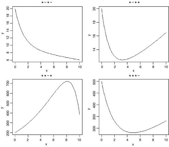
7.2 Probability functions
There are many specific probability distributions in R (normal, Poisson, binomial, etc.), and these are discussed in detail later. Here we look at the base mathematical functions that deal with elementary probability. The factorial function gives the number of permutations of n items. How many ways can four items be arranged? The first position could have any one of the 4 items in it, but by the time we get to choosing the second item we shall already have specified the first item so there are just 4 – 1 = 3 ways of choosing the second item. There are only 4 – 2 = 2 ways of choosing the third item, and by the time we get to the last item we have no degrees of freedom at all: the last number must be the one item out of four that we have not used in positions 1, 2 or 3. So with 4 items the answer is 4 × (4 – 1) × (4 – 2) × (4 – 3) which is 4 × 3 × 2 × 1 = 24. In general, factorial(n) is given by

The R function is factorial and we can plot it for values of x from 0 to 10 using the step option type="s", in plot with a logarithmic scale on the y axis log="y",
par(mfrow=c(1,1))
x <- 0:6
plot(x,factorial(x),type="s",main="factorial x",log="y")
The other important base function for probability calculations in R is the choose function which calculates binomial coefficients. These show the number of ways there are of selecting x items out of n items when the item can be one of just two types (e.g. either male or female, black or white, solvent or insolvent). Suppose we have 8 individuals and we want to know how many ways there are that 3 of them could be males (and hence 5 of them females). The answer is given by
so with n = 8 and x = 3 we get
and in R
choose(8,3)
[1] 56
Obviously there is only one way that all 8 individuals could be male or female, so there is only one way of getting 0 or 8 ‘successes’. One male could be the first individual you select, or the second, or the third, and so on. So there are 8 ways of selecting 1 out of 8. By the same reasoning, there must be 8 ways of selecting 7 males out of 8 individuals (the lone female could be in any one of the 8 positions). The following is a graph of the number of ways of selecting from 0 to 8 males out of 8 individuals:
plot(0:8,choose(8,0:8),type="s",main="binomial coefficients")

7.3 Continuous probability distributions
R has a wide range of built-in probability distributions, for each of which four functions are available: the probability density function (which has a d prefix); the cumulative probability (p); the quantiles of the distribution (q); and random numbers generated from the distribution (r). Each letter can be prefixed to the R function names in Table 7.1 (e.g. dbeta).
Table 7.1 The probability distributions supported by R. The meanings of the parameters are explained in the text.
| R function | Distribution | Parameters |
| beta | beta | shape1, shape2 |
| binom | binomial | sample size, probability |
| cauchy | Cauchy | location, scale |
| exp | exponential | rate (optional) |
| chisq | chi-squared | degrees of freedom |
| F | Fisher's F | df1, df2 |
| gamma | gamma | shape |
| geom | geometric | probability |
| hyper | hypergeometric | m, n, k |
| lnorm | lognormal | mean, standard deviation |
| logis | logistic | location, scale |
| nbinom | negative binomial | size, probability |
| norm | normal | mean, standard deviation |
| pois | Poisson | mean |
| signrank | Wilcoxon signed rank statistic | sample size n |
| t | Student's t | degrees of freedom |
| unif | uniform | minimum, maximum (opt.) |
| weibull | Weibull | shape |
| wilcox | Wilcoxon rank sum | m, n |
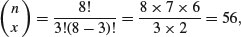
The cumulative probability function is a straightforward notion: it is an S-shaped curve showing, for any value of x, the probability of obtaining a sample value that is less than or equal to x. Here is what it looks like for the normal distribution:
curve(pnorm(x),-3,3)
arrows(-1,0,-1,pnorm(-1),col="red")
arrows(-1,pnorm(-1),-3,pnorm(-1),col="green")
The value of x (–1) leads up to the cumulative probability (red arrow) and the probability associated with obtaining a value of this size (–1) or smaller is on the y axis (green arrow). The value on the y axis is 0.1586553:
pnorm(-1)
[1] 0.1586553
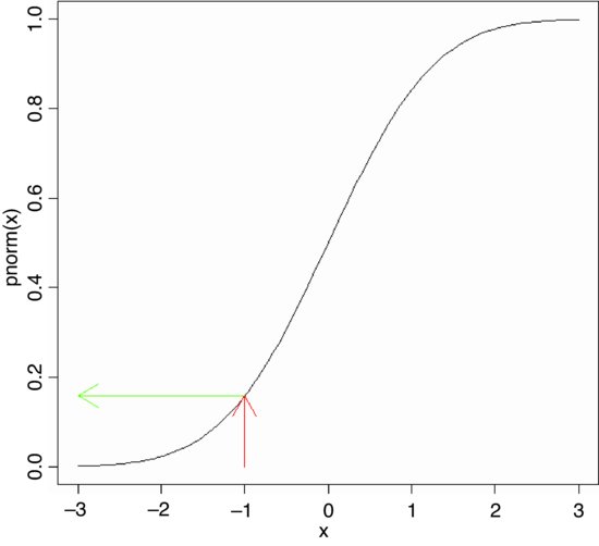
The probability density is the slope of this curve (its derivative). You can see at once that the slope is never negative. The slope starts out very shallow up to about x = –2, increases up to a peak (at x = 0 in this example) then gets shallower, and becomes very small indeed above about x = 2. Here is what the density function of the normal (dnorm) looks like:
curve(dnorm(x),-3,3)
For a discrete random variable, like the Poisson or the binomial, the probability density function is straightforward: it is simply a histogram with the y axis scaled as probabilities rather than counts, and the discrete values of x (0, 1, 2, 3, …) on the horizontal axis. But for a continuous random variable, the definition of the probability density function is more subtle: it does not have probabilities on the y axis, but rather the derivative (the slope) of the cumulative probability function at a given value of x.
7.3.1 Normal distribution
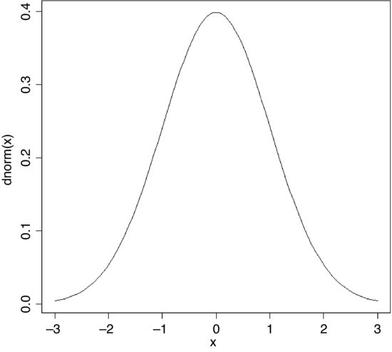
This distribution is central to the theory of parametric statistics. Consider the following simple exponential function:
As the power (m) in the exponent increases, the function becomes more and more like a step function. The following panels show the relationship between y and x for m = 1, 2, 3 and 8, respectively:
par(mfrow=c(2,2))
x <- seq(-3,3,0.01)
y <- exp(-abs(x))
plot(x,y,type="l",main= "x")
y <- exp(-abs(x)^2)
plot(x,y,type="l",main= "x^2")
y <- exp(-abs(x)^3)
plot(x,y,type="l",main= "x^3")
y <- exp(-abs(x)^8)
plot(x,y,type="l",main= "x^8")

The second of these panels (top right), where y = exp (–x2), is the basis of an extremely important and famous probability density function. Once it has been scaled, so that the integral (the area under the curve from –∞ to +∞) is unity, this is the normal distribution. Unfortunately, the scaling constants are rather cumbersome. When the distribution has mean 0 and standard deviation 1 (the standard normal distribution) the equation becomes:
Suppose we have measured the heights of 100 people. The mean height was 170 cm and the standard deviation was 8 cm. We can ask three sorts of questions about data like these: what is the probability that a randomly selected individual will be:
- shorter than a particular height?
- taller than a particular height?
- between one specified height and another?
The area under the whole curve is exactly 1; everybody has a height between minus infinity and plus infinity. True, but not particularly helpful. Suppose we want to know the probability that one of our people, selected at random from the group, will be less than 160 cm tall. We need to convert this height into a value of z; that is to say, we need to convert 160 cm into a number of standard deviations from the mean. What do we know about the standard normal distribution? It has a mean of 0 and a standard deviation of 1. So we can convert any value y, from a distribution with mean  and standard deviation s very simply by calculating

So we convert 160 cm into a number of standard deviations. It is less than the mean height (170 cm) so its value will be negative:

Now we need to find the probability of a value of the standard normal taking a value of –1.25 or smaller. This is the area under the left-hand tail (the integral) of the density function. The function we need for this is pnorm: we provide it with a value of z (or, more generally, with a quantile) and it provides us with the probability we want:
pnorm(-1.25)
[1] 0.1056498
So the answer to our first question (the shaded area, top left) is just over 10%.
Next, what is the probability of selecting one of our people and finding that they are taller than 185 cm (top right)? The first two parts of the exercise are exactly the same as before. First we convert our value of 185 cm into a number of standard deviations:
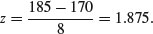
Then we ask what probability is associated with this, using pnorm:
pnorm(1.875)
[1] 0.9696036
But this is the answer to a different question. This is the probability that someone will be less than or equal to 185 cm tall (that is what the function pnorm has been written to provide). All we need to do is to work out the complement of this:
1-pnorm(1.875)
[1] 0.03039636
So the answer to the second question is about 3%.
Finally, we might want to know the probability of selecting a person between 165 cm and 180 cm. We have a bit more work to do here, because we need to calculate two z values:

The important point to grasp is this: we want the probability of selecting a person between these two z values, so we subtract the smaller probability from the larger probability:
pnorm(1.25)-pnorm(-0.625)
[1] 0.6283647
Thus we have a 63% chance of selecting a medium-sized person (taller than 165 cm and shorter than 180 cm) from this sample with a mean height of 170 cm and a standard deviation of 8 cm (bottom left).

The trick with curved polygons like these is to finish off their closure properly. In the bottom left-hand panel, for instance, we want to return to the x axis at 180 cm then draw straight along the x axis to 165 cm. We do this by concatenating two extra points on the end of the vectors of z and p coordinates:
x <- seq(-3,3,0.01)
z <- seq(-3,-1.25,0.01)
p <- dnorm(z)
z <- c(z,-1.25,-3)
p <- c(p,min(p),min(p))
plot(x,dnorm(x),type="l",xaxt="n",ylab="probability density",xlab="height")
axis(1,at=-3:3,labels=c("146","154","162","170","178","186","192"))
polygon(z,p,col="red")
z <- seq(1.875,3,0.01)
p <- dnorm(z)
z <- c(z,3,1.875)
p <- c(p,min(p),min(p))
plot(x,dnorm(x),type="l",xaxt="n",ylab="probability density",xlab="height")
axis(1,at=-3:3,labels=c("146","154","162","170","178","186","192"))
polygon(z,p,col="red")
z <- seq(-0.635,1.25,0.01)
p <- dnorm(z)
z <- c(z,1.25,-0.635)
p <- c(p,0,0)
plot(x,dnorm(x),type="l",xaxt="n",ylab="probability density",xlab="height")
axis(1,at=-3:3,labels=c("146","154","162","170","178","186","192"))
polygon(z,p,col="red")
7.3.2 The central limit theorem
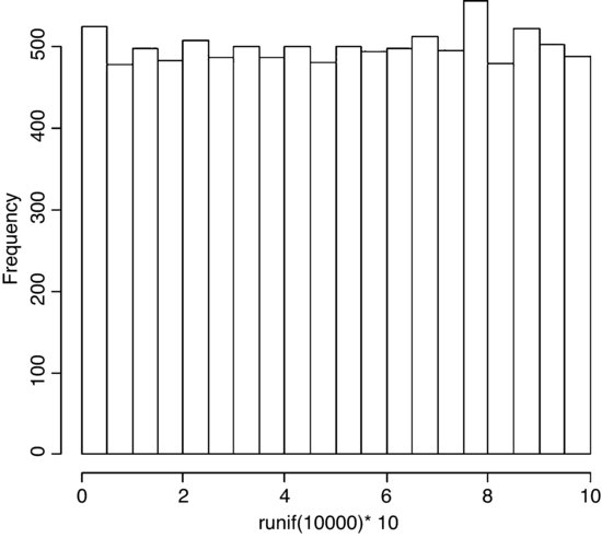
If you take repeated samples from a population with finite variance and calculate their averages, then the averages will be normally distributed. This is called the central limit theorem. Let us demonstrate it for ourselves. We can take five uniformly distributed random numbers between 0 and 10 and work out the average. The average will be low when we get, say, 2,3,1,2,1 and high when we get 9,8,9,6,8. Typically, of course, the average will be close to 5. Let us do this 10 000 times and look at the distribution of the 10 000 means. The data are rectangularly (uniformly) distributed on the interval 0 to 10, so the distribution of the raw data should be flat-topped:
par(mfrow=c(1,1))
hist(runif(10000)*10,main="")
What about the distribution of sample means, based on taking just five uniformly distributed random numbers?
means <- numeric(10000)
for (i in 1:10000){
means[i] <- mean(runif(5)*10)
}
hist(means,ylim=c(0,1600),main="")
Nice, but how close is this to a normal distribution? One test is to draw a normal distribution with the same parameters on top of the histogram. But what are these parameters? The normal is a two-parameter distribution that is characterized by its mean and its standard deviation. We can estimate these two parameters from our sample of 10 000 means (your values will be slightly different because of the randomization):
mean(means)
[1] 4.998581
sd(means)
[1] 1.289960
Now we use these two parameters in the probability density function of the normal distribution (dnorm) to create a normal curve with our particular mean and standard deviation. To draw the smooth line of the normal curve, we need to generate a series of values for the x axis; inspection of the histograms suggest that sensible limits would be from 0 to 10 (the limits we chose for our uniformly distributed random numbers). A good rule of thumb is that for a smooth curve you need at least 100 values, so let us try this:
xv <- seq(0,10,0.1)
There is just one thing left to do. The probability density function has an integral of 1.0 (that is the area beneath the normal curve), but we had 10 000 samples. To scale the normal probability density function to our particular case, however, depends on the height of the highest bar (about 1500 in this case). The height, in turn, depends on the chosen bin widths; if we doubled with width of the bin there would be roughly twice as many numbers in the bin and the bar would be twice as high on the y axis. To get the height of the bars on our frequency scale, therefore, we multiply the total frequency, 10 000 by the bin width, 0.5 to get 5000. We multiply 5000 by the probability density to get the height of the curve. Finally, we use lines to overlay the smooth curve on our histogram:
yv <- dnorm(xv,mean=4.998581,sd=1.28996)*5000
lines(xv,yv)
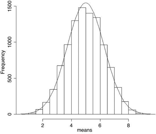
The fit is excellent. The central limit theorem really works. Almost any distribution, even a ‘badly behaved’ one like the uniform distribution we worked with here, will produce a normal distribution of sample means taken from it.
A simple example of the operation of the central limit theorem involves the use of dice. Throw one die lots of times and each of the six numbers should come up equally often: this is an example of a uniform distribution:
par(mfrow=c(2,2))
hist(sample(1:6,replace=T,10000),breaks=0.5:6.5,main="",xlab="one die")
Now throw two dice and add the scores together: this is the ancient game of craps. There are 11 possible scores from a minimum of 2 to a maximum of 12. The most likely score is 7 because there are six ways that this could come about:

For many throws of craps we get a triangular distribution of scores, centred on 7:
a <- sample(1:6,replace=T,10000)
b <- sample(1:6,replace=T,10000)
hist(a+b,breaks=1.5:12.5,main="", xlab="two dice")
There is already a clear indication of central tendency and spread. For three dice we get
c <- sample(1:6,replace=T,10000)
hist(a+b+c,breaks=2.5:18.5,main="", xlab="three dice")
and the bell shape of the normal distribution is starting to emerge. By the time we get to five dice, the binomial distribution is virtually indistinguishable from the normal:
d <- sample(1:6,replace=T,10000)
e <- sample(1:6,replace=T,10000)
hist(a+b+c+d+e,breaks=4.5:30.5,main="", xlab="five dice")

The smooth curve is given by a normal distribution with the same mean and standard deviation:
mean(a+b+c+d+e)
[1] 17.5937
sd(a+b+c+d+e)
[1] 3.837668
lines(seq(1,30,0.1),dnorm(seq(1,30,0.1),17.5937,3.837668)*10000)
7.3.3 Maximum likelihood with the normal distribution
The probability density of the normal is
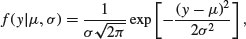
which is read as saying the probability density for a data value y, given (|) a mean of μ and a variance of σ2, is calculated from this rather complicated-looking two-parameter exponential function. For any given combination of μ and σ2, it gives a value between 0 and 1. Recall that likelihood is the product of the probability densities, for each of the values of the response variable, y. So if we have n values of y in our experiment, the likelihood function is

where the only change is that y has been replaced by yi and we multiply together the probabilities for each of the n data points. There is a little bit of algebra we can do to simplify this: we can get rid of the product operator, ∏, in two steps. First, the constant term, multiplied by itself n times, can just be written as  . Second, remember that the product of a set of antilogs (exp) can be written as the antilog of a sum of the values of xi like this:
 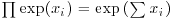 . This means that the product of the right-hand part of the expression can be written as
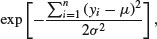
so we can rewrite the likelihood of the normal distribution as

The two parameters μ and σ are unknown, and the purpose of the exercise is to use statistical modelling to determine their maximum likelihood values from the data (the n different values of y). So how do we find the values of μ and σ that maximize this likelihood? The answer involves calculus: first we find the derivative of the function with respect to the parameters, then set it to zero, and solve.
It turns out that because of the exp function in the equation, it is easier to work out the log of the likelihood,

and maximize this instead. Obviously, the values of the parameters that maximize the log-likelihood 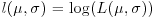 will be the same as those that maximize the likelihood. From now on, we shall assume that summation is over the index i from 1 to n.
Now for the calculus. We start with the mean, μ. The derivative of the log-likelihood with respect to μ is
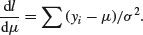
Set the derivative to zero and solve for μ:

Taking the summation through the bracket, and noting that  ,
,

The maximum likelihood estimate of μ is the arithmetic mean.
Next we find the derivative of the log-likelihood with respect to σ:
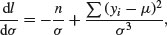
recalling that the derivative of log(x) is 1/x and the derivative of –1/x2 is 2/x3. Solving, we get
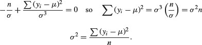
The maximum likelihood estimate of the variance σ2 is the mean squared deviation of the y values from the mean. This is a biased estimate of the variance, however, because it does not take account of the fact that we estimated the value of μ from the data. To unbias the estimate, we need to lose 1 degree of freedom to reflect this fact, and divide the sum of squares by n – 1 rather than by n (see p. 119 and restricted maximum likelihood estimators in Chapter 19).
Here, we illustrate R's built-in probability functions in the context of the normal distribution. The density function dnorm has a value of z (a quantile) as its argument. Optional arguments specify the mean and standard deviation (the default is the standard normal with mean 0 and standard deviation 1). Values of z outside the range –3.5 to +3.5 are very unlikely.
par(mfrow=c(2,2))
curve(dnorm,-3,3,xlab="z",ylab="Probability density",main="Density")
The probability function pnorm also has a value of z (a quantile) as its argument. Optional arguments specify the mean and standard deviation (default is the standard normal with mean 0 and standard deviation 1). It shows the cumulative probability of a value of z less than or equal to the value specified, and is an S-shaped curve:
curve(pnorm,-3,3,xlab="z",ylab="Probability",main="Probability")
Quantiles of the normal distribution qnorm have a cumulative probability as their argument. They perform the opposite function of pnorm, returning a value of z when provided with a probability.
curve(qnorm,0,1,xlab="p",ylab="Quantile (z)",main="Quantiles")
The normal distribution random number generator rnorm produces random real numbers from a distribution with specified mean and standard deviation. The first argument is the number of numbers that you want to be generated: here are 1000 random numbers with mean 0 and standard deviation 1:
y <- rnorm(1000)
hist(y,xlab="z",ylab="frequency",main="Random numbers")

The four functions (d, p, q and r) work in similar ways with all the other probability distributions.
7.3.4 Generating random numbers with exact mean and standard deviation
If you use a random number generator like rnorm then, naturally, the sample you generate will not have exactly the mean and standard deviation that you specify, and two runs will produce vectors with different means and standard deviations. Suppose we want 100 normal random numbers with a mean of exactly 24 and a standard deviation of precisely 4:
yvals <- rnorm(100,24,4)
mean(yvals)
[1] 24.2958
sd(yvals)
[1] 3.5725
Close, but not spot on. If you want to generate random numbers with an exact mean and standard deviation, then do the following:
ydevs <- rnorm(100,0,1)
Now compensate for the fact that the mean is not exactly 0 and the standard deviation is not exactly 1 by expressing all the values as departures from the sample mean scaled in units of the sample's standard deviations:
ydevs <- (ydevs-mean(ydevs))/sd(ydevs)
Check that the mean is 0 and the standard deviation is exactly 1:
mean(ydevs)
[1] -2.449430e-17
sd(ydevs)
[1] 1
The mean is as close to 0 as makes no difference, and the standard deviation is 1. Now multiply this vector by your desired standard deviation and add to your desired mean value to get a sample with exactly the means and standard deviation required:
yvals <- 24 + ydevs*4
mean(yvals)
[1] 24
sd(yvals)
[1] 4
7.3.5 Comparing data with a normal distribution
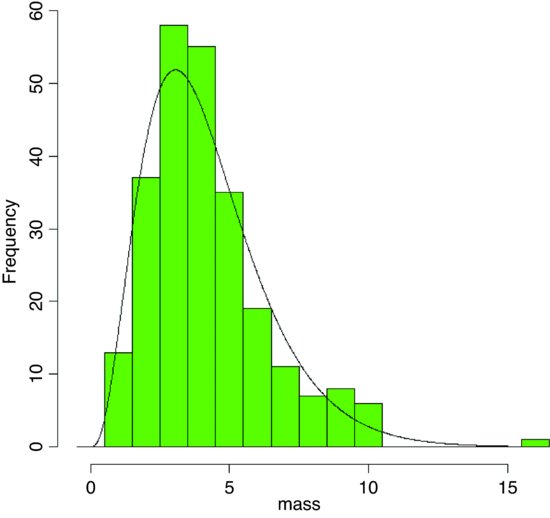
Various tests for normality are described on p. 346. Here we are concerned with the task of comparing a histogram of real data with a smooth normal distribution with the same mean and standard deviation, in order to look for evidence of non-normality (e.g. skew or kurtosis).
par(mfrow=c(1,1))
fishes <- read.table("c:\\temp\\fishes.txt",header=T)
attach(fishes)
names(fishes)
[1] "mass"
mean(mass)
[1] 4.194275
max(mass)
[1] 15.53216
Now the histogram of the mass of the fish is produced, specifying integer bins that are 1 gram in width, up to a maximum of 16.5 g:
hist(mass,breaks=-0.5:16.5,col="green",main="")
For the purposes of demonstration, we generate everything we need inside the lines function: the sequence of x values for plotting (0 to 16), and the height of the density function (the number of fish (length(mass)) times the probability density for each member of this sequence, for a normal distribution with mean(mass) and standard deviation sqrt(var(mass)) as its parameters, like this:
lines(seq(0,16,0.1),length(mass)*dnorm(seq(0,16,0.1),mean(mass),sqrt(var(mass))))

The distribution of fish sizes is clearly not normal. There are far too many fishes of 3 and 4 grams, too few of 6 or 7 grams, and too many really big fish (more than 8 grams). This kind of skewed distribution is probably better described by a gamma distribution (see Section 7.3.10) than a normal distribution.
7.3.6 Other distributions used in hypothesis testing
The main distributions used in hypothesis testing are: chi-squared, for testing hypotheses involving count data; Fisher's F, in analysis of variance (ANOVA) for comparing two variances; and Student's t, in small-sample work for comparing two parameter estimates. These distributions tell us the size of the test statistic that could be expected by chance alone when nothing was happening (i.e. when the null hypothesis was true). Given the rule that a big value of the test statistic tells us that something is happening, and hence that the null hypothesis is false, these distributions define what constitutes a big value of the test statistic (its critical value).
For instance, if we are doing a chi-squared test, and our test statistic is 14.3 on 9 degrees of freedom (d.f.), we need to know whether this is a large value (meaning the null hypothesis is probably false) or a small value (meaning that the null hypothesis cannot be rejected). In the old days we would have looked up the value in chi-squared tables. We would have looked in the row labelled 9 (the degrees of freedom row) and the column headed by α = 0.05. This is the conventional value for the acceptable probability of committing a Type I error: that is to say, we allow a 1 in 20 chance of rejecting the null hypothesis when it is actually true (see p. 358). Nowadays, we just type:
1-pchisq(14.3,9)
[1] 0.1120467
This indicates that 14.3 is actually a relatively small number when we have 9 d.f. We would conclude that nothing is happening, because a value of chi-squared as large as 14.3 has a greater than an 11% probability of arising by chance alone when the null hypothesis is true. We would want the probability to be less than 5% before we rejected the null hypothesis. So how large would the test statistic need to be, before we would reject the null hypothesis (i.e. what is the critical value of chi-squared)? We use qchisq to answer this. Its two arguments are 1 – α and the number of degrees of freedom:
qchisq(0.95,9)
[1] 16.91898
So the test statistic would need to be larger than 16.92 in order for us to reject the null hypothesis when there were 9 d.f.
We could use pf and qf in an exactly analogous manner for Fisher's F. Thus, the probability of getting a variance ratio of 2.85 by chance alone when the null hypothesis is true, given that we have 8 d.f. in the numerator and 12 d.f. in the denominator, is just under 5% (i.e. the value is just large enough to allow us to reject the null hypothesis):
1-pf(2.85,8,12)
[1] 0.04992133
Note that with pf, degrees of freedom in the numerator (8) come first in the list of arguments, followed by d.f. in the denominator (12).
Similarly, with Student's t statistic and pt and qt. For instance, the value of t in tables for a two-tailed test at α/2 = 0.025 with 10 d.f. is
qt(0.975,10)
[1] 2.228139
7.3.7 The chi-squared distribution
This is perhaps the second-best known of all the statistical distributions, introduced to generations of school children in their geography lessons and comprehensively misunderstood thereafter. It is a special case of the gamma distribution (p. 293) characterized by a single parameter, the number of degrees of freedom. The mean is equal to the degrees of freedom ν (‘nu’, pronounced ‘new’), and the variance is equal to 2ν. The density function looks like this:
where Γ is the gamma function (see p. 17). The chi-squared distribution is important because many quadratic forms follow it under the assumption that the data follow the normal distribution. In particular, the sample variance is a scaled chi-squared variable. Likelihood ratio statistics are also approximately distributed as a chi-squared (see the F distribution, below).
When the cumulative probability is used, an optional third argument can be provided to describe non-centrality. If the non-central chi-squared is the sum of ν independent normal random variables, then the non-centrality parameter is equal to the sum of the squared means of the normal variables. Here are the cumulative probability plots for a non-centrality parameter (ncp) based on three normal means (of 1, 1.5 and 2) and another with 4 means and ncp = 10:
windows(7,4)
par(mfrow=c(1,2))
x <- seq(0,30,.25)
plot(x,pchisq(x,3,7.25),type="l",ylab="p(x)",xlab="x")
plot(x,pchisq(x,5,10),type="l",ylab="p(x)",xlab="x")

The cumulative probability on the left has 3 d.f. and non-centrality parameter 12+1.52+22 = 7.25, while the distribution on the right has 4 d.f. and non-centrality parameter 10 (note the longer left-hand tail at low probabilities).
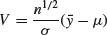
Chi-squared is also used to establish confidence intervals for sample variances. The quantity

is the degrees of freedom (n – 1) multiplied by the ratio of the sample variance s2 to the unknown population variance σ2. This follows a chi-squared distribution, so we can establish a 95% confidence interval for σ2 as follows:
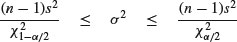
Suppose the sample variance s2 = 10.2 on 8 d.f. Then the interval on σ2 is given by
8*10.2/qchisq(.975,8)
[1] 4.65367
8*10.2/qchisq(.025,8)
[1] 37.43582
which means that we can be 95% confident that the population variance lies in the range 4.65≤ σ2 ≤ 37.44.
7.3.8 Fisher's F distribution
This is the famous variance ratio test that occupies the penultimate column of every ANOVA table. The ratio of treatment variance to error variance follows the F distribution, and you will often want to use the quantile qf to look up critical values of F. You specify, in order, the probability of your one-tailed test (this will usually be 0.95), then the two degrees of freedom – numerator first, then denominator. So the 95% value of F with 2 and 18 d.f. is
qf(.95,2,18)
[1] 3.554557
This is what the density function of F looks like for 2 and 18 d.f. (left) and 6 and 18 d.f. (right):
x <- seq(0.05,4,0.05)
plot(x,df(x,2,18),type="l",ylab="f(x)",xlab="x")
plot(x,df(x,6,18),type="l",ylab="f(x)",xlab="x")

The F distribution is a two-parameter distribution defined by the density function
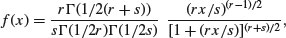
where r is the degrees of freedom in the numerator and s is the degrees of freedom in the denominator. The distribution is named after R.A. Fisher, the father of analysis of variance, and principal developer of quantitative genetics. It is central to hypothesis testing, because of its use in assessing the significance of the differences between two variances. The test statistic is calculated by dividing the larger variance by the smaller variance. The two variances are significantly different when this ratio is larger than the critical value of Fisher's F. The degrees of freedom in the numerator and in the denominator allow the calculation of the critical value of the test statistic. When there is a single degree of freedom in the numerator, the distribution is equal to the square of Student's t: F = t2. Thus, while the rule of thumb for the critical value of t is 2, so the rule of thumb for F = t2 = 4. To see how well the rule of thumb works, we can plot critical F against d.f. in the numerator:
windows(7,7)
par(mfrow=c(1,1))
df <- seq(1,30,.1)
plot(df,qf(.95,df,30),type="l",ylab="Critical F")
lines(df,qf(.95,df,10),lty=2)

You see that the rule of thumb (critical F = 4) quickly becomes much too large once the d.f. in the numerator (on the x axis) is larger than 2. The lower (solid) line shows the critical values of F when the denominator has 30 d.f. and the upper (dashed) line shows the case in which the denominator has 10 d.f.
The shape of the density function of the F distribution depends on the degrees of freedom in the numerator.
x <- seq(0.01,3,0.01)
plot(x,df(x,1,10),type="l",ylim=c(0,1),ylab="f(x)")
lines(x,df(x,2,10),lty=6,col="red")
lines(x,df(x,5,10),lty=2,col="green")
lines(x,df(x,30,10),lty=3,col="blue")
legend(2,0.9,c("1","2","5","30"),col=(1:4),lty=c(1,6,2,3),
title="numerator d.f.")
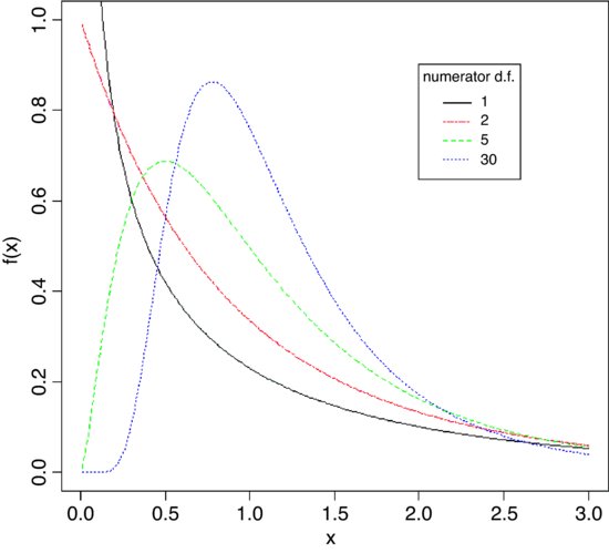
The probability density f(x) declines monotonically when the numerator has 1 or 2 d.f., but rises to a maximum for 3 d.f. or more (5 and 30 are shown here): all the graphs have 10 d.f. in the denominator.
7.3.9 Student's t distribution
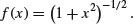
This famous distribution was first published by W.S. Gossett in 1908 under the pseudonym of ‘Student’ because his then employer, the Guinness brewing company in Dublin, would not permit employees to publish under their own names. It is a model with one parameter, r, with density function

where –∞ < x < +∞. This looks very complicated, but if all the constants are stripped away, you can see just how simple the underlying structure really is:
We can plot this for values of x from –3 to +3 as follows:
curve( (1+x^2)^(-0.5), -3, 3,ylab="t(x)",col="red")
The main thing to notice is how fat the tails of the distribution are, compared with the normal distribution. The plethora of constants is necessary to scale the density function so that its integral is 1. If we define U as

then this is chi-squared distributed on n – 1 d.f. (see above). Now define V as
and note that this is normally distributed with mean 0 and standard deviation 1 (the standard normal distribution), so

is the ratio of a normal distribution and a chi-squared distribution. You might like to compare this with the F distribution (above), which is the ratio of two chi-squared distributed random variables.
At what point does the rule of thumb for Student's t = 2 break down so seriously that it is actually misleading? To find this out, we need to plot the value of Student's t against sample size (actually against degrees of freedom) for small samples. We use qt (quantile of t) and fix the probability at the two-tailed value of 0.975:
plot(1:30,qt(0.975,1:30), ylim=c(0,12),type="l",
ylab="Students t value",xlab="d.f.",col="red")
abline(h=2,lty=2,col="green")
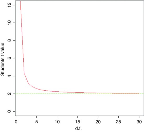
As you see, the rule of thumb only becomes really hopeless for degrees of freedom less than about 5 or so. For most practical purposes t ≈ 2 really is a good working rule of thumb. So what does the t distribution look like, compared to a normal? Let us redraw the standard normal as a dotted line (lty=2):
xvs <- seq(-4,4,0.01)
plot(xvs,dnorm(xvs),type="l",lty=2,
ylab="Probability density",xlab="Deviates")
Now we can overlay Student's t with d.f. = 5 as a solid line to see the difference:
lines(xvs,dt(xvs,df=5),col="red")

The difference between the normal (blue dashed line) and Student's t distributions (solid red line) is that the t distribution has ‘fatter tails’. This means that extreme values are more likely with a t distribution than with a normal, and the confidence intervals are correspondingly broader. So instead of a 95% interval of ± 1.96 with a normal distribution we should have a 95% interval of ± 2.57 for a Student's t distribution with 5 degrees of freedom:
qt(0.975,5)
[1] 2.570582
In hypothesis testing we generally use two-tailed tests because typically we do not know the direction of the response in advance. This means that we put 0.025 in each of two tails, rather than 0.05 in one tail.
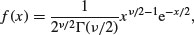
7.3.10 The gamma distribution
The gamma distribution is useful for describing a wide range of processes where the data are positively skew (i.e. non-normal, with a long tail on the right). It is a two-parameter distribution, where the parameters are traditionally known as shape and rate. Its density function is:
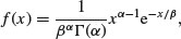
where α is the shape parameter and β–1 is the rate parameter (alternatively, β is known as the scale parameter). Special cases of the gamma distribution are the exponential (α = 1) and chi-squared (α = ν/2, β = 2).
To see the effect of the shape parameter on the probability density, we can plot the gamma distribution for different values of shape and rate over the range 0.01 to 4:
x <- seq(0.01,4,.01)
par(mfrow=c(2,2))
y <- dgamma(x,.5,.5)
plot(x,y,type="l",col="red",main="alpha = 0.5")
y <- dgamma(x,.8,.8)
plot(x,y,type="l",col="red", main="alpha = 0.8")
y <- dgamma(x,2,2)
plot(x,y,type="l",col="red", main="alpha = 2")
y <- dgamma(x,10,10)
plot(x,y,type="l",col="red", main="alpha = 10")

The graphs from top left to bottom right show different values of α: 0.5, 0.8, 2 and 10. Note how α < 1 produces monotonic declining functions and α > 1 produces humped curves that pass through the origin, with the degree of skew declining as α increases.
The mean of the distribution is αβ, the variance is αβ2, the skewness is  and the kurtosis is 6/α. Thus, for the exponential distribution we have a mean of β, a variance of β2, a skewness of 2 and a kurtosis of 6, while for the chi-squared distribution we have a mean of ν, a variance of 2ν a skewness of
  and a kurtosis of 12/ν. Observe also that
We can now answer questions like this: what is the value of the 95% quantile expected from a gamma distribution with mean = 2 and variance = 3? This implies that rate is 2/3 and shape is 4/3 so:
qgamma(0.95,2/3,4/3)
[1] 1.732096
An important use of the gamma distribution is in describing continuous measurement data that are not normally distributed. Here is an example where body mass data for 200 fishes are plotted as a histogram and a gamma distribution with the same mean and variance is overlaid as a smooth curve:
fishes <- read.table("c:\\temp\\fishes.txt",header=T)
attach(fishes)
names(fishes)
[1] "mass"
First, we calculate the two parameter values for the gamma distribution:
rate <- mean(mass)/var(mass)
shape <- rate*mean(mass)
rate
[1] 0.8775119
shape
[1] 3.680526
We need to know the largest value of mass, in order to make the bins for the histogram:
max(mass)
[1] 15.53216
Now we can plot the histogram, using break points at 0.5 to get integer-centred bars up to a maximum of 16.5 to accommodate our biggest fish:
par(mfrow=c(1,1))
hist(mass,breaks=-0.5:16.5,col="green",main="")
The density function of the gamma distribution is overlaid using lines like this:
lines(seq(0.01,15,0.01),length(mass)*dgamma(seq(0.01,15,0.01),shape,rate))
The fit is much better than when we tried to fit a normal distribution to these same data earlier (see p. 286).
7.3.11 The exponential distribution
This is a one-parameter distribution that is a special case of the gamma distribution. Much used in survival analysis, its density function is given on p. 874 and its use in survival analysis is explained on p. 884. The random number generator of the exponential is useful for Monte Carlo simulations of time to death when the hazard (the instantaneous risk of death) is constant with age. You specify the hazard, which is the reciprocal of the mean age at death:
rexp(15,0.1)
[1] 8.4679954 19.4649828 16.3599100 31.6182943 1.9592625 6.3877954
[7] 26.4725498 18.7831597 34.9983158 18.0820563 2.1303369 0.1319956
[13] 35.3649667 3.5672353 4.8672067
These are 15 random lifetimes with an expected value of 1/0.1=10 years; they give a sample mean of 9.66 years.
7.3.12 The beta distribution
This has two positive constants, a and b, and x is bounded in the range 0 ≤ x ≤ 1:

In R we generate a family of density functions like this:
par(mfrow=c(2,2))
x <- seq(0,1,0.01)
fx <- dbeta(x,2,3)
plot(x,fx,type="l",main="a=2 b=3",col="red")
fx <- dbeta(x,0.5,2)
plot(x,fx,type="l",main="a=0.5 b=2",col="red")
fx <- dbeta(x,2,0.5)
plot(x,fx,type="l",main="a=2 b=0.5",col="red")
fx <- dbeta(x,0.5,0.5)
plot(x,fx,type="l",main="a=0.5 b=0.5",col="red")
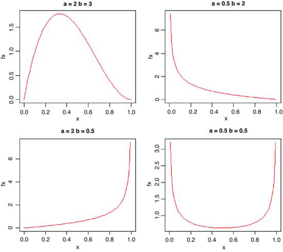
The important point is whether the parameters are greater or less than 1. When both are greater than 1 we get an n-shaped curve which becomes more skew as b > a (top left). If 0 < a < 1 and b > 1 then the slope of the density is negative (top right), while for a > 1 and 0 < b < 1 the slope of the density is positive (bottom left). The function is U-shaped when both a and b are positive fractions. If a = b = 1, then we obtain the uniform distribution on [0,1].
Here are 10 random numbers from the beta distribution with shape parameters 2 and 3:
rbeta(10,2,3)
[1] 0.2908066 0.1115131 0.5217944 0.1691430 0.4456099
[6] 0.3917639 0.6534021 0.3633334 0.2342860 0.6927753
7.3.13 The Cauchy distribution
This is a long-tailed two-parameter distribution, characterized by a location parameter a and a scale parameter b. It is real-valued, symmetric about a (which is also its median), and is a curiosity in that it has long enough tails that the expectation does not exist – indeed, it has no moments at all (it often appears in counter-examples in maths books). The harmonic mean of a variable with positive density at 0 is typically distributed as Cauchy, and the Cauchy distribution also appears in the theory of Brownian motion (e.g. random walks). The general form of the distribution is
for –∞ < x < ∞. There is also a one-parameter version, with a = 0 and b = 1, which is known as the standard Cauchy distribution and is the same as Student's t distribution with one degree of freedom:

for –∞ < x < ∞.
windows(7,4)
par(mfrow=c(1,2))
plot(-200:200,dcauchy(-200:200,0,10),type="l",ylab="p(x)",xlab="x",
col="red")
plot(-200:200,dcauchy(-200:200,0,50),type="l",ylab="p(x)",xlab="x",
col="red")

Note the very long, fat tail of the Cauchy distribution. The left-hand density function has scale = 10 and the right hand plot has scale = 50; both have location = 0.
7.3.14 The lognormal distribution
The lognormal distribution takes values on the positive real line. If the logarithm of a lognormal deviate is taken, the result is a normal deviate, hence the name. Applications for the lognormal include the distribution of particle sizes in aggregates, flood flows, concentrations of air contaminants, and failure times. The hazard function of the lognormal is increasing for small values and then decreasing. A mixture of heterogeneous items that individually have monotone hazards can create such a hazard function.
Density, cumulative probability, quantiles and random generation for the lognormal distribution employ the functions dlnorm, plnorm, qlnorm and rlnorm. Here, for instance, is the density function: dlnorm(x, meanlog=0, sdlog=1). The mean and standard deviation are optional, with default meanlog = 0 and sdlog = 1. Note that these are not the mean and standard deviation; the lognormal distribution has mean , variance
  , skewness
  and kurtosis
  .
.
windows(7,7)
plot(seq(0,10,0.05),dlnorm(seq(0,10,0.05)),
type="l",xlab="x",ylab="LogNormal f(x)",col="x")
The extremely long tail and exaggerated positive skew are characteristic of the lognormal distribution. Logarithmic transformation followed by analysis with normal errors is often appropriate for data such as these.
7.3.15 The logistic distribution
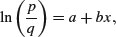
The logistic is the canonical link function in generalized linear models with binomial errors and is described in detail in Chapter 16 on the analysis of proportion data. The cumulative probability is a symmetrical S-shaped distribution that is bounded above by 1 and below by 0. There are two ways of writing the cumulative probability equation:
and
The great advantage of the first form is that it linearizes under the log-odds transformation (see p. 630) so that
where p is the probability of success and q = 1 – p is the probability of failure. The logistic is a unimodal, symmetric distribution on the real line with tails that are longer than the normal distribution. It is often used to model growth curves, but has also been used in bioassay studies and other applications. A motivation for using the logistic with growth curves is that the logistic distribution function f(x) has the property that the derivative of f(x) with respect to x is proportional to [f(x) – A][B – f(x)] with A < B. The interpretation is that the rate of growth is proportional to the amount already grown, times the amount of growth that is still expected.
windows(7,4)
par(mfrow=c(1,2))
plot(seq(-5,5,0.02),dlogis(seq(-5,5,.02)),
type="l",main="Logistic",col="red",xlab="x",ylab="p(x)")
plot(seq(-5,5,0.02),dnorm(seq(-5,5,.02)),
type="l",main="Normal",col="red",xlab="x",ylab="p(x)")

Here, the logistic density function dlogis (left) is compared with an equivalent normal density function dnorm (right) using the default mean 0 and standard deviation 1 in both cases. Note the much fatter tails of the logistic (there is still substantial probability at ±4 standard deviations). Note also the difference in the scales of the two y axes (0.25 for the logistic, 0.4 for the normal).
7.3.16 The log-logistic distribution
The log-logistic is a very flexible four-parameter model for describing growth or decay processes:
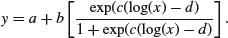
Here are two cases. The first is a negative sigmoid with c = –1.59 and a = –1.4:
windows(7,4)
par(mfrow=c(1,2))
x <- seq(0.1,1,0.01)
y <- -1.4+2.1*(exp(-1.59*log(x)-1.53)/(1+exp(-1.59*log(x)-1.53)))
plot(log(x),y,type="l", main="c = -1.59", col="red")
For the second we have c = 1.59 and a = 0.1:
y <- 0.1+2.1*(exp(1.59*log(x)-1.53)/(1+exp(1.59*log(x)-1.53)))
plot(log(x),y,type="l",main="c = 1.59",col="red")
7.3.17 The Weibull distribution
The origin of the Weibull distribution is in weakest link analysis. If there are r links in a chain, and the strengths of each link Zi are independently distributed on (0, ∞), then the distribution of weakest link V = min(Zj) approaches the Weibull distribution as the number of links increases.
The Weibull is a two-paramter model that has the exponential distribution as a special case. Its value in demographic studies and survival analysis is that it allows for the death rate to increase or to decrease with age, so that all three types of survivorship curve can be analysed (as explained on p. 872). The density, survival and hazard functions with λ = μ–α are:
The mean of the Weibull distribution is  and the variance is
  , and the parameter α describes the shape of the hazard function (the background to determining the likelihood equations is given by Aitkin et al., 2009). For α = 1 (the exponential distribution) the hazard is constant, while for α > 1 the hazard increases with age and for α < 1 the hazard decreases with age.
Because the Weibull, lognormal and log-logistic all have positive skewness, it is difficult to discriminate between them with small samples. This is an important problem, because each distribution has differently shaped hazard functions, and it will be hard, therefore, to discriminate between different assumptions about the age-specificity of death rates. In survival studies, parsimony requires that we fit the exponential rather than the Weibull unless the shape parameter α is significantly different from 1.
Here is a family of three Weibull distributions with α = 1, 2 and 3 (red, green and blue lines, respectively):
windows(7,7)
a <- 3
l <- 1
t <- seq(0,1.8,.05)
ft <- a*l*t^(a-1)*exp(-l*t^a)
plot(t,ft,type="l",col="blue",ylab="f(t) ")
a <- 1
ft <- a*l*t^(a-1)*exp(-l*t^a)
lines(t,ft,type="l",col="red")
a <- 2
ft <- a*l*t^(a-1)*exp(-l*t^a)
lines(t,ft,type="l",col="green")
legend(1.4,1.1,c("1","2","3"),title="alpha",lty=c(1,1,1),col=c(2,3,4))

Note that for large values of α the distribution becomes symmetrical, while for α ≤ 1 the distribution has its mode at t = 0.
7.3.18 Multivariate normal distribution
If you want to generate two (or more) vectors of normally distributed random numbers that are correlated with one another to a specified degree, then you need the mvrnorm function from the MASS library:
library(MASS)
Suppose we want two vectors of 1000 random numbers each. The first vector has a mean of 50 and the second has a mean of 60. The difference from rnorm is that we need to specify their covariance as well as the standard deviations of each separate variable. This is achieved with a positive-definite symmetric matrix specifying the covariance matrix of the variables.
xy <- mvrnorm(1000,mu=c(50,60),matrix(c(4,3.7,3.7,9),2))
We can check how close the variances are to our specified values:
var(xy)
[,1] [,2]
[1,] 3.849190 3.611124
[2,] 3.611124 8.730798
Not bad: we said the covariance should be 3.70 and the simulated data are 3.611 124. We extract the two separate vectors x and y and plot them to look at the correlation:
x <- xy[,1]
y <- xy[,2]
plot(x,y,pch=16,ylab="y",xlab="x",col="blue")

It is worth looking at the variances of x and y in more detail:
var(x)
[1] 3.84919
var(y)
[1] 8.730798
If the two samples were independent, then the variance of the sum of the two variables would be equal to the sum of the two variances. Is this the case here?
var(x+y)
[1] 19.80224
var(x)+var(y)
[1] 12.57999
No it is not. The variance of the sum (19.80) is much greater than the sum of the variances (12.58). This is because x and y are positively correlated; big values of x tend to be associated with big values of y and vice versa. This being so, we would expect the variance of the difference between x and y to be less than the sum of the two variances:
var(x-y)
[1] 5.357741
As predicted, the variance of the difference (5.36) is much less than the sum of the variances (12.58). We conclude that the variance of a sum of two variables is only equal to the variance of the difference of two variables when the two variables are independent. What about the covariance of x and y? We found this already by applying the var function to the matrix xy (above). We specified that the covariance should be 3.70 in calling the multivariate normal distribution, and the difference between 3.70 and 3.611 124 is simply due to the random selection of points. The covariance is related to the separate variances through the correlation coefficient ρ as follows (see p. 373):
For our example, this checks out as follows, where the sample value of ρ is cor(x,y):
cor(x,y)*sqrt(var(x)*var(y))
[1] 3.611124
which is our observed covariance between x and y with ρ = 0.622 917 8.
7.3.19 The uniform distribution
This is the distribution that the random number generator in your calculator hopes to emulate. The idea is to generate numbers between 0 and 1 where every possible real number on this interval has exactly the same probability of being produced. If you have thought about this, it will have occurred to you that there is something wrong here. Computers produce numbers by following recipes. If you are following a recipe then the outcome is predictable. If the outcome is predictable, then how can it be random? As John von Neumann once said: ‘Anyone who uses arithmetic methods to produce random numbers is in a state of sin.’ This raises the question as to what, exactly, a computer-generated random number is. The answer turns out to be scientifically very interesting and very important to the study of encryption (for instance, any pseudorandom number sequence generated by a linear recursion is insecure, since, from a sufficiently long subsequence of the outputs, one can predict the rest of the outputs). If you are interested, look up the Mersenne twister online. Here we are only concerned with how well the modern pseudorandom number generator performs. Here is the outcome of the R function runif simulating the throwing of a six-sided die 10 000 times: the histogram ought to be flat:
x <- ceiling(runif(10000)*6)
table(x)
x
1 2 3 4 5 6
1680 1668 1654 1622 1644 1732
hist(x,breaks=0.5:6.5,main="")

This is remarkably close to theoretical expectation, reflecting the very high efficiency of R's random-number generator. Try mapping 1 000 000 points to look for gaps:
x <- runif(1000000)
y <- runif(1000000)
plot(x,y,pch=".",col="blue")
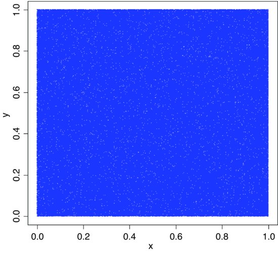
The scatter of unfilled space (white dots amongst the sea produced by 1 000 000 blue dots pch=".") shows no evidence of clustering. For a more thorough check we can count the frequency of combinations of numbers: with 36 cells, the expected frequency is 1 000 000/36 = 27 777.78 numbers per cell. We use the cut function to produce 36 bins:
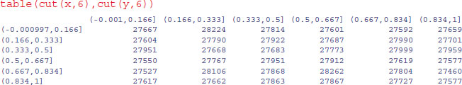
As you can see the observed frequencies are remarkably close to expectation:
range(table(cut(x,6),cut(y,6)))
[1] 27460 28262
None of the cells contained fewer than 27 460 random points, and none more than 28 262.
7.3.20 Plotting empirical cumulative distribution functions
The function ecdf is used to compute or plot an empirical cumulative distribution function. Here it is in action for the fishes data (p. 286 and 296):
fishes <- read.table("c:\\temp\\fishes.txt",header=T)
attach(fishes)
names(fishes)
[1] "mass"
plot(ecdf(mass))

The pronounced positive skew in the data is evident from the fact that the left-hand side of the cumulative distribution is much steeper than the right-hand side (and see p. 350).
7.4 Discrete probability distributions
7.4.1 The Bernoulli distribution
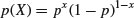
This is the distribution underlying tests with a binary response variable. The response takes one of only two values: it is 1 with probability p (a ‘success’) and is 0 with probability 1 – p (a ‘failure’). The density function is given by:
The statistician's definition of variance is the expectation of x2 minus the square of the expectation of x: 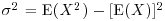 . We can see how this works with a simple distribution like the Bernoulli. There are just two outcomes in f(x): a success, where x = 1 with probability p and a failure, where x = 0 with probability 1 – p. Thus, the expectation of x is

and the expectation of x2 is

so the variance of the Bernoulli distribution is

7.4.2 The binomial distribution
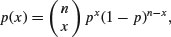
This is a one-parameter distribution in which p describes the probability of success in a binary trial. The probability of x successes out of n attempts is given by multiplying together the probability of obtaining one specific realization and the number of ways of getting that realization.
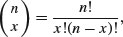
We need a way of generalizing the number of ways of getting x items out of n items. The answer is the combinatorial formula

where the ‘exclamation mark’ means ‘factorial’. For instance, 5! = 5 × 4 × 3 × 2 = 120. This formula has immense practical utility. It shows you at once, for example, how unlikely you are to win the National Lottery in which you are invited to select six numbers between 1 and 49. We can use the built-in factorial function for this,
factorial(49)/(factorial(6)*factorial(49-6))
[1] 13983816
which is roughly a 1 in 14 million chance of winning the jackpot. You are more likely to die between buying your ticket and hearing the outcome of the draw. As we have seen (p. 17), there is a built-in R function for the combinatorial function,
choose(49,6)
[1] 13983816
and we use the choose function from here on.
The general form of the binomial distribution is given by
using the combinatorial formula above. The mean of the binomial distribution is np and the variance is np(1 – p).
Since 1 – p is less than 1 it is obvious that the variance is less than the mean for the binomial distribution (except, of course, in the trivial case when p = 0 and the variance is 0). It is easy to visualize the distribution for particular values of n and p.
p <- 0.1
n <- 4
x <- 0:n
px <- choose(n,x)*p^x*(1-p)^(n-x)
barplot(px,names=x,xlab="outcome",ylab="probability",col="green")

The four distribution functions available for the binomial in R (density, cumulative probability, quantiles and random generation) are used like this. The density function dbinom(x, size, prob) shows the probability for the specified count x (e.g. the number of parasitized fish) out of a sample of n = size, with probability of success = prob. So if we catch four fish when 10% are parasitized in the parent population, we have size = 4 and prob = 0.1, (as illustrated above). Much the most likely number of parasitized fish in our sample is 0.
The cumulative probability shows the sum of the probability densities up to and including p(x), plotting cumulative probability against the number of successes, for a sample of n = size and probability = prob. Our fishy plot looks like this:
barplot(pbinom(0:4,4,0.1),names=0:4,xlab="parasitized fish",
ylab="probability",col="red")

This shows that the probability of getting 2 or fewer parasitized fish out of a sample of 4 is very close to 1. Note that you can generate the series inside the density function (0:4).
To obtain a confidence interval for the expected number of fish to be caught in a sample of n = size and a probability = prob, we need qbinom, the quantile function for the binomial. The lower and upper limits of the 95% confidence interval are
qbinom(.025,4,0.1)
[1] 0
qbinom(.975,4,0.1)
[1] 2
This means that with 95% certainty we shall catch between 0 and 2 parasitized fish out of 4 if we repeat the sampling exercise. We are very unlikely to get 3 or more parasitized fish out of a sample of 4 if the proportion parasitized really is 0.1.
This kind of calculation is very important in power calculations in which we are interested in determining whether or not our chosen sample size (n = 4 in this case) is capable of doing the job we ask of it. Suppose that the fundamental question of our survey is whether or not the parasite is present in a given lake. If we find one or more parasitized fish then the answer is clearly ‘yes’. But how likely are we to miss out on catching any parasitized fish and hence of concluding, wrongly, that the parasites are not present in the lake? With our sample size of n = 4 and p = 0.1 we have a probability of missing the parasite of 0.9 for each fish caught and hence a probability of 0.94 = 0.6561 of missing out altogether on finding the parasite. This is obviously unsatisfactory. We need to think again about the sample size. What is the smallest sample, n, that makes the probability of missing the parasite altogether less than 0.05?
We need to solve

Taking logs,
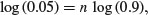
so
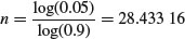
which means that to make our journey worthwhile we should keep fishing until we have found more than 28 unparasitized fishes, before we reject the hypothesis that parasitism is present at a rate of 10%. Of course, it would take a much bigger sample to reject a hypothesis of presence at a substantially lower rate.
Random numbers are generated from the binomial distribution like this. The first argument is the number of random numbers we want. The second argument is the sample size (n = 4) and the third is the probability of success (p = 0.1).
rbinom(10,4,0.1)
[1] 0 0 0 0 0 1 0 1 0 1
Here we repeated the sampling of 4 fish ten times. We got 1 parasitized fish out of 4 on three occasions, and 0 parasitized fish on the remaining seven occasions. We never caught 2 or more parasitized fish in any of these samples of 4.
7.4.3 The geometric distribution
Suppose that a series of independent Bernoulli trials with probability p are carried out at times 1, 2, 3, … . Now let W be the waiting time until the first success occurs. So

which means that

The density function, therefore, is
fx <- dgeom(0:20,0.2)
barplot(fx,names=0:20,xlab="outcome",ylab="probability",col="cyan")

For the geometric distribution,
- the mean is

- the variance is

The geometric has a very long tail. Here are 100 random numbers from a geometric distribution with p = 0.1: the modes are 0 and 1, but outlying values as large as 33 and 44 have been generated:

7.4.4 The hypergeometric distribution
‘Balls in urns’ are the classic sort of problem solved by this distribution. The density function of the hypergeometric is
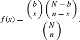
Suppose that there are N coloured balls in the statistician's famous urn: b of them are blue and r = N – b of them are red. Now a sample of n balls is removed from the urn; this is sampling without replacement. Now f(x) gives the probability that x of these n balls are blue.
The built-in functions for the hypergeometric are used like this: dhyper(q,b,r,n) and rhyper(m,b,r,n). Here
- q is a vector of values of a random variable representing the number of blue balls out of a sample of size n drawn from an urn containing b blue balls and r red ones.
- b is the number of blue balls in the urn. This could be a vector with non-negative integer elements.
- r is the number of red balls in the urn = N – b. This could also be a vector with non-negative integer elements.
- n number of balls drawn from an urn with b blue and r red balls. This can be a vector like b and r.
- p vector of probabilities with values between 0 and 1.
- m the number of hypergeometrically distributed random numbers to be generated.
Let the urn contain N = 20 balls, of which 6 are blue and 14 are red. We take a sample of n = 5 balls so x could be 0, 1, 2, 3, 4 or 5 of them blue, but since the proportion blue is only 6/20 the higher frequencies are most unlikely. Our example is evaluated like this:
ph <- dhyper(0:5,6,14,5)
barplot(ph,names=(0:5),col="red",xlab="outcome",ylab="probability")
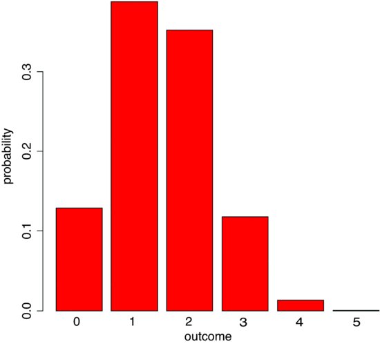
We are very unlikely to get more than 3 red balls out of 5. The most likely outcome is that we get 1 or 2 red balls out of 5. We can simulate a set of Monte Carlo trials of size 5. Here are the numbers of red balls obtained in 20 realizations of our example:
rhyper(20,6,14,5)
[1] 1 1 1 2 1 2 0 1 3 2 3 0 2 0 1 1 2 1 1 2
The binomial distribution is a limiting case of the hypergeometric which arises as N, b and r approach infinity in such a way that b/N approaches p, and r/N approaches 1 – p (see p. 308). This is because as the numbers get large, the fact that we are sampling without replacement becomes irrelevant. The binomial distribution assumes sampling with replacement from a finite population, or sampling without replacement from an infinite population.
7.4.5 The multinomial distribution
Suppose that there are t possible outcomes from an experimental trial, and the outcome i has probability pi. Now allow n independent trials where n = n1 + n2 + … + nt and ask what is the probability of obtaining the vector of Ni occurrences of the ith outcome:
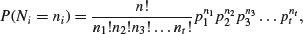
where i goes from 1 to t. Take an example with three outcomes, (say black, red and blue, so t = 3), where the first outcome is twice as likely as the other two (p1 = 0.5, p2 = 0.25, p3 = 0.25), noting that the probabilities sum to 1. It is sensible to start by writing a function called multi to carry out the calculations for any numbers of successes a, b and c (black, red and blue, respectively) given our three probabilities (above):
multi <- function(a,b,c) {
factorial(a+b+c)/(factorial(a)*factorial(b)*factorial(c))*0.5^a*0.25^b*0.25^c}
We illustrate just one case, in which the third outcome (blue) is fixed at four successes out of 24 trials. This means that the first and second outcomes must add to 24 – 4 = 20. We plot the probability of obtaining different numbers of blacks from 0 to 20:
barplot(sapply(0:20,function (i) multi(i,20-i,4)),names=0:20,cex.names=0.7,
xlab="outcome",ylab="probability",col="yellow")
The most likely outcome for this example is that we would get 13 or 14 successes of type 1 (black) in a trial of size = 24 with probabilities 0.5, 0.25 and 0.25 for the three types of outcome, when the number of successes of the third case was 4 out of 24. Note the use of cex.names=0.7 to make the labels sufficiently small that all of the bars are given outcome names.
7.4.6 The Poisson distribution
This is one of the most useful and important of the discrete probability distributions for describing count data. We know how many times something happened (e.g. kicks from cavalry horses, lightening strikes, bomb hits), but we have no way of knowing how many times it did not happen. The Poisson is a one-parameter distribution with the interesting property that its variance is equal to its mean. A great many processes show variance increasing with the mean, often faster than linearly (see the negative binomial distribution below). The density function of the Poisson shows the probability of obtaining a count of x when the mean count per unit is λ:

The zero term of the Poisson (the probability of obtaining a count of zero) is obtained by setting x = 0:

which is simply the antilog of minus the mean. Given p(0), it is clear that p(1) is just

and any subsequent probability is readily obtained by multiplying the previous probability by the mean and dividing by the count,
Functions for the density, cumulative distribution, quantiles and random number generation of the Poisson distribution are obtained by dpois(x, lambda), ppois(q, lambda), qpois(p, lambda) and rpois(n, lambda), where lambda is the mean count per sample.
The Poisson distribution holds a central position in three quite separate areas of statistics:
- in the description of random spatial point patterns (see p. 838);
- as the frequency distribution of counts of rare but independent events (see p. 314);
- as the error distribution in GLMs for count data (see p. 579).
If we wanted 600 simulated counts from a Poisson distribution with a mean of, say, 0.90 blood cells per slide, we just type:
count <- rpois(600,0.9)
We can use table to see the frequencies of each count generated:
or hist to see a histogram of the counts:
hist(count,breaks = - 0.5:6.5,main="")

Note the use of the vector of break points on integer increments from –0.5 to create integer bins for the histogram bars.
7.4.7 The negative binomial distribution
This discrete, two-parameter distribution is useful for describing the distribution of count data, where the variance is often much greater than the mean. The two parameters are the mean μ and the clumping parameter k, given by

The smaller the value of k, the greater the degree of clumping. The density function is
The zero term is found by setting x = 0 and simplifying:
Successive terms in the distribution can then be computed iteratively from
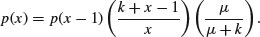
An initial estimate of the value of k can be obtained from the sample mean and variance,

Since k cannot be negative, it is clear that the negative binomial distribution should not be fitted to data where the variance is less than the mean.
The maximum likelihood estimate of k is found numerically, by iterating progressively more fine-tuned values of k until the left- and right-hand sides of the following equation are equal:
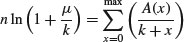
where the vector A(x) contains the total frequency of values greater than x. You could write a function to work out the probability densities like this:
negbin <- function(x,u,k)
(1+u/k)^(-k)*(u/(u+k))^x*gamma(k+x)/(factorial(x)*gamma(k))
then use the function to produce a barplot of probability densities for a range of x values (say 0 to 10), for a distribution with specified mean and aggregation parameter (say μ = 0.8, k = 0.2) like this:
xf <- sapply(0:10, function(i) negbin(i,0.8,0.2))
barplot(xf,names=0:10,xlab="count",ylab="probability density",col="green")

There is another, quite different way of looking at the negative binomial distribution. Here, the response variable is the waiting time Wr for the rth success:

It is important to realize that x starts at r and increases from there (obviously, the rth success cannot occur before the rth attempt). The density function dnbinom(x, size, prob) represents the number of failures x (e.g. tails in coin tossing) before size successes (or heads in coin tossing) are achieved, when the probability of a success (a head) is prob.
Suppose we are interested in the distribution of waiting times until the fifth success occurs in a negative binomial process with p = 0.1. We start the sequence of x values at 5:
plot(5:100,dnbinom(5:100,5,0.1),type="s",xlab="x",ylab="f(x)")

This shows that the most likely waiting time for the 5th success, when the probability of a success is 1/10, is about 31 trials after the fifth trial. Note that the negative binomial distribution is quite strongly skew to the right.
It is easy to generate negative binomial data using the random number generator: rnbinom(n, size, prob). The number of random numbers required is n. When the second parameter, size, is set to 1 the distribution becomes the geometric (see above). The final parameter, prob, is the probability of success per trial, p. Here we generate 100 counts with a mean of 0.6:
count <- rnbinom(100,1,0.6)
We can use table to see the frequency of the different counts:
table(count)
0 1 2 3 5 6
65 18 13 2 1 1
It is sensible to check that the mean really is 0.6 (or very close to it):
mean(count)
[1] 0.61
The variance will be substantially greater than the mean:
var(count)
[1] 1.129192
This gives an estimate of k of
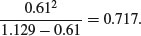
The following data show the number of spores counted on 238 buried glass slides. We are interested in whether these data are well described by a negative binomial distribution. If they are we would like to find the maximum likelihood estimate of the aggregation parameter k.
x <- 0:12
freq <- c(131,55,21,14,6,6,2,0,0,0,0,2,1)
barplot(freq,names=x,ylab="frequency",xlab="spores",col="purple")

We start by looking at the variance–mean ratio of the counts. We cannot use mean and variance directly, because our data are frequencies of counts, rather than counts themselves. This is easy to rectify: we use rep to create a vector of counts y in which each count (x) is repeated the relevant number of times (freq). Now we can use mean and var directly:
y <- rep(x,freq)
mean(y)
[1] 1.004202
var(y)
[1] 3.075932
This shows that the data are highly aggregated (the variance–mean ratio is roughly 3, recalling that it would be 1 if the data were Poisson distributed). Our rough estimate of k is therefore
mean(y)^2/(var(y)-mean(y))
[1] 0.4867531
Here is a function that takes a vector of frequencies of counts x (between 0 and length(x) − 1) and computes the maximum likelihood estimate of k, the aggregation parameter:
kfit <- function(x) {
lhs <- numeric()
rhs <- numeric()
y <- 0:(length(x) - 1)
j <- 0:(length(x)-2)
m <- sum(x * y)/(sum(x))
s2 <- (sum(x * y^2) - sum(x * y)^2/sum(x))/(sum(x)- 1)
k1 <- m^2/(s2 - m)
a <- numeric(length(x)-1)
for(i in 1:(length(x) - 1)) a[i] <- sum(x [- c(1:i)])
i <- 0
for (k in seq(k1/1.2,2*k1,0.001)) {
i <- i+1
lhs[i] <- sum(x) * log(1 + m/k)
rhs[i] <- sum(a/(k + j))
}
k <- seq(k1/1.2,2*k1,0.001)
plot(k, abs(lhs-rhs),xlab="k",ylab="Difference",type="l",col="red")
d <- min(abs(lhs-rhs))
sdd <- which(abs(lhs-rhs)==d)
k[sdd]
}
We can try it out with our spore count data.
kfit(freq)
[1] 0.5826276
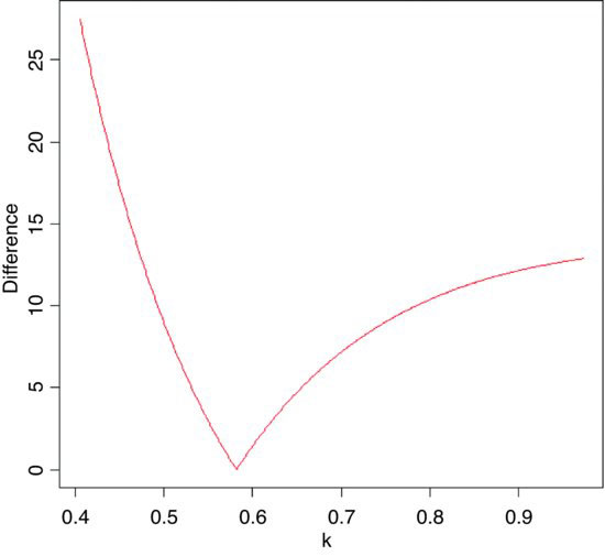
The minimum difference is close to zero and occurs at about k = 0.58. The printout shows that the maximum likelihood estimate of k is 0.582 (to the 3 decimal places we simulated; the last 4 decimals (6276) are meaningless and would not be printed in a more polished function).
How would a negative binomial distribution with a mean of 1.0042 and a k value of 0.582 describe our count data? The expected frequencies are obtained by multiplying the probability density (above) by the total sample size (238 slides in this case).
nb <- 238*(1+1.0042/0.582)^(-0.582)*factorial(.582+(0:12)-1)/
(factorial(0:12)*factorial(0.582-1))*(1.0042/(1.0042+0.582))^(0:12)
We shall compare the observed and expected frequencies using barplot. We intend to alternate the observed and expected frequencies. There are three steps to the procedure:
- Concatenate the observed and expected frequencies in an alternating sequence.
- Create list of labels to name the bars (alternating blanks and counts).
- Produce a legend to describe the different bar colours.
The concatenated list of frequencies (called both) is made like this, putting the 13 observed counts (freq) in the odd-numbered bars and the 13 expected counts (nb) in the even-numbered bars (note the use of modulo %% to do this):
both <- numeric(26)
both[1:26 %% 2 != 0] <- freq
both[1:26 %% 2 == 0] <- nb
Because adjacent blue and green bars refer to the same count (the observed and expected frequencies) we do not want to use barplot's built-in names argument for labelling the bars (it would want to write a label on every bar, 26 labels in all). Instead, we want to write the count just once for each pair of bars, located beneath the observed and (green) bars, using as.character(0:12). The trick is to produce a vector of length 26 containing the repeated bar labels, then replace the even-numbered entries with blanks like this (using modulo to pick out the even numbers):
labs <- as.character(rep(0:12,each=2))
labs[1:26%%2==0] <- ""
Now we can draw the combined barplot specifying cex.names=0.8 to ensure that all the bar labels are small enough to be printed:
barplot(both,col=rep(c(3,4),13),ylab="frequency",names=labs,cex.names=0.8)
The legend function creates a legend to show which bars represent the observed frequencies (black in this case) and which represent the expected, negative binomial frequencies (open bars). Just click when the cursor is in the position where you want the top left-hand corner of the legend box to be:
legend(locator(1),c("observed","expected"),fill=c(3,4))

The fit is very close, so we can be reasonably confident in describing the observed counts as negative binomially distributed. The tail of the observed distribution is rather fatter than the expected negative binomial tail, so we might want to measure the lack of fit between observed and expected distributions. A simple way to do this is to use Pearson's chi-squared, taking care to use only those cases where the expected frequency nb is greater than 5:
sum(((freq-nb)^2/nb)[nb > 5])
[1] 1.634975
This is based on five legitimate comparisons,
sum(nb>5)
[1] 5
and hence on 5 – p – 1 = 2 d.f. because we have estimated p = 2 parameters from the data in estimating the expected distribution (the mean and k of the negative binomial) and lost one degree of freedom for contingency (the total number of counts must add up to 238). Our calculated value of chi-squared = 1.63 is much less than the value in tables:
qchisq(0.95,2)
[1] 5.991465
so we accept the hypothesis that our data are not significantly different from a negative binomial with mean = 1.0042 and k = 0.582.
7.4.8 The Wilcoxon rank-sum statistic
This function calculates the distribution of the Wilcoxon rank-sum statistic (also known as Mann–Whitney), and returns values for the exact probability at discrete values of q: dwilcox(q, m, n). Here q is a vector of quantiles, m is the number of observations in sample x (a positive integer not greater than 50), and n is the number of observations in sample y (also a positive integer not greater than 50). The Wilcoxon rank-sum statistic is the sum of the ranks of x in the combined sample c(x,y). The Wilcoxon rank-sum statistic takes on values W between the limits
This statistic can be used for a non-parametric test of location shift between the parent populations x and y.
7.5 Matrix algebra
There is a comprehensive set of functions for handling matrices in R. We begin with a matrix called a that has three rows and two columns. Data are typically entered into matrices columnwise, so the first three numbers (1, 0, 4) go in column 1 and the second three numbers (2, –1, 1) go in column 2:
a <- matrix(c(1,0,4,2,-1,1),nrow=3)
a
[,1] [,2]
[1,] 1 2
[2,] 0 -1
[3,] 4 1
Our second matrix, called b, has the same number of columns as A has rows (i.e. three in this case). Entered columnwise, the first two numbers (1, –1) go in column 1, the second two numbers (2, 1) go in column 2, and the last two numbers (1, 0) go in column 3:
b <- matrix(c(1,-1,2,1,1,0),nrow=2)
b
[,1] [,2] [,3]
[1,] 1 2 1
[2,] -1 1 0
7.5.1 Matrix multiplication
To multiply one matrix by another matrix you take the rows of the first matrix and the columns of the second matrix. Put the first row of a side by side with the first column of b:
a[1,]
[1] 1 2
b[,1]
[1] 1 -1
and work out the point products:
a[1,]*b[,1]
[1] 1 -2
then add up the point products
sum(a[1,]*b[,1])
[1] -1
The sum of the point products is –1 and this is the first element of the product matrix. Next, put the first row of a with the second column of b:
a[1,]
[1] 1 2
b[,2]
[1] 2 1
a[1,]*b[,2]
[1] 2 2
sum(a[1,]*b[,2])
[1] 4
so the point products are 2, 2 and the sum of the point products is 2 + 2 = 4. So 4 goes in row 1 and column 2 of the answer. Then take the last column of b and match it against the first row of a:
a[1,]*b[,3]
[1] 1 0
sum(a[1,]*b[,3])
[1] 1
so the sum of the point products is 1 + 0 = 1. This goes in row 1, column 3 of the answer. And so on. We repeat these steps for row 2 of matrix a (0, –1) and then again for row 3 of matrix a (4, 1) to obtain the complete matrix of the answer. In R, the symbol for matrix multiplication is %*%. Here is the full answer:
a %*% b
[,1] [,2] [,3]
[1,] -1 4 1
[2,] 1 -1 0
[3,] 3 9 4
where you see the values we calculated by hand (–1, 4, 1) in the first row.
It is important to understand that with matrices a times b is not the same as b times a. The matrix resulting from a multiplication has the number of rows of the matrix on the left (a has 3 rows in the case above). But b has just two rows, so multiplication
b %*% a
[,1] [,2]
[1,] 5 1
[2,] -1 -3
produces a matrix with 2 rows. The value 5 in row 1 column 1 of the answer is the sum of the point products (1 × 1) + (2 × 0) + (1 × 4) = 1 + 0 + 4 = 5.
7.5.2 Diagonals of matrices
To create a diagonal matrix of 3 rows and 3 columns, with 1s on the diagonal use the diag function like this:
(ym <- diag(1,3,3))
[,1] [,2] [,3]
[1,] 1 0 0
[2,] 0 1 0
[3,] 0 0 1
You can alter the values of the diagonal elements of a matrix like this:
diag(ym) <- 1:3
ym
[,1] [,2] [,3]
[1,] 1 0 0
[2,] 0 2 0
[3,] 0 0 3
or extract a vector containing the diagonal elements of a matrix like this:
diag(ym)
[1] 1 2 3
You might want to extract the diagonal of a variance–covariance matrix:
M <- cbind(X=1:5, Y=rnorm(5))
var(M)
X Y
X 2.50000000 0.04346324
Y 0.04346324 0.88056034
diag(var(M))
X Y
2.5000000 0.8805603
7.5.3 Determinant
The determinant of the square (2 × 2) array

is defined for any numbers a, b, c and d as
Suppose that A is a square matrix of order (3 × 3):
Then the third-order determinant of A is defined to be the number
Applying the rule 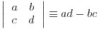 to this equation gives

Take a numerical example:
This has determinant

Here is the example in R using the determinant function det:
A <- matrix(c(1,2,4,2,1,1,3,1,2),nrow=3)
A
[,1] [,2] [,3]
[1,] 1 2 3
[2,] 2 1 1
[3,] 4 1 2
det(A)
[1] -5
The great thing about determinants is that if any row or column of a determinant is multiplied by a scalar λ, then the value of the determinant is multiplied by λ (since a factor λ will appear in each of the products). Also, if all the elements of a row or a column are zero then the determinant |A| = 0. Again, if all the corresponding elements of two rows or columns of |A| are equal then |A| = 0.
For instance, here is the bottom row of A multiplied by 3:
B <- A
B[3,] <- 3*B[3,]
B
[,1] [,2] [,3]
[1,] 1 2 3
[2,] 2 1 1
[3,] 12 3 6
and here is the determinant:
det(B)
[1] -15
Here is an example when all the elements of column 2 are zero, so det C = 0:
C <- A
C[,2] <- 0
C
[,1] [,2] [,3]
[1,] 1 0 3
[2,] 2 0 1
[3,] 4 0 2
det(C)
[1] 0
If det A ≠ 0 then the rows and columns of A must be linearly independent. This important concept is expanded in terms of contrast coefficients on p. 434.
7.5.4 Inverse of a matrix
The operation of division is not defined for matrices. However, for a square matrix that has |A| ≠ 0 a multiplicative inverse matrix denoted by A–1 can be defined. This multiplicative inverse A–1 is unique and has the property that
where I is the unit matrix. So if A is a square matrix for which |A| ≠ 0 the matrix inverse is defined by the relationship

where the adjoint matrix of A (adj A) is the matrix of cofactors of A. The cofactors of A are computed as Aij = (–1)i+ j Mij, where Mij are the ‘minors’ of the elements aij (these are the determinants of the matrices of A from which row i and column j have been deleted). The properties of the inverse matrix can be laid out for two non-singular square matrices, A and B, of the same order as follows:
Here is R's version of the inverse of the 3 × 3 matrix A (above) using the ginv function from the MASS library:
library(MASS)
ginv(A)
[,1] [,2] [,3]
[1,] -2.000000e-01 0.2 0.2
[2,] -2.224918e-16 2.0 -1.0
[3,] 4.000000e-01 -1.4 0.6
where the number in row 2 column 1 is zero (except for rounding error). Here is the penultimate rule, (A–1)–1 = A, evaluated by R:
ginv(ginv(A))
[,1] [,2] [,3]
[1,] 1 2 3
[2,] 2 1 1
[3,] 4 1 2
Here is the last rule, |A| = 1/ |A–1|:
1/det(ginv(A))
[1] -5
7.5.5 Eigenvalues and eigenvectors
We have a square matrix A and two column vectors X and K, where

and we want to discover the scalar multiplier λ such that

This is equivalent to (A – λI)X = 0, where I is the unit matrix. This can only have one non-trivial solution when the determinant associated with the coefficient matrix A vanishes, so we must have

When expanded, this determinant gives rise to an algebraic equation of degree n in λ called the characteristic equation. It has n roots λ1, λ2, … , λn, each of which is called an eigenvalue. The corresponding solution vector Xi is called an eigenvector of A corresponding to λi.
Here is an example from population ecology. The matrix A shows the demography of different age classes: the top row shows fecundity (the number of females born per female of each age) and the sub-diagonals show survival rates (the fraction of one age class that survives to the next age class). When these numbers are constants the matrix is known as the Leslie matrix. In the absence of density dependence the constant parameter values in A will lead either to exponential increase in total population size (if λ1 > 1) or exponential decline (if λ1 < 1) once the initial transients in age structure have damped away. Once exponential growth has been achieved, then the age structure, as reflected by the proportion of individuals in each age class, will be a constant. This is known as the first eigenvector.
Consider the Leslie matrix, L, which is to be multiplied by a column matrix of age-structured population sizes, n:
L <- c(0,0.7,0,0,6,0,0.5,0,3,0,0,0.3,1,0,0,0)
L <- matrix(L,nrow=4)
Note that the elements of the matrix are entered in columnwise, not row-wise sequence. We make sure that the Leslie matrix is properly conformed:
L
[,1] [,2] [,3] [,4]
[1,] 0.0 6.0 3.0 1
[2,] 0.7 0.0 0.0 0
[3,] 0.0 0.5 0.0 0
[4,] 0.0 0.0 0.3 0
The top row contains the age-specific fecundities (e.g. 2-year-olds produce six female offspring per year), and the sub-diagonal contains the survivorships (70% of 1-year-olds become 2-year-olds, etc.). Now the population sizes at each age go in a column vector, n:
n <- c(45,20,17,3)
n <- matrix(n,ncol=1)
n
[,1]
[1,] 45
[2,] 20
[3,] 17
[4,] 3
Population sizes next year in each of the four age classes are obtained by matrix multiplication:
L %*% n
[,1]
[1,] 174.0
[2,] 31.5
[3,] 10.0
[4,] 5.1
We can check this the long way. The number of juveniles next year (the first element of n) is the sum of all the babies born last year:
45*0+20*6+17*3+3*1
[1] 174
We write a function to carry out the matrix multiplication, giving next year's population vector as a function of this year's:
fun <- function(x) L %*% x
Now we can simulate the population dynamics over a period long enough (say, 40 generations) for the age structure to approach stability. So long as the population growth rate λ > 1 the population will increase exponentially, once the age structure has stabilized:
n <- c(45,20,17,3)
n <- matrix(n,ncol=1)
structure <- numeric(160)
dim(structure) <- c(40,4)
for (i in 1:40) {
n <- fun(n)
structure[i,] <- n
}
matplot(1:40,log(structure),type="l")

You can see that after some initial transient fluctuations, the age structure has more or less stabilized by year 20 (the lines for log population size of juveniles (top line), 1-, 2- and 3-year-olds are parallel). By year 40 the population is growing exponentially in size, multiplying by a constant of λ each year.
The population growth rate (the per-year multiplication rate, λ) is approximated by the ratio of total population sizes in the 40th and 39th years:
sum(structure[40,])/sum(structure[39,])
[1] 2.164035
and the approximate stable age structure is obtained from the 40th value of n:
structure[40,]/sum(structure[40,])
[1] 0.709769309 0.230139847 0.052750539 0.007340305
The exact values of the population growth rate and the stable age distribution are obtained by matrix algebra: they are the dominant eigenvalue and dominant eigenvector, respectively. Use the function eigen applied to the Leslie matrix, L, like this:
The dominant eigenvalue is 2.1694 (compared with our empirical approximation of 2.1640 after 40 years). The stable age distribution is given by the first eigenvector (column 1, above), which we need to turn into proportions:
eigen(L)$vectors[,1]/sum(eigen(L)$vectors[,1])
[1] 0.710569659+0i 0.229278977+0i 0.052843768+0i 0.007307597+0i
This compares with our approximation (above) in which the proportion in the first age class was 0.709 77 after 40 years (rather than 0.710 57).
7.5.6 Matrices in statistical models
Perhaps the main use of matrices in R is in statistical calculations, in generalizing the calculation of sums of squares and sums of products (see p. 450 for background). Here are the data used in Chapter 10 to introduce the calculation of sums of squares in linear regression:
numbers <- read.table("c:\\temp\\tannin.txt",header=T)
attach(numbers)
names(numbers)
[1] "growth" "tannin"
The response variable is growth (y) and the explanatory variable is tannin concentration (x) in the diet of a group of insect larvae. We need the famous five (see p. 453): the sum of the y values,
growth
[1] 12 10 8 11 6 7 2 3 3
sum(growth)
[1] 62
the sum of the squares of the y values,
growth^2
[1] 144 100 64 121 36 49 4 9 9
sum(growth^2)
[1] 536
the sum of the x values,
tannin
[1] 0 1 2 3 4 5 6 7 8
sum(tannin)
[1] 36
the sum of the squares of the x values,
tannin^2
[1] 0 1 4 9 16 25 36 49 64
sum(tannin^2)
[1] 204
and finally, to measure the covariation between x and y, we need the sum of the products,
growth*tannin
[1] 0 10 16 33 24 35 12 21 24
sum(growth*tannin)
[1] 175
You can see at once that for more complicated models (such as multiple regression) it is essential to be able to generalize and streamline this procedure. This is where matrices come in. Matrix multiplication involves the calculation of sums of products where a row vector is multiplied by a column vector of the same length to obtain a single value. Thus, we should be able to obtain the required sum of products, 175, by using matrix multiplication symbol %*% in place of the regular multiplication symbol:
growth %*% tannin
[,1]
[1,] 175
That works fine. But what about sums of squares? Surely if we use matrix multiplication on the same vector we will get an object with many rows (nine in this case). Not so.
growth %*% growth
[,1]
[1,] 536
R has coerced the left-hand vector of growth into a row vector in order to obtain the desired result. You can override this, if for some reason you wanted the answer to have nine rows, by specifying the transpose t() of the right-hand growth vector,

but, of course, that is not what we want. R's default is what we need. So this should also work in obtaining the sum of squares of the explanatory variable:
tannin %*% tannin
[,1]
[1,] 204
So far, so good. But how do we obtain the sums using matrix multiplication? The trick here is to matrix multiply the vector by a vector of 1s: here are the sum of the y values:
growth %*% rep(1,9)
[,1]
[1,] 62
and the sum of the x values,
tannin %*% rep(1,9)
[,1]
[1,] 36
Finally, can we use matrix multiplication to arrive at the sample size, n? We do this by matrix multiplying a row vector of 1s by a column vector of 1s. This rather curious operation produces the right result, by adding up the nine 1s that result from the nine repeats of the calculation 1 × 1:
rep(1,9 )%*% rep(1,9)
[,1]
[1,] 9
But how do we get all of the famous five in a single matrix? The thing to understand is the dimensionality of such a matrix. It needs to contain sums as well as sums of products. We have two variables (growth and tannin) and their matrix multiplication produces a single scalar value (see above). In order to get to the sums of squares as well as the sums of products we use cbind to create a 9 × 2 matrix like this:
a <- cbind(growth,tannin)
a
growth tannin
[1,] 12 0
[2,] 10 1
[3,] 8 2
[4,] 11 3
[5,] 6 4
[6,] 7 5
[7,] 2 6
[8,] 3 7
[9,] 3 8
To obtain a results table with 2 rows rather than 9 rows we need to multiply the transpose of matrix a by matrix a:
t(a) %*% a
growth tannin
growth 536 175
tannin 175 204
That's OK as far as it goes, but it has only given us the sums of squares (536 and 204) and the sum of products (175). How do we get the sums as well? The trick is to bind a column of 1s onto the left of matrix a:
b <- cbind(1,growth,tannin)
b
growth tannin
[1,] 1 12 0
[2,] 1 10 1
[3,] 1 8 2
[4,] 1 11 3
[5,] 1 6 4
[6,] 1 7 5
[7,] 1 2 6
[8,] 1 3 7
[9,] 1 3 8
It would look better if the first column had a variable name: let's call it sample:
dimnames(b)[[2]] [1] <- "sample"
Now to get a summary table of sums as well as sums of products, we matrix multiply b by itself. We want the answer to have three rows (rather than nine) so we matrix multiply the transpose of b (which has three rows) by b (which has nine rows):
t(b) %*% b
sample growth tannin
sample 9 62 36
growth 62 536 175
tannin 36 175 204
So there you have it. All of the famous five, plus the sample size, in a single matrix multiplication.
7.5.7 Statistical models in matrix notation
We continue this example to show how matrix algebra is used to generalize the procedures used in linear modelling (such as regression or analysis of variance) based on the values of the famous five. We want to be able to determine the parameter estimates (such as the intercept and slope of a linear regression) and to apportion the total sum of squares between variation explained by the model (SSR) and unexplained variation (SSE). Expressed in matrix terms, the linear regression model is

and we want to determine the least-squares estimate of b, given by

and then carry out the analysis of variance

We look at each of these in turn.
The response variable Y, 1 and the errors e are simple n × 1 column vectors, X is an n × 2 matrix and β is a 2 × 1 vector of coefficients, as follows:
The y vector and the 1 vector are created like this:
Y <- growth
one <- rep(1,9)
The sample size is given by 1′1 (transpose of vector 1 times vector 1):
t(one) %*% one
[,1]
[1,] 9
The vector of explanatory variable(s) X is created by binding a column of ones to the left:
X <- cbind(1,tannin)
X
tannin
[1,] 1 0
[2,] 1 1
[3,] 1 2
[4,] 1 3
[5,] 1 4
[6,] 1 5
[7,] 1 6
[8,] 1 7
[9,] 1 8
In this notation

t(Y) %*% Y
[,1]
[1,] 536

t(one) %*% Y
[,1]
[1,] 62
t(Y) %*% one %*% t(one) %*% Y
[,1]
[1,] 3844
For the matrix of explanatory variables, we see that X′X gives a 2 × 2 matrix containing  . The numerical values are easy to find using matrix multiplication:
t(X) %*% X
tannin
9 36
tannin 36 204
Note that X′X (a 2 × 2 matrix) is completely different from XX′ (a 9 × 9 matrix). The matrix  gives a 2 × 1 matrix containing
  and the sum of products
  :
:
t(X) %*% Y
[,1]
62
tannin 175
Now, using the beautiful symmetry of the normal equations,

we can write the regression directly in matrix form as

because we already have the necessary matrices to form the left- and right-hand sides. To find the least-squares parameter values b we need to divide both sides by X′X. This involves calculating the inverse of the X′X matrix. The inverse exists only when the matrix is square and when its determinant is non-singular. The inverse contains  and
and  as its terms, with
  the sum of the squared differences between the x values and mean x, or n.SSX as the denominator:
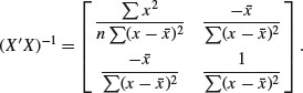
When every element of a matrix has a common factor, it can be taken outside the matrix. Here, the term 1/(n.SSX) can be taken outside to give
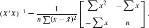
Computing the numerical value of this is easy using the matrix function ginv:
library(MASS)
ginv(t(X) %*% X)
[,1] [,2]
[1,] 0.37777778 -0.06666667
[2,] -0.06666667 0.01666667
Now we can solve the normal equations

using the fact that 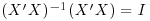 to obtain the important general result:
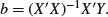
ginv(t(X) %*% X) %*% t(X) %*% Y
[,1]
[1,] 11.755556
[2,] -1.216667
which you will recognize from our hand calculations as the intercept and slope respectively (see p. 455). The ANOVA computations are as follows. The correction factor is
CF <- t(Y) %*% one %*% t(one) %*% Y/9
CF
[,1]
[1,] 427.1111
The total sum of squares, SSY, is Y′Y – CF:
t(Y) %*% Y - CF
[,1]
[1,] 108.8889
The regression sum of squares, SSR, is  :
:
b <- ginv(t(X) %*% X) %*% t(X) %*% Y
t(b) %*% t(X) %*% Y - CF
[,1]
[1,] 88.81667
The error sum of squares, SSE, is  :
:
t(Y) %*% Y - t(b) %*% t(X) %*% Y
[,1]
[1,] 20.07222
You should check these figures against the hand calculations on p. 457. Obviously, this is not a sensible way to carry out a single linear regression, but it demonstrates how to generalize the calculations for cases that have two or more continuous explanatory variables.
7.6 Solving systems of linear equations using matrices
Suppose we have two equations containing two unknown variables:

We can use the function solve to find the values of the variables if we provide it with two matrices:
- a square matrix A containing the coefficients (3, 1, 4 and 2, columnwise);
- a column vector kv containing the known values (12 and 8).
We set the two matrices up like this (columnwise, as usual):
A <- matrix(c(3,1,4,2),nrow=2)
A
[,1] [,2]
[1,] 3 4
[2,] 1 2
kv <- matrix(c(12,8),nrow=2)
kv
[,1]
[1,] 12
[2,] 8
Now we can solve the simultaneous equations, using the solve function like this:
solve(A,kv)
[,1]
[1,] -4
[2,] 6
to give x = –4 and y = 6 (which you can easily verify by hand). The function is most useful when there are many simultaneous equations to be solved.
7.7 Calculus
The rules of differentiation and integration are known to R. You will use them in modelling (e.g. in calculating starting values in non-linear regression) and for numeric minimization using optim. Read the help files ?D and ?integrate to understand the limitations of these functions.
7.7.1 Derivatives
The R function for symbolic and algorithmic derivatives of simple expressions is D. Here are some simple examples to give you the idea. See also ?deriv.
D(expression(2*x^3),"x")
2 * (3 * x^2)
D(expression(log(x)),"x")
1/x
D(expression(a*exp(-b * x)),"x")
-(a * (exp(-b * x) * b))
D(expression(a/(1+b*exp(-c * x))),"x")
a * (b * (exp(-c * x) * c))/(1 + b * exp(-c * x))^2
trig.exp <- expression(sin(cos(x + y^2)))
D(trig.exp, "x")
-(cos(cos(x + y^2)) * sin(x + y^2))
7.7.2 Integrals
The R function is integrate. Here are some simple examples to give you the idea:
integrate(dnorm,0,Inf)
0.5 with absolute error < 4.7e-05
integrate(dnorm,-Inf,Inf)
1 with absolute error < 9.4e-05
integrate(function(x) rep(2, length(x)), 0, 1)
2 with absolute error < 2.2e-14
integrand <- function(x) {1/((x+1)*sqrt(x))}
integrate(integrand, lower = 0, upper = Inf)
3.141593 with absolute error < 2.7e-05
xv <- seq(0,10,0.1)
plot(xv,integrand(xv),type="l")
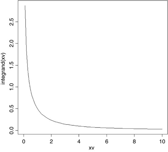
The area under the curve is π = 3.141 593.
7.7.3 Differential equations
We need to solve a system of ordinary differential equations (ODEs) using classical Runge–Kutta integration from the deSolve package (Soetaert et al., 2012):
install.packages("deSolve")
library(deSolve)
The example involves a simple resource-limited plant–herbivore interaction where V = vegetation and N = herbivore population. We need to specify two differential equations: one for the vegetation (dV/dt) and one for the herbivore population (dN/dt):
The steps involved in solving these ODEs in R are as follows:
- Define a function (called phmodel in this case) containing the equations.
- Write the vegetation equation as dv using with.
- Write the herbivore equation as dn using with.
- Combine these vectors into a list called result.
- Generate a time series over which to solve the equations in times.
- Set the parameter values in parameters.
- Set the starting values for V and N in initial.
- Use ode to create a matrix with the time series of V and N in output.
None of this is at all complicated, but there are lots of steps, so it looks a bit daunting.
First we write a function called phmodel (for plant–herbivore model) which tells R the structure of the two equations, showing how change in each population is related to the functional and numerical responses, and then puts the results into a list:
phmodel <- function(t,state,parameters){
with(as.list(c(state,parameters)),{
dv <- r*v*(K-v)/K-b*v*n
dn <- c*v*n-d*n
result <- c(dv,dn)
list(result)
})}
The rightmost curly bracket ends the function, the plain right bracket closes the with function and the leftmost curly bracket ends the definition of the equations.
To run the model we need to create a vector of times over which to calculate the population dynamics,
times <- seq(0,500,length=501)
then define the numeric values of the five parameters (these values will determine the behaviour of the two populations)
parameters <- c(r=0.4,K=1000,b=0.02,c=0.01,d=0.3)
and set the initial conditions (plant = 50 and herbivores = 10 at the start):
initial <- c(v=50,n=10)
That is the end of the preliminaries.
Solving the equations could not be easier. The important function is ode (ordinary differential equation solver). The function takes four arguments: the starting values, the vector of times, the function containing the equations, and the list containing the parameter values:
output <- ode(y=initial,time=times,func=phmodel,parms=parameters)
The output object is a matrix with three columns: time, plant abundance (v) and herbivore abundance (n):
head(output)
time v n
[1,] 0 50.00000 10.00000
[2,] 1 58.29220 12.75106
[3,] 2 62.99695 17.40172
[4,] 3 60.70065 24.09264
[5,] 4 50.79407 31.32860
[6,] 5 37.68312 36.12636
Plotting the two time series is done like this:
plot(output[,1],output[,2],
ylim=c(0,60),type="n",ylab="abundance",xlab="time")
lines(output[,1],output[,2],col="green")
lines(output[,1],output[,3],col="red")
The graph shows plant abundance as a green line against time and herbivore abundance as a red line:

The system exhibits damped oscillations to a stable point equilibrium at which dV/dt and dN/dt are both equal to zero, so equilibrium plant abundance V* = d/c = 0.3/0.01 = 30 and equilibrium herbivore abundance N* = r(K – V*)/bK = 19.4.
An alternative is to plot the output as a phase plane, with herbivore abundance on the x axis and plant abundance on the y axis:
plot(output[,3],output[,2],
ylim=c(0,70),xlim=c(0,70),type="n",ylab="plant",xlab="herbivore")
lines(output[,2],output[,3],col="red")