Chapter 8
Classical Tests
There is absolutely no point in carrying out an analysis that is more complicated than it needs to be. Occam's razor applies to the choice of statistical model just as strongly as to anything else: simplest is best. The so-called classical tests deal with some of the most frequently used kinds of analysis for single-sample and two-sample problems.
8.1 Single samples
Suppose we have a single sample. The questions we might want to answer are these:
- What is the mean value?
- Is the mean value significantly different from current expectation or theory?
- What is the level of uncertainty associated with our estimate of the mean value?
In order to be reasonably confident that our inferences are correct, we need to establish some facts about the distribution of the data:
- Are the values normally distributed or not?
- Are there outliers in the data?
- If data were collected over a period of time, is there evidence for serial correlation?
Non-normality, outliers and serial correlation can all invalidate inferences made by standard parametric tests like Student's t test. It is much better in cases with non-normality and/or outliers to use a non-parametric technique such as Wilcoxon's signed-rank test. If there is serial correlation in the data, then you need to use time series analysis or mixed-effects models.
8.1.1 Data summary
To see what is involved in summarizing a single sample, read the data called y from the file called classic.txt:
data <- read.table("c:\\temp\\classic.txt",header=T)
names(data)
[1] "y"
attach(data)
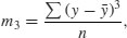
As usual, we begin with a set of single sample plots: an index plot (scatterplot with a single argument, in which data are plotted in the order in which they appear in the dataframe), a box-and-whisker plot (see p. 212) and a frequency plot (a histogram with bin widths chosen by R):
par(mfrow=c(2,2))
plot(y)
boxplot(y)
hist(y,main="")
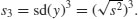
y2 <- y
y2[52] <- 21.75
plot(y2)
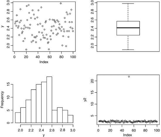
The index plot (bottom right) is particularly valuable for drawing attention to mistakes in the dataframe. Suppose that the 52nd value had been entered as 21.75 instead of 2.175: the mistake stands out like a sore thumb in the plot.
Summarizing the data could not be simpler. We use the built-in function called summary like this:
summary(y)
Min. 1st Qu. Median Mean 3rd Qu. Max.
1.904 2.241 2.414 2.419 2.568 2.984
This gives us six pieces of information about the vector y. The smallest value is 1.904 (labelled Min. for minimum) and the largest value is 2.984 (labelled Max. for maximum). There are two measures of central tendency: the median is 2.414 and the arithmetic mean in 2.419. The other two figures (labelled 1st Qu. and 3rd Qu.) are the first and third quartiles (the 25th and 75th percentiles; see p. 115).
An alternative is Tukey's ‘five-number summary’ which comprises minimum, lower hinge, median, upper hinge and maximum for the input data. Hinges are close to the first and third quartiles (compare with summary, above), but different for small samples (see below):
fivenum(y)
[1] 1.903978 2.240931 2.414137 2.569583 2.984053
Notice that in this case Tukey's ‘hinges’ are not exactly the same as the 25th and 75th percentiles produced by summary. In our sample of 100 numbers the hinges are the average of the 25th and 26th sorted numbers and the average of the 75th and 76th sorted numbers. This is how the fivenum summary is produced: x takes the sorted values of y, and n is the length of y. Then five numbers, d, are calculated to use as subscripts to extract five averaged values from x like this:
x <- sort(y)
n <- length(y)
d <- c(1, 0.5 * floor(0.5 * (n + 3)), 0.5 * (n + 1), n + 1 - 0.5 *
floor(0.5 * (n + 3)), n)
0.5 * (x[floor(d)] + x[ceiling(d)])
[1] 1.903978 2.240931 2.414137 2.569583 2.984053
where the d values are
[1] 1.0 25.5 50.5 75.5 100.0
with floor and ceiling providing the lower and upper subscripts for averaging (25 with 26 and 75 with 76 for the lower and upper hinges, respectively).
8.1.2 Plots for testing normality
The simplest test of normality (and in many ways the best) is the ‘quantile–quantile plot’. This plots the ranked samples from our distribution against a similar number of ranked quantiles taken from a normal distribution. If our sample is normally distributed then the line will be straight. Departures from normality show up as various sorts of non-linearity (e.g. S-shapes or banana shapes). The functions you need are qqnorm and qqline (quantile–quantile plot against a normal distribution):
par(mfrow=c(1,1))
qqnorm(y)
qqline(y,lty=2)

This shows a slight S-shape, but there is no compelling evidence of non-normality (our distribution is somewhat skew to the left; see the histogram, above). A novel plot for illustrating non-normality is shown on p. 232.
8.1.3 Testing for normality
We might use shapiro.test for testing whether the data in a vector come from a normal distribution. The null hypothesis is that the sample data are normally distributed. Let us generate some data that are log-normally distributed, in the hope that they will fail the normality test:
x <- exp(rnorm(30))
shapiro.test(x)
Shapiro-Wilk normality test
data: x
W = 0.5701, p-value = 3.215e-08
They certainly do fail: p < 0.000 001. A p value is not the probability that the null hypothesis is true (this is a common misunderstanding). On the contrary, the p value is based on the assumption that the null hypothesis is true. A p value is an estimate of the probability that a particular result (W = 0.5701 in this case), or a result more extreme than the result observed, could have occurred by chance, if the null hypothesis were true. In short, the p value is a measure of the credibility of the null hypothesis. A large p value (say, p = 0.23) means that there is no compelling evidence on which to reject the null hypothesis. Of course, saying ‘we do not reject the null hypothesis’ and ‘the null hypothesis is true’ are two quite different things. For instance, we may have failed to reject a false null hypothesis because our sample size was too low, or because our measurement error was too large. Thus, p values are interesting, but they do not tell the whole story: effect sizes and sample sizes are equally important in drawing conclusions.
8.1.4 An example of single-sample data
We can investigate the issues involved by examining the data from Michelson's famous experiment in 1879 to measure the speed of light (see Michelson, 1880). The dataframe called light contains his results (km s–1), but with 299 000 subtracted.
light <- read.table("t:\\data\\light.txt",header=T)
attach(light)
hist(speed,main="",col="green")

We get a summary of the non-parametric descriptors of the sample like this:
summary(speed)
Min. 1st Qu. Median Mean 3rd Qu. Max.
650 850 940 909 980 1070
From this, you see at once that the median (940) is substantially bigger than the mean (909), as a consequence of the strong negative skew in the data seen in the histogram. The interquartile range is the difference between the first and third quartiles: 980 − 850 = 130. This is useful in the detection of outliers: a good rule of thumb is that an outlier is a value that is more than 1.5 times the interquartile range above the third quartile or below the first quartile (130 × 1.5 = 195). In this case, therefore, outliers would be measurements of speed that were less than 850 − 195 = 655 or greater than 980 + 195 = 1175. You will see that there are no large outliers in this data set, but one or more small outliers (the minimum is 650).
We want to test the hypothesis that Michelson's estimate of the speed of light is significantly different from the value of 299 990 thought to prevail at the time. Since the data have all had 299 000 subtracted from them, the test value is 990. Because of the non-normality, the use of Student's t test in this case is ill advised. The correct test is Wilcoxon's signed-rank test.
wilcox.test(speed,mu=990)
Wilcoxon signed rank test with continuity correction
data: speed
V = 22.5, p-value = 0.00213
alternative hypothesis: true location is not equal to 990
Warning message:
In wilcox.test.default(speed, mu = 990) :
cannot compute exact p-value with ties
We reject the null hypothesis and accept the alternative hypothesis because p = 0.002 13 (i.e. much less than 0.05). The speed of light is significantly less than 299 990.
8.2 Bootstrap in hypothesis testing
You have probably heard the old phrase about ‘pulling yourself up by your own bootlaces’. That is where the term ‘bootstrap’ comes from. It is used in the sense of getting ‘something for nothing’. The idea is very simple. You have a single sample of n measurements, but you can sample from this in very many ways, so long as you allow some values to appear more than once, and other samples to be left out (i.e. sampling with replacement). All you do is calculate the sample mean lots of times, once for each sampling from your data, then obtain the confidence interval by looking at the extreme highs and lows of the estimated means using a quantile function to extract the interval you want (e.g. a 95% interval is specified using c(0.0275, 0.975) to locate the lower and upper bounds).
Our sample mean value of y is 909 (see the previous example). The question we have been asked to address is this: how likely is it that the population mean that we are trying to estimate with our random sample of 100 values is as big as 990? We take 10 000 random samples with replacement using n = 100 from the 100 values of light and calculate 10 000 values of the mean. Then we ask: what is the probability of obtaining a mean as large as 990 by inspecting the right-hand tail of the cumulative probability distribution of our 10 000 bootstrapped mean values? This is not as hard as it sounds:
a <- numeric(10000)
for(i in 1:10000) a[i] <- mean(sample(speed,replace=T))
hist(a,main="",col="blue")

The test value of 990 is way off the scale to the right, so a mean of 990 is clearly most unlikely, given the data with max(a) = 979. In our 10 000 samples of the data, we never obtained a mean value greater than 979, so the probability that the mean is 990 is clearly p < 0.0001.
8.3 Skew and kurtosis
So far, and without saying so explicitly, we have encountered the first two moments of a sample distribution. The quantity ∑ y was used in the context of defining the arithmetic mean of a single sample: this is the first moment  . The quantity
  , the sum of squares, was used in calculating sample variance, and this is the second moment of the distribution
 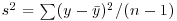 . Higher-order moments involve powers of the difference greater than 2 such as
  and
and  .
.
8.3.1 Skew
Skew (or skewness) is the dimensionless version of the third moment about the mean,
which is rendered dimensionless by dividing by the cube of the standard deviation of y (because this is also measured in units of y3),
The skew is then given by
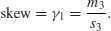
It measures the extent to which a distribution has long, drawn-out tails on one side or the other. A normal distribution is symmetrical and has γ1 = 0. Negative values of γ1 mean skew to the left (negative skew) and positive values mean skew to the right.
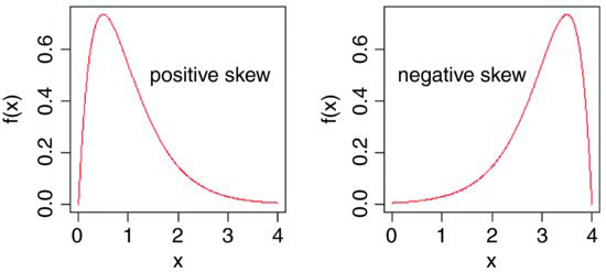
windows(7,4)
par(mfrow=c(1,2))
x <- seq(0,4,0.01)
plot(x,dgamma(x,2,2),type="l",ylab="f(x)",xlab="x",col="red")
text(2.7,0.5,"positive skew")
plot(4-x,dgamma(x,2,2),type="l",ylab="f(x)",xlab="x",col="red")
text(1.3,0.5,"negative skew")
To test whether a particular value of skew is significantly different from 0 (and hence the distribution from which it was calculated is significantly non-normal) we divide the estimate of skew by its approximate standard error:

It is straightforward to write an R function to calculate the degree of skew for any vector of numbers, x, like this:
skew <- function(x){
m3 <- sum((x-mean(x))^3)/length(x)
s3 <- sqrt(var(x))^3
m3/s3
}
Note the use of the length(x) function to work out the sample size, n, whatever the size of the vector x. The last expression inside the function is not assigned a variable name, and is returned as the value of skew(x) when this is executed from the command line.
Let us test the following data set:
data <- read.table("c:\\temp\\skewdata.txt",header=T)
attach(data)
names(data)
[1] "values"
hist(values)

The data appear to be positively skew (i.e. to have a longer tail on the right than on the left). We use the new function skew to quantify the degree of skewness:
skew(values)
[1] 1.318905
Now we need to know whether a skew of 1.319 is significantly different from zero. We do a t test, dividing the observed value of skew by its standard error 
skew(values)/sqrt(6/length(values))
[1] 2.949161
Finally, we ask what is the probability of getting a t value of 2.949 by chance alone, when the skew value really is zero:
1-pt(2.949,28)
[1] 0.003185136
We conclude that these data show significant non-normality (p < 0.0032).
The next step might be to look for a transformation that normalizes the data by reducing the skewness. One way of drawing in the larger values is to take square roots, so let us try this to begin with:
skew(sqrt(values))/sqrt(6/length(values))
[1] 1.474851
This is not significantly skew. Alternatively, we might take the logs of the values:
skew(log(values))/sqrt(6/length(values))
[1] -0.6600605
This is now slightly skew to the left (negative skew), but the value of Student's t is smaller than with a square root transformation, so we might prefer a log transformation in this case.
8.3.2 Kurtosis
This is a measure of non-normality that has to do with the peakyness, or flat-toppedness, of a distribution. The normal distribution is bell-shaped, whereas a kurtotic distribution is other than bell-shaped. In particular, a more flat-topped distribution is said to be platykurtic, and a more pointy distribution is said to be leptokurtic.
Kurtosis is the dimensionless version of the fourth moment about the mean,
which is rendered dimensionless by dividing by the square of the variance of y (because this is also measured in units of y4),
Kurtosis is then given by
The −3 is included because a normal distribution has m4/s4 = 3. This formulation therefore has the desirable property of giving zero kurtosis for a normal distribution, while a flat-topped (platykurtic) distribution has a negative value of kurtosis, and a pointy (leptokurtic) distribution has a positive value of kurtosis. The approximate standard error of kurtosis is


plot(-200:200,dcauchy(-200:200,0,10),type="l",ylab="f(x)",xlab="",yaxt="n",
xaxt="n",main="leptokurtosis",col="red")
xv <- seq(-2,2,0.01)
plot(xv,exp(-abs(xv)^6),type="l",ylab="f(x)",xlab="",yaxt="n",
xaxt="n",main="platykurtosis",col="red")
An R function to calculate kurtosis might look like this:
kurtosis <- function(x) {
m4 <- sum((x-mean(x))^4)/length(x)
s4 <- var(x)^2
m4/s4 - 3 }
For our present data, we find that kurtosis is not significantly different from normal:
kurtosis(values)
[1] 1.297751
kurtosis(values)/sqrt(24/length(values))
[1] 1.45093
8.4 Two samples
The classical tests for two samples include:
- comparing two variances (Fisher's F test, var.test);
- comparing two sample means with normal errors (Student's t test, t.test);
- comparing two means with non-normal errors (Wilcoxon's rank test, wilcox.test);
- comparing two proportions (the binomial test, prop.test);
- correlating two variables (Pearson's or Spearman's rank correlation, cor.test);
- testing for independence of two variables in a contingency table (chi-squared, chisq.test, or Fisher's exact test, fisher.test).
8.4.1 Comparing two variances
Before we can carry out a test to compare two sample means (see below), we need to test whether the sample variances are significantly different (see p. 356). The test could not be simpler. It is called Fisher's F test after the famous statistician and geneticist R.A. Fisher, who worked at Rothamsted in south-east England. To compare two variances, all you do is divide the larger variance by the smaller variance. Obviously, if the variances are the same, the ratio will be 1. In order to be significantly different, the ratio will need to be significantly bigger than 1 (because the larger variance goes on top, in the numerator). How will we know a significant value of the variance ratio from a non-significant one? The answer, as always, is to look up the critical value of the variance ratio. In this case, we want critical values of Fisher's F. The R function for this is qf, which stands for ‘quantiles of the F distribution’.
For our example of ozone levels in market gardens (see p. 354) there were 10 replicates in each garden, so there were 10 − 1 = 9 degrees of freedom for each garden. In comparing two gardens, therefore, we have 9 d.f. in the numerator and 9 d.f. in the denominator. Although F tests in analysis of variance are typically one-tailed (the treatment variance is expected to be larger than the error variance if the means are significantly different; see p. 501), in this case we have no expectation as to which garden was likely to have the higher variance, so we carry out a two-tailed test (p = 1 − α/2). Suppose we work at the traditional α = 0.05, then we find the critical value of F like this:
qf(0.975,9,9)
4.025994
This means that a calculated variance ratio will need to be greater than or equal to 4.02 in order for us to conclude that the two variances are significantly different at α = 0.05.
To see the test in action, we can compare the variances in ozone concentration for market gardens B and C:
f.test.data <- read.table("c:\\temp\\f.test.data.txt",header = T)
attach(f.test.data)
names(f.test.data)
[1] "gardenB" "gardenC"
First, we compute the two variances:
var(gardenB)
[1] 1.333333
var(gardenC)
[1] 14.22222
The larger variance is clearly in garden C, so we compute the F ratio like this:
F.ratio <- var(gardenC)/var(gardenB)
F.ratio
[1] 10.66667
The variance in garden C is more than 10 times as big as the variance in garden B. The critical value of F for this test (with 9 d.f. in both the numerator and the denominator) is 4.026 (see qf, above), so, since the calculated value is larger than the critical value we reject the null hypothesis. The null hypothesis was that the two variances were not significantly different, so we accept the alternative hypothesis that the two variances are significantly different. In fact, it is better practice to present the p value associated with the calculated F ratio rather than just to reject the null hypothesis; to do this we use pf rather than qf. We double the resulting probability to allow for the two-tailed nature of the test:
2*(1-pf(F.ratio,9,9))
[1] 0.001624199
so the probability that the variances are the same is p < 0.002. Because the variances are significantly different, it would be wrong to compare the two sample means using Student's t test.
There is a built-in function called var.test for speeding up the procedure. All we provide are the names of the two variables containing the raw data whose variances are to be compared (we do not need to work out the variances first):
var.test(gardenB,gardenC)
F test to compare two variances
data: gardenB and gardenC
F = 0.0938, num df = 9, denom df = 9, p-value = 0.001624
alternative hypothesis: true ratio of variances is not equal to 1
95 percent confidence interval:
0.02328617 0.37743695
sample estimates:
ratio of variances
0.09375
Note that the variance ratio, F, is given as roughly 1/10 rather than roughly 10 because var.test put the variable name that came first in the alphabet (gardenB) on top (i.e. in the numerator) instead of the bigger of the two variances. But the p value of 0.0016 is the same as we calculated by hand (above), and we reject the null hypothesis. These two variances are highly significantly different. This test is highly sensitive to outliers, so use it with care.
It is important to know whether variance differs significantly from sample to sample. Constancy of variance (homoscedasticity) is the most important assumption underlying regression and analysis of variance (p. 490). For comparing the variances of two samples, Fisher's F test is appropriate (p. 354). For multiple samples you can choose between the Bartlett test and the Fligner–Killeen test. Here are both tests in action:
refs <- read.table("c:\\temp\\refuge.txt",header=T)
attach(refs)
names(refs)
[1] "B" "T"
where T is an ordered factor with nine levels. Each level produces 30 estimates of yields except for level 9 which is a single zero. We begin by looking at the variances:
tapply(B,T,var)
1 2 3 4 5 6 7 8 9
1354.024 2025.431 3125.292 1077.030 2542.599 2221.982 1445.490 1459.955 NA
When it comes to the variance tests we shall have to leave out level 9 of T because the tests require at least two replicates at each factor level. We need to know which data point refers to treatment T = 9:
which(T==9)
[1] 31
So we shall omit the 31st data point using negative subscripts. First Bartlett:
bartlett.test(B[-31],T[-31])
Bartlett test of homogeneity of variances
data: B[-31] and T[-31]
Bartlett's K-squared = 13.1986, df = 7, p-value = 0.06741
So there is no significant difference between the eight variances (p = 0.067). Now Fligner:
fligner.test(B[-31],T[-31])
Fligner-Killeen test of homogeneity of variances
data: B[-31] and T[-31]
Fligner-Killeen:med chi-squared = 14.3863, df = 7, p-value = 0.04472
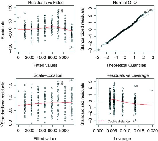
Hmm. This test says that there are significant differences between the variances (p < 0.05). What you do next depends on your outlook. There are obviously some close-to-significant differences between these eight variances, but if you simply look at a plot of the data, plot(T,B), the variances appear to be very well behaved. A linear model shows some slight pattern in the residuals and some evidence of non-normality:
model <- lm(B∼T)
plot(model)
The various tests can give wildly different interpretations. Here are the ozone data from three market gardens:
ozone <- read.table("c:\\temp\\gardens.txt",header=T)
attach(ozone)
names(ozone)
[1] "gardenA" "gardenB" "gardenC"
y <- c(gardenA,gardenB,gardenC)
garden <- factor(rep(c("A","B","C"),c(10,10,10)))
The question is whether the variance in ozone concentration differs from garden to garden or not. Fisher's F test comparing gardens B and C says that variance is significantly greater in garden C:
var.test(gardenB,gardenC)
F test to compare two variances
data: gardenB and gardenC
F = 0.0938, num df = 9, denom df = 9, p-value = 0.001624
alternative hypothesis: true ratio of variances is not equal to 1
95 percent confidence interval:
0.02328617 0.37743695
sample estimates:
ratio of variances
0.09375
Bartlett's test, likewise, says there is a highly significant difference in variance across gardens:
bartlett.test(y∼garden)
Bartlett test of homogeneity of variances
data: y by garden
Bartlett's K-squared = 16.7581, df = 2, p-value = 0.0002296
In contrast, the Fligner–Killeen test (preferred over Bartlett's test by many statisticians) says there is no compelling evidence for non-constancy of variance (heteroscedasticity) in these data:
fligner.test(y∼garden)
Fligner-Killeen test of homogeneity of variances
data: y by garden
Fligner-Killeen: med chi-squared = 1.8061, df = 2, p-value = 0.4053
The reason for the difference is that Fisher and Bartlett are sensitive to outliers, whereas Fligner–Killeen is not (it is a non-parametric test which uses the ranks of the absolute values of the centred samples, and weights a(i) = qnorm((1 + i/(n+1))/2). Of the many tests for homogeneity of variances, this is the most robust against departures from normality (Conover et al., 1981). In this particular case, I think the Flinger test is too forgiving: gardens B and C both had a mean of 5 parts per hundred milllion (pphm; well below the damage threshold of 8 pphm), but garden B never suffered damaging levels of ozone whereas garden C experienced damaging ozone levels on 30% of days. That difference is scientifically important, and deserves to be statistically significant.
8.4.2 Comparing two means
Given what we know about the variation from replicate to replicate within each sample (the within-sample variance), how likely is it that our two sample means were drawn from populations with the same average? If it is highly likely, then we shall say that our two sample means are not significantly different. If it is rather unlikely, then we shall say that our sample means are significantly different. But perhaps a better way to proceed is to work out the probability that the two samples were indeed drawn from populations with the same mean. If this probability is very low (say, less than 5% or less than 1%) then we can be reasonably certain (95% or 99% in these two examples) than the means really are different from one another. Note, however, that we can never be 100% certain; the apparent difference might just be due to random sampling – we just happened to get a lot of low values in one sample, and a lot of high values in the other.
There are two classical tests for comparing two sample means:
- Student's t test when the samples are independent, the variances constant, and the errors are normally distributed;
- Wilcoxon's rank-sum test when the samples are independent but the errors are not normally distributed (e.g. they are ranks or scores or some sort).
What to do when these assumptions are violated (e.g. when the variances are different) is discussed later on.
8.4.3 Student's t test
Student was the pseudonym of W.S. Gossett who published his influential paper in Biometrika in 1908. The archaic employment laws in place at the time allowed his employer, the Guinness Brewing Company, to prevent him publishing independent work under his own name. Student's t distribution, later perfected by R.A. Fisher, revolutionized the study of small-sample statistics where inferences need to be made on the basis of the sample variance s2 with the population variance σ2 unknown (indeed, usually unknowable). The test statistic is the number of standard errors of the difference by which the two sample means are separated:
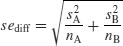
We know the standard error of the mean (see p. 43) but we have not yet met the standard error of the difference between two means. For two independent (i.e. non-correlated) variables, the variance of a difference is the sum of the separate variances. This important result allows us to write down the formula for the standard error of the difference between two sample means:
We now have everything we need to carry out Student's t test. Our null hypothesis is that the two population means are the same, and we shall accept this unless the value of Student's t is so large that it is unlikely that such a difference could have arisen by chance alone. Everything varies, so in real studies our two sample means will never be exactly the same, no matter what the parent population means. For the ozone example introduced on p. 354, each sample has 9 degrees of freedom, so we have 18 d.f. in total. Another way of thinking of this is to reason that the complete sample size as 20, and we have estimated two parameters from the data,  so we have 20 − 2 = 18 d.f. We typically use 5% as the chance of rejecting the null hypothesis when it is true (this is the Type I error rate). Because we did not know in advance which of the two gardens was going to have the higher mean ozone concentration (and we usually do not), this is a two-tailed test, so the critical value of Student's t is:
qt(0.975,18)
[1] 2.100922
This means that our test statistic needs to be bigger than 2.1 in order to reject the null hypothesis, and hence to conclude that the two means are significantly different at α = 0.05.
The dataframe is attached like this:
t.test.data <- read.table("c:\\temp\\t.test.data.txt",header=T)
attach(t.test.data)
par(mfrow=c(1,1))
names(t.test.data)
[1] "gardenA" "gardenB"
A useful graphical test for two samples employs the notch option of boxplot:
ozone <- c(gardenA,gardenB)
label <- factor(c(rep("A",10),rep("B",10)))
boxplot(ozone∼label,notch=T,xlab="Garden",ylab="Ozone")

Because the notches of two plots do not overlap, we conclude that the medians are significantly different at the 5% level. Note that the variability is similar in both gardens, both in terms of the range (the whiskers) and the interquartile range (the boxes).
To carry out a t test long-hand, we begin by calculating the variances of the two samples:
s2A <- var(gardenA)
s2B <- var(gardenB)
The value of the test statistic for Student's t is the difference divided by the standard error of the difference. The numerator is the difference between the two means, and the denominator is the square root of the sum of the two variances divided by their sample sizes:
(mean(gardenA)-mean(gardenB))/sqrt(s2A/10+s2B/10)
which gives the value of Student's t as
[1] -3.872983
With t-tests you can ignore the minus sign; it is only the absolute value of the difference between the two sample means that concerns us. So the calculated value of the test statistic is 3.87 and the critical value is 2.10 (qt(0.975,18), above). Since the calculated value of the test statistic is larger than the critical value, we reject the null hypothesis. Notice that the wording is exactly the same as it was for the F test (above). Indeed, the wording is always the same for all kinds of tests, and you should try to memorize it. The abbreviated form is easier to remember: ‘larger reject, smaller accept’. The null hypothesis was that the two population means are not significantly different, so we reject this and accept the alternative hypothesis that the two means are significantly different. Again, rather than merely rejecting the null hypothesis, it is better to state the probability that data as extreme as this (or more extreme) would be observed if the population mean values really were the same. For this we use pt rather than qt, and in this instance 2*pt because we are doing a two-tailed test:
2*pt(-3.872983,18)
[1] 0.001114540
We conclude that p < 0.005.
You will not be surprised to learn that there is a built-in function to do all the work for us. It is called, helpfully, t.test and is used simply by providing the names of the two vectors containing the samples on which the test is to be carried out (gardenA and gardenB in our case).
t.test(gardenA,gardenB)
There is rather a lot of output. You often find this: the simpler the statistical test, the more voluminous the output.
Welch Two Sample t-test
data: gardenA and gardenB
t = -3.873, df = 18, p-value = 0.001115
alternative hypothesis: true difference in means is not equal to 0
95 percent confidence interval:
-3.0849115 -0.9150885
sample estimates:
mean of x mean of y
3 5
The result is exactly the same as we obtained the long way. The value of t is –3.873 and, since the sign is irrelevant in a t test, we reject the null hypothesis because the test statistic is larger than the critical value of 2.1. The mean ozone concentration is significantly higher in garden B than in garden A. The computer output also gives a p value and a confidence interval. Note that, because the means are significantly different, the confidence interval on the difference does not include zero (in fact, it goes from –3.085 up to –0.915). You might present the result like this: ‘Ozone concentration was significantly higher in garden B (mean = 5.0 pphm) than in garden A (mean = 3.0 pphm; t = 3.873, p = 0.0011 (2-tailed), d.f. = 18).’
There is a formula-based version of t.test that you can use when your explanatory variable consists of a two-level factor (see ?t.test).
8.4.4 Wilcoxon rank-sum test
This is a non-parametric alternative to Student's t test, which we could use if the errors were non-normal. The Wilcoxon rank-sum test statistic, W, is calculated as follows. Both samples are put into a single array with their sample names clearly attached (A and B in this case, as explained below). Then the aggregate list is sorted, taking care to keep the sample labels with their respective values. A rank is assigned to each value, with ties getting the appropriate average rank (two-way ties get (rank i + (rank i + 1))/2, three-way ties get (rank i + (rank i + 1) + (rank i + 2))/3, and so on). Finally the ranks are added up for each of the two samples, and significance is assessed on the size of the smaller sum of ranks.
First we make a combined vector of the samples:
ozone <- c(gardenA,gardenB)
ozone
[1] 3 4 4 3 2 3 1 3 5 2 5 5 6 7 4 4 3 5 6 5
Then we make a list of the sample names:
label <- c(rep("A",10),rep("B",10))
label
[1] "A" "A" "A" "A" "A" "A" "A" "A" "A" "A" "B" "B" "B" "B" "B" "B" "B" "B" "B" "B"
Now use the built-in function rank to get a vector containing the ranks, smallest to largest, within the combined vector:
combined.ranks <- rank(ozone)
combined.ranks
[1] 6.0 10.5 10.5 6.0 2.5 6.0 1.0 6.0 15.0 2.5 15.0 15.0
[13] 18.5 20.0 10.5 10.5 6.0 15.0 18.5 15.0
Notice that the ties have been dealt with by averaging the appropriate ranks. Now all we need to do is calculate the sum of the ranks for each garden. We use tapply with sum as the required operation
tapply(combined.ranks,label,sum)
A B
66 144
Finally, we compare the smaller of the two values (66) with values in tables of Wilcoxon rank sums (e.g. Snedecor and Cochran, 1980, p. 555), and reject the null hypothesis if our value of 66 is smaller than the value in tables. For samples of size 10 and 10 like ours, the 5% value in tables is 78. Our value of 66 is smaller than this, so we reject the null hypothesis. The two sample means are significantly different (in agreement with our earlier t test).
We can carry out the whole procedure automatically, and avoid the need to use tables of critical values of Wilcoxon rank sums, by using the built-in function wilcox.test:
wilcox.test(gardenA,gardenB)
Wilcoxon rank sum test with continuity correction
data: gardenA and gardenB
W = 11, p-value = 0.002988
alternative hypothesis: true location shift is not equal to 0
Warning message:
In wilcox.test.default(gardenA, gardenB) :
cannot compute exact p-value with ties
The function uses a normal approximation algorithm to work out a z value, and from this a p value to assess the hypothesis that the two means are the same. This p value of 0.002 988 is much less than 0.05, so we reject the null hypothesis, and conclude that the mean ozone concentrations in gardens A and B are significantly different. The warning message at the end draws attention to the fact that there are ties in the data (repeats of the same ozone measurement), and this means that the p value cannot be calculated exactly (this is seldom a real worry).
It is interesting to compare the p values of the t test and the Wilcoxon test with the same data: p = 0.001 115 and 0.002 988, respectively. The non-parametric test is much more appropriate than the t test when the errors are not normal, and the non-parametric test is about 95% as powerful with normal errors, and can be more powerful than the t test if the distribution is strongly skewed by the presence of outliers. Typically, as here, the t test will give the lower p value, so the Wilcoxon test is said to be conservative: if a difference is significant under a Wilcoxon test it would be even more significant under a t test.
8.5 Tests on paired samples
Sometimes, two-sample data come from paired observations. In this case, we might expect a correlation between the two measurements, because they were either made on the same individual, or taken from the same location. You might recall that the variance of a difference is the average of

which is the variance of sample A, plus the variance of sample B, minus twice the covariance of A and B. When the covariance of A and B is positive, this is a great help because it reduces the variance of the difference, which makes it easier to detect significant differences between the means. Pairing is not always effective, because the correlation between yA and yB may be weak.
The following data are a composite biodiversity score based on a kick sample of aquatic invertebrates:
streams <- read.table("c:\\temp\\streams.txt",header=T)
attach(streams)
names(streams)
[1] "down" "up"
The elements are paired because the two samples were taken on the same river, one upstream and one downstream from the same sewage outfall.
If we ignore the fact that the samples are paired, it appears that the sewage outfall has no impact on biodiversity score (p = 0.6856):
t.test(down,up)
Welch Two Sample t-test
data: down and up
t = -0.4088, df = 29.755, p-value = 0.6856
alternative hypothesis: true difference in means is not equal to 0
95 percent confidence interval:
-5.248256 3.498256
sample estimates:
mean of x mean of y
12.500 13.375
However, if we allow that the samples are paired (simply by specifying the option paired=T), the picture is completely different:
t.test(down,up,paired=TRUE)
Paired t-test
data: down and up
t = -3.0502, df = 15, p-value = 0.0081
alternative hypothesis: true difference in means is not equal to 0
95 percent confidence interval:
-1.4864388 -0.2635612
sample estimates:
mean of the differences
-0.875
This is a good example of the benefit of writing TRUE rather than T. Because we have a variable called T (p. 22) the test would fail if we typed t.test(down,up,paired=T). Now the difference between the means is highly significant (p = 0.0081). The moral is clear. If you can do a paired t test, then you should always do the paired test. It can never do any harm, and sometimes (as here) it can do a huge amount of good. In general, if you have information on blocking or spatial correlation (in this case, the fact that the two samples came from the same river), then you should always use it in the analysis.
Here is the same paired test carried out as a one-sample t test based on the differences between the pairs (upstream diversity minus downstream diversity):
difference <- up - down
t.test(difference)
One Sample t-test
data: difference
t = 3.0502, df = 15, p-value = 0.0081
alternative hypothesis: true mean is not equal to 0
95 percent confidence interval:
0.2635612 1.4864388
sample estimates:
mean of x
0.875
As you see, the result is identical to the two-sample t test with paired=TRUE (p = 0.0081). The upstream values of the biodiversity score were greater by 0.875 on average, and this difference is highly significant. Working with the differences has halved the number of degrees of freedom (from 30 to 15), but it has more than compensated for this by reducing the error variance, because there is such a strong positive correlation between yA and yB.
8.6 The sign test
This is one of the simplest of all statistical tests. Suppose that you cannot measure a difference, but you can see it (e.g. in judging a diving contest). For example, nine springboard divers were scored as better or worse, having trained under a new regime and under the conventional regime (the regimes were allocated in a randomized sequence to each athlete: new then conventional, or conventional then new). Divers were judged twice: one diver was worse on the new regime, and 8 were better. What is the evidence that the new regime produces significantly better scores in competition? The answer comes from a two-tailed binomial test. How likely is a response of 1/9 (or 8/9 or more extreme than this, i.e. 0/9 or 9/9) if the populations are actually the same (i.e. p = 0.5)? We use a binomial test for this, specifying the number of ‘failures’ (1) and the total sample size (9):
binom.test(1,9)
Exact binomial test
data: 1 and 9
number of successes = 1, number of trials = 9, p-value = 0.03906
alternative hypothesis: true probability of success is not equal to 0.5
95 percent confidence interval:
0.002809137 0.482496515
sample estimates:
probability of success
0.1111111
We would conclude that the new training regime is significantly better than the traditional method, because p < 0.05.
It is easy to write a function to carry out a sign test to compare two samples, x and y:
sign.test <- function(x, y)
{
if(length(x) != length(y)) stop("The two variables must be the same length")
d <- x - y
binom.test(sum(d > 0), length(d))
}
The function starts by checking that the two vectors are the same length, then works out the vector of the differences, d. The binomial test is then applied to the number of positive differences (sum(d > 0)) and the total number of numbers (length(d)). If there was no difference between the samples, then on average, the sum would be about half of length(d). Here is the sign test used to compare the ozone levels in gardens A and B (see above):
sign.test(gardenA,gardenB)
Exact binomial test
data: sum(d > 0) and length(d)
number of successes = 0, number of trials = 10, p-value = 0.001953
alternative hypothesis: true probability of success is not equal to 0.5
95 percent confidence interval:
0.0000000 0.3084971
sample estimates:
probability of success
0
Note that the p value (0.002) from the sign test is larger than in the equivalent t test (p = 0.0011) that we carried out earlier. This will generally be the case: other things being equal, the parametric test will be more powerful than the non-parametric equivalent.
8.7 Binomial test to compare two proportions
Suppose that only four females were promoted, compared to 196 men. Is this an example of blatant sexism, as it might appear at first glance? Before we can judge, of course, we need to know the number of male and female candidates. It turns out that 196 men were promoted out of 3270 candidates, compared with 4 promotions out of only 40 candidates for the women. Now, if anything, it looks like the females did better than males in the promotion round (10% success for women versus 6% success for men).
The question then arises as to whether the apparent positive discrimination in favour of women is statistically significant, or whether this sort of difference could arise through chance alone. This is easy in R using the built-in binomial proportions test prop.test in which we specify two vectors, the first containing the number of successes for females and males c(4,196) and second containing the total number of female and male candidates c(40,3270):
prop.test(c(4,196),c(40,3270))
2-sample test for equality of proportions with continuity correction
data: c(4, 196) out of c(40, 3270)
X-squared = 0.5229, df = 1, p-value = 0.4696
alternative hypothesis: two.sided
95 percent confidence interval:
-0.06591631 0.14603864
sample estimates:
prop 1 prop 2
0.10000000 0.05993884
Warning message:
In prop.test(c(4, 196), c(40, 3270)) :
Chi-squared approximation may be incorrect
There is no evidence in favour of positive discrimination (p = 0.4696). A result like this will occur more than 45% of the time by chance alone. Just think what would have happened if one of the successful female candidates had not applied. Then the same promotion system would have produced a female success rate of 3/39 instead of 4/40 (7.7% instead of 10%). In small samples, small changes have big effects.
8.8 Chi-squared contingency tables
A great deal of statistical information comes in the form of counts (whole numbers or integers): the number of animals that died, the number of branches on a tree, the number of days of frost, the number of companies that failed, the number of patients who died. With count data, the number 0 is often the value of a response variable (consider, for example, what a 0 would mean in the context of the examples just listed). The analysis of count data is discussed in more detail in Chapters 14 and 15.
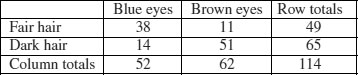
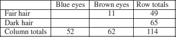
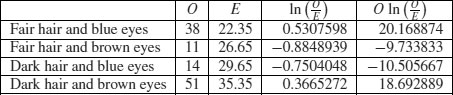
The dictionary definition of contingency is: ‘A possible or uncertain event on which other things depend or are conditional’ (OED, 2012). In statistics, however, the contingencies are all the events that could possibly happen. A contingency table shows the counts of how many times each of the contingencies actually happened in a particular sample. Consider the following example that has to do with the relationship between hair colour and eye colour in white people. For simplicity, we just chose two contingencies for hair colour: ‘fair’ and ‘dark’. Likewise we just chose two contingencies for eye colour: ‘blue’ and ‘brown’. Each of these two categorical variables, eye colour and hair colour, has two levels (‘blue’ and ‘brown’, and ‘fair’ and ‘dark’, respectively). Between them, they define four possible outcomes (the contingencies): fair hair and blue eyes, fair hair and brown eyes, dark hair and blue eyes, and dark hair and brown eyes. We take a random sample of white people and count how many of them fall into each of these four categories. Then we fill in the 2 × 2 contingency table like this:
| Blue eyes | Brown eyes | |
| Fair hair | 38 | 11 |
| Dark hair | 14 | 51 |
These are our observed frequencies (or counts). The next step is very important. In order to make any progress in the analysis of these data we need a model which predicts the expected frequencies. What would be a sensible model in a case like this? There are all sorts of complicated models that you might select, but the simplest model (Occam's razor, or the principle of parsimony) is that hair colour and eye colour are independent. We may not believe that this is actually true, but the hypothesis has the great virtue of being falsifiable. It is also a very sensible model to choose because it makes it possible to predict the expected frequencies based on the assumption that the model is true. We need to do some simple probability work. What is the probability of getting a random individual from this sample whose hair was fair? A total of 49 people (38 + 11) had fair hair out of a total sample of 114 people. So the probability of fair hair is 49/114 and the probability of dark hair is 65/114. Notice that because we have only two levels of hair colour, these two probabilities add up to 1 ((49 + 65)/114). What about eye colour? What is the probability of selecting someone at random from this sample with blue eyes? A total of 52 people had blue eyes (38 + 14) out of the sample of 114, so the probability of blue eyes is 52/114 and the probability of brown eyes is 62/114. As before, these sum to 1 ((52 + 62)/114). It helps to add the subtotals to the margins of the contingency table like this:
Now comes the important bit. We want to know the expected frequency of people with fair hair and blue eyes, to compare with our observed frequency of 38. Our model says that the two are independent. This is essential information, because it allows us to calculate the expected probability of fair hair and blue eyes. If, and only if, the two traits are independent, then the probability of having fair hair and blue eyes is the product of the two probabilities. So, following our earlier calculations, the probability of fair hair and blue eyes is 49/114 × 52/114. We can do exactly equivalent things for the other three cells of the contingency table:
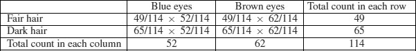
Now we need to know how to calculate the expected frequency. It couldn't be simpler. It is just the probability multiplied by the total sample (n = 114). So the expected frequency of blue eyes and fair hair is 49/114 × 52/114 × 114 = 22.35, which is much less than our observed frequency of 38. It is beginning to look as if our hypothesis of independence of hair and eye colour is false.
You might have noticed something useful in the last calculation: two of the sample sizes cancel out. Therefore, the expected frequency in each cell is just the row total (R) times the column total (C) divided by the grand total (G) like this:

We can now work out the four expected frequencies:
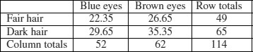
Notice that the row and column totals (the so-called ‘marginal totals’) are retained under the model. It is clear that the observed frequencies and the expected frequencies are different. But in sampling, everything always varies, so this is no surprise. The important question is whether the expected frequencies are significantly different from the observed frequencies.
We can assess the significance of the differences between observed and expected frequencies in a variety of ways:
- Pearson's chi-squared;
- G test;
- Fisher's exact test.
8.8.1 Pearson's chi-squared
We begin with Pearson's chi-squared test. The test statistic  is
is
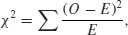
where O is the observed frequency and E is the expected frequency. It makes the calculations easier if we write the observed and expected frequencies in parallel columns, so that we can work out the corrected squared differences more easily.
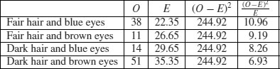
All we need to do now is to add up the four components of chi-squared to get χ2 = 35.33.
The question now arises: is this a big value of chi-squared or not? This is important, because if it is a bigger value of chi-squared than we would expect by chance, then we should reject the null hypothesis. If, on the other hand, it is within the range of values that we would expect by chance alone, then we should accept the null hypothesis.
We always proceed in the same way at this stage. We have a calculated value of the test statistic: χ2 = 35.33. We compare this value of the test statistic with the relevant critical value. To work out the critical value of chi-squared we need two things:
- the number of degrees of freedom, and
- the degree of certainty with which to work.
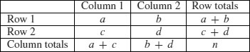
In general, a contingency table has a number of rows (r) and a number of columns (c), and the degrees of freedom is given by

So we have (2 − 1) × (2 − 1) = 1 degree of freedom for a 2 × 2 contingency table. You can see why there is only one degree of freedom by working through our example. Take the ‘fair hair, brown eyes’ box (the top right in the table) and ask how many values this could possibly take. The first thing to note is that the count could not be more than 49, otherwise the row total would be wrong. But in principle, the number in this box is free to take any value between 0 and 49. We have one degree of freedom for this box. But when we have fixed this box to be, say, 11,
you will see that we have no freedom at all for any of the other three boxes. The top left box has to be 49 − 11 = 38 because the row total is fixed at 49. Once the top left box is defined as 38 then the bottom left box has to be 52 − 38 = 14 because the column total is fixed (the total number of people with blue eyes was 52). This means that the bottom right box has to be 65 − 14 = 51. Thus, because the marginal totals are constrained, a 2 × 2 contingency table has just one degree of freedom.
The next thing we need to do is say how certain we want to be about the falseness of the null hypothesis. The more certain we want to be, the larger the value of chi-squared we would need to reject the null hypothesis. It is conventional to work at the 95% level. That is our certainty level, so our uncertainty level is 100 – 95 = 5%. Expressed as a decimal, this is called alpha (α = 0.05). Technically, alpha is the probability of rejecting the null hypothesis when it is true. This is called a Type I error. A Type II error is accepting the null hypothesis when it is false.
Critical values in R are obtained by use of quantiles (q) of the appropriate statistical distribution. For the chi-squared distribution, this function is called qchisq. The function has two arguments: the certainty level (p = 0.95), and the degrees of freedom (d.f. = 1):
qchisq(0.95,1)
[1] 3.841459
The critical value of chi-squared is 3.841. Since the calculated value of the test statistic is greater than the critical value we reject the null hypothesis.
What have we learned so far? We have rejected the null hypothesis that eye colour and hair colour are independent. But that is not the end of the story, because we have not established the way in which they are related (e.g. is the correlation between them positive or negative?). To do this we need to look carefully at the data, and compare the observed and expected frequencies. If fair hair and blue eyes were positively correlated, would the observed frequency be greater or less than the expected frequency? A moment's thought should convince you that the observed frequency will be greater than the expected frequency when the traits are positively correlated (and less when they are negatively correlated). In our case we expected only 22.35 but we observed 38 people (nearly twice as many) to have both fair hair and blue eyes. So it is clear that fair hair and blue eyes are positively associated.
In R the procedure is very straightforward. We start by defining the counts as a 2 × 2 matrix like this:
count <- matrix(c(38,14,11,51),nrow=2)
count
[,1] [,2]
[1,] 38 11
[2,] 14 51
Notice that you enter the data columnwise (not row-wise) into the matrix. Then the test uses the chisq.test function, with the matrix of counts as its only argument:
chisq.test(count)
Pearson's Chi-squared test with Yates' continuity correction
data: count
X-squared = 33.112, df = 1, p-value = 8.7e-09
The calculated value of chi-squared is slightly different from ours, because Yates' correction has been applied as the default (see Sokal and Rohlf, 1995, p. 736). If you switch the correction off (correct=F), you get the value we calculated by hand:
chisq.test(count,correct=F)
Pearson's Chi-squared test
data: count
X-squared = 35.3338, df = 1, p-value = 2.778e-09
It makes no difference at all to the interpretation: there is a highly significant positive association between fair hair and blue eyes for this group of people. If you need to extract the frequencies expected under the null hypothesis of independence then use:
chisq.test(count,correct=F)$expected
[,1] [,2]
[1,] 22.35088 26.64912
[2,] 29.64912 35.35088
8.8.2 G test of contingency
The idea is exactly the same. We are looking for evidence of non-independence of hair colour and eye colour. Even the distribution of the critical value is the same: chi-squared. The difference is in the test statistic. Instead of computing Pearson's chi-squared  , we compute the deviance from a log-linear model (see p. 562):
Here are the calculations:
The test statistic G is twice the sum of the right-hand column: 2 × 18.622 26 = 37.244 53. This value is compared with chi-squared in tables with 1 d.f. as before. The calculated value of the test statistic is much greater than the critical value (3.841) so we reject the null hypothesis of independence. Hair colour and eye colour are correlated in this group of people. We need to look at the data to see which way the correlation goes. We see far more people with fair hair and blue eyes (38) than expected under the null hypothesis of independence (22.35) so the correlation is positive. Pearson's chi-squared was χ2 = 35.33 (above) so the test statistic values are slightly different (χ2 = 37.24 in the G test) but the interpretation is identical.
8.8.3 Unequal probabilities in the null hypothesis
So far we have assumed equal probabilities, but chisq.test can deal with cases with unequal probabilities. This example has 21 individuals distributed over four categories:
chisq.test(c(10,3,2,6))
Chi-squared test for given probabilities
data: c(10, 3, 2, 6)
X-squared = 7.381, df = 3, p-value = 0.0607
The four counts are not significantly different if the probability of appearing in each of the four cells is 0.25 (the calculated p-value is greater than 0.05). However, if the null hypothesis was that the third and fourth cells had 1.5 times the probability of the first two cells, then these counts are highly significant.
chisq.test(c(10,3,2,6),p=c(0.2,0.2,0.3,0.3))
Chi-squared test for given probabilities
data: c(10, 3, 2, 6)
X-squared = 11.3016, df = 3, p-value = 0.0102
Warning message:
In chisq.test(c(10, 3, 2, 6), p = c(0.2, 0.2, 0.3, 0.3)) :
Chi-squared approximation may be incorrect
Note the warning message associated with the low expected frequencies in cells 1 and 2.
8.8.4 Chi-squared tests on table objects
You can use the chisq.test function with table objects as well as vectors. To test the random number generator as a simulator of the throws of a six-sided die we could simulate 100 throws like this, then use table to count the number of times each number appeared:
die <- ceiling(runif(100,0,6))
table(die)
die
1 2 3 4 5 6
23 15 20 14 12 16
So we observed only 12 fives in this trail and 23 ones. But is this a significant departure from fairness of the die? chisq.test will answer this:
chisq.test(table(die))
Chi-squared test for given probabilities
data: table(die)
X-squared = 5, df = 5, p-value = 0.4159
No. This is a fair die (p = 0.4159). Note that the syntax is chisq.test(table(die)) not chisq.test(die) and that there are 5 degrees of freedom in this case.
8.8.5 Contingency tables with small expected frequencies: Fisher's exact test
When one or more of the expected frequencies is less than 4 (or 5 depending on the rule of thumb you follow) then it is wrong to use Pearson's chi-squared or log-linear models (G tests) for your contingency table. This is because small expected values inflate the value of the test statistic, and it no longer can be assumed to follow the chi-squared distribution. The individual counts are a, b, c and d like this:
The probability of any one particular outcome is given by
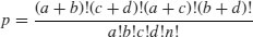
where n is the grand total.
Our data concern the distribution of eight ants' nests over 10 trees of each of two species of tree (A and B). There are two categorical explanatory variables (ants and trees), and four contingencies, ants (present or absent) and trees (A or B). The response variable is the vector of four counts c(6,4,2,8) entered columnwise:
We can calculate the probability for this particular outcome:
factorial(8)*factorial(12)*factorial(10)*factorial(10)/
(factorial(6)*factorial(2)*factorial(4)*factorial(8)*factorial(20))
[1] 0.07501786
But this is only part of the story. We need to compute the probability of outcomes that are more extreme than this. There are two of them. Suppose only 1 ant colony had been found on tree B. Then the table values would be 7, 1, 3, 9 but the row and column totals would be exactly the same (the marginal totals are constrained). The numerator always stays the same, so this case has probability
factorial(8)*factorial(12)*factorial(10)*factorial(10)/
(factorial(7)*factorial(3)*factorial(1)*factorial(9)*factorial(20))
[1] 0.009526078
There is an even more extreme case if no ant colonies at all were found on tree B. Now the table elements become 8, 0, 2, 10 with probability
factorial(8)*factorial(12)*factorial(10)*factorial(10)/
(factorial(8)*factorial(2)*factorial(0)*factorial(10)*factorial(20))
[1] 0.0003572279
and we need to add these three probabilities together:
0.07501786 + 0.009526078 + 0.000352279
[1] 0.08489622
But there was no a priori reason for expecting that the result would be in this direction. It might have been tree A that happened to have relatively few ant colonies. We need to allow for extreme counts in the opposite direction by doubling this probability (all Fisher's exact tests are two-tailed):
2*(0.07501786 + 0.009526078 + 0.000352279)
[1] 0.1697924
This shows that there is no evidence of any correlation between tree and ant colonies. The observed pattern, or a more extreme one, could have arisen by chance alone with probability p = 0.17.
There is a built-in function called fisher.test, which saves us all this tedious computation. It takes as its argument a 2 × 2 matrix containing the counts of the four contingencies. We make the matrix like this (compare with the alternative method of making a matrix, above):
x <- as.matrix(c(6,4,2,8))
dim(x) <- c(2,2)
x
[,1] [,2]
[1,] 6 2
[2,] 4 8
We then run the test like this:
fisher.test(x)
Fisher's Exact Test for Count Data
data: x
p-value = 0.1698
alternative hypothesis: true odds ratio is not equal to 1
95 percent confidence interval:
0.6026805 79.8309210
sample estimates:
odds ratio
5.430473
You see the same non-significant p-value that we calculated by hand. Another way of using the function is to provide it with two vectors containing factor levels, instead of a two-dimensional matrix of counts. This saves you the trouble of counting up how many combinations of each factor level there are:
table <- read.table("c:\\temp\\fisher.txt",header=TRUE)
head(table)
tree nests
1 A ants
2 B ants
3 A none
4 A ants
5 B none
6 A none
attach(table)
fisher.test(tree,nests)
Fisher's Exact Test for Count Data
data: tree and nests
p-value = 0.1698
alternative hypothesis: true odds ratio is not equal to 1
95 percent confidence interval:
0.6026805 79.8309210
sample estimates:
odds ratio
5.430473
The fisher.test procedure can be used with matrices much bigger than 2 × 2.
8.9 Correlation and covariance
With two continuous variables, x and y, the question naturally arises as to whether their values are correlated with each other. Correlation is defined in terms of the variance of x, the variance of y, and the covariance of x and y (the way the two vary together, which is to say the way they covary) on the assumption that both variables are normally distributed. We have symbols already for the two variances: s2x and s2y. We denote the covariance of x and y by cov(x, y), so the correlation coefficient r is defined as

We know how to calculate variances, so it remains only to work out the value of the covariance of x and y. Covariance is defined as the expectation of the vector product xy. The covariance of x and y is the expectation of the product minus the product of the two expectations. Note that when x and y are independent (i.e. they are not correlated) then the covariance between x and y is 0, so E[xy] = E[x].E[y] (i.e. the product of their mean values).
Let us work through a numerical example:
data <- read.table("c:\\temp\\twosample.txt",header=T)
attach(data)
plot(x,y,pch=21,col="red",bg="orange")

There is clearly a strong positive correlation between the two variables. First, we need the variance of x and the variance of y:
var(x)
[1] 199.9837
var(y)
[1] 977.0153
The covariance of x and y, cov(x, y), is given by the var function when we supply it with two vectors like this:
var(x,y)
[1] 414.9603
Thus, the correlation coefficient should be 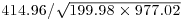 :
:
var(x,y)/sqrt(var(x)*var(y))
[1] 0.9387684
Let us see if this checks out:
cor(x,y)
[1] 0.9387684
So now you know the definition of the correlation coefficient: it is the covariance divided by the geometric mean of the two variances.
8.9.1 Data dredging
The R function cor returns the correlation matrix of a data matrix, or a single value showing the correlation between one vector and another (as above):
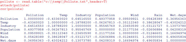
The phrase ‘data dredging’ is used disparagingly to describe the act of trawling through a table like this, desperately looking for big values which might suggest relationships that you can publish. This behaviour is not to be encouraged. The raw correlation suggests that there is a very strong positive relationship between Industry and Population (r = 0.9555). The correct approach is model simplification (see p. 391), which indicates that people live in places with less, not more, polluted air. Note that the correlations are identical in opposite halves of the matrix (in contrast to regression, where regression of y on x would give different parameter values and standard errors than regression of x on y). The correlation between two vectors produces a single value:
cor(Pollution,Wet.days)
[1] 0.3695636
Correlations with single explanatory variables can be highly misleading if (as is typical) there is substantial correlation amongst the explanatory variables (collinearity; see p. 490).
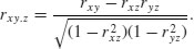
8.9.2 Partial correlation
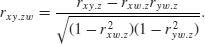
With more than two variables, you often want to know the correlation between x and y when a third variable, say, z, is held constant. The partial correlation coefficient measures this. It enables correlation due to a shared common cause to be distinguished from direct correlation. It is given by
Suppose we had four variables and we wanted to look at the correlation between x and y holding the other two, z and w, constant. Then
You will need partial correlation coefficients if you want to do path analysis. R has a package called sem for carrying out structural equation modelling (including the production of path.diagram) and another called corpcor for converting correlations into partial correlations using the cor2pcor function (or vice versa with pcor2cor).
8.9.3 Correlation and the variance of differences between variables
Samples often exhibit positive correlations that result from pairing, as in the upstream and downstream invertebrate biodiversity data that we investigated earlier. There is an important general question about the effect of correlation on the variance of differences between variables. In the extreme, when two variables are so perfectly correlated that they are identical, then the difference between one variable and the other is zero. So it is clear that the variance of a difference will decline as the strength of positive correlation increases.
The following data show the depth of the water table (in centimetres below the surface) in winter and summer at 10 locations:
data <- read.table("c:\\temp\\wtable.txt",header=T)
attach(data)
names(data)
[1] "summer" "winter"
We begin by asking whether there is a correlation between summer and winter water table depths across locations:
cor(summer, winter)
[1] 0.6596923
There is a reasonably strong positive correlation (p = 0.037 95, which is marginally significant; see below). Not surprisingly, places where the water table is high in summer tend to have a high water table in winter as well. If you want to determine the significance of a correlation (i.e. the p value associated with the calculated value of r) then use cor.test rather than cor. This test has non-parametric options for Kendall's tau or Spearman's rank, depending on the method you specify (method="k" or method="s"), but the default method is Pearson's product-moment correlation (method="p"):
cor.test(summer, winter)
Pearson's product-moment correlation
data: summer and winter
t = 2.4828, df = 8, p-value = 0.03795
alternative hypothesis: true correlation is not equal to 0
95 percent confidence interval:
0.05142655 0.91094772
sample estimates:
cor
0.6596923
Now, let us investigate the relationship between the correlation coefficient and the three variances: the summer variance, the winter variance, and the variance of the differences (winter minus summer water table depth):
varS <- var(summer)
varW <- var(winter)
varD <- var(winter-summer)
varS;varW;varD
[1] 15.13203
[1] 7.541641
[1] 8.579066
The correlation coefficient ρ is related to these three variances by:
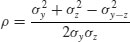
So, using the values we have just calculated, we get the correlation coefficient to be
(varS+varW-varD)/(2*sqrt(varS)*sqrt(varW))
[1] 0.6596923
which checks out. We can also see whether the variance of the difference is equal to the sum of the component variances (see p. 362):
varD
[1] 8.579066
varS+varW
[1] 22.67367
No, it is not. They would be equal only if the two samples were independent. In fact, we know that the two variables are positively correlated, so the variance of the difference should be less than the sum of the variances by an amount equal to 2 × r × s1 × s2:
varS+varW-varD
[1] 14.09461
2 * cor(summer,winter) * sqrt(varS) * sqrt(varW)
[1] 14.09461
That's more like it.
8.9.4 Scale-dependent correlations
Another major difficulty with correlations is that scatterplots can give a highly misleading impression of what is going on. The moral of this exercise is very important: things are not always as they seem. The following data show the number of species of mammals (y) in forests of differing productivity (x):
productivity <- read.table("c:\\temp\\productivity.txt",header=T)
attach(productivity)
head(productivity)
x y f
1 1 3 a
2 2 4 a
3 3 2 a
4 4 1 a
5 5 3 a
6 6 1 a
plot(x,y,pch=21,col="blue",bg="green",
xlab="Productivity",ylab="Mammal species")

cor.test(x,y)
Pearson's product-moment correlation
data: x and y
t = 7.5229, df = 52, p-value = 7.268e-10
alternative hypothesis: true correlation is not equal to 0
95 percent confidence interval:
0.5629686 0.8293555
sample estimates:
cor
0.7219081
There is evidently a significant positive correlation (p < 0.000 001) between mammal species and productivity: increasing productivity is associated with increasing species richness. However, when we look at the relationship for each region (f) separately using coplot, we see exactly the opposite relationship:

The pattern is obvious. In every single case, increasing productivity is associated with reduced mammal species richness within each region (regions are labelled a–g from bottom left). The lesson is clear: you need to be extremely careful when looking at correlations across different scales. Things that are positively correlated over short time scales may turn out to be negatively correlated in the long term. Things that appear to be positively correlated at large spatial scales may turn out (as in this example) to be negatively correlated at small scales.
8.10 Kolmogorov–Smirnov test
People know this test for its wonderful name, rather than for what it actually does. It is an extremely simple test for asking one of two different questions:
- Are two sample distributions the same, or are they significantly different from one another in one or more (unspecified) ways?
- Does a particular sample distribution arise from a particular hypothesized distribution?
The two-sample problem is the one most often used. The apparently simple question is actually very broad. It is obvious that two distributions could be different because their means were different. But two distributions with exactly the same mean could be significantly different if they differed in variance, or in skew or kurtosis (see p. 350).
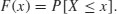
The Kolmogorov–Smirnov test works on cumulative distribution functions. These give the probability that a randomly selected value of X is less than or equal to x:
This sounds somewhat abstract. Suppose we had insect wing sizes (y) for two geographically separated populations (A and B) and we wanted to test whether the distribution of wing lengths was the same in the two places:
data <- read.table("c:\\temp\\ksdata.txt",header=T)
attach(data)
names(data)
[1] "y" "site"
We start by extracting the data for the two populations, and describing the samples:
table(site)
site
A B
10 12
There are 10 samples from site A and 12 from site B.
tapply(y,site,mean)
A B
4.355266 11.665089
tapply(y,site,var)
A B
27.32573 90.30233
Their means are quite different, but the size of the difference in their variances precludes using a t test. We start by plotting the cumulative probabilities for the two samples on the same axes, bearing in mind that there are 10 values if A and 12 values of B:
plot(seq(0,1,length=12),cumsum(sort(B)/sum(B)),type="l",
ylab="Cumulative probability",xlab="Index",col="red")
lines(seq(0,1,length=10),cumsum(sort(A)/sum(A)),col="blue")

It certainly looks as if population A (the blue line) is different. We test the significance of the difference between the two distributions with ks.test like this:
ks.test(y[site=="A"],y[site=="B"])
Two-sample Kolmogorov-Smirnov test
data: y[site == "A"] and y[site == "B"]
D = 0.55, p-value = 0.04889
alternative hypothesis: two-sided
The test works despite the difference in length of the two vectors, and shows a marginally significant difference between the two sites (p = 0.049).
The other test involves comparing one sample with the probability function of a named distribution. Let us test whether the larger sample from site B is normally distributed, using pnorm as the probability function, with specified mean and standard deviation:
ks.test(y[site=="B"],"pnorm",mean(y[site=="B"]),sd(y[site=="B"]))
One-sample Kolmogorov-Smirnov test
data: y[site == "B"]
D = 0.1844, p-value = 0.7446
alternative hypothesis: two-sided
There is no evidence that the samples from site B depart significantly from normality. Note, however, that the Shapiro–Wilk test
shapiro.test(y[site=="B"])
Shapiro-Wilk normality test
data: y[site == "B"]
W = 0.876, p-value = 0.0779
comes much closer to suggesting significant non-normality (above), while

the standard model-checking quantile–quantile plot looks suspiciously non-normal:
qqnorm(y[site=="B"],pch=16,col="blue")
qqline(y[site=="B"],col="green",lty=2)
8.11 Power analysis
The power of a test is the probability of rejecting the null hypothesis when it is false. It has to do with Type II errors: β is the probability of accepting the null hypothesis when it is false. In an ideal world, we would obviously make β as small as possible. But there is a snag. The smaller we make the probability of committing a Type II error, the greater we make the probability of committing a Type I error, and rejecting the null hypothesis when, in fact, it is correct. This is a classic trade-off. A compromise is called for. Most statisticians work with α = 0.05 and β = 0.2. The power of a test is defined as 1 − β = 0.8 under the standard assumptions.
The issues involved are your choices of alpha and beta (the trade-off between Type I and Type II errors), the size of the effect you want to detect as being significant, the variance of the samples, and the sample size. If we are doing a two-sample t test, the value of the test statistic is the difference between the two means, d, divided by the standard error of the difference between two means (assuming equal variances, s2, and equal sample sizes, n):

Let us rearrange this expression to find the sample size as a function of the other variables:
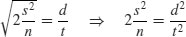
so

The value of t depends on our choice of power (1 − β = 0.8) and significance level (α = 0.025). Roughly speaking, the quantile associated with the 0.025 tail of a normal distribution is 1.96, and the quantile associated with 0.8 is 0.84. We add these quantiles to estimate t = 2.8, so t2 is roughly 7.8. To get our rule of thumb, we round this up to 8. Now the formula for n is 2 × 8 × variance/the square of the difference:

The smaller the effect size that we want to be able to detect as being significant, the larger the sample size will need to be.
Suppose that the control value of our response variable is known from the literature to have a mean of 20 and a standard deviation of 2 (so the variance is 4). The rule of thumb would give the following relationship:

So if you want to be able to detect an effect size of 1.0 you will need at least 60 samples per treatment. The standard idea of a ‘big-enough’ sample (n = 30) would enable you to detect an effect size of about 1.5 in this example. If you could only afford 10 replicates per treatment, you should not expect to be able to detect effects smaller than about 2.5.
There are built-in functions in R for carrying out power analyses for ANOVA, proportion data and t tests:
| power.t.test | power calculations for one- and two-sample t tests; |
| power.prop.test | power calculations two-sample test for proportions; |
| power.anova.test | power calculations for balanced one-way ANOVA tests. |
The arguments to the power.t.test function are n (the number of observations per group), delta (the difference in means we want to be able to detect; you will need to think hard about this value), sd (the standard deviation of the sample), sig.level (the significance level, i.e. Type I error probability, where you will often accept the default value of 5%), power (the power you want the test to have, where you will often accept the default value of 80%), type (the type of t test you want to carry out: two-sample, one-sample or paired) and alternative (whether you want to do a one- or a two-tailed test, where you will typically want to do the default, two-tailed test). One of the parameters n, delta, power, sd and sig.level must be passed as NULL, and that parameter will be calculated from the others. This sounds like a lot of work, but you will typically use all of the defaults so you only need to specify the difference, delta, and the standard deviation, sd, to work out the sample size n that will give you the power you want.
So how many replicates do we need in each of two samples to detect a difference of 10% with power = 80% when the mean is 20 (i.e. delta = 2.0) and the standard deviation is about 3.5?
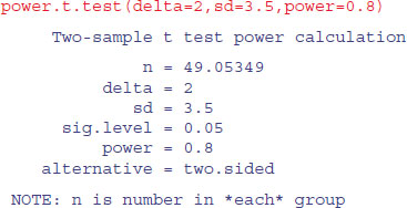
The (perhaps rather shocking) answer is that you need at least 50 replicates from each sample (100 data points in all).
If you had been working with a rule of thumb like ‘30 is a big enough sample’ then you would be severely disappointed in this case. You simply could not have detected a difference of 10% with this experimental design. You need 50 replicates in each sample (100 replicates in all) to achieve a power of 80%. You can work out what size of difference your sample of 30 would allow you to detect, by specifying n (15 in each treatment) and omitting delta:
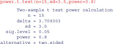
This shows that you could have detected an 18.5% change (100 × 3.709/20), which is roughly double the effect size you hoped to be able to detect (10% = 2.0). The work you need to do before carrying out a power analysis before designing your experiment is to find values for the standard deviation (from the literature or by carrying out a pilot experiment) and the size of the difference your want to detect (from discussions with your sponsor and your colleagues). Experiments in ecology are often planned to be able to detect 50% effects. Aspiring to estimate effects as small as 10% would lead to impossibly large sample sizes (see the discussion in Perry et al., 2003).
8.12 Bootstrap
We want to use bootstrapping to obtain a 95% confidence interval for the mean of a vector of numbers called values:
data <- read.table("c:\\temp\\skewdata.txt",header=T)
attach(data)
names(data)
[1] "values"
We shall sample with replacement from values using sample(values,replace=T), then work out the mean, repeating this operation 10 000 times, and storing the 10 000 different mean values in a vector called ms:
ms <- numeric(10000)
for (i in 1:10000){
ms[i] <- mean(sample(values,replace=T)) }
The answer to our problem is provided by the quantile function applied to ms: we want to know the values of ms associated with its 0.025 and 0.975 tails:
quantile(ms,c(0.025,0.975))
2.5% 97.5%
24.97918 37.62932
Thus the intervals below and above the mean are
mean(values)-quantile(ms,c(0.025,0.975))
2.5% 97.5%
5.989472 -6.660659
How does this compare with the parametric confidence interval,  ?
?
1.96*sqrt(var(values)/length(values))
[1] 6.569802
Close, but not identical. Our bootstrapped intervals are skew because the data are skewed, but the parametric interval, of course, is symmetric.
Now let us see how to do the same thing using the boot function from the library called boot:
install.packages("boot")
library(boot)
The syntax of boot is very simple:
boot(data, statistic, R)
The trick to using boot lies in understanding how to write the statistic function. R is the number of resamplings you want to do (R=10000 in this example), and data is the name of the data object to be resampled (values in this case). The attribute we want to estimate repeatedly is the mean value of values. Thus, the first argument to our function must be values. The second argument is an index (a vector of subscripts) that is used within boot to select random assortments of values. Our statistic function can use the built-in function mean to calculate the mean value of the sample of values.
mymean <- function(values,i) mean(values[i])
The key point is that we write mean(values[i]) not mean(values). Now we can run the bootstrap for 10 000 iterations:
myboot <- boot(values,mymean,R=10000)
myboot
ORDINARY NONPARAMETRIC BOOTSTRAP
Call:
boot(data = values, statistic = mymean, R = 10000)
Bootstrap Statistics :
original Bias std. error
t1* 30.96866 -0.08155796 3.266455
The output is interpreted as follows. The original is the mean of the whole sample:
mean(values)
[1] 30.96866
while bias is the difference between the arithmetic mean and the mean of the bootstrapped samples which are in the variable called myboot$t:
mean(myboot$t)-mean(values)
[1] -0.08155796
and std. error is the standard deviation of the simulated values in myboot$t:
sqrt(var(myboot$t))
[,1]
[1,] 3.266455
The components of myboot can be used to do other things. For instance, we can compare our homemade vector (ms above) with a histogram of myboot$t:
windows(7,4)
par(mfrow=c(2,1))
hist(ms)
hist(myboot$t)
They differ in detail because they were generated with different series of random numbers. Here are the 95% intervals for comparison with ours, calculated from the quantiles of myboot$t:
mean(values)-quantile(myboot$t,c(0.025,0.975))
2.5% 97.5%
6.126120 -6.599232
There is a function boot.ci for calculating confidence intervals from the boot object:
Normal is the parametric CI based on the standard error of the mean and the sample size (p. 514). The Percentile interval is the quantile from the bootstrapped estimates:
quantile(myboot$t,c(0.025,0.975))
2.5% 97.5%
24.84254 37.56789
which, as we saw earlier, was close to our home-made values (above). The BCa interval is the bias-corrected accelerated percentile. It is not greatly different in this case, but it is the interval preferred by statisticians. A more complex example of the use of bootstrapping involving a generalized linear model is explained on p. 570. For other examples see ?boot, and for more depth read the Davison and Hinkley (1997) book from which the boot package was developed (as programmed by A.J. Canty).