Chapter 11
Analysis of Variance
Instead of fitting continuous, measured variables to data (as in regression), many experiments involve exposing experimental material to a range of discrete levels of one or more categorical variables known as factors. Thus, a factor might be drug treatment for a particular cancer, with five levels corresponding to a placebo plus four new pharmaceuticals. Alternatively, a factor might be mineral fertilizer, where the four levels represent four different mixtures of nitrogen, phosphorus and potassium. Factors are often used in experimental designs to represent statistical blocks; these are internally homogeneous units in which each of the experimental treatments is repeated. Blocks may be different fields in an agricultural trial, different genotypes in a plant physiology experiment, or different growth chambers in a study of insect photoperiodism.
It is important to understand that regression and analysis of variance (ANOVA) are identical approaches except for the nature of the explanatory variables. For example, it is a small step from having three levels of a shade factor (say light, medium and heavy shade cloths) then carrying out a one-way ANOVA, to measuring the light intensity in the three treatments and carrying out a regression with light intensity as the explanatory variable. As we shall see later on, some experiments combine regression and ANOVA by fitting a series of regression lines, one in each of several levels of a given factor (this is called analysis of covariance; see Chapter 12).
The emphasis in ANOVA was traditionally on hypothesis testing. Nowadays, the aim of an analysis of variance in R is to estimate means and standard errors of differences between means. Comparing two means by a t test involved calculating the difference between the two means, dividing by the standard error of the difference, and then comparing the resulting statistic with the value of Student's t from tables (or better still, using qt to calculate the critical value; see p. 287). The means are said to be significantly different when the calculated value of t is larger than the critical value. For large samples (n > 30) a useful rule of thumb is that a t value greater than 2 is significant. In ANOVA, we are concerned with cases where we want to compare three or more means. For the two-sample case, the t test and the ANOVA are identical, and the t test is to be preferred because it is simpler.
11.1 One-way ANOVA
There is a real paradox about analysis of variance, which often stands in the way of a clear understanding of exactly what is going on. The idea of ANOVA is to compare several means, but it does this by comparing variances. How can that work?
A visual example should make this clear. To keep things simple, suppose we have just two levels of a single factor. We plot the data in the order in which they were measured: first for the first level of the factor and then for the second level. Draw the overall mean as a horizontal line through the data, and indicate the departures of each data point from the overall mean with a set of vertical lines:
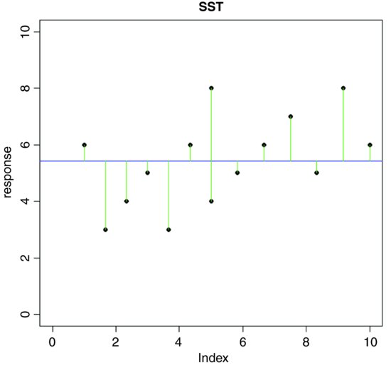
The green lines illustrate the total variation in the response. We shall call this quantity SST (the ‘total sum of squares’). It is the sum of the squares of the differences between the data, y, and the overall mean. In symbols,
where  (‘y double bar’) is the overall mean. Next we can fit each of the separate means,
  (through the red points) and
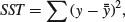
  (through the blue points), and consider the sum of squares of the differences between each y value and its own treatment mean (either the red line or the blue line). We call this SSE (the ‘error sum of squares’), and calculate it like this:

On the graph, the differences from which SSE is calculated look like this:
SSE is the sum of the squares of the green lines (the ‘residuals’, as they are known).
Now ask yourself this question. If the treatment means are different from the overall mean, what will be the relationship between SST and SSE? After a moment's thought you should have been able to convince yourself that if the means are the same, then SSE is the same as SST, because the two horizontal lines in the last plot would be in the same position as the single line in the earlier plot.
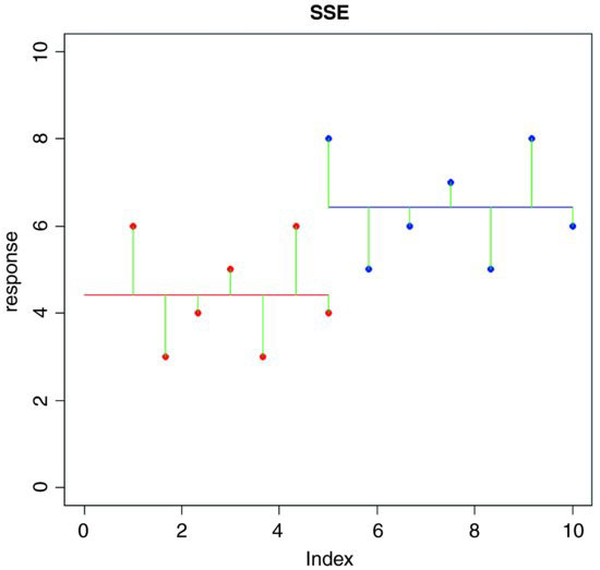
Now what if the means were significantly different from one another? What would be the relationship between SSE and SST in this case? Which would be the larger? Again, it should not take long for you to see that if the means are different, then SSE will be less than SST. Indeed, in the limit, SSE could be zero if the replicates from each treatment fell exactly on their respective means, like this:
In the top row, there is a highly significant difference between the two means: SST is big but SSE is zero (all the replicates are identical). In the bottom row, the means are identical. SST is still big, but now SSE = SST. Once you have understood these three plots, you will see why you can investigate differences between means by looking at variances. This is how analysis of variance works.
We can calculate the difference between SST and SSE, and use this as a measure of the difference between the treatment means; this is traditionally called the treatment sum of squares, and is denoted by SSA:

When differences between means are significant, then SSA will be large relative to SSE. When differences between means are not significant, then SSA will be small relative to SSE. In the limit, SSE could be zero (top right in the last figure), so all of the variation in y is explained by differences between the means (SSA = SST). At the other extreme, when there is no difference between the means (bottom left), SSA = 0 and so SSE = SST.
The technique we are interested in, however, is analysis of variance, not analysis of sums of squares. We convert the sums of squares into variances by dividing by their degrees of freedom. In our example, there are two levels of the factor and so there is 2 − 1 = 1 degree of freedom for SSA. In general, we might have k levels of any factor and hence k − 1 d.f. for treatments. If each factor level were replicated n times, then there would be n − 1 d.f. for error within each level (we lose one degree of freedom for each individual treatment mean estimated from the data). Since there are k levels, there would be k(n − 1) d.f. for error in the whole experiment. The total number of numbers in the whole experiment is kn, so total d.f. is kn − 1 (the single degree is lost for our estimating the overall mean,  ). As a check in more complicated designs, it is useful to make sure that the individual component degrees of freedom add up to the correct total:

The divisions for turning the sums of squares into variances are conveniently carried out in an ANOVA table:
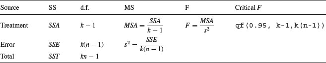
Each element in the sums of squares column is divided by the number in the adjacent degrees of freedom column to give the variances in the mean square column (headed MS). The significance of the difference between the means is then assessed using an F test (a variance ratio test). The treatment variance MSA is divided by the error variance, s2, and the value of this test statistic is compared with the critical value of F using qf (the quantiles of the F distribution, with p = 0.95, k − 1 degrees of freedom in the numerator, and k(n − 1) degrees of freedom in the denominator). If you need to look up the critical value of F in tables, remember that you look up the numerator degrees of freedom (on top of the division) across the top of the table, and the denominator degrees of freedom down the rows. The null hypothesis, traditionally denoted as H0, is stated as

This does not imply that the sample means are exactly the same (the means will always differ from one another, simply because everything varies). In fact, the null hypothesis assumes that the means are not significantly different from one another. What this implies is that the differences between the sample means could have arisen by chance alone, through random sampling effects, despite the fact that the different factor levels have identical means.
If the test statistic is larger than the critical value we reject the null hypothesis and accept the alternative:

If the test statistic is less than the critical value, then it could have arisen due to chance alone, and so we accept the null hypothesis.
Another way of visualizing the process of ANOVA is to think of the relative amounts of sampling variation between replicates receiving the same treatment (i.e. between individual samples in the same level), and between different treatments (i.e. between-level variation). When the variation between replicates within a treatment is large compared to the variation between treatments, we are likely to conclude that the difference between the treatment means is not significant. Only if the variation between replicates within treatments is relatively small compared to the differences between treatments will we be justified in concluding that the treatment means are significantly different.
11.1.1 Calculations in one-way ANOVA
The definitions of the various sums of squares can now be formalized, and ways found of calculating their values from samples. The total sum of squares, SST, is defined as:
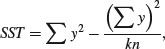
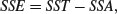
just as in regression (see Chapter 10). Note that we divide by the total number of numbers we added together to get  (the grand total of all the ys) which is kn. It turns out that the formula that we used to define SSE is rather difficult to calculate (see above), so we calculate the treatment sums of squares, SSA, and obtain SSE by difference. The treatment sum of squares, SSA, is calculated as:
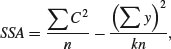
where the new term is C, the treatment total. This is the sum of all the n replicates within a given level. Each of the k different treatment totals is squared, added up, and then divided by n (the number of numbers added together to get the treatment total). The formula is slightly different if there is unequal replication in different treatments, as we shall see below. The meaning of C will become clear when we work through the example later on. Notice the symmetry of the equation. The second term on the right-hand side is also divided by the number of numbers that were added together (kn) to get the total ( ) which is squared in the
numerator. Finally,
) which is squared in the
numerator. Finally,
to give all the elements required for completion of the ANOVA table.
11.1.2 Assumptions of ANOVA
You should be aware of the assumptions underlying the analysis of variance. They are all important, but some are more important than others:
- random sampling;
- equal variances;
- independence of errors;
- normal distribution of errors;
- additivity of treatment effects.
11.1.3 A worked example of one-way ANOVA
To draw this background material together, we shall work through an example by hand. In so doing, it will become clear what R is doing during its analysis of the data. We have an experiment in which crop yields per unit area were measured from 10 randomly selected fields on each of three soil types. All fields were sown with the same variety of seed and provided with the same fertilizer and pest control inputs. The question is whether soil type significantly affects crop yield, and if so, to what extent.
results <- read.table("c:\\temp\\yields.txt",header=T)
attach(results)
names(results)
[1] "sand" "clay" "loam"
Here are the data:
results
sand clay loam
1 6 17 13
2 10 15 16
3 8 3 9
4 6 11 12
5 14 14 15
6 17 12 16
7 9 12 17
8 11 8 13
9 7 10 18
10 11 13 14
The function sapply is used to calculate the mean yields for the three soils (contrast this with tapply, below, where the response and explanatory variables are in adjacent columns in a dataframe):
sapply(list(sand,clay,loam),mean)
[1] 9.9 11.5 14.3
Mean yield was highest on loam (14.3) and lowest on sand (9.9).
It will be useful to have all of the yield data in a single vector called y. To create a dataframe from a spreadsheet like results where the values of the response are in multiple columns, we use the function called stack like this:
(frame <- stack(results))
values ind
1 6 sand
2 10 sand
3 8 sand
4 6 sand
…
…
27 17 loam
28 13 loam
29 18 loam
30 14 loam
You can see that the stack function has invented names for the response variable (values) and the explanatory variable (ind). We will always want to change these:
names(frame) <- c("yield","soil")
attach(frame)
head(frame)
yield soil
1 6 sand
2 10 sand
3 8 sand
4 6 sand
5 14 sand
6 17 sand
That's more like it.
Before carrying out analysis of variance, we should check for constancy of variance (see p. 354) across the three soil types:
tapply(yield,soil,var)
clay loam sand
15.388889 7.122222 12.544444
The variances differ by more than a factor of 2. But is this significant? We test for heteroscedasticity using the Fligner–Killeen test of homogeneity of variances:
fligner.test(y∼soil)
Fligner-Killeen test of homogeneity of variances
data: y by soil
Fligner-Killeen:med chi-squared = 0.3651, df = 2, p-value = 0.8332
We could have used bartlett.test(y∼soil), which gives p = 0.5283 (but this is more a test of non-normality than of equality of variances). Either way, there is no evidence of any significant difference in variance across the three samples, so it is legitimate to continue with our one-way analysis of variance.
Because the explanatory variable is categorical (three levels of soil type), initial data inspection involves a box-and-whisker plot of y against soil like this:
plot(yield∼soil,col="green")
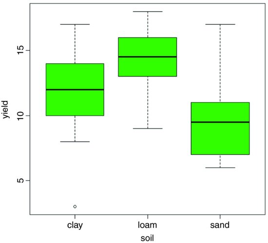
Median yield is lowest on sand and highest on loam, but there is considerable variation from replicate to replicate within each soil type (there is even a low outlier on clay). It looks as if yield on loam will turn out to be significantly higher than on sand (their boxes do not overlap) but it is not clear whether yield on clay is significantly greater than on sand or significantly lower than on loam. The analysis of variance will answer these questions.
The analysis of variance involves calculating the total variation in the response variable (yield in this case) and partitioning it (‘analysing it’) into informative components. In the simplest case, we partition the total variation into just two components, explained variation and unexplained variation:
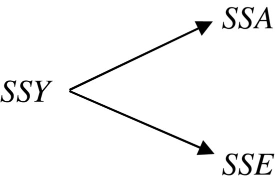
Explained variation is called the treatment sum of squares (SSA) and unexplained variation is called the error sum of squares (SSE, also known as the residual sum of squares), as defined earlier. Let us work through the numbers in R. From the formula for SSY, we can obtain the total sum of squares by finding the differences between the data and the overall mean:
sum((yield-mean(yield))^2)
[1] 414.7
The unexplained variation, SSE, is calculated from the differences between the yields and the mean yields for that soil type:
sand-mean(sand)
[1] -3.9 0.1 -1.9 -3.9 4.1 7.1 -0.9 1.1 -2.9 1.1
clay-mean(clay)
[1] 5.5 3.5 -8.5 -0.5 2.5 0.5 0.5 -3.5 -1.5 1.5
loam-mean(loam)
[1] -1.3 1.7 -5.3 -2.3 0.7 1.7 2.7 -1.3 3.7 -0.3
We need the sums of the squares of these differences:
sum((sand-mean(sand))^2)
[1] 112.9
sum((clay-mean(clay))^2)
[1] 138.5
sum((loam-mean(loam))^2)
[1] 64.1
To get the sum of these totals across all soil types, we can use sapply like this:
sum(sapply(list(sand,clay,loam),function (x) sum((x-mean(x))^2) ))
[1] 315.5
So SSE, the unexplained (or residual, or error) sum of squares, is 315.5.
The extent to which SSE is less than SSY is a reflection of the magnitude of the differences between the means. The greater the difference between the mean yields on the different soil types, the greater will be the difference between SSE and SSY.
The treatment sum of squares, SSA, is the amount of the variation in yield that is explained by differences between the treatment means. In our example,

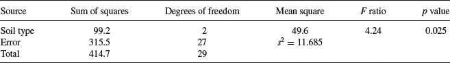
Now we can draw up the ANOVA table. There are six columns indicating, from left to right, the source of variation, the sum of squares attributable to that source, the degrees of freedom for that source, the variance for that source (traditionally called the mean square rather than the variance), the F ratio (testing the null hypothesis that this source of variation is not significantly different from zero) and the p value associated with that F value (if p < 0.05 then we reject the null hypothesis). We can fill in the sums of squares just calculated, then think about the degrees of freedom:
There are 30 data points in all, so the total degrees of freedom are 30 – 1 = 29. We lose 1 d.f. because in calculating SSY we had to estimate one parameter from the data in advance, namely the overall mean,  , before we could calculate
 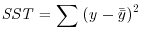 . Each soil type has n = 10 replications, so each soil type has 10 – 1 = 9 d.f. for error, because we estimated one parameter from the data for each soil type, namely the treatment means
  in calculating SSE. Overall, therefore, the error has 3 × 9 = 27 d.f. There were three soil types, so there are 3 – 1 = 2 d.f. for soil type.
The mean squares are obtained simply by dividing each sum of squares by its respective degrees of freedom (in the same row). The error variance, s2, is the residual mean square (the mean square for the unexplained variation); this is sometimes called the ‘pooled error variance’ because it is calculated across all the treatments. The alternative would be to have three separate variances, one for each treatment:
tapply(yield,soil,var)
clay loam sand
15.388889 7.122222 12.544444
mean(tapply(yield,soil,var))
[1] 11.68519
You will see that the pooled error variance s2 = 11.685 is simply the mean of the three separate variances, because (in this case) there is equal replication in each soil type (n = 10).
By tradition, we do not calculate the total mean square, so the bottom cell of the fourth column of the ANOVA table is empty. The F ratio is the treatment variance divided by the error variance, testing the null hypothesis that the treatment means are not significantly different. If we reject this null hypothesis, we accept the alternative hypothesis that at least one of the means is significantly different from the others. The question naturally arises at this point as to whether 4.24 is a big number or not. If it is a big number then we reject the null hypothesis. If it is not a big number, then we accept the null hypothesis. As ever, we decide whether the test statistic F = 4.24 is big or small by comparing it with the critical value of F, given that there are 2 d.f. in the numerator and 27 d.f. in the denominator. Critical values in R are found from the function qf which gives us quantiles of the F distribution:
qf(.95,2,27)
[1] 3.354131
Our calculated test statistic of 4.24 is larger than the critical value of 3.35, so we reject the null hypothesis. At least one of the soils has a mean yield that is significantly different from the others. The modern approach is not to work slavishly at the 5% level but rather to calculate the p value associated with our test statistic of 4.24. Instead of using the function for quantiles of the F distribution, we use the function pf for cumulative probabilities of the F distribution like this:
1-pf(4.24,2,27)
[1] 0.02503987
The p value is 0.025, which means that a value of F = 4.24 or bigger would arise by chance alone when the null hypothesis was true about 25 times in 1000. This is a sufficiently small probability (i.e. it is less than 5%) for us to conclude that there is a significant difference between the mean yields (i.e. we reject the null hypothesis).
That was a lot of work. R can do the whole thing in a single line:
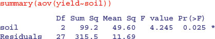
Here you see all the values that we calculated longhand. The error row is labelled Residuals. In the second and subsequent columns you see the degrees of freedom for treatment and error (2 and 27), the treatment and error sums of squares (99.2 and 315.5), the treatment mean square of 49.6, the error variance s2 = 11.685, the F ratio and the p value (labelled Pr(>F)). The single asterisk next to the p value indicates that the difference between the soil means is significant at 5% (but not at 1%, which would have merited two asterisks). Notice that R does not print the bottom row of the ANOVA table showing the total sum of squares and total degrees of freedom.
The next thing we would do is to check the assumptions of the aov model. This is done using plot like this (see p. 419):
par(mfrow=c(2,2))
plot(aov(yield∼soil))
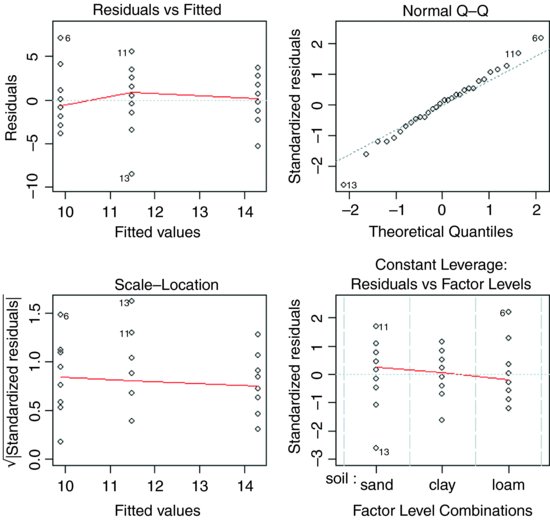
The first plot (top left) checks the most important assumption (constancy of variance); there should be no pattern in the residuals against the fitted values (the three treatment means) – and, indeed, there is none. The second plot (top right) tests the assumption of normality of errors: there should be a straight-line relationship between our standardized residuals and theoretical quantiles derived from a normal distribution. Points 6, 11 and 13 lie a little off the straight line, but this is nothing to worry about (see p. 405). The residuals are well behaved (bottom left) and there are no highly influential values that might be distorting the parameter estimates (bottom right).
11.1.4 Effect sizes
The best way to view the effect sizes graphically is to use plot.design (which takes a formula rather than a model object), but our current model with just one factor is perhaps too simple to get full value from this (plot.design(yield∼soil)). To see the effect sizes in tabular form use model.tables (which takes a model object as its argument) like this:
model <- aov(yield∼soil)
model.tables(model,se=T)
Tables of effects
soil
soil
clay loam sand
-0.4 2.4 -2.0
Standard errors of effects
soil
1.081
replic. 10
The effects are shown as departures from the overall mean: soil 1 (sand) has a mean yield that is 2.0 below the overall mean, and soil 3 (loam) has a mean that is 2.4 above the overall mean. The standard error of effects is 1.081 on a replication of n = 10 (this is the standard error of a mean). You should note that this is not the appropriate standard error for comparing two means (see below). If you specify "means" you get:
model.tables(model,"means",se=T)
Tables of means
Grand mean
11.9
soil
soil
clay loam sand
11.5 14.3 9.9
Standard errors for differences of means
soil
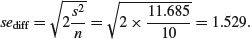
1.529
replic. 10
Now the three means are printed (rather than the effects) and the standard error of the difference of means is given (this is what you need for doing a t test to compare any two means).
Another way of looking at effect sizes is to use the summary.lm option for viewing the model, rather than summary.aov (as we used above):
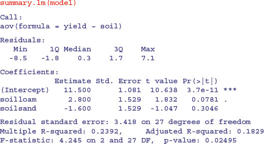
In regression analysis (p. 461) the summary.lm output was easy to understand because it gave us the intercept and the slope (the two parameters estimated by the model) and their standard errors. But this table has three rows. Why is that? What is an intercept in the context of analysis of variance? And why are the standard errors different for the intercept and for soilsand?
It will take a while before you feel at ease with summary.lm tables for analysis of variance. The details are explained on p. 424, but the central point is that all summary.lm tables have as many rows as there are parameters estimated from the data. There are three rows in this case because our aov model estimates three parameters: a mean yield for each of the three soil types. In the context of aov, an intercept is a mean value; in this case it is the mean yield for clay because this factor-level name comes first in the alphabet. So if Intercept is the mean yield for clay, what are the other two rows labelled soilloam and soilsand? This is the hardest thing to understand. All other rows in the summary.lm table for aov are differences between means. Thus row 2, labelled soilloam, is the difference between the mean yields on loam and clay, and row 3, labelled soilsand, is the difference between the mean yields of sand and clay.
The first row (Intercept) is a mean, so the standard error column in row 1 contains the standard error of a mean. Rows 2 and 3 are differences between means, so their standard error columns contain the standard error of the difference between two means (and this is a bigger number; see p. 358). The standard error of a mean is
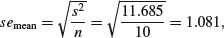
whereas the standard error of the difference between two means is
The summary.lm table shows that neither loam nor sand produces a significantly higher yield than clay (none of the p-values is less than 0.05, despite the fact that the ANOVA table showed p = 0.025). But what about the contrast in the yields from loam and sand? To assess this we need to do some arithmetic of our own. The two parameters differ by 2.8 + 1.6 = 4.4 (take care with the signs). The standard error of the difference is 1.529, so the t value is 2.88. This is much greater than 2 (our rule of thumb for t) so the mean yields of loam and sand are significantly different. To find the precise value of Student's t with 10 replicates in each treatment, the critical value of t is given by the function qt with 18 d.f. (we have lost two degrees of freedom for the two treatment means we have estimated from the data):
qt(0.975,18)
[1] 2.100922
Alternatively we can work out the p value associated with our calculated t = 2.88:
2*(1 - pt(2.88, df = 18))
[1] 0.009966426
We multiply by 2 because this is a two-tailed test (see p. 293); we did not know in advance that loam would outyield sand under the particular circumstances of this experiment.
The residual standard error in the summary.lm output is the square root of the error variance from the ANOVA table: 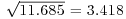 . R-squared is the fraction of the total variation in yield that is explained by the model (adjusted R-squared are explained on p. 461). The F statistic and the p value come from the last two columns of the ANOVA table.
So there it is. That is how analysis of variance works. When the means are significantly different, then the sum of squares computed from the individual treatment means will be significantly smaller than the sum of squares computed from the overall mean. We judge the significance of the difference between the two sums of squares using analysis of variance.
11.1.5 Plots for interpreting one-way ANOVA
There are two traditional ways of plotting the results of ANOVA:
- box-and-whisker plots;
- barplots with error bars.
Here is an example to compare the two approaches. We have an experiment on plant competition with one factor and five levels. The factor is called clipping and the five levels consist of control (i.e. unclipped), two intensities of shoot pruning and two intensities of root pruning:
comp <- read.table("c:\\temp\\competition.txt",header=T)
attach(comp)
names(comp)
[1] "biomass" "clipping"
plot(clipping,biomass,xlab="Competition treatment",
ylab="Biomass",col="yellow")
The box-and-whisker plot is good at showing the nature of the variation within each treatment, and also whether there is skew within each treatment (e.g. for the control plots, there is a wider range of values between the median and third quartile than between the median and first quartile). No outliers are shown above the whiskers, so the tops and bottoms of the bars are the maxima and minima within each treatment. The medians for the competition treatments are all higher than the third quartile of the controls, suggesting that they may be significantly different from the controls, but there is little to suggest that any of the competition treatments are significantly different from one another (see below for the analysis).
Barplots with error bars are preferred by many journal editors, and some people think that they make hypothesis testing easier. We shall see. Unlike S-PLUS, R does not have a built-in function called error.bar, so we shall have to write our own. Here is a very simple version without any bells or whistles. We shall call it error.bars to distinguish it from the much more general S-PLUS function:
error.bars <- function(yv,z,nn)
{xv <- barplot(yv,ylim=c(0,(max(yv)+max(z))),
col="green",names=nn,ylab=deparse(substitute(yv)))
for (i in 1:length(xv)) {
arrows(xv[i],yv[i]+z[i],xv[i],yv[i]-z[i],angle=90,code=3,length=0.15)
}}
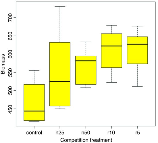
To use this function we need to decide what kind of values (z) to use for the lengths of the bars. Let us use the standard error of a mean based on the pooled error variance from the ANOVA, then return to a discussion of the pros and cons of different kinds of error bars later. Here is the one-way analysis of variance:
From the ANOVA table we can see that the pooled error variance s2 = 4961. Now we need to know how many numbers were used in the calculation of each of the five means:
table(clipping)
clipping
control n25 n50 r10 r5
6 6 6 6 6
There was equal replication (which makes life easier), and each mean was based on six replicates, so the standard error of a mean is  . We shall draw an error bar up 28.75 from each mean and down by the same distance, so we need five values for z, one for each bar, each of 28.75:
se <- rep(28.75,5)
We need to provide labels for the five different bars – the factor levels should be good for this:
labels <- levels(clipping)
Now we work out the five mean values which will be the heights of the bars, and save them as a vector called ybar:
ybar <- tapply(biomass,clipping,mean)
Finally, we can create the barplot with error bars (the function is defined above):
error.bars(ybar,se,labels)
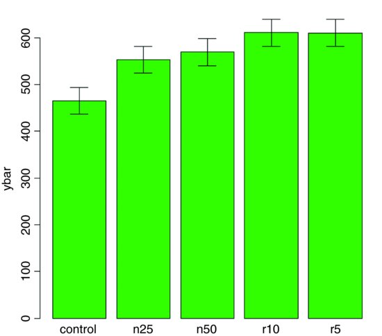
We do not get the same feel for the distribution of the values within each treatment as was obtained by the box-and-whisker plot, but we can certainly see clearly which means are not significantly different. If, as here, we use ±1 standard error of the mean as the length of the error bars, then when the bars overlap this implies that the two means are not significantly different. Remember the rule of thumb for t: significance requires 2 or more standard errors, and if the bars overlap it means that the difference between the means is less than 2 standard errors. There is another issue, too. For comparing means, we should use the standard error of the difference between two means (not the standard error of one mean) in our tests (see p. 358); these bars would be about 1.4 times as long as the bars we have drawn here. So while we can be sure that the two root-pruning treatments are not significantly different from one another, and that the two shoot-pruning treatments are not significantly different from one another (because their bars overlap), we cannot conclude from this plot (although we do know it from the ANOVA table above; p = 0.008 75) that the controls have significantly lower biomass than the rest (because the error bars are not the correct length for testing differences between means).
An alternative graphical method is to use 95% confidence intervals for the lengths of the bars, rather than standard errors of means. This is easy to do: we multiply our standard errors by Student's t, qt(.975,5) = 2.570 582, to get the lengths of the confidence intervals:
error.bars(ybar,2.570582*se,labels)

Now, all of the error bars overlap, implying visually that there are no significant differences between the means. But we know that this is not true from our analysis of variance, in which we rejected the null hypothesis that all the means were the same at p = 0.008 75. If it were the case that the bars did not overlap when we are using confidence intervals (as here), then that would imply that the means differed by more than 4 standard errors, and this is a much greater difference than is required to conclude that the means are significantly different. So this is not perfect either. With standard errors we could be sure that the means were not significantly different when the bars did overlap. And with confidence intervals we can be sure that the means are significantly different when the bars do not overlap. But the alternative cases are not clear-cut for either type of bar. Can we somehow get the best of both worlds, so that the means are significantly different when the bars do not overlap, and the means are not significantly different when the bars do overlap?
The answer is yes, we can, if we use least significant difference (LSD) bars. Let us revisit the formula for Student's t test:
We say that the difference is significant when t > 2 (by the rule of thumb, or t > qt(0.975,df) if we want to be more precise). We can rearrange this formula to find the smallest difference that we would regard as being significant. We can call this the least significant difference:
LSD = qt(0.975,df) × standard error of a difference ≈ 2× sediff.
In our present example this is
qt(0.975,10)*sqrt(2*4961/6)
[1] 90.60794
because a difference is based on 12 – 2 = 10 degrees of freedom. What we are saying is the two means would be significantly different if they differed by 90.61 or more. How can we show this graphically? We want overlapping bars to indicate a difference less than 90.61, and non-overlapping bars to represent a difference greater than 90.61. With a bit of thought you will realize that we need to draw bars that are LSD/2 in length, up and down from each mean. Let us try it with our current example:
lsd <- qt(0.975,10)*sqrt(2*4961/6)
lsdbars <- rep(lsd,5)/2
error.bars(ybar,lsdbars,labels)
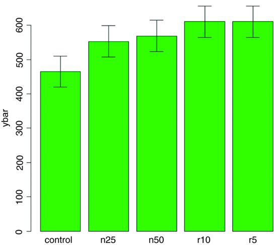
Now we can interpret the significant differences visually. The control biomass is significantly lower than any of the four treatments, but none of the four treatments is significantly different from any other. The statistical analysis of this contrast is explained in detail in Section 9.23 (p. 430). Sadly, most journal editors insist on error bars of 1 standard error of the mean. It is true that there are complicating issues to do with LSD bars (not least the vexed question of multiple comparisons; see p. 531), but at least they do what was intended by the error plot (i.e. overlapping bars means non-significance and non-overlapping bars means significance); neither standard errors nor confidence intervals can say that. A better option might be to use box-and-whisker plots with the notch=T option to indicate significance (see p. 213).
11.2 Factorial experiments
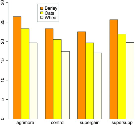
A factorial experiment has two or more factors, each with two or more levels, plus replication for each combination of factors levels. This means that we can investigate statistical interactions, in which the response to one factor depends on the level of another factor. Our example comes from a farm-scale trial of animal diets. There are two factors: diet and supplement. Diet is a factor with three levels: barley, oats and wheat. Supplement is a factor with four levels: agrimore, control, supergain and supersupp. The response variable is weight gain after 6 weeks.
weights <- read.table("c:\\temp\\growth.txt",header=T)
attach(weights)
Data inspection is carried out using barplot (note the use of beside=T to get the bars in adjacent clusters rather than vertical stacks):
barplot(tapply(gain,list(diet,supplement),mean),
beside=T,ylim=c(0,30),col=c("orange","yellow","cornsilk"))
Note that the second factor in the list (supplement) appears as groups of bars from left to right in alphabetical order by factor level, from agrimore to supersupp. The first factor (diet) appears as three levels within each group of bars: orange = barley, yellow = oats, cornsilk = wheat, again in alphabetical order by factor level. We should really add a key to explain the levels of diet. Use locator(1) to find the coordinates for the top left corner of the box around the legend. You need to increase the default scale on the y axis to make enough room for the legend box.
labs <- c("Barley","Oats","Wheat")
legend(locator(1),labs,fill= c("orange","yellow","cornsilk"))
We inspect the mean values using tapply as usual:
tapply(gain,list(diet,supplement),mean)
agrimore control supergain supersupp
barley 26.34848 23.29665 22.46612 25.57530
oats 23.29838 20.49366 19.66300 21.86023
wheat 19.63907 17.40552 17.01243 19.66834
Now we use aov or lm to fit a factorial analysis of variance (the choice affects only whether we get an ANOVA table or a list of parameters estimates as the default output from summary). We estimate parameters for the main effects of each level of diet and each level of supplement, plus terms for the interaction between diet and supplement. Interaction degrees of freedom are the product of the degrees of freedom of the component terms (i.e. (3 – 1) × (4 – 1) = 6). The model is gain∼diet+supplement+diet:supplement, but this can be simplified using the asterisk notation like this:

The ANOVA table shows that there is no hint of any interaction between the two explanatory variables (p = 0.917); evidently the effects of diet and supplement are additive. The disadvantage of the ANOVA table is that it does not show us the effect sizes, and does not allow us to work out how many levels of each of the two factors are significantly different.
As a preliminary to model simplification, summary.lm is often more useful than summary.aov:
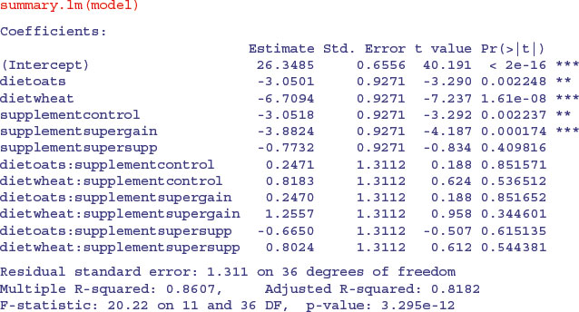
This is a rather complex model, because there are 12 estimated parameters (the number of rows in the table): six main effects and six interactions. Remember that the parameter labelled Intercept is the mean with both factor levels set to their first in the alphabet (diet=barley and supplement=agrimore). All other rows are differences between means. The output re-emphasizes that none of the interaction terms is even close to significant, but it suggests that the minimal adequate model will require five parameters: an intercept, a difference due to oats, a difference due to wheat, a difference due to control and difference due to supergain (these are the five rows with significance stars). This draws attention to the main shortcoming of using treatment contrasts as the default. If you look carefully at the table, you will see that the effect sizes of two of the supplements, control and supergain, are not significantly different from one another. You need lots of practice at doing t tests in your head, to be able to do this quickly. Ignoring the signs (because the signs are negative for both of them), we have 3.05 vs. 3.88, a difference of 0.83. But look at the associated standard errors (both 0.927); the difference is less than 1 standard error of a difference between two means. For significance, we would need roughly 2 standard errors (remember the rule of thumb, in which t ≥ 2 is significant; see p. 292). The rows get starred in the significance column because treatments contrasts compare all the main effects in the rows with the intercept (where each factor is set to its first level in the alphabet, namely agrimore and barley in this case). When, as here, several factor levels are different from the intercept, but not different from one another, they all get significance stars. This means that you cannot count up the number of rows with stars in order to determine the number of significantly different factor levels.
We first simplify the model by leaving out the interaction terms:
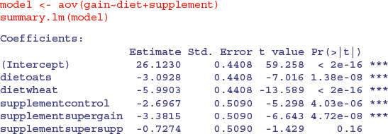
It is clear that we need to retain all three levels of diet (oats differs from wheat by 5.99 – 3.09 = 2.90 with a standard error of 0.44). But it is not clear that we need four levels of supplement: supersupp is not obviously different from agrimore (0.727 with standard error 0.509). Nor is supergain obviously different from the unsupplemented control animals (3.38 – 2.70 = 0.68). We shall try a new two-level factor to replace the four-level supplement, and see if this significantly reduces the model's explanatory power: agrimore and supersupp are recoded as ‘best’ and control and supergain as ‘worst’:
supp2 <- factor(supplement)
levels(supp2)
[1] "agrimore" "control" "supergain" "supersupp"
levels(supp2)[c(1,4)] <- "best"
levels(supp2)[c(2,3)] <- "worst"
levels(supp2)
[1] "best" "worst"
Now we can compare the two models:
model2 <- aov(gain∼diet+supp2)
anova(model,model2)
Analysis of Variance Table
Model 1: gain ∼ diet + supplement
Model 2: gain ∼ diet + supp2
Res.Df RSS Df Sum of Sq F Pr(>F)
1 42 65.296
2 44 71.284 -2 -5.9876 1.9257 0.1584
The simpler model2 has saved two degrees of freedom and is not significantly worse than the more complex model (p = 0.1584). This is the minimal adequate model: all of the parameters are significantly different from zero and from one another:
summary.lm(model2)
Coefficients:
Estimate Std. Error t value Pr(>|t|)
(Intercept) 25.7593 0.3674 70.106 < 2e-16 ***
dietoats -3.0928 0.4500 -6.873 1.76e-08 ***
dietwheat -5.9903 0.4500 -13.311 < 2e-16 ***
supp2worst -2.6754 0.3674 -7.281 4.43e-09 ***
Model simplification has reduced our initial 12-parameter model to a four-parameter model.
11.3 Pseudoreplication: Nested designs and split plots
The model-fitting functions aov, lme and lmer have the facility to deal with complicated error structures, and it is important that you can recognize such error structures, and hence avoid the pitfalls of pseudoreplication. There are two general cases:
- nested sampling, as when repeated measurements are taken from the same individual, or observational studies are conducted at several different spatial scales (mostly random effects);
- split-plot analysis, as when designed experiments have different treatments applied to plots of different sizes (mostly fixed effects).
11.3.1 Split-plot experiments
In a split-plot experiment, different treatments are applied to plots of different sizes. Each different plot size is associated with its own error variance, so instead of having one error variance (as in all the ANOVA tables up to this point), we have as many error terms as there are different plot sizes. The analysis is presented as a series of component ANOVA tables, one for each plot size, in a hierarchy from the largest plot size with the lowest replication at the top, down to the smallest plot size with the greatest replication at the bottom.
The following example refers to a designed field experiment on crop yield with three treatments: irrigation (with two levels, irrigated or not), sowing density (with three levels, low, medium and high), and fertilizer application (with three levels, low, medium and high).
yields <- read.table("c:\\temp\\splityield.txt",header=T)
attach(yields)
names(yields)
[1] "yield" "block" "irrigation" "density" "fertilizer"
The largest plots were the four whole fields (block), each of which was split in half, and irrigation was allocated at random to one half of the field. Each irrigation plot was split into three, and one of three different seed-sowing densities (low, medium or high) was allocated at random (independently for each level of irrigation and each block). Finally, each density plot was divided into three, and one of three fertilizer nutrient treatments (N, P, or N and P together) was allocated at random.
The issue with split-plot experiments is pseudoreplication. Think about the irrigation experiment. There were four blocks, each split in half, with one half irrigated and the other as a control. The dataframe for an analysis of this experiment should therefore contain just 8 rows (not 72 rows as in the present case). There would be seven degrees of freedom in total, three for blocks, one for irrigation and just 7 − 3 − 1 = 3 d.f. for error. If you did not spot this, the model could be run with 51 d.f. representing massive pseudoreplication (the correct p value for the irrigation treatment is 0.0247, but for the pseudoreplicated mistaken analysis p = 6.16 × 10⁻¹⁰ ).
The model formula is specified as a factorial, using the asterisk notation. The error structure is defined in the Error term, with the plot sizes listed from left to right, from largest to smallest, with each variable separated by the slash operator /. Note that the smallest plot size, fertilizer, does not need to appear in the Error term:
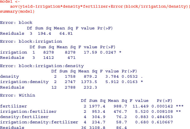
Here you see the four ANOVA tables, one for each plot size: blocks are the biggest plots, half blocks get the irrigation treatment, one third of each half block gets a sowing density treatment, and one third of a sowing density treatment gets each fertilizer treatment. Note that the non-significant main effect for density (p = 0.053) does not mean that density is unimportant, because density appears in a significant interaction with irrigation (the density terms cancel out, when averaged over the two irrigation treatments; see below). The best way to understand the two significant interaction terms is to plot them using interaction.plot like this:
interaction.plot(fertilizer,irrigation,yield)
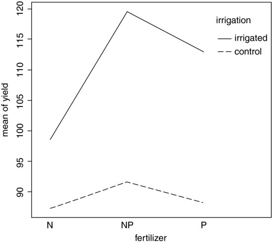
Irrigation increases yield proportionately more on the N-fertilized plots than on the P-fertilized plots. The irrigation–density interaction is more complicated:
interaction.plot(density,irrigation,yield)
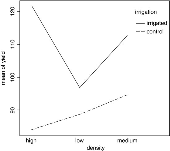
On the irrigated plots, yield is lowest on the low-density plots, but on control plots yield is lowest on the high-density plots. Alternatively, you could use the effects package which takes a model object (a linear model or a generalized linear model) and provides attractive trellis plots of specified interaction effects (p. 968).
When there are one or more missing values (NA), then factors have effects in more than one stratum and the same main effect turns up in more than one ANOVA table. In such a case, use lme or lmer rather than aov. The output of aov is not to be trusted under these circumstances.
11.3.2 Mixed-effects models
Mixed-effects models are so called because the explanatory variables are a mixture of fixed effects and random effects:
- fixed effects influence only the mean of y;
- random effects influence only the variance of y.
A random effect should be thought of as coming from a population of effects: the existence of this population is an extra assumption. We speak of prediction of random effects, rather than estimation: we estimate fixed effects from data, but we intend to make predictions about the population from which our random effects were sampled. Fixed effects are unknown constants to be estimated from the data. Random effects govern the variance–covariance structure of the response variable. The fixed effects are often experimental treatments that were applied under our direction, and the random effects are either categorical or continuous variables that are distinguished by the fact that we are typically not interested in the parameter values, but only in the variance they explain.
One of more of the explanatory variables might represent grouping in time or in space. Random effects that come from the same group will be correlated, and this contravenes one of the fundamental assumptions of standard statistical models: independence of errors. Mixed-effects models take care of this non-independence of errors by modelling the covariance structure introduced by the grouping of the data.
A major benefit of random-effects models is that they economize on the number of degrees of freedom used up by the factor levels. Instead of estimating a mean for every single factor level, the random-effects model estimates the distribution of the means (usually as the standard deviation of the differences of the factor-level means around an overall mean). Mixed-effects models are particularly useful in cases where there is temporal pseudoreplication (repeated measurements) and/or spatial pseudoreplication (e.g. nested designs or split-plot experiments). These models can allow for:
- spatial autocorrelation between neighbours;
- temporal autocorrelation across repeated measures on the same individuals;
- differences in the mean response between blocks in a field experiment;
- differences between subjects in a medical trial involving repeated measures.
The point is that we really do not want to waste precious degrees of freedom in estimating parameters for each of the separate levels of the categorical random variables. On the other hand, we do want to make use of the all measurements we have taken, but because of the pseudoreplication we want to take account of both the
- correlation structure, used to model within-group correlation associated with temporal and spatial dependencies, using correlation, and
- variance function, used to model non-constant variance in the within-group errors using weights.
11.3.3 Fixed effect or random effect?
It is difficult without lots of experience to know when to use a categorical explanatory variable as a fixed effect or as a random effect. Some guidelines are given below.
- Am I interested in the effect sizes? Yes means fixed effects.
- Is it reasonable to suppose that the factor levels come from a population of levels? Yes means random effects.
- Are there enough levels of the factor in the dataframe on which to base an estimate of the variance of the population of effects? No means fixed effects.
- Are the factor levels informative? Yes means fixed effects.
- Are the factor levels just numeric labels? Yes means random effects.
- Am I mostly interested in making inferences about the distribution of effects, based on the random sample of effects represented in the dataframe? Yes means random effects.
- Is there hierarchical structure? Yes means we need to ask whether the data are experimental or observations.
- Is it a hierarchical experiment, where the factor levels are experimental manipulations? Yes means fixed effects in a split-plot design (see p. 519)
- Is it a hierarchical observational study? Yes means random effects, perhaps in a variance components analysis (see p. 524).
- When the model contains both fixed and random effects, use mixed-effects models.
- If the model structure is linear, use linear mixed effects, lme or lmer.
- Otherwise, specify the model equation and use non-linear mixed effects, nlme.
11.3.4 Removing the pseudoreplication
If you are principally interested in the fixed effects, then the best response to pseudoreplication in a data set is simply to eliminate it. Spatial pseudoreplication can be averaged away. You will always get the correct effect size and p value from the reduced, non-pseudoreplicated dataframe. Note also that you should not use anova to compare different models for the fixed effects when using lme or lmer with REML (see p. 688). Temporal pseudoreplication can be dealt with by carrying out carrying out separate ANOVAs, one at each time (or just one at the end of the experiment). This approach, however, has two weaknesses:
- It cannot address questions about treatment effects that relate to the longitudinal development of the mean response profiles (e.g. differences in growth rates between successive times).
- Inferences made with each of the separate analyses are not independent, and it is not always clear how they should be combined.
The key feature of longitudinal data is that the same individuals are measured repeatedly through time. This would represent temporal pseudoreplication if the data were used uncritically in regression or ANOVA. The set of observations on one individual subject will tend to be positively correlated, and this correlation needs to be taken into account in carrying out the analysis. The alternative is a cross-sectional study, with all the data gathered at a single point in time, in which each individual contributes a single data point. The advantage of longitudinal studies is that they are capable of separating age effects from cohort effects; these are inextricably confounded in cross-sectional studies. This is particularly important when differences between years mean that cohorts originating at different times experience different conditions, so that individuals of the same age in different cohorts would be expected to differ.
There are two extreme cases in longitudinal studies:
- a few measurements on a large number of individuals;
- a large number of measurements on a few individuals.
In the first case it is difficult to fit an accurate model for change within individuals, but treatment effects are likely to be tested effectively. In the second case, it is possible to get an accurate model of the way that individuals change though time, but there is less power for testing the significance of treatment effects, especially if variation from individual to individual is large. In the first case, less attention will be paid to estimating the correlation structure, while in the second case the covariance model will be the principal focus of attention. The aims are:
- to estimate the average time course of a process;
- to characterize the degree of heterogeneity from individual to individual in the rate of the process;
- to identify the factors associated with both of these, including possible cohort effects.
The response is not the individual measurement, but the sequence of measurements on an individual subject. This enables us to distinguish between age effects and year effects; see Diggle et al. (1994) for details.
11.3.5 Derived variable analysis
The idea here is to get rid of the pseudoreplication by reducing the repeated measures into a set of summary statistics (slopes, intercepts or means), then analyse these summary statistics using standard parametric techniques such as ANOVA or regression. The technique is weak when the values of the explanatory variables change through time. Derived variable analysis makes most sense when it is based on the parameters of scientifically interpretable non-linear models from each time sequence. However, the best model from a theoretical perspective may not be the best model from the statistical point of view.
There are three qualitatively different sources of random variation:
- random effects, where experimental units differ (e.g. genotype, history, size, physiological condition) so that there are intrinsically high responders and other low responders;
- serial correlation, where there may be time-varying stochastic variation within a unit (e.g. market forces, physiology, ecological succession, immunity) so that correlation depends on the time separation of pairs of measurements on the same individual, with correlation weakening with the passage of time;
- measurement error, where the assay technique may introduce an element of correlation (e.g. shared bioassay of closely spaced samples; different assay of later specimens).
11.4 Variance components analysis
For random effects we are often more interested in the question of how much of the variation in the response variable can be attributed to a given factor, than we are in estimating means or assessing the significance of differences between means. This procedure is called variance components analysis.
The following classic example of spatial pseudoreplication comes from Snedecor and Cochran (1980):
rats <- read.table("c:\\temp\\rats.txt",header=T)
attach(rats)
names(rats)
[1] "Glycogen" "Treatment" "Rat" "Liver"
Three experimental treatments were administered to rats, and the glycogen content of the rats' livers was analysed as the response variable. There were two rats per treatment, so the total sample was n = 3 × 2 = 6. The tricky bit was that after each rat was killed, its liver was cut up into three pieces: a left-hand bit, a central bit and a right-hand bit. So now there are six rats each producing three bits of liver, for a total of 6 × 3 = 18 numbers. Finally, two separate preparations were made from each macerated bit of liver, to assess the measurement error associated with the analytical machinery. At this point there are 2 × 18 = 36 numbers in the dataframe as a whole. The factor levels are numbers, so we need to declare the explanatory variables to be categorical before we begin:
Treatment <- factor(Treatment)
Rat <- factor(Rat)
Liver <- factor(Liver)
Here is the analysis done the wrong way:
A massively significant effect or treatment, right? Wrong. This result is due entirely to pseudoreplication. With just six rats in the whole experiment, there should be just three degrees of freedom for error, not 33.
The simplest way to do the analysis properly is to average away the pseudoreplication. Here are the mean glycogen values for the six rats:
(means <- tapply(Glycogen,list(Treatment,Rat),mean))
1 2
1 132.5000 148.5000
2 149.6667 152.3333
3 134.3333 136.0000
We need a new variable to represent the treatments associated with each of these rats. The ‘generate levels’ function gl is useful here:
treat <- gl(3,1,length=6)
Now we can fit the non-pseudoreplicated model with the correct error degrees of freedom (3 d.f., not 33):
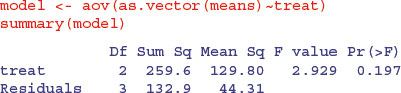
As you can see, the treatment effect falls well short of significance (p = 0.197).
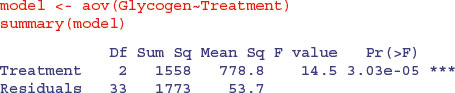
There are two different ways of doing the analysis properly in R: ANOVA with multiple error terms (aov) or linear mixed-effects models (lmer). The problem is that the bits of the same liver are pseudoreplicates because they are spatially correlated (they come from the same rat); they are not independent, as required if they are to be true replicates. Likewise, the two preparations from each liver bit are very highly correlated (the livers were macerated before the preparations were taken, so they are essentially the same sample (certainly not independent replicates of the experimental treatments).
Here is the correct analysis using aov with multiple error terms. In the Error term we start with the largest scale (treatment), then rats within treatments, then liver bits within rats within treatments. Finally, there were replicated measurements (two preparations) made for each bit of liver.
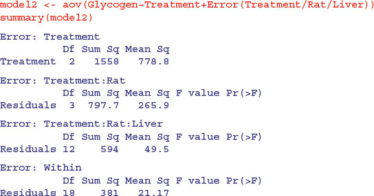
You can do the correct, non-pseudoreplicated analysis of variance from this output (Box 11.1).
 . Instead, the correction factor is the uncorrected sum of squared subtotals from the level in the hierarchy immediately above the level in question. This is very hard to see without lots of practice. The total sum of squares, SSY, and the treatment sum of squares, SSA, are computed in the usual way (see p. 499):
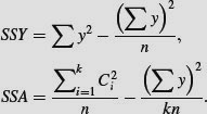
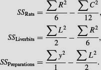

The F test for equality of the treatment means is the treatment variance divided by the ‘rats within treatment variance’ from the row immediately beneath: F = 778.78/265.89 = 2.928 956, with 2 d.f. in the numerator and 3 d.f. in the denominator (as we obtained in the correct ANOVA, above).
To turn this into a variance components analysis we need to do a little work. The mean squares are converted into variance components like this:
- residuals = preparations within liver bits: unchanged = 21.17,
- liver bits within rats within treatments: (49.5 – 21.17)/2 = 14.165,
- rats within treatments: (265.89 – 49.5)/6 = 36.065.
You divide the difference in variance in going from one spatial scale to the next, by the number of numbers in the level below (i.e. two preparations per liver bit, and six preparations per rat, in this case). Variance components analysis typically expresses these variances as percentages of the total:
varcomps <- c(21.17,14.165,36.065)
100*varcomps/sum(varcomps)
[1] 29.64986 19.83894 50.51120
illustrating that more than 50% of the random variation is accounted for by differences between the rats. Repeating the experiment using more than six rats would make much more sense than repeating it by cutting up the livers into more pieces. Analysis of the rats data using lmer is explained on p. 703.
11.5 Effect sizes in ANOVA: aov or lm?
The difference between lm and aov is mainly in the form of the output: the summary table with aov is in the traditional form for analysis of variance, with one row for each categorical variable and each interaction term. On the other hand, the summary table for lm produces one row per estimated parameter (i.e. one row for each factor level and one row for each interaction level). If you have multiple error terms (spatial pseudoreplication) then you must use aov because lm does not support the Error term.
Here is a three-way analysis of variance fitted first using aov then using lm:
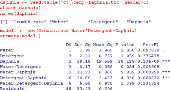
All three factors are likely to stay in the model because each is involved in at least one significant interaction. We must not be misled by the apparently non-significant main effect for detergent. The three-way interaction is clearly non-significant and can be deleted (p = 0.234). Here is the output from the same analysed using the linear model function:
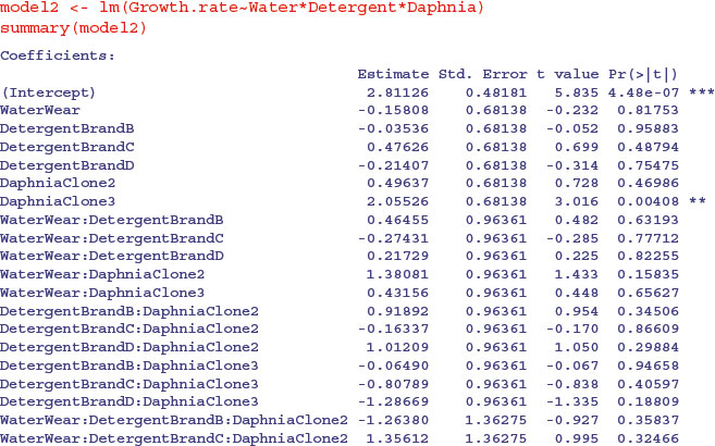
Note that the two significant interactions from the aov table do not show up in the summary.lm table (Water–Daphnia and Detergent–Daphnia). This is because summary.lm shows treatment contrasts, comparing everything to the Intercept, rather than orthogonal contrasts (see p. 430). This draws attention to the importance of model simplification rather than per-row t tests in assessing statistical significance (i.e. removing the non-significant three-way interaction term in this case). In the aov table, the p values are ‘on deletion’ p values, which is a big advantage.
The main difference is that there are eight rows in the summary.aov table (three main effects, three two-way interactions, one three-way interaction and an error term) but there are 24 rows in the summary.lm table (four levels of detergent by three levels of daphnia clone by two levels of water). You can easily view the output of model1 in linear model layout, or model2 as an ANOVA table using the opposite summary options:
summary.lm(model1)
summary.aov(model2)
In complicated designed experiments, it is easiest to summarize the effect sizes with plot.design and model.tables functions. For main effects, use
plot.design(Growth.rate∼Water*Detergent*Daphnia)

This simple graphical device provides a very clear summary of the three sets of main effects. It is no good, however, at illustrating the interactions. The model.tables function takes the name of the fitted model object as its first argument, and you can specify whether you want the standard errors (as you typically would):
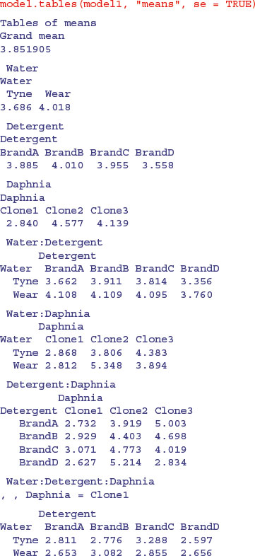

Note how the standard errors of the differences between two means increase as the replication declines. All the standard errors use the same pooled error variance s2 = 0.696 (see above). For instance, the three-way interactions have 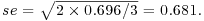 and the daphnia main effects have
Attractive plots of effect sizes can be obtained using the effects library (p. 968).
11.6 Multiple comparisons
One of the cardinal sins is to take a set of samples, search for the sample with the largest mean and the sample with the smallest mean, and then do a t test to compare them. You should not carry out contrasts until the analysis of variance, calculated over the whole set of samples, has indicated that there are significant differences present (i.e. until after the null hypothesis has been rejected). Also, bear in mind that there are just k − 1 orthogonal contrasts when you have a categorical explanatory variable with k levels, so do not carry out more than k − 1 comparisons of means (see p. 430 for discussion of these ideas).
When comparing the multiple means across the levels of a factor, a simple comparison using multiple t tests will inflate the probability of declaring a significant difference when there is none. This is because the intervals are calculated with a given coverage probability for each interval but the interpretation of the coverage is usually with respect to the entire family of intervals (i.e. for the factor as a whole).
If you follow the protocol of model simplification recommended in this book, then issues of multiple comparisons will not arise very often. An occasional significant t test amongst a bunch of non-significant interaction terms is not likely to survive a deletion test (see p. 437). Again, if you have factors with large numbers of levels you might consider using mixed-effects models rather than ANOVA (i.e. treating the factors as random effects rather than fixed effects; see p. 681).
John Tukey introduced intervals based on the range of the sample means rather than the individual differences; nowadays, these are called Tukey's honest significant differences. The intervals returned by the TukeyHSD function are based on Studentized range statistics. Technically the intervals constructed in this way would only apply to balanced designs where the same number of observations is made at each level of the factor. This function incorporates an adjustment for sample size that produces sensible intervals for mildly unbalanced designs.
The following example concerns the yield of fungi gathered from 16 different habitats:
data <- read.table("c:\\temp\\Fungi.txt",header=T)
attach(data)
names(data)
[1] "Habitat" "Fungus.yield"
First we establish whether there is any variation in fungus yield to explain:
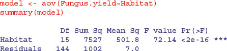
Yes, there is (p < 0.000 001). But this is not of much real interest, because it just shows that some habitats produce more fungi than others. We are likely to be interested in which habitats produce significantly more fungi than others. Multiple comparisons are an issue because there are 16 habitats and so there are (16 × 15)/2 = 120 possible pairwise comparisons. There are two options:
- apply the function TukeyHSD to the model to get Tukey's honest significant differences;
- use the function pairwise.t.test to get adjusted p values for all comparisons.
Here is Tukey's test in action: it produces a table of p values by default:
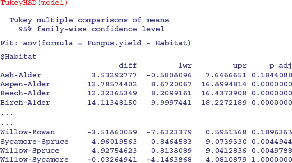
You can plot the confidence intervals if you prefer (or do both, of course):
plot(TukeyHSD(model))

Habitats on opposite sides of the dotted line and not overlapping it are significantly different from one another.
Alternatively, you can use the pairwise.t.test function in which you specify the response variable, and then the categorical explanatory variable containing the factor levels you want to be compared, separated by a comma (not a tilde):
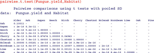

As you see, the default method of adjustment of the p values is holm, but other adjustment methods include hochberg, hommel, bonferroni, BH, BY, fdr and none. Without adjustment of the p values, the rowan–willow comparison looks highly significant (p = 0.003 35), as you can see if you try
pairwise.t.test(Fungus.yield,Habitat,p.adjust.method="none")
I like TukeyHSD because it is conservative without being ridiculously so (in contrast to Bonferroni). For instance, Tukey gives the birch–cherry comparison as non-significant (p = 0.101 102 7), while Holm makes this difference significant (p = 0.049 43). Tukey has the comparison between willow and Holm oak as significant (p = 0.038 091 0), whereas Bonferroni throws this baby out with the bathwater (p = 0.056 72). You need to decide how circumspect you want to be in the context of your particular question.
There is a useful package for multiple comparisons called multcomp:
install.packages("multcomp")
You can see at once how contentious the issue of multiple comparisons is, just by looking at the length of the list of different multiple comparisons methods supported in this package:
- the many-to-one comparisons of Dunnett
- the all-pairwise comparisons of Tukey
- Sequen
- AVE
- changepoint
- Williams
- Marcus
- McDermott
- Tetrade
- Bonferroni correction
- Holm
- Hochberg
- Hommel
- Benjamini–Hochberg
- Benjamini–Yekutieli
The old-fashioned Bonferroni correction is highly conservative, because the p values are multiplied by the number of comparisons. Instead of using the usual Bonferroni and Holm procedures, the adjustment methods include less conservative corrections that take the exact correlations between the test statistics into account by use of the multivariate t distribution. The resulting procedures are therefore substantially more powerful (the Bonferroni and Holm adjusted p values are reported for reference). There seems to be no reason to use the unmodified Bonferroni correction because it is dominated by Holm's method, which is valid under arbitrary assumptions.
The tests are designed to suit multiple comparisons within the general linear model, so they allow for covariates, nested effects, correlated means and missing values. The first four methods are designed to give strong control of the familywise error rate. The methods of Benjamini, Hochberg, and Yekutieli control the false discovery rate, which is the expected proportion of false discoveries amongst the rejected hypotheses. The false discovery rate is a less stringent condition than the familywise error rate, so these methods are more powerful than the others.
11.7 Multivariate analysis of variance
Two or more response variables are sometimes measured in the same experiment. Of course you can analyse each response variable separately, and that is the typical way to proceed. But there are occasions where you want to treat the group of response variables as one multivariate response. The function for this is manova, the multivariate analysis of variance. Note that manova does not support multi-stratum analysis of variance, so the formula must not include an Error term.
data <- read.table("c:\\temp\\manova.txt",header=T)
attach(data)
names(data)
[1] "tear" "gloss" "opacity" "rate" "additive"
First, create a multivariate response variable, Y, by binding together the three separate response variables (tear, gloss and opacity), like this:
Y <- cbind(tear, gloss, opacity)
Then fit the multivariate analysis of variance using the manova function:
model <- manova(Y∼rate*additive)
There are two ways to inspect the output. First, as a multivariate analysis of variance:
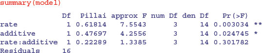
This shows significant main effects for both rate and additive, but no interaction. Note that the F tests are based on 3 and 14 degrees of freedom (not 1 and 16). The default method in summary.manova is the Pillai–Bartlett statistic. Other options include Wilks, Hotelling–Lawley and Roy. Second, you will want to look at each of the three response variables separately:


Notice that one of the three response variables, opacity, is not significantly associated with either of the explanatory variables.