Chapter 14
Count Data
Up to this point, the response variables have all been continuous measurements such as weights, heights, lengths, temperatures and growth rates. A great deal of the data collected by scientists, medical statisticians and economists, however, is in the form of counts (whole numbers or integers). The number of individuals who died, the number of firms going bankrupt, the number of days of frost, the number of red blood cells on a microscope slide, and the number of craters in a sector of lunar landscape are all potentially interesting variables for study. With count data, the number 0 often appears as a value of the response variable (consider, for example, what a 0 would mean in the context of the examples just listed). In this chapter we deal with data on frequencies, where we count how many times something happened, but we have no way of knowing how often it did not happen (e.g. lightning strikes, bankruptcies, deaths, births). This is in contrast to count data on proportions, where we know the number doing a particular thing, but also the number not doing that thing (e.g. the proportion dying, sex ratios at birth, proportions of different groups responding to a questionnaire).
Straightforward linear regression methods (assuming constant variance, normal errors) are not appropriate for count data for four main reasons:
- The linear model might lead to the prediction of negative counts.
- The variance of the response variable is likely to increase with the mean.
- The errors will not be normally distributed.
- Zeros are difficult to handle in transformations.
In R, count data are handled very elegantly in a generalized linear model by specifying family=poisson which sets errors = Poisson and link = log (see p. 558). The log link ensures that all the fitted values are positive, while the Poisson errors take account of the fact that the data are integer and have variances that are equal to their means.
14.1 A regression with Poisson errors
The following example has a count (the number of reported cancer cases per year per clinic) as the response variable, and a single continuous explanatory variable (the distance from a nuclear plant to the clinic in kilometres). The question is whether or not proximity to the reactor affects the number of cancer cases.
clusters<-read.table("c:\\temp\\clusters.txt",header=T)

attach(clusters)

names(clusters)
[1] "Cancers" "Distance"
There seems to be a downward trend in cancer cases with distance (see the plot below). But is the trend significant? We do a regression of cases against distance, using a GLM with Poisson errors:
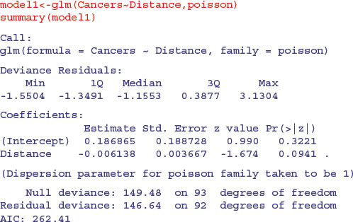
The trend does not look to be significant, but look at the residual deviance. Under Poisson errors, it is assumed that residual deviance is equal to the residual degrees of freedom (because the variance and the mean should be the same). The fact that residual deviance is larger than residual degrees of freedom indicates that we have overdispersion (extra, unexplained variation in the response). We compensate for the overdispersion by refitting the model using quasi-Poisson rather than Poisson errors:
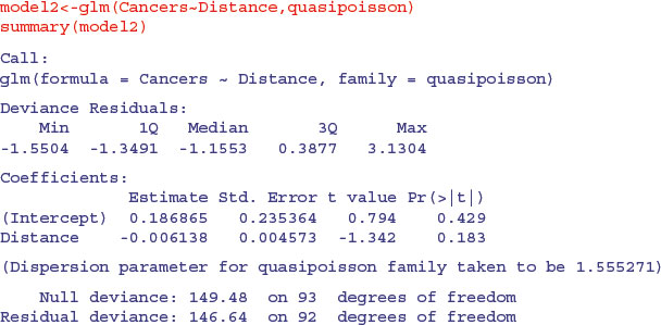
Compensating for the overdispersion has increased the p value to 0.183, so there is no compelling evidence to support the existence of a trend in cancer incidence with distance from the nuclear plant. To draw the fitted model through the data, you need to understand that the GLM with Poisson errors uses the log link, so the parameter estimates and the predictions from the model (the ‘linear predictor’) are in logs, and need to be antilogged exp(yv) before the (non-significant) fitted line is drawn.
xv <- seq(0,100)

yv <- predict(model2,list(Distance=xv))


plot(Cancers∼Distance,pch=21,col="red",bg="orange")

lines(xv,exp(yv),col="blue")
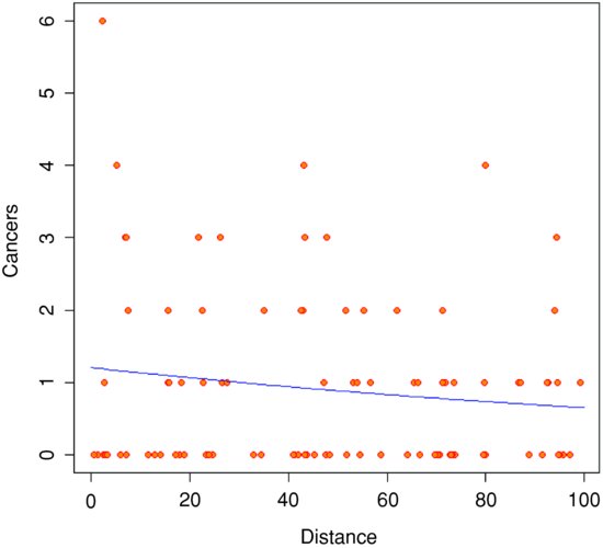
Note how odd the scatterplot looks when we have count data as the response. The values of the response variable are in rows (because they are all whole numbers), and there are data points all over the place (not clustered around the regression line, as they were in previous regressions).
14.2 Analysis of deviance with count data
In our next example the response variable is a count of infected blood cells per square millimetre on microscope slides prepared from randomly selected individuals. The explanatory variables are smoker (logical: yes or no), age (three levels: under 20, 21 to 59, 60 and over), sex (male or female) and body mass score (three levels: normal, overweight, obese).
count<-read.table("c:\\temp\\cellcounts.txt",header=T)

attach(count)

names(count)
[1] "cells" "smoker" "age" "sex" "weight"
It is always a good idea with count data to get a feel for the overall frequency distribution of counts using table:
table(cells)
cells

 0	1	2	3	4	5	6	7

314	75	50	32	18	13	7	2
Most subjects (314 of them) showed no damaged cells, and the maximum of 7 was observed in just two patients.
We begin data inspection by tabulating the main effect means:
tapply(cells,smoker,mean)
 FALSE	TRUE

0.5478723 1.9111111
tapply(cells,weight,mean)
 normal	obese	over

0.5833333 1.2814371 0.9357143
tapply(cells,sex,mean)
 female	male

0.6584507 1.2202643
tapply(cells,age,mean)
 mid	old	young

0.8676471 0.7835821 1.2710280
It looks as if smokers had a substantially higher mean count than non-smokers, overweight and obese subjects had higher counts than those of normal weight, males had a higher count than females, and young subjects had a higher mean count than middle-aged or older people. We need to test whether any of these differences are significant and to assess whether there are interactions between the explanatory variables.
model1<-glm(cells∼smoker*sex*age*weight,poisson)

summary(model1)
	Null deviance: 1052.95 on 510 degrees of freedom

Residual deviance: 736.33 on 477 degrees of freedom

AIC: 1318

Number of Fisher Scoring iterations: 6
The residual deviance (736.33) is much greater than the residual degrees of freedom (477), indicating overdispersion, so before interpreting any of the effects, we should refit the model using quasi-Poisson errors:
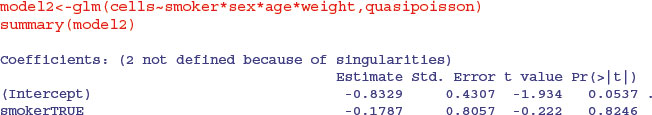

The first thing to understand is what the NAs in the coefficients table mean. This is a sign of aliasing: there is no information in the dataframe from which to estimate this particular interaction term. There is an apparently significant three-way interaction between smoking, age and obesity (p = 0.0424). There were too few subjects to assess the four-way interaction (see the NAs in the table), so we begin model simplification by removing the highest-order interaction:

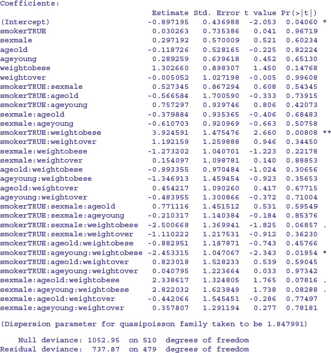
The remaining model simplification is left to you as an exercise. Your minimal adequate model might look something like this:
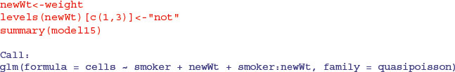
This model shows a highly significant interaction between smoking and weight in determining the number of damaged cells, but there are no convincing effects of age or sex. In a case like this, it is useful to produce a summary table to highlight the effects:
tapply(cells,list(smoker,weight),mean)
	normal	obese	over

FALSE 0.4184397 0.6893939 0.5436893

TRUE 0.9523810 3.5142857 2.0270270
The interaction arises because the response to smoking depends on body weight: smoking adds a mean of about 0.5 damaged cells for individuals with normal body weight, but adds 2.8 damaged cells for obese people.
It is straightforward to turn the summary table into a barplot:
barplot(tapply(cells,list(smoker,weight),mean),col=c("wheat2","wheat4"),

 		beside=T,ylab="damaged cells",xlab="body mass")

legend(1.2,3.4,c("non-smoker","smoker"),fill=c("wheat2","wheat4"))

14.3 Analysis of covariance with count data
In this next example the response is a count of the number of plant species on plots that have different biomass (a continuous explanatory variable) and different soil pH (a categorical variable with three levels: high, mid and low).
species<-read.table("c:\\temp\\species.txt",header=T)

attach(species)

names(species)

[1] "pH" "Biomass" "Species"

plot(Biomass,Species,type="n")

spp<-split(Species,pH)

bio<-split(Biomass,pH)

points(bio[[1]],spp[[1]],pch=16,col="red")

points(bio[[2]],spp[[2]],pch=16,col="green")

points(bio[[3]],spp[[3]],pch=16,col="blue")

legend(locator(1),legend=c("high","low","medium"),

 		pch=c(16,16,16),col=c("red","green","blue"),title="pH")

Note the use of split to create separate lists of plotting coordinates for the three levels of pH. It is clear that species declines with biomass, and that soil pH has a big effect on species, but does the slope of the relationship between species and biomass depend on pH? The lines look reasonably parallel from the scatterplot. This is a question about interaction effects, and in analysis of covariance, interaction effects are about differences between slopes:

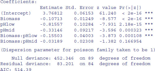
There is no evidence of overdispersion (residual deviance = 83.2 on 89 d.f.). We can test for the need for different slopes by comparing this maximal model (with six parameters) with a simpler model with different intercepts but the same slope (four parameters):
model2<-glm(Species∼Biomass+pH,poisson)

anova(model1,model2,test="Chi")
Analysis of Deviance Table


Model 1: Species ∼ Biomass * pH

Model 2: Species ∼ Biomass + pH

 Resid. Df Resid. Dev Df Deviance Pr(>Chi)

1	84 83.201

2	86 99.242 -2 -16.04 0.0003288 ***
The slopes are very significantly different (p = 0.000 33), so we are justified in retaining the more complicated model1.
Finally, we draw the fitted lines through the scatterplot, using predict We need to specify values for all of the explanatory variables in the model, namely biomass (a continuous variable) and soil pH (a three-level categorical variable). First, the continuous variable for the x axis:
xv<-seq(0,10,0.1)
Next we need to provide a vector of factor levels for soil pH and this vector must be exactly the same length as the vector of x values (length(xv) = 101 in this case). It is simplest to use the factor levels for pH in the order in which they appear:
levels(pH)
[1] "high" "low" "mid"
We shall draw the line for the high pH first, remembering to antilog the predictions:
pHs<-factor(rep("high",101))

xv<-seq(0,10,0.1)


yv<-predict(model1,list(Biomass=xv,pH=pHs))
lines(xv,exp(yv),col="red")

pHs<-factor(rep("low",101))


yv<-predict(model1,list(Biomass=xv,pH=pHs))


lines(xv,exp(yv),col="green")

pHs<-factor(rep("mid",101))


yv<-predict(model1,list(Biomass=xv,pH=pHs))

lines(xv,exp(yv),col="blue")
You could make the R code more elegant by writing a function to plot any number of lines, depending on the number of levels of the factor (three levels of pH in this case).

14.4 Frequency distributions
Here are data on the numbers of bankruptcies in 80 districts. The question is whether there is any evidence that some districts show greater than expected numbers of cases. What would we expect? Of course we should expect some variation, but how much, exactly? Well that depends on our model of the process. Perhaps the simplest model is that absolutely nothing is going on, and that every singly bankruptcy case is absolutely independent of every other. That leads to the prediction that the numbers of cases per district will follow a Poisson process, a distribution in which the variance is equal to the mean (see p. 314). Let us see what the data show.
case.book<-read.table("c:\\temp\\cases.txt",header=T)

attach(case.book)

names(case.book)
[1] "cases"
First we need to count the numbers of districts with no cases, one case, two cases, and so on. The R function that does this is called table:
frequencies<-table(cases)

frequencies
cases

 0	1	2	3	4	5	6	7	8	9	10

34	14	10	7	4	5	2	1	1	1	1
There were no cases at all in 34 districts, but one district had 10 cases. A good way to proceed is to compare our distribution (called frequencies) with the distribution that would be observed if the data really did come from a Poisson distribution as postulated by our model. We can use the R function dpois to compute the probability density of each of the 11 frequencies from 0 to 10 (we multiply the probability produced by dpois by the total sample of 80 to obtain the predicted frequencies). We need to calculate the mean number of cases per district – this is the Poisson distribution's only parameter:
mean(cases)
[1] 1.775
The plan is to draw two distributions side by side, so we set up the plotting region:
windows(7,4)

par(mfrow=c(1,2))
Now we plot the observed frequencies in the left-hand panel and the predicted, Poisson frequencies in the right-hand panel:
barplot(frequencies,ylab="Frequency",xlab="Cases",col="green4", main="Cases")

barplot(dpois(0:10,1.775)*80,names=as.character(0:10),

 		ylab="Frequency",xlab="Cases",col="green3",main="Poisson")

The distributions are very different: the mode of the observed data is 0, but the mode of the Poisson distribution with the same mean is 1; the observed data contained examples of 8, 9 and 10 cases, but these would be highly unlikely under a Poisson process. We would say that the observed data are highly aggregated – they have a variance–mean ratio much greater than 1 (the Poisson distribution, of course, has a variance–mean ratio of 1):
var(cases)/mean(cases)
[1] 2.99483
So, if the data are not Poisson distributed, how are they distributed? A good candidate distribution where the variance–mean ratio is this big (around 3.0) is the negative binomial distribution (see p. 315). This is a two-parameter distribution: the first parameter is the mean number of cases (1.775), and the second is called the clumping parameter, k (measuring the degree of aggregation in the data: small values of k (k < 1) show high aggregation, while large values of k (k > 5) show randomness). We can get an approximate estimate of the magnitude of k from

We can work this out:
mean(cases)^2/(var(cases)-mean(cases))
[1] 0.8898003
so we shall work with k = 0.89. How do we compute the expected frequencies? The density function for the negative binomial distribution is dnbinom and it has three arguments: the frequency for which we want the probability (in our case 0 to 10), the number of successes (in our case 1), and the mean number of cases (1.775); we multiply by the total number of cases (80) to obtain the expected frequencies
exp<-dnbinom(0:10,1,mu=1.775)*80
We will draw a single figure in which the observed and expected frequencies are drawn side by side. The trick is to produce a new vector (called both) which is twice as long as the observed and expected frequency vectors (2 × 11 = 22). Then, we put the observed frequencies in the odd-numbered elements (using modulo 2 to calculate the values of the subscripts), and the expected frequencies in the even-numbered elements:
both<-numeric(22)

both[1:22 %% 2 != 0]<-frequencies

both[1:22 %% 2 == 0]<-exp
On the x axis, we intend to label only every other bar:
labels<-character(22)

labels[1:22 %% 2 == 0]<-as.character(0:10)
Now we can produce the barplot, using dark red for the observed frequencies and dark blue for the negative binomial frequencies (‘expected’):
windows(7,7)

barplot(both,col=rep(c("red4","blue4"),11),names=labels,ylab="Frequency",

 		xlab="Cases")

Now we need to add a legend to show what the two colours of the bars mean. You can locate the legend by trial and error, or by left-clicking the mouse when the cursor is in the correct position, using the locator(1) function to fix the lop left corner of the legend box (see p. 194):
legend(locator(1),c("observed","expected") ,fill=c("red4","blue4"))
The fit to the negative binomial distribution is much better than it was with the Poisson distribution, especially in the right-hand tail. But the observed data have too many 0s and too few 1s to be represented perfectly by a negative binomial distribution. If you want to quantify the lack of fit between the observed and expected frequency distributions, you can calculate Pearson's chi-squared  based on the number of comparisons that have expected frequency greater than 4:
exp
[1]	28.8288288	18.4400617	11.7949944	7.5445460	4.8257907	3.0867670


[7]	1.9744185	 1.2629164	 0.8078114	 0.5167082	 0.3305070
If we accumulate the rightmost six frequencies, then all the values of exp will be bigger than 4. The degrees of freedom are then given by the number of legitimate comparisons (6) minus the number of parameters estimated from the data (2 in our case) minus 1 (for contingency, because the total frequency must add up to 80), i.e. 3 d.f. We reduce the lengths of the observed and expected vectors, creating an upper interval called 5+ for ‘5 or more’:
cs<-factor(0:10)

levels(cs)[6:11]<-"5+"

levels(cs)
[1] "0" "1" "2" "3" "4" "5+"
Now make the two shorter vectors of and ef (for ‘observed’ and ‘expected frequencies’):
ef<-as.vector(tapply(exp,cs,sum))


of<-as.vector(tapply(frequencies,cs,sum))
Finally, we can compute the chi-squared value measuring the difference between the observed and expected frequency distributions, and use 1-pchisq to work out the p value:
sum((of-ef)^2/ef)
[1] 3.594145
1-pchisq(3.594145,3)
[1] 0.3087555
We conclude that a negative binomial description of these data is reasonable (the observed and expected distributions are not significantly different, p = 0.31).
14.5 Overdispersion in log-linear models
The data analysed in this section refer to children from Walgett, New South Wales, Australia, who were classified by sex (with two levels: male (M) and female (F)), culture (also with two levels: Aboriginal (A) and not (N)), age group (with four levels: F0 (primary), F1, F2 and F3) and learner status (with two levels: average (AL) and slow (SL)). The response variable is a count of the number of days absent from school in a particular school year (Days).
library(MASS)

data(quine)

attach(quine)

names(quine)
[1] "Eth" "Sex" "Age" "Lrn" "Days"
We begin with a log-linear model for the counts, and fit a maximal model containing all the factors and all their interactions:
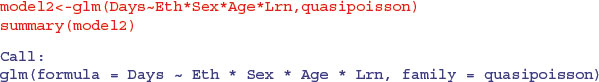
model1<-glm(Days∼Eth*Sex*Age*Lrn,poisson)

summary(model1)
(Dispersion parameter for poisson family taken to be 1)


	Null deviance: 2073.5 on 145 degrees of freedom

Residual deviance: 1173.9 on 118 degrees of freedom

AIC: 1818.4
Next, we check the residual deviance to see if there is overdispersion. Recall that the residual deviance should be equal to the residual degrees of freedom if the Poisson errors assumption is appropriate. Here it is 1173.9 on 118 d.f., indicating overdispersion by a factor of roughly 10. This is much too big to ignore, so before embarking on model simplification we try a different approach, using quasi-Poisson errors to account for the overdispersion:
Notice that certain interactions are aliased (shown by rows with NA). These have not been estimated because of missing factor-level combinations, as indicated by the zeros in the following table:

Most of this occurs because slow learners never get into Form 3.
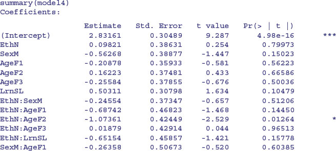
Unfortunately, Akaike's information citerion is not defined for this model, so we cannot automate the simplification using step or stepAIC. We need to do the model simplification longhand, therefore, remembering to do F tests (not chi-squared) because of the overdispersion. Here is the last step of the simplification before obtaining the minimal adequate model. Do we need the age by learning interaction?

No, we do not. So here is the minimal adequate model with quasi-Poisson errors:
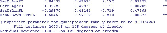
There is a very significant three-way interaction between ethnic origin, sex and learning difficulty; non-Aboriginal slow-learning boys were more likely to be absent than non-Aboriginal boys without learning difficulties.
ftable(tapply(Days,list(Eth,Sex,Lrn),mean))
	AL		SL

A F 14.47368	27.36842

 M 22.28571	20.20000

N F 13.14286	7.00000

 M 13.36364	17.00000
Note, however, that among the pupils without learning difficulties it is the Aboriginal boys who miss the most days, and it is Aboriginal girls with learning difficulties who have the highest rate of absenteeism overall.
14.6 Negative binomial errors
Instead of using quasi-Poisson errors (as above) we could use a negative binomial model. This is in the MASS library and involves the function glm.nb. The modelling proceeds in exactly the same way as with a typical GLM:
model.nb1<-glm.nb(Days∼Eth*Sex*Age*Lrn)

summary(model.nb1,cor=F)
Call:

glm.nb(formula = Days ∼ Eth * Sex * Age * Lrn,

	init.theta = 1.92836014510701, link = log)

(Dispersion parameter for Negative Binomial(1.9284) family taken to be 1)

 Null deviance: 	 272.29 on 145 degrees of freedom

Residual deviance: 	 167.45 on 118 degrees of freedom

AIC: 1097.3

		Theta: 1.928

	Std. Err.: 0.269

 2 x log-likelihood: -1039.324
The output is slightly different than for a conventional GLM: you see the estimated negative binomial parameter (here called Theta, but known to us as k, and equal to 1.928) and its approximate standard error (0.269) and 2 times the log-likelihood (contrast this with the residual deviance from our quasi-Poisson model, which was 1301.1; see above). Note that the residual deviance in the negative binomial model (167.45) is not 2 times the log-likelihood.
An advantage of the negative binomial model over the quasi-Poisson is that we can automate the model simplification with stepAIC:
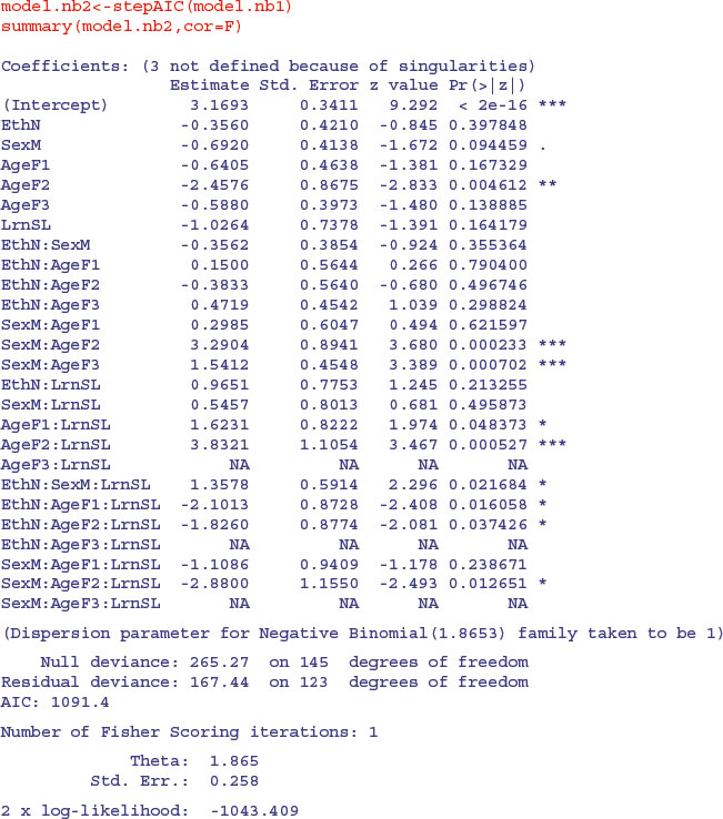
We take up the model simplification where AIC leaves off:
model.nb3<-update(model.nb2,∼. - Sex:Age:Lrn)

anova(model.nb3,model.nb2)
Likelihood ratio tests of Negative Binomial Models
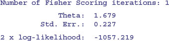
	theta Resid. df		2 x log-lik.	Test	df LR stat.		Pr(Chi)

1 1.789507	125		-1049.111

2 1.865343	123		-1043.409 1 vs 2	2 5.701942 0.05778817
Because we are so ruthless, the marginally significant sex by age by learning interaction does not survive a deletion test (p = 0.058), nor do ethnic origin by age by learning (p = 0.115) nor age by learning (p = 0.150):
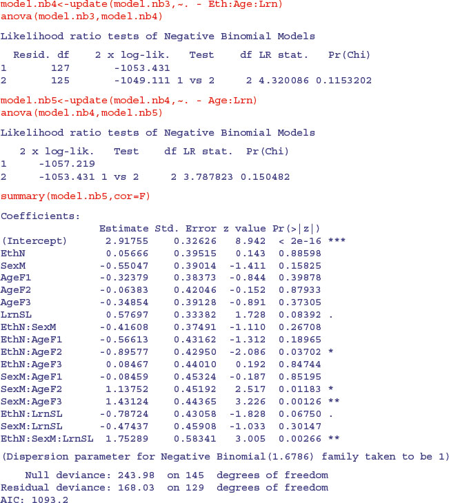
The minimal adequate model, therefore, contains exactly the same terms as we obtained with quasi-Poisson, but the significance levels are higher (e.g. the three-way interaction has p = 0.002 66 compared with p = 0.005 73). We need to plot the model to check assumptions:
plot(model.nb5)
The variance is well behaved and the residuals are close to normally distributed. The combination of low p values and the ability to use stepAIC makes glm.nb a very useful modelling function for count data such as these.