Chapter 15
Count Data in Tables
The analysis of count data with categorical explanatory variables comes under the heading of contingency tables. The general method of analysis for contingency tables involves log-linear modelling, but the simplest contingency tables are often analysed by Pearson's chi-squared, Fisher's exact test or tests of binomial proportions (see p. 365).
15.1 A two-class table of counts
You count 47 animals and find that 29 of them are males and 18 are females. Are these data sufficiently male-biased to reject the null hypothesis of an even sex ratio? With an even sex ratio the expected number of males and females is 47/2 = 23.5. The simplest test is Pearson's chi-squared in which we calculate
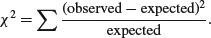
Substituting our observed and expected values, we get
This is less than the critical value for chi-squared with 1 degree of freedom (3.841), so we conclude that the sex ratio is not significantly different from 50:50. There is a built-in function for this:
observed <- c(29,18)

chisq.test(observed)
	Chi-squared test for given probabilities

data: observed

X-squared = 2.5745, df = 1, p-value = 0.1086
which indicates that a sex ratio of this size or more extreme than this would arise by chance alone about 10% of the time (p = 0.1086). Alternatively, you could carry out a binomial test:
binom.test(observed)
	Exact binomial test

data: observed

number of successes = 29, number of trials = 47, p-value = 0.1439

alternative hypothesis: true probability of success is not equal to 0.5

95 percent confidence interval:

0.4637994 0.7549318

sample estimates:

probability of success

	0.6170213
You can see that the 95% confidence interval for the proportion of males (0.46, 0.75) contains 0.5, so there is no evidence against a 50:50 sex ratio in these data. The p value is slightly different than it was in the chi-squared test, but the interpretation is exactly the same.
15.2 Sample size for count data
How many samples do you need before you have any chance of detecting a significant departure from equality? Suppose you are studying sex ratios in families. How many female children would you need to discover in a family with no males before you could conclude that a father's sex-determining chromosomes were behaving oddly? What about five females and no males? This is not significant because it can occur by chance when p = 0.5 with probability 2 × 0.55 = 0.0625 (note that this is a two-tailed test). The smallest sample that gives significance is a family of six children, all of one sex: 2 × 0.56 = 0.031 25. How big would the sample need to be to reject the null hypothesis if one of the children was of the opposite sex? One out of seven is no good, as is one out of eight. You need a sample of at least nine children before you can reject the hypothesis that p = 0.5 when one of the children is of the opposite sex. Here is that calculation using the binom.test function:
binom.test(1,9)
	Exact binomial test

data: 1 and 9

number of successes = 1, number of trials = 9, p-value = 0.03906

alternative hypothesis: true probability of success is not equal to 0.5

95 percent confidence interval:

0.002809137 0.482496515

sample estimates:

probability of success

	0.1111111
15.3 A four-class table of counts
Mendel's famous peas produced 315 yellow round phenotypes, 101 yellow wrinkled, 108 green round and 32 green wrinkled offspring (a total of 556):
observed <- c(315,101,108,32)
The question is whether these data depart significantly from the 9:3:3:1 expectation that would arise if there were two independent 3:1 segregations (with round seeds dominating wrinkled, and yellow seeds dominating green).
Because the null hypothesis is not a 25:25:25:25 distribution across the four categories, we need to calculate the expected frequencies explicitly:
(expected <- 556*c(9,3,3,1)/16)
312.75 104.25 104.25 34.75
The expected frequencies are very close to the observed frequencies in Mendel's experiment, but we need to quantify the difference between them and ask how likely such a difference is to arise by chance alone:
chisq.test(observed,p=c(9,3,3,1),rescale.p=TRUE)
 	Chi-squared test for given probabilities

data: observed

X-squared = 0.47, df = 3, p-value = 0.9254
Note the use of different probabilities for the four phenotypes: p=c(9,3,3,1). Because these values do not sum to 1.0, we require the extra argument rescale.p=TRUE. A difference as big as or bigger than the one observed will arise by chance alone in more than 92% of cases and is clearly not statistically significant. The Pearson's chi-squared value is
sum((observed-expected)^2/expected)
[1] 0.470024
and the p-value comes from the right-hand tail of the cumulative probability function of the chi-squared distribution 1-pchisq with 3 degrees of freedom (4 comparisons minus 1 for contingency; the total count must be 556)
1-pchisq(0.470024,3)
[1] 0.9254259
exactly as we obtained using the built-in chisq.test function, above.
15.4 Two-by-two contingency tables
Count data are often classified by more than one categorical explanatory variable. When there are two explanatory variables and both have just two levels, we have the famous 2 × 2 contingency table (see p. 365). We can return to the example of Mendel's peas. We need to convert the vector of observed counts into a matrix with two rows:
observed <- matrix(observed,nrow=2)

observed
	[,1]	[,2]

[1,]	315	108

[2,]	101	32
Fisher's exact test (p. 371) can take such a matrix as its sole argument:
fisher.test(observed)
	Fisher's Exact Test for Count Data

data: observed

p-value = 0.819

alternative hypothesis: true odds ratio is not equal to 1

95 percent confidence interval:

0.5667874 1.4806148

sample estimates:

odds ratio

0.9242126
Alternatively we can use Pearson's chi-squared test with Yates' continuity correction:
chisq.test(observed)
	Pearson's Chi-squared test with Yates' continuity correction

data: observed

X-squared = 0.0513, df = 1, p-value = 0.8208
Again, the p-values are different with different tests, but the interpretation is the same: these pea plants behave in accordance with Mendel's predictions of two independent traits, coat colour and seed shape, each segregating 3:1.
15.5 Using log-linear models for simple contingency tables
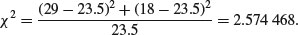
It is worth repeating these simple examples with a log-linear model so that when we analyse more complex cases you have a feel for what the GLM is doing. Recall that the deviance for a log-linear model of count data (p. 562) is
where O is a vector of observed counts and E is a vector of expected counts. Our first example had 29 males and 18 females and we wanted to know if the sex ratio was significantly male-biased:
observed <- c(29,18)

summary(glm(observed∼1,poisson))
Coefficients:

		Estimate Std. Error z value Pr(>|z|)

(Intercept)	3.1570	0.1459	21.64	<2e-16 ***

(Dispersion parameter for poisson family taken to be 1)

	Null deviance:	2.5985 on 1 degrees of freedom

Residual deviance:		2.5985 on 1 degrees of freedom

AIC: 14.547
Only the bottom part of the summary table is informative in this case. The residual deviance is compared to the critical value of chi-squared in tables with 1 d.f.:
1-pchisq(2.5985,1)
[1] 0.1069649
We accept the null hypothesis that the sex ratio is 50:50 (p = 0.106 96).
In the case of Mendel's peas we had a four-level categorical variable (i.e. four phenotypes) and the null hypothesis was a 9:3:3:1 distribution of traits:
observed <- c(315,101,108,32)
We need vectors of length 4 for the two seed traits, shape and colour:
shape <- factor(c("round","round","wrinkled","wrinkled"))

colour <- factor(c("yellow","green","yellow","green"))
Now we fit a saturated model (model1) and a model without the interaction term (model2) and compare the two models using anova with a chi-squared test:

There is no interaction between seed colour and seed shape (p = 0.732 15) so we conclude that the two traits are independent and the phenotypes are distributed 9:3:3:1 as predicted. The p value is slightly different because the ratios of the two dominant traits are not exactly 3:1 in the data: round to wrinkled is exp(1.089 04) = 2.971 42 and yellow to green is exp(1.157 02) = 3.180 441:

To summarize, the log-linear model involves fitting a saturated model with zero residual deviance (a parameter is estimated for every row of the dataframe) and then simplifying the model by removing the highest-order interaction term. The increase in deviance gives the chi-squared value for testing the hypothesis of independence. The minimal model must contain all the nuisance variables necessary to constrain the marginal totals (i.e. main effects for shape and colour in this example), as explained on p. 604.
15.6 The danger of contingency tables
We have already dealt with simple contingency tables and their analysis using Fisher's exact test or Pearson's chi-squared (see p. 365). But there is an important further issue to be dealt with. In observational studies we quantify only a limited number of explanatory variables. It is inevitable that we shall fail to measure a number of factors that have an important influence on the behaviour of the system in question. That's life, and given that we make every effort to note the important factors, there is little we can do about it. The problem comes when we ignore factors that have an important influence on the response variable. This difficulty can be particularly acute if we aggregate data over important explanatory variables. An example should make this clear.
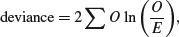
Suppose we are carrying out a study of induced defences in trees. A preliminary trial has suggested that early feeding on a leaf by aphids may cause chemical changes in the leaf which reduce the probability of that leaf being attacked later in the season by hole-making insects. To this end we mark a large cohort of leaves, then score whether they were infested by aphids early in the season and whether they were holed by insects later in the year. The work was carried out on two different trees and the results were as follows:
There are four variables: the response variable, count, with eight values (in columns 3 and 4, with row totals in column 5), a two-level factor for late season feeding by caterpillars (holed or intact), a two-level factor for early season aphid feeding (aphids present or absent) and a two-level factor for tree (the observations come from two separate trees, imaginatively named tree 1 and tree 2).
induced <- read.table("C:\\temp\\induced.txt",header=T)

attach(induced)

names(induced)
[1]"Tree" "Aphid" "Caterpillar" "Count"
We begin by fitting what is known as a saturated model. This is a curious thing, which has as many parameters as there are values of the response variable. The fit of the model is perfect, so there are no residual degrees of freedom and no residual deviance. The reason why we fit a saturated model is that it is always the best place to start modelling complex contingency tables. If we fit the saturated model, then there is no risk that we inadvertently leave out important interactions between the so-called ‘nuisance variables’. These are the parameters that need to be in the model to ensure that the marginal totals (the row and column totals, for instance) are properly constrained.
model <- glm(Count∼Tree*Aphid*Caterpillar,family=poisson)
The asterisk notation ensures that the saturated model is fitted, because all of the main effects and two-way interactions are fitted, along with the three-way Tree by Aphid by Caterpillar interaction. The model fit involves the estimation of 2 × 2 × 2 = 8 parameters, and exactly matches the eight values of the response variable, Count. Looking at the saturated model in any detail serves no purpose, because the reams of information it contains are all superfluous.
The first real step in the modelling is to use update to remove the three-way interaction from the saturated model, and then to use anova to test whether the three-way interaction is significant or not:
model2 <- update(model, ∼ . - Tree:Aphid:Caterpillar)
The punctuation here is very important (it is ‘comma, tilde, dot, minus’), and note the use of colons rather than asterisks to denote interaction terms rather than main effects plus interaction terms. Now we can see whether the three-way interaction was significant by specifying test="Chi" like this:
anova(model,model2,test="Chi")
Analysis of Deviance Table


Model 1: Count ∼ Tree * Aphid * Caterpillar

Model 2: Count ∼ Tree + Aphid + Caterpillar + Tree:Aphid +

 	Tree:Caterpillar + Aphid:Caterpillar

 	Resid. Df Resid. Dev Df		Deviance Pr(>Chi)

1		0 0.00000000

2		1 0.00079137 -1 -0.00079137		0.9776
This shows very clearly that the interaction between caterpillar attack and leaf holing does not differ from tree to tree (p = 0.977 56). Note that if this interaction had been significant, then we would have stopped the modelling at this stage. But it was not, so we leave it out and continue.
What about the main question? Is there an interaction between aphid attack and leaf holing? To test this we delete the Caterpillar by Aphid interaction from the model, and assess the results using anova:
model3 <- update(model2, ∼ . - Aphid:Caterpillar)

anova(model3,model2,test="Chi")
Analysis of Deviance Table


Model 1: Count ∼ Tree + Aphid + Caterpillar + Tree:Aphid + Tree:Caterpillar

Model 2: Count ∼ Tree + Aphid + Caterpillar + Tree:Aphid + Tree:Caterpillar +

 	Aphid:Caterpillar

 Resid. Df Resid. Dev Df Deviance Pr(>Chi)

1	2 0.0040853

2	1 0.0007914 1 0.003294 0.9542
There is absolutely no hint of an interaction (p = 0.954). The interpretation is clear: this work provides no evidence at all for induced defences caused by early season caterpillar feeding.
But look what happens when we do the modelling the wrong way. Suppose we went straight for the interaction of interest, Aphid by Caterpillar. We might proceed like this:
wrong <- glm(Count∼Aphid*Caterpillar,family=poisson)

wrong1 <- update (wrong,∼. - Aphid:Caterpillar)

anova(wrong,wrong1,test="Chi")
Analysis of Deviance Table


Model 1: Count ∼ Aphid * Caterpillar

Model 2: Count ∼ Aphid + Caterpillar

	Resid. Df Resid. Dev Df Deviance Pr(>Chi)

1		4 550.19

2		5 556.85	-1 -6.6594 0.009864 **
The Aphid by Caterpillar interaction is highly significant (p = 0.01), providing strong evidence for induced defences. This is wrong! By failing to include Tree in the model we have omitted an important explanatory variable. As it turns out, and as we should really have determined by more thorough preliminary analysis, the trees differ enormously in their average levels of leaf holing:
as.vector(tapply(Count,list(Caterpillar,Tree),sum))[1]/tapply(Count,Tree,sum) [1]
	Tree1

0.01963439
as.vector(tapply(Count,list(Caterpillar,Tree),sum))[3]/tapply(Count,Tree,sum) [2]
	Tree2

0.08182241
Tree2 has more than four times the proportion of its leaves holed by caterpillars. If we had been paying more attention when we did the modelling the wrong way, we should have noticed that the model containing only Aphid and Caterpillar had massive overdispersion, and this should have alerted us that all was not well.
The moral is simple and clear. Always fit a saturated model first, containing all the variables of interest and all the interactions involving the nuisance variables (Tree in this case). Only delete from the model those interactions that involve the variables of interest (Aphid and Caterpillar in this case). Main effects are meaningless in contingency tables (they do nothing more than constrain the marginal totals), as are the model summaries. Always test for overdispersion. It will never be a problem if you follow the advice of simplifying down from a saturated model, because you only ever leave out non-significant terms, and you never delete terms involving any of the nuisance variables.
15.7 Quasi-Poisson and negative binomial models compared
The data on red blood cell counts are read from a file:
data <- read.table("c:\\temp\\bloodcells.txt",header=T)

attach(data)

names(data)
[1]"count"
Now we need to create a vector for gender containing 5000 repeats of ‘female’ and then 5000 repeats of ‘male’:
gender <- factor(rep(c("female","male"),c(5000,5000)))
The idea is to test the significance of the difference in mean cell counts for the two genders, which is slightly higher in males than in females:
tapply(count,gender,mean)
female		male

1.1986		1.2408
We begin with the simplest log-linear model – a GLM with Poisson errors:
model <- glm (count∼gender,poisson)

summary(model)
You should check for overdispersion before drawing any conclusions about the significance of the gender effect. It turns out that there is substantial overdispersion (scale parameter = 23 154/9998 = 2.315 863), so we repeat the modelling using quasi-Poisson errors instead:
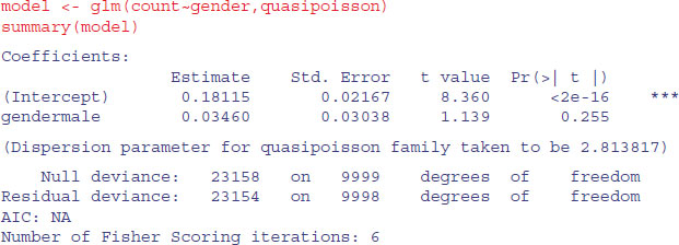
As you see, the gender effect falls well short of significance (p = 0.255).
Alternatively, you could use a GLM with negative binomial errors. The function is in the MASS library:

You would come to the same conclusion, although the p value is slightly different (p = 0.256).
15.8 A contingency table of intermediate complexity
We start with a three-dimensional table of count data from college records. It is a contingency table with two levels of year (freshman and sophomore), two levels of discipline (arts and science), and two levels of gender (male and female):
numbers <- c(24,30,29,41,14,31,36,35)
The statistical question is whether the relationship between gender and discipline varies between freshmen and sophomores (i.e. we want to know the significance of the three-way interaction between year, discipline and gender).
The first task is to define the dimensions of numbers using the dim function:
dim(numbers) <- c(2,2,2)

numbers
, , 1

	[,1]	[,2]

[1,]	24	29

[2,]	30	41

, , 2

 	[,1]	[,2]

 [1,]	14	36

 [2,]	31	35
The top table refers to the males [,,1] and the bottom table to the females [,,2]. Within each table, the rows are the year groups and the columns are the disciplines. It would make the table much easier to understand if we provided these dimensions with names using the dimnames function:
dimnames(numbers)[[3]] <- list("male", "female")

dimnames(numbers)[[2]] <- list("arts", "science")

dimnames(numbers)[[1]] <- list("freshman", "sophomore")
To see this as a flat table, use the ftable function like this:
ftable(numbers)
			male	female

freshman	arts		24	14

	science		29	36

sophomore	arts		30	31

	science		41	35
The thing to understand is that the dimnames are the factor levels (e.g. male or female), not the names of the factors (e.g. gender).
We convert this table into a dataframe using the as.data.frame.table function. This saves us from having to create separate vectors to describe the levels of gender, year and discipline associated with each count:
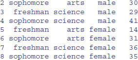
You can see that R has generated reasonably sensible variable names for the four columns, but we want to use our own names:
Now we can do the statistical modelling. The response variable is count, and we begin by fitting a saturated model with eight estimated parameters (i.e. the model generates the observed counts exactly, so the deviance is zero and there are no degrees of freedom):
attach(frame)

model1 <- glm(count∼year*discipline*gender,poisson)
We test for the significance of the year by discipline by gender interaction by deleting the year by discipline by gender interaction from model1 to make model2 using update:
model2 <- update(model1,∼. - year:discipline:gender)
then comparing model1 and model2 using anova with a chi-squared test:

The interaction is not significant (p = 0.079), indicating similar gender by discipline relationships in the two year groups. We finish the analysis at this point because we have answered the question that we were asked to address.
15.9 Schoener's lizards: A complex contingency table
In this section we are interested in whether lizards show any niche separation across various ecological factors and, in particular, whether there are any interactions – for example, whether they show different habitat separation at different times of day:
lizards <- read.table("c:\\temp\\lizards.txt",header=T)

attach(lizards)

names(lizards)
[1]"n" "sun" "height" "perch" "time" "species"
The response variable is n, the count for each contingency. The explanatory variables are all categorical: sun is a two-level factor (Sun and Shade within the bush), height is a two-level factor (High and Low within the bush), perch is a two-level factor (Broad and Narrow twigs), time is a three-level factor (Afternoon, Mid.day and Morning), and there are two lizard species both belonging to the genus Anolis (A. grahamii and A. opalinus). As usual, we begin by fitting a saturated model, fitting all the interactions and main effects:
model1 <- glm(n∼sun*height*perch*time*species,poisson)
Model simplification begins with removal of the highest-order interaction effect: the sun by height by perch by time by species interaction:
model2 <- update(model1, ∼.- sun:height:perch:time:species)

anova(model1,model2,test="Chi")
Analysis of Deviance Table


  Resid. Df Resid. Dev Df Deviance Pr(>Chi)

1	0 3.3472e-10

2	2 2.1807e-10 -2 1.1665e-10
When the change in deviance is so close to zero, R does not print a p value. Also, you need to ignore the warning messages in the early stages of model simplification with complex contingency tables. It is a considerable relief that this interaction is not significant (imagine trying to explain what it meant in the Discussion section of your paper). The key point to understand in this kind of analysis is that the only interesting terms are interactions involving species. All of the other interactions and main effects are nuisance variables that have to be retained in the model to constrain the marginal totals (see p. 368 for an explanation of what this means).
There are four four-way interactions of interest – species by sun by height by perch, species by sun by height by time, species by sun by perch by time, and species by height by perch by time – and we should test their significance by deleting them from model2 which contains all of the four-way interactions. Here goes:
model3 <- update(model2, ∼.-sun:height:perch:species)

anova(model2,model3,test="Chi")
Analysis of Deviance Table


  Resid. Df Resid. Dev Df Deviance Pr(>Chi)

1	2 0.0000

2	3 2.7088	-1 -2.7088	0.0998 .
Close, but not significant (p = 0.0998). As ever, we are ruthless, so we shall leave it out.
model4 <- update(model2, ∼.-sun:height:time:species)

anova(model2,model4,test="Chi")
Analysis of Deviance Table


 Resid. Df Resid. Dev Df Deviance Pr(>Chi)

1	2 0.00000

2	4 0.44164 -2 -0.44164 0.8019
Nothing at all (p = 0.802).
model5 <- update(model2, ∼.-sun:perch:time:species)

anova(model2,model5,test="Chi")
Analysis of Deviance Table


 Resid. Df Resid. Dev Df Deviance Pr(>Chi)

1	2 0.00000

2	4 0.81008 -2 -0.81008	0.667
Again, nothing there (p = 0.667). Finally:
model6 <- update(model2, ∼.-height:perch:time:species)

anova(model2,model6,test="Chi")
Analysis of Deviance Table


 Resid. Df Resid. Dev Df Deviance Pr(>Chi)

1	2 0.0000

2	4 3.2217 -2 -3.2217		0.1997
This means that none of the four-way interactions involving species need be retained.
Now we have to assess all six of the three-way interactions involving species: species by height by perch, species by height by time, species by perch by time, species by sun by height, species by sun by time, and species by sun by perch. Can we speed this up by using automatic deletion? Yes and no. Yes, we can use step, to remove terms assessed by AIC to be non-significant (p. 547). No, unless we are very careful. We must not allow step to remove any interactions that do not involve species (because these are the essential nuisance variables). We do this with the lower argument:
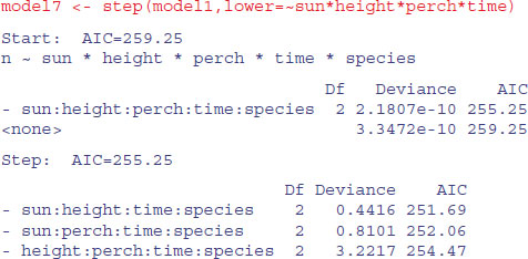
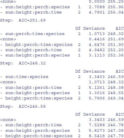
You can see that step has been very forgiving, and has left two of the four-way interactions involving species in the model. What we can do next is to take out all of the four-way interactions and start step off again with this simpler starting point. We want to start at the lower model plus all the three-way interactions involving species with sun, height, perch and time:

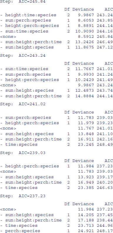
Again, we need to be harsh and to test whether these terms really to deserve to stay in model9. The most complex term is the interaction sun by height by perch by time, but we do not want to remove this because it is a nuisance variable (the interaction does not involve species). We should start by removing sun by height by species:
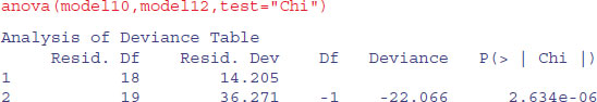
model10 <- update(model9, ∼.-sun:height:species)

anova(model9,model10,test="Chi")
Analysis of Deviance Table


 Resid. Df Resid. Dev Df Deviance Pr(>Chi)

1	17 11.984

2	18 14.205 -1 -2.2203	0.1362
This interaction is not significant, so we leave it out. Our model10 contains no three- or four-way interactions involving species.
Let us try deleting the two-way interactions in turn from model10:
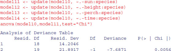
We need to retain a main effect for sun (p = 0.0056).
We need to retain a main effect for height (p < 0.0001).
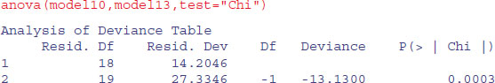
We need to retain a main effect for perch (p = 0.0003).
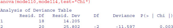
We need to retain a main effect for time of day (p = 0.003).
To see where we are, we should produce a summary table of the counts:

The modelling has indicated that species differ in their responses to all four explanatory variables, but that there are no interactions between the factors. The only remaining question for model simplification is whether we need to keep all three levels for time of day, or whether two levels would do just as well (we lump together Mid.day and Morning):

That simplification was justified, so we keep time in the model but as a two-level factor.
That was hard, I think you will agree. You need to be extremely well organized to do this sort of analysis without making any mistakes. A high degree of serenity is required throughout. What makes it difficult is keeping track of the interactions that are in the model and those that have been excluded, and making absolutely sure that no nuisance variables have been omitted unintentionally. It turns out that life can be made much more straightforward if the analysis can be reformulated as an exercise in proportions rather than counts, because if it can, then all of the problems with nuisance variables disappear. On p. 643 the example is reanalysed with the response variable as a proportion in a GLM with binomial errors. This is possible because we have just two species, so we can reformulate the response as the proportion of all lizards that are A. opalinus. This is a big advantage because it does away with the need to retain any of the nuisance variables.
15.10 Plot methods for contingency tables
The departures from expectations of the observed frequencies in a contingency table can be regarded as  . The R function called assocplot produces a Cohen–Friendly association plot indicating deviations from independence of rows and columns in a two-dimensional contingency table.
Here are data on hair colour and eye colour:
data(HairEyeColor)

(x <- margin.table(HairEyeColor, c(1, 2)) )
 Eye

Hair	Brown	Blue	Hazel	Green

 Black	68	20	15	5

 Brown	119	84	54	29

 Red	26	17	14	14

 Blond	7	94	10	16
assocplot(x, main = "Relation between hair and eye color")
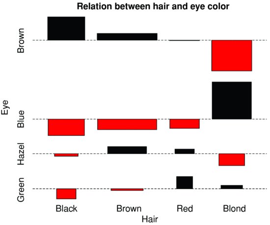
The plot shows the excess (black bars) of people with black hair who have brown eyes, the excess of people with blond hair who have blue eyes, and the excess of redheads who have green eyes. The red bars show categories where fewer people were observed than expected under the null hypothesis of independence of hair colour and eye colour.
Here are the same data plotted as a mosaic plot:
mosaicplot(HairEyeColor, shade = TRUE)
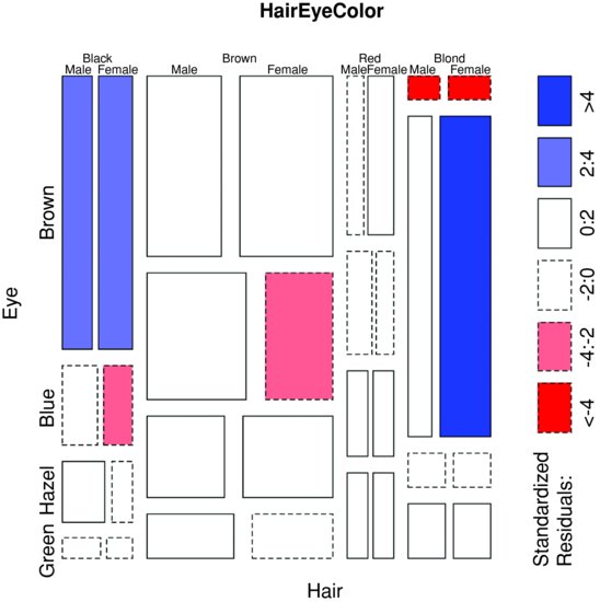
The plot indicates that there are significantly more blue-eyed blond females than expected in the case of independence, and too few brown-eyed blond females. Extended mosaic displays show the standardized residuals of a log-linear model of the counts by the colour and outline of the mosaic's tiles. Negative residuals are drawn in shades of red and with broken outlines, while positive residuals are drawn in shades of blue with solid outlines.
Where there are multiple 2 × 2 tables (dataframes with three or more categorical explanatory variables), then fourfoldplot might be useful. It allows a visual inspection of the association between two dichotomous variables in one or several populations (known as strata).
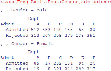
A classic example of contingency table data comes built in with R: UCBAdmissions describes the admissions policy of different departments at the University of California at Berkeley in relation to gender:
data(UCBAdmissions)

head(UCBAdmissions)
[1] 512 313 89 19 353 207
str(UCBAdmissions)
table [1:2, 1:2, 1:6] 512 313 89 19 353 207 17 8 120 205 . . .

- attr(*, "dimnames")=List of 3

 ..$ Admit : chr [1:2] "Admitted" "Rejected"

 ..$ Gender: chr [1:2] "Male" "Female"

 ..$ Dept : chr [1:6] "A" "B" "C" "D" . . .

You see that the object is a table with three dimensions: two levels of status, two levels of gender and six departments. Here are the college admissions data plotted for each department separately:

fourfoldplot(x, margin = 2)
You will need to compare the graphs with the frequency table (above) to see what is going on. The central questions are whether the rejection rate for females is different from the rejection rate for males, and whether any such difference varies from department to department. The log-linear model suggests that the difference does vary with department (p = 0.0011; see below). That Department B attracted a smaller number of female applicants is very obvious. What is less clear (but in many ways more interesting) is that they rejected proportionally fewer of the female applicants (32%) than the male applicants (37%). You may find these plots helpful, but I must admit that I do not.
Here we use gl to generate factor levels for department, sex and admission, then fit a saturated contingency table model for the counts, x. We then use anova with test="Chi" to assess the significance of the three-way interaction:
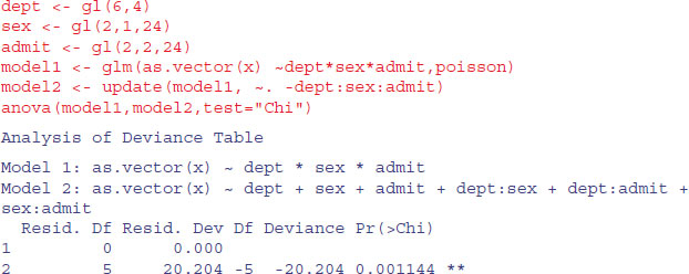
The interaction is highly significant, indicating that the admission rates of the two sexes differ substantially from department to department. There are five degrees of freedom for the interaction: (departments – 1) × (genders – 1). The remaining parameters are nuisance variables of no interest in this analysis.
Another way to do the same test is to turn the three-dimensional contingency table into a dataframe:


There is a useful function called xtabs (‘cross tabulations’) which creates a contingency table from cross-classifying factors using a formula interface (it has the added advantage of allowing you to specify the name of the dataframe with which to work). Here are the total numbers of applicants by gender and department:
xtabs(Freq∼Gender+Dept,admissions)
 Dept

Gender		A	B	C	D	E	F

 Male		825	560	325	417	191	373

 Female		108	25	593	375	393	341
Notice that the proportion of female applicants was very low in some departments (e.g. A and B) but high in others (e.g. Department E had a female-biased application rate).
The formula interface allows the dot ‘.’ convention, which means ‘fit all the explanatory variables’; i.e. everything else in the dataframe except the response. The summary option with xtabs calculates the total number of applications, and tests for independence:
summary(xtabs(Freq ∼ ., admissions))
Call: xtabs(formula = Freq ∼ ., data = admissions)

Number of cases in table: 4526

Number of factors: 3

Test for independence of all factors:

 	Chisq = 2000.3, df = 16, p-value = 0
Clearly there is a highly significant difference in the proportion of female applicants admitted across the different departments.
To turn the counts into proportions we can extract parts of the summary tables produced by xtabs, using subscripts. We start by calculating the total numbers of female applicants to each department:
Because this table is three-dimensional, we need to specify three subscripts separated by two commas. We want the column totals (colSums) from the lower half of the table (i.e. only for the females), for which the appropriate index is [,,2]:
females <- colSums(xtabs(Freq∼Admit+Dept+Gender,admissions)[,,2])

females
 A	B	C	D	E	F

108	25	593	375	393	341
Now we want to extract the numbers of females admitted to each department, which is the top row [1,] of the lower half-table [,,2]:
admitted.females <- xtabs(Freq∼Admit+Dept+Gender,admissions)[,,2][1,]
The proportion of female applicants admitted by departments is then simply:
(female.success <- admitted.females/females)
	A	B	C	D	E	F

 0.82407407 0.68000000 0.34064081 0.34933333 0.23918575 0.07038123
It is no wonder that the interaction term was so significant (p = 0.001 144): the success rate varies from a low of 7% in Department F to a high of 82% in Department A.
15.11 Graphics for count data: Spine plots and spinograms
Here is an illustration of what a spine plot does. Suppose you have three treatments (placebo, drug A and drug B) and the response variable is a five-level categorical variable (much worse, worse, no change, better, much better). The data, one row per patient, consist of their current condition and the treatment they were given:
data <- read.table("c:\\temp\\spino.txt",header=T)

attach(data)

head(data)
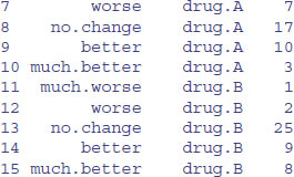
 condition		treatment

1 no.change	drug.A

2 better		drug.B

3 better		drug.B

4 no.change	placebo

5 no.change	drug.B

6 no.change	drug.B
The plot will be easier to interpret if we specify the order of the factor levels (they would be in alphabetic order by default):
condition<-factor(condition,c("much.worse","worse","no.change","better","much.better"))

treatment<-factor(treatment,c("placebo","drug.A","drug.B"))
Now we can use spineplot (either in (x, y) format or in (y ∼ x) format) like this:
spineplot(condition∼treatment)

There are two things to notice about the spine plot. The grey-scale partitions within the bars are the proportions of a given treatment in each of the five conditions, i.e. the conditional relative frequencies of y in every x group (these are labelled on the left axis and quantified on the right axis). Where a category is empty (as in the ‘much worse’ level with drug A) the labels on the left can be confusing. The widths of the bars reflect the total sample sizes (there were more patients getting drug B than the placebo). It looks like drug B is better than the placebo, but the efficacy of drug A is less clear. Here are the counts:
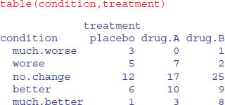
With so few patients showing changes in condition, we are going to struggle to find significant effects in this data set. To do the stats, we need to create a dataframe of these counts with matching columns, one to show the level of treatment and one to show the level of condition. The tool for this is as.data.frame.table:

You might have thought about using aggregate to do this, where the function we want to apply would be length (for instance, to count how many patients receiving the placebo got much worse; we can see from the table above that the answer is length=3 in this case)
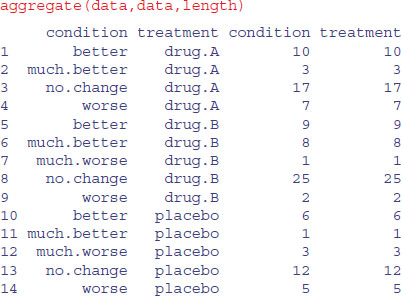
As you can see, the problem is that aggregate leaves out rows from the dataframe when there were zero cases (i.e. no patients receiving drug A got much worse), so there are only 14 rows in the dataframe, not the 15 we want for doing the statistics.
As usual, we start by fitting a saturated model, then remove the highest-order interaction:
new <- as.data.frame.table(table(condition,treatment))


model1 <- glm(Freq∼condition*treatment,poisson,data=new)

model2 <- glm(Freq∼condition+treatment,poisson,data=new)
Then we compare the two models using anova with a chi-squared test:
anova(model1,model2,test="Chi")
Analysis of Deviance Table

Model 1: Freq ∼ condition * treatment

Model 2: Freq ∼ condition + treatment

 Resid. Df Resid. Dev Df Deviance P(>|Chi|)

1	0 0.000

2	8 15.133 -8 -15.133 0.05661 .
As we suspected, given the low replication, there is no significant interaction between treatment and condition (p > 0.05; close, but not significant).
In a spinogram, the response is categorical but the explanatory variable is continuous. The following data show parasitism (a binary response, parasitized or not) as a function of host population density:

Apparently, the proportion of hosts parasitized increases as host density is increased. To visualize this, we use spineplot like this:
spineplot(fate∼density)

The trend of increasing parasitism with density is very clear. In these plots, the width of the sector indicates how many of the data fell in this range of population densities; there were equal numbers of hosts in the first two bins, but twice as many in the highest density category than in the category below, with a peak of just over 80% parasitized.
Alternatively, if you want a smooth curve you can use the conditional density plot cdplot like this:
cdplot(fate∼density)

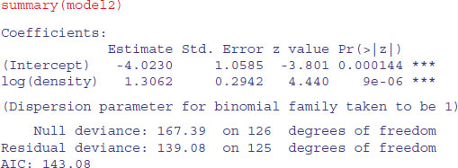
The trend is quantified using logistic regression like this:
model1<-glm(fate∼density,binomial)

model2<-glm(fate∼log(density),binomial)

AIC(model1,model2)
	df	AIC

model1	2	144.3978

model2	2	143.0790
We choose the log-transformed explanatory variable because this gives a lower AIC:
The data and the fitted regression line are plotted like this:
plot(as.numeric(fate)-1∼log(density),pch=16,ylab="parasitized")

xv<-seq(0,4.5,0.01)

yv<-1/(1+1/exp(-4.023+1.3062*xv))

lines(xv,yv)
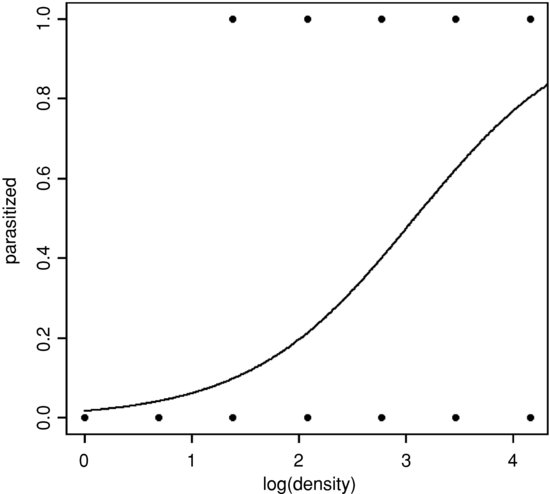
The spinogram is much better at illustrating the pattern in the data than are the non-jittered 0s and 1s of the binary response plot. The logistic plot is improved by overlaying the empirical frequencies, rather than by showing the raw data as 0s and 1s. We might choose four bins in an example like this, averaging the four lowest density classes, and using the counts data from the three highest classes (16, 32 and 64):
den <- c(3.75,16,32,64)

pd <- c(3/15,5/16,20/32,52/64)
Now redraw the axes leaving out the 0s and 1s (type="n") then add the logistic trend line and overlay the empirical frequencies as larger solid circles (cex=2):
plot(as.numeric(fate)-1∼log(density),pch=16,ylab="parasitized",type="n")

lines(xv,yv)

points(log(den),pd,pch=16,cex=2)
To add error bars (eb) to show plus and minus one standard error of the estimated proportion,  , we put the code to draw lines up and down from each point in a loop:
eb<-sqrt(pd*(1-pd)/den)

for (i in 1:4) lines(c(log(den)[i],log(den)[i]),c(pd[i]+eb[i],pd[i]-eb[i]))
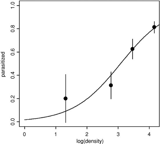
This has the virtue of illustrating the excellent fit of the model at high densities, but the rather poor fit at lower densities.