Chapter 16
Proportion Data
An important class of problems involves count data on proportions such as:
- studies on death rates,
- infection rates of diseases,
- answers to questionnaires,
- proportion responding to clinical treatment,
- proportion admitting to particular voting intentions,
- sex ratios, or
- data on proportional response to an experimental treatment.
What all these have in common is that we know how many of the experimental objects are in one category (dead, insolvent, male or infected) and we also know how many are in another (alive, solvent, female or uninfected). This contrasts with Poisson count data, where we knew how many times an event occurred, but not how many times it did not occur (p. 579).
We model processes involving proportional response variables in R by specifying a generalized linear model with family=binomial. The only complication is that whereas with Poisson errors we could simply specify family=poisson, with binomial errors we must give the number of failures as well as the numbers of successes in a two-vector response variable. To do this we bind together two vectors using cbind into a single object, y, comprising the numbers of successes and the number of failures. The binomial denominator, n, is the total sample, and
number.of.failures <- binomial.denominator - number.of.successes

y <- cbind(number.of.successes, number.of.failures)
The old fashioned way of modelling this sort of data was to use the percentage mortality as the response variable. There are four problems with this:
- The errors are not normally distributed.
- The variance is not constant.
- The response is bounded (by 1 above and by 0 below).
- By calculating the percentage, we lose information on the size of the sample, n, from which the proportion was estimated.
R carries out weighted regression, using the individual sample sizes as weights, and the logit link function to ensure linearity. There are some kinds of proportion data, such as percentage cover, which are best analysed using conventional linear models (assuming normal errors and constant variance) following arcsine transformation. The response variable, y, measured in radians, is  where p is percentage cover. If, however, the response variable takes the form of a percentage change in some continuous measurement (such as the percentage change in weight on receiving a particular diet), then rather than arcsine-transforming the data, it is usually better treated by either
- analysis of covariance (see p. 537), using final weight as the response variable and initial weight as a covariate, or
- by specifying the response variable as a relative growth rate, measured as log(final weight/initial weight),
both of which can be analysed as linear models with normal errors without further transformation.
16.1 Analyses of data on one and two proportions
For comparisons of one binomial proportion with a constant, use binom.test (see p. 600). For comparison of two samples of proportion data, use prop.test (see p. 365). The methods of this chapter are required only for more complex models of proportion data, including regression and contingency tables, where GLMs are used.
16.2 Count data on proportions
The traditional transformations of proportion data were arcsine and probit. The arcsine transformation took care of the error distribution, while the probit transformation was used to linearize the relationship between percentage mortality and log dose in a bioassay. There is nothing wrong with these transformations, and they are available within R, but a simpler approach is often preferable, and is likely to produce a model that is easier to interpret.
The major difficulty with modelling proportion data is that the responses are strictly bounded. There is no way that the percentage dying can be greater than 100% or less than 0%. But if we use simple techniques such as regression or analysis of covariance, then the fitted model could quite easily predict negative values or values greater than 100%, especially if the variance was high and many of the data were close to 0 or close to 100%.
The logistic curve is commonly used to describe data on proportions, because, unlike the straight-line model, it asymptotes at 0 and 1 so that negative proportions and responses of more than 100% cannot be predicted. Throughout this discussion we shall use p to describe the proportion of individuals observed to respond in a given way. Because much of their jargon was derived from the theory of gambling, statisticians call these successes, although to a demographer measuring death rates this may seem somewhat macabre. The proportion of individuals that respond in other ways (the statistician's failures) is therefore 1 – p, and we shall call this proportion q. The third variable is the size of the sample, n, from which p was estimated (this is the binomial denominator, and the statistician's number of attempts).
An important point about the binomial distribution is that the variance is not constant. In fact, the variance of a binomial distribution with mean np is

so that the variance changes with the mean like this:
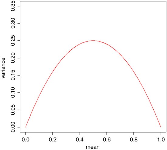
The variance is low when p is very high or very low, and the variance is greatest when p = q = 0.5. As p gets smaller, so the binomial distribution gets closer and closer to the Poisson distribution. You can see why this is so by considering the formula for the variance of the binomial (above). Remember that for the Poisson, the variance is equal to the mean: s2 = np. Now, as p gets smaller, so q gets closer and closer to 1, so the variance of the binomial converges to the mean:

16.3 Odds
The logistic model for p as a function of x is given by

and there are no prizes for realizing that the model is not linear. But if x = –∞ then p = 0, and if x = +∞ then p = 1, so the model is strictly bounded. If x = 0, then p = exp(a)/[1 + exp(a)]. The trick of linearizing the logistic model actually involves a very simple transformation. You may have come across the way in which bookmakers specify probabilities by quoting the odds against a particular horse winning a race (they might give odds of 2 to 1 on a reasonably good horse or 25 to 1 on an outsider). This is a rather different way of presenting information on probabilities than scientists are used to dealing with. Thus, where the scientist might state a proportion as 0.333 (one chance of winning in three), the bookmaker would give odds of 2 to 1 (based on the counts of outcomes: one success against two failures). In symbols, this is the difference between the scientist stating the probability p, and the bookmaker stating the odds p/q. Now if we take the odds p/q and substitute this into the formula for the logistic, we get
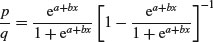
which looks awful. But a little algebra shows that
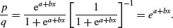
Taking natural logs and recalling that ln(ex) = x will simplify matters even further, so that
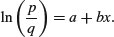
This gives a linear predictor, a + bx, not for p but for the logit transformation of p, namely ln(p/q). In the jargon of R, the logit is the link function relating the linear predictor to the value of p.
Here are p as a function of x (left panel) and logit(p) as a function of x (right panel) for the logistic model with a = 1 and b = 0.1:
You might ask at this stage: ‘why not simply do a linear regression of ln(p/q) against the explanatory x-variable?’ GLM with binomial errors has three great advantages here:
- It allows for the non-constant binomial variance.
- It deals with the fact that logits for ps near 0 or 1 are infinite.
- It allows for differences between the sample sizes by weighted regression.
16.4 Overdispersion and hypothesis testing
That the errors are binomially distributed is an assumption, not a fact. When we have overdispersion, this assumption is wrong and we need to deal with it.
All the different statistical procedures that we have met in earlier chapters can also be used with data on proportions. Factorial analysis of variance, multiple regression, and a variety of models in which different regression lines are fitted in each of several levels of one or more factors, can be carried out. The only difference is that we assess the significance of terms on the basis of chi-squared – the increase in scaled deviance that results from removal of the term from the current model.
The important point to bear in mind is that hypothesis testing with binomial errors is less clear-cut than with normal errors. While the chi-squared approximation for changes in scaled deviance is reasonable for large samples (i.e. larger than about 30), it is poorer with small samples. Most worrying is the fact that the degree to which the approximation is satisfactory is itself unknown. This means that considerable care must be exercised in the interpretation of tests of hypotheses on parameters, especially when the parameters are marginally significant or when they explain a very small fraction of the total deviance. With binomial or Poisson errors we cannot hope to provide exact p values for our tests of hypotheses.
When we have obtained the minimal adequate model, the residual scaled deviance should be roughly equal to the residual degrees of freedom. Overdispersion occurs when the residual deviance is larger than the residual degrees of freedom. There are two possibilities: either the model is misspecified, or the probability of success, p, is not constant within a given treatment level. The effect of randomly varying p is to increase the binomial variance from npq to
leading to a large residual deviance. This occurs even for models that would fit well if the random variation were correctly specified.
One simple solution is to assume that the variance is not npq but npqϕ, where ϕ is an unknown scale parameter (ϕ >1). We obtain an estimate of the scale parameter by dividing the Pearson chi-squared by the degrees of freedom, and use this estimate of ϕ to compare the resulting scaled deviances. To accomplish this, we use family=quasibinomial rather than family=binomial when there is overdispersion.
The most important points to emphasize in modelling with binomial errors are as follows:
- Create a two-column object for the response, using cbind to join together the two vectors containing the counts of success and failure.
- Check for overdispersion (residual deviance greater than the residual degrees of freedom), and correct for it by using family=quasibinomial rather than family=binomial if necessary.
- Remember that you do not obtain exact p values with binomial errors; the chi-squared approximations are sound for large samples, but small samples may present a problem.
- The fitted values are two sets of counts, like the response variable.
- The linear predictor is in logits (the log of the odds = ln(p/q)).
- You can back-transform from logits (z) to proportions (p) by p = 1/[1+1/exp(z)].
16.5 Applications
You can do as many kinds of modelling in a GLM as in a linear model. Here we show examples of:
- regression with binomial errors (continuous explanatory variables);
- analysis of deviance with binomial errors (categorical explanatory variables);
- analysis of covariance with binomial errors (both kinds of explanatory variables).
16.5.1 Logistic regression with binomial errors
This example concerns sex ratios in insects (the proportion of all individuals that are males). In the species in question, it has been observed that the sex ratio is highly variable, and an experiment was set up to see whether population density was involved in determining the fraction of males.
numbers <- read.table("c:\\temp\\sexratio.txt",header=T)

attach(numbers)

head(numbers)
	density females	males

1	1	1	0

2	4	3	1

3	10	7	3

4	22	18	4

5	55	22	33

6	121	41	80
It certainly looks as if there are proportionally more males at high density, but we should plot the data as proportions to see this more clearly:
windows(7,4)

par(mfrow=c(1,2))


p <- males/(males+females)


plot(density,p,ylab="Proportion male",pch=16,col="blue")

plot(log(density),p,ylab="Proportion male",pch=16,col="blue")
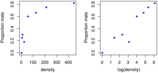
Evidently, a logarithmic transformation of the explanatory variable is likely to improve the model fit. We shall see in a moment.
The question is whether increasing population density leads to a significant increase in the proportion of males in the population – or, more briefly, whether the sex ratio is density-dependent. It certainly looks from the plot as if it is.
The response variable is a matched pair of counts that we wish to analyse as proportion data using a GLM with binomial errors. First, we use cbind to bind together the vectors of male and female counts into a single object that will be the response in our analysis:
y <- cbind(males,females)
This means that y will be interpreted in the model as the proportion of all individuals that were male. The model is specified like this:
model <- glm(y∼density,binomial)
This says that the object called model gets a generalized linear model in which y (the sex ratio) is modelled as a function of a single continuous explanatory variable (called density), using an error distribution from the binomial family. The output looks like this:
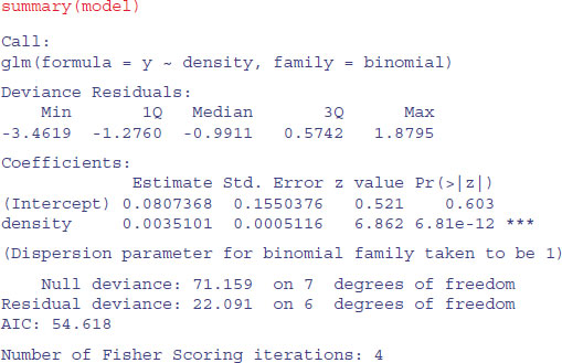
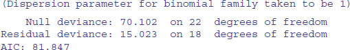
The model table looks just as it would for a straightforward regression. The first parameter in the Coefficients table is the intercept and the second is the slope of the graph of sex ratio against population density. The slope is highly significantly steeper than zero (proportionately more males at higher population density; p = 6.81 × 10⁻¹²), but there is substantial overdispersion (residual deviance = 22.091 is much greater than residual d.f. = 6) . We can see if log transformation of the explanatory variable improves this:
model2 <- glm(y∼log(density),binomial)

summary(model2)
Coefficients:

		Estimate Std. Error z value Pr(>|z|)

(Intercept)	-2.65927	0.48758	-5.454 4.92e-08 ***

log(density)	0.69410	0.09056	7.665 1.80e-14 ***


(Dispersion parameter for binomial family taken to be 1)


 Null deviance:	71.1593 on 7 degrees of freedom

Residual deviance:	 5.6739 on 6 degrees of freedom

AIC: 38.201
This is a big improvement, so we shall adopt it. In the model with log(density) there is no evidence of overdispersion (residual deviance = 5.67 on 6 d.f.), whereas the lack of fit introduced by the curvature in our first model caused substantial overdispersion (residual deviance = 22.09 on 6 d.f.).
Model checking involves the use of plot(model2). As you will see, there is no pattern in the residuals against the fitted values, and the normal plot is reasonably linear. Point no. 4 is highly influential (it has a large Cook's distance), but the model is still significant with this point omitted.
We conclude that the proportion of animals that are males increases significantly with increasing density, and that the logistic model is linearized by logarithmic transformation of the explanatory variable (population density). We finish by drawing the fitted line though the scatterplot:
windows(7,7)

xv <- seq(0,6,0.01)


yv <- predict(model2,list(density=exp(xv)),type="response")


plot(log(density),p,ylab="Proportion male",pch=16,col="blue")

lines(xv,yv,col="red")
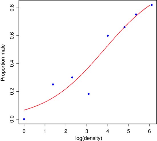
Note the use of type="response" to back-transform from the logit scale to the S-shaped proportion scale.
16.5.2 Estimating LD50 and LD90 from bioassay data
The data consist of numbers dead and initial batch size for five doses of pesticide application, and we wish to know what dose kills 50% of the individuals (or 90% or 95%, as required). The tricky statistical issue is that one is using a value of y (50% dead) to predict a value of x (the relevant dose) and to work out a standard error on the x axis.
data <- read.table("c:\\temp\\bioassay.txt",header=T)

attach(data)

names(data)
[1] "dose" "dead" "batch"
The logistic regression is carried out in the usual way:
y <- cbind(dead,batch-dead)


model <- glm(y∼log(dose),binomial)
Then the function dose.p from the MASS library is run with the model object, specifying the proportions killed for which we want the predicted log(doses) (p = 0.5 is the default for LD50):
library(MASS)

dose.p(model,p=c(0.5,0.9,0.95))
	Dose	SE

p = 0.50: 2.306981 0.07772065

p = 0.90: 3.425506 0.12362080

p = 0.95: 3.805885 0.15150043
Despite the label ‘Dose’, the output shows the logs of the doses associated with kills of LD50, LD90 and LD95, along with their standard errors.
16.5.3 Proportion data with categorical explanatory variables
This next example concerns the germination of seeds of two genotypes of the parasitic plant Orobanche and two extracts from host plants (bean and cucumber) that were used to stimulate germination. It is a two-way factorial analysis of deviance.
germination <- read.table("c:\\temp\\germination.txt",header=T)

attach(germination)

names(germination)
[1] "count" "sample" "Orobanche" "extract"
The count is the number of seeds that germinated out of a batch of size = sample. So the number that did not germinate is sample - count, and we construct the response vector like this:
y <- cbind(count, sample-count)
Each of the categorical explanatory variables has two levels:
levels(Orobanche)
[1] "a73" "a75"
levels(extract)
[1] "bean" "cucumber"
We want to test the hypothesis that there is no interaction between Orobanche genotype (a73 or a75) and plant extract (bean or cucumber) on the germination rate of the seeds. This requires a factorial analysis using the asterisk * operator like this:
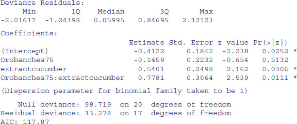
At first glance, it looks as if there is a highly significant interaction (p = 0.0111). But we need to check that the model is sound. The first thing is to check for is overdispersion. The residual deviance is 33.278 on 17 d.f., so the model is quite badly overdispersed:
33.279 / 17
[1] 1.957588
The overdispersion factor is almost 2. The simplest way to take this into account is to use what is called an ‘empirical scale parameter’ to reflect the fact that the errors are not binomial as we assumed, but were larger than this (i.e. overdispersed) by a factor of 1.9576. We refit the model using quasi-binomial errors to account for the overdispersion:
model <- glm(y ∼ Orobanche * extract, quasibinomial)
Then we use update to remove the interaction term in the normal way:
model2 <- update(model, ∼ . - Orobanche:extract)
The only difference is that we use an F test instead of a chi-squared test to compare the original and simplified models because now we have estimated two parameters from the model (the mean plus the empirical scale parameter):
anova(model,model2,test="F")
Analysis of Deviance Table

Model 1: y ∼ Orobanche * extract

Model 2: y ∼ Orobanche + extract

	Resid. Df Resid.	Dev Df Deviance	F Pr(>F)

1	17	33.278

2	18	39.686	-1	-6.4081 3.4418 0.08099 .
Now you see that the interaction is not significant (p = 0.081). There is no compelling evidence that different genotypes of Orobanche respond differently to the two plant extracts.
The next step is to see if any further model simplification is possible:
anova(model2,test="F")
Analysis of Deviance Table


Model: quasibinomial, link: logit


	Df Deviance Resid.	Df Resid.	Dev	F Pr(>F)

NULL			20	98.719

Orobanche  1	2.544	19	96.175 1.1954	0.2887

extract	1	56.489	18	39.686 26.5412 6.692e-05 ***
There is a highly significant difference between the two plant extracts on germination rate, but it is not obvious that we need to keep Orobanche genotype in the model. We try removing it:
model3 <- update(model2, ∼ . - Orobanche)

anova(model2,model3,test="F")
Analysis of Deviance Table


Model 1: y ∼ Orobanche + extract

Model 2: y ∼ extract

 Resid.	Df Resid.	Dev Df Deviance		F Pr(>F)

1	18	39.686

2	19	42.751 -1		-3.065 1.4401 0.2457
There is no justification for retaining Orobanche in the model. So the minimal adequate model contains just two parameters:
coef(model3)
 (Intercept) extractcucumber

 -0.5121761	1.0574031
What, exactly, do these two numbers mean? Remember that the coefficients are from the linear predictor. They are on the transformed scale, so because we are using quasi-binomial errors, they are in logits (ln(p/(1 – p)). To turn them into the germination rates for the two plant extracts requires a little calculation.
To go from a logit x to a proportion p, you need to calculate

So our first x value is –0.5122 and we calculate
1/(1+1/(exp(-0.5122)))
[1] 0.3746779
This says that the mean germination rate of the seeds with the first plant extract (bean) was 37%. What about the parameter for extract (1.0574)? Remember that with categorical explanatory variables the parameter values are differences between means. So to get the second germination rate we add 1.057 to the intercept before back-transforming:
1/(1+1/(exp(-0.5122+1.0574)))
[1] 0.6330212
This says that the germination rate was nearly twice as great (63%) with the second plant extract (cucumber). Obviously we want to generalize this process, and also to speed up the calculations of the estimated mean proportions. We can use predict to help here, because type="response" makes predictions on the back-transformed scale automatically:
tapply(predict(model3,type="response"),extract,mean)
 bean	cucumber

0.3746835	0.6330275
It is interesting to compare these figures with the averages of the raw proportions. First we need to calculate the proportion germinating, p, in each sample:
p <- count/sample
Then we can find the average germination rates for each extract:
tapply(p,extract,mean)
 bean	cucumber

0.3487189	0.6031824
You see that this gives different answers. Not too different in this case, but different none the less. The correct way to average proportion data is to add up the total counts for the different levels of abstract, and only then to turn them into proportions:
tapply(count,extract,sum)
 bean	cucumber

 148	276
This means that 148 seeds germinated with bean extract and 276 with cucumber. But how many seeds were involved in each case?
tapply(sample,extract,sum)
 bean	cucumber

 395	436
This means that 395 seeds were treated with bean extract and 436 seeds were treated with cucumber. So the answers we want are 148/395 and 276/436 (i.e. the correct mean proportions). We can automate the calculation like this:
as.vector(tapply(count,extract,sum))/as.vector(tapply(sample,extract,sum))
[1] 0.3746835 0.6330275
These are the correct mean proportions that were produced by the GLM. The moral here is that you calculate the average of proportions by using total counts and total samples and not by averaging the raw proportions.
16.6 Averaging proportions
Here is an example of what not to do. We have four proportions:
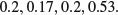
So surely we just add them up and divide by 4. This gives 1.1/4 = 0.275. Wrong! And not by just a little bit. We need to look at the counts on which the proportions were based. These turn out to be:
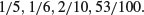
The correct way to average proportions is to add up the total count of successes (1 + 1 + 2 + 53 = 57) and divide this by the total number of samples (5 + 6 + 10 + 100 = 121). The correct mean proportion is 57/121 = 0.4711. This is nearly double our incorrect answer (above).
16.7 Summary of modelling with proportion count data
- Make a two-column response vector containing the successes and failures.
- Use glm with family=binomial (you can omit family=).
- Fit the maximal model.
- Test for overdispersion.
- If you find overdispersion then use quasibinomial rather than binomial errors.
- Begin model simplification by removing interaction terms.
- Remove non-significant main effects
- Use plot to obtain your model-checking diagnostics.
- Back-transform using predict with the option type="response" to obtain means.
16.8 Analysis of covariance with binomial data
We now turn to an example concerning flowering in five varieties of perennial plant. Replicated individuals in a fully randomized design were sprayed with one of six doses of a controlled mixture of growth promoters. After 6 weeks, plants were scored as flowering or not flowering. The count of flowering individuals forms the response variable. This is an ANCOVA because we have both continuous (dose) and categorical (variety) explanatory variables. We use logistic regression because the response variable is a count (flowered) that can be expressed as a proportion (flowered/number).
props <- read.table("c:\\temp\\flowering.txt",header=T)

attach(props)

names(props)
[1] "flowered" "number" "dose" "variety"
y <- cbind(flowered,number-flowered)

pf <- flowered/number

pfc <- split(pf,variety)

dc <- split(dose,variety)


plot(dose,pf,type="n",ylab="Proportion flowered")

points(jitter(dc[[1]]),jitter(pfc[[1]]),pch=21,col="blue",bg="red")

points(jitter(dc[[2]]),jitter(pfc[[2]]),pch=21,col="blue",bg="green")

points(jitter(dc[[3]]),jitter(pfc[[3]]),pch=21,col="blue",bg="yellow")

points(jitter(dc[[4]]),jitter(pfc[[4]]),pch=21,col="blue",bg="green3")

points(jitter(dc[[5]]),jitter(pfc[[5]]),pch=21,col="blue",bg="brown")
Note the use of split to separate the different varieties, so that we can plot them with different symbols, and of jitter to stop repeated values hiding one another.
There is clearly a substantial difference between the plant varieties in their response to the flowering stimulant. The modelling proceeds in the normal way. We begin by fitting the maximal model with different slopes and intercepts for each variety (estimating ten parameters in all):
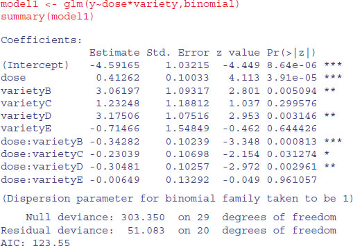
The model exhibits substantial overdispersion, but this is probably due to poor model selection rather than extra, unmeasured variability. Let us investigate this by plotting the fitted curves through the scatterplot.
xv <- seq(0,35,0.1)

vn <- rep("A",length(xv))

yv <- predict(model1,list(variety=factor(vn),dose=xv),type="response")

lines(xv,yv,col="red")


vn <- rep("B",length(xv))

yv <- predict(model1,list(variety=factor(vn),dose=xv),type="response")

lines(xv,yv,col="green")


vn <- rep("C",length(xv))

yv <- predict(model1,list(variety=factor(vn),dose=xv),type="response")

lines(xv,yv,col="yellow")


vn <- rep("D",length(xv))

yv <- predict(model1,list(variety=factor(vn),dose=xv),type="response")

lines(xv,yv,col="green3")


vn <- rep("E",length(xv))

yv <- predict(model1,list(variety=factor(vn),dose=xv),type="response")

lines(xv,yv,col="brown")


legend(locator(1),legend=c("A","B","C","D","E"),title="variety",

 		lty=rep(1,5),col=c("red","green","yellow","green3","brown"))
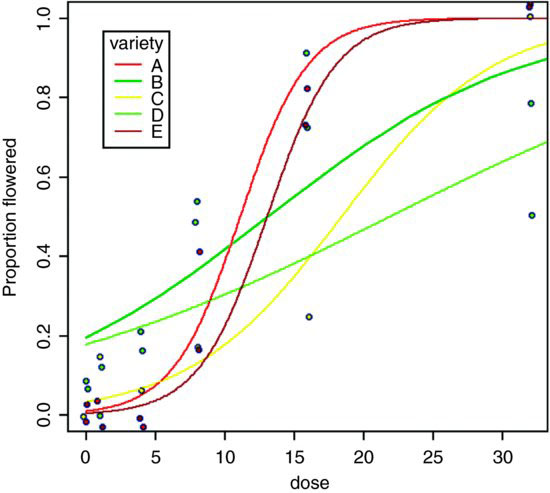
As you can see, the model is reasonable for two of the genotypes (A and E, represented by red and brown lines, respectively), moderate for one genotype (C, yellow) but very poor for two of them, B (lower, light green line) and D (upper, dark green line). For both of the latter, the model greatly overestimates the proportion flowering at zero dose, and for genotype B there seems to be some inhibition of flowering at the highest dose because the graph falls from 90% flowering at dose 16 to just 50% at dose 32. Variety D appears to be asymptoting at less than 100% flowering.
tapply(pf,list(dose,variety),mean)
	 A	B	C	D	E

0	0.0000000 0.08333333 0.00000000 0.06666667 0.0000000

1	0.0000000 0.00000000 0.14285714 0.11111111 0.0000000

4	0.0000000 0.20000000 0.06666667 0.15789474 0.0000000

8	0.4000000 0.50000000 0.17647059 0.53571429 0.1578947

16	0.8181818 0.90000000 0.25000000 0.73076923 0.7500000

32	1.0000000 0.50000000 1.00000000 0.77777778 1.0000000
These failures of the model should focus attention for future work.
The moral is that the fact that we have proportion data does not mean that the data will necessarily be well described by the logistic model. For instance, in order to describe the response of genotype B, the model would need to have a hump, rather than to asymptote at p = 1 for large doses. It is essential to look closely at the data, both with plots and with tables, before accepting the model output. Model choice is very big deal indeed. The logistic was a poor choice for two of the five varieties in this case.
16.9 Converting complex contingency tables to proportions
In this section we show how to remove the need for all of the nuisance variables that are involved in complex contingency table modelling (the row and column totals that have to be included in all of the models). We can do this when the response can be restated as a binary proportion (a choice of one out of two contingencies). For instance, in the case of Schoener's lizards which proved so tricky to analyse as a complex contingency table (see p. 610), we can work with the proportion of all lizards that are Anolis grahamii as the response variable, instead of analysing the counts of the numbers of A. grahamii and A. opalinus separately. This has the huge advantage of requiring none of the nuisance variables to be included in the model. The technique would not work if we had three lizard species, however. Then we would have to stick with the complex contingency table modelling.
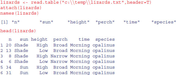
First, we need to make absolutely sure that all the explanatory variables are in exactly the same order for both species of lizards. The reason for this is that we are going to cbind the counts for one of the lizard species onto the half dataframe containing the other species counts and all of the explanatory variables. Any mistakes here would be disastrous because the count would be lined up with the wrong combination of explanatory variables, and the analysis would be wrong and utterly meaningless.
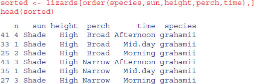
Next we need to extract the top half of this dataframe (i.e. rows 1–24):
short <- sorted[1:24,]
Note that this operation has lost all of the data for A. opalinus. Also, the name for the left-hand variable, n, is no longer appropriate. It is the count for A. grahamii, so we should rename it Ag, say (with the intention of adding another column called Ao in due course to contain the counts of A. opalinus):
names(short)[1] <- "Ag"


names(short)
[1] "Ag" "sun" "height" "perch" "time" "species"
The right-hand variable, species, is redundant now (all the entries are A. grahamii), so we should drop it:

The counts for each row of A. opalinus are in the variable called n in the bottom half of the dataframe called sorted. We extract them like this:
sorted$n[25:48]
[1] 4 8 20 5 4 8 12 8 13 1 0 6 18 69 34 8 60 17 13 55 31 4 21 12
The idea is to create a new dataframe with these counts for A. opalinus lined up alongside the matching counts for A. grahamii:
new.lizards <- data.frame(sorted$n[25:48], short)
The first variable needs an informative name, like Ao:

That completes the editing of the dataframe. Notice, however, that we have got three dataframes, all of different configurations, but each containing the same variable names (sun, height, perch and time) – look at objects() and search(). We need to do some housekeeping:
detach(lizards)

rm(short,sorted)

attach(new.lizards)
16.9.1 Analysing Schoener's lizards as proportion data
With the foregoing preliminaries, here are the variable names:
names(new.lizards)
[1] "Ao" "Ag" "sun" "height" "perch" "time"
The response variable is a two-column object containing the counts of the two species:
y <- cbind(Ao,Ag)
We begin by fitting the saturated model containing all possible interactions:
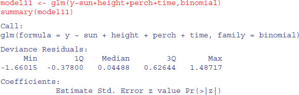
model1 <- glm(y∼sun*height*perch*time,binomial)
Since there are no nuisance variables, we can use step directly to begin the model simplification (compare this with p. 611 with a log-linear model of the same data):
model2 <- step(model1)
Start: AIC=102.82

y ∼ sun * height * perch * time
			Df	Deviance	AIC

- sun:height:perch:time	1	2.1797e-10	100.82

<none>				3.5825e-10	102.82
Out goes the four-way interaction (with a sigh of relief):

Next, we wave goodbye to three of the three-way interactions:

Then we discard the two-way interaction of sun by time:
Step: AIC=92.16

		Df	Deviance	 AIC

<none>			3.3403	92.165

- sun:height:perch	 1	5.8273	92.651

- height:perch:time	 2	8.5418	93.366
We have seen that AIC is very generous in leaving terms in the model that we would ruthlessly eliminate. To begin with, we need to test whether we would have kept the two three-way interactions and the five two-way interactions:
model3 <- update(model2,∼. - height:perch:time)

model4 <- update(model2,∼. - sun:height:perch)

anova(model2,model3,test="Chi")
Analysis of Deviance Table


Model 1: y ∼ sun + height + perch + time + sun:height + sun:perch +
height:perch +

	height:time + perch:time + sun:height:perch + height:perch:time

Model 2: y ∼ sun + height + perch + time + sun:height + sun:perch +
height:perch +

	height:time + perch:time + sun:height:perch

 Resid. Df Resid. Dev Df Deviance Pr(>Chi)

1	7	3.3403

2	9	8.5418 -2	-5.2014		0.07422 .
That was close, but not significant. So out it goes.
anova(model2,model4,test="Chi")

Analysis of Deviance Table
Model 1: y ∼ sun + height + perch + time + sun:height + sun:perch +
height:perch +

	height:time + perch:time + sun:height:perch + height:perch:time

Model 2: y ∼ sun + height + perch + time + sun:height + sun:perch +
height:perch +

	height:time + perch:time + height:perch:time

 Resid. Df Resid. Dev Df Deviance Pr(>Chi)

1	7	3.3403

2	8	5.8273 -1	-2.487	0.1148
No. We would not keep either of those three-way interactions. What about the two-way interactions? We need to start with a simpler base model than model2:
model5 <- glm(y∼(sun+height+perch+time)^2-sun:time,binomial)
We shall remove each of the two-way interactions separately, comparing each to model5 which contains all of the two-way interactions:


So we do not need any of the two-way interactions. What about the main effects?

All the main effects are significant and so must be retained.
Just one last point. We might not need all three levels for time, since the summary suggests that Mid.day and Morning are not significantly different (parameter difference of 0.9639 – 0.7368 = 0.2271, with a standard error of the difference of 0.29). We lump them together in a new factor called t2:
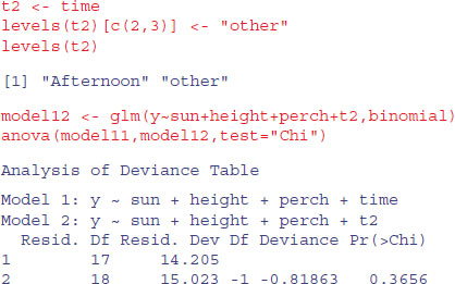
A model with just two times of day is not significantly worse than a model with three.

All the parameters are significant, so this is the minimal adequate model. There is no evidence of overdispersion. There are just five parameters, and the model contains no nuisance variables (compare this with the massive contingency table model summary.lm(model1)). The ecological interpretation is straightforward: the two lizard species differ significantly in their niches on all the niche axes that were measured. However, there were no significant interactions (nothing subtle was happening such as swapping perch sizes at different times of day).