Chapter 19
Mixed-Effects Models
Up to this point, we have treated all categorical explanatory variables as if they were the same. This is certainly what R.A. Fisher had in mind when he invented the analysis of variance in the 1920s and 1930s. It was Eisenhart (1947) who realized that there were actually two fundamentally different sorts of categorical explanatory variables: he called these fixed effects and random effects. It will take a good deal of practice before you are confident in deciding whether a particular categorical explanatory variable should be treated as a fixed effect or a random effect, but in essence:
- fixed effects influence only the mean of y;
- random effects influence only the variance of y.
Fixed effects are unknown constants to be estimated from the data. Random effects govern the variance–covariance structure of the response variable (see p. 519). Nesting (or hierarchical structure) of random effects is a classic source of pseudoreplication, so it important that you are able to recognize it and hence not fall into its trap. Random effects that come from the same group will be correlated, and this contravenes one of the fundamental assumptions of standard statistical models: independence of errors. Random effects occur in two contrasting kinds of circumstances:
- observational studies with hierarchical structure;
- designed experiments with different spatial or temporal scales.
Fixed effects have informative factor levels, while random effects often have uninformative factor levels. The distinction is best seen by an example. In most mammal species the categorical variable sex has two levels: male and female. For any individual that you find, the knowledge that it is, say, female conveys a great deal of information about the individual, and this information draws on experience gleaned from many other individuals that were female. A female will have a whole set of attributes (associated with her being female) no matter what population that individual was drawn from. Take a different categorical variable like genotype. If we have two genotypes in a population we might label them A and B. If we take two more genotypes from a different population we might label them A and B as well. In a case like this, the label A does not convey any information at all about the genotype, other than that it is probably different from genotype B. In the case of sex, the factor level (male or female) is informative: sex is a fixed effect. In the case of genotype, the factor level (A or B) is uninformative: genotype is a random effect.
Random effects have factor levels that are drawn from a large (potentially very large) population in which the individuals differ in many ways, but we do not know exactly how or why they differ. To get a feel for the difference between fixed effects and random effects here are some more examples:
| Fixed effects | Random effects |
| Drug administered or not | Genotype |
| Insecticide sprayed or not | Brood |
| Nutrient added or not | Block within a field |
| One country versus another | Split plot within a plot |
| Male or female | History of development |
| Upland or lowland | Household |
| Wet versus dry | Individuals with repeated measures |
| Light versus shade | Family |
| One age versus another | Parent |
The important point is that because the random effects come from a large population, there is not much point in concentrating on estimating means of our small subset of factor levels, and no point at all in comparing individual pairs of means for different factor levels. Much better to recognize them for what they are, random samples from a much larger population, and to concentrate on their variance. This is the added variation caused by differences between the levels of the random effects.
Variance components analysis is all about estimating the size of this variance, and working out its percentage contribution to the overall variation. There are five fundamental assumptions of linear mixed-effects models:
- Within-group errors are independent with mean zero and variance σ2.
- Within-group errors are independent of the random effects.
- The random effects are normally distributed with mean zero and covariance matrix Ψ.
- The random effects are independent in different groups.
- The covariance matrix does not depend on the group.
The validity of these assumptions needs to be tested by employing a series of plotting methods involving the residuals, the fitted values and the predicted random effects. The tricks with mixed-effects models are:
- learning which variables are random effects;
- specifying the fixed and random effects in the model formula;
- getting the nesting structure of the random effects right;
- remembering to get library(lme4) or library(nlme) at the outset.
The issues fall into two broad categories: questions about experimental design and the management of experimental error (e.g. where does most of the variation occur, and where would increased replication be most profitable?); and questions about hierarchical structure, and the relative magnitude of variation at different levels within the hierarchy (e.g. studies on the genetics of individuals within families, families within parishes, and parishes with counties, to discover the relative importance of genetic and phenotypic variation).
Most ANOVA models are based on the assumption that there is a single error term. But in hierarchical studies and nested experiments, where the data are gathered at two or more different spatial scales, there is a different error variance for each different spatial scale. There are two reasonably clear-cut sets of circumstances where your first choice would be to use a linear mixed-effects model: you want to do variance components analysis because all your explanatory variables are categorical random effects and you do not have any fixed effects; or you do have fixed effects, but you also have pseudoreplication of one sort or another (e.g. temporal pseudoreplication resulting from repeated measurements on the same individuals; see p. 699). To test whether one should use a model with mixed effects or just a plain old linear model, Douglas Bates wrote in the R help archive: ‘I would recommend the likelihood ratio test against a linear model fit by lm. The p-value returned from this test will be conservative because you are testing on the boundary of the parameter space.’
19.1 Replication and pseudoreplication
To qualify as replicates, measurements must have the following properties:
- They must be independent.
- They must not form part of a time series (data collected from the same place on successive occasions are not independent).
- They must not be grouped together in one place (aggregating the replicates means that they are not spatially independent).
- They must be of an appropriate spatial scale;
- Ideally, one replicate from each treatment ought to be grouped together into a block, and the whole experiment repeated in many different blocks.
- Repeated measures (e.g. from the same individual or the same spatial location) are not replicates (this is probably the commonest cause of pseudoreplication in statistical work).
Pseudoreplication occurs when you analyse the data as if you had more degrees of freedom than you really have. There are two kinds of pseudoreplication:
- temporal pseudoreplication, involving repeated measurements from the same individual;
- spatial pseudoreplication, involving several measurements taken from the same vicinity.
Pseudoreplication is a problem because one of the most important assumptions of standard statistical analysis is independence of errors. Repeated measures through time on the same individual will have non-independent errors because peculiarities of the individual will be reflected in all of the measurements made on it (the repeated measures will be temporally correlated with one another). Samples taken from the same vicinity will have non-independent errors because peculiarities of the location will be common to all the samples (e.g. yields will all be high in a good patch and all be low in a bad patch).
Pseudoreplication is generally quite easy to spot. The question to ask is this. How many degrees of freedom for error does the experiment really have? If a field experiment appears to have lots of degrees of freedom, it is probably pseudoreplicated. Take an example from pest control of insects on plants. There are 20 plots, 10 sprayed and 10 unsprayed. Within each plot there are 50 plants. Each plant is measured five times during the growing season. Now this experiment generates 20 × 50 × 5 = 5000 numbers. There are two spraying treatments, so there must be 1 degree of freedom for spraying and 4998 degrees of freedom for error. Or must there? Count up the replicates in this experiment. Repeated measurements on the same plants (the five sampling occasions) are certainly not replicates. The 50 individual plants within each quadrat are not replicates either. The reason for this is that conditions within each quadrat are quite likely to be unique, and so all 50 plants will experience more or less the same unique set of conditions, irrespective of the spraying treatment they receive. In fact, there are 10 replicates in this experiment. There are 10 sprayed plots and 10 unsprayed plots, and each plot will yield only one independent datum for the response variable (the mean proportion of leaf area consumed by insects, for example). Thus, there are 9 degrees of freedom within each treatment, and 2 × 9 = 18 degrees of freedom for error in the experiment as a whole. It is not difficult to find examples of pseudoreplication on this scale in the literature (Hurlbert 1984). The problem is that it leads to the reporting of masses of spuriously significant results (with 4998 degrees of freedom for error, it is almost impossible not to have significant differences). The first skill to be acquired by the budding experimenter is the ability to plan an experiment that is properly replicated. There are various things that you can do when your data are pseudoreplicated:
- Average away the pseudoreplication and carry out your statistical analysis on the means.
- Carry out separate analyses for each time period.
- Use proper time series analysis or mixed-effects models.
19.2 The lme and lmer functions
Most of the examples in this chapter use the linear mixed model formula lme. This is to provide compatibility with the excellent book by Pinheiro and Bates (2000) on Mixed-Effects Models in S and S-PLUS. More recently, however, Douglas Bates has released the generalized mixed model function lmer as part of the lme4 package, and you may prefer to use this in your own work, especially for nested count data or proportion data. To begin with, I provide a simple comparison of the basic syntax of the two functions.
19.2.1 lme
Specifying the fixed and random effects in the model formula is done with two formulae. Suppose that there are no fixed effects, so that all of the categorical variables are random effects. Then the fixed effect simply estimates the intercept (parameter 1):
fixed = y ∼ 1
The fixed effect (a compulsory part of the lme structure) is just the overall mean value of the response variable y ∼ 1. The fixed = part of the formula is optional if you put this object first. The random effects show the identities of the random variables and their relative locations in the hierarchy. The three random effects (a, b, and c) are specified like this:
random = ∼ 1 | a/b/c
and in this case the phrase random = is not optional. An important detail to notice is that the name of the response variable (y) is not repeated in the random-effects formula: there is a blank space to the left of the tilde ∼. In most mixed-effects models we assume that the random effects have a mean of zero and that we are interested in quantifying variation in the intercept caused by differences between the factor levels of the random effects. After the intercept comes the vertical bar | which is read as ‘given the following spatial arrangement of the random variables’. In this example there are three random effects with ‘c nested within b which in turn is nested within a’. The factors are separated by forward slash characters, and the variables are listed from left to right in declining order of spatial (or temporal) scale. This will only become clear with practice, but it is a simple idea. The formulae are put together like this:
lme(fixed = y ∼ 1, random = ∼ 1 | a/b/c)
19.2.2 lmer
There is just one formula in lmer, not separate formulae for the fixed and random effects. The fixed effects are specified first, to the right of the tilde, in the normal way. Next comes a plus sign, then one or more random terms enclosed in parentheses (in this example there is just one random term, but we might want separate random terms for the intercept and for the slopes, for instance). R can identify the random terms because they must contain a ‘given’ symbol |, to the right of which are listed the random effects in the usual way, from largest to smallest scale, left to right. So the lmer formula for this example is:
lmer(y ∼ 1+( 1 | a/b/c ))
19.3 Best linear unbiased predictors
In aov, the effect size for treatment i is defined as  where μ is the overall mean. In mixed-effects models, however, correlation between the pseudoreplicates within a group causes what is called shrinkage. The best linear unbiased predictors (BLUPs, denoted by ai) are smaller than the effect sizes
  and are given by
where  is the residual variance and
  is the between-group variance which introduces the correlation between the pseudoreplicates within each group. Thus, the parameter estimate ai is ‘shrunk’ compared to the fixed effect size
  When
When  is estimated to be large compared with the estimate of
  (i.e. when most of the variation is between classes and there is little variation within classes), the fixed effects and the BLUP are similar. On the other hand, when
  is estimated to be small compared with the estimate of
  then the fixed effects and the BLUP can be very different.
19.4 Designed experiments with different spatial scales: Split plots
The important distinction in models with categorical explanatory variables is between cases where the data come from a designed experiment, in which treatments were allocated to locations or subjects at random, and cases where the data come from an observational study in which the categorical variables are associated with an observation before the study. Here, we call the first case split-plot experiments and the second case hierarchical designs. The point is that their dataframes look identical, so it is easy to analyse one case wrongly as if it were the other. You need to be able to distinguish between fixed effects and random effects in both cases.
Here is the linear model for a split-plot experiment analysed in Chapter 11 by aov (see p. 519):
yields <- read.table("c:\\temp\\splityield.txt",header=T)

attach(yields)

names(yields)
[1] "yield" "block" "irrigation" "density" "fertilizer"
library(nlme)
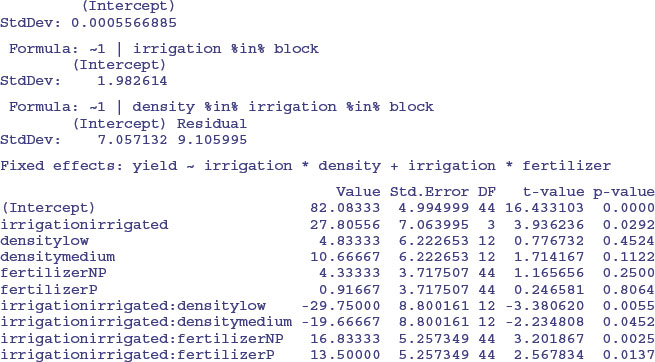
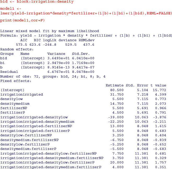
The fixed-effects part of the model is specified in just the same way as in a straightforward factorial experiment: yield ∼ irrigation*density*fertilizer. The random-effects part of the model says that we want the random variation to enter via effects on the intercept as random=∼1. Finally, we define the spatial structure of the random effects after the ‘given’ symbol | as: block/irrigation/density reflecting the progressively smaller plot sizes. There is no need to specify the smallest spatial scale (fertilizer plots in this example).
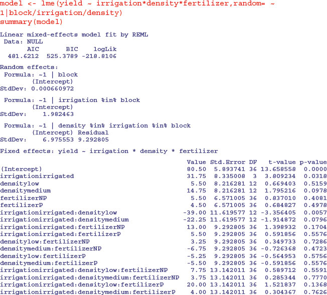
This output suggests that the only significant effects are the main effect of irrigation (p = 0.0318) and the irrigation by density interaction (p = 0.0057). The three-way interaction is not significant so we remove it, fitting all terms up to two-way interactions:
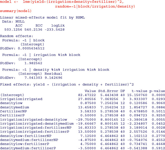
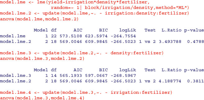
The fertilizer by density interaction is not significant, so we remove it:
Both the irrigation by fertilizer and irrigation by density interactions are now highly significant. The apparently non-significant main effect of density is spurious because density appears in a significant interaction with irrigation. The moral is that you must do the model simplification to get the appropriate p values.
Remember, too, that if you want to use anova to compare mixed models with different fixed-effects structures, then you must use maximum likelihood (method = "ML" in lme but REML = FALSE in lmer) rather than the default restricted maximum likelihood (REML). Here is the analysis again, but this time using anova to compare models with progressively simplified fixed effects:
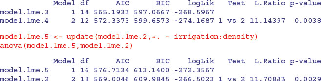
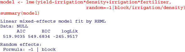
The irrigation by fertilizer interaction is more significant (p = 0.0038 compared to p = 0.0081) under this mixed-effects model than it was in the linear model earlier, as is the irrigation by density interaction (p = 0.0029 compared to p = 0.01633). You need to do the model simplification in lme to uncover the significance of the main effect and interaction terms, but it is worth it, because the lme analysis can be more powerful. The minimal adequate model under the lme is:
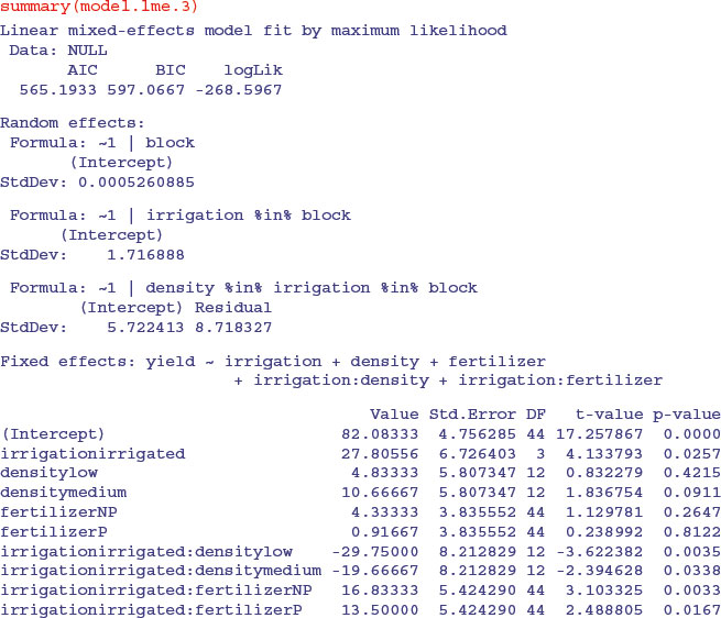
You should pay special attention to the degrees of freedom column. Note that the degrees of freedom are not pseudoreplicated: there are only 3 d.f. for testing the irrigation main effect; 12 d.f. for testing the irrigation by density interaction and 44 d.f. for irrigation by fertilizer (this is 36+4+ 4 = 44 after model simplification). Also, remember that you must do your model simplification using maximum likelihood (method = "ML") because you cannot use anova to compare models with different fixed-effect structures using REML.
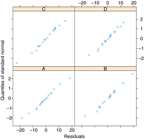
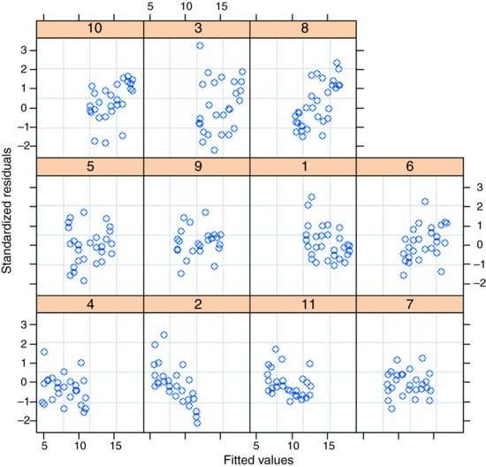
Model-checking plots show that the residuals are well behaved:
plot(model.lme.3)
the response variable is a reasonably linear function of the fitted values:
plot(model.lme.3,yield∼fitted(.))
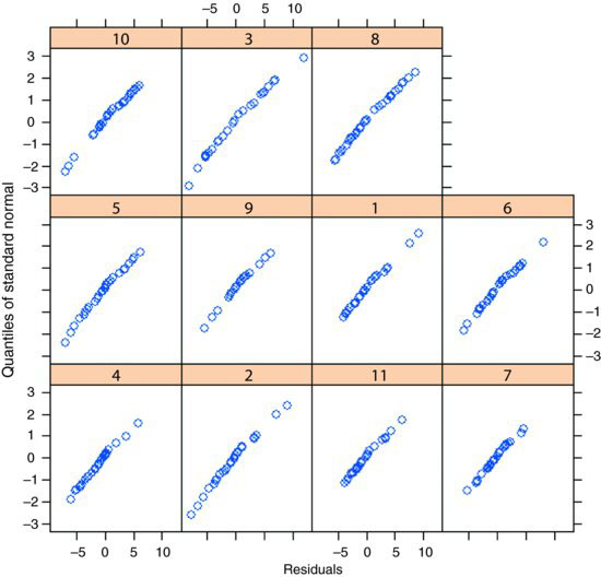
and the errors are reasonably close to normally distributed in all four blocks:
qqnorm(model.lme.3,∼ resid(.)| block)
When, as here, the experiment is balanced and there are no missing values, then it is much simpler to interpret the aov using an Error term to describe the structure of the spatial pseudoreplication (p. 526), not least because it produces separate ANOVA tables for each of the spatial scales, which makes it very easy to check that these is no pseudoreplication. Without balance, however, you will need to use lme or lmer and to use model simplification to estimate the p values of the significant interaction terms.
If you do this example using lmer, you will want to switch off the matrix of correlations for the fixed effects. You do this with the print(model,cor=F) option (rather than summary):
As before, it requires model simplification before the significant interactions become evident.
19.5 Hierarchical sampling and variance components analysis
Hierarchical data are often encountered in observational studies where information is collected at a range of different spatial scales. The principal aim is to discover the scale at which most of the variation is generated. This information would then allow a closer focus on mechanisms operating at this scale in subsequent more detailed studies. The following study involves a test with a mean score of 100 administered to children in four British towns. Each town was divided into districts by postcodes, and six districts were selected at random. Within districts, 10 streets were selected at random, and within streets, four households were selected at random. Naturally, different households had different numbers of children (childless households were excluded from the study) and there was no control over sex ratio of children within household.
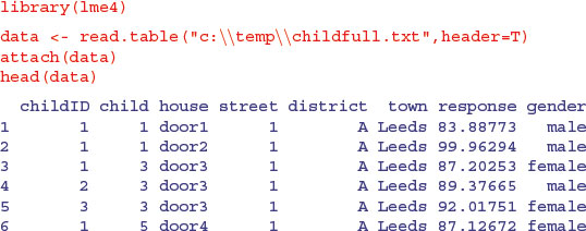
You can see that the factor levels are not unique: for instance, there is a street 1 in each district of Leeds (and of every other town). We use the colon operator to create unique factor levels for each random effect: district within town (d), street within district within town (s) and household within street within district within town (h). Each household has one or more children (maximum = 8, mostly in Leeds) but the sex ratio varies from house to house.
d <- town:district

s <- town:district:factor(street)

h <- town:district:factor(street):house
The mixed effects model has one fixed effect (gender) and four nested random effects:
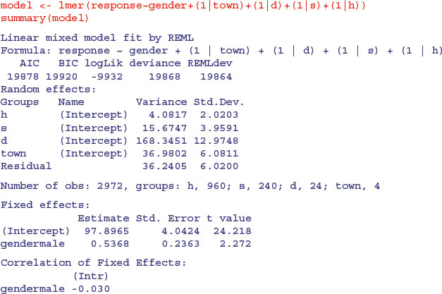
The fixed effect is significant (t = 2.272) but small (0.537) compared to the means for towns, which varied by as much as 20 (e.g. Coventry vs. Derby). Of the random effects, most of the variation in the response is between districts within towns (64%) and least is between households within streets (4%). You get the percentage variance components like this:
vc <- c(36.2405,4.0817,15.6747,168.3451,36.9802)

vc <- 100*c(36.2405,4.0817,15.6747,168.3451,36.9802)/sum(vc)

vc
[1] 13.868129 1.561942 5.998227 64.420512 14.151190
The key feature of these data, however, is the substantial variation between children within the same family (i.e. even after you have controlled for family and environment (town and district within town)).
There are issues about the appropriate graphics in studies like this, simply because there are so many combinations of factor levels, and the nested factor levels typically make sense only in the context of their higher-level associations. Here is one way of showing the variation:
par(mfrow=c(2,2))

hist(response[town=="Coventry"],main="Coventry",breaks=seq(40,150,5),

 	xlab="response")

hist(response[town=="Derby"],main="Derby",breaks=seq(40,150,5),

 	xlab="response")

hist(response[town=="Leeds"],main="Leeds",breaks=seq(40,150,5),

 	xlab="response")

hist(response[town=="Norwich"],main="Norwich",breaks=seq(40,150,5),

 	xlab="response")
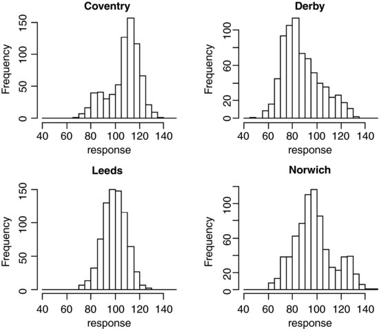
This is good at highlighting non-normality (e.g. the bimodal distribution of the response in Norwich, and the opposite skew in Coventry and Derby). Here is an alternative using box-and-whisker plots, with subset to chose the towns rather than subscripts:
plot(response∼district,subset=(town=="Coventry"),main="Coventry")

plot(response∼district,subset=(town=="Derby"),main="Derby")

plot(response∼district,subset=(town=="Leeds"),main="Leeds")

plot(response∼district,subset=(town=="Norwich"),main="Norwich")

This is particularly good for drawing attention to districts with strikingly different mean scores (e.g. high ones like district A in Norwich and low ones like district E in Coventry). For looking at interactions, coplot is often useful:
coplot(response∼district|town)
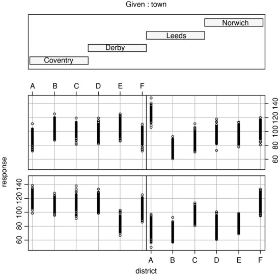
In practice, you will want to try many different kinds of plots across all of the spatial scales.
19.6 Mixed-effects models with temporal pseudoreplication
A common cause of temporal pseudoreplication in growth experiments with fixed effects is when each individual is measured several times as it grows during the course of an experiment. The next example is as simple as possible: we have a single fixed effect (a two-level categorical variable, with fertilizer added or not) and six replicate plants in each treatment, with each plant measured on five occasions (after 2, 4, 6, 8 or 10 weeks of growth). The response variable is root length, measured non-destructively through a glass panel, which is opened to the light only when the root length measurements are being taken. The fixed-effect formula looks like this:
fixed = root∼fertilizer
The random-effects formula needs to indicate that the week of measurement (a continuous random effect) represents pseudoreplication within each individual plant:
random = ∼week|plant
Because we have a continuous random effect (weeks) we write ∼week in the random-effects formula rather than the ∼1 that we used with categorical random effects (above). Here are the data:
results <- read.table("c:\\temp\\fertilizer.txt",header=T)

attach(results)

names(results)
[1] "root" "week" "plant" "fertilizer"
We begin with data inspection. For the kind of data involved in mixed-effects models there are some excellent built-in plotting functions (variously called panel plots, trellis plots, or lattice plots).
library(nlme)


library(lattice)
To use trellis plotting, we begin by turning our dataframe called results into a groupedData object (p. 957). To do this we specify the nesting structure of the random effects, and indicate the fixed effect by defining fertilizer as outer to this nesting (a fixed effect):
results <- groupedData(root∼week|plant,outer = ∼ fertilizer,results)
Because results is now a groupedData object, the plotting is fantastically simple:
plot(results)
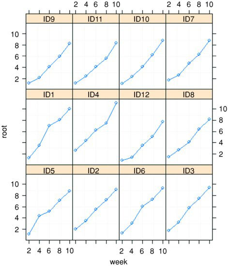
Here you get separate time series plots for each of the individual plants (created, in this case, by joining the dots, which is the default option), with plant identities ranked from bottom left (ID5) to top right (ID7) on the basis of mean root length. In terms of understanding the fixed effects, it is often more informative to group together the six replicates within each treatment, and to have one panel for each of the treatment levels (i.e. one for the fertilized plants and one for the controls in this case). This is very straightforward, using outer to indicate the grouping:
plot(results,outer=T)
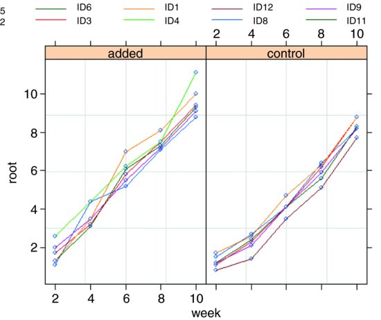
You can see that by week 10 there is virtually no overlap between the two treatment groups. The largest control plant has about the same root length as the smallest fertilized plant (about 9 cm).
Now for the statistical modelling. Ignoring the pseudoreplication, we should have 1 d.f. for fertilizer and 2 × (6 – 1) = 10 d.f. for error.
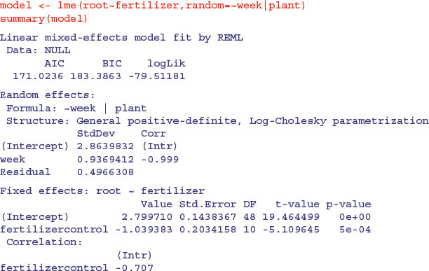
The output looks dauntingly complex, but once you learn your way around it, the essential information is relatively easy to extract. The mean reduction in root size associated with the unfertilized controls is –1.039 383 and this has a standard error of 0.203 415 8 based on the correct 10 residual d.f. (six replicates per factor level). Can you see why the intercept has 48 d.f.? (Hint: ask yourself how many graphs have been fitted to the data.)
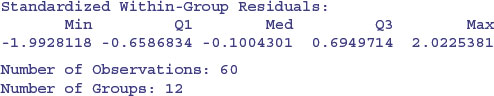
Here is a simple one-way ANOVA for the non-pseudoreplicated data taken from the end of the experiment in week 10:
We can compare this with the output from the lme. The effect size in the lme is slightly smaller (–1.039 393 compared to –1.2833) but the standard error is appreciably lower (0.203 415 8 compared to 0.3787), so the significance of the result is higher in the lme than in the aov. You get increased statistical power as a result of going to the trouble of fitting the mixed-effects model. And, crucially, you do not need to make potentially arbitrary judgements about which time period to select for the non-pseudoreplicated analysis. You use all of the data in the model, and you specify its structure appropriately so that the hypotheses are tested with the correct degrees of freedom (10 in this case, not 48).
The reason why the effect sizes are different in the lm and lme models is that linear models use maximum likelihood estimates of the parameters based on arithmetic means. The linear mixed models, however, use the wonderfully named BLUPs (see p. 685).
19.7 Time series analysis in mixed-effects models
It is common to have repeated measures on subjects in observational studies, where we would expect that the observation on an individual at time t + 1 would be quite strongly correlated with the observation on the same individual at time t. This contravenes one of the central assumptions of linear models (p. 503), that the within-group errors are independent. However, we often observe significant serial correlation in data such as these.
The following example comes from Pinheiro and Bates (2000) and forms part of the nlme library. The data refer to the numbers of ovaries observed in repeated measures on 11 mares (their oestrus cycles have been scaled such that ovulation occurred at time 0 and at time 1). The issue is how best to model the correlation structure of the data. We know from previous work that the fixed effect can be modelled as a three-parameter sine–cosine function of time x:

and we want to assess different structures for modelling the within-class correlation.
The dataframe is of class groupedData which makes the plotting and error checking much simpler.
data(Ovary)

attach(Ovary)

names(Ovary)
[1] "Mare" "Time" "follicles"
plot(Ovary)
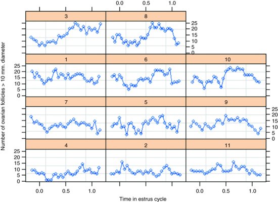
The panel plot has ranked the horses from bottom left to top right on the basis of their mean number of ovules (mare 4 with the lowest number, mare 8 with the highest). Some animals show stronger cyclic behaviour than others.
We begin by fitting a mixed-effects model making no allowance for the correlation structure, and investigate the degree of autocorrelation that is exhibited by the residuals (recall that the assumption of the model is that there is no correlation):
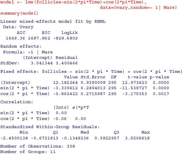
The function ACF allows us to calculate the empirical autocorrelation structure of the residuals from this model:
plot(ACF(model),alpha=0.05)

You can see that there is highly significant autocorrelation at lags 1 and 2 and marginally significant autocorrelation at lags 3 and 4. We model the autocorrelation structure using one of the standard corStruct classes (p. 863). For time series data like this, we typically choose between ‘moving average’, ‘autoregressive’ or ‘autoregressive moving average’ classes. Again, experience with horse biology suggests that a simple moving average model might be appropriate, so we start with this. The class is called corARMA and we need to specify the order of the model (the lag of the moving average part). The simplest assumption is that only the first two lags exhibit non-zero correlations (q=2):
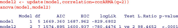
This is a great improvement over the original model, which assumed no correlation in the residuals. But what about a different time series assumption? Let us compare the moving average assumption with a simple first-order autoregressive model corAR1():
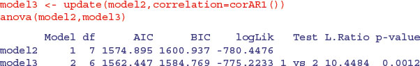
This is a very significant improvement, p = 0.0012, so we choose the corAR1() because it has the lowest AIC (it also uses fewer degrees of freedom, d.f. = 6). Error checking on model3 might proceed like this:
plot(model3,resid(.,type="p")∼fitted(.)|Mare)
which shows that residuals are reasonably well behaved. And the normality assumption?
qqnorm(model3,∼resid(.)|Mare)
The errors are close to normally distributed for all of the mares. The model is well behaved, so we accept a first-order autocorrelation structure corAR1().
19.8 Random effects in designed experiments
The rats example, studied by aov with an Error term on p. 526, can be repeated as a linear mixed-effects model, but only if we recode the factor levels. This example works much better with lmer than with lme.
dd <- read.table("c:\\temp\\rats.txt",h=T)

attach(dd)

names(dd)
[1] "Glycogen" "Treatment" "Rat" "Liver"
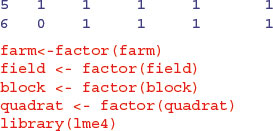
Treatment <- factor(Treatment)

Liver <- factor(Liver)

Rat <- factor(Rat)
There is a single fixed effect (Treatment), and pseudoreplication enters the dataframe because each rat's liver is cut into three pieces and each liver bit is macerated and divided into separate aliquots to produce two readings. First, compute unique factor levels for each rat and each liver bit:
rat <- Treatment:Rat

liver <- Treatment:Rat:Liver
Then use these as random effects in the lmer model:
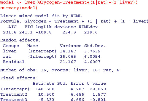
You can see that the treatment effect is correctly interpreted as being non-significant (both t values are less than 2 in absolute value). The variance components (p. 527) can be extracted by expressing the variances as percentages:
vars <- c(14.167,36.065,21.167)

100*vars/sum(vars)
[1] 19.84201 50.51191 29.64607
Thus 50% of the variation is between rats within treatments, 19.8% is between liver bits within rats and 29.6% is between readings within liver bits within rats. If you are interested principally in the fixed effects, then much the best way to proceed is to average away the pseudoreplication and do a one-way ANOVA with 3 d.f. for error (see p. 525).
19.9 Regression in mixed-effects models
The next example involves a regression of plant size against local point measurements of soil nitrogen (N) at five places within each of 24 farms. It is expected that plant size and soil nitrogen will be positively correlated. There is only one measurement of plant size and soil nitrogen at any given point (i.e. there is no temporal pseudoreplication; cf. p. 695):
yields <- read.table("c:\\temp\\farms.txt",header=T)

attach(yields)

names(yields)
[1] "N" "size" "farm"
Here are the data in aggregate, with different plotting colours and symbols for each farm:
plot(N,size,pch=rep(16:19,each=40),col=farm)
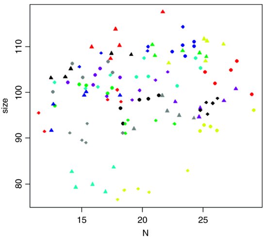
The most obvious pattern is that there is substantial variation in mean values of both soil nitrogen and plant size across the farms: the minimum-yielding fields (yellow) have a mean y value of less than 80, while the maximum (red) fields have a mean y value above 110. Note that because there are more farms (24) than colours (8), we need to use different plotting symbols as well as different colours to distinguish the five points from each farm.
The key distinction to understand is between fitting lots of linear regression models (one for each farm) and fitting one mixed-effects model, taking account of the differences between farms in terms of their contribution to the variance in response as measured by a standard deviation in intercept and a standard deviation in slope. We investigate these differences by contrasting the two fitting functions, lmList and lme. We begin by fitting 24 separate linear models, one for each farm:
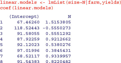
You can see very substantial variations in the value of the intercept from 118.52 on farm 2 to 52.32 on farm 17. Slopes are also dramatically different, from negative –0.555 on farm 2 to steep and positive 1.7555 on farm 17. This is a classic problem in regression analysis when (as here) the intercept is a long way from the average value of x (see p. 460); large values of the intercept are almost bound to be correlated with low values of the slope.
Here are the slopes and intercepts from the model specified entirely in terms of random effects: a population of regression slopes predicted within each farm with nitrogen as the continuous explanatory variable, and a population of intercepts for each farm:
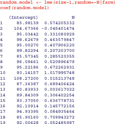
Differences between the intercepts explain 97.26% of the variance, differences in slope a mere 0.245%, with a residual variance of 2.49% (see the summary table). The thing you notice is that the random effects are less extreme (i.e. closer to the mean) than the fixed effects. This is an example of shrinkage (p. 685), and is clearest from a graphical comparison of the coefficients of the linear and mixed models:
mm <- coef(random.model)

ll <- coef(linear.models)

windows(7,4)

par(mfrow=c(1,2))

plot(ll[,1],mm[,1],pch=16,xlab="linear",ylab="random effects")

abline(0,1)

plot(ll[,2],mm[,2],pch=16,xlab="linear",ylab="random effects")

abline(0,1)

Most of the random-effects intercepts (left) are greater than their linear model equivalents (they are above the 45 degree line) while most of the random-effects slopes (right) are shallower than their linear model equivalents (i.e. below the line). For farm 17 the linear model had an intercept of 52.317 11 while the random-effects model had an intercept of 94.933 95. Likewise, the linear model for farm 17 had a slope of 1.755 513 6 while the random-effects model had a slope of 0.084 935 465.
We can fit a mixed model with both fixed and random effects. Here is a model in which size is modelled as a function of nitrogen and farm as fixed effects, with farm as a random effect. Because we intend to compare models with different fixed effect structures we need to specify method="ML" in place of the default REML.
farm <- factor(farm)

mixed.model1 <- lme(size∼N*farm,random=∼1|farm,method="ML")

mixed.model2 <- lme(size∼N+farm,random=∼1|farm,method="ML")

mixed.model3 <- lme(size∼N,random=∼1|farm,method="ML")

mixed.model4 <- lme(size∼1,random=∼1|farm,method="ML")

anova(mixed.model1,mixed.model2,mixed.model3,mixed.model4)
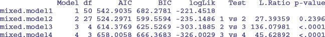
The first model contains a full factorial, with different slopes and intercepts for each of the 25 farms (using up 50 degrees of freedom). The second model has a common slope but different intercepts for the 25 farms (using 27 degrees of freedom); model2 does not have significantly lower explanatory power than model1 (p = 0.2396). The main effects of farm and of nitrogen application (model3 and model4) are both highly significant (p < 0.0001), so we select model2 because it has the lowest AIC.
Finally, we could do an old-fashioned analysis of covariance, fitting a different two-parameter model to each and every farm without any random effects:
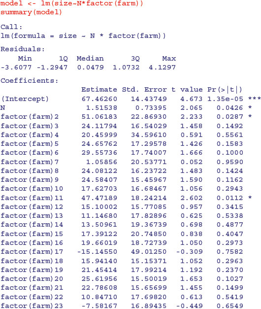
There is a marginally significant overall effect of soil nitrogen on plant size (N has p = 0.0426) and (compared to farm 1) farms 2 and 11 have significantly higher intercepts and shallower slopes. The problem, of course, is that this model, with its 24 slopes and 24 intercepts, is vastly overparameterized. Let us fit a greatly simplified model with a common slope but different intercepts for the different farms:
model2 <- lm(size∼N+factor(farm))

anova(model,model2)
Analysis of Variance Table


Model 1: size ∼ N * factor(farm)

Model 2: size ∼ N + factor(farm)

 	Res.Df	RSS Df Sum of Sq	F Pr(>F)

1	72 281.60

2	95 353.81 -23	-72.212 0.8028 0.717
This analysis provides no support for any significant differences between slopes. What about differences between farms in their intercepts?
model3 <- lm(size∼N)

anova(model2,model3)
Analysis of Variance Table


Model 1: size ∼ N + factor(farm)

Model 2: size ∼ N

 Res.Df		RSS Df Sum of Sq	F Pr(>F)

1	95		353.8

2	118		8454.9 -23	-8101.1 94.574 < 2.2e-16 ***
This shows that there are highly significant differences in intercepts between farms. The interpretation of the analysis of covariance is exactly the same as the interpretation of the mixed model in this case where there is balanced structure and equal replication, but lme is vastly superior to the linear model when there is unequal replication.
19.10 Generalized linear mixed models
Pseudoreplicated data with non-normal errors lead to a choice of generalized linear mixed-effects models using lmer with a specified error family. These were previously handled by the glmmPQL function which is part of the MASS library (see Venables and Ripley, 2002). That function fitted a generalized linear mixed model with multivariate normal random effects, using penalized quasi-likelihood (hence the ‘PQL’). The default method for a generalized linear model fit with lmer has been switched from PQL to the more reliable Laplace method. The lmer function can deal with the same error structures as a generalized linear model, namely Poisson (for count data), binomial (for binary data or proportion data) or gamma (for continuous data where the variance increase with the square of the mean). The model call is just like a mixed-effects model but with the addition of the name of the error family, like this:
lmer(y∼fixed+(time | random), family=binomial)
For a worked example with binary data, involving patients who were tested for the presence of a bacterial infection on a number of occasions (the number varying somewhat from patient to patient), see pp. 660–665. The response variable is binary: yes for infected patients or no for patients not scoring as infected, so the family is binomial. There is a single categorical explanatory variable (a fixed effect) called treatment, which has three levels: drug, drug plus supplement, and placebo. The week numbers in which the repeated assessments on each patient were made is also recorded.
19.10.1 Hierarchically structured count data
This is an example of lmer with Poisson errors. Beetles were collected in pitfall traps laid out in a grid of two columns and five rows (10 pitfalls per quadrat) in each of two quadrats, randomly located within each of 3 randomly-located blocks within a field. On each of 4 farms there were 5 protocols of hedgerow management allocated at random to each of fields within the farm (1 = uncut control, 2 = grass cut, 3 = grass cut twice, 4 = hedge cut, 5 = grass and hedge cut). Here are the 1200 counts:
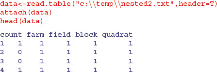
This is what the data look like, classified by farms:
par(mfrow=c(2,2))

hist(count[farm==1],breaks=-0.5:16.5,

 	main="Branton",col="wheat1",xlab="")

hist(count[farm==2],breaks=-0.5:16.5,

 	main="Fawdon",col="wheat2",xlab="")

hist(count[farm==3],breaks=-0.5:16.5,

 	main="Ingram",col="wheat3",xlab="")

hist(count[farm==4],breaks=-0.5:16.5,

 	main="Powburn",col="wheat4",xlab="")
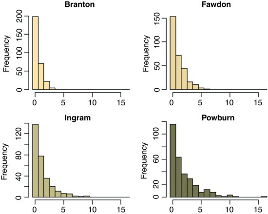
Most of the pitfall traps contained no beetles at all sites, and the maximum number caught was 16 on one occasion at Powburn. There are large differences between the farms in mean beetle counts, but despite this, the five hedgerow management treatments showed substantial differences:
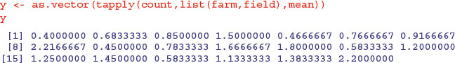
tapply(count,list(farm,field),mean)
		1		2		3		4		5

1 0.4000000 0.4666667 0.4500000 0.5833333 0.5833333

2 0.6833333 0.7666667 0.7833333 1.2000000 1.1333333

3 0.8500000 0.9166667 1.6666667 1.2500000 1.3833333

4 1.5000000 2.2166667 1.8000000 1.4500000 2.2000000
We need to establish whether the treatment differences (as shown here between the column means) are significant. Because of the massive pseudoreplication, we need to analyse the counts very carefully. We shall use a generalized mixed effects model with Poisson errors, treating field as a fixed effect (the field codes refer to the five hedgerow management treatments) with the other factors as nested random effects (quadrats within blocks, within fields, within farms):
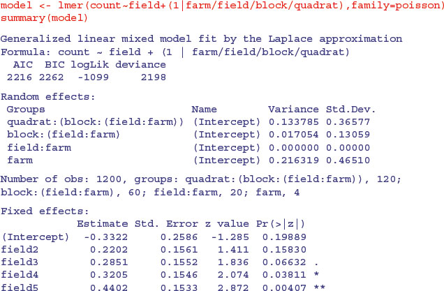
As you can see, management treatments 4 and 5 produced significantly higher beetle counts than the controls. Among the random effects you will see that field:farm (the fixed effect) registers as zero. Much the biggest cause of variation in beetle numbers was differences between the four farms (variance = 0.216) , then differences between the quadrats within a block (0.134), with only very modest differences from block to block within each field (0.017).
If, instead of fitting the management treatment as a fixed effect, we were to fit is as a random effect, then the model changes as follows:
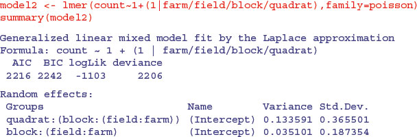
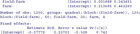
The variance component attributable to differences between blocks has almost doubled (this is the spatial scale immediately below fields, which was the scale at which the fixed effects treatments were applied), but the farm-scale variation (larger scale) and quadrat-scale variation (smaller scale) are almost unaffected. So the difference between fields which looks so small as a random effect (0.001 888) is clearly significant when the term is fitted as a fixed effect (as was appropriate in this example).
Here is the much simpler analysis with the pseudoreplication averaged away. Now, there are only 20 numbers in the dataframe (5 numbers (the five treatment mean counts) from each of 4 farms), and we use these to create a new response variable:
We also need new shorter vectors of categorical explanatory variables for the farm (which now serves as a four-level block in this two-way, non-replicated analysis) and the five-level hedgerow management treatment. The ‘generate factor levels’ function, gl, is useful here. For farm blocks (fblock) we read the instruction to gl like this: ‘generate levels up to 4, each with a repeat of 1, to a total length of 20’. For hedge it says ‘generate levels up to 5, each with a repeat of 4’.
fblock <- gl(4,1,20)

hedge <- gl(5,4)
We cannot fit an exactly analogous model because we no longer have count data (the average beetle numbers are all real numbers) so we cannot use glm with Poisson errors. We can get close enough, however, by using a linear model with the logarithms of the mean counts as the response variable like this:
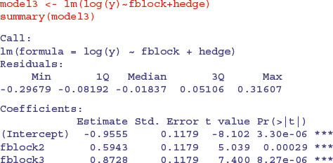
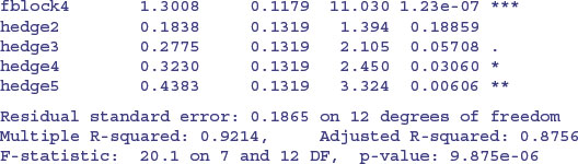
The p values are slightly different, but the interpretation is exactly the same. After model simplification, it turns out that there is one highly significant contrast, between the last two hedge management treatments (4 and 5) and the rest (p = 0.0102). It is hedge cutting, not grass cutting, that makes the difference in beetle counts in this case.
An alternative method of producing the reduced dataframe (i.e. eliminating the pseudoreplication) is to use aggregate like this:
d2<-aggregate(data,list(farm,field),mean)

model<-lm(log(count)∼factor(farm)+factor(field),data=d2)

summary(model)
This produces the same output with less than half the R code.