Chapter 25
Multivariate Statistics
This class of statistical methods is fundamentally different from the others in this book because there is no response variable. Instead of trying to understand variation in a response variable in terms of explanatory variables, in multivariate statistics we look for structure in the data. The problem is that structure is rather easy to find, and all too often it is a feature of that particular data set alone. The real challenge is to find general structure that will apply to other data sets as well. Unfortunately, there is no guaranteed means of detecting pattern, and a great deal of ingenuity has been shown by statisticians in devising means of pattern recognition in multivariate data sets. The main division is between methods that assume a given structure and seek to divide the cases into groups, and methods that seek to discover structure from inspection of the dataframe. The really important point is that you need to know exactly what the question is that you are trying to answer. Do not mistake the opaque for the profound.
The multivariate techniques implemented in R include:
- principal components analysis (prcomp);
- factor analysis (factanal);
- cluster analysis (hclust, kmeans);
- discriminant analysis (lda, qda);
- neural networks (nnet).
These techniques are not recommended unless you know exactly what you are doing, and exactly why you are doing it. Beginners are sometimes attracted to multivariate techniques because of the complexity of the outputs they produce.
25.1 Principal components analysis
The idea of principal components analysis (PCA) is to find a small number of linear combinations of the variables so as to capture most of the variation in the dataframe as a whole. With a large number of variables it may be easier to consider a small number of combinations of the original data rather than the entire dataframe. Suppose, for example, that you had three variables measured on each subject, and you wanted to distil the essence of each individual's performance into a single number. An obvious solution is the arithmetic mean of the three numbers  , where v1, v2 and v3 are the three variables (e.g. pupils' exam scores in maths, physics and chemistry). The vector of coefficients l = (1/3, 1/3, 1/3) is called a linear combination. Linear combinations where
  are called standardized linear combinations. Principal components analysis finds a set of orthogonal standardized linear combinations which together explain all of the variation in the original data. There are as many principal components as there are variables, but typically it is only the first few of them that explain important amounts of the total variation.
Calculating principal components is easy. Interpreting what the components mean in scientific terms is hard, and potentially equivocal. You need to be more than usually circumspect when evaluating multivariate statistical analyses.
The following dataframe contains mean dry weights (in grams) for 54 plant species on 89 plots, averaged over 10 years; see Crawley et al. (2005) for species names and more background. What are the principal components and what environmental factors are associated with them?
pgdata <- read.table("c:\\temp\\pgfull.txt",header=T)

names(pgdata)
[1]	"AC"		 "AE"	"AM"	"AO"	"AP"	"AR"		"AS"

[8]	"AU"		 "BH"	"BM"	"CC"	"CF"	"CM"		"CN"

[15]	"CX"		 "CY"	"DC"	"DG"	"ER"	"FM"		"FP"

[22]	"FR"		 "GV"	"HI"	"HL"	"HP"	"HS"		"HR"

[29]	"KA"		 "LA"	"LC"	"LH"	"LM"	"LO"		"LP"

[36]	"OR"		 "PL"	"PP"	"PS"	"PT"	"QR"		"RA"

[43]	"RB"		 "RC"	"SG"	"SM"	"SO"	"TF"		"TG"

[50]	"TO"		 "TP"	"TR"	"VC"	"VK"	"plot"	"lime"

[57]	"species	 "hay"	"pH"
We need to extract the 54 variables that refer to the species' abundances and leave behind the variables containing the experimental treatments (plot and lime) and the covariates (species richness, hay biomass and soil pH). This creates a smaller dataframe containing all 89 plots (i.e. all the rows) but only columns 1 to 54:
pgd <- pgdata[,1:54]
There are two functions for carrying out PCA in R. The generally preferred method for numerical accuracy is prcomp (where the calculation is done by a singular value decomposition of the centred and scaled data matrix, not by using eigen on the covariance matrix, as in the alternative function princomp).
The aim is to find linear combinations of a set of variables that maximize the variation contained within them, thereby displaying most of the original variation in fewer dimensions. These principal components have a value for every one of the 89 rows of the dataframe. By contrast, in factor analysis (see p. 813), each factor contains a contribution (which may in some cases be zero) from each variable, so the length of each factor is the total number of variables (54 in the current example). This has practical implications, because you can plot the principal components against other explanatory variables from the dataframe, but you cannot do this for factors because the factors are of length 54 while the covariates are of length 89. You need to think about this until the penny drops.
We shall use the option scale=TRUE because the variances are significantly different for the 54 plant species:
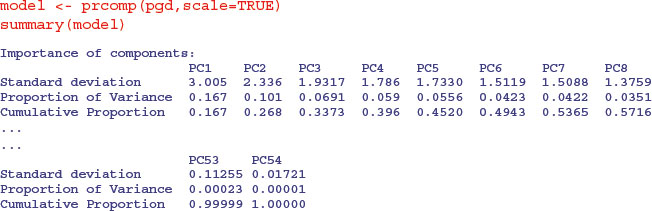
You can see that the first principal component (PC1) explains 16.7% of the total variation, and only the next four (PC2–PC5) explain more than 5% of the total variation. Here is the plot of this model, showing the relative importance of PC1.
plot(model,main="",col="green")

This is called a scree plot in PCA because it is supposed to look like a cliff face on a mountainside (on the left), with a scree slope below it (the tail on the right). The standard practice is to assume that you need sufficient principal components to account for 90 % of the total variation (but that would take 24 components in the present case). Principal component loadings show how the original variables (the 54 different species in our example) influence the principal components.
In a biplot, the original variables are shown by arrows (54 of them in this case):
biplot(model)
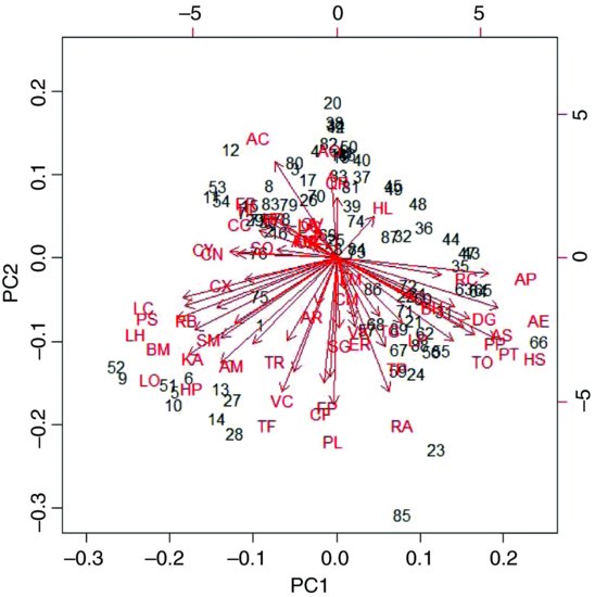
The numbers represent the rows in the original dataframe, and the directions of the arrows show the relative loadings of the species on the first and second principal components. Thus, the species AP, AE and HS have strong positive loadings on PC1 and LC, PS BM and LO have strong negative loadings. PC2 has strong positive loadings from species AO and AC and negative loadings from TF, PL and RA.
If there are explanatory variables available, you can plot these against the principal components to look for patterns. In this example, it looks as if the first principal component is associated with increasing biomass (and hence increasing competition for light) and as if the second principal component is associated with declining soil pH (increasing acidity):
yv <- predict(model)[,1]

yv2 <- predict(model)[,2]

windows(7,4)

par(mfrow=c(1,2))

plot(pgdata$hay,yv,pch=16,xlab="biomass",ylab="PC 1",col="red")

plot(pgdata$pH,yv2,pch=16,xlab="soil pH",ylab="PC 2",col="blue")

There are, indeed, very strong correlations between biomass and PC1 and between soil pH and PC2. Now the real work would start, because we are interested in the mechanisms that underlie these patterns.
25.2 Factor analysis
With principal components analysis we were fundamentally interested in the variables and their contributions. Factor analysis aims to provide usable numerical values for quantities such as intelligence or social status that are not directly measurable. The idea is to use correlations between observable variables in terms of underlying ‘factors’. Note that ‘factors’ in factor analysis are not the same as the categorical explanatory variables we have been calling factors throughout the rest of this book.
Compared with PCA, the variables themselves are of relatively little interest in factor analysis; it is gaining an understanding of the hypothesized underlying factors that is the main aim. The idea is that the correlations amongst the variables are explained by the common factors. The function factanal performs maximum likelihood factor analysis on a covariance matrix or data matrix. The pgd dataframe is introduced on p. 810. You need to specify the number of factors you want to estimate – we begin with 8:
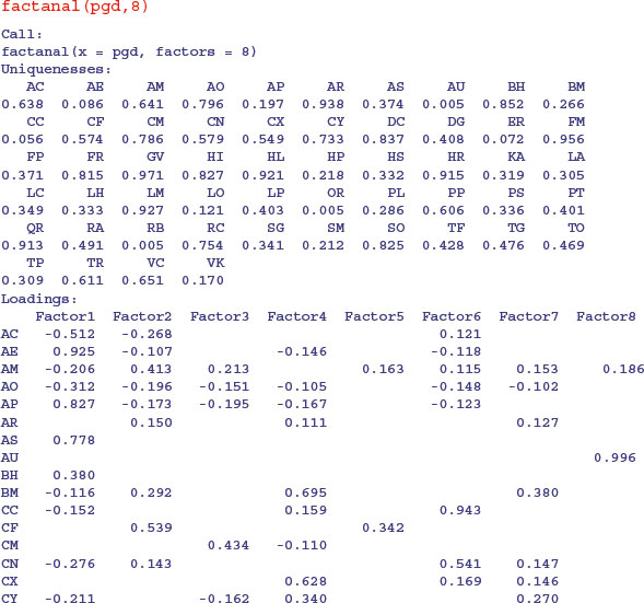
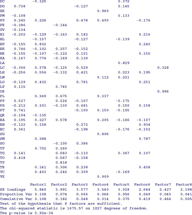
On factor 1 you see strong positive correlations with AE, AP and AS and negative correlations with AC, AO and FR: this has a natural interpretation as a gradient from tall neutral grassland (positive correlations) to short, acidic grasslands (negative correlations). On factor 2, low-growing species associated with moderate to high soil pH (AM, CF, HP, KA) have large positive values and low-growing acid-loving species (AC and AO) have negative values. Factor 3 picks out the key nitrogen-fixing (legume) species LP and TP with high positive values. And so on.
Note that the loadings are of length 54 (the number of variables) not 89 (the number of rows in the dataframe representing the different plots in the experiment), so we cannot plot the loadings against the covariates as we did with PCA (p. 812). However, we can plot the factor loadings against one another:
model <- factanal(pgd,8)

windows(7,7)

par(mfrow=c(2,2))

plot(loadings(model)[,1],loadings(model)[,2],pch=16,xlab="Factor 1",

	ylab="Factor 2",col="blue")

plot(loadings(model)[,1],loadings(model)[,3],pch=16,xlab="Factor 1",

 	ylab="Factor 3",col="red")

plot(loadings(model)[,1],loadings(model)[,4],pch=16,xlab="Factor 1",

 	ylab="Factor 4",col="green")

plot(loadings(model)[,1],loadings(model)[,5],pch=16,xlab="Factor 1",

 	ylab="Factor 5",col="brown")

What factanal does would conventionally be described as exploratory, not confirmatory, factor analysis. For the latter, try the sem package:
install.packages("sem")

library(sem)

?sem
25.3 Cluster analysis
Cluster analysis is a set of techniques that look for groups (clusters) in the data. Objects belonging to the same group resemble each other. Objects belonging to different groups are dissimilar. Sounds simple, doesn't it? The problem is that there is usually a huge amount of redundancy in the explanatory variables. It is not at all obvious which measurements (or combinations of measurements) will turn out to be the ones that are best for allocating individuals to groups. There are three ways of carrying out such allocation:
- partitioning into a number of clusters specified by the user, with functions such as kmeans;
- hierarchical, starting with each individual as a separate entity and ending up with a single aggregation, using functions such as hclust;
- divisive, starting with a single aggregate of all the individuals and splitting up clusters until all the individuals are in different groups.
25.3.1 Partitioning
The kmeans function operates on a dataframe in which the columns are variables and the rows are the individuals. Group membership is determined by calculating the centroid for each group. This is the multidimensional equivalent of the mean. Each individual is assigned to the group with the nearest centroid. The kmeans function fits a user-specified number of cluster centres, such that the within-cluster sum of squares from these centres is minimized, based on Euclidian distance. Here are data from six groups with two continuous explanatory variables (x and y):
kmd <- read.table("c:\\temp\\kmeansdata.txt",header=T)

attach(kmd)

names(kmd)
[1] "x" "y" "group"
par(mfrow=c(2,2))

plot(x,y,pch=16)
The raw data show hints of clustering (top left panel) but the clustering becomes clear only after the groups have been coloured differently using col=group (top right). kmeans does an excellent job when it is told that there are six clusters (open symbols, bottom left) but, of course, there can be no overlap in assignation (as there was in the original data). When just four clusters are estimated, it is the centre cluster and the south-east cluster that disappear (open symbols, bottom right).
plot(x,y,col=group,pch=16)

model <- kmeans(data.frame(x,y),6)

plot(x,y,col=model[[1]])

model <- kmeans(data.frame(x,y),4)

plot(x,y,col=model[[1]])

par(mfrow=c(1,1))
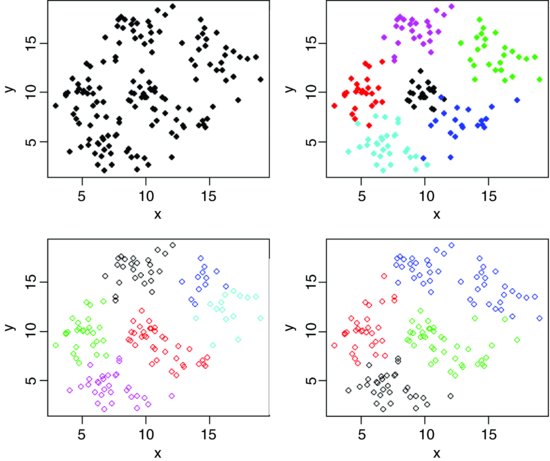
You should compare the bottom two plots carefully to see which points have changed groups.
To see the rate of misclassification we can tabulate the real groups against the groups determined by kmeans:
model <- kmeans(data.frame(x,y),6)

table(model[[1]],group)
 group

	1	2	3	4	5	6

1	0	0	25	1	0	0

2	0	0	0	0	0	25

3	0	0	0	2	10	0

4	0	23	0	0	0	0

5	0	2	0	0	20	0

6	20	0	0	17	0	0
The first thing to note is that R has numbered its groups differently (as it would, because it does not know our names for the groups). Group 1 (in the first column) were associated perfectly (20 out of 20 in R's group 6). Group 2 had 23 of its members in R's group 4 but 2 out of 25 were allocated to R's group 5. Group 3 was classified perfectly. Group 4 was less good, with one misapplication to R's group 1 and two to R's group 3. Group 6 was perfectly classified. The only really poor performance was with Group 5, which was split 20 to 10. This is impressive, given that there were several obvious overlaps in the original data.
25.3.2 Taxonomic use of kmeans
In the next example we have measurements of seven variables on 120 individual plants. The question is which of the variables (fruit size, bract length, internode length, petal width, sepal length, petiole length or leaf width) are the most useful taxonomic characters.
taxa <- read.table("c:\\temp\\taxon.txt",header=T)

attach(taxa)

names(taxa)
[1] "Petals" "Internode" "Sepal" "Bract" "Petiole" "Leaf"

[7] "Fruit"
A simple and sensible way to start is by looking at the dataframe as a whole, using pairs to plot every variable against every other:
pairs(taxa)

There appears to be excellent data separation on sepal length, and reasonable separation on petiole length and leaf width, but nothing obvious for the other variables.
These data actually come from four taxa (labelled I–IV), so in this contrived case we know that there are four groups. In reality, of course, we would not know this, and finding out the number of groups would be one of the central aims of the study. We begin, therefore, by seeing how well kmeans allocates individuals to four groups:
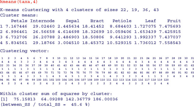
Not very impressive at all. Of course, the computer was doing its classification blind. But we know the four islands from which the plants were collected. Can we write a key that ascribes taxa to islands better than the blind scheme adopted by kmeans? The answer is definitely yes. When we used a classification tree model on the same data, it discovered a faultless key on its own (see Section 23.6).
25.4 Hierarchical cluster analysis
The idea behind hierarchical cluster analysis is to show which of a (potentially large) set of samples are most similar to one another, and to group these similar samples in the same limb of a tree. Groups of samples that are distinctly different are placed in other limbs. The trick is in defining what we mean by ‘most similar’. Each of the samples can be thought of a sitting in an m-dimensional space, defined by the m variables (columns) in the dataframe. We define similarity on the basis of the distance between two samples in this m-dimensional space. Several different distance measures could be used, but the default is Euclidean distance (for the other options, see ?dist), and this is used to work out the distance from every sample to every other sample. This quantitative dissimilarity structure of the data is stored in a matrix produced by the dist function. Initially, each sample is assigned to its own cluster, and then the hclust algorithm proceeds iteratively, at each stage joining the two most similar clusters, continuing until there is just a single cluster (see ?hclust for details).
The following data (introduced on p. 810) show the distribution of 54 plant species over 89 plots receiving different experimental treatments. The aim is to see which plots are most similar in their botanical composition, and whether there are reasonably homogeneous groups of plots that might represent distinct plant communities.
pgdata <- read.table("c:\\temp\\pgfull.txt",header=T)

attach(pgdata)

labels <- paste(plot,letters[lime],sep="")
The first step is to turn the matrix of measurements on individuals into a dissimilarity matrix. In the dataframe, the columns are variables and the rows are the individuals, and we need to calculate the ‘distances’ between each row in the dataframe and every other using dist(pgdata[,1:54]). These distances are then used to carry out hierarchical cluster analysis using the hclust function:
hpg <- hclust(dist(pgdata[,1:54]))
We can plot the object called hpg, and we specify that the leaves of the hierarchy are labelled by their plot numbers (pasted together from the plot number and lime treatment):
plot(hpg,labels=labels,main= "")
If you view this object in full-screen mode within R you will be able to read all the plot labels, and to work out the groupings. It turns out that the groupings have very natural scientific interpretations. The highest break, for instance, separates the two plots dominated by Holcus lanatus (11.1d and 11.2d) from the other 87 plots. The second break distinguishes the high nitrogen plots also receiving phosphorus (plots 11 and 14). The third break takes out the acidified plots (numbers 9, 10 and 4.2). The plots on the right-hand side all have soils that exhibit phosphorus deficiency. The leftmost groups are all from plots receiving high rates of nitrogen and phosphorus input. More subtly, plots 12a and 3a are supposed to be the same (they are replicates of the no-fertilizer, high-lime treatment), yet they are separated at a break at height approximately 15. And so on. The hclust function has done an excellent job of recognizing real plant communities over the top seven splits.
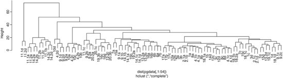
Let us try hierarchical clustering on the taxonomic data (p. 817).
plot(hclust(dist(taxa)),main="")
Because in this artificial example we know that the first 30 rows in the dataframe come from group 1, rows 31–60 from group 2, rows 61–90 from group 3 and rows 91–120 from group 4, we can see than the grouping produced by hclust is pretty woeful. Most of the rows in the leftmost major split are from group 2, but the rightmost split contains members from groups 1, 4 and 3. Neither kmeans nor hclust is up to the job in this case. When we know the group identities, then it is easy to use tree models to devise the optimal means of distinguishing and classifying individual cases (see p. 781).

So there we have it. When we know the identity of the species, then tree models are wonderfully efficient at constructing keys to distinguish between the individuals, and at allocating them to the relevant categories. When we do not know the identities of the individuals, then the statistical task is much more severe, and inevitably ends up being much more error-prone. The best that cluster analysis could achieve through kmeans was with five groups (one too many, as we know, having constructed the data) and in realistic cases we have no way of knowing whether five groups was too many, too few or just right. Multivariate clustering without a response variable is fundamentally difficult and equivocal.
25.5 Discriminant analysis
In this case, you know the identity of each individual (unlike cluster analysis) and you want to know how the explanatory variables contribute to the correct classification of individuals. The method works by uncovering relationships among the groups' covariance matrices to discriminate between groups. With k groups you will need k – 1 discriminators. The functions you will need for discriminant analysis are available in the MASS library. Returning to the taxon dataframe (see p. 817), we will illustrate the use of lda to carry out a linear discriminant analysis. For further relevant information, see ?predict.lda and ?qda in the MASS library.
library(MASS)

model <- lda(Taxon∼.,taxa)

plot(model,col=rep(1:4,each=30))

The linear discriminators LD1 and LD2 clearly separate taxon IV without error, but this is easy because there is no overlap in sepal length between this taxon and the others. LD2 and LD3 are quite good at finding taxon II (upper right), and LD1 and LD3 are quite good at getting taxon I (bottom left). Taxon III would be what was left over. Here is the printed model:
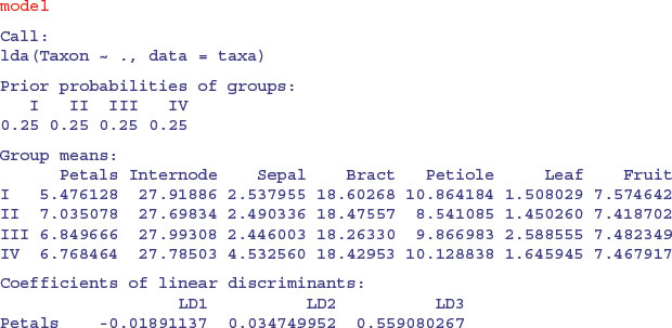
So you would base your key on sepal first (3.45) then leaf (–3.008) then petiole (–1.249). Compare this with the key uncovered by the tree model on p. 778. Here are the predictions from the linear discriminant analysis:
One of the members of taxon I is misallocated to taxon III (case 21), but otherwise the discrimination is perfect. You can train the model with a random subset of the data (say, half of it; 60 random cases):
train <- sort(sample(1:120,60))

table(Taxon[train])
 I II III IV

13 18 16	13
This set has only 13 members of taxon I and IV but reasonable representation of the other two taxa (there would be 15 of each in an even split). Now use this for training:
This is still very good: the first 13 should be I, the next 18 II, and so on. The discrimination is perfect in this randomization. You can use the model based on the training data to predict the unused data:
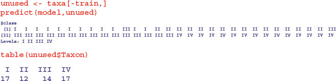
As you can see, one of the first 17 that should have been taxon I was misclassified as taxon III, but all the other predictions were spot on.
25.6 Neural networks
These are computationally intensive methods for finding pattern in data sets that are so large, and contain so many explanatory variables, that standard methods such as multiple regression are impractical (they would simply take too long to plough through). The key feature of neural network models is that they contain a hidden layer: each node in the hidden layer receives information from each of many inputs, sums the inputs, adds a constant (the bias) then transforms the result using a fixed function. Neural networks can operate like multiple regressions when the outputs are continuous variables, or like classifications when the outputs are categorical. They are described in detail by Ripley (1996). Facilities for analysing neural networks are in the MASS library.