Chapter 27
Survival Analysis
A great many studies in statistics deal with deaths or with failures of components: they involve the numbers of deaths, the timing of death, or the risks of death to which different classes of individuals are exposed. The analysis of survival data is a major focus of the statistics business (see Kalbfleisch and Prentice, 1980; Miller, 1981; Fleming and Harrington 1991), for which R supports a wide range of tools. The main theme of this chapter is the analysis of data that take the form of measurements of the time to death, or the time to failure of a component. Up to now, we have dealt with mortality data by considering the proportion of individuals that were dead at a given time. In this chapter each individual is followed until it dies, then the time of death is recorded (this will be the response variable). Individuals that survive to the end of the experiment will die at an unknown time in the future; they are said to be censored (as explained below).
27.1 A Monte Carlo experiment
With data on time to death, the most important decision to be made concerns the error distribution. The key point to understand is that the variance in age at death is almost certain to increase with the mean, and hence standard models (assuming constant variance and normal errors) will be inappropriate. You can see this at once with a simple Monte Carlo experiment. Suppose that the per-week probability of failure of a component is 0.1 from one factory but 0.2 from another. We can simulate the fate of an individual component in a given week by generating a uniformly distributed random number between 0 and 1. If the value of the random number is less than or equal to 0.1 (or 0.2 for the second factory), then the component fails during that week and its lifetime can be calculated. If the random number is larger than 0.1 (or 0.2, respectively), then the component survives to the next week. The lifetime of the component is simply the number of the week in which it finally failed. Thus, a component that failed in the first week has an age at failure of 1 (this convention means that there are no zeros in the dataframe).
The simulation is very simple. We create a vector of random numbers, rnos, that is long enough to be certain to contain a value that is less than our failure probabilities of 0.1 and 0.2. Remember that the mean life expectancy is the reciprocal of the failure rate, so our mean lifetimes will be 1/0.1 = 10 and 1/0.2 = 5 weeks, respectively. A length of 100 should be more than sufficient:
rnos <- runif(100)
The trick is to find the week number in which the component failed; this is the lowest subscript for which rnos <=0.1 for factory 1. We can do this very efficiently using the which function: which returns a vector of subscripts for which the specified logical condition is true. So for factory 1 we would write:
which(rnos<= 0.1)
[1] 5 8 9 19 29 33 48 51 54 63 68 74 80 83 94 95
This means that 16 of my first set of 100 random numbers were less than or equal to 0.1. The important point is that the first such number occurred in week 5. So the simulated value of the age of death of this first component is 5 and is obtained from the vector of failure ages using the subscript [1]:
which(rnos<= 0.1)[1]
[1] 5
All we need to do to simulate the life spans of a sample of 30 components, death1, is to repeat the above procedure 30 times:
death1 <- numeric(30)
for (i in 1:30){
rnos <- runif(100)
death1[i] <- which(rnos<= 0.1)[1]
}
death1
[1] 5 8 7 23 5 4 18 2 6 4 10 12 7 3 5 17 1 3 2 1 12
[22] 8 2 12 6 3 13 16 3 4
The fourth component survived for a massive 23 weeks but the 17th component failed during its first week. The simulation has roughly the right average weekly failure rate:
1/mean(death1)
[1] 0.1351351
which is as close to 0.1 as we could reasonably expect from a sample of only 30 components.
Now we do the same for the second factory with its failure rate of 0.2:
death2 <- numeric(30)
for (i in 1:30) {
rnos <- runif(100)
death2[i] <- which(rnos<= 0.2)[1] }
The sample mean is again quite reasonable (the real hazard was 0.20):
1/mean(death2)
[1] 0.2205882
We now have the simulated raw data to carry out a comparison in age at death between factories 1 and 2. We combine the two vectors into one, and generate a vector to represent the factory identities:
death <- c(death1,death2)
factory <- factor(c(rep(1,30),rep(2,30)))
We get a visual assessment of the data as follows:
plot(factory,death,xlab="factory",ylab="age at failure",col="wheat3")
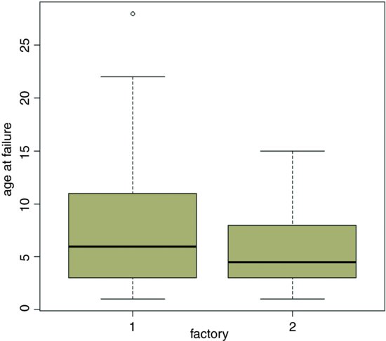
The median age at death for factory 1 is somewhat greater, but the variance in age at death is much higher than from factory 2. For data like this we expect the variance to be proportional to the square of the mean, so an appropriate error structure is the gamma (as explained below). We model the data very simply as a one-way analysis of deviance using glm with family=Gamma (note the upper-case ‘G’):
model1 <- glm(death∼factory,Gamma)
summary(model1)
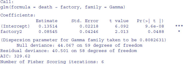
We conclude that the factories are marginally significantly different in mean age at failure of these components (p = 0.0488). So, even with a twofold difference in the true failure rate, it is hard to detect a significant difference in mean age at death with samples of size n = 30. The moral is that for data like this on age at death you are going to need really large sample sizes in order to find significant differences.
It is good practice to remove variable names (like death) that you intend to use later in the same session (see p. 10):
rm(death)
27.2 Background
Since everything dies eventually, it is often not possible to analyse the results of survival experiments in terms of the proportion that were killed (as we did in Chapter 16); in due course, they all die. Look at the following figure: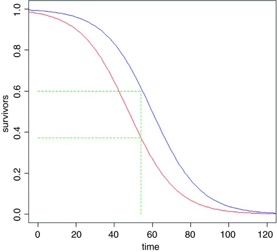
It is clear that the two treatments (red and blue) caused different patterns of mortality, but both start out with 100% survival and both end up with zero. We could pick some arbitrary point in the middle of the distribution at which to compare the percentage survival (say at time 54, shown by the vertical green dashed line, where the red curve shows 38% survival but the blue curve shows 60% survival), but this may be difficult in practice, because one or both of the treatments might have few observations at the same location. Also, the choice of when to measure the difference is entirely subjective and hence open to bias. It is much better to use R's powerful facilities for the analysis of survival data than it is to pick an arbitrary time at which to compare two proportions.
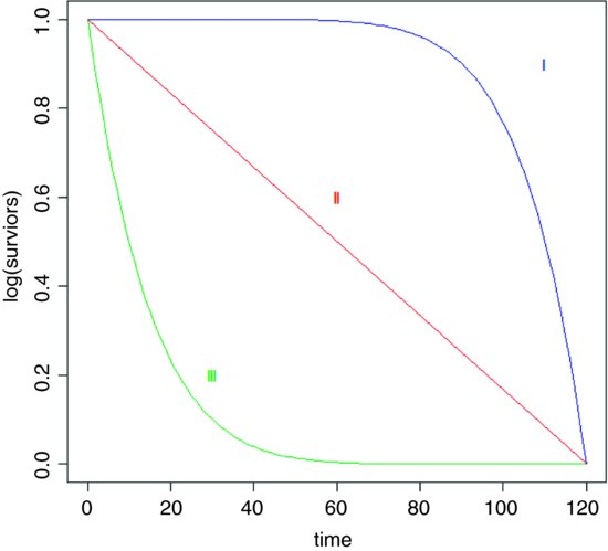
Demographers, actuaries and ecologists use three interchangeable concepts when dealing with data on the timing of death: survivorship, age at death and instantaneous risk of death. There are three broad patterns of survivorship (named by the eminent American animal ecologist Edward Deevey in 1947): Type I, where most of the mortality occurs late in life (e.g. humans); Type II, where mortality occurs at a roughly constant rate throughout life; and Type III, where most of the mortality occurs early in life (e.g. salmonid fishes). On a log scale, the numbers surviving over time would look like this:
27.3 The survivor function
The survivorship curve plots the natural log of the proportion of a cohort of individuals starting out at time 0 that is still alive at time t. For the so-called Type II survivorship curve (the red line above), there is a linear decline in log numbers with time. This means that a constant proportion of the individuals alive at the beginning of a time interval will die during that time interval (i.e. the proportion dying is independent of density and constant for all ages). When the death rate is highest for the younger age classes we get Type III survivorship curve, which descends steeply at first, with the rate of descent easing later on. When it is the oldest animals that have the highest risk of death (as in the case of human populations in affluent societies where there is low infant mortality) we obtain the Type I curve, which has a shallow descent to start, becoming steeper later.
27.4 The density function
The density function describes the fraction of all deaths from our initial cohort that are likely to occur in a given brief instant of time. For the Type II curve this is a negative exponential. Because the fraction of individuals dying is constant with age, the number dying declines exponentially as the number of survivors (the number of individuals at risk of death) declines exponentially with the passage of time. The density function declines more steeply than exponentially for Type III survivorship curves. In the case of Type I curves, however, the density function has a maximum at the time when the product of the risk of death and the number of survivors is greatest (see below).
27.5 The hazard function
The hazard is the instantaneous risk of death. It is the instantaneous rate of change in the log of the number of survivors per unit time. Thus, for the Type II survivorship the hazard function is a horizontal line, because the risk of death is constant with age. Although this sounds highly unrealistic, it is a remarkably robust assumption in many applications. It also has the substantial advantage of parsimony. In some cases, however, it is clear that the risk of death changes substantially with the age of the individuals, and we need to be able to take this into account in carrying out our statistical analysis. In the case of Type III survivorship, the risk of death declines with age, while for Type I survivorship (as in humans) the risk of death increases with age.
27.6 The exponential distribution
This is a one-parameter distribution in which the hazard function is independent of age (i.e. it describes a Type II survivorship curve). The exponential is a special case of the gamma distribution in which the shape parameter α is equal to 1.
27.6.1 Density function
The density function is the probability of a death occurring in the small interval of time between t and t + dt, and a plot of the number dying in the interval around time t as a function of t (i.e. the proportion of the original cohort dying at a given age) declines exponentially:

where both μ and t are greater than 0. Note that the density function has an intercept of 1/μ (remember that e0 is 1). The number from the initial cohort dying per unit time declines exponentially with time, and a fraction 1/μ dies during the first time interval (and, indeed, during every subsequent time interval).
27.6.2 Survivor function
This shows the proportion of individuals from the initial cohort born at time 0 still alive at time t:

The survivor function has an intercept of 1 (i.e. all the cohort is alive at time 0), and shows the probability of surviving at least as long as t.
27.6.3 Hazard function
This is the statistician's equivalent of the ecologist's instantaneous death rate. It is defined as the ratio between the density function and the survivor function, and is the conditional density function at time t, given survival up to time t. In the case of Type II curves this has an extremely simple form:
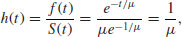
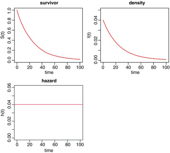
because the exponential terms cancel out. Thus, with the exponential distribution the hazard is the reciprocal of the mean time to death, and vice versa. For example, if the mean time to death is 25 weeks, then the hazard is 0.04; if the hazard were to increase to 0.05, then the mean time of death would decline to 20 weeks.
The survivor, density and hazard functions of the exponential distribution are as follows (note the changes of scale on the y axes):
Of course, the death rate may not be constant with age. For example, the death rate may be high for very young as well as for very old animals, in which case the survivorship curve is like an S shape on its side.
27.7 Kaplan–Meier survival distributions
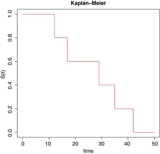
The response in a survival analysis an initially perplexing object called a Kaplan–Meier object. There are two parts to it: the survival part and the status part. The Kaplan–Meier survival distribution is a discrete stepped survivorship curve that accrues information as each death occurs. Suppose we had n = 5 individuals and that the times at death were 12, 17, 29, 35 and 42 weeks after the beginning of a trial. The survival curve is horizontal at 1.0 until the first death occurs at time 12. The curve then steps down to 0.8 because 80% of the initial cohort is now alive. It continues at 0.8 until time 17 when the curve steps down to 0.6 (40% of the individuals are now dead). And so on until all of the individuals are dead at time 42.
In general, therefore, we have two variables at any one time: the number of deaths, d(ti), and the number at risk, r(ti) (i.e. those that have not yet died: the survivors). The Kaplan–Meier survivor function is
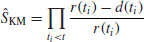
which, as we have seen, produces a step at every time at which one or more deaths occurs.
Sometimes we know when an individual was last seen alive, but not the age at which it died. Patients may leave a study for all sorts of reasons (recovery, emigration, etc.) and it is important that we make the maximum use of the information that we have about them (even though we do not have a value for age at death, which is the response variable). The status of individuals makes up the second component of the response object. It is a vector showing for each individual whether its time value is an age at death or age when last seen alive. Deaths are indicated by 1 and non-deaths by 0. The non-dead individuals are said to be censored. These individuals have their ages shown by a + (‘plus’) on the plot, or after their age in a dataframe (thus 65 means died at time 65, but 65+ means still alive when last seen at age 65). Censored individuals contribute to our understanding of the shape of the survivorship curve but they do not contribute directly to our understanding of the mean age at death.
27.8 Age-specific hazard models
In many circumstances, the risk of death increases with age. There are many models to chose from:
| Distribution | Hazard |
| Exponential |  |
| Weibull |  |
| Gompertz | bect |
| Makeham | a + bect |
| Extreme value |  |
| Rayleigh | a + bt |
The Rayleigh is obviously the simplest model in which hazard increases with time, but the Makeham is widely regarded as the best description of hazard for human subjects. After infancy, there is a constant hazard (a) which is due to age-independent accidents, murder, suicides, etc., with an exponentially increasing hazard in later life. The Gompertz assumption was that ‘the average exhaustion of a man's power to avoid death is such that at the end of equal infinitely small intervals of time he has lost equal portions of his remaining power to oppose destruction which he had at the commencement of these intervals’. Note that the Gompertz differs from the Makeham only by the omission of the extra background hazard (a), and this becomes negligible in old age. The Weibull distribution is very flexible because it can deal with hazards that increase with age in an accelerating (α > 1) or decelerating (α < 1) manner with age.
These plots show how hazard changes with age for four of the hazard functions:

27.9 Survival analysis in R
There are three cases that concern us here:
- constant hazard and no censoring;
- constant hazard with censoring;
- age-specific hazard, with or without censoring.
The first case is dealt with very simply in R by specifying a generalized linear model with gamma errors. The second case involves the use of exponential survival models with a censoring indicator (1 indicates that the response is a time at death, 0 indicates that the individual was alive when last seen; see below and p. 883). The third case involves a choice between parametric models, based on the Weibull distribution, and non-parametric techniques, based on the Cox proportional hazards model.
27.9.1 Parametric models
We are unlikely to know much about the error distribution in advance of the study, except that it will certainly not be normal. In R we are offered several choices for the analysis of survival data:
- gamma;
- exponential;
- piecewise exponential;
- extreme value;
- log-logistic;
- lognormal;
- Weibull.
In practice, it is often difficult to choose between them. In general, the best solution is to try several distributions and to pick the error structure that produces the minimum error deviance.
27.9.2 Cox proportional hazards model
This is the most widely used regression model for survival data. It assumes that the hazard is of the form
where Zi(t) is the set of explanatory variables for individual i at time t. The risk score for subject i is

in which β is a vector of parameters from the linear predictor; λ0(t) is an unspecified baseline hazard function that will cancel out in due course. The antilog guarantees that λ is positive for any regression model βZi(t). If a death occurs at time t*, then, conditional on this death occurring, the likelihood that it is individual i that dies, rather than any other individual at risk, is
The product of these terms over all times of death,  , was christened a partial likelihood by Cox (1972). This is clever, because maximizing log(L(β)) allows an estimate of β without knowing anything about the baseline hazard function (λ0(t) is a nuisance variable in this context). The proportional hazards model is nonparametric in the sense that it depends only on the ranks of the survival times.
27.9.3 Cox's proportional hazard or a parametric model?
In cases where you have censoring, or where you want to use a more complex error structure, you will need to choose between a parametric model, fitted using survreg, and a non-parametric model, fitted using coxph. If you want to use the model for prediction, then you have no choice: you must use the parametric survreg because coxph does not extrapolate beyond the last observation. Traditionally, medical studies use coxph while engineering studies use survreg (so-called accelerated failure-time models), but both disciples could fruitfully use either technique, depending on the nature of the data and the precise question being asked. Here is a typical question addressed with coxph: ‘How much does the risk of dying decrease if a new drug treatment is given to a patient?’ In contrast, parametric techniques are typically used for questions like this: ‘What proportion of patients will die in 2 years based on data from an experiment that ran for just 4 months?’
27.10 Parametric analysis
The following example concerns survivorship of two cohorts of seedlings. All the seedlings died eventually, so there is no censoring in this case. There are two questions:
- Was survivorship different in the two cohorts?
- Was survivorship affected by the size of the canopy gap in which germination occurred?
Here are the data:
seedlings <- read.table("c:\\temp\\seedlings.txt",header=T)
attach(seedlings)
names(seedlings)
[1] "cohort" "death" "gapsize"
We need to load the survival library:
library(survival)
We begin by creating a variable called status to indicate which of the data are censored:
status <- 1*(death>0)
There are no cases of censoring in this example, so all of the values of status are equal to 1.
The fundamental object in survival analysis is Surv(death,status), the Kaplan–Meier survivorship object (see p. 875 for an introduction to this). We can plot it out using survfit like this:
plot(survfit(Surv(death,status)∼1),ylab="Survivorship",xlab="Weeks",col=4)
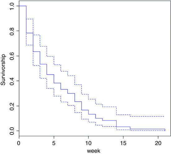
This shows the overall survivorship curve with the confidence intervals. All the seedlings were dead by week 21. Were there any differences in survival between the two cohorts?
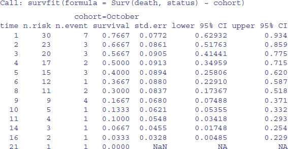
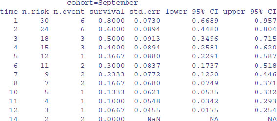
model <- survfit(Surv(death,status)∼cohort)
summary(model)
To plot these figures use plot(model) like this:
plot(model,col=c("red","blue"),ylab="Survivorship",xlab="week")

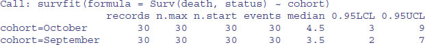
The red line is for the October cohort and the blue line is for September. To see the median times at death for the two cohorts, just type:
model
27.11 Cox's proportional hazards
The median age at death was one week later in the October cohort, but look at the width of the confidence intervals: 3 to 9 versus 2 to 7. Clearly there is no significant effect of cohort on time of death. What about gap size? We start with a full analysis of covariance using coxph rather than survfit.
model1 <- coxph(Surv(death,status)∼strata(cohort)*gapsize)
summary(model1)
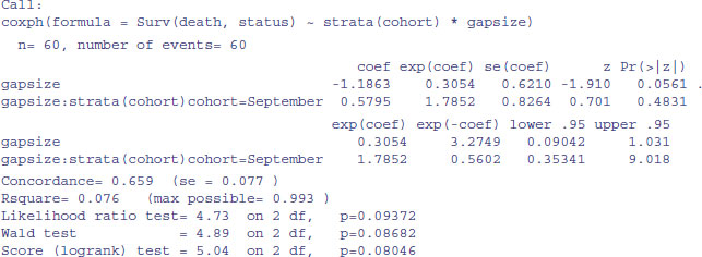
There is no evidence of any interaction (p = 0.483) and the main effect of gap size is not quite significant in this model (p = 0.056). We fit the simpler model with no interaction:
model2 <- coxph(Surv(death,status)∼strata(cohort)+gapsize)
anova(model1,model2)
Analysis of Deviance Table
Cox model: response is Surv(death, status)
Model 1: ∼ strata(cohort) * gapsize
Model 2: ∼ strata(cohort) + gapsize
loglik Chisq Df P(>|Chi|)
1 -146.95
2 -147.20 0.4945 1 0.4819
There is no significant difference in explanatory power, so we accept the simpler model without an interaction term. Note that removing the interaction makes the main effect of gap size significant (p = 0.035):
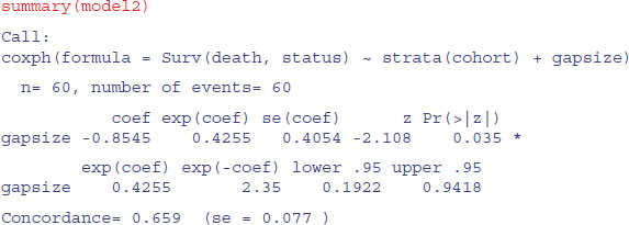
We conclude that the risk of seedling death is lower in bigger gaps (coef = -0.855), but this effect is similar in the September and October germinating cohorts.
You see that the modelling methodology is exactly the same as usual: fit a complicated model and simplify it to find a minimal adequate model. The only difference is the use of Surv(death,status) when the response is a Kaplan–Meier object.
27.12 Models with censoring
Censoring occurs when we do not know the time of death for all of the individuals. This comes about principally because some individuals outlive the experiment, while others leave the experiment before they die. We know when we last saw them alive, but we have no way of knowing their age at death. These individuals contribute something to our knowledge of the survivor function, but nothing to our knowledge of the age at death. Another reason for censoring occurs when individuals are lost from the study: they may be killed in accidents, they may emigrate, or they may lose their identity tags.
In general, then, our survival data may be a mixture of times at death and times after which we have no more information on the individual. We deal with this by setting up an extra vector called the censoring indicator to distinguish between the two kinds of numbers. If a time really is a time to death, then the censoring indicator takes the value 1. If a time is just the last time we saw an individual alive, then the censoring indicator is set to 0. Thus, if we had the following time data T and censoring indicator W on seven individuals, this would mean that five of the times were times at death while in two cases, one at time 8 and another at time 15, individuals were seen alive but never seen again:

With repeated sampling in survivorship studies, it is usual for the degree of censoring to decline as the study progresses. Early on, many of the individuals are alive at the end of each sampling interval, whereas few if any survive to the end of the last study period. We need to tidy up from the last example:
rm(status)
detach(seedlings)
The following example comes from a study of cancer patients undergoing one of four drug treatment programmes (drugs A, B and C and a placebo):
cancer <- read.table("c:\\temp\\cancer.txt",header=T)
attach(cancer)
names(cancer)
[1] "death" "treatment" "status"
plot(survfit(Surv(death,status)∼treatment),
col=c(1:4),ylab="Surivorship",xlab="Time")
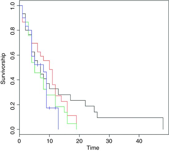
The censored individuals are shown by crosses on the Kaplan–Meier plot, above. Of the non-censored individuals, the mean ages at death were as follows:
tapply(death[status==1],treatment[status==1],mean)
 	DrugA DrugB DrugC placebo
9.480000 8.360000 6.800000 5.238095
The long tail is for drug A (black line). The latest deaths in the other treatments were at times 14 and 19. The variances in age at death are dramatically different under the various treatments:
tapply(death[status==1],treatment[status==1],var)
 	DrugA DrugB DrugC placebo
117.51000 32.65667 27.83333 11.39048
27.12.1 Parametric models
The simplest model assumes a constant hazard: dist="exponential".
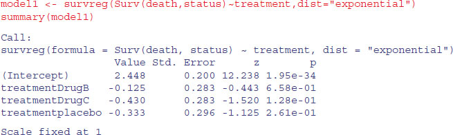
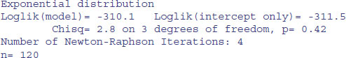
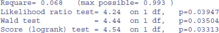
Under the assumption of exponential errors there are no significant effects of drug treatment on survivorship (all p > 0.1). How about modelling non-constant hazard using Weibull errors instead (these are the default for survreg)?
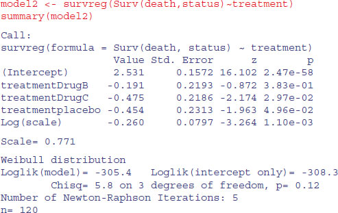
The scale parameter 0.771, being less than 1, indicates that slope of the hazard decreases with age in this study. Drug B is not significantly different from drug A (p = 0.38), but drug C and the placebo are significantly poorer (p < 0.05). We can use anova to compare model1 and model2:
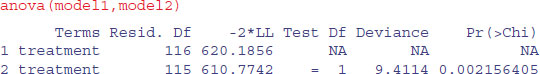
You can see that model2 with Weibull errors is significant improvement over model1 with exponential errors (p = 0.002).
We can try amalgamating the factor levels – the analysis suggests that we begin by grouping A and B together:
treat2 <- treatment
levels(treat2)
[1] "DrugA" "DrugB" "DrugC" "placebo"
levels(treat2)[1:2] <- "DrugsAB"
levels(treat2)
[1] "DrugsAB" "DrugC" "placebo"
model3 <- survreg(Surv(death,status)∼treat2)
anova(model2,model3)

That model simplification was justified. What about drug C? Can we lump it together with the placebo?
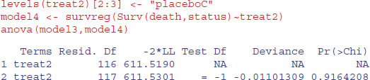
Yes, we can. That simplification was clearly justified (p = 0.916):
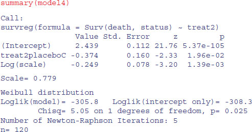
We can summarize the results in terms of the mean age at death, taking account of the censoring:
tapply(predict(model4,type="response"),treat2,mean)
 DrugsAB placeboC
11.459885 7.887685
Here are the uncorrected mean ages at death for those cases where we know the age of death:
tapply(death[status==1],treat2[status==1],mean)
 DrugsAB placeboC
8.920000 6.086957
The greater the censoring, the bigger the difference will be.
detach(cancer)
rm(death, status)
27.12.2 Comparing coxph and survreg survival analysis
Finally, we shall compare the methods, parametric and non-parametric, by analysing the same data set both ways. It is an analysis of covariance with one continuous explanatory variable (initial weight) and one categorical explanatory variable (group):
insects <- read.table("c:\\temp\\roaches.txt",header=T)
attach(insects)
names(insects)
[1] "death" "status" "weight" "group"
First, we plot the survivorship curves of the three groups:
plot(survfit(Surv(death,status)∼group),col=c(2,3,4),ylab="Survivorship",
xlab="Time")
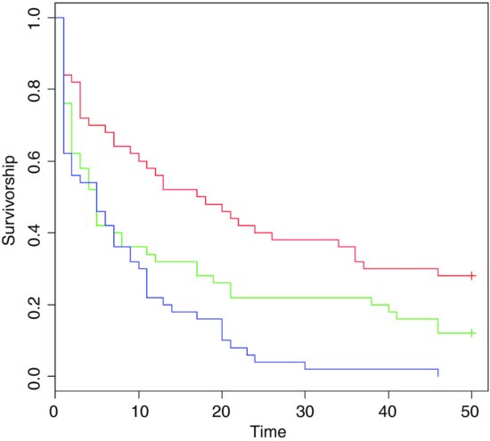
There are clearly big differences between the death rates in the three groups. The crosses + at the end of the survivorship curves for groups A and B indicate that there was censoring in these groups (not all of the individuals were dead at the end of the experiment).
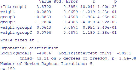
We begin the modelling with parametric methods (survreg). We shall compare the default error distribution (Weibull, which allows for non-constant hazard with age) with the simpler exponential (assuming constant hazard):
model1 <- survreg(Surv(death,status)∼weight*group,dist="exponential")
summary(model1)
Call:
survreg(formula = Surv(death, status) ∼ weight * group, dist = "exponential")
For model2 we employ the default Weibull distribution allowing non-constant hazard:
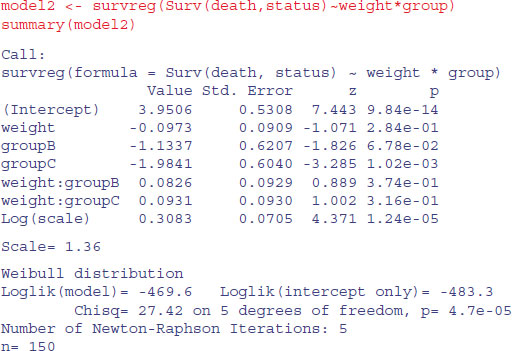
The fact that the scale parameter is greater than 1 indicates that the risk of death increases with age in this case. We compare the two models in the usual way, using anova:
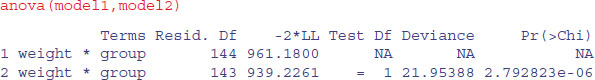
The Weibull model2 is vastly superior to the exponential (p < 0.000 01) so we continue with model2. There is no evidence in model2 (summary above) of any interaction between weight and group (p = 0.374) so we simplify using step:

After eliminating the non-significant interaction (AIC = 950.30), R has removed the main effect of weight (AIC = 949.01), but has kept the main effect of group (AIC of <none> is less than AIC of -group).
The minimal model with survreg is this:
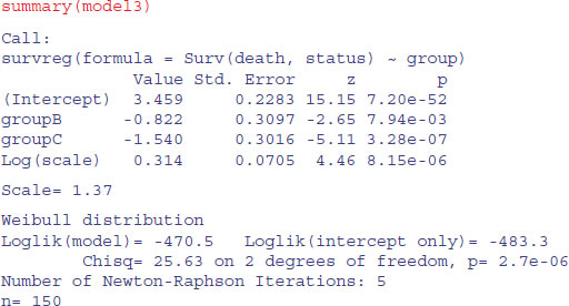
It is clear that all three groups are required (B and C differ by 0.72, with standard error 0.31), so this is the minimal adequate model. Here are the predicted mean ages at death:
tapply(predict(model3),group,mean)
 	A	B	C
31.796137 13.972647 6.814384
You can compare these with the mean ages of those insects that died
tapply(death[status==1],group[status==1],mean)
 	A	B	C
12.611111 9.568182 8.020000
and the ages when insects were last seen (dead or alive):
tapply(death,group,mean)
 	A	 B	C
23.08 14.42	8.02
The predicted ages at death are substantially greater than the observed ages at last sighting when there is lots of censoring (e.g. 31.8 vs. 23.08 for group A).
Here are the same data analysed with the Cox proportional hazards model:

As you see, the interaction terms are not significant (p > 0.39), so we simplify using step as before:
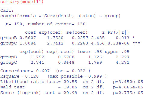
model11 <- step(model10)
Start: AIC=1113.54
Surv(death, status) ∼ weight * group
 	Df	AIC
- weight:group	2 1110.3
<none>		1113.5
Step:	AIC=1110.27
Surv(death, status) ∼ weight + group
 	Df	AIC
- weight		1 1108.8
<none>		1110.3
- group		2 1123.7
Step: AIC=1108.82
Surv(death, status) ∼ group
	Df	AIC
<none>		1108.8
- group		2 1125.4
Note that the AIC values are different than they were with the parametric model. The interaction term is dropped because this simplification reduces AIC to 1110.3. Then the covariate (weight) is dropped because this simplification also reduces AIC (to 1108.8). But removing group would increase AIC to 1125.4, so this is not done. The minimal model contains a main effect for group but no effect of weight:
To see what these numbers mean, it is a good idea to go back to the raw data on times of death (or last sighting for the censored individuals). Here are the mean values of those that died:
tapply(death[status==1],group[status==1],mean)
 	A	B	C
12.611111	9.568182	8.020000
Evidently, individuals in group A lived a lot longer than those in group C. Compared with group C (the minimum value), the mean age at death for group A expressed as a ratio is
12.61/8.02
[1] 1.572319
and for group B we have
12.61/9.57
[1] 1.317659
These figures are the approximate hazards for an individual in group C or B relative to an individual in group A. In the coxph output of model11 they are labelled exp(coef). The model values are slightly different from the raw means because of the way the model has dealt with censoring (14 censored individuals in group A, six in group B and none in group C).
You should compare the outputs from the two functions coxph and survreg to make sure you understand their similarities and differences. One fundamental difference is that the parametric Kaplan–Meier survivorship curves refer to the population, whereas Cox proportional hazards refer to an individual in a particular group.