CHAPTER 16
Illustrations and artwork
16.1 General principles
16.1.1 Introduction
Illustrations are non-textual graphic elements, commonly referred to as artwork, used to enhance publications of all kinds, and are an essential part of many works, from children’s stories to technical manuals, in both conventional print and online/digital media. They may be, for example, photographic images, graphs, charts, maps, or drawings/cartoons, essential to the delivery of the ideas in the publication or purely cosmetic/decorative. They may be embedded in the main text or appear separately; they may be an integral part of the design. Multimedia publication also allows the integrated use of audio and video elements, although this aspect is beyond the scope of the present chapter.
Historically, original artwork was typically supplied to publishers as black and white drawings, tone photographs, or colour transparencies (hard copy; see 16.4). It is now standard publishing practice for illustrations to be handled as digital artwork (see 16.3), created by the author using digital photography or suitable graphics software packages, or produced by scanning existing hard copies.
There are different criteria for preparing/publishing illustrations in print and digital media—an illustration created for online use (e.g. an infographic; see 16.2.4) will generally not be suitable for high-quality printing. It is important that authors prepare and supply artwork in the correct format for the final output.
Illustrations not created by the author(s) for a specific publication (including illustrations previously published elsewhere or images taken from the web) may be subject to copyright, and permission to reproduce them must be obtained from the copyright holder (see 16.5).
The effective use of illustrations can significantly improve the clarity of the messages conveyed. Consult with your editor/publisher and prepare them at the same time as writing the text. Consider their layout in relation to the overall material, whether printed or digital. Do not let them be an afterthought!
16.1.2 Numbering and citations
Figures (illustrations together with their captions) may be numbered by chapter or section in the order in which they appear (e.g. the second figure in Chapter 1 is Figure 1.2 and the third figure in Section III is Figure III.3); if there are only a few, they can be numbered in a single sequence throughout the text. Figures in an appendix are numbered separately (e.g. the fourth figure in Appendix A1 is Figure A1.4). Numbered plates also use a separate sequence (see 16.2.3).
Depending on the nature of the publication, figures may be subdivided into other graphic elements, such as schemes, flowcharts, structures, maps, etc. These can be included in the same sequence with other illustrations or numbered separately for the sake of clarity.
References to figures may be variously styled—consistency is most important, whichever style is adopted. They can be cited actively:
Fig. 1.3 shows a flowchart of mass input/output.
or passively:
A flowchart using boxes for the process units and arrows for the mass inputs/outputs provides an overview of the process (Fig. 1.3).
All the illustrations in the text should be cited (this will enable hyperlinks to be included in digital media).
Avoid positional references (the figure above or the following illustration) in the original text, as the configuration may change during make-up and on different viewing platforms (see 16.2.3).
16.1.3 Page make-up
The typesetter/designer is usually responsible for overseeing the placement of illustrations, ideally following as close as possible to their first citation in the text. The exceptions are plate sections (groups of high-quality images that benefit from the use of glossy art paper) in printed works—these will be inserted in the most convenient place for subsequent collation.
Page make-up/web design software is used by the typesetter/designer to assemble pages digitally to generate output suitable for printing or on-screen viewing. Various elements such as text and digital artwork are combined in a single file; the elements can be ‘cut & pasted’ on-screen.
Indicate the approximate position of figures with a cue (or tag) in square brackets in the original text, for example:
[FIGURE 1.3]
The aesthetics of page design often dictate the layout of illustrations for print output. Pictures generally appear at the bottom or top of a printed page, or may bleed over the cut edge. Illustrations to be set landscape should always be placed with the head of the illustration turned to the left. In double-column formats, multiple illustrations should follow the flow of the text on the page: down the left column and then down the right. Running heads and page numbers are generally omitted from full-page illustrations in books.
Space should be allowed for the caption, and between the illustration and the text or adjacent illustrations. Ensure that nothing important is lost in the gutter between two pages when illustrations span a two-page spread.
Different criteria may be applied to digital publications, such as web pages and ebooks, to take advantage of the opportunities offered by such media. For example, figures in academic journals may only appear as thumbnails in online versions—these are hyperlinked to full-size versions that open in a new page of a web browser. Be aware that illustrations may be resized and reformatted automatically to provide optimum viewing on different digital platforms (e.g. a large computer monitor or a smaller mobile device).
16.1.4 Scaling (sizing)
The final dimensions of the illustrations will depend on the type of publication (printed or digital) and the layout specifications (e.g. one or two columns) developed by the editor and designer.
Hard-copy original artwork may need to be enlarged/reduced to match the final dimensions (see 16.4.1). Digital artwork should be supplied at the final dimensions and resolution (see 16.3).
Similar illustrations need to be in proportion, especially when being compared. Cropping of hard copy may mean that an original does not have to be reduced as much. Be aware of possible cropping restrictions on copyright images (see 16.5 and Chapter 20).
16.1.5 Labelling (lettering) and shading
Traditionally, authors provided hard-copy roughs that were copy-edited and sent to an illustrator for redrawing, at which stage any essential changes could be made. However, most illustrations are now handled as author-prepared digital artwork (see 16.3) and the publisher may not want to have them redrawn, in which case the changes that can be made will be restricted (e.g. it may not be practical to match editorial style in the text with that of labels/lettering). It is therefore helpful for editors to know whether changes are possible.
Ensure final-size characters are large enough to remain sharply defined in the published version. Labels should be no smaller than 8 points (Helvetica, Arial, or a similar sans-serif font is commonly used). Line widths should be no less than ½ point.
If lettering would obscure an item, use leader lines pointing out the relevant features (Figure 16.1).
Spelling, hyphenation, symbols, and abbreviations for units should match those in the captions (see 16.1.7) and text.
Tints/shading may be used to differentiate areas of an illustration (Figure 16.2), but colour or similar effects should not be the only method used to convey meaning. Ensure that vital information is not lost if the image is displayed without colour. Avoid using solid black for large areas, as this may cause problems in conventional printed works.
16.1.6 Key
The key explains the symbols or conventions used in the illustration. It is usually part of the artwork, although if it is simple it may be included as part of the caption (see 16.1.7). Check that the key corresponds with the caption and text; it may be necessary to relabel artwork taken from other sources accordingly.
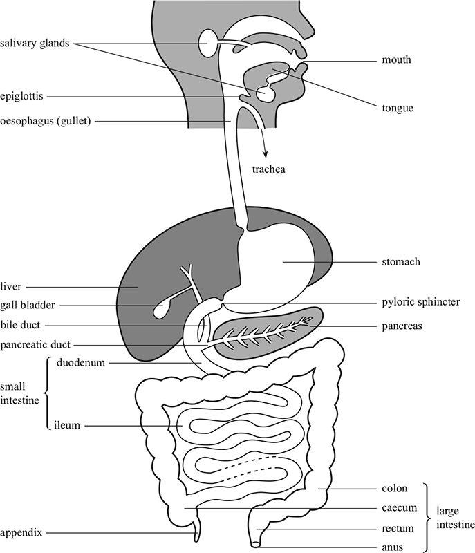
Figure 16.1 The human alimentary canal.
16.1.7 Captions
Most illustrations (apart from purely decorative illustrations) require a caption (a complete sentence) or legend (an incomplete sentence, such as in Figure 16.3, although the terms are often used interchangeably), which should indicate the essential content of the illustration. These generally appear beneath (sometimes beside) the illustration, depending on the page design. Captions or legends should begin with the number of the figure or illustration. Source lines or other wording required by the copyright holder should also appear as part of the caption.
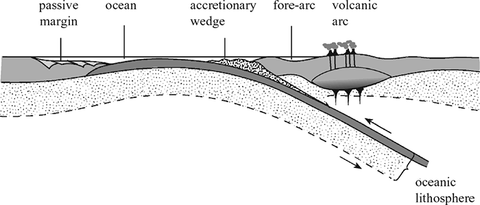
Figure 16.2 Accretionary wedge.
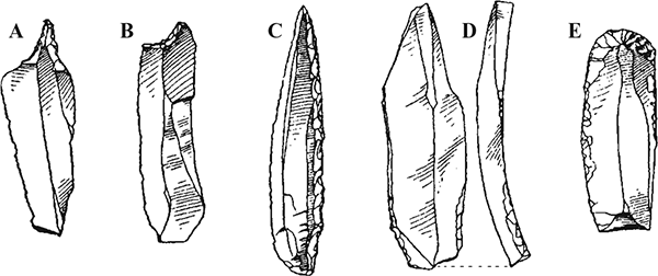
Figure 16.3 Upper Palaeolithic blade tools in flint. (A) Solutrean piercer, Dordogne. (B) Magdalenian concave end-scraper, Dordogne. (C) Gravettian knife point, Dordogne. (D) Magdalenian burin, Dordogne. (E) End-scraper, Vale of Clwyd.
Figures (i.e. the illustration and caption) should be able to stand alone from the text. Captions should explain the illustration in full. They should be concise and extraneous information should be removed. Remove or reduce labelling on the illustration by including explanations in the caption, as in Figure 16.3. Use of descriptive terms such as above, below, top, bottom, left, right, and clockwise can also help identify elements in an illustration or components of a group of illustrations.
Ensure the format of the caption text is consistent.
Supply captions as a list at the end of a chapter or in a separate file. Do not integrate them with the text or incorporate them in the artwork (see 16.1.6). Captions for unnumbered illustrations should be clearly identifiable.
Check that spellings, hyphenation, and symbols correspond to those used in the artwork and text.
16.2 Specific types of illustrations
16.2.1 Maps
Maps are difficult to execute and often require special attention. Information must be relevant, and presented in a clear and uncluttered fashion. The level of detail should relate to the reasons why the reader will consult the map. When a map is to be (re)drawn by the publisher (coordinated to match the design of a publication), supply a rough sketch or copy:
16.2.2 Graphs
Graphs show the relationship between variable quantities. The horizontal (x) and vertical (y) axes should be labelled with a quantity (include any units in parentheses—ensure these match the caption and text). The labels should be parallel to the axis, reading from bottom to top for the y axis (Figure 16.4).
The intervals in the axis divisions should be consistent (unless it is a logarithmic scale). The numbers differentiating divisions should be horizontal for both axes. The numbers do not have to start at zero. A zero symbol should precede any decimal point for values less than one (e.g. 0.86 not .86)
Extra rules other than the x and y axes, such as gridlines, should be deleted unless there is a need to read off a specific value on a curve, but this is unusual. Arrowheads can be drawn at the ends of axes to indicate a trend but are superfluous if the axis has a scale.
Bar charts are used to represent categories of discrete data. They have vertical or horizontal columns where the column length is proportional to the quantity in that category; only the y axis has a scale. All the columns should be the same width and usually have a gap between. A histogram represents continuous data so the column widths may vary as their area is proportional to the frequency; the columns therefore have no gaps between. Both x and y axes have a scale.
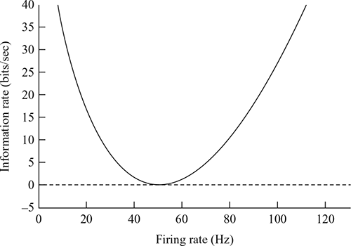
Figure 16.4 Simple graph.
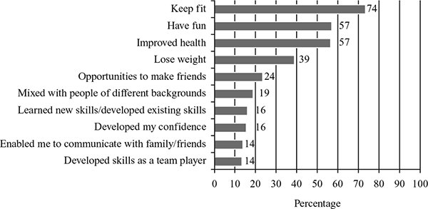
Figure 16.5 Example of a bar chart. From Experience of sport and physical activity in Northern Ireland 2011/12 (Department of Culture, Arts and Leisure, 2013).
The format should be consistent throughout a series of graphs, and be consistent with the text and caption.
Graphs created using generic word-processing, spreadsheet, or presentation software are not suitable for professional printing. Graphs produced using custom software for specific applications may be suitable provided the output settings match those required for digital artwork files (see 16.3).
16.2.3 Medical images
Radiographs (X-rays), scans, and other diagnostic images, as well as pictures of pathology specimens or micrographs, should be supplied as high-resolution digital files. Micrographs should contain internal scale markers.
Remove any patient identification details from such images (and accompanying text and captions). Use of a photograph of a patient will require a Patient Consent Form even if any identifying features have been removed/obscured.
16.2.4 Infographics
Infographics are a popular visual shorthand for conveying complex concepts (data visualization). They provide clear visual representations of data, integrating words and graphics to reveal patterns or trends (e.g. weather maps), or to provide information (e.g. maps of public transportation) that would be unwieldy in text form.
Static infographics may be produced using standard graphics packages. Online interactive infographics that allow the viewer to interact with data can be created using a range of software available on the Internet.
16.3 Digital artwork and graphics files
16.3.1 Overview
The preferred method of handling illustrations for publication in all types of media is via digital artwork. This route has many benefits to the author and the publisher, and has clear advantages over using hard copy. By originating and manipulating artwork, the author has complete control over the final illustration and the production times/costs are minimized for the publisher.
It is very important that digital artwork is prepared in the correct format. Many publishers have their own specific guidelines for authors and general guides/resources are available on the web.
Digital artwork can be created using graphics/image-editing software (see 16.3.2), by a digital camera (see 16.3.5), or by scanning original hard copy to produce digital files (see 16.3.6).
16.3.2 Files and file types
Graphics files can be bitmap (also known as raster) or vector based.
A final illustration may use a combination of vector and bitmap elements.
Graphics files are supported by many file formats. Standard image formats include:
| JPEGA | common bitmap file format produced by most digital cameras; best used for continuous tone illustrations. JPEG is a lossy format, meaning that it discards colour information to produce a compressed file. This is not normally an issue for online publication, but may be noticeable in print. |
| TIFF | The preferred bitmap format for continuous tone illustrations. TIFF files are significantly larger than JPEG files and can be either uncompressed or compressed using lossless compression. Unlike JPEG, TIFF files can support multiple layered images, where elements of the image exist in separate layers that can be manipulated without affecting the others. |
| EPSA | standard format for vector (line artwork) graphics. Bitmaps can also be embedded in EPS files, making this a recommended format for combined vector/bitmapped illustrations. EPS files are high-quality, very large memory files because of their lossless format. |
These exchange formats can be viewed using most software packages.
Application-specific formats such as PSD (bitmap) and AI (vector) are designed to be understood only by the software in which they were created (Adobe Photoshop and Illustrator, respectively); however, they can be easily converted to exchange formats.
PDF files are used for creating and digitally transferring documents, including text and graphics, in the final intended layout. These may be suitable for print, depending on the quality of any embedded images and the output options selected.
Word-processor, spreadsheet, and presentation files are not suitable for high-quality print output. GIF files, which can also support animated graphics, and PNG files are useful for simple web images, but not for print. BMP files offer no advantage over other formats and should be avoided. RAW files are produced by high-end digital cameras, and require processing and conversion to a standard format such as JPEG or TIFF.
16.3.3 Size and resolution
Supply digital artwork at the same size as the final published illustration. Dimensions may be given in units of length for print output (e.g. 10 × 15 cm) or pixels for on-screen viewing (e.g. 800 × 600 pixels).
Resolution is the number of dots or pixels in a given area: dots per inch (dpi) or pixels per inch (ppi) (for most practical purposes the units are interchangeable). It is very important that digital artwork be supplied at the correct resolution to ensure high-quality output—low-resolution artwork is not suitable for print, and may result in requests for resubmission and delays in publication.
Minimum resolutions (at final image size) for print:
Be aware that the requirements for printed and on-screen images are very different. The resolution of a computer monitor is 72–96 dpi, meaning that although an image may look acceptable on a monitor and be suitable for online use, it may be of insufficient resolution for print purposes.
Resolution is not a set value—it is variable and is inversely proportional to visual size. If the visual size is doubled, the resolution halves, reducing the quality (Figure 16.5). The size and resolution of digital artwork can be determined and revised in most graphics software.
Images copied from the web are usually too low resolution for print. It may be possible to obtain high-resolution versions (and appropriate copyright clearance; see 16.5) from the website administrator.
16.3.4 Handling colour
Ensuring accurate reproduction of colour illustrations is an important consideration and is critical for certain types of fine art/photography publications.
Computer monitors/desk-top printers and conventional printers use different models (colour spaces) to handle colour. Computer monitors use RGB (Red, Green and Blue) mode to display colours, whereas conventional printing uses CMYK (Cyan, Magenta, Yellow, and Key (Black) mode. As a result, an image viewed on a computer monitor may not match the final colour rendition of the printed version.
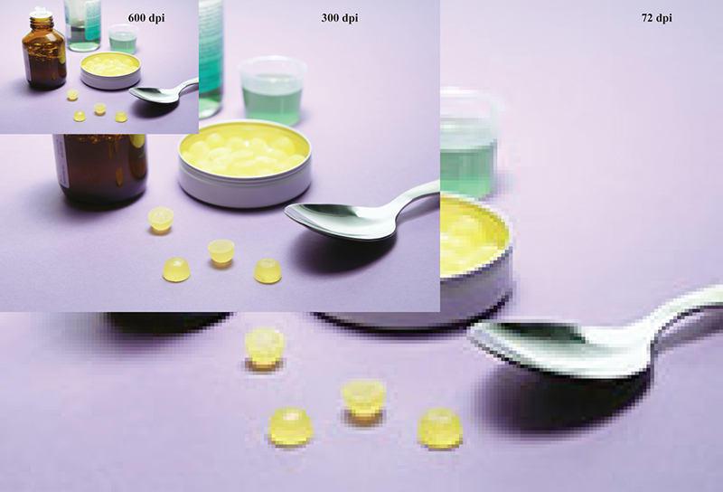
Figure 16.6 The same photograph at different resolutions.
Ideally, monitors should be calibrated to assess colour accuracy, and files should be created in the appropriate colour mode: RGB for online publication and CMYK for print publication.
16.3.5 Digital cameras
Image files of hard copy originals can be created with a good digital camera (at least 10 megapixels and a high-quality lens).
When taking digital photographs, ensure that the lighting is bright and even (without shadows), ISO is set to the lowest value, the image is sharply in focus, extraneous elements are cropped out and the camera is set to produce the largest file size possible. RAW files should be converted to a standard file format (see 16.3.2).
16.3.6 Scanning
Hard copy may be scanned to produce digital files. Scans should be at the final size and orientation, and at the correct resolution (see 16.3.3). The originals should be free from dust and other debris, and the scanned colours should match the original.
It is better to scan originals rather than scan a printed copy, to reduce interference patterns (moiré) caused by previous screening. A high-resolution scan of a poor original will not improve the quality, although it is possible to touch-up and relabel scanned originals using image-editing software.
16.3.7 Submitting files
Check that artwork files conform to any specified requirements. Individual illustrations (and parts) should be supplied as separate files. Do not embed the illustrations in text or other files. Ensure all layered files are flattened (the layers that make up the image are compressed into a single plane).
Name the files in a logical style following the conventions used in the text (e.g. in a simple format Figure_1.1.tif or with a project identifier Smith_Fig_3.tif). If figures are not numbered, use a brief unambiguous descriptive name to match the corresponding citations and captions (e.g. Ozone_distribution_2014.tif).
Compile a separate artwork log listing all of figures (and parts) and corresponding file names, together with any notes (e.g. unusual file formats).
Final artwork files may be submitted on portable media (CD/DVD, flash drives, etc.) or over the Internet via file-sharing sites/FTP. Group large numbers of individual files in a logical directory/folder structure (e.g. by section/chapter). Keep a backup copy of all files.
16.4 Line and tone artwork: hard copy
Traditionally, publishers recognize two main types of illustration: line artwork and tone artwork, both of which may be black and white or colour. Final illustrations may be combinations of line and tone artwork.
The distinction between line and tone illustrations has important consequences when creating digital artwork files (see 16.3).
16.4.1 Submitting original hard copies
Hard copy may be submitted only if it is not possible for an author to create digital artwork from existing material (through scanning or digital photography; see 16.3.5 and 16.3.6) or if originals need to be redrawn (check with your editor/publisher).
Reductions/enlargements should be indicated as a percentage (e.g. ‘67 per cent’ indicates a reduction of the artwork to 67 per cent of its original size—not reduced by 67 per cent).
Any relabelling and cropping should be marked on a photocopy—the original may be scanned to capture the image without redrawing from scratch. Supply an accompanying text file for each label. Avoid making any marks on the original.
Present a composite illustration with more than one part as individual pieces of artwork, clearly identified and accompanied by a photocopy showing the desired layout.
Identify all artwork with the title of the work and identification number, and include name/address details to enable the publisher to return the (often valuable) artwork. Originals should be securely packaged.
16.5 Permissions and acknowledgements
Most illustrations are protected by copyright law and permission (clearance) must be obtained in good time from the copyright holder to reproduce any illustrations not originated by the author specifically for a particular publication. These include illustrations from other publications, including your own material if it has been previously published elsewhere, pictures taken by professional photographers, and material taken from the Internet. Where there is any doubt (e.g. when a modified version of an illustration is to be used) it is prudent to ask for permission. Keep a record of all correspondence relating to obtaining permissions. For more information, see Chapter 20.
The moral rights (see 20.2.4) of any photographer/artist should be asserted because even if copyright has been assigned to a third party, the originator retains the moral rights to their work. When using your own photographs for commercial purposes you may need to use Release Forms to obtain permission from any individuals (or their guardian) in them or anyone who owns property in them. Patient Consent Forms should be obtained for any photographs of patients used in medical publications (see 16.2.3).
Illustrations may also be sourced through picture libraries. These are agencies that represent the creators or the assigned copyright holders of images and sell licences for the images they hold. Some picture libraries also provide images that are in the public domain.
The wording of the copyright information may be stipulated by the copyright holder. This should be included at the end of the caption itself, unless the copyright holder instructs otherwise.