Principal Components Analysis
Pascal Wallisch
How do you represent stimulus encoding of a population of neurons or of a time-varying firing rate? One solution is to try to compress data to make them easier to work with. If you can reduce the dimensionality to two or three dimensions, you can then use your visualization tools. In this chapter you will see how principal components analysis can be used to perform dimensionality reduction. You will also explore an application of this technique for spike-sorting neuronal waveforms.
Keywords
principal components analysis; sample covariance; spike; threshold
19.1 Goals of this Chapter
Previously, we explored how MATLAB® can be used to visualize neural data. This is a powerful tool. For example, a simple 2D tuning curve can demonstrate how a single neuron encodes a stimulus parameter in terms of a firing rate. However, it is not clear how this applies to multidimensional data. How do you represent stimulus encoding of a population of neurons or of a time-varying firing rate?
One solution is to try to compress data to make them easier to work with. If you can reduce the dimensionality to two or three dimensions, you can then use your visualization tools. In this chapter you will see how principal components analysis can be used to perform dimensionality reduction. You will also explore an application of this technique for spike-sorting neuronal waveforms. This will prepare you for the next chapter, where you will use principal components to capture the temporal aspects of a peri-event time histogram.
19.2 Background
Principal components analysis (PCA) performs a linear transformation on data and can be used to reduce multidimensional data down to a few dimensions for easier analysis. The idea is that many large datasets contain correlations between the dimensions, so that a portion of the data is redundant. PCA will transform the data so that as much variation as possible will be crammed into the fewest possible dimensions. This allows you to compress your data by ignoring other dimensions. To apply PCA, you first need to understand how the correlations between dimensions can be described by a covariance matrix.
19.2.1 Covariance Matrices
You will start by analyzing some simulated 2D data. The MATLAB function normrnd can create zero-mean, Gaussian noise (“white noise”). You will use this to create two variables containing two columns, one for each dimension. In the first variable (a), the two dimensions will be uncorrelated, but in the second (b) there will be a significant correlation between the two dimensions. Use the following code to generate a and b:

If you plot the columns of these variables against one another (using plot((a(:,1),a(:,2),‘.’) for a), the data should look something like Figure 19.1.

Figure 19.1 Samples from a two-dimensional Gaussian distribution where the dimensions are uncorrelated (A) and correlated (B).
You should already be familiar with the concepts of mean, variance, and standard deviation. If the sample data consist of n observations stored in a vector x, the sample mean is defined as follows:
 (19.1)
The variance (σ2) of the sample is simply the expected value (mean) of the squared deviations from the sample mean:
 (19.2)
The standard deviation (σ) is just the square root of the variance. Unfortunately, it turns out that using the preceding expression as an estimate of the sample variance might be a bad idea because this estimate is biased: it systematically underestimates the variance. However, it can be shown that the unbiased estimator is formed by replacing n by n−1 in the first term. Thus, the sample variance (s2) is usually defined as follows:
 (19.3)
This is how the function var in MATLAB is defined. You can more compactly express the sample variance using matrix notation as follows:
 (19.4)
The superscript T signifies a transpose, whereby matrix columns are changed to rows and vice versa: an m by n matrix becomes an n by m matrix. In MATLAB, a transpose is designated with an apostrophe placed after the variable.
Let’s compare the preceding formula with the function var. In the following code, do the two expressions give the same result?
| var(a(:,1)) | %Compute sample variance of 1st dim of "a" |
| c=a(:,1)-mean(a(:,1)); | %Subtract mean from 1st dim of "a" |
| c‘*c/(n-1) | %Compute sample variance of 1st dim of "a" |
| %Note the apostrophe denoting transpose(c) |
The covariance is analogous to the variance, except that it is computed between two vectors, not a vector and itself. If you have a second data vector y with n independent values, then the sample covariance is expressed as follows:
 (19.5)
You can see that if x and y are the same, the sample covariance is the same as the sample variance. Also, if x and y are uncorrelated, the covariance should be zero. A positive covariance means that when x is large, so is y; while a negative covariance means that when x is large, y is small. The last thing you need to define is the covariance matrix. If the data have m dimensions, then the covariance matrix is an m by m matrix where the diagonal terms are the variances of each dimension and the off-diagonal terms are the covariances between dimensions. If the additional dimensions are stored as extra columns in variable x (so x becomes an n by m matrix), then the sample covariance can be computed the same way as the sample variance:
 (19.6)
This is computed by the function cov in MATLAB. Compare the two methods by using the following code (the function repmat is used to create multiple copies of a vector):
| cov(a) | %Compute the covariance matrix for "a" |
| c=a-repmat(mean(a),n,1); | %Subtract the mean from "a" |
| c‘*c/(n-1) | %Compute the covariance matrix for "a" |
The covariance of the correlated noise should have large off-diagonal terms. One reason to compute the covariance is that it plays the same role in the multivariate Gaussian distribution as the variance plays in the univariate Gaussian. You can use the covariance and the function mvnrand (mvn stands for multivariate normal) in MATLAB to generate new multivariate correlated noise (b2). Plot b2 on top of the correlated noise generated earlier (b). Did the covariance matrix adequately capture the structure of the data?

19.2.2 Principal Components
Principal components analysis is essentially just a coordinate transformation. The original data are plotted on an X-axis and a Y-axis. For two-dimensional data, PCA seeks to rotate these two axes so that the new axis X’ lies along the direction of maximum variation in the data. PCA requires that the axes be perpendicular, so in two dimensions the choice of X’ will determine Y’. You obtain the transformed data by reading the x and y values off this new set of axes, X’ and Y’. For more than two dimensions, the first axis is in the direction of most variation; the second, in direction of the next-most variation; and so on.
How do you get your new set of axes? It turns out they are related to the eigenvalues and eigenvectors of the covariance matrix you just calculated (consult the mathematics tutorial in Chapter 3 for a review of what eigenvalues and eigenvectors are). In PCA, each eigenvector is a unit vector pointing in the direction of a new coordinate axis, and the axis with the highest eigenvalue is the axis that explains the most variation.
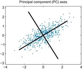
This concept may seem confusing, so start by looking at the correlated noise data (b)shown in Figure 19.1. You could make a decent guess at the principal components just by looking at the data: the first principal component line should fall on the long axis of the ellipse-shaped cluster. You can use the function eig in MATLAB to compute the eigenvectors and eigenvalues of the covariance matrix (sigma) you computed previously:
| [V, D]=eig(sigma) | %V=eigenvectors, D=eigenvalues for covariance matrix sigma |
This will output something like the following (because the noise was generated randomly, the exact values will vary):
The eigenvalues are stored on the diagonal of D, while the corresponding eigenvectors are the columns stored in V. Because the second eigenvalue is bigger, the second eigenvector is the first principal component. This means that a vector pointing from the origin to (–0.8445,–0.5387) lies along the axis of maximum variation in the data. Type the following to plot the new coordinate axes on the original data:
| plot(b(:,1),b(:,2),‘b.’); hold on | %Plot correlated noise |
| plot(3*[-V(1,1) V(1,1)],3*[-V(1,2) V(1,2)],‘k’) | %Plot axis in direction of 1st eigenvector |
| plot(3*[-V(2,1) V(2,1)],3*[-V(2,2) V(2,2)],‘k’) | %Plot axis in direction of 2nd eigenvector |
This will produce a graph like the one in Figure 19.2.
Now you use these new coordinate axes to reassign the (X,Y) values to all your datapoints. First, you want to reorder the eigenvectors so that the first principal component is in the first row. Then you can simply multiply the data by this reordered matrix to obtain the new, transformed data. For example:
| V2(:,1)=V(:,2); | %Place the 1st principal component in the 1st row |
| V2(:,2)=V(:,1); | %Place the 2nd principal component in the 2nd row |
| newB=b*V2; | %Project data on PC coordinates |
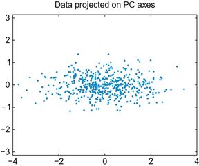
If you plot these transformed data, it is clear that you just rotated the data so that most of the variation lies along the X-axis, as shown in Figure 19.3.
If you stop here, you haven’t gained much, since the transformed data have just as many dimensions as the original data. However, if you wanted to compress the data, you can now just throw away the second column (the data plotted on the Y-axis in Figure 19.3). The whole point of PCA is that if you force as much of the variation as possible into a few dimensions, you can throw away the rest without losing much information.
How much variation can you capture by doing this? It turns out that the fraction of variation captured by each principal component is the ratio of its eigenvalue to the sum of all the eigenvalues. For the example, the first principal component has an eigenvalue of around 1.33, and the second principal component has an eigenvalue of around 0.20. That means if you keep just the first column of the transformed data, you still keep 87% of the variation in the data (0.87=1.33/[1.33+0.20]). That is, you can compress the size of the data by 50% but lose only 13% of the variation.
Conveniently, MATLAB already has a function that performs all these calculations in one fell swoop: princomp. Type the following to compute principal components for the correlated data:
| [coeff,score,latent]=princomp(b); | %Compute principal components of data in b |
The eigenvectors are stored in the variable coeff, the eigenvalues are stored in latent, and the transformed data (the old data projected onto the new PC axes) are stored in score. MATLAB even orders the eigenvectors so that the one with highest eigenvalue is first.
19.2.3 Spike Sorting
One common application of PCA is the spike sorting of neural data. Typically, a data acquisition system monitors a raw voltage trace. Every time the voltage crosses some threshold, the raw voltage is sampled during a time window surrounding this crossing to produce the recorded spike waveform. For example, in one commercially available data acquisition system (Cerebus system, Cyberkinetics Neurotechnology Systems, Inc.), each spike waveform consists of a 1600 μs section of the voltage trace sampled 30 times per millisecond for a total of 48 data points.
Because any experimental system contains noise, the threshold crossing is often triggered by a chance deviation from the mean and not an action potential. Thus, after these recordings are made, the noise must be differentiated from the real spikes. You must also determine if the real spikes came from one or many neurons and then sort them accordingly. How do you compare waveforms? You can start by plotting them all on the same graph.
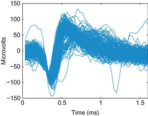
If you load the dataset for this chapter, you can use the code below to plot the first 200 waveforms from one electrode, as shown in Figure 19.4:
| wf=session(2).chan48; | %Load waveforms |
| plot(wf(:,1:200)); | %Plot 200 waveforms. |

Figure 19.4 A plot of 200 extracellular action potential waveforms recorded from one electrode of a microelectrode array implanted in the primary motor cortex of a macaque monkey.
Since this is an extracellular recording, the sign of the voltage trace of the action potential is reversed, and the amplitude is much smaller than for intracellular recordings (microvolts instead of millivolts). You can immediately see that there is a large amplitude unit on the electrode. There may also be a smaller amplitude unit with a larger trough-peak spike width. There is also some noise. It is not immediately clear how to separate these categories, and you are looking at only 200 spikes. How do you deal with all 80,000 spikes that were recorded during an hour-long session? You could represent each waveform as a single point, but then each point would be in a 48-dimensional space. How do you make this analysis easier?
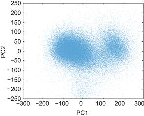
The solution (as you may have guessed) is to compress the data using principal components. Then you can plot the first versus the second principal component and see whether the data fall into clusters. When you use the code below to display all the spikes in a graph like the one in Figure 19.5, it becomes clear that there are two major clusters.
%Princomp doesn’t work on integers, so convert to double
[coeff,score,latent]=princomp(double(wf’));
plot(score(:,1),score(:,2),‘.’,‘MarkerSize’,1)

Figure 19.5 A scatterplot of the motor cortical spike waveforms projected on the first and second principal components.
Unfortunately, with so many spikes, it’s not clear how densely packed the clusters are. You can create a 3D histogram using the function hist3 and then visualize the histogram using the function surface. Use the following code to reproduce Figure 19.6:
| edges{1}=[-300:25:300]; | %Bins for the X-axis |
| edges{2}=[-250:25:250]; | %Bins for the Y-axis |
| h=hist3(score(:,1:2),edges); | %Compute a 2-D histogram |
| s=surface(h’); | %Visualize the histogram |
| set(s,‘XData’,edges{1}) | %Label the X-axis |
| set(s,‘YData’,edges{2}) | %Label the Y-axis |

Figure 19.6 A three-dimensional histogram showing the frequency of motor cortical spike waveforms projected on the first (PC1) and second (PC2) principal components.
The default view is looking straight down on the surface. To make the figure prettier, click the Rotate 3D button (its icon is a counterclockwise arrow encircling a cube). Then click and drag on the figure to rotate it. Play with the function colormap to change the color scheme and type help graph3D for the list of color maps. For example, colormap(white) produces a black and white mesh grid.
Unfortunately, it is difficult to quickly spike sort these waveforms without a good graphical user interface. For example, you would like to be able to select a point in PC space and see what the corresponding waveform looks like. You want to be able to circle a group of points and then see both the average waveform and the interspike-interval histogram. This is the sort of functionality provided by commercial spike sorting packages, such as Offline Sorter by Plexon, Inc. You can implement something similar in MATLAB, but doing so is beyond our scope here.
In the project you will perform in this chapter, instead of using a graphical selection tool, you will select waveforms by looking at distances in PC space. Pick a point in PC1 versus PC2 space that you think is at the center of a cluster. Then calculate the Euclidean distance of every other point from this template point and pick all those that fall below a certain threshold. This is equivalent to drawing a circle on the PC graph and picking all the points that fall within the circle. Now you can calculate any statistic you want of the sorted waveforms, such as the average waveform or the interspike interval histogram. The function find may be useful. For example, if you store your Euclidean distances in dist and your distance threshold in threshold, you can find the indices of all the waveforms meeting this threshold with ind=find(dist<threshold);.
You can use this average waveform as the basis of a template sort, a common strategy in spike sorting. The average waveform is a template to which you compare all other waveforms. Calculate the mean-squared error for each waveform from this template waveform. Then keep all waveforms whose mean squared error falls below a certain threshold.
While this procedure would be easier with a commercial spike sorter, sometimes custom procedures in MATLAB can be useful. In the project for this chapter, you will also consider the problem of comparing waveforms from one day to the next. Because the principal components change depending on the data, instead of calculating the PCs of the second day, you will project the second day’s data onto the first day’s PCs. This isn’t something that is usually possible with spike sorting software, so understanding how to implement this in MATLAB expands your analytical possibilities.
19.4 Project
In this project, you will build your own primitive spike sorter using principal components analysis to analyze extracellular data from recordings in the primary motor cortex of a nonhuman primate (data courtesy of the Hatsopoulos laboratory). The spike waveform and spike times data for this project are stored in a struct called session. You can access the data using the following code:
| wf1=session(1).wf; | %Waveforms from the 1st day |
| wf2=session(2).wf; | %Waveforms from the 2nd day |
| stamps1=session(1).stamps; | %Time stamps from the 1st day |
| stamps2=session(2).stamps; | %Time stamps from the 2nd day |
Specifically, you are asked to do the following:
1. Apply PCA to the first day’s waveforms. What percent of variation is captured by the first two dimensions?
2. Spike sort the first day’s waveforms using a template sort. First, select a region of interest in 2D PC space (a circle at the heart of a cluster) by finding all points in PC space within a certain Euclidean distance from a given point. Calculate the average waveform of the waveforms in this region. Use this average waveform as the template in a template sort. Plot the template and all the sorted waveforms for each neuron you think is present. Also plot the interspike interval histograms, which are just histograms of the times between sorted spikes. The function diff may be useful for this task.
3. Project the second day’s data onto the first day’s principal component’s axes. How is this different from the second day’s data projected on its own principal components? Repeat the sort you used for the first day’s data. How do the neurons compare? Do you think they are the same neurons?

