
We associate Pop with music, fashion, art, and many other things, but not architecture, and yet Pop was bound up with architectural debates from first to last. The very idea of Pop—that is, of a direct engagement with mass culture as it was transformed by consumer capitalism after World War II—was first floated in the early 1950s by the Independent Group (IG) in London, a motley collection of young artists and art critics such as Richard Hamilton and Lawrence Alloway, who were guided by young architects and architectural historians such as Alison and Peter Smithson and Reyner Banham. Elaborated by American artists a decade later, the Pop idea was again brought into architectural discussion, especially by Robert Venturi and Denise Scott Brown, where it came to serve as a discursive support for the postmodern design of the Venturis, Michael Graves, Charles Moore, Robert Stern, and others in the 1980s, all of whom featured images that were somehow commercial or historical in origin, or both. More generally, the primary precondition of Pop was a gradual reconfiguration of cultural space, demanded by consumer capitalism, in which structure, surface, and symbol were combined in new ways.1 That mixed space is still with us, and so a Pop dimension persists in contemporary architecture, too.
In the early 1950s Britain remained in a state of economic austerity that made the consumerist world appear seductive to emergent Pop artists there, while a decade later this landscape was already second nature for American artists. Common to both groups, however, was the sense that consumerism had changed not only the look of things but the nature of appearance as such, and all Pop art found its principal subject here—in the heightened visuality of a display world, in the charged iconicity of personalities and products (of people as products and vice versa).2 The consumerist superficiality of signs and seriality of objects affected architecture and urbanism as well as painting and sculpture. Accordingly, in Theory and Design in the First Machine Age (1960) Banham imagined a Pop architecture as a radical updating of modern design under the changed conditions of a “Second Machine Age” in which “imageability” became the primary criterion.3 Twelve years later, in Learning from Las Vegas (1972), Venturi and Scott Brown advocated a Pop architecture that would return this imageability to the built environment from which it arose. However, for the Venturis, this imageability was more commercial than technological, and it was advanced not to update modern design but to displace it; it was here, then, that Pop began to be refashioned in terms of the postmodern.4 In some ways the first age of Pop can be framed by these two moments—between the retooling of modern architecture urged by Banham on the one hand and the founding of postmodern architecture prepared by the Venturis on the other; but, again, it has an afterlife that extends to the present. It is this story that I sketch here.
In November 1956, just a few months after the fabled “This is Tomorrow” exhibition in London first brought the Pop idea to public attention, Alison and Peter Smithson published a short essay that included this little prose-poem: “[Walter] Gropius wrote a book on grain silos, Le Corbusier one on aeroplanes, and Charlotte Perriand brought a new object to the office every morning; but today we collect ads.”5 Modern designers like Gropius, Corb, and Perriand were hardly naïve about mass media; the point here is polemical, not historical: they, the old protagonists of modern design, were cued by functional things, while we, the new celebrants of Pop culture, look to “the throw-away object and the pop-package” for inspiration. This was done partly in delight, and partly in desperation: “Today we are being edged out of our traditional role [as form-givers] by the new phenomenon of the popular arts—advertising,” the Smithsons continued. “We must somehow get the measure of this intervention if we are to match its powerful and exciting impulses with our own.”6 This anxious thrill drove the entire IG, and architectural minds led the way. “We have already entered the Second Machine Age,” Banham wrote four years later in Theory and Design, “and can look back on the First as a period of the past.”7 In this landmark study, conceived as a dissertation in the heyday of the IG, he, too, insisted on a historical distance from modern masters (including architectural historians like Nikolaus Pevsner, his advisor at the Courtauld Institute, and Sigfried Giedion, author of the classic account of modern archiecture, Space, Time, and Architecture [1941]). Banham challenged the functionalist and/or rationalist assumptions of these figures (that form must follow function and/or technique) and recovered other imperatives neglected by them. In doing so he advocated a Futurist imaging of technology in Expressionist terms—that is, in forms that were often sculptural and sometimes gestural—as the prime motive of advanced design not only in the First Machine Age but in the Second Machine (or First Pop) Age as well. Far from academic, his revision of architectural priorities also reclaimed an “aesthetic of expendability,” first proposed in Futurism, for this Pop Age, where “standards hitched to permanency” were no longer so relevant.8 More than any other figure, Banham moved design discourse away from a modernist syntax of abstract forms toward a Pop idiom of mediated images.9 If architecture was adequately to express this world—where the dreams of the austere 1950s were about to become the products of the consumerist 1960s—it had to “match the design of expendabilia in functional and aesthetic performance”: it had to go Pop.10
What did this mean in practice? Initially Banham supported the Brutalist architecture represented by the Smithsons and James Stirling, who pushed given materials and exposed structures to a “bloody-minded” extreme. “Brutalism tries to face up to a mass production society,” the Smithsons wrote in 1957, “and drag a rough poetry out of the confused and powerful forces which are at work.”11 This insistence on the “as found” sounds Pop, to be sure, but the “poetry” of Brutalism was too “rough” for it to serve for long as the signal style of the sleek Pop Age, and in fact the most Pop project by the Smithsons, the House of the Future (1955–56), is also the most alien to their work as a whole. Commissioned by the Daily Mail to suggest the suburban habitat to come, this model house was replete with gadgets devised by sponsors (for example, a shower-blowdryer-sunlamp), but its curvy plasticity was inspired by the sci-fi movie imagery of the time as much as by any imperative to translate new technologies into architectural form.

Alison and Peter Smithson, The House of the Future, 1955–56.
As the Swinging Sixties unfolded in London, Banham looked to the young architects of Archigram—Warren Chalk, Peter Cook, Dennis Crompton, David Greene, Ron Herron, and Michael Webb—to carry forward the Pop project of imageability and expendability. According to Banham, Archigram (1961–76) took “the capsule, the rocket, the bathyscope, the Zipark [and] the handy-pak” as its models, and celebrated technology as a “visually wild rich mess of piping and wiring and struts and cat-walks.”12 Influenced by Buckminster Fuller, its projects might appear functionalist—the Plug-In City (1964) proposed an immense framework in which parts might be changed according to need or desire—but, finally, with its “rounded corners, hip, gay, synthetic colours [and] pop-culture props,” Archigram was “in the image business,” and its schemes answered to fantasy above all.13 Like the Fun Palace (1961–67) conceived by Cedric Price for the Theatre Workshop of Joan Littlewood, Plug-In City offered “an image-starved world a new vision of the city of the future, a city of components … plugged into networks and grids.”14 Yet, unlike the Price project, almost all Archigram schemes were unrealizable—luckily so, perhaps, for these robotic mega-structures sometimes look like inhuman systems run amok.
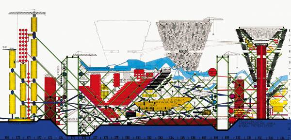
Peter Cook, Plug-In City, Section, Max Pressure Area, 1964. Photo © Archigram. Courtesy of Archigram Archives.
For Banham it was imperative that Pop design not only express contemporary technologies but also elaborate them into new modes of existence. Here lies the great difference between Banham and the Venturis.15 Again, Banham sought to update the Expressionist imperative of modern form-making vis-à-vis a Futurist commitment to modern technology, while the Venturis shunned both expressive and technophilic tendencies; in fact they opposed any prolongation of the modern movement along these lines. For Banham contemporary architecture was not modern enough, while for the Venturis it had become disconnected from both society and history precisely through its commitment to a modernity that was abstract and amnesiac in nature. According to the Venturis, modern design lacked “inclusion and allusion”—inclusion of popular taste and allusion to architectural tradition—a failure that stemmed above all from its rejection of ornamental “symbolism” in favor of formal “expressionism.”16 To right this wrong, they argued, the modern paradigm of the “duck,” in which the form expresses the building almost sculpturally, must cede to the postmodern model of the “decorated shed,” a building with “a rhetorical front and conventional behind,” where “space and structure are directly at the service of program, and ornament is applied independently of them.”17 “The duck is the special building that is a symbol,” the Venturis wrote in a famous definition; “the decorated shed is the conventional shelter that applies symbols.”18
To be sure, the Venturis also endorsed Pop imageability: “We came to the automobile-oriented commercial architecture of urban sprawl as our source for a civic and residential architecture of meaning, viable now, as the turn-of-the-century industrial vocabulary was viable for a Modern architecture of space and industrial technology 40 years ago.”19 Yet in doing so they accepted—not only as a given but as a desideratum—the identification of the “civic” with the “commercial,” and thus they took the strip and the suburb, however “ugly and ordinary,” not only as normative but as exemplary. “Architecture in this landscape becomes symbol in space rather than form in space,” the Venturis declared. “The big sign and the little building is the rule of Route 66.”20 Given this rule, Learning from Las Vegas could then conflate corporate trademarks with public symbols: “The familiar Shell and Gulf signs stand out like friendly beacons in a foreign land.”21 It could also conclude that only a scenographic architecture (i.e. one that foregrounds a façade of signs) might “make connections among many elements, far apart and seen fast.”22 In this way the Venturis translated important insights into this “new spatial order” into bald affirmations of “the brutal auto landscape of great distances and high speeds.”23 This move naturalized a landscape that was anything but natural; more, it instrumentalized a sensorium of distraction, as they urged architects to design for “a captive, somewhat fearful, but partly inattentive audience, whose vision is filtered and directed forward.”24 As one result, the old Miesian motto of modernist elegance in architecture—“less is more”—became a new mandate of postmodern overload in design: “less is a bore.”25
In the call for architecture to “enhance what is there,” the Venturis cited Pop art as a key inspiration, in particular the photo-books of Ed Ruscha such as Every Building on the Sunset Strip (1966).26 Yet this is a partial understanding of Pop, one cleansed of its dark side, such as the culture of death in consumerist America exposed by Warhol in his 1963 silkscreens of car wrecks and botulism victims. Even Ruscha hardly endorsed the new autoscape: his photo-books underscore its null aspect, without human presence (let alone social interaction), or document its space as so much gridded real estate, or both.27 A more salient guide to Learning from Las Vegas was the developer Morris Lapidus, whom the Venturis quote as follows: “People are looking for illusions … Where do they find this world of the illusions?…Do they study it in school? Do they go to museums? Do they travel to Europe? Only one place—the movies. They go to the movies. The hell with everything else.”28 However ambivalently, Pop art worked to explore this new regime of social inscription, this new symbolic order of surface and screen. The postmodernism prepared by the Venturis was placed largely in its service—in effect, to update its built environment. One might find a moment of democracy in this commercialism, or even a moment of critique in this cynicism, but it is likely to be a projection.
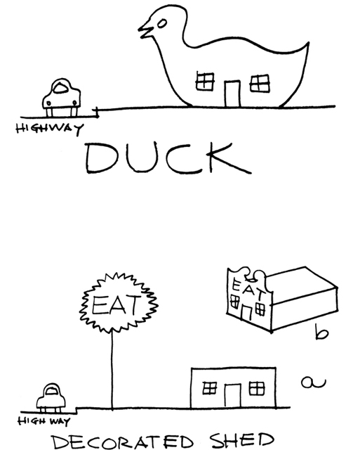
Illustration from Robert Venturi, Denise Scott Brown and Steven Izenour, Learning from Las Vegas (1972). Courtesy of Venturi, Scott Brown and Associates, Inc.
By this point, then, the Pop rejection of elitism became a postmodern manipulation of populism. While many Pop artists practiced an “ironism of affirmation”—an attitude, inspired by Marcel Duchamp, that Richard Hamilton once defined as a “peculiar mixture of reverence and cynicism”—most postmodern architects practiced an affirmation of irony: as the Venturis put it, “Irony may be the tool with which to confront and combine divergent values in architecture for a pluralist society.”29 In principle this strategy sounds fitting; in practice, however, the “double-functioning” of postmodern design—“allusion” to architectural tradition for the initiated, “inclusion” of commercial iconography for everyone else—served as a double-coding of cultural cues that reaffirmed class lines even as it seemed to cross them. This deceptive populism only became dominant in political culture a decade later, under Ronald Reagan, as did the neoconservative equation of political freedom with free markets also anticipated in Learning from Las Vegas. In this way, the recouping of Pop as the postmodern did constitute an avant-garde, but it was an avant-garde of most use to the Right. With commercial images thus cycled back to the built environment from which they arose, Pop became tautological in the postmodern: rather than a challenge to official culture, it was that culture, or at least its setting (as the corporate skylines of countless cities still attest).
Yet this narrative is too neat, and its conclusion too final. There were alternative elaborations of Pop design, such as the visionary proposals of the Florentine collective Superstudio (1966–78), the antic happenings of the San Francisco–Houston group Ant Farm (1968–78), and other schemes by related groups in France and elsewhere. Both Superstudio (Adolfo Natalini and Cristiano Toraldo di Francia) and Ant Farm (Chip Lord, Doug Michels, Hudson Marquez, and Curtis Schreier) were inspired by the technological dimension of Pop design, as manifest in the geodesic domes of Fuller and the inflatable forms of Archigram. Yet, changed by the political events associated with 1968, they also wanted to turn this aspect of Pop against its consumerist dimension. By this point, then, the two sides of Pop, Banhamite and Venturian, were developed enough to be played against each other.
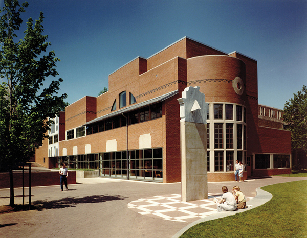
Venturi, Scott Brown and Associates, Wu Hall, Princeton University, 1983. Courtesy of Venturi, Scott Brown and Associates, Inc.
In 1968 Fuller proposed a massive dome for midtown Manhattan—a utopian project that also suggested a dystopian foreboding of cataclysmic pollution, even of nuclear holocaust, to come. Again, this dystopian shadow is sometimes sensed in the sci-fi imagery of Archigram, with its “Armageddon overtones of survivaltechnology.”30 Superstudio took this utopian-dystopian slippage to the limit: its Continuous Monument (1969), a project of visionary architecture as Conceptual art, imagined the capitalist city swept clean of commodities and reconciled with nature—but at the cost of a ubiquitous grid that, however beautiful in its purity, is monstrous in its totality. Also inspired by Fuller and Archigram, the Ant Farmers were Merry Pranksters by comparison, pledged as they were to Bay Area counter-culture rather than to tabula-rasa transformation. Yet their performances and videos, which somehow combine anti-consumerist impulses with spectacular effects, also pushed Pop design back toward art. This is most evident in two famous pieces—Cadillac Ranch (1974), where Ant Farm partially buried ten old Cadillacs, nose down in a row like upside-down rockets, on a farm near Armarillo, Texas, and Media Burn (1975), where, in a perverse replay of the JFK assassination, they drove a customized Cadillac at full speed through a pyramid of televisions set ablaze at the Cow Palace in San Francisco. Today both works read in part as parodies of the teachings of Learning from Las Vegas.

Superstudio, Continuous Monument, New York, 1969.
Pop design after the classic moment of Pop was not confined to visionary concepts and sensational happenings—that is, to paper architecture and art events. In fact its emblematic instance might be the familiar Centre Pompidou (1971–77), designed by Richard Rogers and Renzo Piano, which is at once technological (or Banhamite) and popular (or Venturian) in effect. These two main strands of Pop design have persisted in other ways as well. Indeed, they can be detected, albeit transformed, in two of the greatest stars in the architectural firmament of the last thirty years: Rem Koolhaas and Frank Gehry.
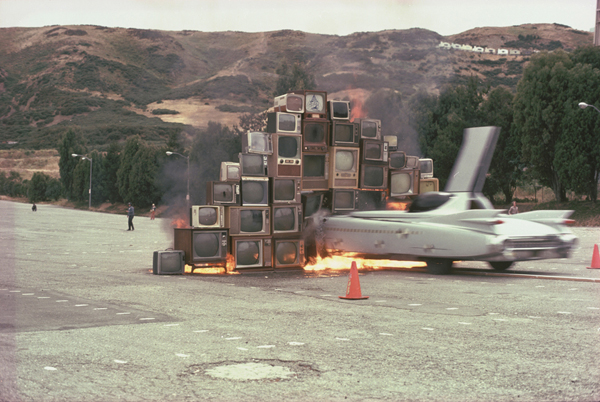
Ant Farm, Media Burn, Cow Palace, San Francisco, July 4, 1975. Photo © John F. Turner. University of California, Berkeley Art Museum and Pacific Film Archive.
Koolhaas could not help but be influenced by Archigram, trained as he was at the Architectural Association in London at a time, the late 1960s, when Chalk, Crompton, and Herron all taught there. Certainly his first book, Delirious New York (1978), a “retrospective manifesto” for the urban density of Manhattan that was also a riposte to the celebration of suburban signage-sprawl in Learning from Las Vegas, advanced such Archigram themes as the “Technology of the Fantastic.”31 Yet Koolhaas played down this connection and, in a strategic swerve around Archigram, cited modernist precedents instead, Le Corbusier and Salvador Dalí above all. Critical of both figures, he nonetheless combined these opposites—Corb the Purist form-giver (and manifesto-maker), Dalí the Surrealist desire-purveyor (and media-celebrity)—in a lively compound that triggered his own success, first as a writer and then as a designer.32 Yet the Pop imaging of new technology à la Archigram, cut with a Brutalist attention to rough materials and exposed structures, still guided Koolhaas.
Koolhaas borrowed from Dalí his “paranoid-critical method,” a Pop strategy avant la lettre which “promises that, through conceptual recycling, the worn, consumed contents of the world can be recharged or enriched like uranium.”33 In a way that echoes both Banham and the Venturis, Koolhaas turned this device of a “systematic overestimation of what exists” into his own way of working: his office has often produced its designs through an exacerbation of one architectural element or type, and does so to this day. For example, in the public library in Seattle (1999–2004) and the CCTV (China Central Television) complex in Beijing (2004–08), Koolhaas retooled the old skyscraper, the hero-type of Delirious New York. In Seattle the glass-and-steel grid of the Miesian tower is sliced into five large levels (four above grade), stepped into cantilevered overhangs, and faceted like a prism at its corners; as it follows these twists and turns, the light-blue metal grid is transformed into different diagonals and diamonds. The result is a powerful image, second only to the Space Needle (1962) as Pop emblem of the city, that is not a fixed image at all, for it changes at every angle and from every point of view. The image is also not arbitrary: the building uses its site, an uneven slope in downtown Seattle, to ground its forms, which renders them less sculptural and less subjective than they might otherwise appear. More importantly, the profile is motivated by the program, especially in the penultimate level that contains a great spiral of ramped bookshelves. The Cubistic skin as a whole wraps the different functions of the building, which serves as its own diagrammatic representation.
The idea of building as Pop sign is problematic, yet at least in Seattle the sign is placed in the service of a civic institution. The CCTV in Beijing is a different matter. It, too, transforms the Miesian tower into a “bent skyscraper,” here an immense faceted arch, and it, too, is motivated by the program, which combines “the entire process of TV-making”—administration and offices, news and broadcasting, program production and services—into one structure of “interconnected activities.”34 Moreover, like the Seattle diamond, the CCTV arch is both a technological innovation and an “instant icon,” and in this respect it is also connected to Pop, at once Banhamite and Venturian in its lineage.35 Yet, unlike the Seattle library, this building-sign is overwhelming in its sense of scale and underwhelming in its sense of site, and one can hardly see it as civic (if anything, it reads as a triumphal arch dedicated to the state).
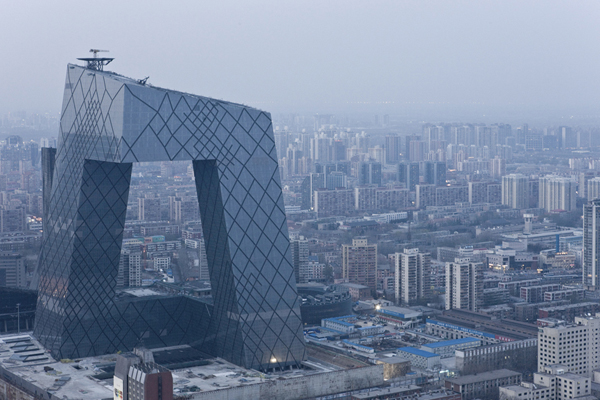
OMA, Rem Koolhaas and Ole Scheeren, CCTV Building, Beijing, 2004–08. Photo © Iwan Baan.
Like Koolhaas, Gehry has steered mostly clear of architectural labels. Influenced by the Austrian emigré Richard Neutra (who was long active in Los Angeles), he first turned a modernist idiom into an LA vernacular, mostly in domestic architecture, through an innovative use of cheap materials associated with commercial building (for example, exposed plywood, corrugated metal siding, chain-link fencing, and asphalt), as in his own celebrated home in Santa Monica (1977–78/1991–92). However, this gritty style was soon succeeded by an imagistic one, as in his Chiat/Day Building in Venice (1985–91), where, in collaboration with Claes Oldenburg and Coosje van Bruggen, Gehry designed giant binoculars for the entrance of this advertising agency. At stake in this stylistic shift is the difference between an inventive use of common materials, as in his house, and a manipulative use of mass signs, as in the Chiat/Day Building—or indeed the Aerospace Hall (1982–84), also in LA, where a fighter jet is attached to the façade. The first path can bring elite design back in touch with everyday culture, and renew an architectural form with a social spirit; the second tends to ingratiate architecture to a public projected as a mass consumer. For the most part Gehry followed the second path into stardom in the 1990s, and the present status of the celebrity designer, the architect as Pop figure, is in no small measure a by-product of his fame.
Along the way Gehry seemed to transcend the Venturian opposition of modern structure and postmodern ornament, formal duck and decorated shed, architecture as monument and architecture as sign, but in fact he collapsed the two categories. This occurred first, almost programmatically, in his huge Fish Sculpture at the Olympic Village in Barcelona in 1992—a trellis hung over arched ribs that is equal parts duck and shed, both all structure and all surface, with no functional interior. The Fish also marked his initial use of CATIA, or “computer-aided three-dimensional interactive application.” Because CATIA permits the modeling of non-repetitive surfaces and supports, of different exterior panels and interior armatures, it allowed Gehry to privilege shape and skin, the overall configuration, above all else: hence the non-Euclidean curves, swirls, and blobs that became his signature gestures in the 1990s, most famously in the Guggenheim Bilbao (1991–97), and perhaps most egregiously in the Experience Music Project (1995–2000) in Seattle, whose six blobs clad in different metals have little apparent relation to the many interior display-stations dedicated to popular music. In Bilbao Gehry moved to make the Guggenheim legible through an allusion to a splintered ship; in Seattle he compensated with an allusion to a smashed guitar (a broken fret lies over two of the blobs). Yet neither image works even as a Pop version of sited connection (Bilbao as an old port, Seattle as the home of Jimi Hendrix and Grunge music), for one cannot read them at ground level. In fact one can see them in this way only in media reproduction, which is a primary site of such architecture in any case.
On the one hand, then, Gehry buildings remain modern ducks inasmuch as they privilege formal expression above all; on the other hand, they also remain decorated sheds inasmuch as they often break down into fronts and backs, with interiors disconnected from exteriors in a way that sometimes results in dead spaces and cul-de-sacs in-between (this is especially true of his Walt Disney Concert Hall in LA [1987–2003]).36 But the chief effect of this combination of duck and shed is the promotion of the quasi-abstract building as Pop sign or media logo. And, on this score, Gehry is hardly alone: there is a whole flock of “decorated ducks” that combine the willful monumentality of modern architecture with the faux-populist iconicity of postmodern design.
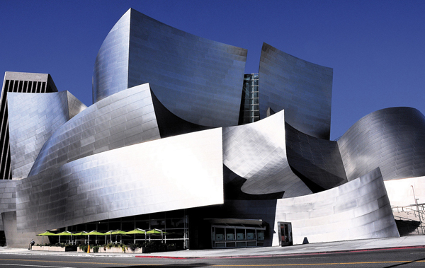
Frank Gehry, Walt Disney Concert Hall, Los Angeles, 1987–2003. Courtesy of Gehry Partners, LLP.
In some cases, the duck has become the decoration; that is, the form of the building serves as the sign, and sometimes at a scale that dominates the setting, as the Guggenheim Bilbao dominates its surroundings. In other cases the decorated shed has become the duck; that is, the surface of the building is elaborated, with the aid of high-tech materials manipulated by digital means, into idiosyncratic shapes and mediated envelopes. The first tendency exceeds the ambition of the Venturis, who wanted only to reconcile architecture to its given context via signs, not to have it become a sign that overwhelms its context (the latter is also a “Bilbao effect,” one not often acknowledged).37 The second tendency exceeds the ambition of Banham, who wanted only to relate architecture to contemporary technology and media, not to have it become a “mediated envelope” or “datascape” subsidiary to them.38 Today decorated ducks come in a wide variety of plumage, yet even as the stylistic appearance is varied, the logic of effect is often much the same. And, despite the attacks of September 2001 and the crash of September 2008, it remains a winning formula for museums and companies, cities and states, indeed for any corporate entity that desires to be perceived, through an instant icon, as a global player.39 For them, and perforce for us, it is still—it is ever more—a Pop world.