Chapter 10
Classification of Cells
This case study relies heavily on features available only in JMP Pro.
Cellularplex is a small cell phone provider anxious to attract new customers. Jeremy Halls, the director of marketing, faces the challenge of running targeted and well-timed marketing campaigns. To that end, he wants to explore the value of predictive analytics, namely, the use of modeling techniques to predict future trends and behavior. You are a statistical analyst with prior experience in both marketing and medical research. Jeremy enlists your help in developing strong marketing programs that will expand Cellularplex's customer base.
A test campaign aimed at identifying new customers who would take advantage of a specific offer is being launched. The data collected will allow the marketing group to explore the impact of a large number of demographic characteristics, as well as how the offer was made, on the response rate. The key response is the category into which a respondent falls, and there are four possible outcomes: an inquiry about the offer, the purchase of the promoted offer, the purchase of a different offer, or a rejection of the offer. The information from this test campaign will be used to shape a large-scale drive to attract new customers.
The test campaign duration is set to three months. During this time, you start learning about JMP Pro, focusing on its powerful visualization and modeling capabilities. Because you will need to be ready to analyze the campaign data quickly when the responses arrive, you search for some practice data, preferably a data set with a large number of potential predictors and where classification into two or more outcomes is required. You find a published data set called the Wisconsin Breast Cancer Diagnostic Data. These data resulted from a study to accurately classify breast growths as malignant or benign, based on characterization of a fine needle aspirate. The data includes 569 records and 30 potential predictor variables.
This case study follows your self-study as you explore features of JMP that support classification and data mining. You make extensive use of visualization techniques to build an understanding of the data set. After dividing the data into a training set, a validation set, and a test set, you fit seven models to the training data: two regression tree models, a logistic model, two penalized regression models using the Generalized Regression platform, and two neural net models. Specifically, these models are:
- A Decision Tree model (Partition platform)
- A Boosted Tree model (Partition platform)
- A Logistic model (Stepwise personality in Fit Model)
- A Lasso model (Generalized Regression personality in Fit Model)
- An Elastic Net model (Generalized Regression personality in Fit Model)
- A Neural Net model without boosting (Neural platform)
- A Neural Net model with boosting (Neural platform)
Comparing the performance of these models on the test set leads you to choose one of these as your preferred model.
A list of the JMP platforms and options that you use in this case study is shown in Exhibit 10.1. Many of these require JMP Pro. The JMP data tables that you use are available at http://support.sas.com/visualsixsigma.
Exhibit 10.1 Platforms and Options Illustrated in This Case Study
| Menus | Platforms and Options |
| Tables | Subset |
| Sort | |
| Missing Data Pattern | |
| Rows | Hide and Exclude |
| Color or Mark by Column | |
| Cols | Column Info |
| Column Properties | |
| Formula | |
| Modeling Utilities | |
| Explore Outliers | |
| Make Validation Column | |
| Group Columns | |
| Analyze | Distribution |
| Histogram | |
| Frequency Distribution | |
| Tabulate | |
| Fit Model | |
| Stepwise | |
| Generalized Regression | |
| Nominal Logistic | |
| Modeling | |
| Partition | |
| Decision Tree | |
| Boosted Tree | |
| Neural Net | |
| Model Comparison | |
| Multivariate Methods | Multivariate |
| Correlation and Scatterplot Matrix | |
| Graph | Graph Builder |
| Scatterplot Matrix | |
| Other | Column Switcher |
SETTING THE SCENE
Cellularplex is a small cell phone provider that is poised and anxious to expand its customer base. Jeremy Halls, the director of marketing, has been hearing about predictive analytics and how it can be successfully used to focus marketing strategies. He believes that statistical and data-mining models of customer characteristics and proclivities could greatly enhance his ability to run marketing campaigns that are targeted and well timed, reaching potential customers with the right offers and using the right marketing channels.
You have recently been hired by Cellularplex. Your previous position was with a medical research firm, where you conducted statistical analysis relating to clinical trials. Prior to that position, you worked with a retail firm doing predictive analytics in the marketing area.
You are a key member of a team that Jeremy forms to design a test campaign aimed at identifying new customers for a specific offer that Cellularplex will market in the coming year. The goal of the test campaign is to identify demographic characteristics of individuals who would likely purchase the offer and to determine the best delivery method for various combinations of demographic characteristics. The knowledge gained will be employed in designing a subsequent large-scale campaign to attract new customers.
The team members brainstorm a large number of characteristics that they think are indicative of people who might respond positively. Then they work with a data vendor to obtain a list of people with these characteristics. They also obtain the contact details for a small random sample of people who do not have the characteristics that they have identified, realizing that information from a group outside their chosen demographics could yield information on customers who might otherwise be overlooked. The team also determines different delivery methods for the offer, and with your help they include these in their design. Finally they agree on how to measure customer response—for each contact, they will record whether the result was a customer inquiry, purchase of the offer, purchase of a different offer, or rejection. You point out to the team that if they later collapse this information into only two categories (purchase or nonpurchase), then uplift modeling will provide another possibility for analyzing the resulting data.
The duration of the test campaign is set at three months, starting in the second quarter. You will support the effort, but in the meantime you want to prepare yourself to analyze the kind of data it will generate. You will need to use the numerous measured characteristics and the response of each individual to classify each into one of the four possible categories, and thus determine those likely to become customers and those unlikely to become customers. You start learning JMP Pro, which is used by the engineers at Cellularplex, and soon realize that it has powerful visualization and modeling capabilities that you can use when the real data arrive.
Knowing that you will have to undertake this analysis quickly once the data become available, you look for a published data set that you can use for practice, both to learn how to use JMP Pro and to see how it performs relative to other software that you have used. Specifically, you would like a data set with a large number of descriptive characteristics where classification of subjects into two or more categories is of primary interest.
Given your medical background, you easily find and download an appropriate data set—the Wisconsin Breast Cancer Diagnostic Data Set. Your plan is to use various techniques in JMP Pro to fit classification models to this data set. Realizing that some of the Cellularplex engineers are experienced JMP users, you ask a few of them if they would be willing to help you if necessary. James, who has used JMP Pro for several years, spends a couple of hours with you, giving you an introduction and offering to help you with further questions as they arise. What James shows you provides a good starting point for learning more about modeling high-dimensional data on your own.
In this case study, you work with various JMP capabilities for exploring and modeling data. You begin by using visualization techniques to help build an understanding of the Wisconsin Breast Cancer Diagnostic Data Set. After dividing the data into a training set, a validation set, and a test set, you construct seven models using four different modeling approaches. All of the models you construct use the validation set for cross-validation. Your study ends with a comparison of the performance of your seven models on the test set.
This case study uses the principles of Visual Six Sigma to construct knowledge. This type of knowledge can eventually be used to guide sound business decisions. By its nature, this case study focuses on the Model Relationships step of the Visual Six Sigma Data Analysis Process, and does not involve the Revise Knowledge and Utilize Knowledge activities. These activities will become relevant once the classification scheme that you eventually develop for the marketing data is implemented as part of the formal marketing campaign.
FRAMING THE PROBLEM AND COLLECTING THE DATA: THE WISCONSIN BREAST CANCER DIAGNOSTIC DATA SET
The Wisconsin Breast Cancer Diagnostic Data Set arises in connection with diagnosing breast tumors based on a fine needle aspirate.1 In this study, a small-gauge needle is used to remove fluid directly from the lump or mass. The fluid is placed on a glass slide and stained so as to reveal the nuclei of the cells. An imaging system is used to determine the boundaries of the nuclei. A typical image consists of 10 to 40 nuclei. The associated software computes ten characteristics for each nucleus: radius, perimeter, area, texture, smoothness, compactness, number of concave regions, size of concavities (a concavity is an indentation in the cell nucleus), symmetry, and fractal dimension of the boundary (the higher the value of fractal dimension, the less regular the contour).2
A set of 569 lumps was sampled, and each resulting image was processed as described above. Since a typical image can contain from 10 to 40 nuclei, the measurements were summarized. For each characteristic, the mean, max, and standard error of the mean were computed, resulting in 30 variables. The model developed by the researchers was based on separating hyperplanes.3 A best model was chosen by applying cross-validation to estimate prediction accuracy, using all 569 records as a training set. This best model involved only three variables—mean texture, max area, and max smoothness—and achieved an estimated classification accuracy of 97.5 percent. Even more remarkably, 131 subsequent patients were diagnosed with 100 percent accuracy.
Since your goal is to become familiar with the various modeling techniques you might use later, your modeling approach will differ from that of the study authors. You will construct seven models using a training and validation set. Then you will assess the performance of your models on a test set. Your figure of merit will be the overall misclassification rate, which you want to be as small as possible.
The data are publicly available at http://archive.ics.uci.edu/ml/datasets.html. The data set is called “Breast Cancer Wisconsin (Diagnostic).” You download the data and arrange them in a JMP data table called CellClassification.jmp.
INITIAL DATA EXPLORATION
The data table CellClassification.jmp has 32 columns. The first column is ImageID, which is simply an identifier. The second column is Diagnosis, the variable you want to predict. Each of the following 30 variables has a name beginning with Mean, Max, or SE, indicating which summary statistic has been calculated—the mean, max, or standard error of the mean of the measured quantity.
In exploring the data and fitting your models, you realize that you will often want to treat all 30 of your predictors as a group. When a large number of columns will be treated as a unit, say, as potential predictors, this can make analyzing data more convenient.
Before you engage in any modeling, you want to get a better understanding of the data. Do you have missing data values? What do the data look like? Are there outliers?
Also, as suggested by the Visual Six Sigma Roadmap (Exhibit 3.30), you want to visualize your data one variable at a time and then two variables at a time. This will provide you with the knowledge that there are strong relationships between the 30 predictors and the diagnosis into benign or malignant masses.
Missing Data Analysis
You begin by checking to see if you have any missing data.
The resulting report, partially shown in Exhibit 10.2, is a data table. The second column, Number of columns missing, indicates that none of the 569 columns has any missing values. Had there been missing values, the Patterns column would indicate the columns in which they occur.

Exhibit 10.2 Missing Data Pattern Report, Partial View
Rather than use Missing Data Pattern, you realize that you can also use Cols > Columns Viewer to simply get a count of missing values in each column.
Exploring All Distributions
Now you want to see how the data are distributed. You want to obtain distribution reports for all of the variables other than ImageID, which is simply an identifier for each row.
The first four of the 31 distribution reports are shown in Exhibit 10.3. The vertical layout for the graphs is the JMP default. You realize that you can change this either for just this report or more permanently for all subsequent reports in File > Preferences, but you are happy with this layout for now.
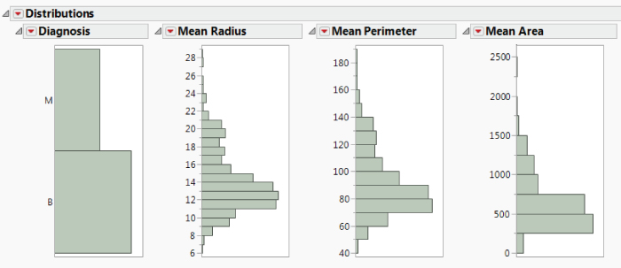
Exhibit 10.3 First 4 of 31 Distribution Reports
The bar graph corresponding to Diagnosis indicates that 212, or 37.258 percent, of the tumors in the study were assigned the value M, indicating they were malignant rather than benign. This means that neither of the two categories is highly underrepresented. A sparse category would cause problems for your analysis, since standard models would favor the more highly represented category.
Scrolling through the plots for the 30 predictors, you assess the shapes of the distributions and look for the presence of possible outliers. You note that most distributions are skewed toward higher values and that there may be some outliers, for example, for SE Radius, SE Perimeter, SE Area, and SE Concavity. You make a mental note to examine outliers in depth later on.
All in all, the data are well behaved—you expect your marketing data to be much messier—but you decide that this is a good practice data set given your goal.
Exploring Relationships for Two Variables at a Time
Distribution and Dynamic Linking
Of special interest to you is whether the predictors are useful in predicting the values of Diagnosis, the dependent variable.
To get some initial insight on this issue, return to your distribution report. In the graph for Diagnosis, click on the bar corresponding to M. This selects all rows in the data table for which Diagnosis has the value M. These rows are dynamically linked to all plots, and so, in the 30 histograms corresponding to predictors, areas that correspond to the rows where Diagnosis is M are highlighted.
Scroll across the histograms to see that malignant masses tend to have high values for all of the Mean and Max variables except for Mean Fractal Dim and Max Fractal Dim. Five of the distributions for Max variables are shown in Exhibit 10.4. The malignant observations are highlighted. Max Fractal Dim is shown in the last histogram.

Exhibit 10.4 Histograms for Five Max Variables with Malignant Masses Highlighted
Next, click on the bar for Diagnosis equal to B and scroll across the histograms. You conclude that there are clear relationships between Diagnosis and the 30 potential predictors. You should be able to build good models for classifying a mass as malignant or benign based on these predictors.
Correlations and Scatterplot Matrix
You are also interested in how the 30 predictors relate to each other. To see bivariate relationships among these 30 continuous predictors, you obtain correlations and construct scatterplots.
The report shows a Correlations outline where you see the correlations between the predictors. It also shows a 30 × 30 Scatterplot Matrix. This is a matrix of scatterplots for all pairs of variables. The 6 × 6 portion of the matrix corresponding to the first six Mean variables is shown in Exhibit 10.5.

Exhibit 10.5 Partial View of Correlation Matrix: First Six Mean Variables
You scroll through the matrix and notice that some variables are highly related. For example, the Mean and Max values of the size variables, Perimeter, Area, and Radius, are strongly related, as you might expect. Also, as you might expect, Perimeter and Area have a nonlinear relationship. Weaker, but noticeable, relationships exist among other pairs of variables as well.
You would like to see how Diagnosis fits into the scatterplot display. James had shown you that in many plots you can simply right-click to color or mark points by the values in a given column.
You notice that the colored markers now appear in your data table next to the row numbers. Also, an asterisk appears next to Diagnosis in the Columns panel. When you click on it, it indicates that Diagnosis has the Value Colors column property. When you click on Value Colors, it takes you to the Diagnosis Column Info dialog, where you see that the colors have been applied to B and M as you specified.
The colors and markers appear in the scatterplots as well, and a legend is inserted to the right of the matrix as part of the report. You can use this legend to select points. But you have also created a Legend window, shown in Exhibit 10.7. (Script is Colors and Markers.)
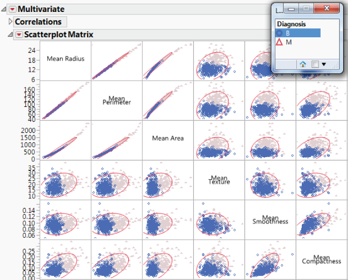
Exhibit 10.7 Legend Window with B Selected
Move the Legend window into the upper right of your scatterplot matrix, as shown in Exhibit 10.7. Click on the B level for Diagnosis. This selects all rows where Diagnosis is B and highlights these points in plots, as is shown in the portion of the scatterplot matrix shown in Exhibit 10.7. To unselect the B rows, hold the Control key as you click on the B level in the legend.
Viewing the scatterplot matrix, it is clear that Diagnosis is associated with patterns of bivariate behavior.
Pairwise Correlations
You are interested in which variables are most strongly correlated with each other, either in a positive or negative sense. The scatterplot certainly gives you some clear visual information. However, a quick numerical summary showing correlations for all pairs of variables would be nice.
Because you have 30 variables, each of which can be paired with 29 other variables, there are  combinations of two variables. Because these combinations double-count the correlations, there are
  distinct pairwise correlations. These 435 correlations are sorted in descending order. Exhibit 10.8 shows the largest 20 and the smallest 10 correlations.
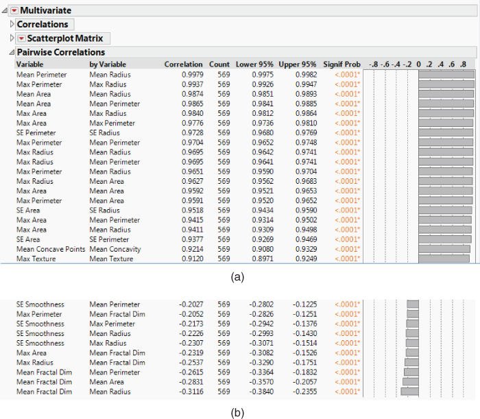
Exhibit 10.8 Largest 20 and Smallest 10 Correlations
The report shows the high positive correlations among the Mean size variables, the Max size variables, and the SE size variables. All of these are 0.9377 or higher. This is expected. Scanning further down the report, you observe that the Mean and Max variables for the same characteristics tend to have fairly high correlations. This is also expected.
Many of the large negative correlations involve fractal dimension and the size measures. Recall that the larger the fractal dimension, the more irregular the contour. Six such correlations are shown in the bottom part of Exhibit 10.8. This suggests that larger cells tend to have more regular contours than smaller cells. How interesting!
A Better Look at Mean Fractal Dimension
To get a better feeling for relationships between size variables and fractal dimension, you decide to explore Mean Radius and Mean Fractal Dim.
The combined collection of benign and malignant cells exhibits a decreasing relationship between Mean Radius and Mean Fractal Dim. Given a value of Mean Fractal Dim, Mean Radius is generally higher for malignant cells than for benign cells. The fitted lines and confidence curves suggest that there is a big difference between the two diagnosis groups based on how Mean Radius and Mean Fractal Dim are related.
Given values on these two variables, you could make a fairly good guess as to whether a mass is benign or malignant. But to help distinguish the two groups in the murky area between the fitted lines, you will need additional variables. This is encouraging—it should be possible to devise a good classification scheme.
In examining the scatterplot matrix further, you observe that there may be a few bivariate outliers. If this were your marketing data set, you would attempt to obtain more background on these records to get a better understanding of how to deal with them. For now, you decide not to take any action relative to these points. However, you make a mental note that you might want to revisit their inclusion in model-building since they have the potential to be influential.
CONSTRUCTING THE TRAINING, VALIDATION, AND TEST SETS
By now you have accumulated enough knowledge to realize that you should be able to build a strong classification model. You are ready to progress to the Model Relationships step of the Visual Six Sigma Data Analysis Process. You anticipate that the marketing study will result in a large and unruly data set, probably with many outliers, some missing values, irregular distributions, and some categorical data. It will not be nearly as small or as clean as this practice data set.
Some data-mining techniques, such as recursive partitioning and neural nets, fit highly parameterized nonlinear models that have the potential to fit the anomalies and noise in a data set, as well as the signal. These data-mining techniques do not allow for variable selection based on hypothesis tests, which, in classical modeling, help the analyst choose models that do not overfit or underfit the data.
To balance the competing forces of overfitting and underfitting in data-mining efforts, one often divides the available data into at least two and sometimes three distinct sets. A portion of the data, called the training set, is used to construct several potential models. The performance of these models is then assessed on a holdout portion of the data called the validation set. A best model is chosen based on performance on the validation data. You will use this strategy in fitting models using recursive partitioning, logistic regression, generalized (penalized) regression, and neural nets.
Choosing a model based on a validation set can also lead to overfitting. In situations where a model's predictive ability is important, a third independent portion of the data, called the test set, is often reserved to assess the model's performance. The test set can also be used to compare several models and select a best predictive model.4
For these reasons, you decide to construct three analysis sets: a training set, a validation set, and a test set. You will construct a column called Validation in your data table that assigns each row to one of these three sets. Then you will run a quick visual check to see that there are no obvious issues arising from how you divided the data.
Defining the Training, Validation, and Test Sets
Admittedly, your data set of 569 observations is small and well-behaved compared to most data sets where data-mining techniques are applied. But keep in mind that you are working with this smaller, more manageable data set in order to learn how to apply techniques to the much larger marketing data set that you will soon need to analyze, as well as to any other large databases with which you may work in the future.
You will randomly divide your data set of 569 rows into three portions:
- A Training set consisting of about 60 percent of the data
- A Validation set consisting of about 20 percent of the data
- A Test set consisting of the remaining 20 percent of the data
The suggested split proportions are not derived from theory, but rather from practical considerations. They can vary somewhat from application to application. However, it is common to allocate a large share of the data to develop models and smaller shares to compare and assess them.
A new column called Validation appears in your data table. This column designates each row as belonging to the Training, Validation, or Test set. In the Columns panel (see Exhibit 10.10), you notice that Validation has a plus sign (+) and an asterisk next to it:
- The plus sign indicates that the column is defined by a formula. Click on the
plus signto see theFormula. - The asterisk indicates that the column has the
Value Labelsproperty. Click on theasteriskto see that the underlying values are 0, 1, and 2. These values define an order that will be used in reports. The labels Training, Validation, and Test are associated with the integer values.
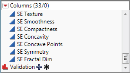
Exhibit 10.10 Columns Panel Showing Plus Sign and Asterisk Next to Validation Column
Since rows are assigned to analysis sets at random, your analysis sets will differ from those used in this chapter. Note, however, that if you want to be able to reproduce a validation column, you can use the Random Seed Reset add-in found at https://community.jmp.com/docs/DOC-6601. Alternatively, you can set a seed using a script. The script Make Validation Column specifies a random seed and then completes the dialog obtained when you select Cols > Modeling Utilities > Make Validation.
Distribution of the Three Analysis Data Sets
At this point, you should check that the assignment of rows to the three analysis sets worked out as you expected. Run Distribution on Validation (Exhibit 10.11). You observe that the proportion of rows in each set is about what you wanted.
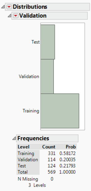
Exhibit 10.11 Distribution Report for Validation
Checking for Outliers
Your next step is to develop models. Before proceeding, you want to ensure that your data sets don't contain outliers that might influence the models or your validation of the models. When you constructed individual distributions for your predictors early on, you noticed some potential outliers for SE Radius, SE Perimeter, SE Area, and SE Concavity. You need to address these observations at this point.
JMP Pro provides various ways to explore outliers in Cols > Modeling Utilities > Explore Outliers (see Exhibit 10.12). The Quantile Range Outliers and Robust Fit Outliers options identify rows that contain outliers relative to individual variables. The Multivariate Robust Outliers option identifies observations that are outliers based on a multivariate normal distribution. The Multivariate k-Nearest Neighbor Outliers option identifies observations that are outliers based on their multivariate distance from their nearest neighbors.

Exhibit 10.12 Explore Outliers Options
You have 30 predictors and your main interest is in rows that contain outliers from the multivariate distribution. However, your data are far from multivariate normal. So you decide to use the Multivariate k-Nearest Neighbor Outliers option.
The plot in Exhibit 10.13 appears. The plot for Distance to 1 Closest shows several points that might be outliers. The remaining plots show three rows with observations that are distant from their nearest two, three, five, or eight neighbors. These points are distant from a clump of near points. Hover over these points to see that they are in rows 153, 213, and 462.

Exhibit 10.13 K Nearest Neighbor Plots
These points are difficult to see in the histograms constructed using the Distribution—31 Variables script. If you broadcast the Outlier Boxplot Option from one of the histograms (by holding the Control key when you request this option), you can see these points. However, another easy way to see them is using Graph Builder and Column Switcher.
Exhibit 10.14 shows the Graph Builder window showing SE Radius and the three selected points.
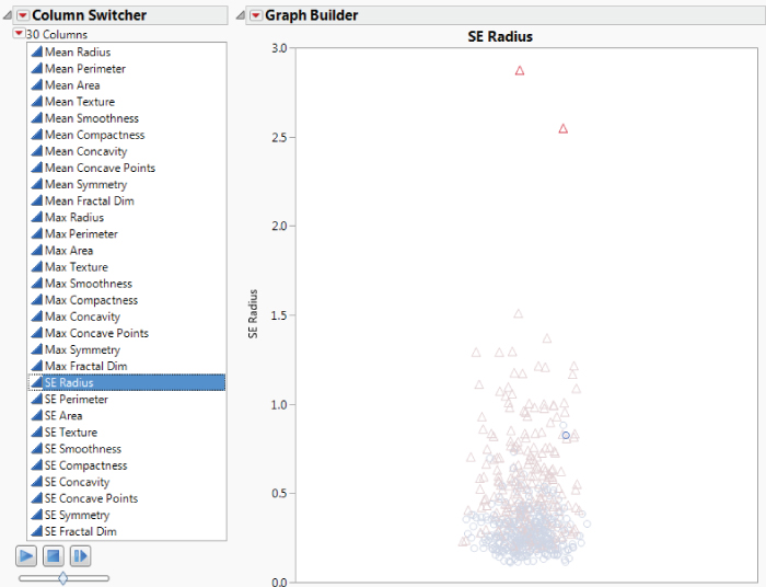
Exhibit 10.14 Graph Builder and Columns Switcher Showing SE Radius
As you scroll through all distributions, you see that rows 213 and 462 contain observations that are outliers for SE Radius, SE Perimeter, and SE Area. Row 153 contains an outlier for SE Concavity and perhaps SE Concave Points and SE Fractal Dimension. These three points might be highly influential on some of the models that you plan to fit.
In the plot for SE Concavity, there appears to be a second outlier, row 69. Select that point. Scroll through the other variables to see that row 69 does not seem to be outlier for other predictors. Yet, because it is so distant from the other SE Concavity measurements, it might be influential on some model fits.
It is possible for outlying observations to be influential without distorting model fits, or to be part of the common cause distribution that you are studying. In both cases, it makes sense to retain them in analyses. In every case, though, you should always investigate each outlier to determine if it is the result of an unrelated or special cause distribution, or a recording error.
In your situation, because you are handling secondary data, you are unable to further investigate these four observations directly. To be prudent, you decide to exclude them from further analyses. You exclude and hide rows 69, 153, 213, and 462 in the data table. This excludes the points from models that you construct and does not show them in plots.
To document that these rows have been hidden and excluded as potential outliers, a Table Variable called Potential Outliers has been added to the data table.
This information now appears in the table panel, directly beneath the name of the data table. Defining a Table Variable is a convenient way to document information about the data table and changes you have made.
Checking Your Analysis Data Sets
You are also interested in confirming that your training, validation, and test sets do not differ greatly in terms of the distributions of the predictors. You can easily do this using Graph Builder and Column Switcher. You use these tools to quickly explore the 30 distributions broken down by training, validation, or test set.
Exhibit 10.18 sows the plot for Mean Concavity. The plots indicate that the distributions for the three analysis groups are similar, accounting for the fact that the training set is three times as big as the two other data sets. There do not appear to be any pronounced discrepancies in the distributions. Also, there do not appear to be any observations that are serious outliers relative to the combined analysis sets. This conclusion extends to the other variables.

Exhibit 10.18 Graph Builder with Mean Concavity as Y
At this point, you close all of your open reports. Go the Home window by clicking on the house icon at the bottom right of any report or data table. In the Window list, select the reports that you want to close, right-click, and select Close.
PREDICTION MODELS
Your goal is to explore four modeling approaches:
- Partitioning, where you will construct a Decision Tree and a Boosted Tree model
- Stepwise Regression, which you will use to construct a Logistic model
- Generalized Regression, where you will construct two penalized regression models: a Lasso and an Elastic Net model
- Neural, where you will construct a Neural Net model without boosting and one with boosting
You consider using discriminant analysis, which classifies observations into groups based on continuous variables. Discriminant analysis is based on the assumption of multivariate normality of the predictors. That is not the case for the CellClassification.jmp data. Also, although all the predictors in this data table are continuous, thinking ahead to your test campaign data, you realize that some of your predictors will be nominal. For these reasons, you decide not to pursue discriminant analysis.
Each of your seven models will be constructed using your Training set as a base and by tuning model parameters using the Validation set. To select the best model, you will assess the performance of your models on the Test set.
Your objective is to minimize the overall misclassification rate. One could argue that your chosen criterion should weight the misclassifications differently. Misclassifying malignant tumors as benign may be a more serious error than misclassifying benign tumors as malignant. To address such a situation, you can assign a column property called Profit Matrix to a categorical response. The Profit Matrix allows you to specify losses due to misclassification. For simplicity of exposition, we will not employ the Profit Matrix. But we encourage you to explore its potential on your own.
RECURSIVE PARTITIONING
The JMP Partition platform provides several methods for constructing decision trees or classification and regression models.5 The platform allows both the response and predictors to be either continuous or categorical. The methods include:
- Decision Tree
- Bootstrap Forest
- Boosted Tree
- K Nearest Neighbors
The first three methods are tree-based algorithms. The Decision Tree method is the basis for both Bootstrap Forest and Boosted Tree. The K Nearest Neighbors method is not tree-based, but rather relies on distances to construct a classification or regression model.
You decide to explore the use of just two of these methods to keep your workload reasonable: Decision Tree and Boosted Tree. The Boosted Tree method builds a large additive decision tree by fitting small trees to the residuals of previously fitted trees.
The tree-based methods construct trees by progressively splitting the values of predictors into two non-overlapping sets, or nodes. Continuous predictors are split into two nodes according to a cut value, while predictors that are nominal or ordinal are split into two groups of levels. At each step the two nodes defining the split are selected so as to maximize the difference in the response across observations in the node being split. Note that this involves picking a predictor to split on.
If the response is continuous, the sum of squares due to the difference between means is a measure of the difference in the two groups. Both the variable to be split on and the cut value for the split are determined by maximizing a quantity, called the LogWorth, which is related to the p-value associated with the sum of squares due to the difference between means. The fitted values are the means within the two groups.
If the response is categorical, as in your case, the splits are determined by maximizing a LogWorth statistic that is related to the p-value of the likelihood ratio chi-square statistic, which is referred to as G^2. In this case, the fitted values are the estimated proportions, or response rates, within the resulting two groups.
The Boosted Tree method builds a large tree using smaller trees that are fit to the scaled residuals of the previous tree that is fit. The hope is that the new tree does a better job in fitting observations that were not fit well so far, helping to reduce unexplained variation. This goes on for a number of stages and then the trees are weighted and combined into a final tree.
The Partition platform is useful both for exploring relationships and for modeling. It is very flexible, allowing a user to find not only splits that are optimal in a global sense, but also node-specific splits that satisfy various criteria. The platform provides various stopping rules, that is, criteria to end splitting. Stopping rules help prevent you from overfitting the data.
Decision Tree Model
You begin by fitting a Decision Tree model. It is the only method available in the standard version of JMP.
Fitting a Decision Tree Model
Decision Tree is the method that JMP fits by default when you launch the Partition platform.
The Partition Report
The report shown in Exhibit 10.19 appears. The initial node is shown, indicating under Count that there are 327 rows of data. These are the observations in your training set.

Exhibit 10.19 Initial Partition Report
In the bar graph in the node and the graph above the node, the color red indicates malignant values (red triangles) and blue indicates benign values (blue circles). The colors and markers are those that you assigned in the script Colors and Markers. Currently there is only one node (All Rows), and the graph above the node shows the points within a node with random jitter in the horizontal direction.
You would like JMP to display the proportions of malignant and benign records in each node. To see these, select Display Options > Show Split Prob from the red triangle at the top of the report. The diagram updates to show the Rate and Prob columns for the two levels of Diagnosis in the initial node, and the report will show these in all subsequent nodes as well. The Rate statistic gives the proportion of observations that are in each response level. The Prob value is the predicted value for the response level, calculated in such a way that the predicted probability is always nonzero.
Now the initial node appears as shown in Exhibit 10.20. You see that the benign proportion is 0.6514 and the malignant proportion is 0.3486. The horizontal line separating the benign points from the malignant points in the graph at the top of the report is at 0.6514.
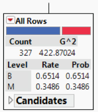
Exhibit 10.20 Initial Node Showing Split Probabilities
Splitting
To get a sense of what Partition does, click once on the Split button. JMP determines the best variable on which to split and the best cutting value for that variable.
The report, after the first split, is shown in Exhibit 10.21. The first split is on the variable Max Concave Points, and the observations are split at the value where Max Concave Points = 0.15. Of the 98 observations where Max Concave Points ≥ 0.15 (the leftmost node), 97.96 percent are malignant. Of the 229 for which Max Concave Points < 0.15, 92.14 percent are benign. The plot at the top updates to incorporate the information about the first split, suggesting that the first split has done very well in discriminating between benign and malignant tumors.

Exhibit 10.21 Decision Tree Report after First Split
You can continue to split manually by clicking the Split button or you can fit a model automatically by clicking the Go button.
If you continue to split manually, splitting continues until splitting is stopped by the Minimum Size Split. To see the default value for Minimum Size Split, select Minimum Size Split from the red triangle menu next to Partition for Diagnosis. The minimum default size is five. So you will be able to split until no further splits of size five or larger are possible. You can set a larger value for Minimum Size Split if you think the value of five results in overfitting.
Automatic Splitting
If you split using the Go button, the Partition platform splits until the RSquare of the validation set no longer improves. Specifically, splitting is continuous until the RSquare of the validation set fails to improve for the next ten splits.
The summary report immediately beneath the graph and above the tree shows that four splits occurred. (See Exhibit 10.22.) The RSquare for the training set is 0.890 and the RSquare for the Validation set is 0.596. Since the tree is trained to fit the training set, it is not surprising that the RSquare for the validation set is lower than the RSquare for the training set. The RSquare for the test set is also given, but it is not of interest to us now.

Exhibit 10.22 Decision Tree Graph and Summary after Automatic Fitting
Split History
When you clicked the Go button, a report called Split History, shown in Exhibit 10.23, appeared beneath the tree. For each of the training, validation, and test sets, this report shows the RSquare value plotted against the number of splits. The plot only shows RSquare values for up to seven splits. This is because the Minimum Size Split rule, with the default minimum size for a node set at five, ends splitting at seven splits.
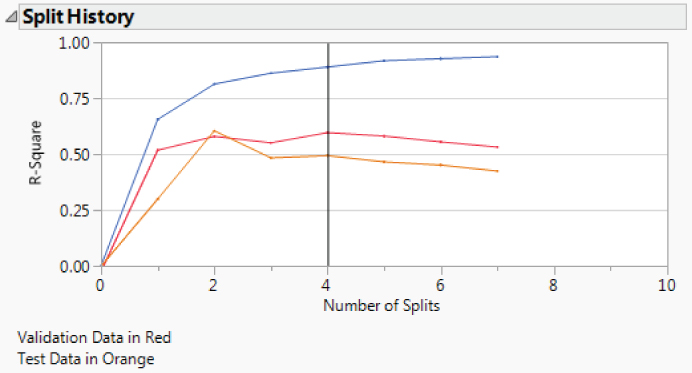
Exhibit 10.23 Split History
You see that the RSquare value for the training set (the top line, shown in blue) continues to increase over the seven splits. This is expected, since the models keep fitting finer features of the training set.
The RSquare value for the validation set (the middle line, shown in red) begins to decrease after the fourth split. This is an indication that, after the fourth split, models are fitting nuances of the training set that are not shared by the independent validation set. This suggests that the model has moved from fitting structure to fitting noise. Since the maximum RSquare for the validation set occurs for a model with four splits, the four-split model is selected by the stopping rule and displayed in the tree.
Confusion Matrices
The graph in Exhibit 10.22 indicates that the nodes do a good job of separating the malignant from the benign cases. Select Show Fit Details from the report's red triangle menu to obtain the Fit Details report, which shows numerical results (Exhibit 10.24). The first part of the report shows various measures and summary information. The Misclassification Rate for the Training set is 0.0275. The Misclassification Rate for the Validation set is 0.0789.
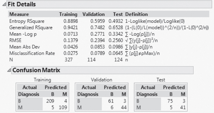
Exhibit 10.24 Fit Details Report
The Confusion Matrix report shows the nature of the misclassifications. The matrix for the validation set shows that 61 benign tumors were correctly classified as benign, while 3 benign tumors were misclassified as malignant. It also shows that 6 malignant tumors were misclassified as benign while 44 malignant tumors were correctly classified as malignant. This gives the misclassification rate of  .
.
For all three sets, there are more cases of malignant tumors being misclassified as benign than of benign tumors being misclassified as malignant. Misclassifying malignant tumors as benign may be a more serious error than misclassifying benign tumors as malignant. This is something you want to keep in mind in your model selection.
Decision Tree and Options
Now you go back to your decision tree to see which variables were important (Exhibit 10.25). The terminal nodes, that is, nodes where no further splitting occurs, involve Max Concave Points, Max Area, Max Texture, and Max Concavity. So, concavity, area, and texture variables are involved. It's interesting that these involve the maximum values of the related measurements, and not their means or standard deviations. But you need to keep in mind that these selections might be different with a different validation set, especially because some of the predictors are highly correlated. The Decision Tree method tends to be sensitive to the nuances of the training and validation sets and to correlations among predictors.6

Exhibit 10.25 Decision Tree
You notice that there are many options available in the report's red triangle menu. These include Leaf Report, Column Contributions, K-Fold Cross Validation, ROC Curve, Lift Curve, and so on. ROC and lift curves are used to assess model fit. When a tree is large, the Small Tree View option provides a plot that condenses the information in the large tree. This small schematic shows the split variables and the split values in the tree. For reasons of space, we will not discuss these additional options. We encourage you to explore these using the documentation in Help.
Saving the Decision Tree Prediction Formula
At this point, you want to save the prediction equation to the data table. You do this by selecting Save Columns > Save Prediction Formula from the red triangle at the top of the report (CellClassification.jmp, script is Decision Tree Prediction Formula). This saves three new columns to the data table, Prob(Diagnosis==B), Prob(Diagnosis==M), and Most Likely Diagnosis.
By clicking on the plus sign to the right of Prob(Diagnosis==M) in the Columns panel, you are able to view its formula, shown in Exhibit 10.26. The formula has the effect of placing a new observation into a terminal node based on its values for the split variables and then assigning to that new observation a probability of malignancy equal to the proportion of malignant outcomes observed for training data records in that node. It follows that the classification rule consists of determining the terminal node into which a new observation falls and classifying it into the class with the higher sample proportion in that node.

Exhibit 10.26 Formula for Prob(Diagnosis==M)
The Most Likely Diagnosis column contains the classification for each observation. Click on the plus sign to the right of Most Likely Diagnosis in the Columns panel. The formula shows that an observation is classified into the group “B” or “M” for which the probability of diagnosis into that group is larger.
With the prediction formula saved to the data table, you are ready to move on to your next fitting technique.
Boosted Tree
Your next model will be constructed using the Boosted Tree method. The term boosted connotes fitting models adaptively based on the residuals of previous models. The “boost” comes from increasing the weights assigned to misclassified observations and decreasing the weights assigned to correctly classified observations. Using this approach, subsequent models are forced to focus on the observations that previous models failed to classify correctly. The results of all models are combined in a weighted fashion to provide a single final decision tree, called the boosted tree.
In JMP's implementation, the Boosted Tree method fits a large, additive decision tree using a sequence of smaller trees. The smaller trees are short and typically have one to five splits. Each tree in the sequence is fit on scaled residuals derived from the previous tree. If a validation column is provided, the algorithm has the option of terminating tree growth at a point where the validation statistic no longer improves. The final prediction model is obtained by summing the estimates for each terminal node over all the stages. For a categorical response such as yours, the final predicted probability is a logistic transformation of the sum of the trees that fit the residuals at each stage.
Fitting a Boosted Tree Model
The Boosted Tree Control Panel
In the control panel (see Exhibit 10.27), you can set the following options that control the boosted tree fit:
- Number of LayersThe maximum number of small trees to fit.
- Splits Per TreeThe number of splits for each of the small trees.
- Learning RateA value between 0 and 1 that controls the learning speed. Larger values place higher weight on the residuals and result in faster convergence to a final tree, but because they give high weight to initial trees, they tend to overfit. A default Learning Rate of 0.1 is specified.
- Overfit PenaltyA biasing parameter that prevents fitting probabilities of zero. This only appears for categorical responses.
- Minimum Size SplitThe minimum number of observations required for a terminal node. Splitting stops when all possible splits would result in nodes smaller than the Minimum Size Split.
- Early StoppingThis is checked by default and only appears if validation is used. When the option is checked, the boosting process stops if fitting additional small trees fails to improve the validation statistic. If you uncheck this option, then boosting continues until the specified Number of Layers is reached.
- Multiple Fits over splits and learning rateFits a boosted tree for a grid of combinations of Splits Per Tree and Learning Rate. The grid ranges from the lower values specified as Number of Layers and Learning Rate to the higher values specified below the option as Max Splits per Tree and Max Learning Rate.
The Boosted Tree Report
The Boosted Tree report is shown in Exhibit 10.28. It echoes the model specifications, gives overall measures for the three analysis sets, and provides a confusion matrix for each analysis set.
The Specifications report gives you a summary of various aspects of the model fit you requested. Note that 43 layers were fit before the Early Stopping Rule terminated fitting.
The Overall Statistics report is similar to the report shown in Exhibit 10.24 for the Decision Tree fit. Note that the Misclassification Rate in the Training set is 0.0 and in the Validation set is 0.0526. The Confusion Matrix report shows the nature of the misclassifications.
Cumulative Validation Plot
The Cumulative Validation graph (Exhibit 10.29) shows various statistics plotted over models with various numbers of layers. You can obtain the exact values in the plot by selecting Save Columns > Save Cumulative Details from the red triangle menu. The RSquare statistic achieves its maximum value for a 33-layer model. From that point, ten more layers are constructed. Since none of these models improve on the 33-layer model, fitting stops with the 43-layer model and that model becomes the final model.

Exhibit 10.29 Cumulative Validation Plot
You can see the small tree fits by selecting Show Trees > Show names categories estimates from the report's red triangle menu. A Tree Views outline appears at the bottom of the report. Click its disclosure icon. There are reports for all 43 layers. Each layer is a small decision tree that has been fit to the residuals of the tree constructed from the layers that precede it. The residuals are weighted using the Learning Rate.
Open the reports for Layer 1, Layer 24, and Layer 43. Notice how different predictors enter the splits in an attempt to explain the residuals. Note that the trees show Estimates for each terminal node. The option Save Columns > Save Tree Details saves the estimates to a separate data table.
Column Contributions Report
To obtain a sense of which predictors are important in this boosted tree model, select Column Contributions from the red triangle menu for the report. The report, shown in Exhibit 10.30, measures a predictor's contribution using the number of times it defined a split and the likelihood ratio chi-square (G^2) for a test that the dichotomized predictor is significant. The main contributors are Max and Mean predictors that measure size, smoothness, concavity, and texture. Recall that for your simple Decision Tree model, the four splits were on Max Concave Points, Max Area, Max Texture, and Max Concavity.
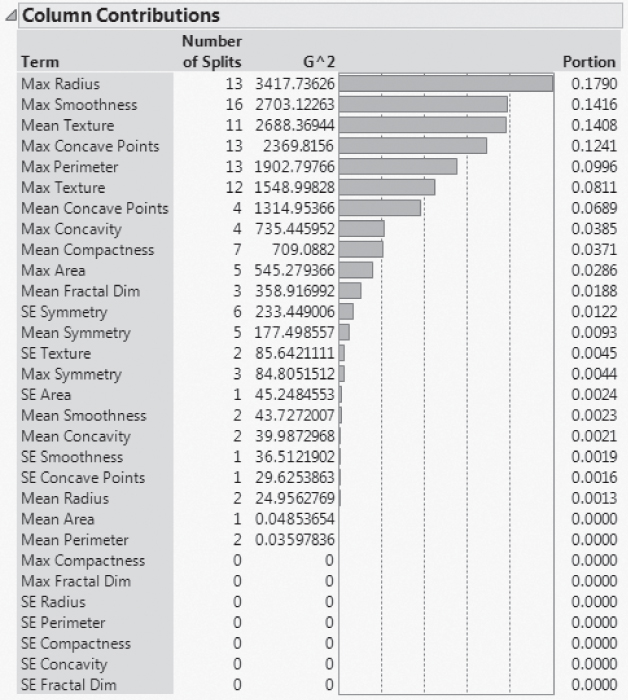
Exhibit 10.30 Column Contributions Report
Saving the Boosted Tree Prediction Equation
As you did for the Decision Tree model, you save the prediction formula for the Boosted Tree model to the data table by selecting Save Columns > Save Prediction Formula from the red triangle at the top of the report (CellClassification.jmp, script is Boosted Tree Prediction Formula). This saves three new columns to the data table, Prob(Diagnosis==M) 2, Prob(Diagnosis==B) 2, and Most Likely Diagnosis 2. The suffix “2” is added to these column names to distinguish them from the columns with the same names saved as the Decision Tree prediction formulas.
Click on the plus sign to the right of Prob(Diagnosis==M) 2 in the Columns panel to view its formula. The formula is a logistic transformation of a constant (−0.6251) plus 43 “If” functions, each one corresponding to a small tree. Each “If” function assigns to an observation the Estimate for that observation shown in the corresponding tree. To see this, take the first “If” function and compare it to the tree shown in the Tree Report for Layer 1.
Note that many predictors are involved in the prediction formula. These have entered through the Layers. It is difficult to judge the relative importance of the predictors by viewing the prediction formula. The Column Contributions report (Exhibit 10.30) is very helpful in assessing which predictors are important for the boosted tree model.
The Most Likely Diagnosis 2 column contains the classification for each observation. As with the Decision Tree prediction formula, the formula for Most Likely Diagnosis 2 classifies an observation into the group for which the probability of diagnosis into that group is larger.
With the prediction formula saved to the data table, you are ready to move on to your next fitting technique.
STEPWISE LOGISTIC MODEL
Next, you proceed to fit a logistic model. Even with only 30 predictors, there are well over one billion different combinations of these predictors, resulting in over one billion possible logistic models (without considering potential interaction effects). To settle on one of these models, you will use stepwise regression to reduce the number of potential predictors that you include in your logistic model.
Stepwise Regression
Because you have entered a Validation column in the Fit Model launch window, the default Stopping Rule, shown in Exhibit 10.31, is the Max Validation RSquare. When a term is entered by Stepwise, the model is fit using the training set. Then the model is applied to the validation set and the RSquare value is computed. The Max Validation RSquare stopping rule attempts to maximize the RSquare value computed for the validation set.
The Direction is set to Forward by default. A forward selection procedure consists of sequentially entering the most desirable terms into the model while a backward selection procedure consists of sequentially removing the least desirable terms from the model.
The Go, Stop, and Step buttons control how terms are entered into the model. Go automatically enters (or removes) terms until the Stopping Rule limit is reached. Stop interrupts the automatic procedure. Step allows you to enter or remove terms one step at a time.
Beneath the Go, Stop, and Step buttons you see statistics that summarize the current model fit. These update as terms are entered or removed. RSquare Validation is the quantity that the Max Validation RSquare stopping rule attempts to maximize.
The Current Estimates panel shows estimates of parameters and significance probabilities for the model under consideration at a given time. Once you click Go, three predictors are entered (Exhibit 10.32). Note that the RSquare Validation value is 0.7829.
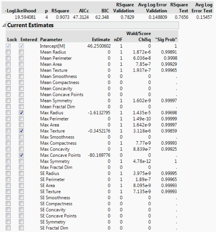
Exhibit 10.32 Current Estimates Panel in Stepwise Fit
The Step History panel (Exhibit 10.33) gives a log of the sequence in which variables were entered. Also provided are various statistics of interest with RSquare Validation in the last column. Notice that at Step 3, at the point where the three predictors have been entered, RSquare Validation is 0.7829.
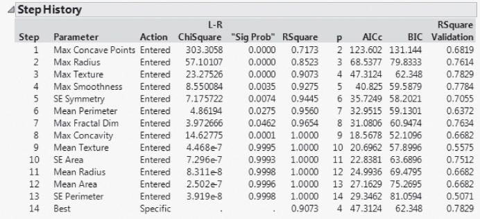
Exhibit 10.33 Step History Panel in Fit Stepwise
Stepwise enters ten more predictors after that point. If the RSquare Validation fails to increase for any of these ten additional steps, then the Stopping Rule terminates the procedure. Note that the RSquare Validation values for Steps 4 to 13 are all less than 0.7829. Step 14 reports that the Best model has an RSquare Validation of 0.7829. The Current Estimates panel shows the selected predictors for that best model.
Fitting the Logistic Model
To fit the three-predictor model obtained using Stepwise and the training set, click on Make Model in the Stepwise Regression Control panel, and then Run. From the red triangle next to Nominal Logistic Fit for Diagnosis, select Confusion Matrix. The report is shown in Exhibit 10.34. (Script is Logistic Model.)
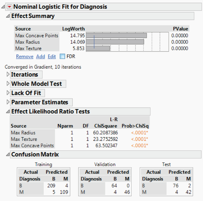
Exhibit 10.34 Fit Nominal Logistic Report for Stepwise Model
Contribution of Predictors
All three predictors (Max Concave Points, Max Radius, and Max Texture) are significant. As in the Decision Tree model, all three predictors are “Max” measurements. Recall that, for the Decision Tree model, the order of contribution was Max Concave Points, Max Area, Max Texture, and Max Concavity. For the boosted tree model, Max Concave Points, Max Radius, and Max Texture were among the first six predictors in terms of contribution (Exhibit 10.30).
Confusion Matrices
The Confusion Matrix report shows correct and incorrect classification counts. For the Training set, 9 out of 327 observations were misclassified. For the Validation set, 4 out of 114 observations were misclassified. Keep in mind that the choice of predictors by Stepwise, and hence the choice of model, made integral use of the training set. The Test set confusion matrix gives you an idea of how this model will predict for independent data. For the Test set, 6 of the 124 observations are misclassified. Four of the misclassifications result from predicting a benign mass when the mass is in fact malignant.
Saving the Logistic Prediction Equation
At this point, you save the prediction formula so that you can compare this Stepwise model with models obtained using other techniques. To save the prediction formula, select Save Probability Formula from the red triangle menu next to Nominal Logistic Fit for Diagnosis (CellClassification.jmp, script is Logistic Prediction Formula).
This saves a number of formulas to the data table. The columns Prob[M] and Prob[B] give the probability that the tumor is malignant or benign, respectively. The column Most Likely Diagnosis gives the diagnosis class with the highest probability, conditional on the values of the predictors.
Now that you have saved the prediction formula to the data table, you can close the reports that deal with the logistic fit. Your next adventure is to construct and explore penalized models using the Generalized Regression platform.
GENERALIZED REGRESSION
The Generalized Regression platform in JMP Pro provides shrinkage methods that construct biased parameter estimates. The biased estimates can provide better predictive models than do least squares estimates, especially when predictors are correlated or when there is high dimensionality. Various response distributions are available. In your case, you will be interested in the Binomial distribution for Diagnosis.
The platform provides five estimation methods, but you will be interested in only two of these, the Lasso and the Elastic Net. These two methods conduct variable selection as part of the estimation process. The Lasso shrinks parameters by imposing a penalty on the sum of the absolute values of the parameters. The Elastic Net imposes a penalty on a convex combination of the sum of the absolute values and the sum of the squares of the parameters. The size of the penalty is determined by a tuning parameter. The value of the tuning parameter is selected to optimize a criterion that you select.
Both the Lasso and the Elastic Net have adaptive versions that attempt to penalize active predictors less than inactive predictors. However, the adaptive techniques are based on the maximum likelihood estimator (MLE). When predictors are highly correlated, using the MLE in the adaptive fit can be problematic, and so in these cases it is prudent to avoid using the adaptive versions.
An interesting difference between the Lasso and the Elastic Net techniques is the following. When predictors are correlated, the Lasso tends to include only one of the variables from the correlated group in the model. The Elastic Net, on the other hand, tends to include all variables from the correlated group.7
Your plan is to construct both a Lasso and an Elastic Net model using the Generalized Regression platform.
Specifying the Generalized Regression Model
Generalized Regression is a Personality that you access from the Fit Model specification window. When you click Run in the Model Specification window, you can then launch various fits using the Model Launch outline.
A Generalized Regression report appears. The Model Launch panel, with the Advanced Controls outline open, is shown in Exhibit 10.35.
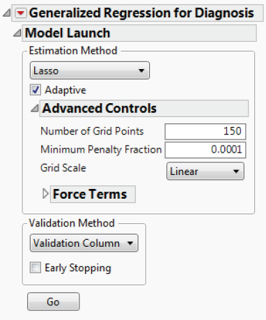
Exhibit 10.35 Model Launch Panel Showing Advanced Controls
The Model Launch window lets you choose one of five estimation methods. One of these is Maximum Likelihood, which allows you to compare a penalized fit to a traditional fit. The Adaptive Lasso model is the default. Note that you can also select Forward Selection, Elastic Net, and Ridge.
The Advanced Controls outline enables you to make selections regarding the tuning parameter grid. It also provides a way to force terms into the model. You will fit models accepting the defaults in the Advanced Controls panel.
Several Validation Methods are available. Because you included a Validation column in the Model Specification window, the Validation Method is set to Validation Column.
A viable alternative approach to cross-validation would be to combine your Training and Validation sets and conduct KFold cross-validation on the 441 observations in those sets. However, for simplicity, consistency, and continuity, in this section you will fit penalized regression models using the Validation column for cross-validation. (Note that while Partition calculates a KFold cross-validation statistic as a report option, it does not actually fit models using a KFold approach.)
Fitting a Lasso Model
You uncheck the box next to Adaptive and click Go to fit a Lasso model (CellClassification.jmp, script is Lasso Model).
The Lasso with Validation Column Validation Report
The report shown in Exhibit 10.36 appears. The Parameter Estimates for Original Predictors outline, which is closed in Exhibit 10.36, is shown in Exhibit 10.37.
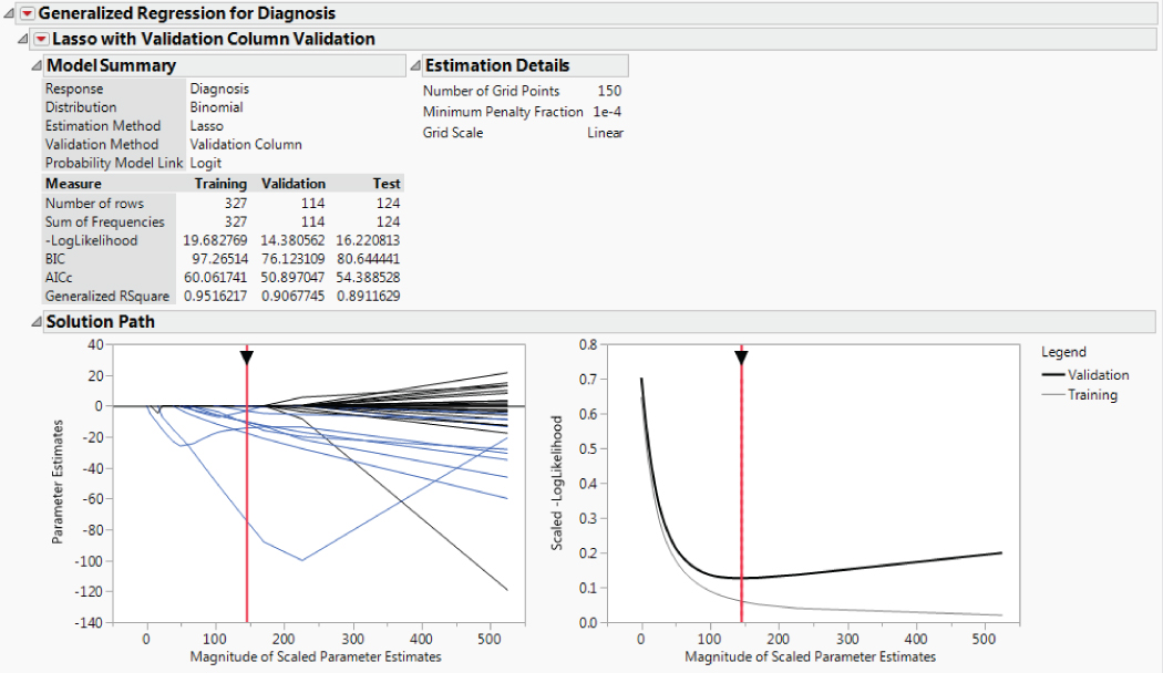
Exhibit 10.36 Lasso Report

Exhibit 10.37 Parameter Estimates for Original Predictors
The Model Summary outline provides descriptive information about the model you selected, followed by measures of fit for the model for each of the Training, Validation, and Tests sets. Since the statistics under Measure depend on the sample size, they cannot be compared across the three sets. But they can be used to compare models built on the Training set. The Estimation Details outline echoes the selections under Advanced Controls.
The Solution Path outline shows two plots:
- The plot on the left shows the scaled parameter estimates as a function of the Magnitude of Scaled Parameter Estimates. The parameter estimates are for a model given in terms of centered and scaled predictors. The Magnitude of Scaled Parameter Estimates is the sum of the absolute values of the scaled parameter estimates for the model (excluding the intercept, dispersion, and zero-inflation parameters). It reflects the amount of shrinkage, or bias, used in obtaining the given parameter estimates. Estimates with large magnitudes are close to the maximum likelihood estimate. Those with small values are heavily penalized.
- The plot on the right shows the Scaled-LogLikelihood as a function of the Magnitude of Scaled Parameter Estimates. The Scaled-LogLikelihood is the statistic used to assess model fit when holdback validation is performed. Smaller values indicate better fit than larger values.
Parameter Estimates Plot
In fitting a generalized regression model, predictors are first centered and scaled. The horizontal axis is given in terms of the sums of the absolute values of the parameter estimates for the centered and scaled predictors. The tuning parameter increases as the Magnitude of the Scaled Parameter Estimates decreases. The tuning parameter is 0 at the maximum likelihood estimator (MLE).
When possible, the horizontal axis in the Parameter Estimates plot ranges from 0 to the magnitude of the scaled parameter estimates at the MLE. However, in the case of a binomial response, separation often occurs before the estimates reach the MLE. Separation occurs when, for some interval defined by a linear combination of the predictors, all observations assume the same value for the response. In such a situation, the MLE does not exist and estimates for values of the tuning parameter near zero are unstable. For this data set and model, separation occurs at some point, so the horizontal scale is cut off once separation is reached.
The blue paths show the values of the parameter estimates. Clicking on any of the paths highlights the corresponding term in the list Parameter Estimates for Original (or Scaled) Predictors report and selects the related column in the data table.
The red vertical line in the plot marks the solution obtained using the validation procedure. The Parameter Estimates for Original Predictors report for this solution is shown in Exhibit 10.37. You can move the red vertical line to explore other solutions (models). The estimates shown in the list Parameter Estimates for Original (or Scaled) Predictors update as you move it.
At the optimal solution, 21 terms have parameter estimates of 0, leaving 9 terms in the model. The lasso procedure has effectively conducted variable selection as part of the estimation procedure.
Note that the first three options in the red triangle menu for Lasso with Validation Column Validation give you control over your view of the paths. You can highlight paths for the non-zeroed terms or the zeroed terms or hide paths for the zeroed terms.
Contribution of Predictors
To get a sense of which predictors are important, open the Parameter Estimates for Centered and Scaled Predictors report. Centering and scaling the predictors gives them comparable ranges of values and so, in a sense, puts them on equal footing. Comparing the absolute values of the parameter estimates for the transformed predictors gives you a sense of which are most important relative to the predictive model.
Right-click in the Parameter Estimates for Centered and Scaled Predictors report and select Sort by Column. In the Select Columns window, select Estimate and check the Ascending box, and then click OK. The report now appears as shown in Exhibit 10.38.

Exhibit 10.38 Parameter Estimates for Centered and Scaled Predictors
Since all estimates except for the intercept are negative, the report now lists the predictors in order of the absolute value of their estimates. (This was an expedient way to list the predictors in that order. In general, you would right-click on the table, select Make into Data Table, create a column of absolute values for Estimate in the data table, and then sort that column.)
The variable Max Radius is the largest contributor to the model, followed by Max Texture. Compare Exhibit 10.38 with Exhibit 10.30 to see that the order of contribution is fairly consistent with the Boosted Tree model. Another way to assess sensitivity to predictors is to use the Variable Importance feature found in the profiler. Variable Importance measures sensitivity to predictors in a way that does not depend on the model type, but only on the prediction equation. The method is based on simulating predictor values. You are given several choices for how to do the simulation. See the JMP documentation for details.8
Scaled -LogLikelihood Plot
In the Solution Path report, the graph on the right plots the average -LogLikelihood for both the Training and Validation sets against the Magnitude of the Scaled Parameter Estimates. In your case, the solution is the set of parameter estimates that minimize the -LogLikelihood for the Validation set.
Because -LogLikelihood depends on the number of observations, you can't compare the -LogLikelihood of the Training and Validation sets directly. But you can compare the mean -LogLikelihood for each set. The Scaled -LogLikelihood plot shows that the Training set has uniformly smaller average -LogLikelihood than the Validation set, which is not surprising.
The point where the -LogLikelihood of the Validation set is smallest is around a magnitude of 146. To the right of that point, -LogLikelihood increases, indicating overfitting. However, for a range of magnitudes smaller than 146, -LogLikelihood does not increase noticeably, suggesting that perhaps another term (SE Radius) could be removed from the prediction equation. However, for the purpose of this example you will retain SE Radius as a predictor and obtain a prediction equation for the optimal solution identified by the platform.
Saving the Lasso Prediction Equation
You now save the prediction equation for your Lasso model by selecting Save Columns > Save Prediction Formula from the red triangle menu next to Lasso with Validation Column Validation (CellClassification.jmp, script is Lasso Prediction Formula). Three columns are saved to the data table: Probability(Diagnosis=B), Probability(Diagnosis=M), and Most Likely Diagnosis 4.
To see how well this model predicts, you can use Tabulate to construct tables that are analogous to confusion matrices.
The resulting table appears as shown in Exhibit 10.40. Three observations are misclassified in the Validation set.

Exhibit 10.40 Completed Table Showing Confusion Matrices for Lasso Model
Fitting an Elastic Net Model
You now proceed to fit an elastic net model.
The Elastic Net with Validation Column Validation Report
The Model Summary and Solution Path reports are shown in Exhibit 10.41. The Solution Path report shows that the optimal solution occurs at the right end of the Magnitude of Scaled Parameter Estimates range. This is where separation begins to be a problem. The plot indicates that there are more non-zero estimates involved in the solution for the Elastic Net than for the Lasso. The Parameter Estimates report indicates that only nine terms have zero as their estimate, leaving 21 terms in the model.
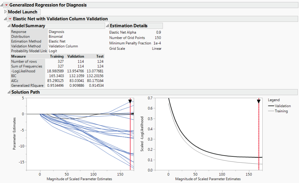
Exhibit 10.41 Model Summary and Solution Path Reports for Elastic Net
The -LogLikehood values for the Training, Validation, and Test sets are smaller for the Elastic Net model than for the Lasso model. The Bayesian Information Criterion (BIC) and corrected Akaike's Information Criterion (AICc) values are all larger for the Elastic Net model than for the Lasso model. This is because the Elastic Net tends to include all predictors within a correlated group, whereas the Lasso tends to only choose one.
Contribution of Predictors
To get a sense of which predictors are important, open the Parameter Estimates for Centered and Scaled Predictors report. Recall that centering and scaling the predictors puts them on equal footing. You will compare the absolute values of the parameter estimates for the transformed predictors to get a sense of which are most important in the predictive model.
The first three columns in your new data table now appear as shown in Exhibit 10.42. Note that eight of the ten “Max” predictors appear first on the list. The predictors Max Radius and Max Texture were the top two predictors for the Lasso model, they were two of the three predictors selected by stepwise for the Logistic model, and they were among the highest contributors for the Boosted Tree model. Keep in mind, though, that many of the predictors are highly correlated, making it difficult to compare your models in terms of which predictors are important.

Exhibit 10.42 Parameter Estimates for Centered and Scaled Predictors Ranked by Absolute Value
Saving the Elastic Net Prediction Equation
You now save the prediction equation for your Elastic Net model by selecting Save Columns > Save Prediction Formula from the red triangle menu next to Elastic Net with Validation Column Validation (CellClassification.jmp, script is Elastic Net Prediction Formula).
Three columns are saved to the data table: Probability(Diagnosis=B) 2, Probability(Diagnosis=M) 2, and Most Likely Diagnosis 5.
To see how well this model predicts, you can use Tabulate, as described in the section Saving the Lasso Prediction Equation, to construct tables that are analogous to Confusion Matrices. You will obtain the table shown in Exhibit 10.43. Again, three observations are misclassified in the Validation set.

Exhibit 10.43 Completed Table Showing Confusion Matrices for Elastic Net Model
NEURAL NET MODELS
In your study of data-mining techniques, you have read about how neural nets can be used for classification and prediction. So you are interested in exploring neural net classification models for your data. You will fit one neural net model without boosting and one with boosting.
Background
Neural net algorithms were originally inspired by how biological neurons are believed to function. Starting in the 1940s, scientists in the area of artificial intelligence pursued the idea of designing algorithms that can learn in a way that emulates neuron function in the human brain.
In fact, the science of biologically informed computation has its origins in a seminal paper called “A Logical Calculus of Ideas Immanent in Nervous Activity.”9 Implicit in this paper's use of logic and computation to describe the nervous system was the concept that ideas are carried by the collection of neurons as a whole, rather than being tied to a specific neuron. Research since these early days has leveraged this idea of distributed processing, and neural nets typically have an input layer of neurons, an output layer, and a hidden layer where processing occurs.10
In a mathematical sense, a neural net is nothing more than a nonlinear regression model. In its implementation of neural net models, JMP uses standard nonlinear least squares regression methods. Although a general neural net can have many hidden layers, one layer is considered sufficient for most modeling situations. JMP Pro provides two hidden layers, but uses a single hidden layer as the default. Each hidden neuron or node is modeled using a transformation (TanH, Linear, or Gaussian) applied to a linear function of the predictors. In a classification situation, the output value results from a logistic function applied to a linear function of the outputs from the hidden nodes. For example, this means that for 30 input variables, one response, and one layer with k hidden nodes, the number of parameters to be estimated is (31 × k) + (k + 1).
With so many parameters, it is easy to see that a major advantage of a neural net is its ability to model a variety of patterns of response. But fitting this many parameters comes at a cost. Because the criterion that is optimized usually has many local optima, convergence to a global optimum can be difficult. Also, with so many parameters, overfitting is problematic. This is why validation sets are critical to neural net modeling strategies. Another disadvantage of neural net models is that they are not interpretable beyond the relationship between inputs and output, due to the hidden layer.
Neural Platform in JMP
The Neural Net algorithm in JMP uses a ridge-type penalty to help minimize overfitting. Because of its similarity to a ridge-regression penalty function, the neural net overfitting penalty not only addresses overfitting, but also helps mitigate the effects of multicollinearity.11
You can set the number of nodes in the hidden layer. Note that a small number of hidden nodes can lead to underfitting and a large number can lead to overfitting, but small and large are relative to the specific problem under study. For a given number of hidden nodes, each application of the fitting algorithm has a random start, and JMP refers to these individual fits as tours. Based on experience, about 16 to 20 tours are recommended in order to find a useful optimum.
JMP provides four validation methods to help you select a neural net model that predicts well for new data:
- Excluded Rows Holdback
- Holdback
- KFold
- Validation Column
Excluded Rows Holdback, Holdback, and Validation Column are holdback methods. Excluded Rows Holdback treats excluded rows as a holdback sample. Holdback allows you to set a holdback proportion and then randomly selects a sample of that size to use as a holdback sample. If you specify a Validation set in the model launch window, then Validation Column treats your validation set as the holdback sample.
In the holdback methods, a sample of the observations is withheld (the holdback sample) while the remaining observations are used to train a neural net. JMP constructs a neural net model for the training sample. Then it applies the model to the holdback sample and calculates a LogLikelihood value for that sample. The LogLikelihood of the holdback sample determines when the algorithm stops fitting.
You can vary the number of hidden nodes and other aspects of the model in an attempt to find a fit that generalizes well to the holdback sample. This method works well for large numbers of observations, where one can easily fit a model to 75 percent or fewer of the observations. JMP uses two-thirds of the complete data set by default.
The fourth method is called KFold cross-validation. Here, a neural net model is fit to all of the data to provide starting values. Then, the observations are divided randomly into K groups (or folds). In turn, each of these groups is treated as a holdback sample. For each of the K groups, a model is fit to the data in the other (K − 1) folds, using the starting values from the full fit. The model is then extended to the holdback group. The LogLikelihood is calculated for each holdback sample, and these are averaged to give an average LogLikelihood that represents how the model might perform on new (Validation) observations. The starting values from the full fit are used because the function being optimized is multimodal, and this practice attempts to bias the estimates for the submodels to the mode of the overall fit.
A First Model: Neural Net 1
Your first model will fit a neural net without boosting. You will use your Validation column to define a validation set.
The Neural report appears showing the Model Launch panel (Exhibit 10.44).

Exhibit 10.44 Neural Net Model Launch Panel
The note above the Model Launch panel indicates that the Validation column will be used for cross-validation.
There are three panels in the Model Launch outline:
- The
Hidden Layer Structurepanel allows you to specify whether you want to use one or two layers, and how many and which activation functions you want to select. This defines the base structure. - The
Boostingpanel allows you to request boosting. The idea is similar to the concept behind boosted trees. A sequence of small models is constructed, each fit to the scaled residuals of the previous model. The predictions from the models are combined to form a final model. Boosting uses cross-validation to determine a stopping point. The number of nodes in the final boosted model is the number of nodes specified for the base structure times the number of models fit by boosting. - The
Fitting Optionspanel allows you to transform continuous predictors to normality, to specify a penalty, and to set the number of tours. Recall that a tour is a restart of the fitting process.
The default Hidden Layer Structure is a model with one layer and three hidden nodes. Each of the three nodes uses the TanH, or hyperbolic tangent, activation function.
Fitting the Neural Net 1 Model
You will first fit this model, and then you will be able to obtain a diagram of its structure.
The Model NTanH(3) Report
The Model NTanH(3) report appears (Exhibit 10.45), giving Measures, Confusion Matrices, and a Diagram plot. Because fitting a neural net involves a random component, your results will differ from those shown in the exhibit. If you want to replicate the results in Exhibit 10.45, run the script Neural Net Model 1. The script controls the random component by specifying a value for the random seed random seed.

Exhibit 10.45 Model NTanH(3) Report
Note that the Misclassification Rates across the data sets are small, on the order of 0.03. The Confusion Matrices give more detail on the performance of your model relative to misclassification.
The Diagram plot, shown in Exhibit 10.46, shows the 30 input variables, the three hidden nodes (H1, H2, and H3), and their combination in the prediction of the probability of Diagnosis classes. The final model is a logistic function of a linear combination of three models, each of which relates one of the hidden nodes, H1, H2, and H3, to the 30 predictors.

Exhibit 10.46 Neural Net 1 Diagram: 30 Predictors and 3 Hidden Nodes
From the red triangle next to Model NTanH(3), select Estimates. The Estimates report provides a list of parameters estimated. Note that a total of 97 parameters have been estimated. To see this, right-click in the report and select Make into Data Table. The table has 97 rows. (Note that because of the random starts, when you run this report on your own, your results will differ slightly from those shown here.)
To get some insight on the 30-predictor model, you explore a few other options provided by the Neural Net report. From the red triangle for Model NTanH(3), select Categorical Profiler. This adds a Prediction Profiler plot, a portion of which is shown in Exhibit 10.47.

Exhibit 10.47 Partial View of Categorical Profiler for Neural Net Model 1
The dotted vertical red lines represent settings for each of the predictors. The trace shown in the profiler cell above a given predictor represents the cross section of the fitted model for Prob(Diagnosis=B) for that variable, at the given settings of the other variables. When you change one variable's value, you can see the impact of the change on the surface for all other variables. Note that the surfaces appear to be fairly smooth with some steep peaks, but no very jagged areas.
For another way to visualize the surface, select Surface Profiler from the top red triangle menu. This gives a three-dimensional view of the effect of predictor variables, taken two at a time, on Prob(Diagnosis=B) and Prob(Diagnosis=M).
Saving the Neural Net 1 Prediction Equation
You now save the prediction equation for your Neural Net model by selecting Save Profile Formulas from the red triangle menu next to ModelNTanH(3) (CellClassification.jmp, script is Neural Net 1 Prediction Formula).
Three columns are saved to the data table: Probability(Diagnosis=B) 3, Probability(Diagnosis=M) 3, and Most Likely Diagnosis 6.
If you had selected Save Formulas, you would have obtained six formulas: the three formulas described above; and the formulas for the three hidden nodes, called H1_1, H1_2, and H1_3. The Save Formulas option shows the Probability(Diagnosis=B) and Probability(Diagnosis=M) formulas in terms of the three hidden nodes. Probability(Diagnosis=B) applies a logistic function to the estimated linear function of the hidden nodes. If you would like some insight on what a neural net fit is like, explore these formulas.
A Second Model: Neural Net 2
For your second Neural Net model, you decide to explore boosting.
Fitting the Neural Net 2 Model
The Neural Net report allows you to fit multiple models in the single report window. To do this, go to the top of the report and open the Model Launch panel. Alternatively, you can click the red triangle next to Neural and select Script > Relaunch Analysis and click Go in the window that appears.
The Model NTanH(3)NBoost(10) Report
The report shown in Exhibit 10.48 appears. This second model has a lower misclassification rate than the first model on the Training and Validation data, but a higher misclassification rate on the Test data.

Exhibit 10.48 Model NTanH(3)NBoost(10) Report
The Diagram report for this model, shown in Exhibit 10.49, shows 30 activation functions. There are three nodes, and ten models were fit as part of the boosting process.
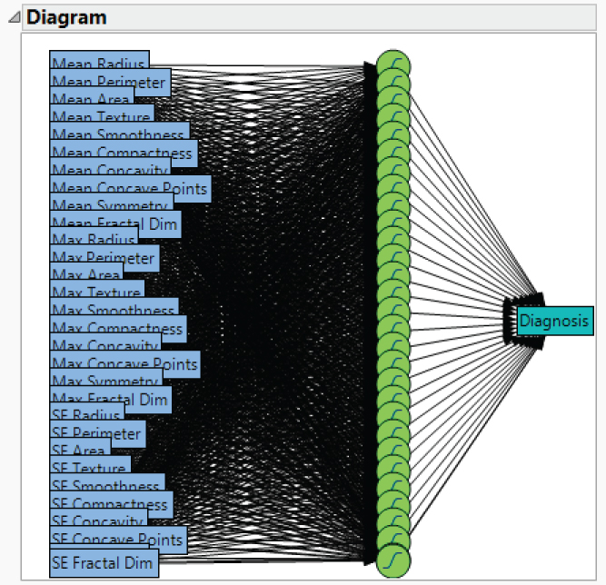
Exhibit 10.49 Neural Net 2 Diagram: 30 Predictors, 3 Hidden Nodes, and 10 Boosted Models
This model requires the estimation of 961 parameters. Again, to see this, select Estimates from the red triangle menu for Model NTandH(3)NBoost(10). Then right-click in the report and select Make into Data Table.
Saving the Neural Net 2 Prediction Equation
You now save the prediction equation for your second Neural Net model. To save the prediction formula, select Save Profile Formulas from the red triangle menu next to Model NTanH(3)NBoost(10) (CellClassification.jmp, script is Neural Net 2 Prediction Formula).
Three columns are saved to the data table: Probability(Diagnosis=B) 4, Probability(Diagnosis=M) 4, and Most Likely Diagnosis 7.
For simplicity and continuity in the exposition, we have fit neural nets using the Validation column. However, your data set, containing 569 observations, is a moderate-sized data set and KFold cross-validation might provide better models. You might want to explore the use of Kfold cross-validation in fitting neural net models to these data.
COMPARISON OF CLASSIFICATION MODELS
You have fit seven different models to your data:
- Decision Tree (Partition)
- Boosted Tree
- Logistic
- Lasso
- Elastic Net
- Neural Net (no Boosting)
- Neural Net (with Boosting)
Each of these models was fit using your Validation data set for cross-validation. At this point, you are ready to select a single model by comparing the performance of all seven models on your test set. Your main interest is the misclassification rate.
The Model Comparison report is shown in Exhibit 10.50. You will use the test set results to select a final model. But before you do this, compare the misclassification rates for:
- The training set (
Model Comparison Validation = Trainingoutline) - The validation set (
Model Comparison Validation = Validationoutline) - The test set (
Model Comparison Validation = Testoutline)
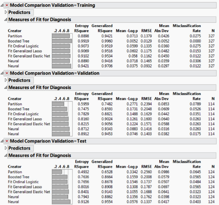
Exhibit 10.50 Model Comparison Report
The rates for the training set are uniformly smaller than for the validation set. This is expected, because the models are being fit to the training data, but using the validation set for selection within a given class of models. Note that the rates for the validation set are generally smaller than the rates for the test set. This is also to be expected, because the validation set is used in fitting the models. This phenomenon explains the need for an independent test set to assess the predictive ability of each model and to help choose a final model.
For this reason, you base your choice of a final model on the test set results. In the Measures of Fit for Diagnosis report for the Test set (in the Model Comparison Validation = Test outline), the Misclassification Rate column indicates that the smallest misclassification rates are given by the Elastic Net model and Neural Net 1. (Open the Predictors outline to see which Probability columns are associated with each of the Neural Net models.) Neural Net 2 is the next best model based on misclassification rate.
As well as matching the best misclassification rate, the Elastic Net model also provides interpretability in the form of information about the predictors that are important in the prediction equation. You saw this in Exhibit 10.42. A neural net is not interpretable in this sense.
Select Confusion Matrix from the red triangle menu in the Model Comparison Validation = Test outline. This shows the misclassification detail for all the models. Exhibit 10.51 shows the detail for the Elastic Net and the two Neural Net models.
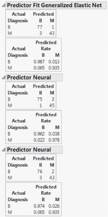
Exhibit 10.51 Confusion Matrices for Elastic Net, Neural Net 1, and Neural Net 2
Although the overall misclassification rates for the Elastic Net and Neural Net 1 models are the same, the Neural Net 1 model errs in the direction of classifying benign tumors as malignant, whereas the Elastic Net model errs in the other direction, tending to classify malignant tumors as benign. Interestingly, Neural Net 2 tends in this direction as well.
Your goal was to evaluate models based on overall misclassification rate. On that basis, the Elastic Net model and Neural Net 1 are tied. The Elastic Net is more interpretable and might be preferred for this reason.
If overlooking a malignant tumor is more serious than incorrectly classifying a benign tumor, you might select Neural Net 1 as the best model. However, if misclassifications differ in the severity of their consequences, you might base your classifications on a Profit Matrix. Alternatively, you might use a Weight column that gives greater weight to rows with malignant outcomes and fit models using that Weight column.
We encourage you to explore these approaches on your own. The Profit Matrix uses your existing models, but bases classification on expected profit. To apply the Profit Matrix column property to Diagnosis, give a large loss (for example, −5) to the cell Actual = M and Decision of Prediction = B. Clear all the current prediction formulas from your data table. Rerun the seven prediction scripts. (The script Fit All Prediction Formulas fits all seven models.) Run Model Comparison by entering the Validation column as a By variable and then clicking OK. Review the Confusion Matrices.
CONCLUSION
Your goal in this analysis was to explore some of the features that JMP provides to support classification and data mining. You began by using various visualization techniques to develop an understanding of the data and relationships among the variables.
You were interested in investigating partition, logistic, generalized regression, and neural net fits. Given that your goal was to learn about these platforms, you constructed various models in a fairly straightforward way. The best classification, based on performance on your test set, was obtained by two models: an Elastic Net model and a Neural Net model. We note that you could have taken a number of more sophisticated approaches to your modeling endeavor, had you so desired.
Among your seven models, the Decision Tree model had the worst performance. In our experience, JMP Partition models tend not to perform as well as nonlinear (or linear) regression techniques when the predictors are continuous. They can be very useful when there are categorical predictors, and especially when these have many levels. Moreover, unlike Neural Net models, Partition models are very intuitive and interpretable, which makes them all the more valuable for data exploration. In your situation, where classification is the primary goal, the interpretability of the model is less important than its ability to classify accurately.
We also want to underscore the importance of guarding against overfitting, which, in the case of Neural Net models, often results in claims of exaggerated model performance. In the case study, you used a validation set for cross-validation in constructing your Neural Net models to maintain consistency with the partition and generalized regression approaches. However, using KFold cross-validation in constructing a Neural Net model might lead to better models.
Also, in the case of neural nets, where overfitting is so easy, we strongly recommended that model performance be assessed on a genuinely independent data set. Without such an approach, claims about the model's predictive performance are likely to be overly optimistic.
Although prediction was your goal in this case study, the interpretability of the predictive model is often of interest. You saw that penalized regression models, obtained using the Generalize Regression personality in Fit Model, provide variable reduction and a high level of interpretability.
Armed with this new understanding of JMP's capabilities for predictive modeling, you feel confident in tackling the Cellularplex test campaign data when they arrive in a couple of months.