2nd EDITION NOTE: This section has substantial changes to reflect new features and options that Facebook has added in the past few years.
OK, I lied before; this is the fun part!
Once you’ve created, and saved, your Ad Set (which is where audience, placement, and daily budget all live), we get to the heart of things: the Ad itself.
There are a number of ad types you can make, but I’m going to start by telling you which ones not to do.
I know, I’m such a Debbie Downer, aren’t I?

Don’t do a video, carousel, or collection.
The reason is not because they don’t work; it’s that they’re either expensive or time-consuming to create (or both). No one gets all their ads right on the first run, and every ad needs some tweaking. It’s often cost prohibitive to tweak a video ad, and carousel and slideshow ads have a lot of variables.
I do toy with them from time to time, and I’m getting better at them, but even at their best, they don’t convert as well as my single image ads.
Single image ads have five parts:
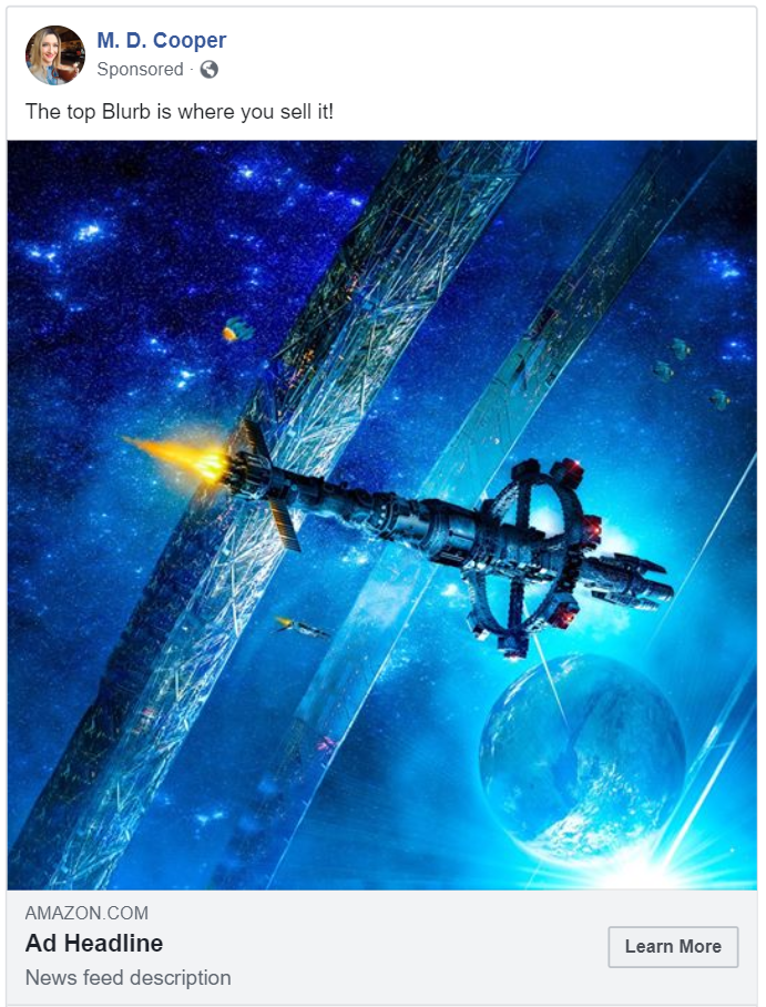
These five parts make for a lot less to play with when you’re tuning the ad (than the other ad types, that is), and a lot less to have to put together when you’re making it.
A bit further down, I’ll talk about how to pick a good image, but here I want to just add some notes about how to get the best out of your image.
Facebook now lets you have different images for different locations. You can either upload three separate images, or crop one.
Start by picking the image and uploading it.
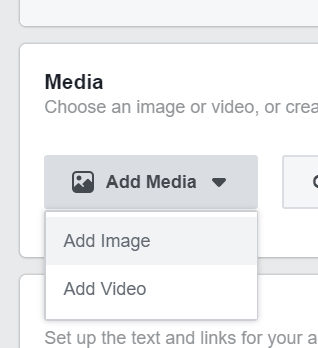
Once it’s uploaded, toggle the slider in the “Recommended Aspect Ratios” section.
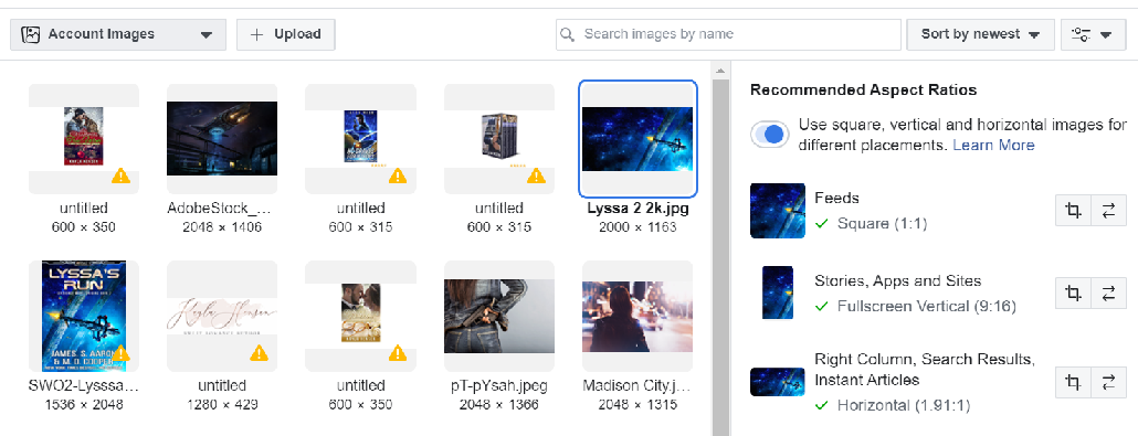
Then crop your image so that it will look good at each aspect ratio.
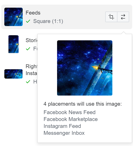
Becomes…
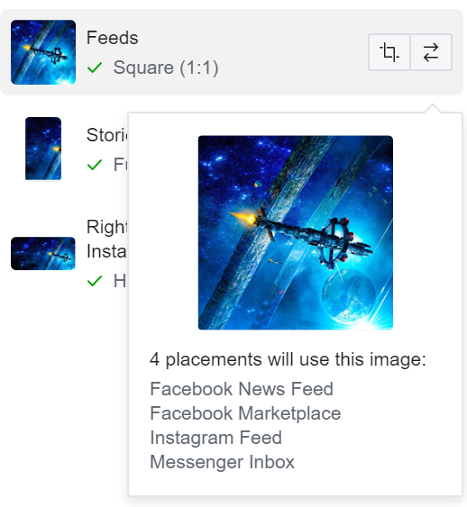
The majority of ads are seen on mobile devices, and a square image takes up almost 2x the screen real estate on mobile, so square is now highly recommended. Also, it will cause an ad to work much better on Instagram (more on this in the “Instagram” section).
I mean…unless you’re vegan. Then it’s veggie meat. Trust me.
This interface has changed a bit and contains some really cool new parts. But first, we need to talk basics, and because I just like to be crazy, I’m going to go through these sections in almost no particular order.
Because reasons….
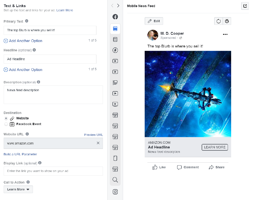
Before we get to how to craft that ad, let’s talk about where to link it. Previously, in the section on not using ads for lead generation (email address capturing), I talk about the reasons you should always link your ads directly to Amazon.
In case you skipped that part, I really want to reiterate it here.
Remember the funnel. You want that funnel to be as short as possible (while still enticing the reader to buy). Essentially, this means the fewer steps, the better.
Getting that reader right to the Amazon product page, which is purpose-built to sell, is your number one goal. You should already have put significant effort behind a good cover, catchy blurb, and a good, grabbing peek inside; that being said, there are a few scenarios where you might want to send people to a page other than your Amazon product page.
I did this recently, where I discounted three books in a series. To facilitate that, I ran single ads that landed the reader on a page that listed all three books with links to get them on sale.
OK, so now that we have that out of the way….
The Facebook interface refers to this simply as the “Text”. This is the section above the image, which I often refer to as “the blurb”.
There are two ways to write this blurb. The first is to write it as “you,” and the second is to write it as a marketer. The “you” version will be long, and should bring out your passion about the story. The marketer version should be about the deal, ratings, reviews, awards, etc.
This one comes in two flavors. The first one is what I call the “Pimpin’” ad. Here you’re flashing pedigree, reviews, a great price; you’re pimpin’ that puppy out.
BOOKNAME by AUTHOR is rated as one of the best GENRE books out there. Top reviewer, NAME, said it lit his pants on fire! NYT Best-selling AUTHOR is bringing his/her/its A-Game, and you don’t want to miss out!
The Pimpin’ version is best suited for sales and deals, because then people really just care about quick facts and savings. “Get BOOK by AUTHOR this week only, for just 99c! Critics love it and rave….”
You get the picture.
I find that this type of blurb does not work for a long-running ad, and puts off a lot of readers (though it works for some).
Is Malorie Cooper the next J. K. Rowling? Pick up a copy and find out for yourself!
Well that’s pretty bold, isn’t it? Some people may not be comfortable doing an ad like this, but they can really work. Just be prepared to police ad comments as the jerks show up.
That being said, Facebook doesn’t really care that much if comments are positive or negative. If people are engaging, the platform thinks your ad has value to their audience, and they show it more. Any comments are social proof.
Also, look at the stats for how many people chose not to have that ad, or any of your ads, shown to them again (which we’ll get to in the tuning section), as you do want to make sure you’re not putting people off too much.
This one comes in a number of flavors. The first one is the “Flat-Out You” version.
Hey, folks! I hope you don’t mind me taking this little bit of your Facebook news feed, but I wanted to tell you about my latest book that is fan-freaking-tastic. It has dragons, an evil wizard, and a young lad who has to beat all the odds. I wrote it in an LSD-fueled haze, and it was amazeballs (the LSD and the book). You’re gonna love it.
This type of copy works best when you’re making ads for people who have liked your page, or people who really have a close set of interests to your book.
These people already know you and your voice, and will respond well to it. Also, they are often just in need of a small reminder that your next book is out and waiting for them to devour.
These ads have the benefit of being genuine, which a lot of people really like and respond well to.
Dragons rule the land, and no one is safe. Even those who do attempt to venture out of their holds in defiance of the dragons find themselves attacked by the evil wizard. One young man possesses the power to defeat all the bad guys and save the day!
This is the type of ad that people always tell you not to make. They tell you to make the marketer’s ad. But for most authors, that’s just not who we are; we’re storytellers. That’s our jam.
I say we should embrace that.
Our readers come to us for stories. What better way than to get that story across to them in the ad? Tell them about the grand adventure that awaits them, of swordplay, or love, or desperate times!
You (should) have a strong emotional attachment to your book and know why you love it. This is a strength. Use it.
When you’re done writing this ad, read it aloud in a movie announcer voice. If it doesn’t make you want to rush to the theater to see it on the big screen, keep working till it does.
Jimmy has lived all his life in the Grimlock hold, scraping by to get food and shelter, and survive the daily rain of dragon poop. But one day, through some amazing circumstance, Jimmy discovers that he has a stupendous destiny to save the world (plus the girl—if she doesn’t save him first)!
The character-based blurb is really just a twist on the plot-based one. There’s a reason for this: some people prefer character-driven stories, and other people prefer plot-driven stories.
Chances are that your story is both. So make an ad for each element and run both. What you’ll find is that about ¾ of the time, your plot-driven ads will resonate better with men, and character-based ads will resonate better with women.
That’s not to say that women don’t like plots, and men don’t like characters. It’s just that gender is a fairly clear marker as to a preference for one over the other.
However, experimentation is key. Disparate demographics, markets, and genres will yield different results.
I had an ad that I was certain would not appeal to women, and so, for five months, I only targeted it at men. Then, as I began to saturate that audience, I decided to duplicate the Ad Set (since that’s where the audience is contained), add one reference to the main character in the story, and put that ad in front of women.
And it did great! It cost about $0.10 more per click than it did for men, but it was still within my tolerance for a positive ROI, and I reached a brand new audience with the ad.
Who doesn’t like to have a bit of fun?
Right after Jimmy finishes his after-school snack, he’s gotta go save the world—or at least his town.
That is, if his mom doesn’t make him clean his room first.
He’d better get to it, or plant-eating zombies are gonna be everywhere!
Ads like this really pair well with funny and food-related images. People also usually engage with them more; and the more engagement your ad gets, the less Facebook charges you for your clicks.
Obviously, you can’t do this for a tragic book. But if your story has humorous elements, you can certainly pick out a few and make a fun ad that shows off your book’s character.
Stop right there! I saw you grabbing your book’s cover to make a little banner image. I know what you think you’re doing, and you can stop it right now!
I’m going to start with the don’ts for you again.
There may be an exception to this rule, but it only applies to people who are willing to pay $1.50 per click, and I haven’t experimented with it enough yet. When I do, I’ll let my FB Ads mailing list know how it turned out.
I can hear you again; you have a ream of reasons as to why your book cover will be the perfect thing for an ad. Let me explain to you why it’s not: Facebook doesn’t like it.
The good folks at Facebook have long-since determined that advertising images with words on them piss off their users (because, let’s be honest, most people don’t really like ads). Users who are pissed off from seeing crappy ads need to be shown fewer ads, or they leave the platform.
Facebook doesn’t want people to leave just because they’re inundated with market-y ads all the time, but they want to make money selling ad space. The result? They don’t want your ad to look like an ad.
You’re readying your response, aren’t you?
“But, Malorie, FB now allows text on ads. I have several of them running right now!”
Yes, you may have, but my experience tells me that your ad with text on the image may be shown less, and cost more per click than the exact same ad with no text on the image.
I test this about once a month. I did it again just a few days before writing this segment, and it still holds true.
I took two ads in the same Ad Set, identical in every other way, and ran them side-by-side. The one with the text showed about only one fifth as often, and cost over three times as much. This was even after I requested a manual review of the ad, so that it wouldn’t have the display restrictions for being text-heavy.
Great question, glad you asked it.
After I did my initial posts on Facebook advertising, this is one of the questions I got asked most frequently.
Previously, I mentioned that you shouldn’t slice off a chunk of your book cover and use that. You’re probably wondering why; you paid a lot of coin for that gal-darn cover, after all.
The reason is that the framing of the image on the cover often won’t work if you take only a slice.
In art, there are concepts like negative space, and the placement of main elements in the image and their relationship to one another. Also, some people feel uncomfortable if they see a picture of a person with the top of their head cut off. Finally, color balance may be wonky on a narrow slice of your cover image.
A good image that was specifically composed to have a balance of elements across a landscape (wide) image will be built differently, and will simply work much better.
The best thing to use is a straight-up stock image. You can get subscriptions on major stock image sites, like depositphotos.com, and snatch up good pictures that fit your genre.
Important Consideration:
These images don’t really need to match your book. They need to match the genre, and they need to have good contrast to grab the eye on a Facebook feed.
I know this will really strike some of you as hard to believe, but trust me. I have spoken with many, many authors who spend as much as six figures on Facebook ads each year. This is how they do it: stock images, no text.
Plain and simple.
I ran an ad, at one point, for a science fiction series. The image featured a girl standing on a ship, staring out over a starscape. You saw her from the back, with her head turned to the side ever so slightly. Great image, worked well with both men and women.
From the waist up, it looked very proper and not like something anyone would have an issue with. However, from the waist down, she only had thong coverage of her bum. It honestly bugged me, and I still might pay a digital artist to put pants on her, because it’s a striking image.
So, I uploaded the image, and used the cropping tool in the ad manager to show her only from the waist up. I submitted the ad, it was approved, and I started getting clicks for a good price.
Then I started getting weird comments on the ad such as, “Well, nice picture, but I’ll read it for the STORY,” and others like that. I didn’t think much of it; people leave weird comments all the time.
Then, not too long ago, I used the image again, flipped through the different preview modes, and made a rather interesting discovery.
If you don’t do it yourself manually, Facebook crops the image differently for different placements (sidebar, Instagram, audience network, etc). There she was, with her butt hanging out on half those placements…
Intellectually, I knew that the Instagram and mobile images are tall, and crop differently, but I hadn’t ever uploaded an image before when I didn’t want a specific part of it to show, so I didn’t think to check how it would appear.
So, if there is a part of an image you don’t want to show (be it booty, or even just an element that doesn’t fit with your story), crop it the way you want on your computer first, before you upload it to Facebook’s ad manager.
Just some ideas to get your creative juices flowing. These images are all licensed from Depositphotos.com and Dreamstime.com. Only use royalty-free images licensed from a reputable site.




Chances are that if you have already entered the link to your book, FB has auto-filled the headline and the “News Feed Link Description” fields.
Don’t use these defaults.
Make your headline snappy. Make it plot- or character- or deal-based.
This headline should be the punch that follows your blurb above the image. It’s your big do-or-die sell line, but it also needs to stand on its own.
Now, over in the center of the page, there’s an ad preview section with little images. If you hover your mouse over it, you can see the different ways your ad will look. Flip through these options to make sure your headline isn’t cut off at a weird spot on some of those formats.
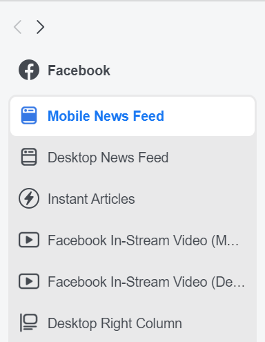
This is smaller text that goes below the headline, which does not show up in all ad placements (you can cycle through the preview options I mentioned above to see it). A lot of the time what I use this for is to provide the yin to my blurb’s yang.
If my blurb is all “raw me” marketing, then I put some character or plot stuff down there. “See what Tanis will be up against as she takes out the big bad and saves the day!”
If it’s a character or plot blurb, I might put, “M. D. Cooper is an NYT best-selling author who loves kittens, and has been compared to Isaac Asimov and Larry Niven.”
That’s a bit short, but still preview it to make sure that on the formats that do show it, it’s not cut off in a weird spot.
Again, don’t be afraid to be funny in your ads if it fits with your books (which it should, if your characters are real, and are not in exceedingly sad situations all the time).
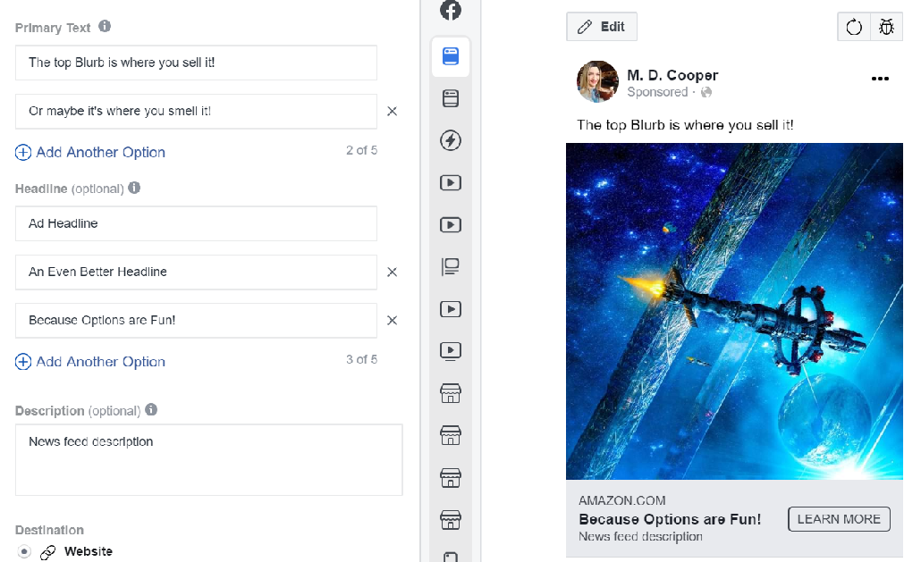
You can now do multivariant testing without having to make special campaigns to test more than one ad type. This is useful if you have an image you know works, but really want to hone your text.
Note: Multivariant testing is like A/B testing, but there are more than just two static options. In this case, you can put in up to five different headlines and blurbs, and Facebook will mix and match them to find the best one.
Ideally, unless you have a high spend, you don’t want to do too many. If you have 5 of each, that will create 25 combinations, and it will take some time for all 25 to show to enough people for the ad system to decide which is working best.
OK, it’s not actually complete. First, you need to pick your call to action button. I really wish there was one that said, “BUY!” but there isn’t. I vacillate between “Download” and “Learn More”.
The effectiveness of one button text over the other probably has more to do with the ad copy than anything else. Feel free to experiment.
But before you submit it, here’s one last thing to consider:
No, not for me; for you. That’s what ads are. You are promoting yourself, and that can feel damn awkward. On the flipside, the folks who do a lot of marketing tend to forget that it is supposed to be damn awkward.
The more you advertise and promote, the more you start to think of yourself and your books as a brand. You detach yourself from it all and treat it like not-you. That is OK, and it’s natural. I’m sure there’s even some name for it.
But be careful. Your readers don’t see you that way.
They see self-promotion as a bit distasteful, and they like authors because they feel like they’re making a connection with a human telling them a story.
You need to keep this in mind as you make your ads.
Self-promotion works best if it’s “raw you” talking right to the reader, or if it’s a deal. They don’t care if you’re shamelessly pimping yourself if they get a bargain in the mix! ;)
There is a way to have the best of both worlds, and it is to not run your ads as you. People will respond to a recommendation from a 3rd party far better than they do to one from you directly. This is obvious; this is why we do NL swaps, and use paid book services. It’s why reviews matter, and why social proof is huge.
So how do you do it for your FB ads?
Here’s the deal. You have your author page where you talk to your folks, push your deals and wares, and post snippets and cover reveals. This is you. Run your “raw you” ads from this page. Don’t run your market-y/plot/character ads from this page, because they aren’t coming from “you”.
What you need to do (and this will take time, a good bit of time) is make a new genre fan page. If it’s SF, you could make it about a trope, or maybe about some good books or TV series. If it’s UF, you could make a Buffy fan page, or a general genre page like “Great Romance books I Love”.
Run your ads as that page. Pimp other people’s books there (good books that you believe in), and you’ll build trust with folks who like and follow the page. That way, when you promote your book on this page, people will trust you and they’ll check it out.
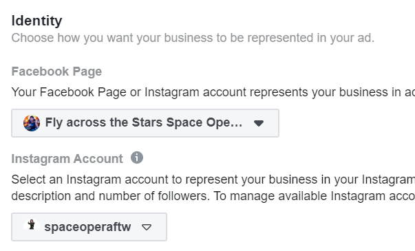
Keep in mind, though, you need to run that page as a faceless marketer. It only works if you create a marketing persona for yourself, and run the genre/fan page as them. Some people can’t do that. If that’s the case, work out a way where you can run it more as “you,” but you’ll lose some of the advantage of the “trusted recommender” promoting your books.
Do not pay for likes, or run giveaways to build followers on this page. You want this page to be true lovers of what you’re putting up there. As you run ads as this page, you will get people liking the page. I know; crazy, right? People will click “like” on the sponsor of an ad!
It does take a year or so to build up a genre-based fan page organically (at least, it did for me). But when it’s built, it will be just as powerful as a newsletter, and will give you an additional marketing and promotion avenue.
OK, we’re ready to submit the ad, so go forth and do it.
Some things to remember (and to double-check, which you can do by clicking along the list of steps on the left side of the page):
Seriously, if you don’t listen to any other advice I have, do #6 and #7. You will see better results. Guaranteed.
Your ad will take a bit to get approved (though it’s faster when there’s no text in the image), and then once it has, the stats can have a few hours’ delay.
What we’re doing at this point is seeing how the ad resonates with your market. If you have a killer ad, you’ll know this in one day. You may also have a fantastic ad that will take 2 days to prove out. Expect to spend $10-$15 for each ad you test. If you’re on day three, and the ad isn’t picking up steam, then it’s time to axe it.
“So, how do I really know if my ad is working?”
Read on, gentle reader, read on…
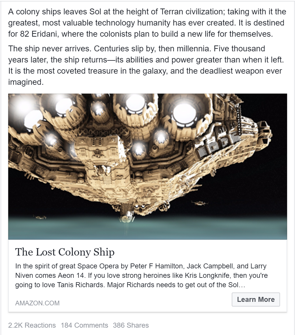
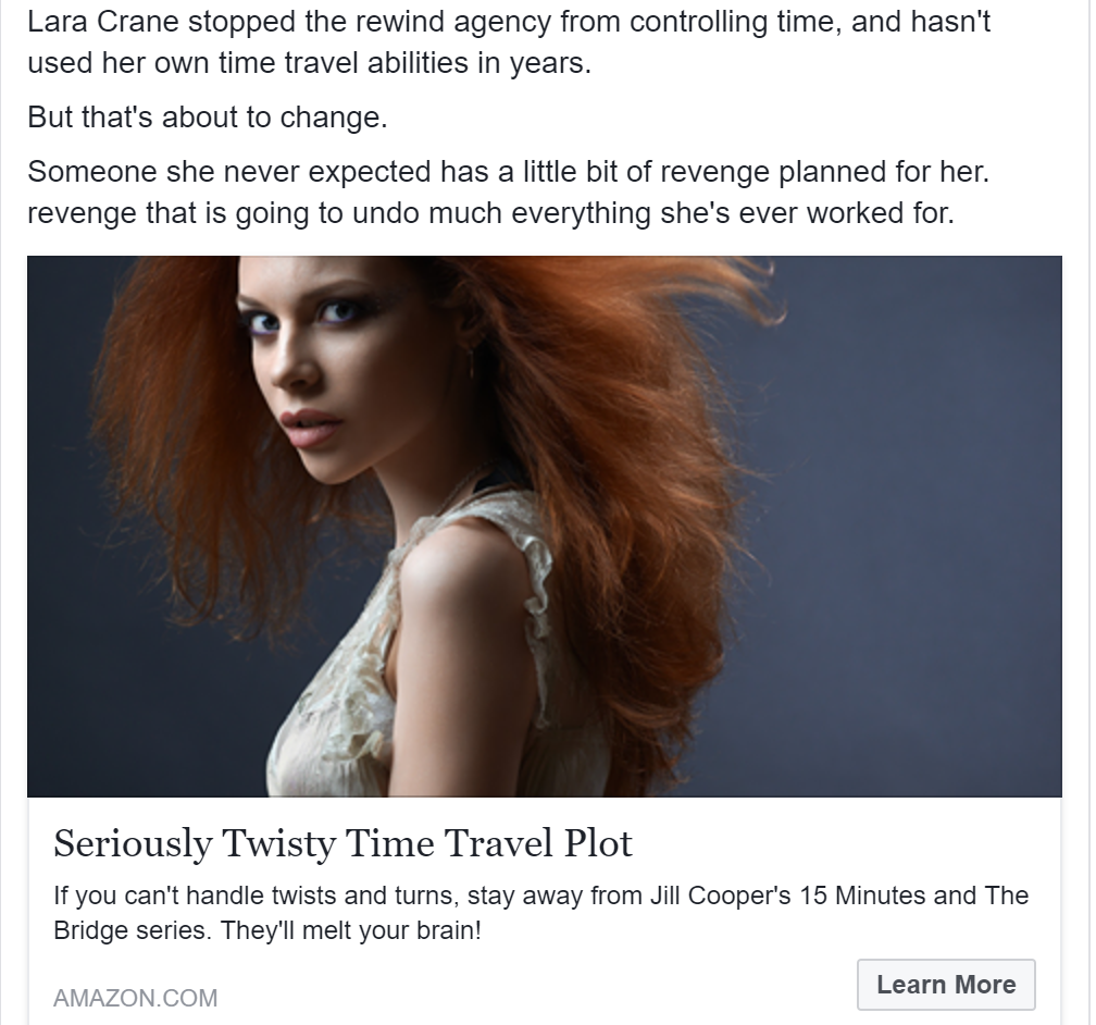
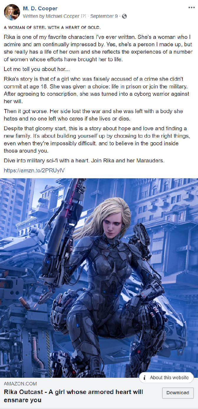
But first, here are some of my ads for you to check out:
